Up Front's bold new brand with arresting illustrations inspired by Moby Dick
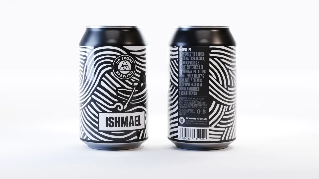
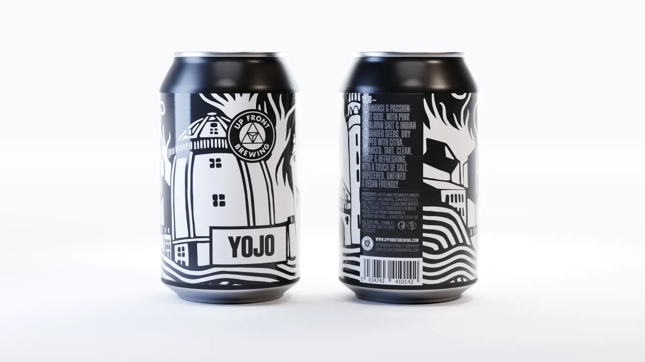
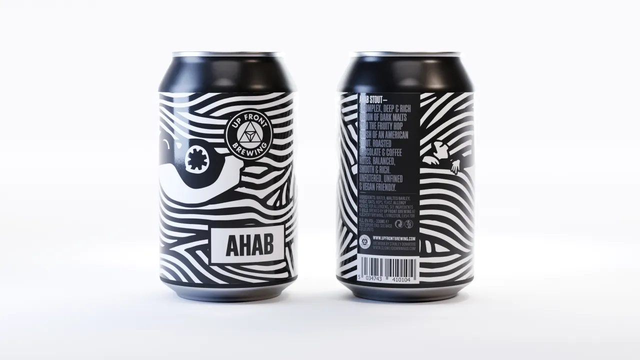
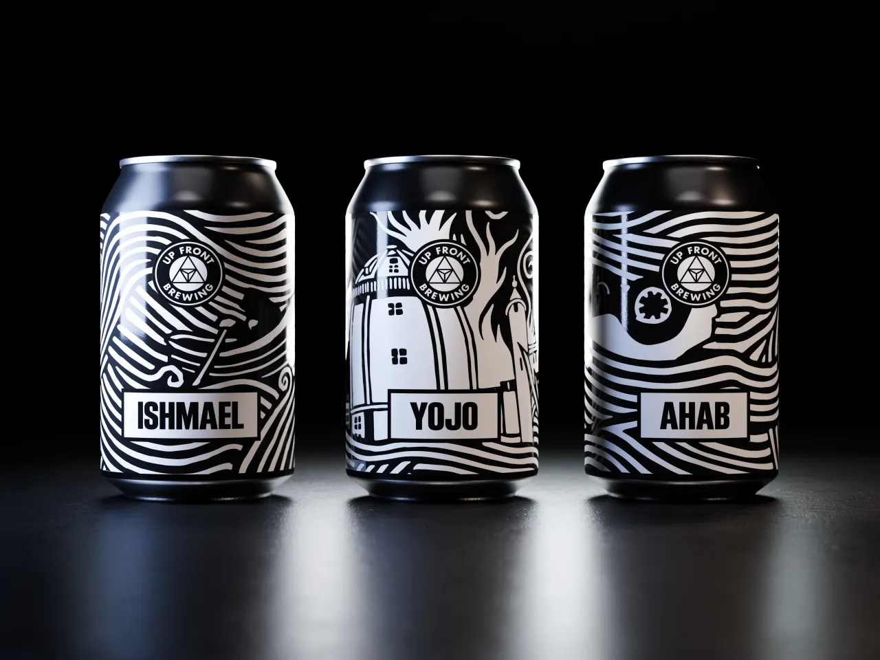
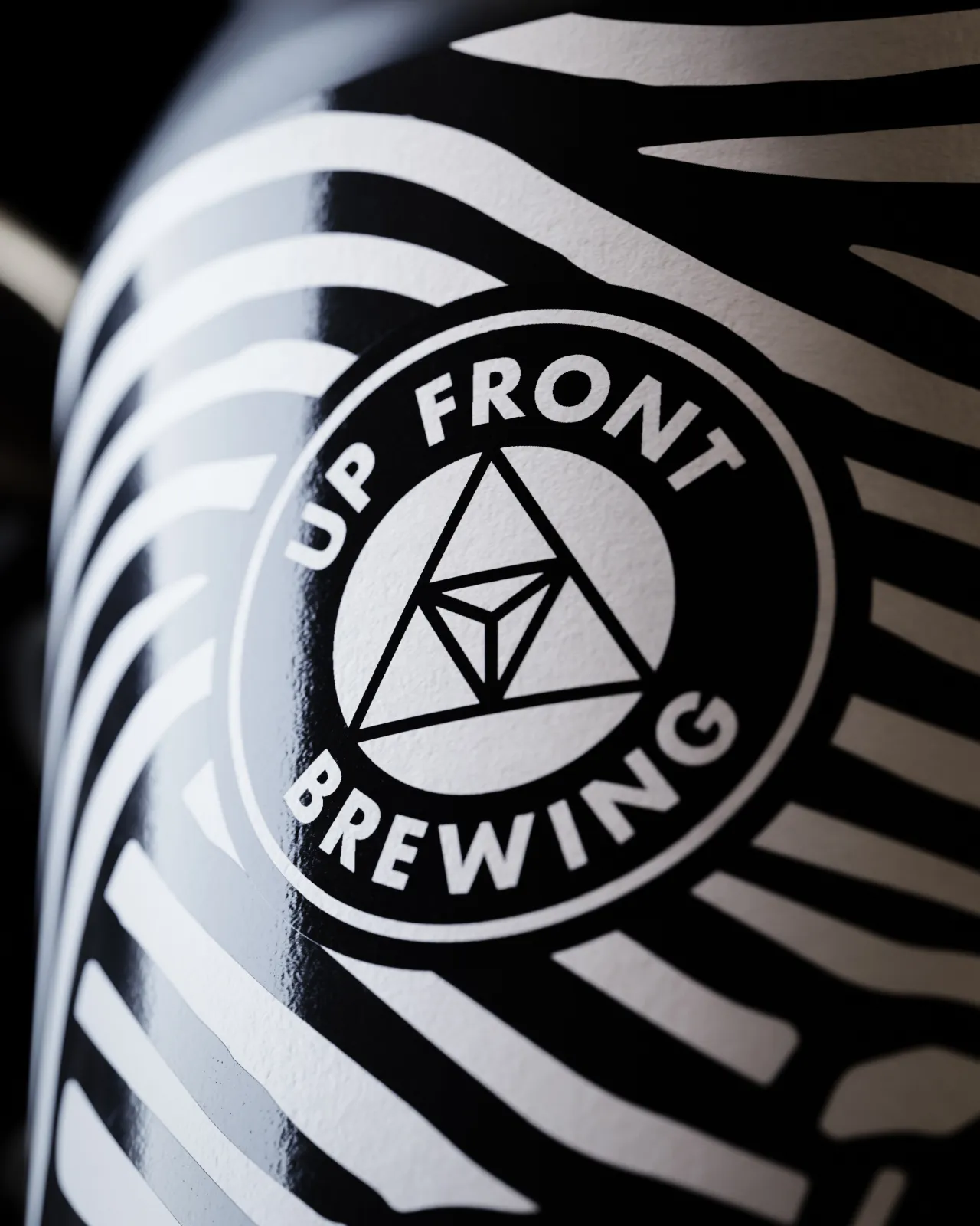
Using linocut graphics by illustrator Stanley Donwood and taking inspiration from Moby Dick, Glasgow studio Freytag Anderson created this seriously nice monochrome packaging for independent brewer Up Front.
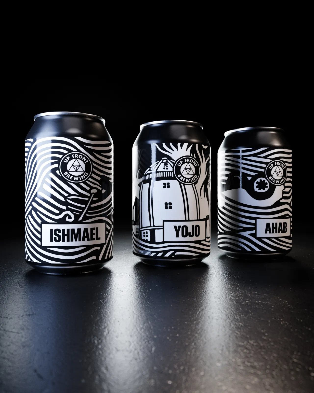
Lovingly crafted by its founder Jake Griffin, the new range of beers have been named after characters from Herman Melville's classic story and so formed the basis of the entire "seaborne adventure" look and feel.
"Up Front’s existing brand identity was refined in line with these signature illustrations and vice versa," said Greig Anderson of Freytag Anderson. "The beer names are presented in a simple letterpress-inspired font which ties in visually with the linocuts."
Apparently, there's more to come from the Scottish studio with labelling for special ranges for Up Front in the coming months. In the meantime, be inspired at freytaganderson.com.
Editor's Picks





Trending






Latest Jobs
Brand Designer at Adfin
Full-time·London·£30k–£50k
Frontend Developer at Northern Artillery
Full-time·Leeds·£35k–£45k
Senior 2D Motion Designer at Art&Graft
Full-time·London·£50k-£65k
Principal Software Engineer at BBC Media Tech
Full-time·Glasgow·Up to £83,790
Design Lead at Madeo
Full-time·New York City·$85k–$120k
Midweight Editor at Earworm
Full-time·Bristol·£28k-£32k