Design Bridge creates vibrant packaging for Fortnum & Mason’s core range of biscuits
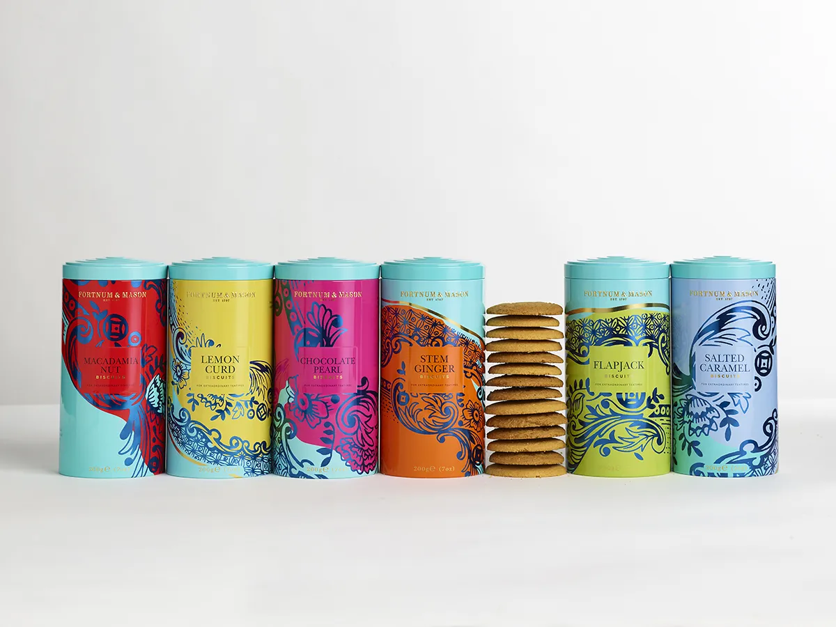
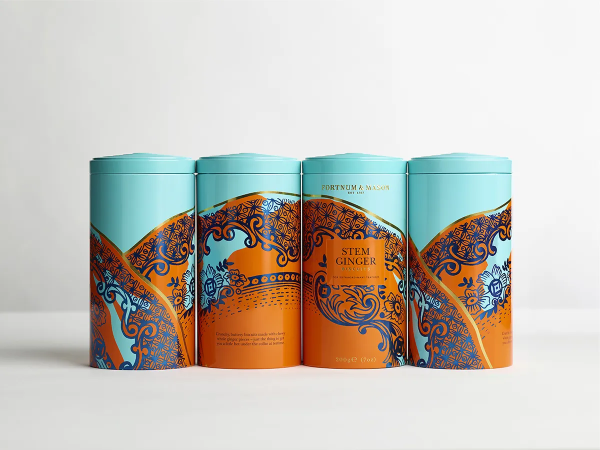
Design Bridge has created delicious new packaging for Fortnum & Mason's core range of biscuits, with six bespoke designs drawing inspiration from decorative ceramics and fine china traditionally used to serve tea and biscuits.
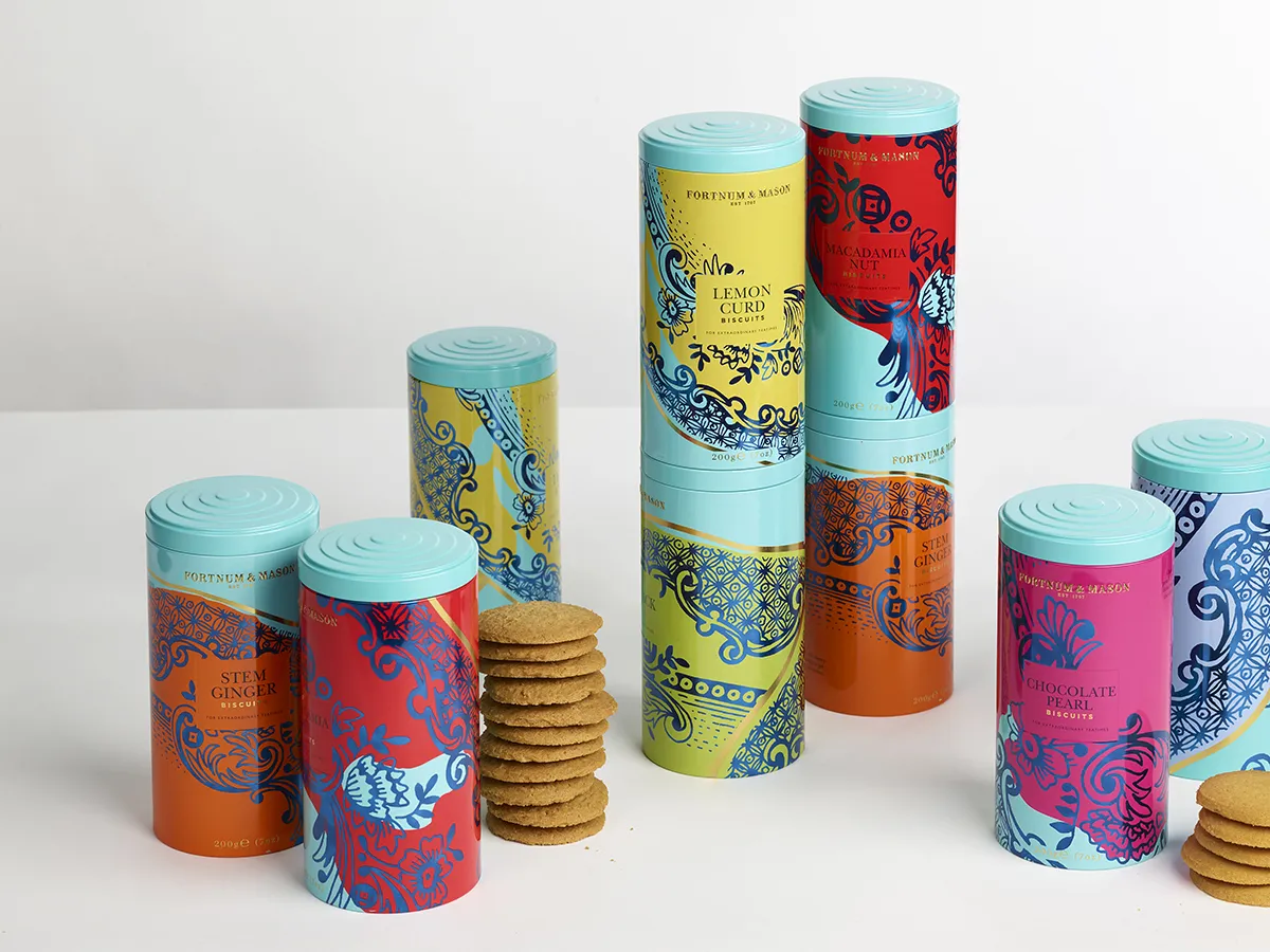
"We were inspired by the very Fortnum’s, and also very British, institution of having tea and biscuits, especially the designs of the special china used to serve them on," explains Chloe Templeman, Design Director at Design Bridge. "Referencing the Fortnum & Mason archives, architectural details of the Piccadilly store, and fine Georgian ceramics we designed our very own decorative plate to incorporate into the new packaging designs. The result is a range of tins that feel so special and considered that people want to show them off next to their finest china instead of decanting the biscuits onto a plate."
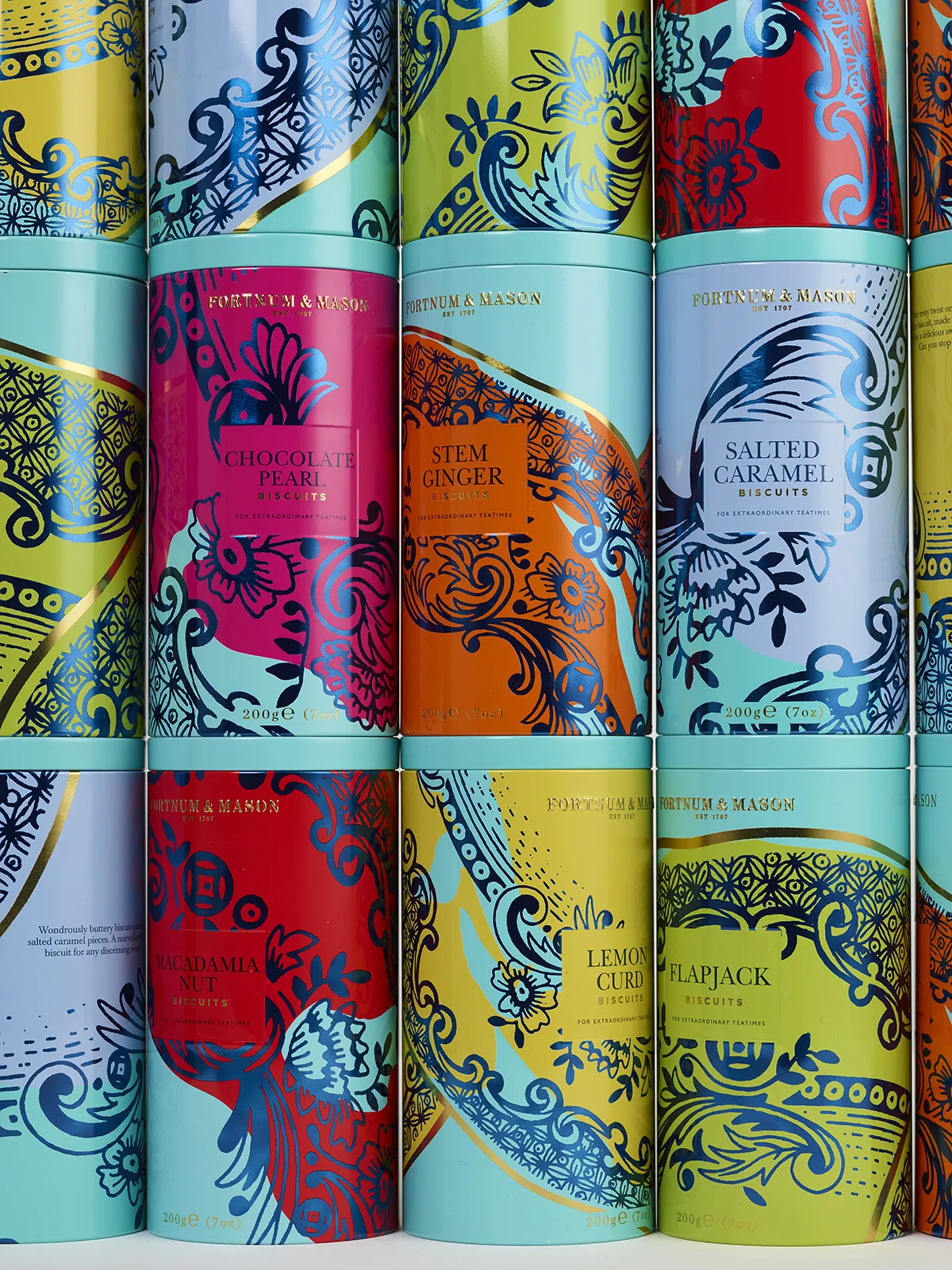
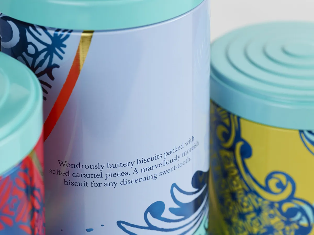
Design Bridge went to great lengths to ensure that each of the six designs felt as special and unique as possible while still feeling part of the same family. The team hand-drew the decorative plate design and carefully varied its pattern of flowers and flourishes to create six unique crops, one for each biscuit flavour. Each crop has been applied to the design at a different scale, introducing a refreshing pace, energy and variety across the range. Their plate design has also been treated to give it a slightly worn feel, rather than being pristine and crisp, as if it's been well-loved and well-used in many a teatime.
Chloe Templeman added: "On pack we’ve added strong, vibrant colours to the pattern to give it a contemporary feel and have applied the colours in bold blocks that don’t always match up with the edges of the pattern, adding energy and a sense of discovery.
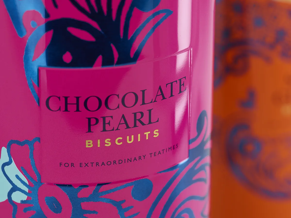
"Combining metallic and non-metallic colours adds even more depth, while a de-bossed square in the middle of each design works as a consistent and calm focal point, displaying the flavour of the biscuits and added the new tagline created for the range: 'For extraordinary teatimes'."
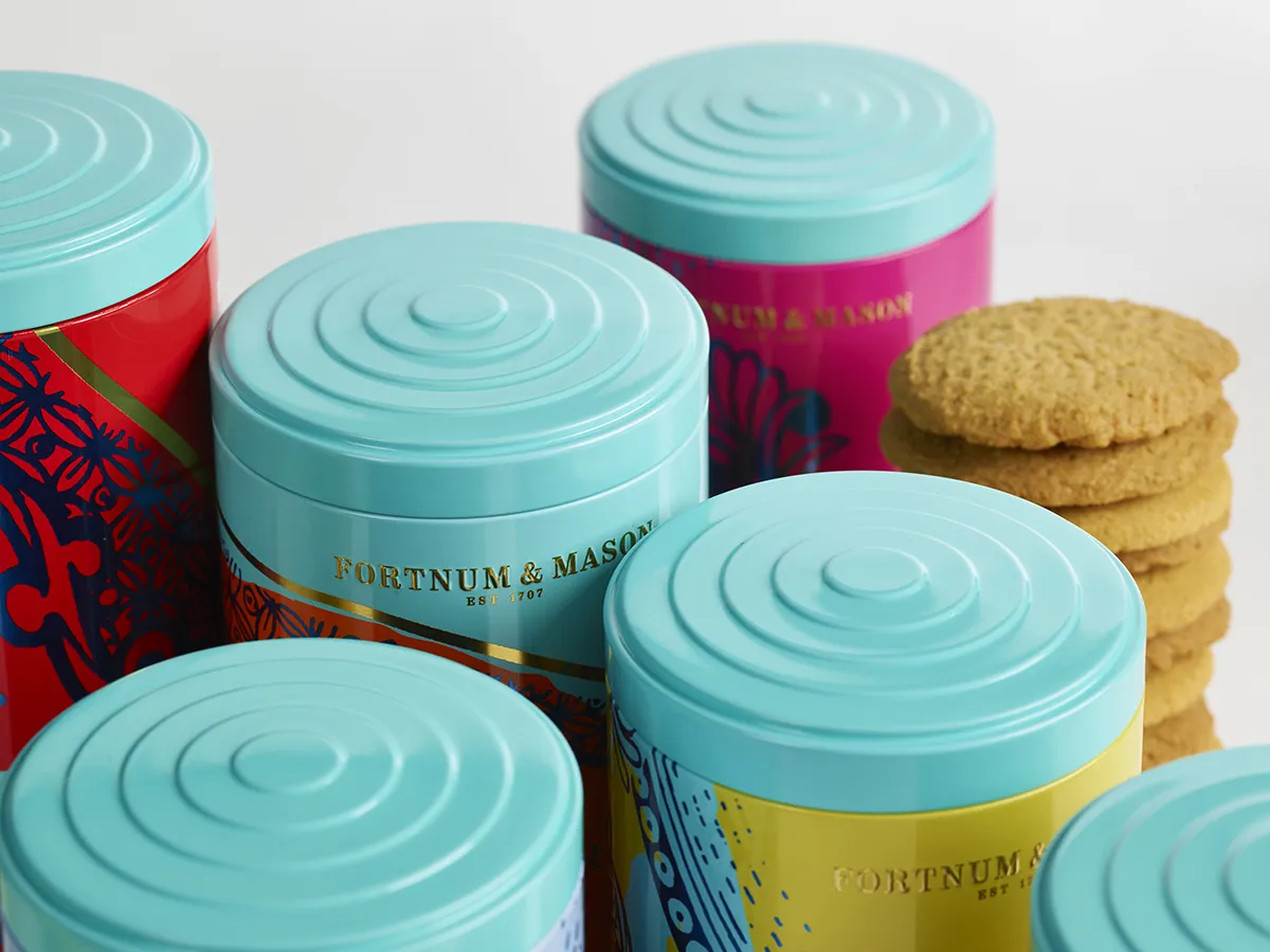
Design Bridge has also updated the structural design of the tin so they can be stacked seamlessly on shelf, better accommodating how the biscuits are merchandised both in London and Fortnum & Mason’s outposts around the world. The new lid is inspired by vintage tea caddies and biscuit tins, which brings a consistent band of Fortnum & Mason’s signature 'Eau de Nil’ colour to the range. To finish it off, the Fortnum & Mason logo is proudly embossed on the front of each design in gold ink.
Editor's Picks





Trending






Latest Jobs
Creative Project Manager at Analogue
Full-time·Leeds·£28k–£35k
Paid Media Executive at Munro Agency
Full-time·Glasgow·From £27,000
Midweight Designer at Catalyst Creative
Full-time·London·£32k-£36k
Brand Copywriter at Origin
Full-time·Porthleven, Cornwall·£35k–£40k
Senior 2D Motion Designer at Art&Graft
Full-time·London·£50k-£65k
Art Director at The New York Times
Full-time·New York·$120k–$130k