An identity straddling weddings and partying from Brooklyn-based Ana Andreeva
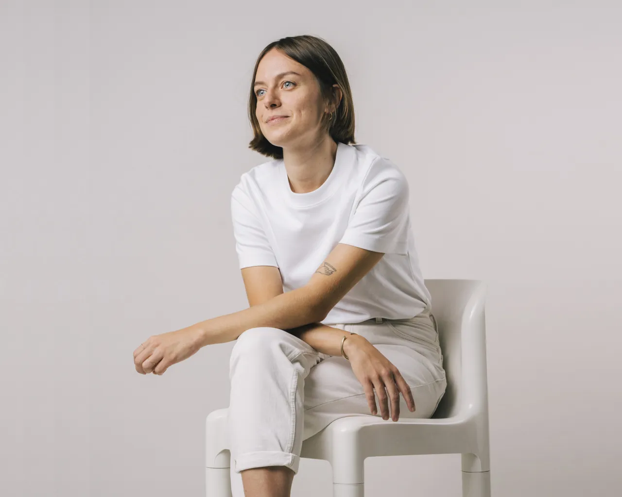
Ana Andreeva is a Brooklyn-based multi-disciplinary designer based in Brooklyn, New York. Having studied typography design at Cooper Union in New York, her work since has focused on type and brand design, which takes a "systematic approach" to projects "where the concept is as important as its scalability and application," she says.
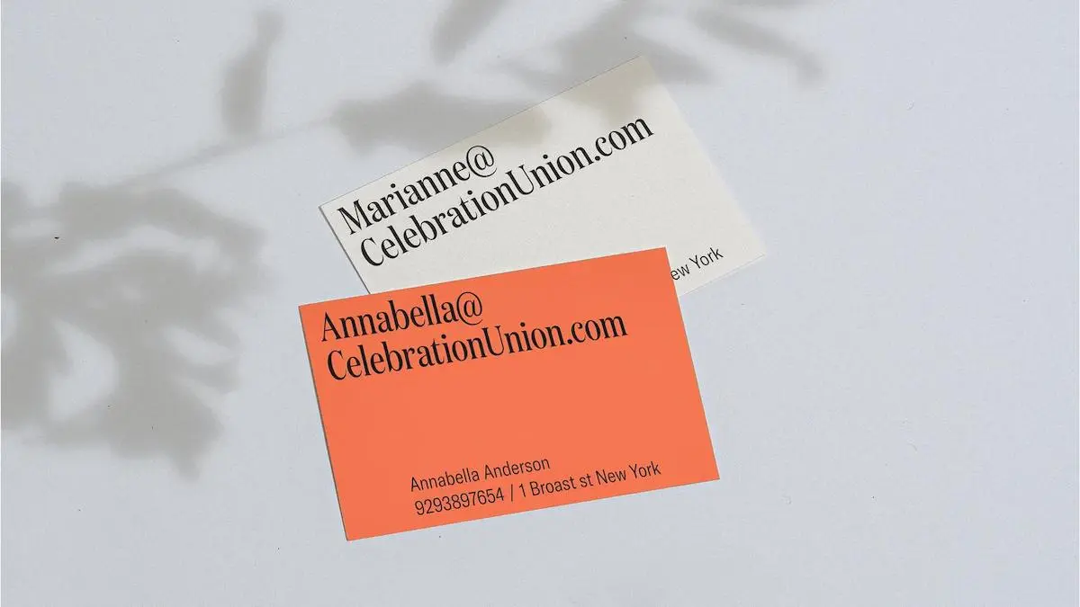
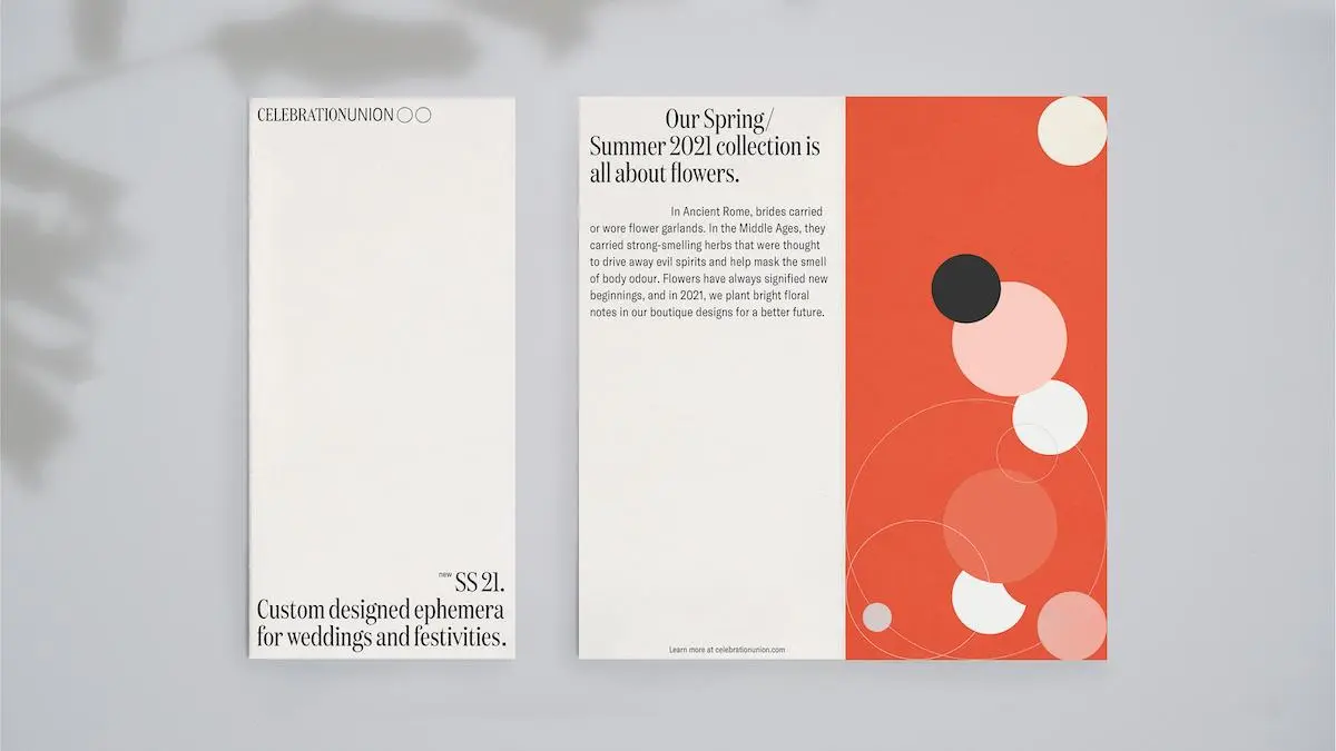
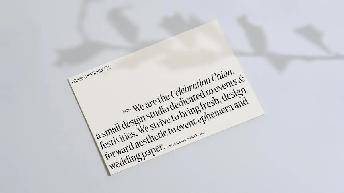
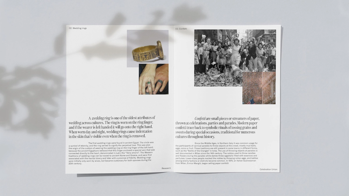
One of her recent standout projects is the identity for New York event design studio Celebration Union. "The visual language is built on research into the history of celebration - weddings, events, gatherings, and parties, to find the essence of what makes our special days special," Andreeva explains.
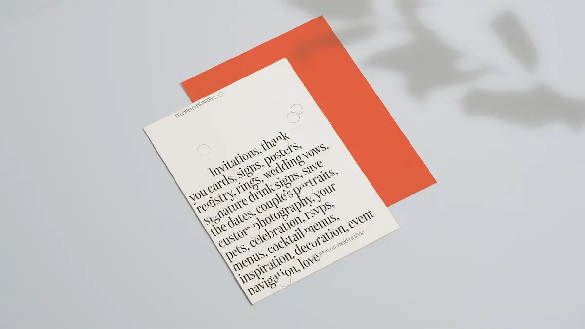
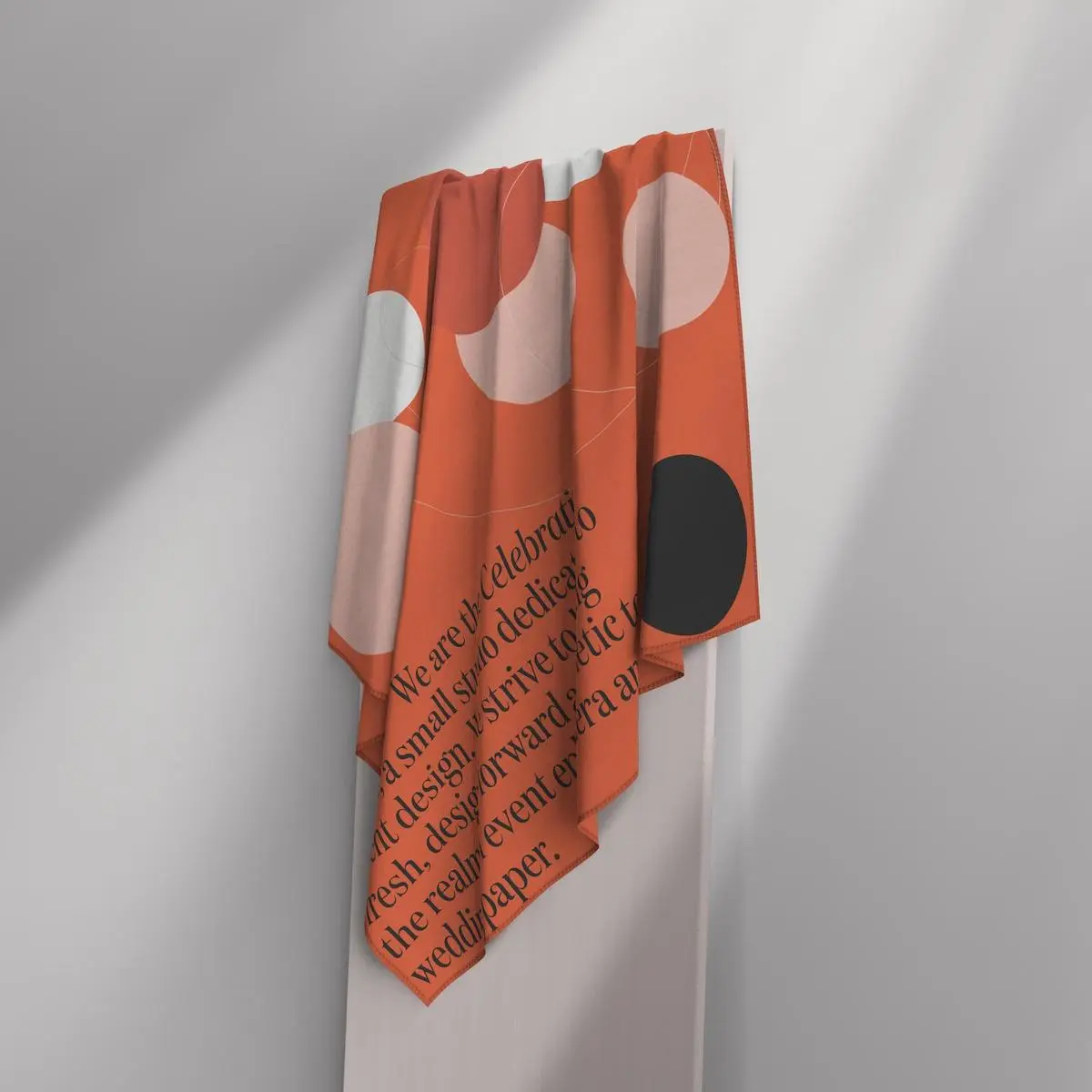
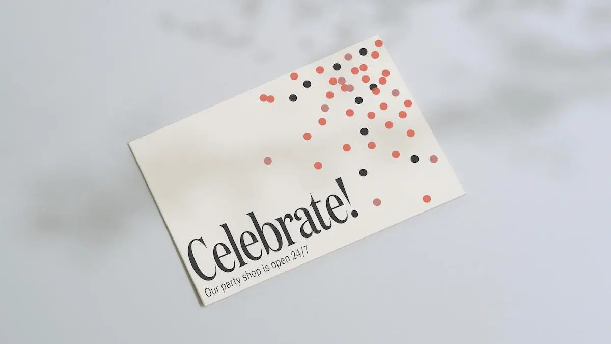
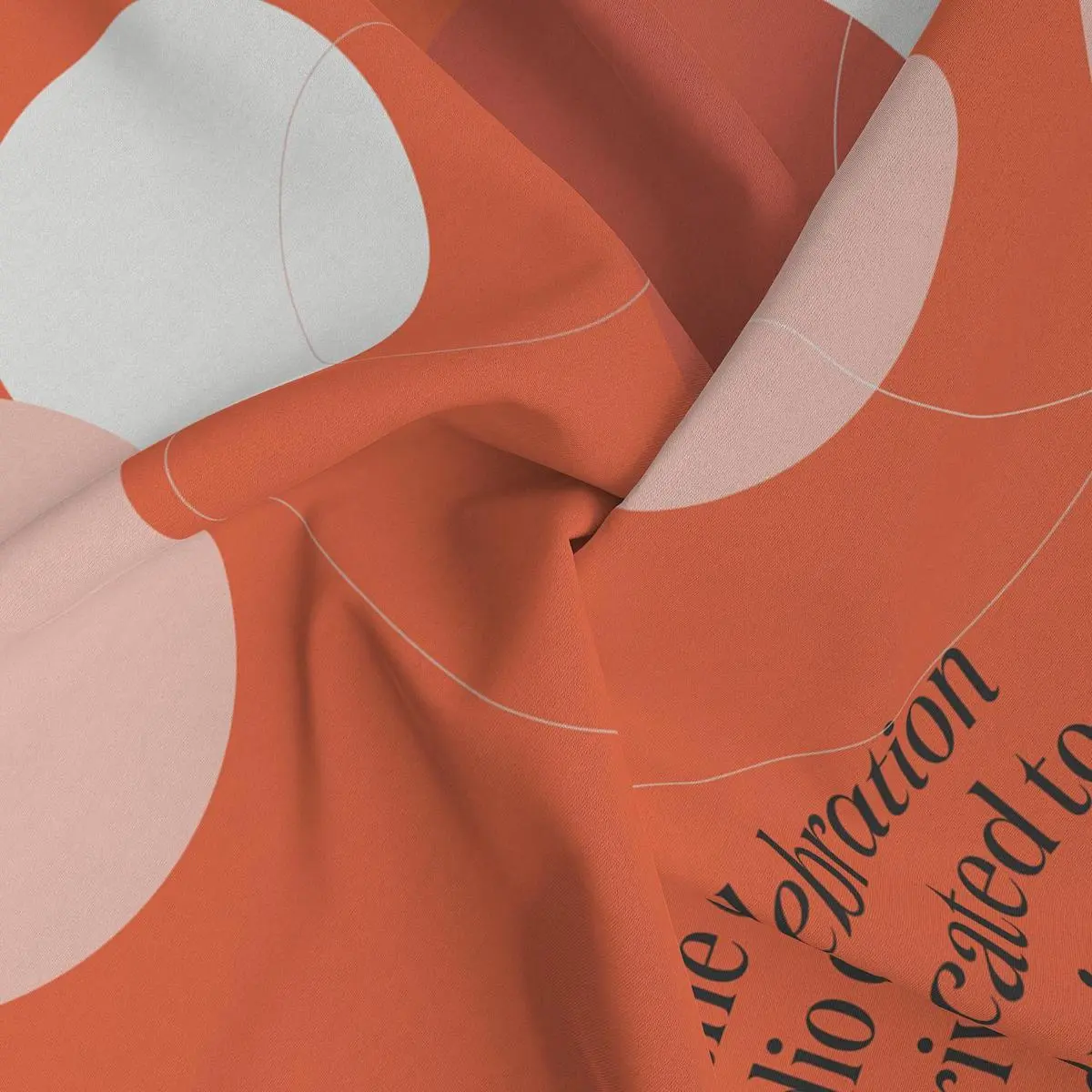
The designs were formed through the designer's efforts to find a visual metaphor that represents both a wedding shop and a party shop and unites the two under one brand. "The circles represent wedding rings and confetti," she explains. "The rings are the only unchanging attribute of weddings across multiple cultures and times, and confetti is a visual representation of fun."
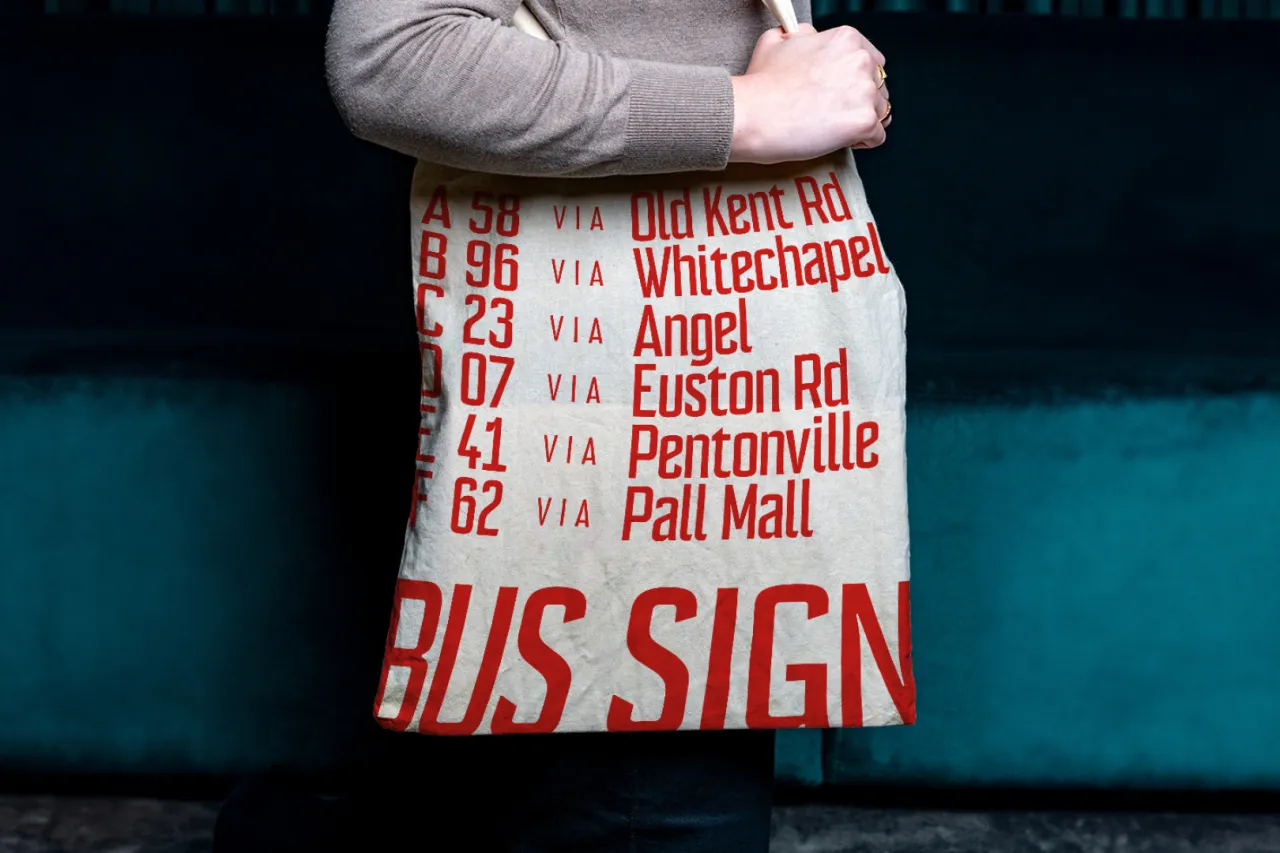
Andreeva is co-founder of ATS Type, a small international type foundry, and has designed the Update Sans typeface design: a multiscript sans serif typeface family "designed for a changing world with global unity in mind," she says. The font will be sold through the ATS Type library in late 2021. Elsewhere, she's worked on branding projects for select typefaces for Monotype.
Her client list includes Facebook, Monotype, Herman Miller and McCann, as well as beautiful work for less big names, such as her visual identity for Method, a restaurant, bar, and music venue based in Moscow.
Editor's Picks





Trending






Latest Jobs
Client Success & Growth Director at Revolution Growth
Full-time·Manchester·£60k-£70k
Senior Digital Designer at Red Antler
Full-time·New York·$95k-$130k
Senior Operations Manager at BIG Partnership
Full-time·Glasgow·£45k–£50k
Senior Designer at Creative Spark
Full-time·Manchester·£35k-£50k
Creative Social Content Producer at Bompas & Parr
Contract·London·£32k–£40k
Design Lead at Madeo
Full-time·New York City·$85k–$120k