Angel & Anchor's nostalgic identity for a Belfast coffee roaster is inspired by VHS tapes
These days, a big city like Belfast is spoilt for coffee shops, so you need a distinctive identity to stand out. And that's just what local studio Angel & Anchor has delivered for Process, an independent speciality coffee roaster in Belfast founded by Ben Hamilton.
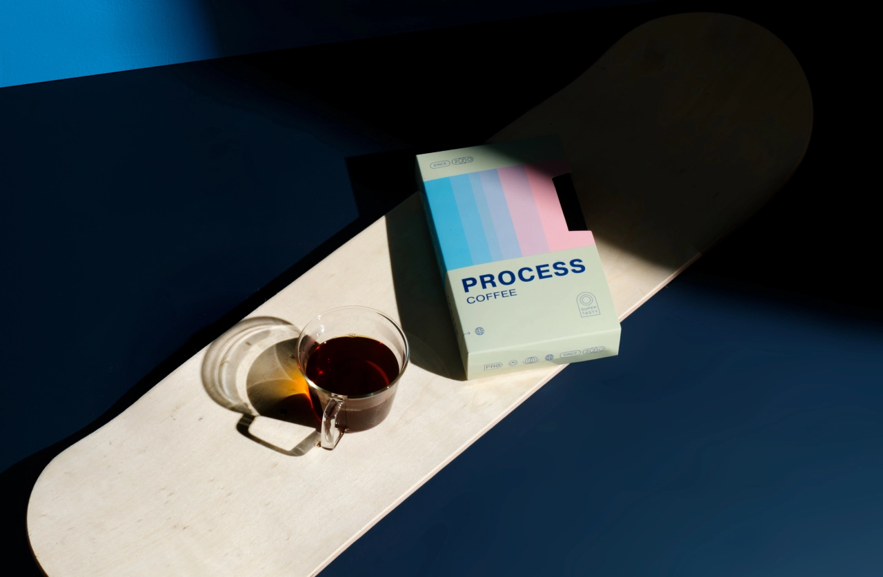
After working in various coffee shops at different levels, Ben wanted to open his own, where he could blend his passion for coffee and skateboarding. Following their sterling work for Lost & Found, a brew bar and eatery on the north coast, Angel & Anchor took a somewhat different – and brilliantly imaginative – approach that summons '90s nostalgia in an inventive way.
"The brand's foundation is built upon the belief that there's growth and joy found between the beginning and the end," explains Angel & Anchor founder Ben Connolly. "Everyone starts somewhere, and whether it's speciality coffee or not, all are invited to keep learning and progressing. Process celebrates that idea with an approach to coffee and business that is anti-exclusive and highly inclusive.
"This spirit of continually trying, learning and perfecting is not only found behind the espresso machine but also at the skatepark," he continues. "Breaking boards in frustration, or the elation of landing something 'first try', perfectly encapsulates the ups and downs of progress. So it made sense that the brand would be built around a low-fi 90s feel, with a never-give-up attitude."
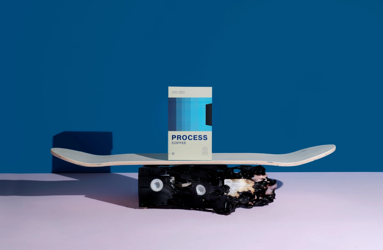
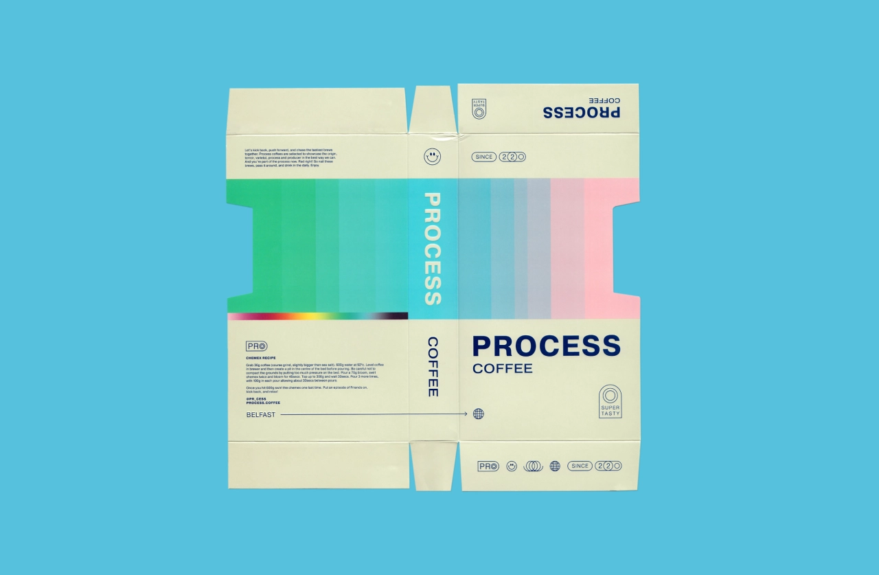
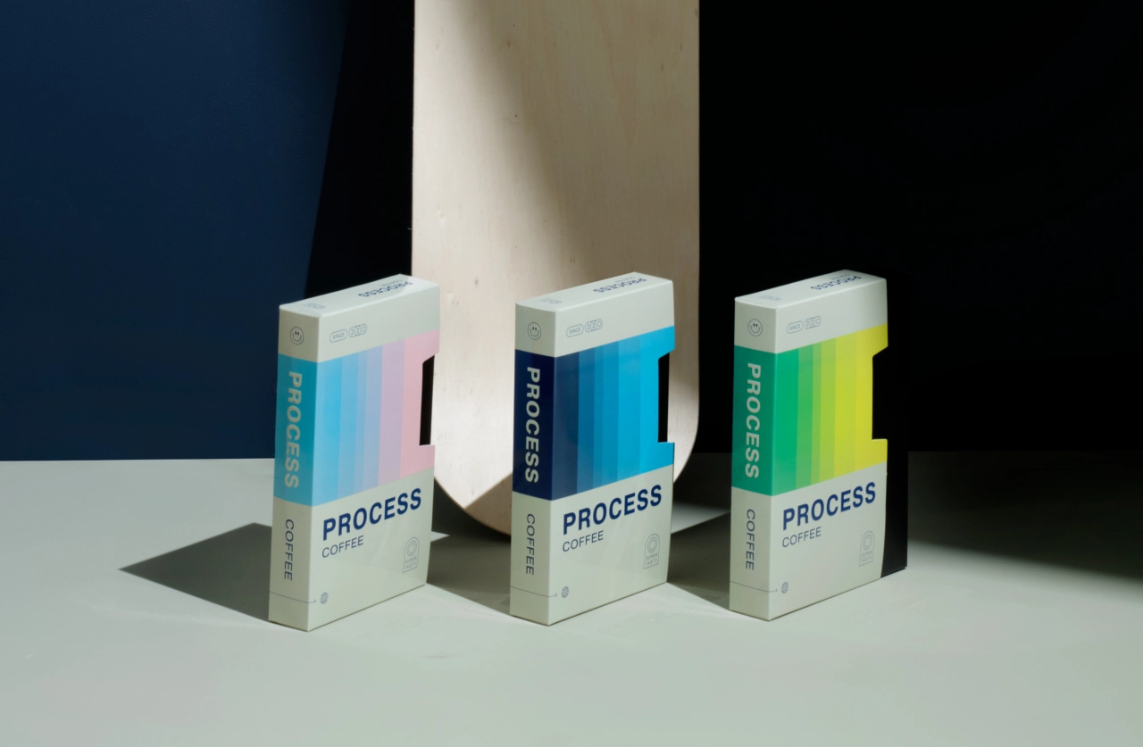
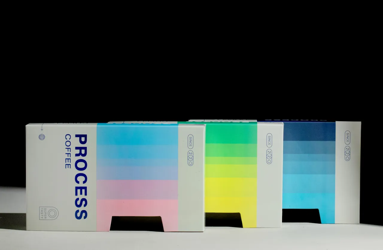
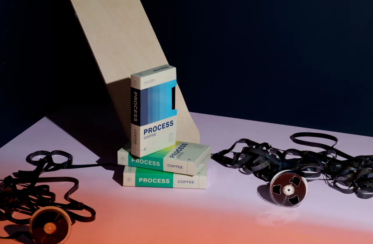
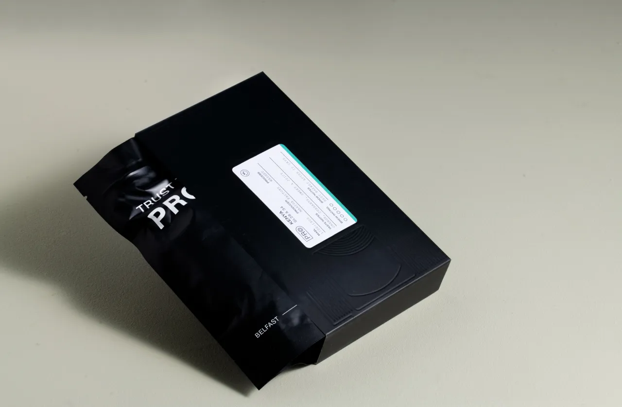
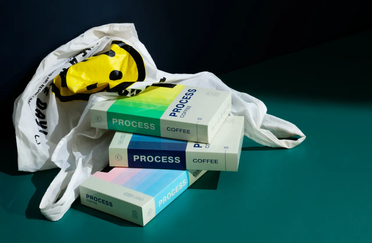
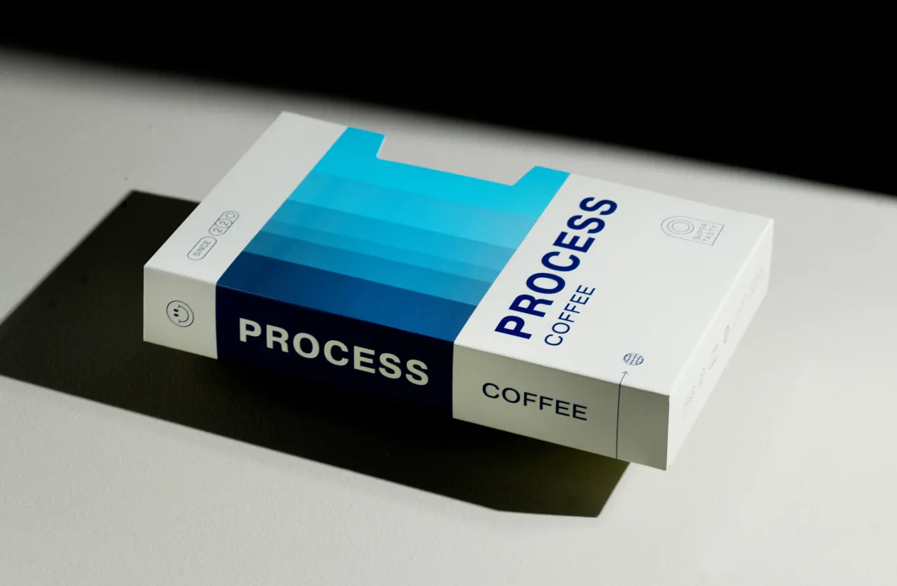
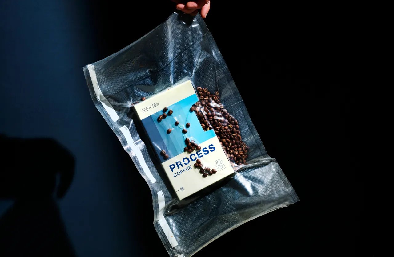
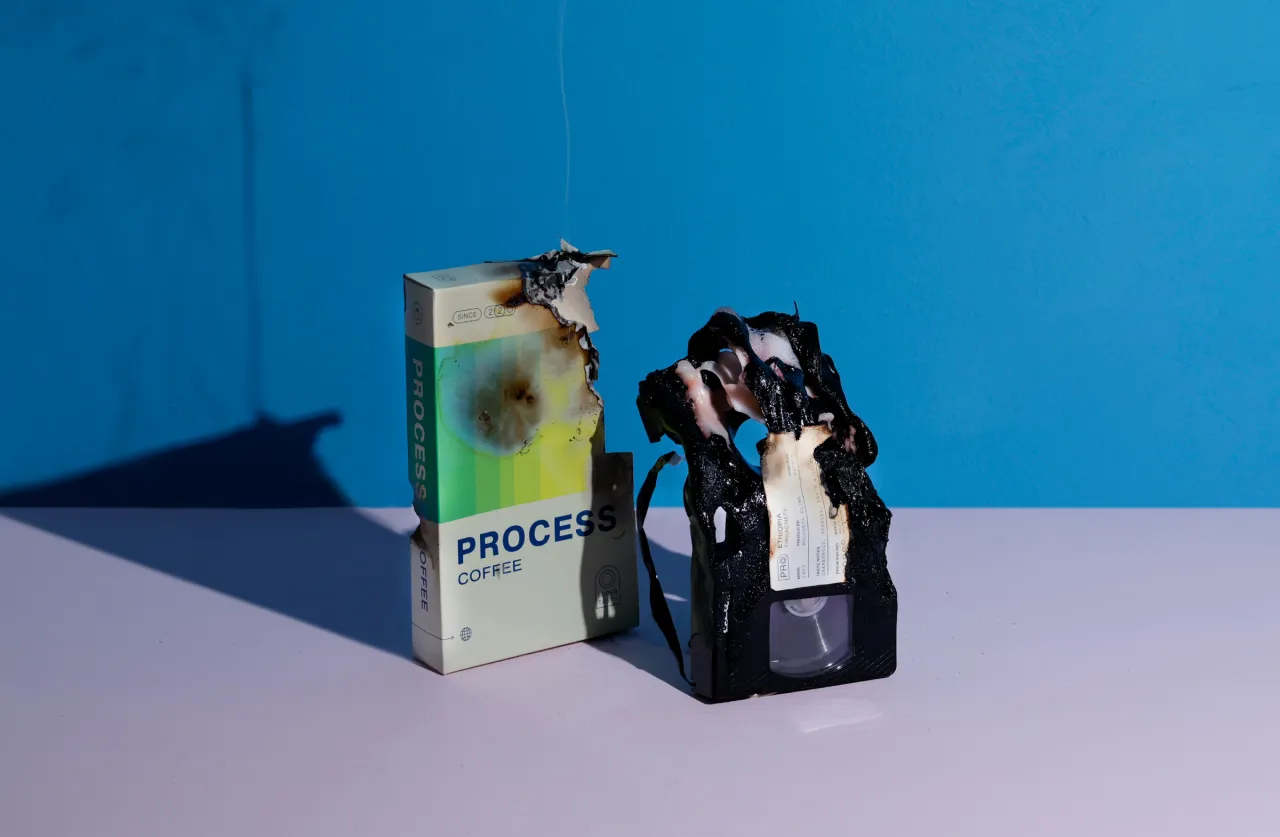
The packaging for the shop's coffee roasters showcases this core brand value in humorous and attention-grabbing fashion. "The glossy VHS tray container slides away from an inner tape that reveals deboss details and a matt finish," explains Ben. "After engaging with the cassette, you can find a bag of tasty coffee inside. With three layers of opening, sliding and revealing, this packaging truly expresses the notion that more is more." Maybe this is why it was honoured as a packaging design finalist in the 2021 Sprudgie Awards, presented by global coffee publication Sprudge.
"Memorable VHS touchpoints are used in new ways throughout the packaging design," Ben continues. "The Pragmatica typeface provides that simple, default feel while supporting the broader vibrant expression. Playful icons and smiley face marks replace what would typically be a Kodak or Fuji on logo VHS tapes. And labels that would usually identify 'Jeffersons Christmas 94' are now used for the coffee region and varietal info. Every tape design reference is used in a new way to express the brand vibe or functionally provide product information.
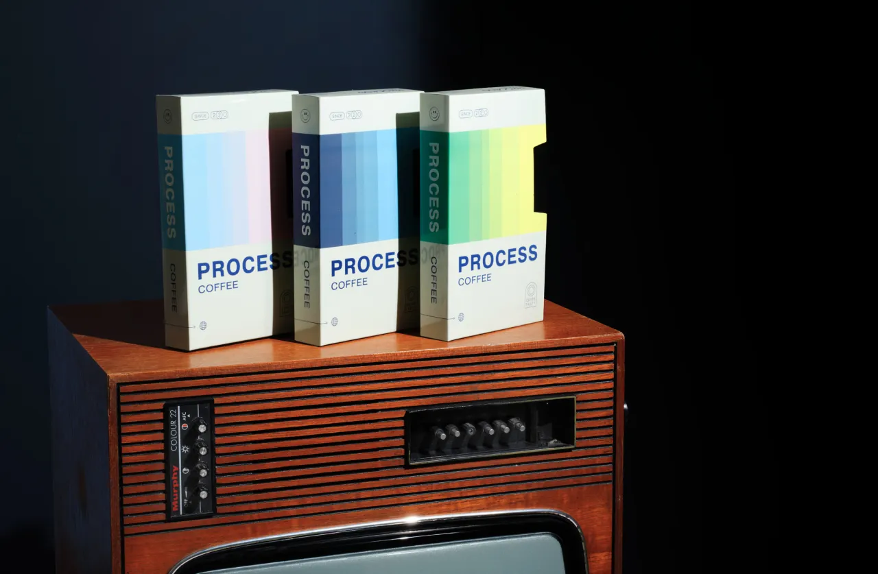
"A spectrum of energising colours creates an identity for every box of coffee," he adds. "Stepped gradients through the cheerful hues provide variety across three to four different colourways, helping them stand out on shop shelves. The colour palette is then used as a distinguishing tool in the label design system."
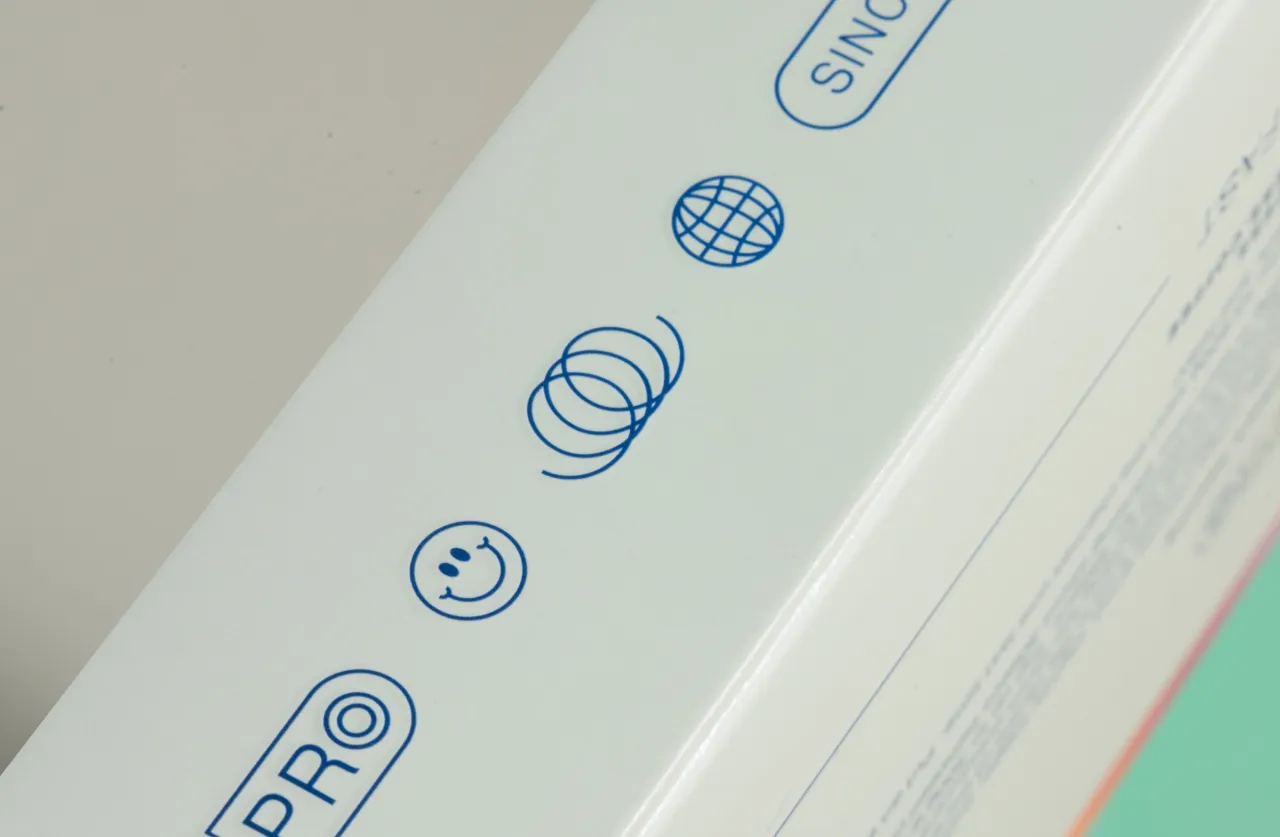
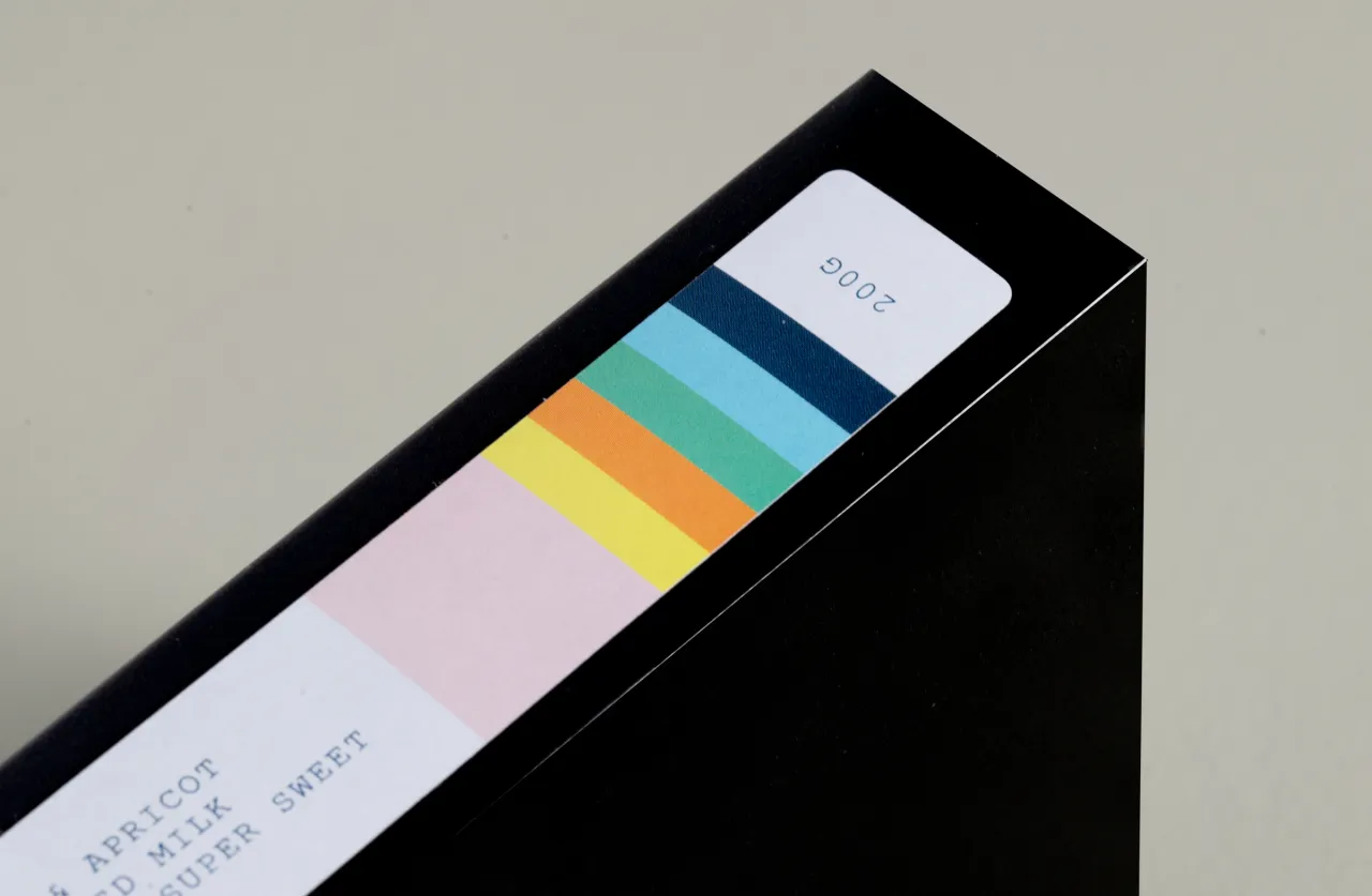
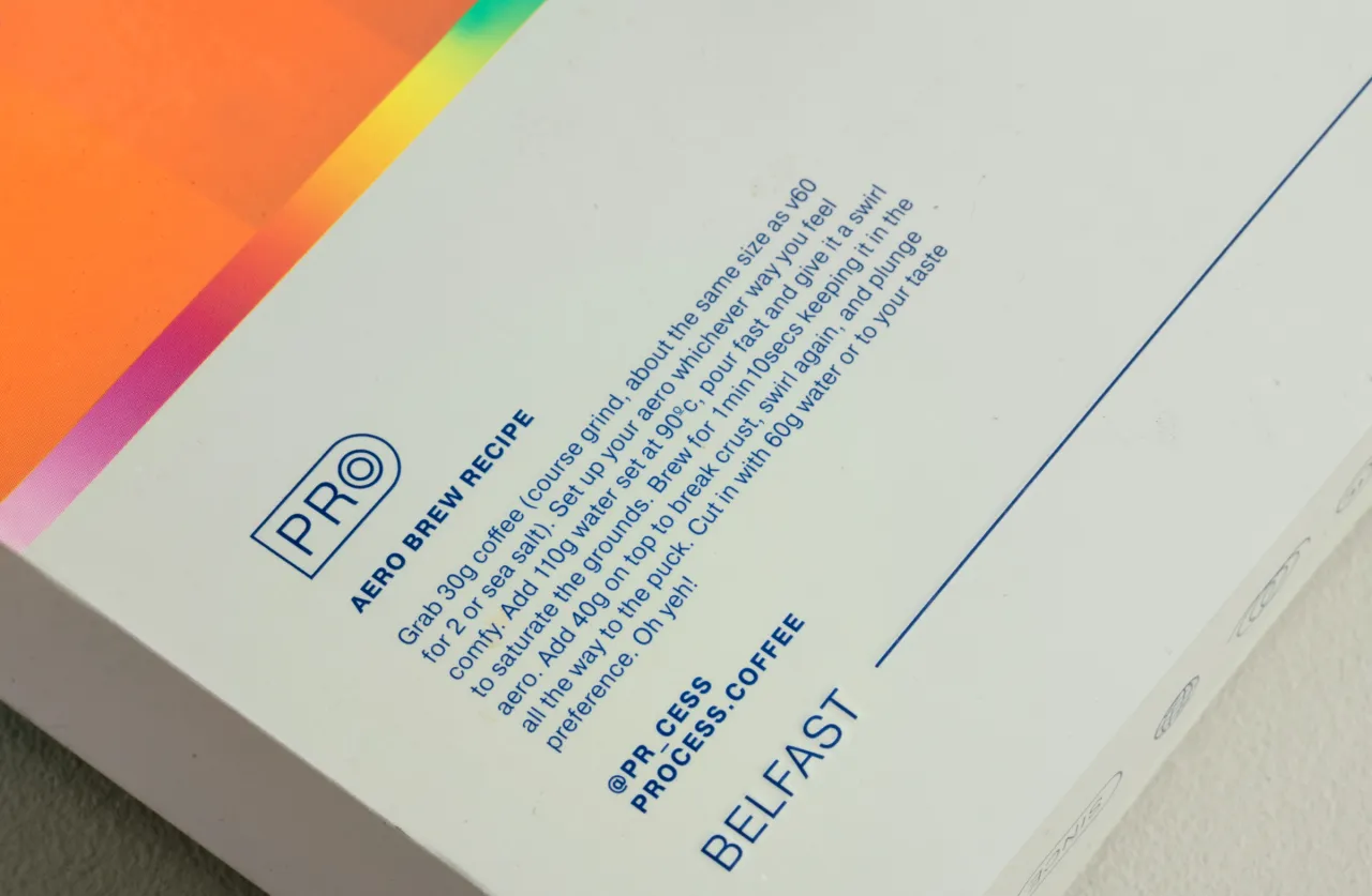
As the cafe is passionate about welcoming everyone into speciality coffee culture, the back of each box includes a different brew method with step-by-step instructions, helpful for a novice and a seasoned homebrewer. "Staying on theme, simple, debossed icons suggest the VHS story even further but, in this case, express the brand values and vibe," explains Ben.
He adds that the packaging has been a huge hit amongst coffee lovers on Instagram. "The initial novelty has progressed to a genuine coffee experience unlike any other. We couldn't be more stoked at the final design, the feel of the box in hand and the response by coffee and design nerds across the world. Insert, play and enjoy – but remember to rewind when you're done."
Editor's Picks





Trending






Latest Jobs
Senior Designer at BKC
Full-time·£50k-£60k
Brand Strategist at DNCO
Full-time·London·£45k-£60k
Creative Project Manager at Analogue
Full-time·Leeds·£28k–£35k
Mid-Senior Designer at Something Familiar
Full-time·Bristol·£32k–£40k
Senior Designer at Definition
Contract·London·£45k–£50k
Creative Content Executive at Cognition
Full-time·Birmingham·£28k–£35k