17 of the best student campaign designs for brands that need a little reinvention
You know the drill. Your client wants you to come up with a campaign to help promote its product or service. It needs to be eye-catching, perhaps thought-provoking. Whatever you do, it has to be original and stand out from the crowd.
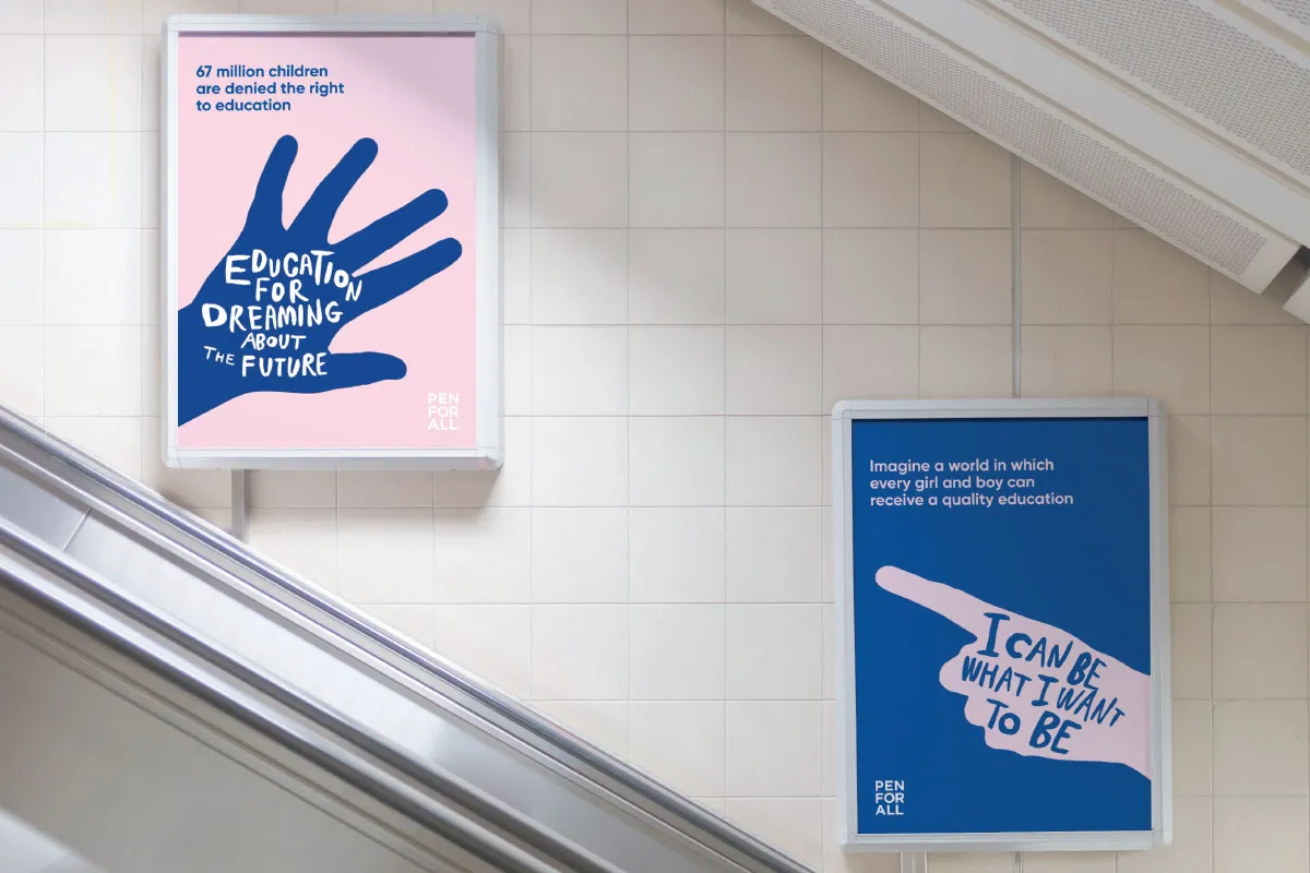
Aya Kudo. All images courtesy of Shillington and its students.
At Shillington, we often put our graphic design students through their paces by setting them interesting briefs, particularly ones that involve campaign design for real-life brands. Ones that perhaps need help with changing their public image.
From creating mini booklets and advertising materials to posters, billboards and display ads, we've picked out 17 of the best projects from our students at our six campuses around the world for you to enjoy and be inspired by.
1. Christina Partyka, New York
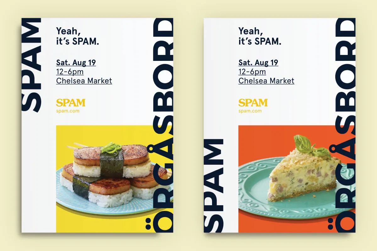
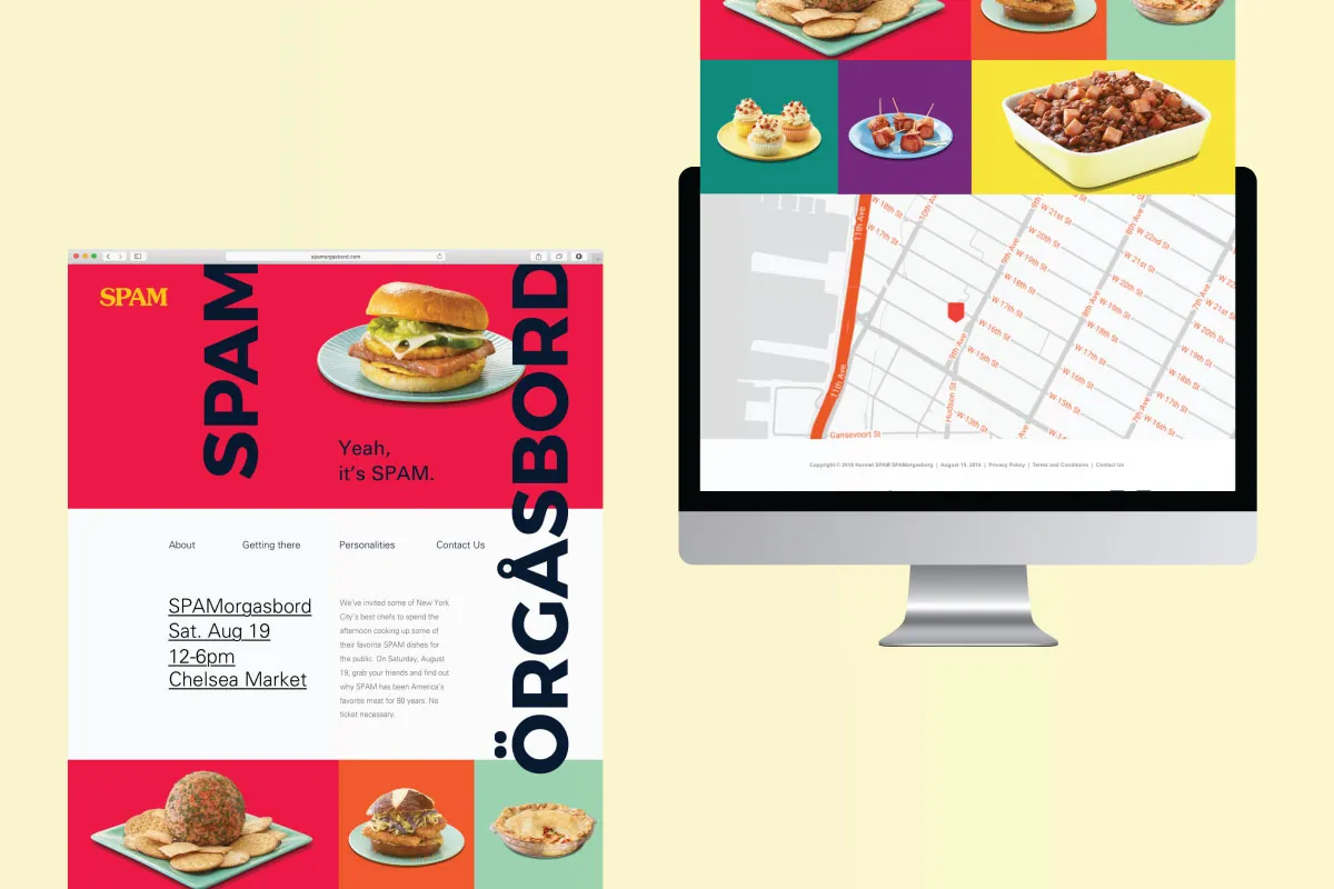
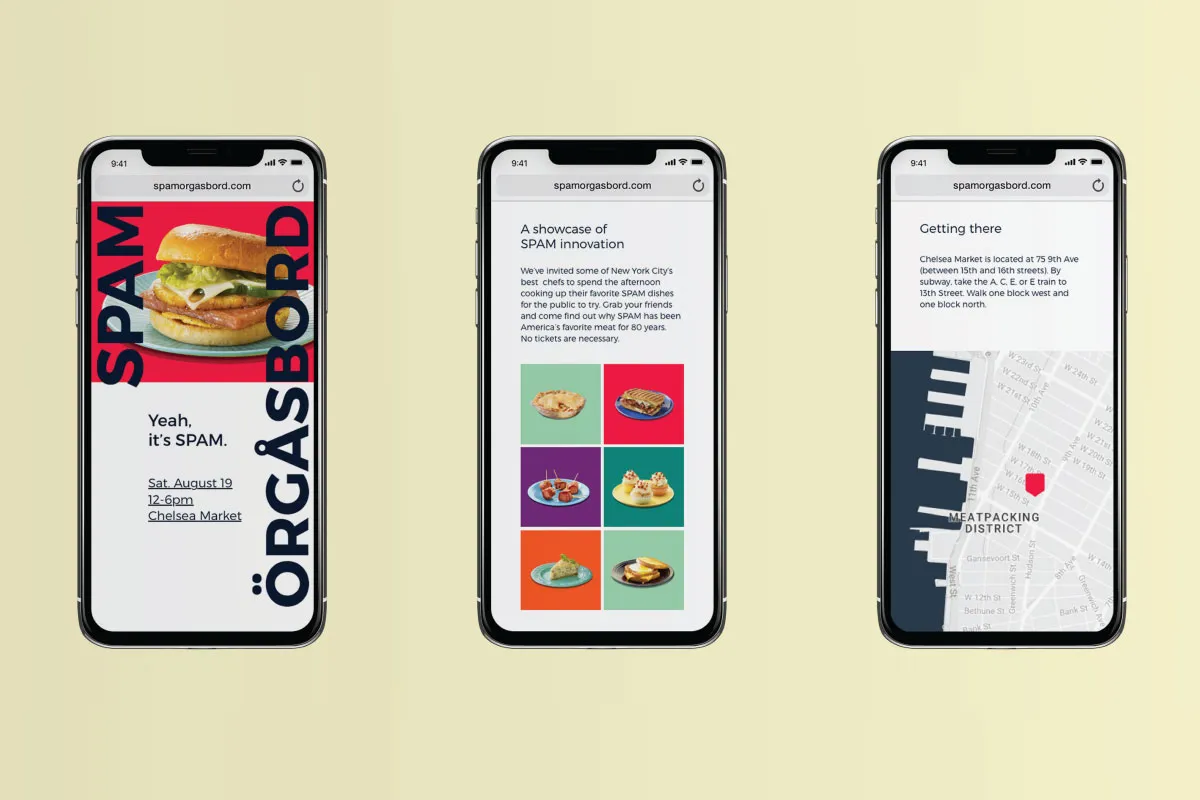
For her make-believe campaign, Christina Partyka focused on a food festival called Spam. Taking place at New York City's famous Chelsea Market, she used strong typography and a dose of prime colours without being afraid to allow the content to breathe and benefit from some white space.
2. Deborah Kutnikas, New York
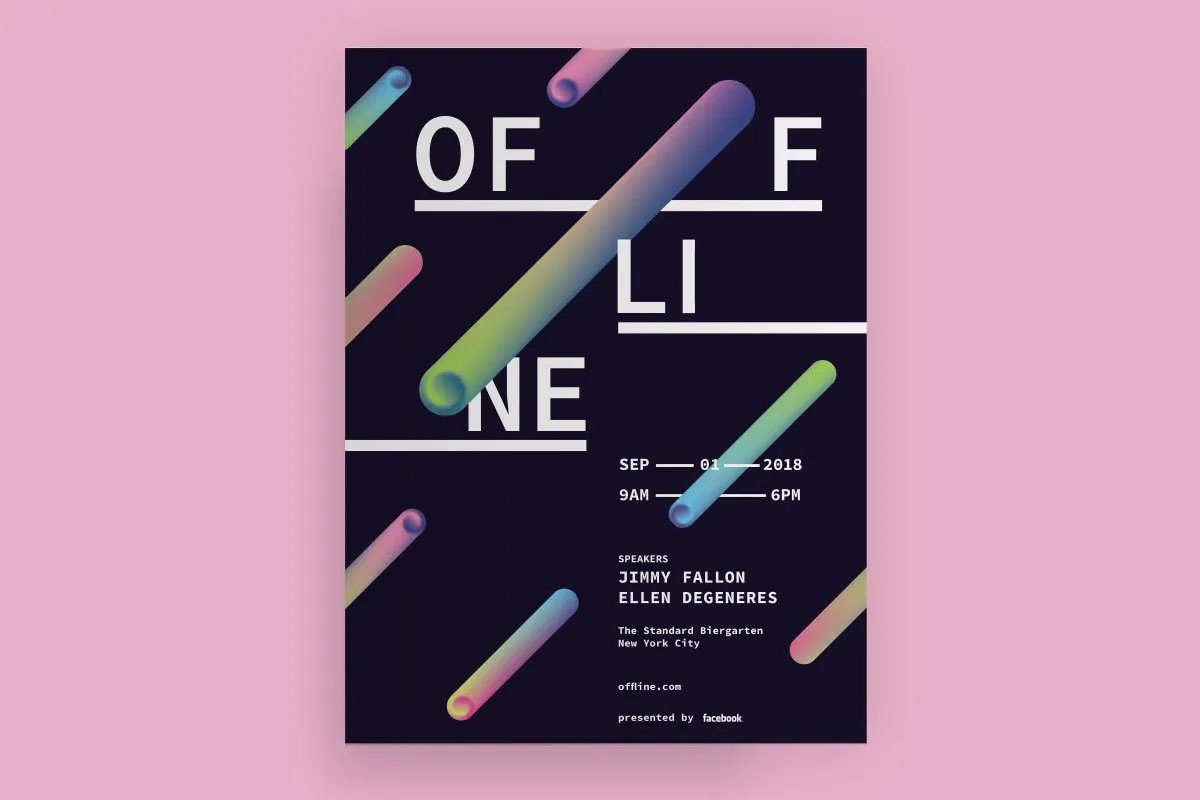
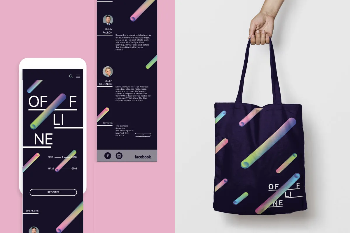
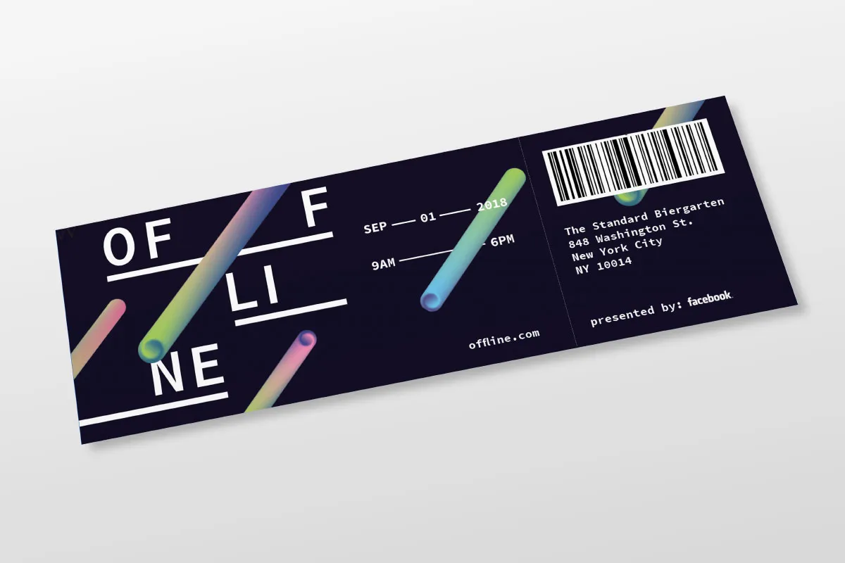
Facebook could certainly do with a helping hand right now and that's what our New York student Deborah Kutnikas set out to achieve with her campaign to improve its public image. Her idea? A one day conference focused on people connecting online and in real life. Marketing materials like posters, day passes, tote bags and a website demonstrate the fictional conference's brand.
3. Freke Oppewal, Melbourne
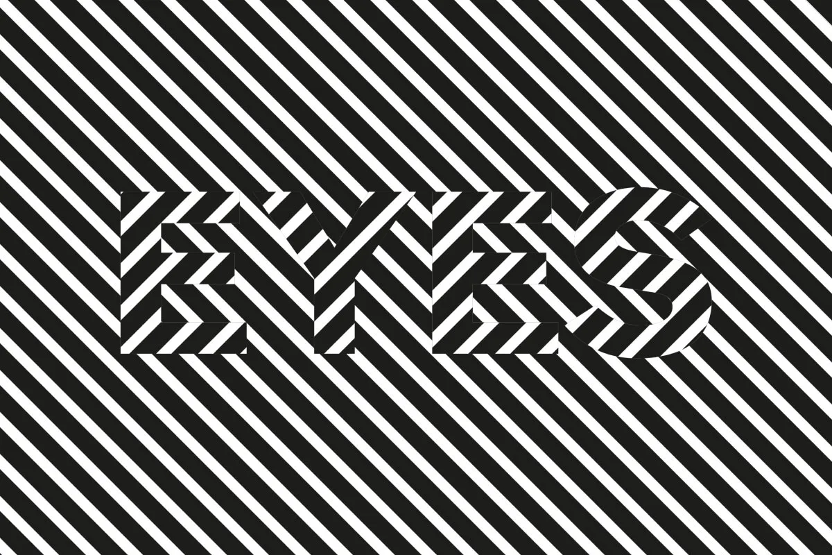
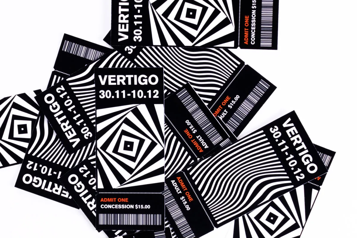
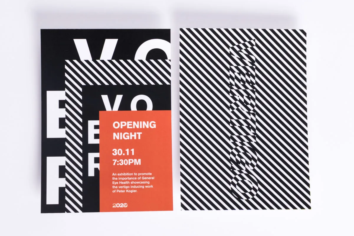
Freke Oppewal in Melbourne came up with a clever campaign design for Optical Illusions, an exhibition that promotes the awareness of general eye health amongst a younger audience. We love the optical illusion angle, the chunky typography and monochrome palette.
4. Kathy Geisel, New York
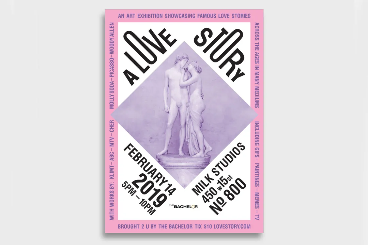
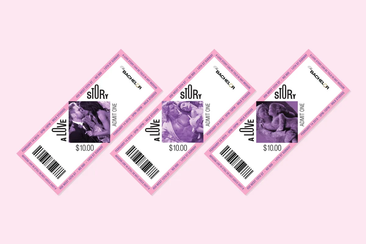
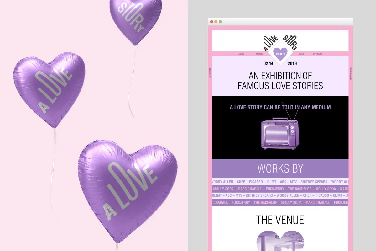
A Love Story is an art exhibition dreamt up by Kathy Geisel at our New York campus. Showcasing love stories throughout the ages, Kathy used a romantic colour palette, classic sculpture imagery and appealing typography to help change the public's view about the event's sponsors, ABC's reality TV show, The Bachelor.
5. Sani Lama, Melbourne
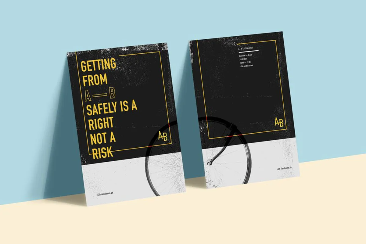
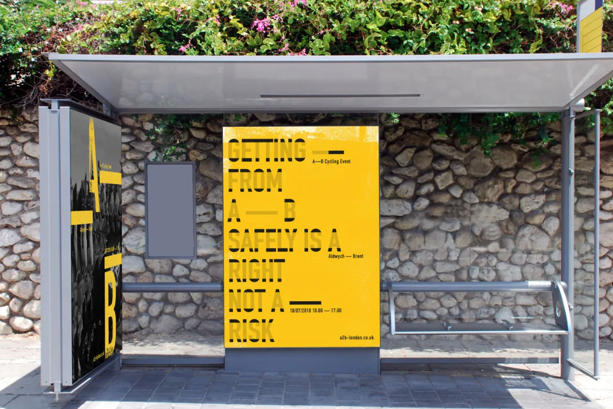
Sani Lama in Melbourne was tasked to turnaround a negative public perception of A–B Cycling, a fictional event around the subject of cycling in the city. We especially love the campaign line, "Getting from A to B safely is a right, not a risk."
6. Sarah Grillo, New York
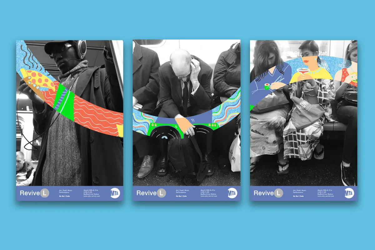
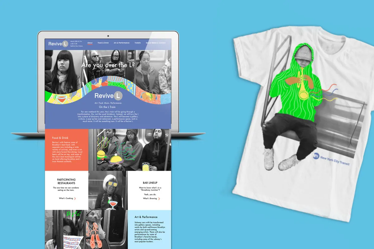
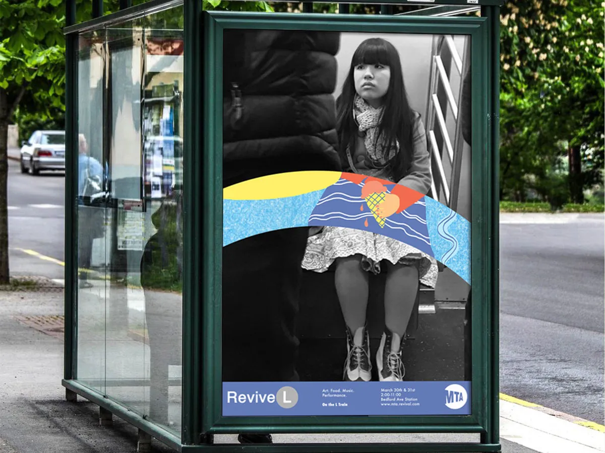
Over in New York, Shillington student Sarah Grillo designed a brand and campaign for a community event called Revive L, putting a positive and fun spin on the L Train Line. Aside from her clever poster designs that contain photographs of commuters with integrated illustrations, it was her website design that really stood out for us.
7. Evena Wong, Brisbane
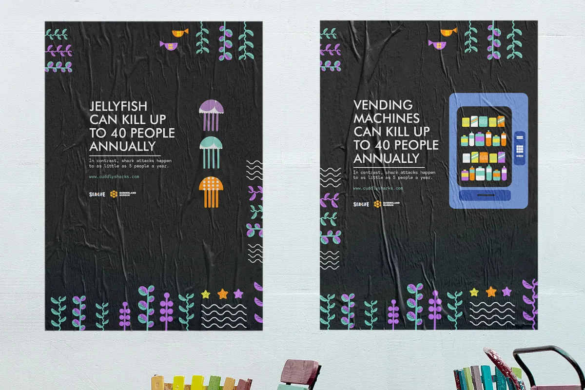
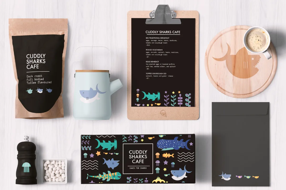
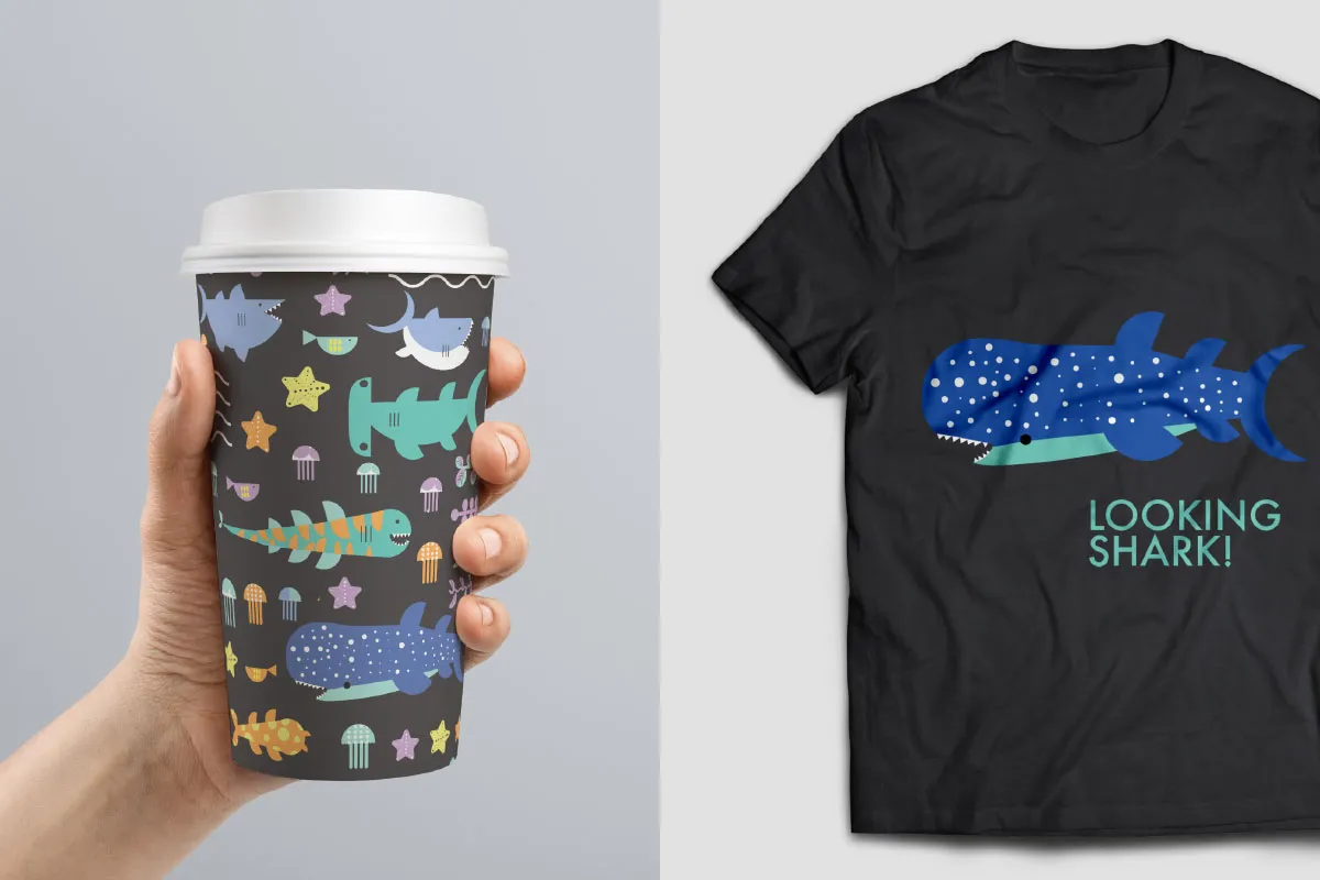
For the Cuddly Sharks Cafe, Evena Wong in Brisbane branded an event aimed at improving the image and reputation of sharks. "Sharks are constantly portrayed as monsters in the media," she explained. "This event aimed to encourage an appreciation for the overlooked charm of sharks." Simple, beautifully illustrated and packing a punch – what's not to love?
8. Ray Wong, London
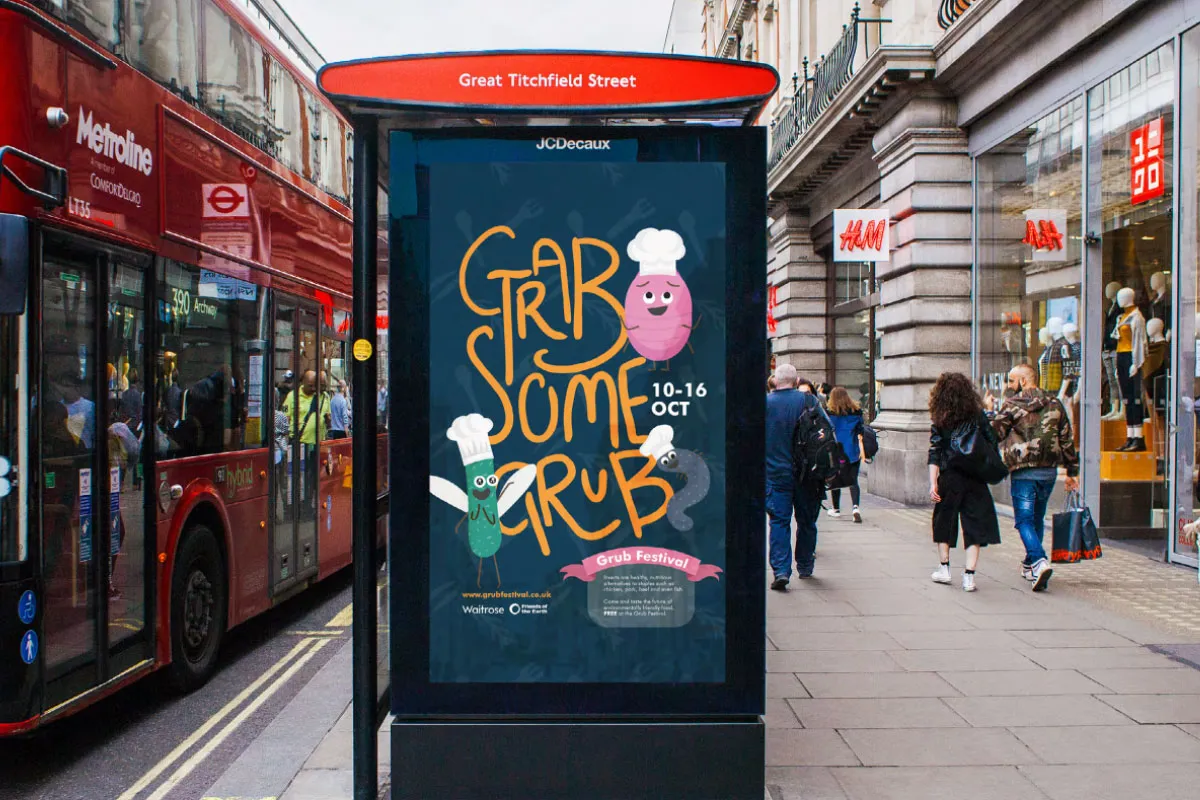
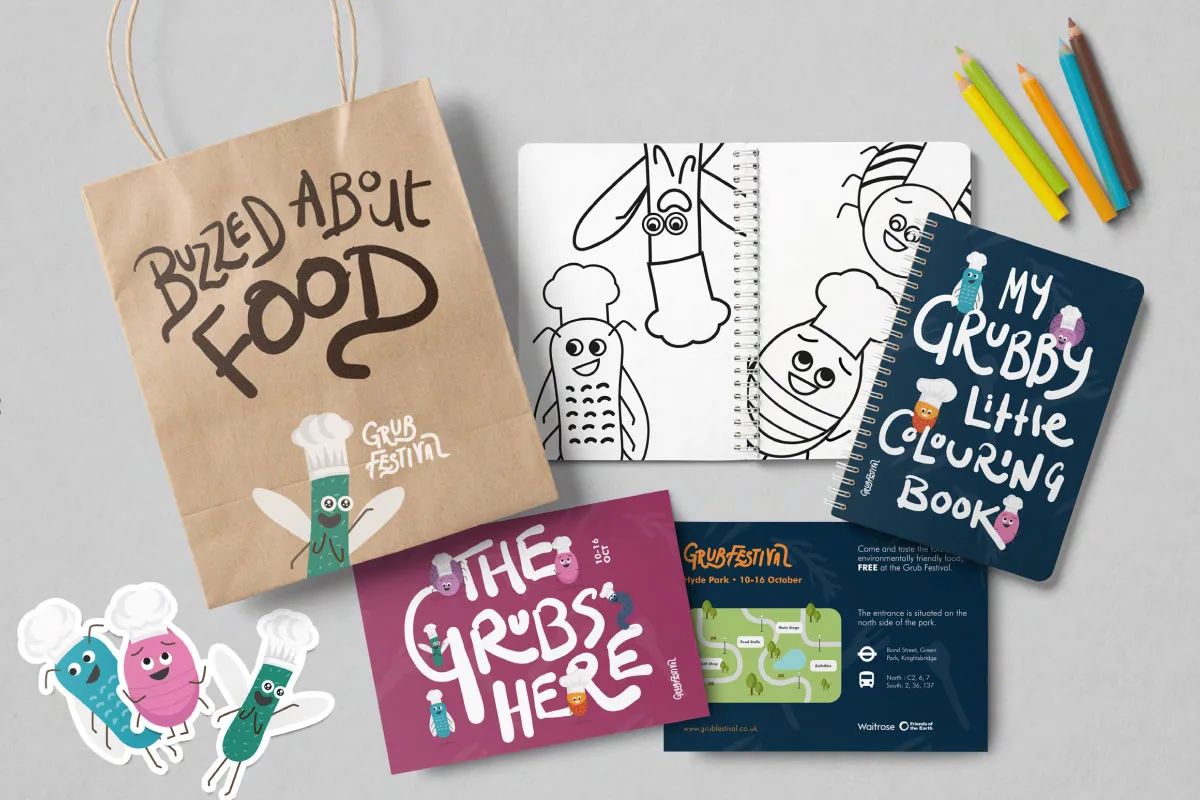
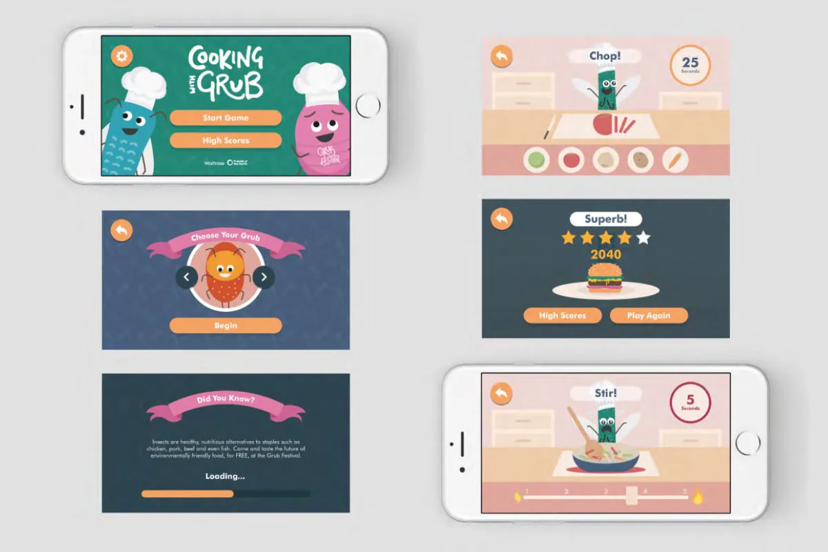
Ray Wong at Shillington's campus in London crafted a campaign for the Grub Festival, a festival that asks the question, why shouldn't insects be a considered part of a staple diet today? Ray explains: "The aim was to incite an environmental change by taking the focus away from the livestock industry, and to normalise the consumption of the creepy crawlies, in a fun and exciting way."
9. Caitlin Clancy, London
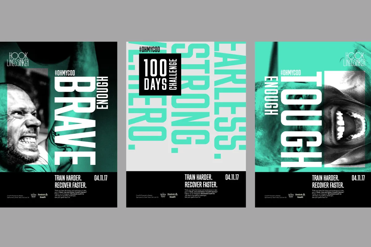
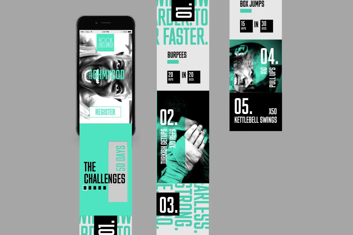
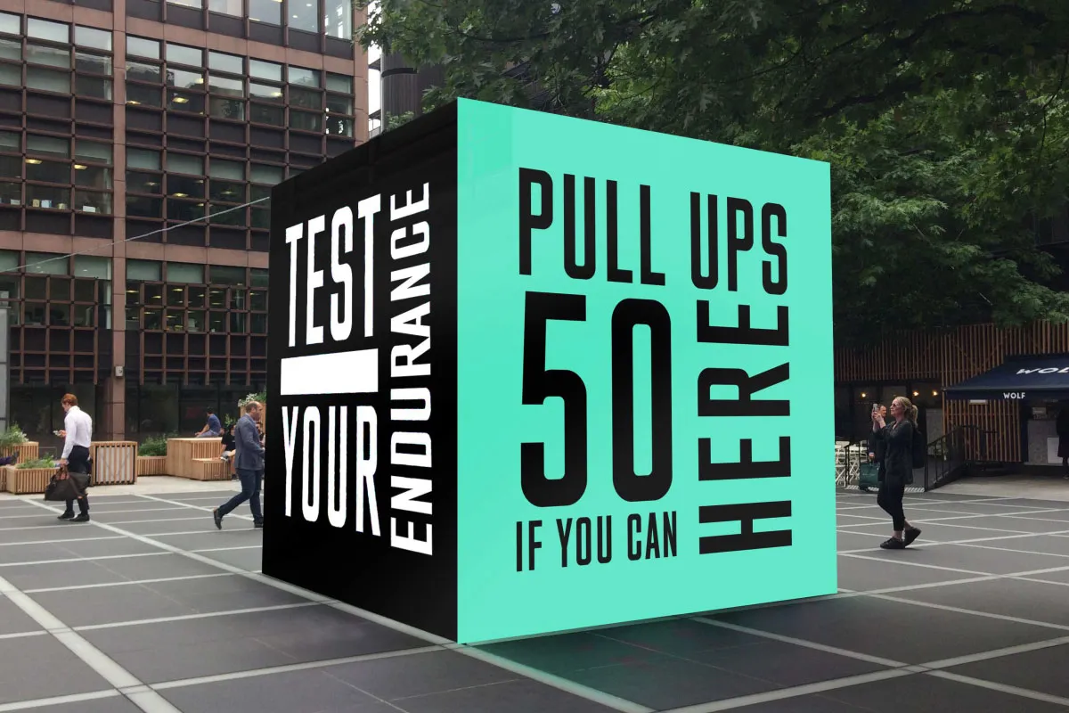
The brief for Caitlin Clancy in London (who now works for The New York Times) was to change the perception of Seven Seas Cod Liver Oil, addressing how to revamp its quaint image to communicate to a wider, more active audience. Caitlan's solution was to create a fitness challenge app and Ultimate Crossfit event in collaboration with Reebox Crossfit. Through a green, black and white coloured campaign, she focused on the product benefits of strength to "push the limits of what a strong body can do."
10. Aya Kudo, London
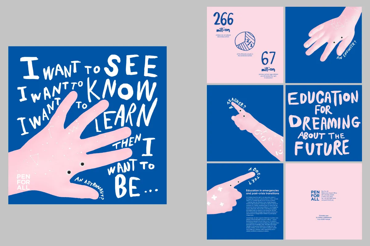
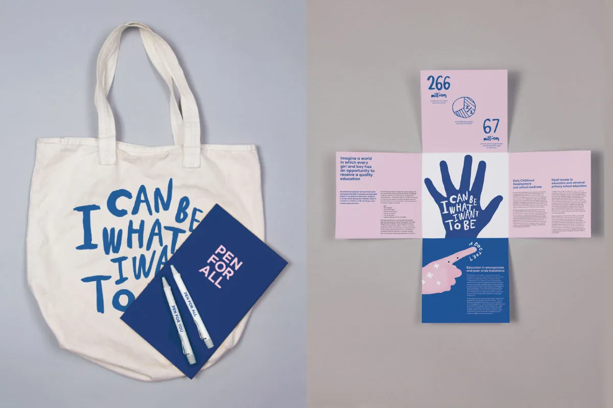
Considering a non-profit organisation for education, Aya Kudo set herself the challenge of designing a mini booklet and advertising materials to reach out and get more attention from potential supporters. Pen For All has a tone of voice, images and hand-drawn texts to express children's energy and their potential towards the future. Designed to make people feel connected and encourage them to get involved.
11. Valentina Hyde, London
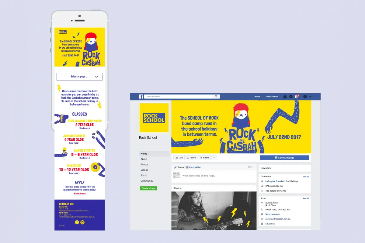
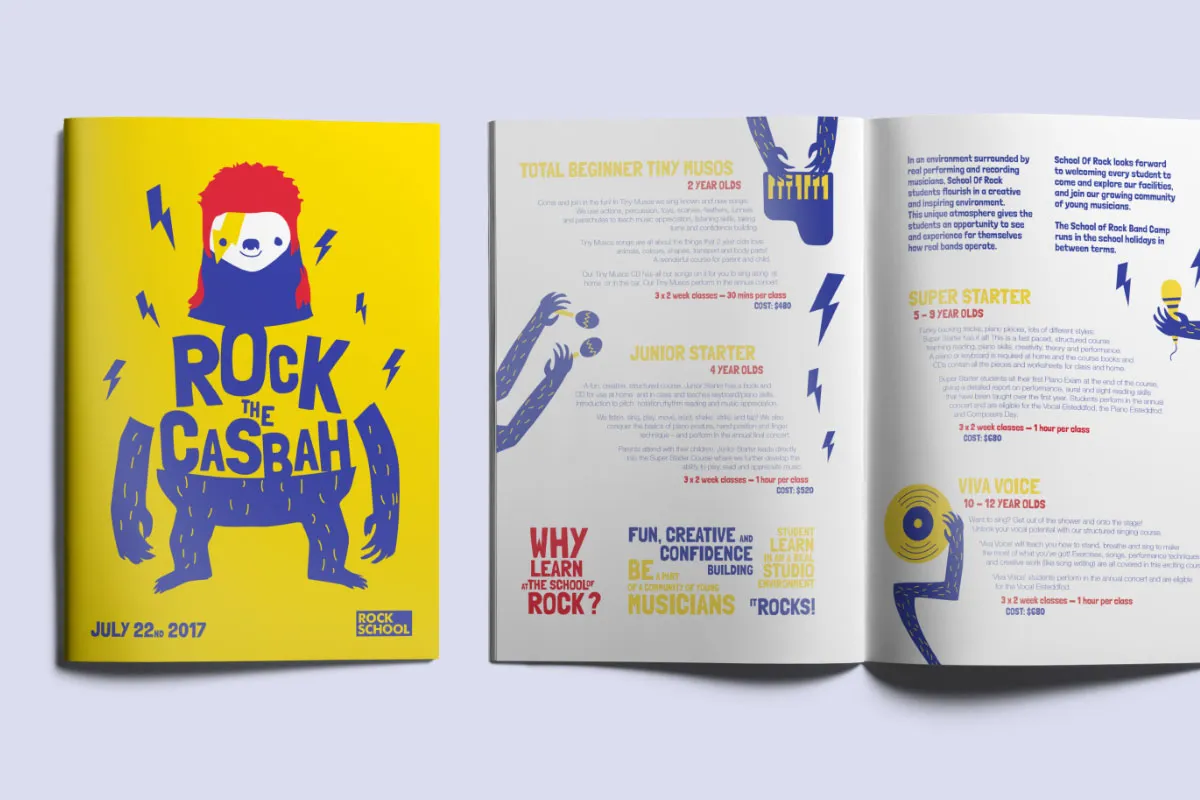
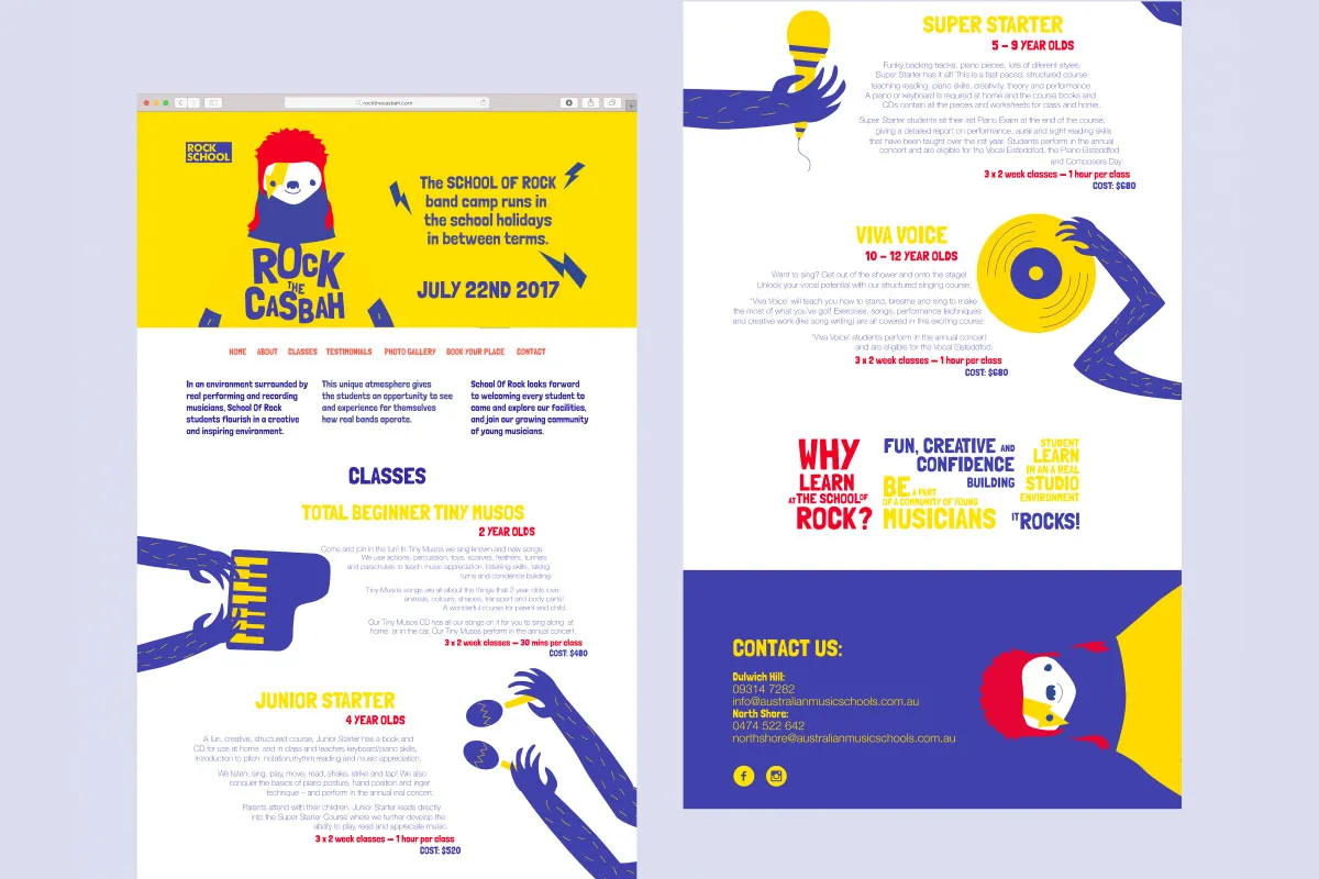
Rock the Casbah by Valentina Hyde in London is a campaign for a fictional British summer camp that aims to teach music to children aged between two and 12 years old. "I got inspiration from the name of the camp 'Rock the Casbah', allowing me to play with the visual elements to create a rocking but child-friendly approach. My campaign is mostly digital and the main goal was to see how the same campaign was working in different digital devices."
12. Richard Salisbury, Manchester
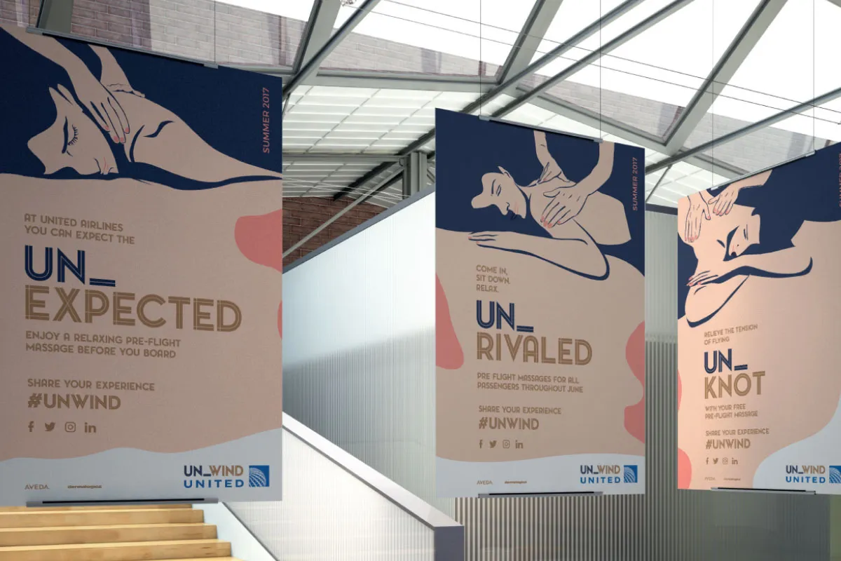
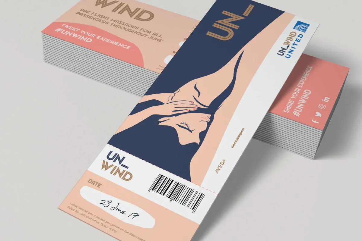
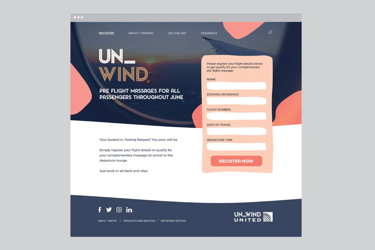
Beautiful, sultry illustrations and a sophisticated colour palette make up the campaign for Un-Wind, a pretend service from United Airlines, dreamt up by Richard Salisbury in Manchester. With promises "pre-flight massages for all passengers throughout June", we feel instantly calm just looking through Richard's poster designs, tickets, drinks packaging and website.
13. Dave Bolland, Manchester
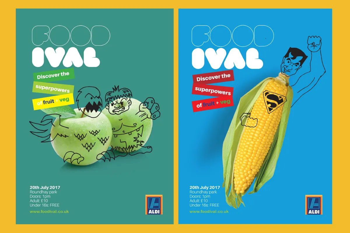
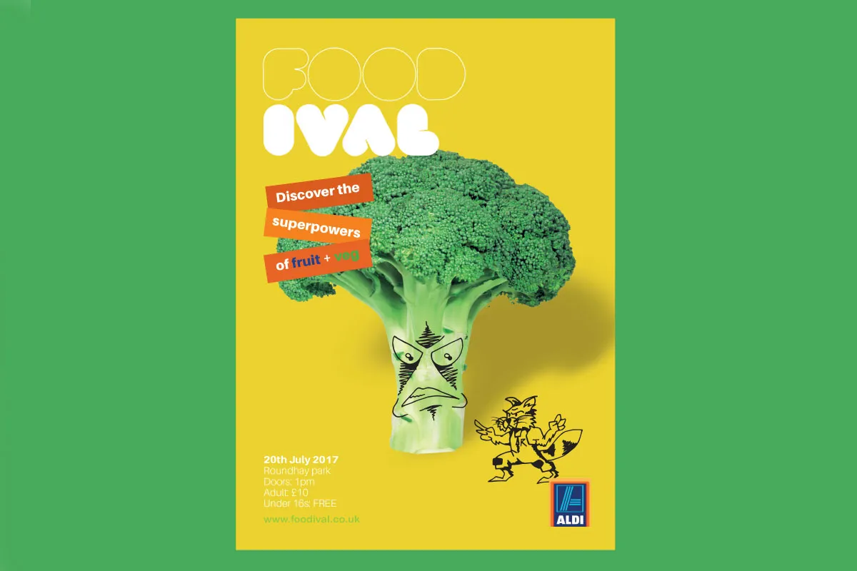
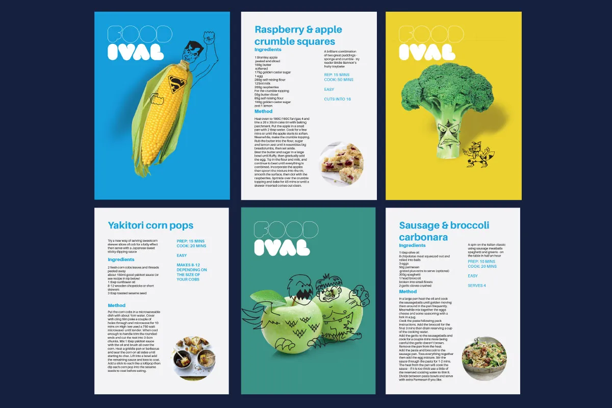
Foodival by Manchester student Dave Bolland is a fictional event in association with Aldi that hopes to get people eating healthier. "Discover the superpowers of fruit and veg," promises the colourful campaign, which includes images of broccoli, sweetcorn and apples with clever illustrations depicting them as superheroes.
14. Monica Farag, Sydney
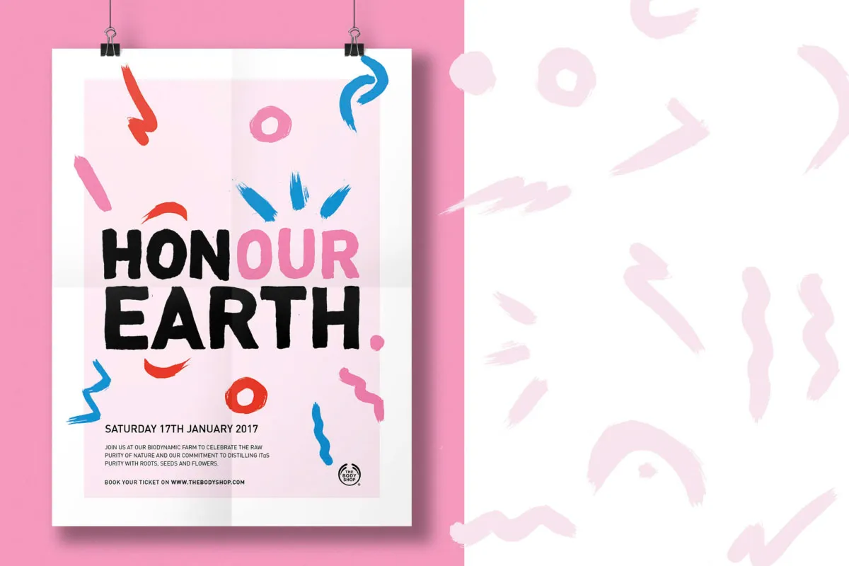
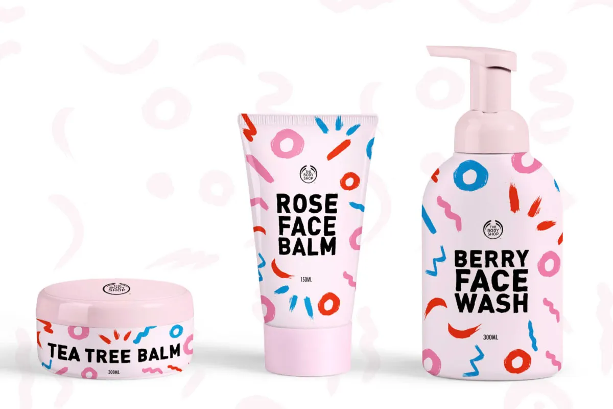
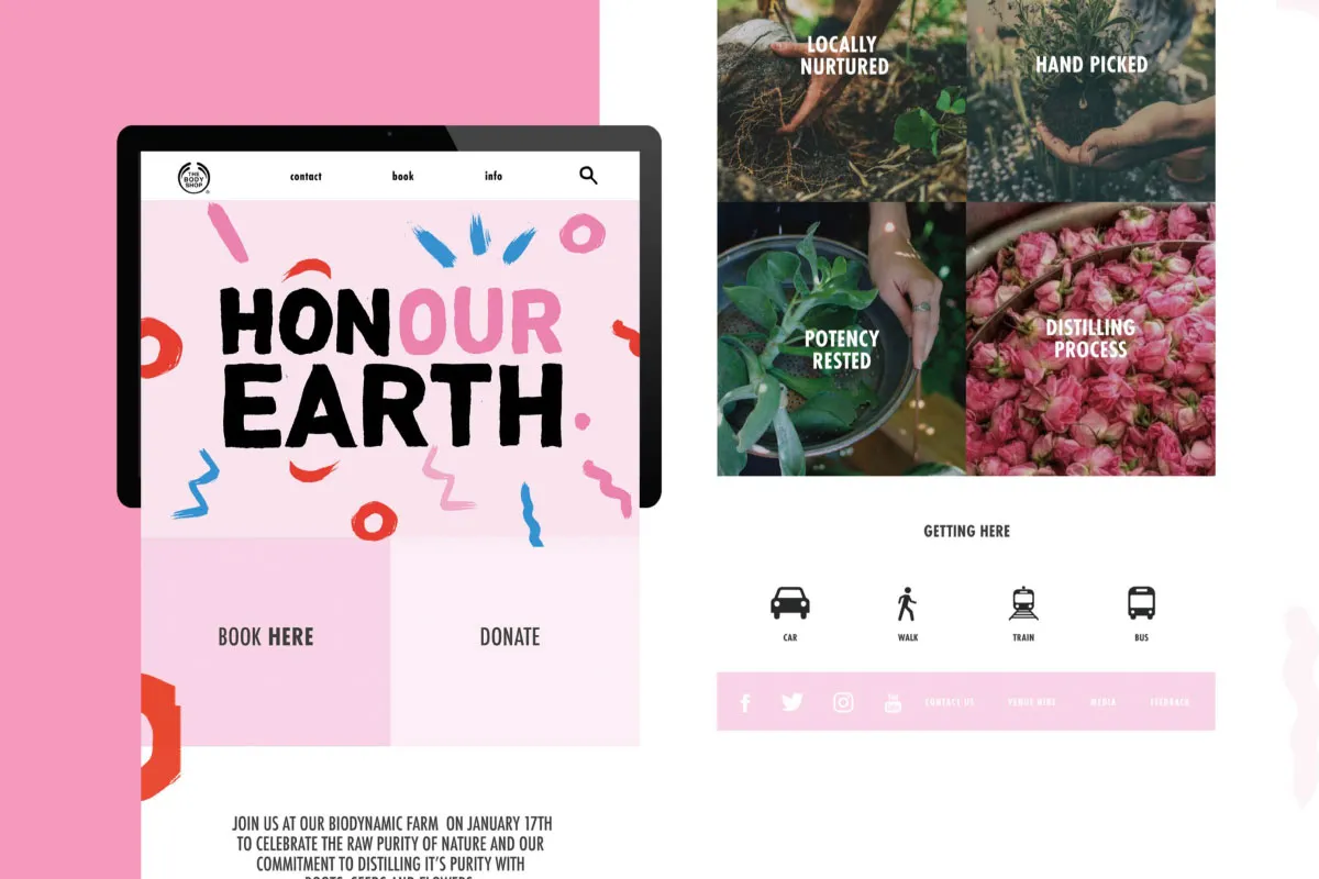
Monica Farag at our Shillington campus in Sydney wanted people to "celebrate the raw purity of nature" with her campaign for Honour Earth, in association with The Body Shop. An interesting play on words, bright and playful pink branding and hand-drawn typography make this piece of work a winner in our eyes.
15. Carla Zimbler, Sydney
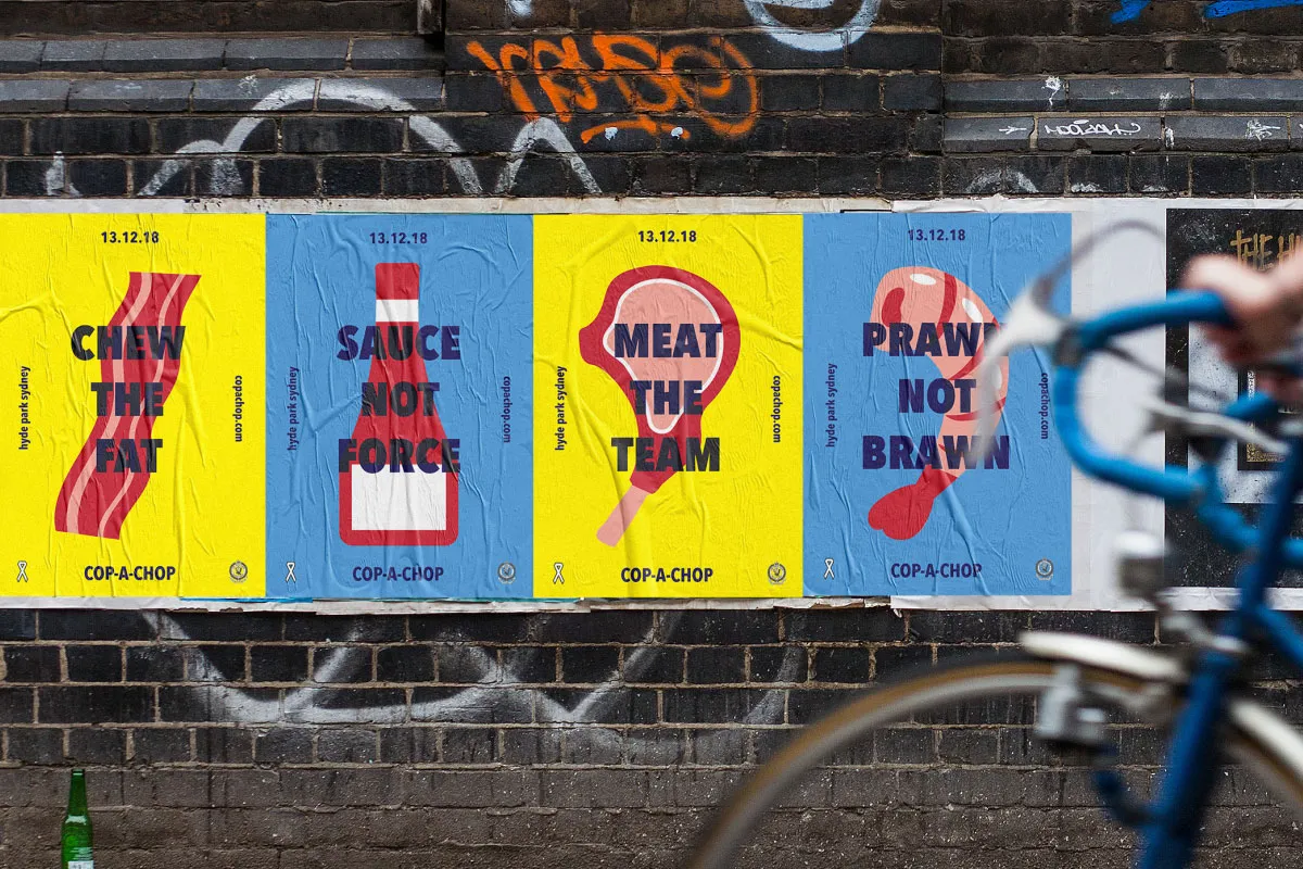
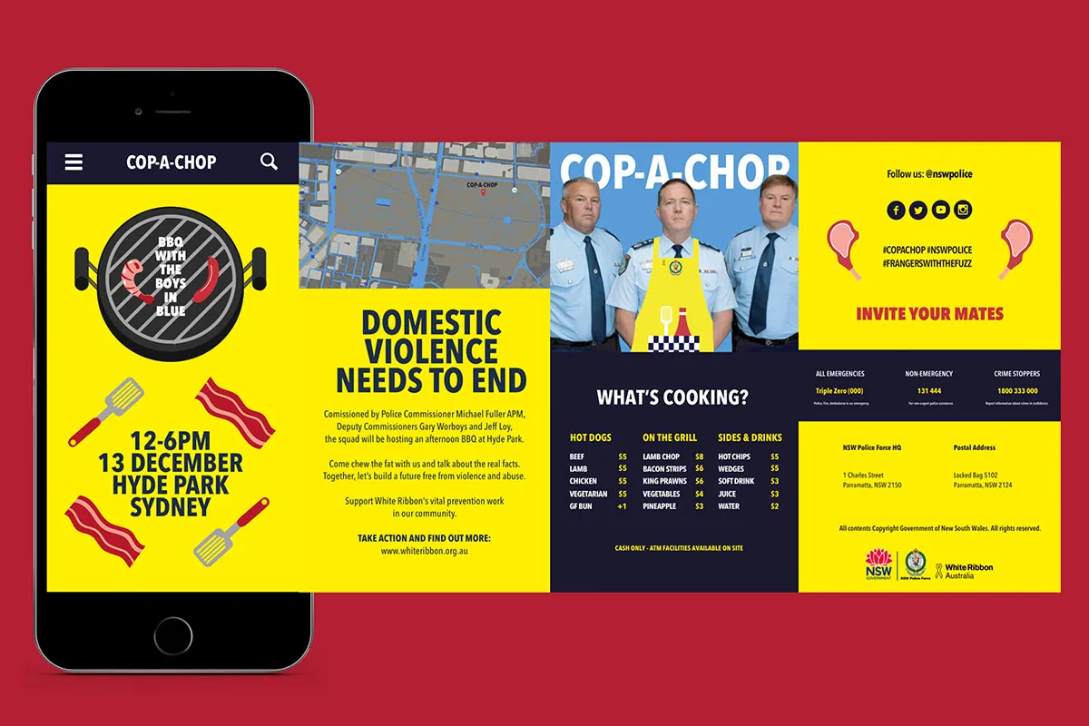
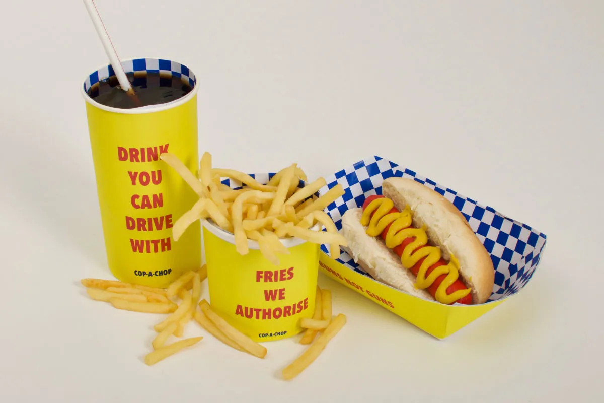
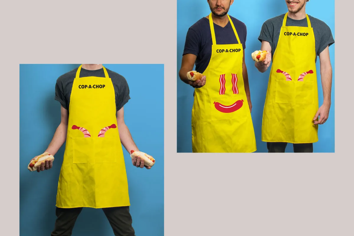
"Sizzle with the squad," reads one of the posters in Carla Zimbler's bold campaign for Cop-a-Chop, a fictional barbeque event with Sydney's police force. The idea is that people can enjoy some food and also talk to officers about raising awareness of and preventing domestic violence in the community. Simple yet hugely effective, the campaign hits the nail on the head in terms of balancing a fun event with a serious issue.
16. Kevin Wardman, Manchester
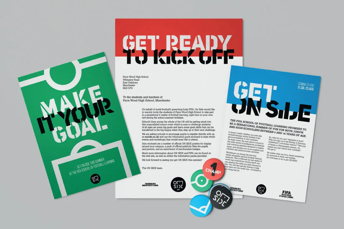
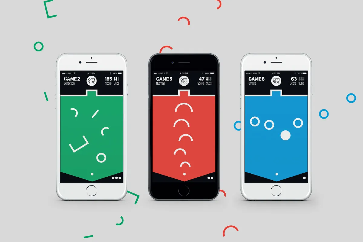
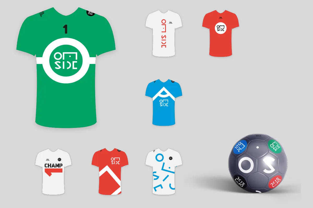
Kevin Wardman in Manchester kicked off his campaign idea with a football-themed event, encouraging schoolchildren to join FIFA for a summer of fun. We love the green, red and blue colours, traditional typography that nods to football's heritage and the fun campaign lines such as "make it your goal" and "get on side".
17. Tom Shepherd, Melbourne
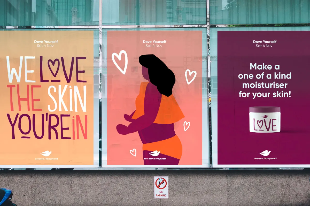
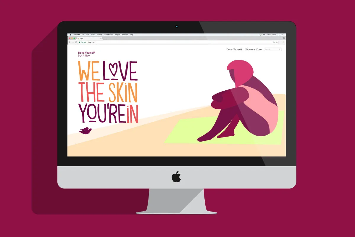
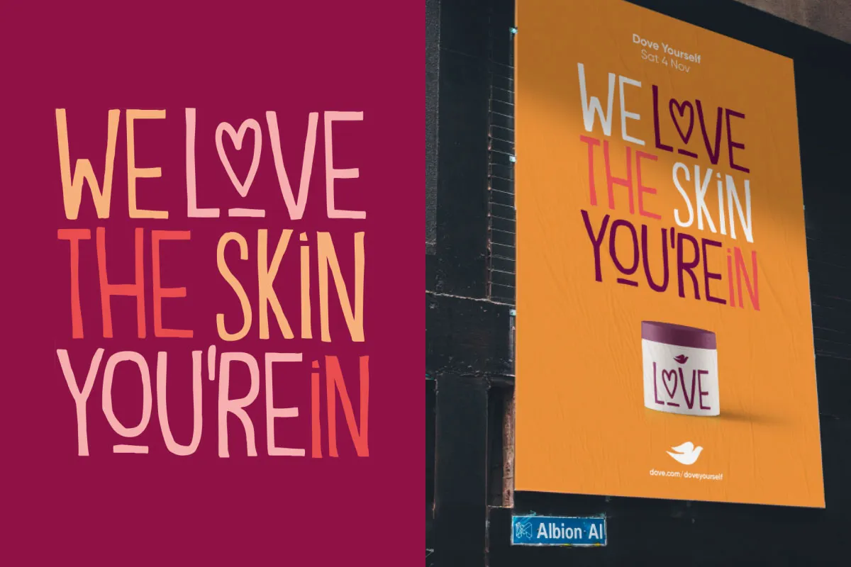
Melbourne student, Tom Shepherd, got under the skin of a positive-themed campaign for Dove, encouraging people to attend an event called Dove Yourself. Its message? To love the skin you're in. With hand-drawn typography, sensitive illustrations and impactful poster designs, Tom's work really stood out.
Editor's Picks





Trending






Latest Jobs
Senior Operations Manager at BIG Partnership
Full-time·Glasgow·£45k–£50k
Midweight Full Stack Developer at Bureau for Visual Affairs
Full-time·London (Open to remote)·£35k–£50k
Senior Designer at BKC
Full-time·£50k-£60k
Senior Creative Lead at Random Studio
Full-time·Amsterdam / Paris·€90k-€110k
Senior Graphic Designer at MoMA Retail
Full-time·New York·$72k-$80k
Creative Project Manager at Analogue
Full-time·Leeds·£28k–£35k