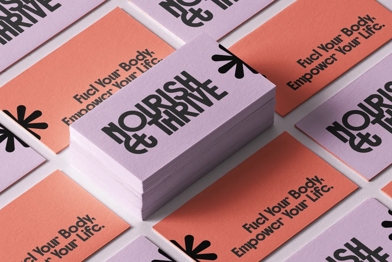
Rockfall by SilverStag
As autumn deepens and the design world turns towards year-end projects, November's typography releases offer a rich harvest of versatile new fonts. From vintage-inspired display faces to a web font with an innovative licensing model, this month's selection of fonts showcases the innovation and craft driving the best independent foundries.
What's particularly striking about November's releases is the balance between utility and character. While some designs lean into specific historical references or cultural moments, they do so without sacrificing contemporary usefulness. This synthesis of inspiration and practicality speaks to the maturing approach of independent foundries, who increasingly understand that even the most expressive typefaces must earn their place in modern designers' toolkits.
So, as we move towards a new year and the mid-point of the decade, check out these new fonts. Whether you're seeking a workhorse sans-serif for digital products or an expressive typeface for bold editorial work, hopefully, you'll find fresh inspiration below. And if you need further inspiration, check out our roundup of the best fonts for October too.
1. RT Dromo by RazziaType
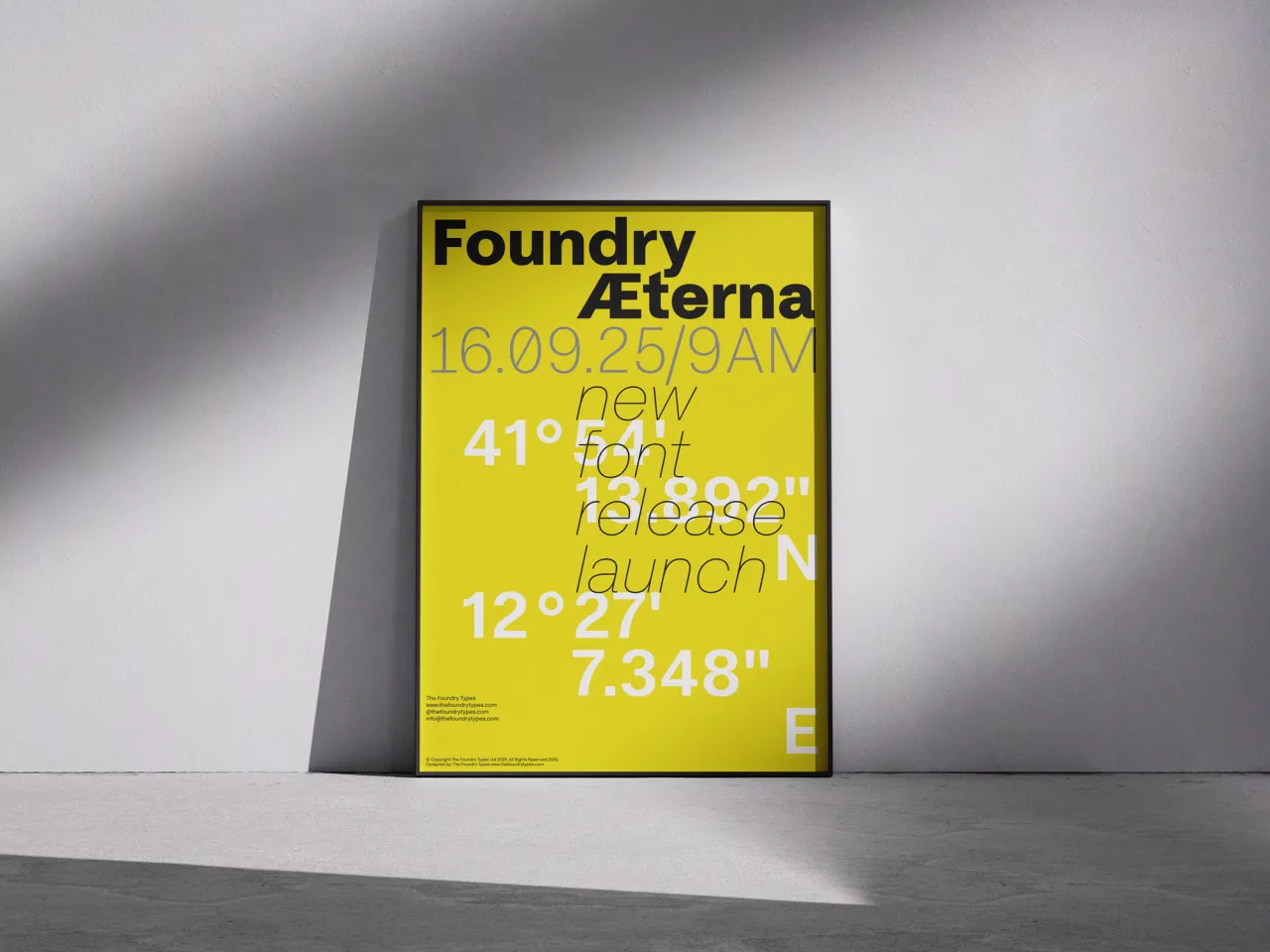
RT Dromo began life as a custom typeface for Die Not hat ein Ende (The Swiss Art of Rock), a publication celebrating the visual culture of 1970s and 1980s Swiss music. Designer Mirco Schiavone has transformed this single-weight commission into a comprehensive family of 16 fonts, drawing inspiration from vintage concert tickets while maintaining contemporary utility.
The result is a sturdy grotesque that carries just enough personality to reference its countercultural origins without sacrificing versatility. It comes with four weights plus matching italics and monospace styles.
2. Season by Displaay Type Foundry
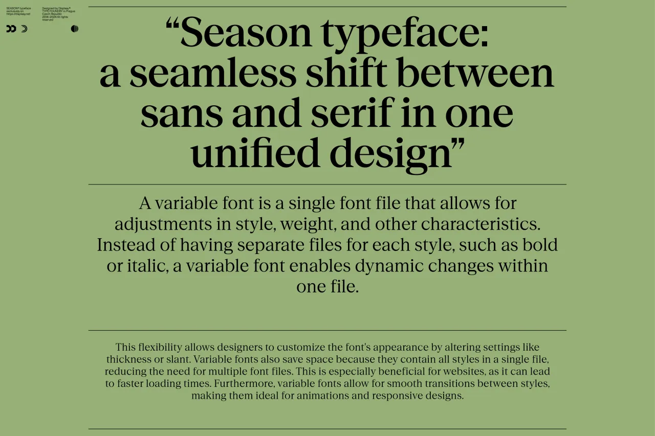
A groundbreaking exploration of the space between sans and serif, Season offers designers unprecedented flexibility in a single typeface family. Designed by Martin Vácha, this innovative collection comprises three distinct families – Sans, Mix and Serif – each available in six weights with matching italics.
The variable font format allows subtle control over the serif emergence and contrast, making it particularly valuable for editorial designers who previously needed to juggle multiple typefaces to achieve similar effects. The thoughtful implementation of triangular serifs, which connect sharply rather than smoothly to the stems, brings a fresh perspective to the ever-evolving conversation between sans and serif designs.
3. PP Neue Corp by Pangram Pangram
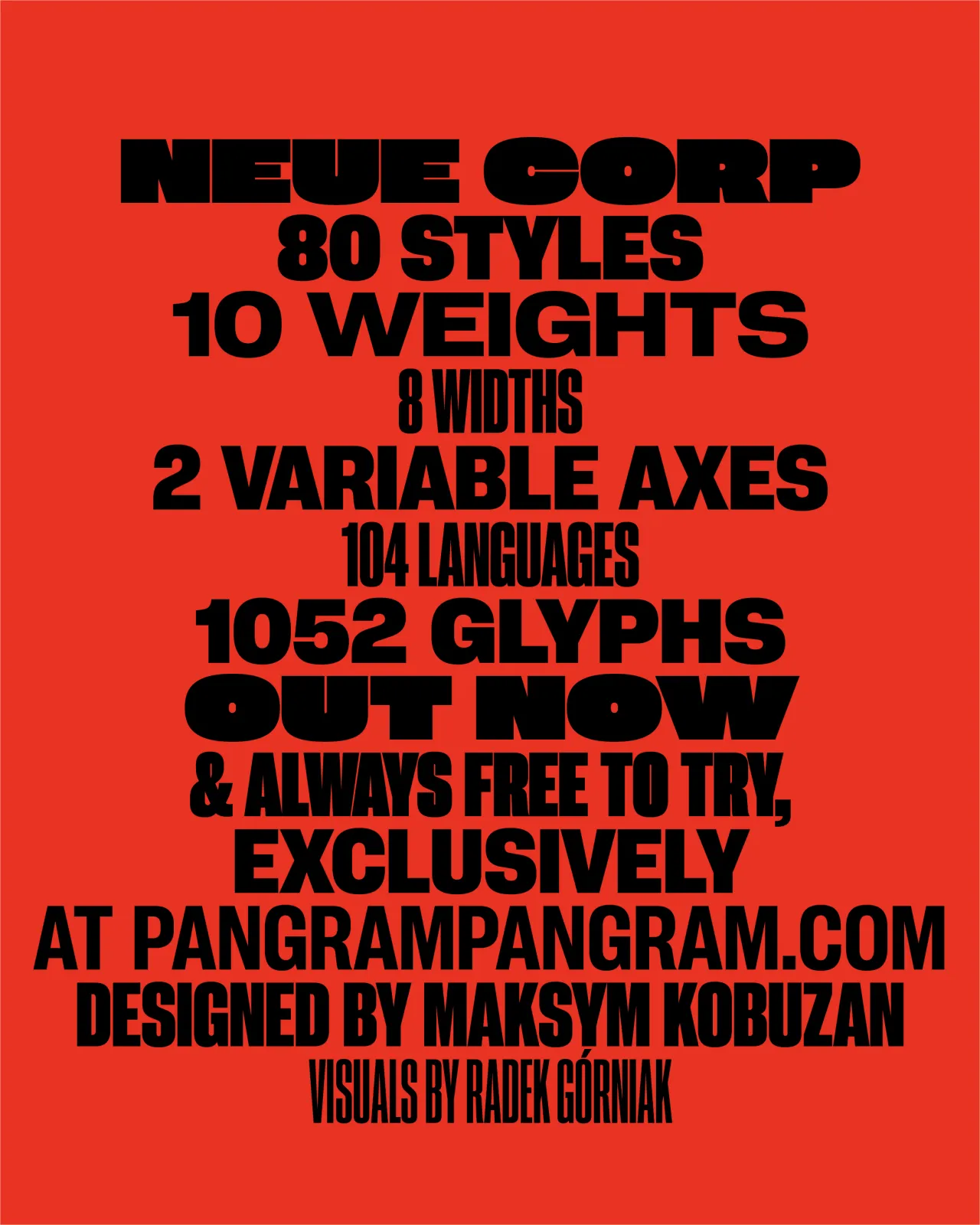
Positioning itself as the ultimate "Do-It-All" typeface, PP Neue Corp is an ambitious release that marries the eccentricity of old wood type with neo-grotesque precision. The extensive family features 80 styles across 10 weights and 8 widths, with two variable axes for maximum flexibility.
What sets it apart is its thoughtful implementation of stylistic sets, allowing designers to shift between geometric neutrality and more characterful grotesque details through the addition of spurs. This Swiss-army-knife approach to type design makes it particularly valuable for branding projects that require both versatility and distinctive personality.
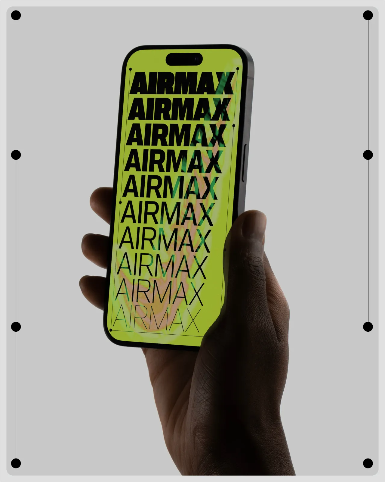
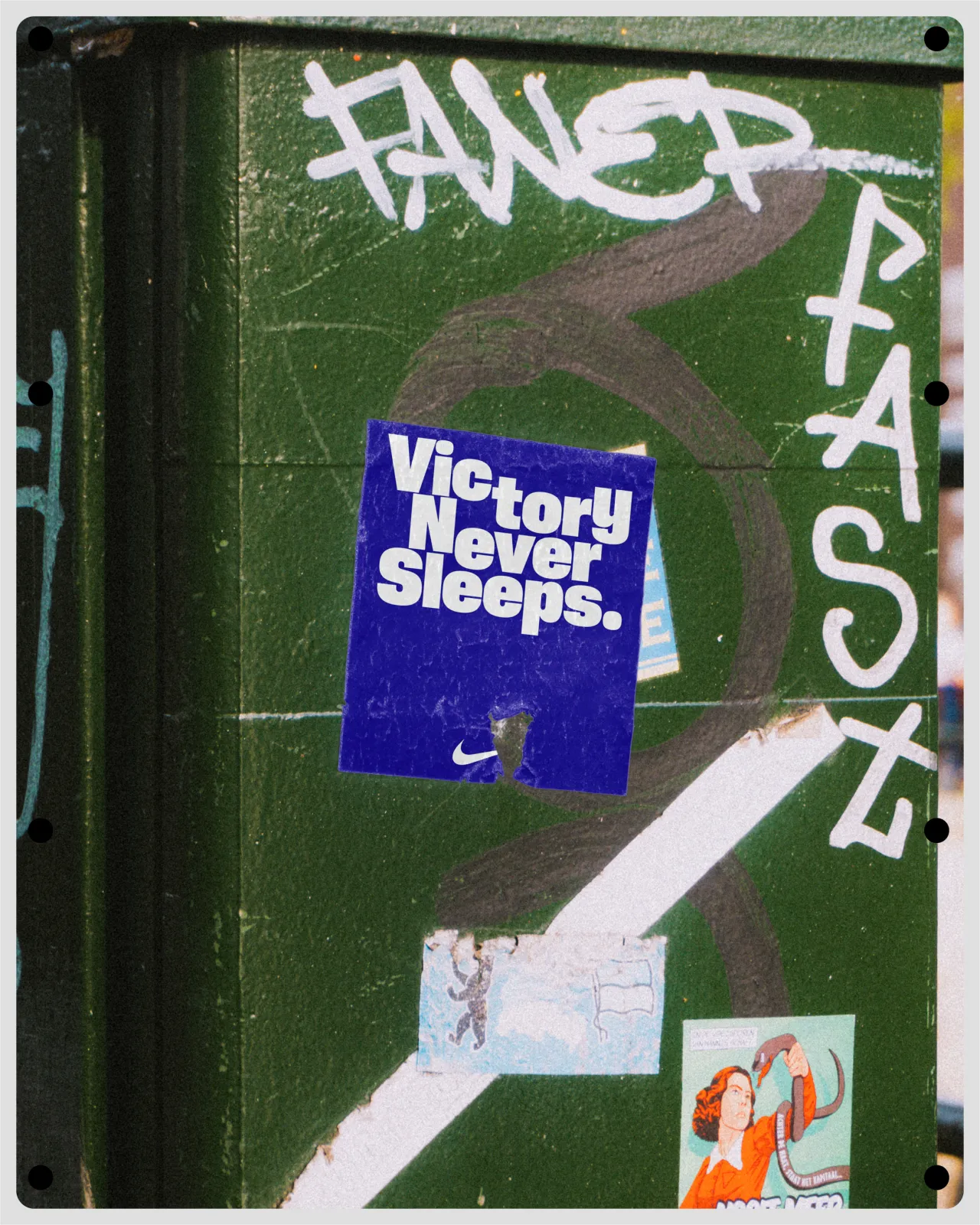
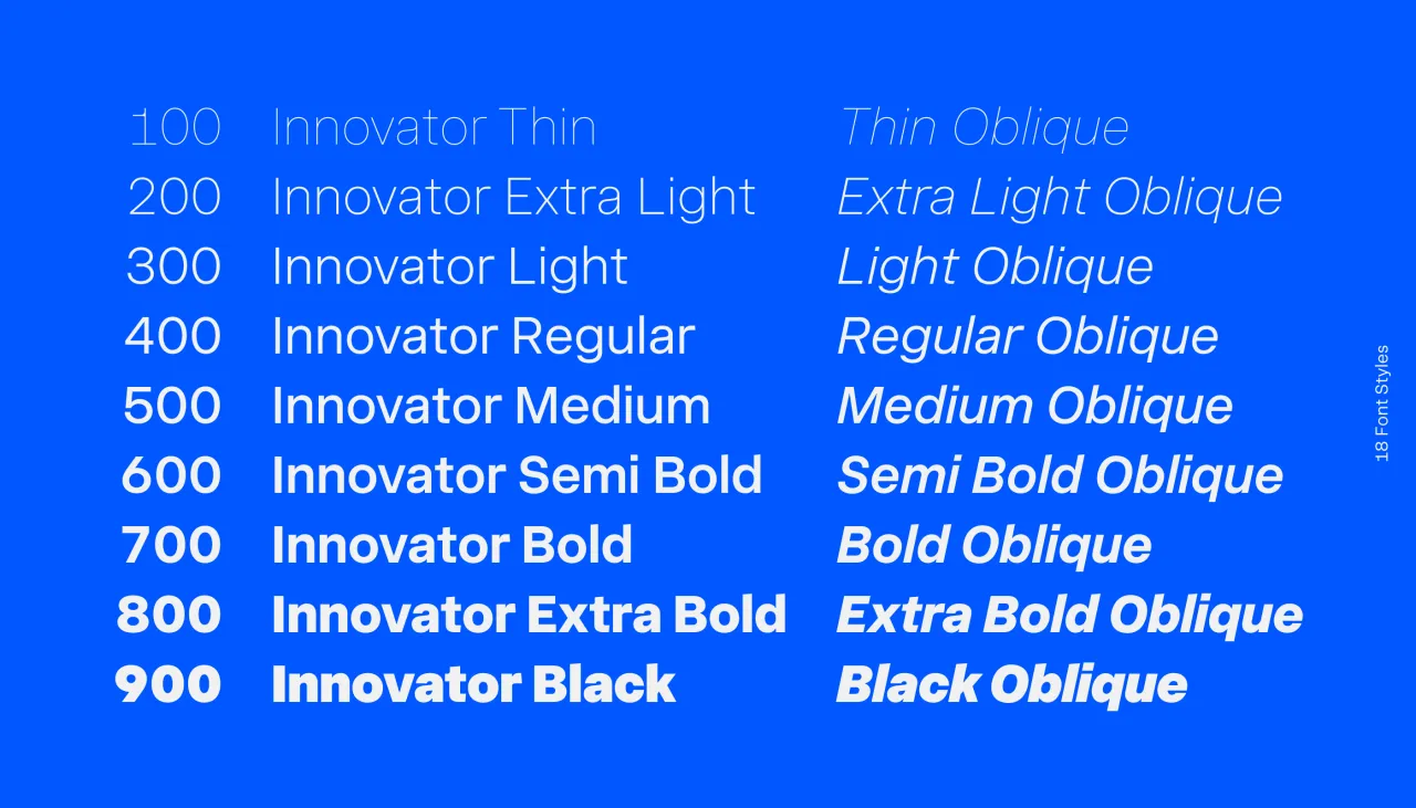
4. Innovator Grotesk by Yep! Type Foundry
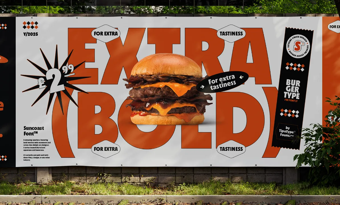
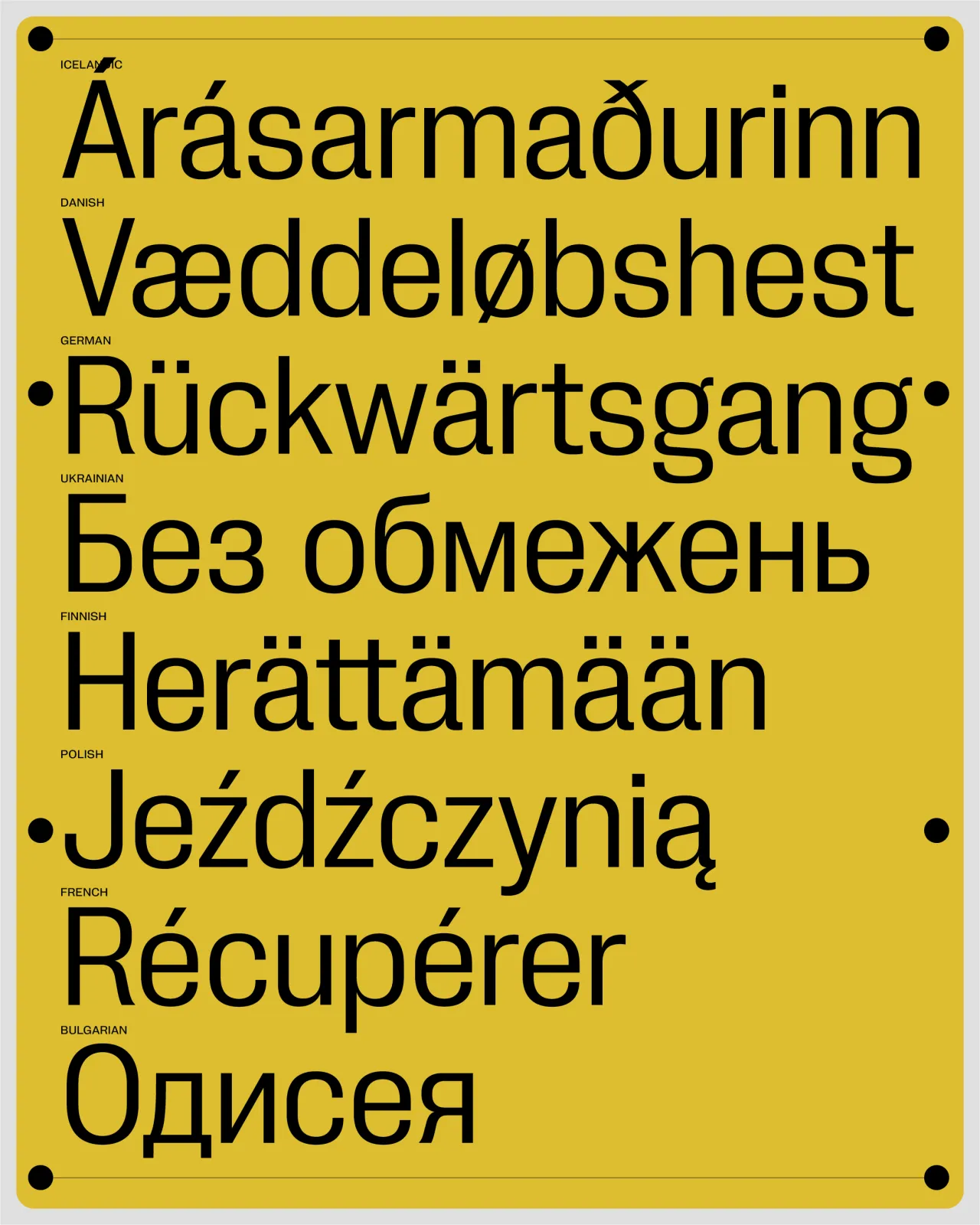
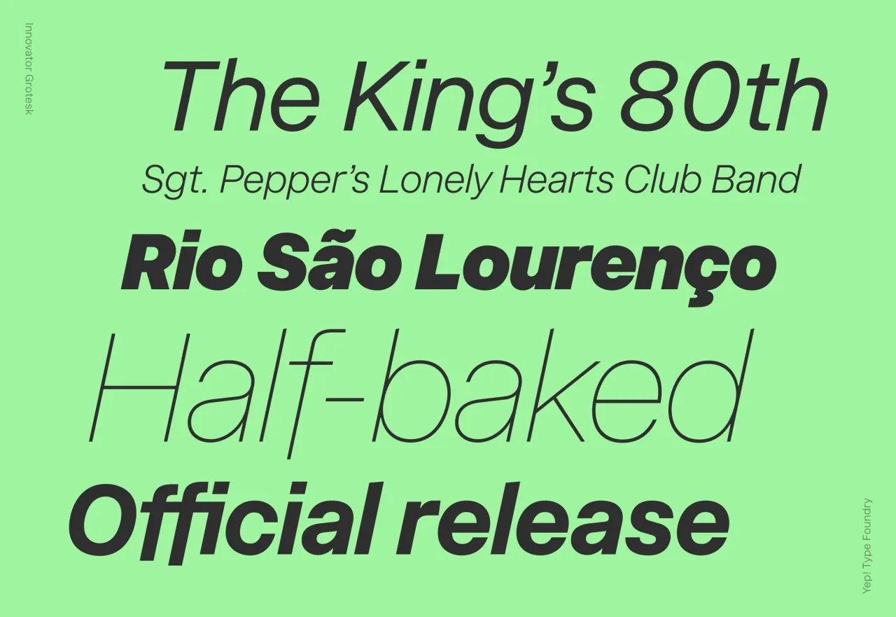
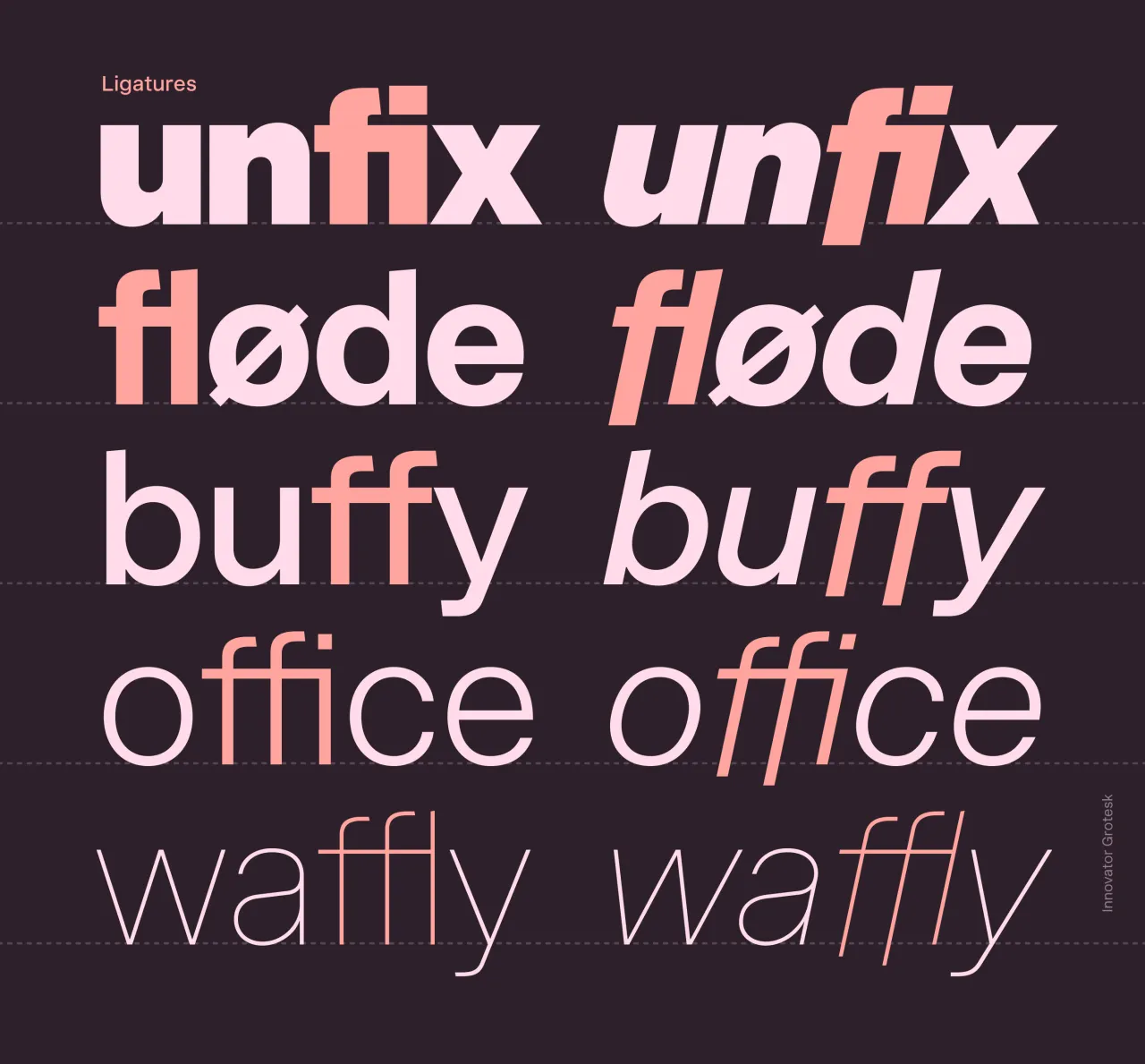
Roman Shamin's debut release through Yep! Type Foundry is notable not just for its design but for its revolutionary licensing model. This neo-grotesque, with 18 styles across nine weights, eliminates traditional restrictions on device installs and web page views. This could help prevent accidental EULA violations, such as when a company's website traffic suddenly spikes and exceeds the limits of a typical web font license.
Beyond the business innovation, the typeface itself is a thoughtfully crafted workhorse with a relatively tall x-height and carefully optimised vertical metrics for UI design. The recent update adds three stylistic sets and 15 character alternates, enhancing its adaptability across different contexts.
5. Rockfall by SilverStag Type Foundry
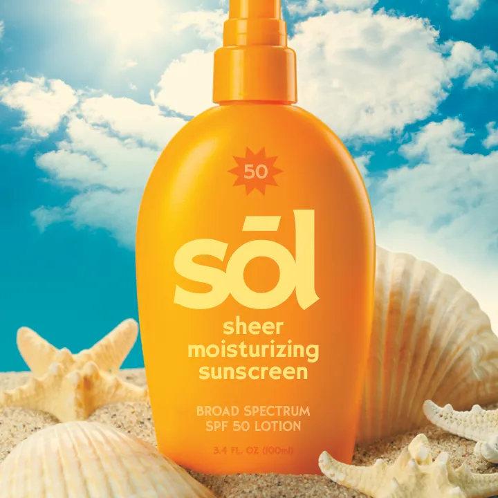
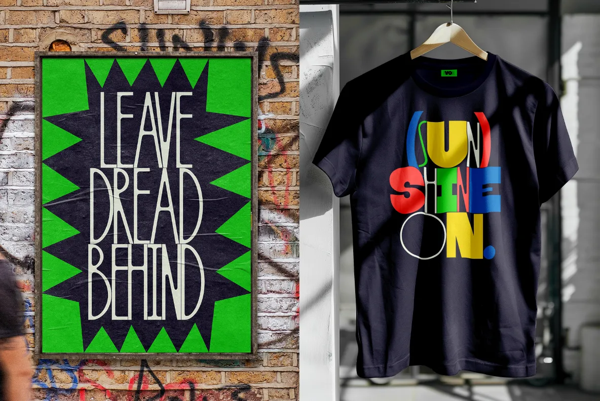
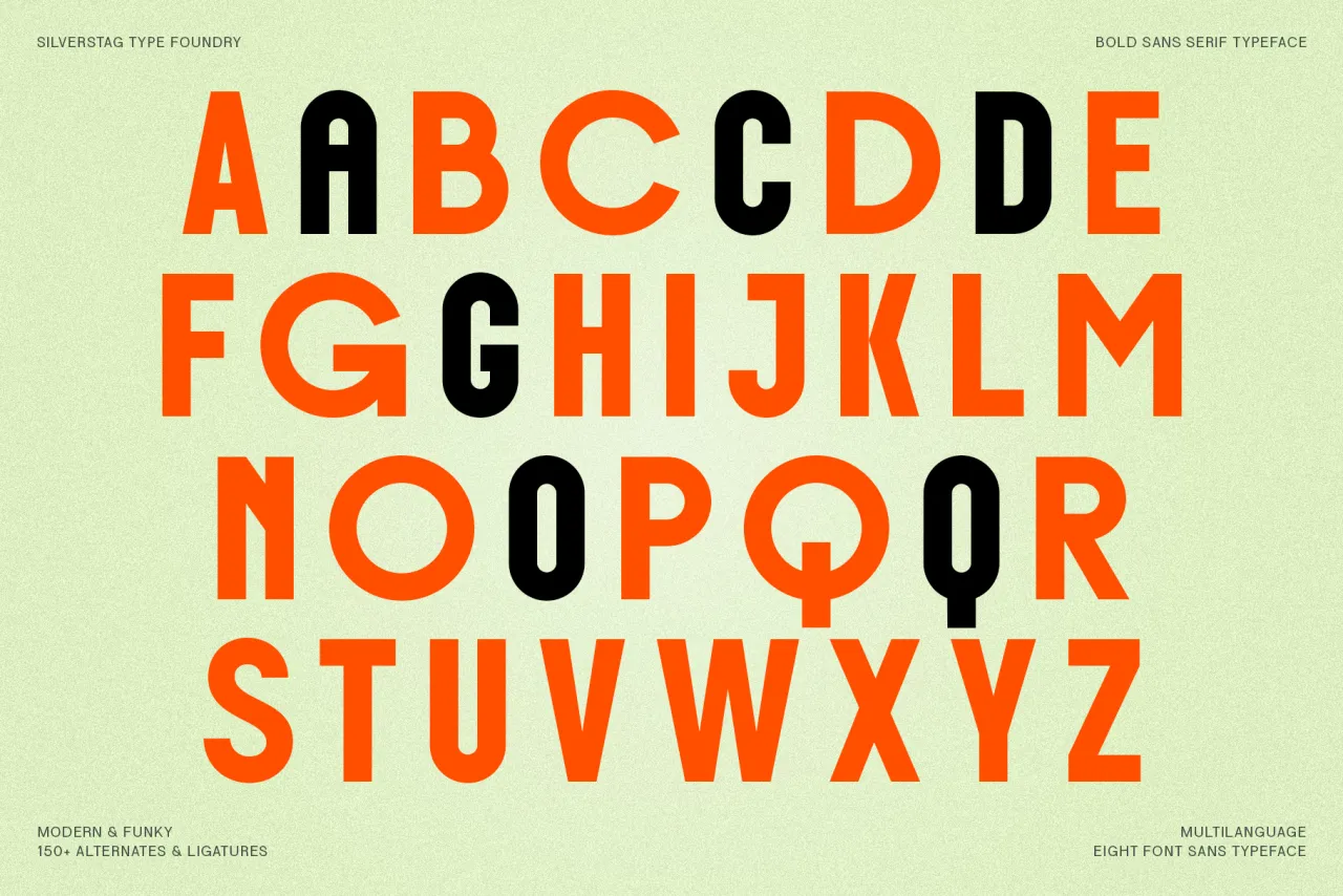
Rockfall captures the bold spirit of 1970s rock culture in a contemporary package. This display typeface family includes eight versions – Regular, Round, Regular Outlined and Round Outlined – each with matching italics. With support for over 90 languages and 150 alternate letters and ligatures, it offers substantial creative flexibility while maintaining its distinctive character.
While obviously useful for music-related projects, Rockfall's robust construction and extensive character set make it viable for broader applications in branding and editorial design where impact is paramount.
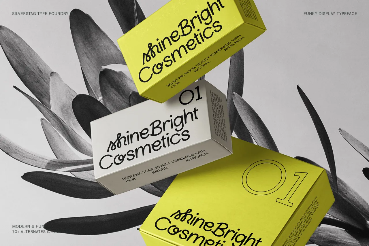
6. Lightshift by SilverStag Type Foundry
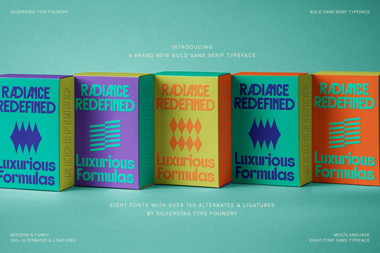
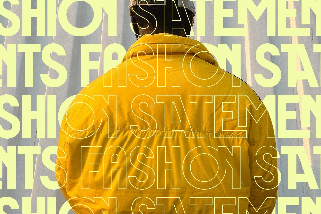
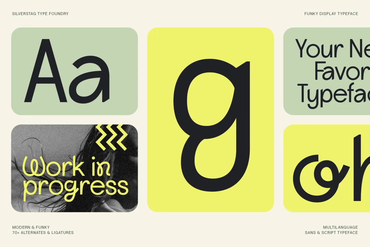
Another SilverStag release, Lightshift takes a more playful approach to display typography, combining sans-serif fundamentals with script-inspired flourishes across four distinct styles: Regular, Round, Outline and Round Outline.
The extensive collection of alternates and ligatures (over 70) allows for creative typesetting while maintaining support for more than 90 languages. Its blend of modern and retro aesthetics makes it particularly suitable for projects that need to balance contemporary design with approachable warmth.
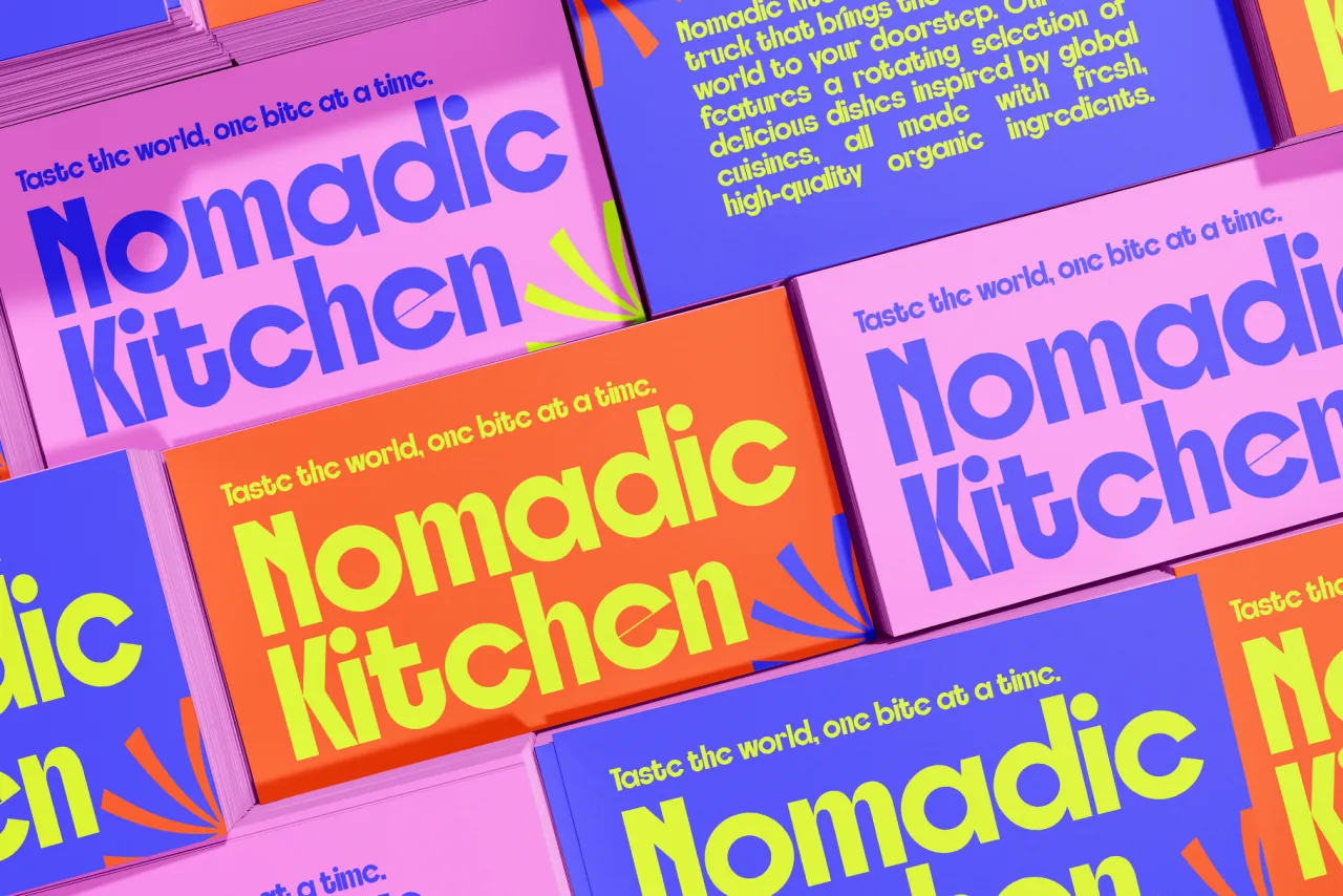
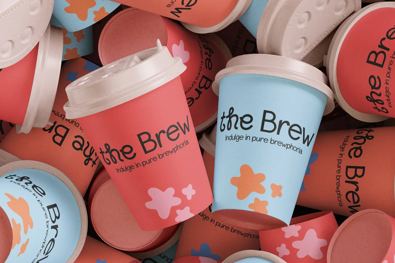
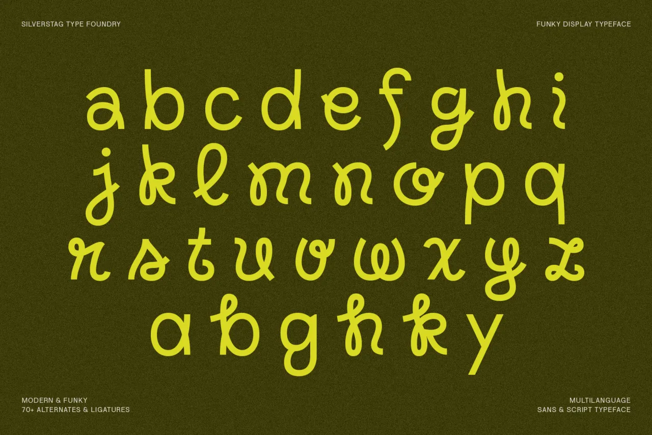
7. Kristolit by Sasha Denisova
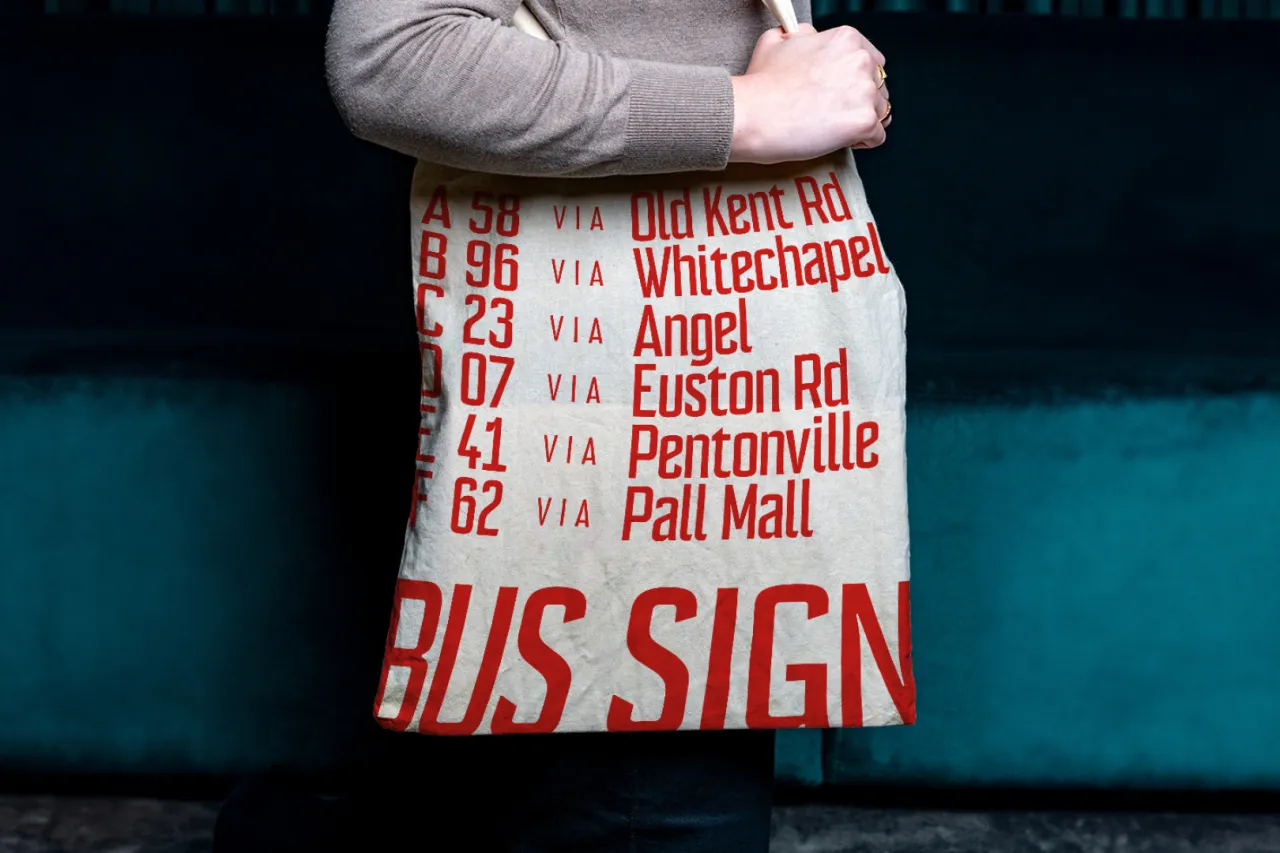
Belgrade-based art director Sasha Denisova brings a technological edge to the Scotch Roman genre with Kristolit. This variable typeface family seamlessly blends classical proportions with contemporary geometric precision, offering both regular and italic styles. I
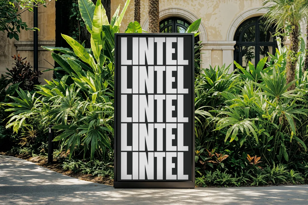
Its sharp geometry and strong stroke contrast create a distinctive voice in the serif landscape while maintaining enough restraint for editorial applications. The addition of Cyrillic support for Serbian, Russian, Ukrainian, and Belarusian makes it valuable for international projects, while stylistic alternates allow fine-tuning between traditional and modern appearances.
8. GT Flaire by Grilli Type
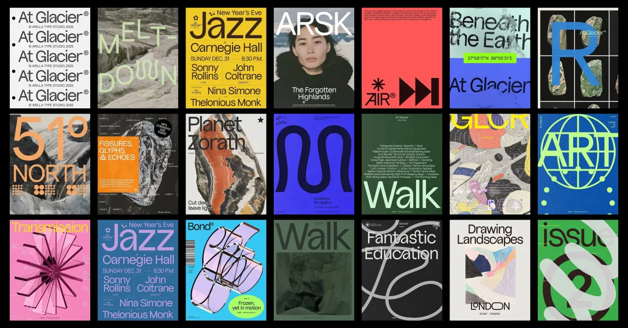
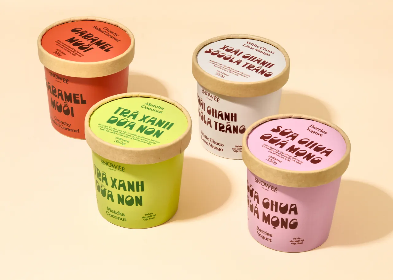
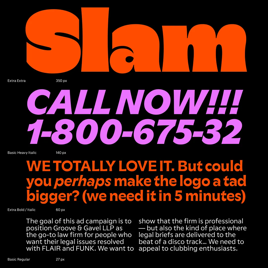
Designed by Reto Moser, GT Flaire demonstrates the continuing vitality of historically informed type design. By translating calligraphic pen strokes into digital form, Moser has created a typeface family that successfully balances business-like reliability with expressive detail.
The collection comprises seven weights with matching italics across both Basic and Extra styles, totalling 28 styles. The variable font implementation, featuring three axes, provides precise control over the typeface's personality, allowing designers to dial in exactly the right amount of flair for each application.
Editor's Picks





Trending






Latest Jobs
Senior Digital Designer at 3800
Full-time·Sheffield·£40k-60k
Digital Marketing Executive at Arise
Full-time·Sheffield·From £23,750
Senior Creative Lead at Random Studio
Full-time·Amsterdam / Paris·€90k-€110k
Art Director at SPOKE
Full-time·London·£55k-65k
Senior Designer at Creative Spark
Full-time·Manchester·£35k-£50k
Designer at New Genre
Full-time·London·£36k–£48k