Typotheque launches Ping, a ‘whole world’ typeface with big ambitions
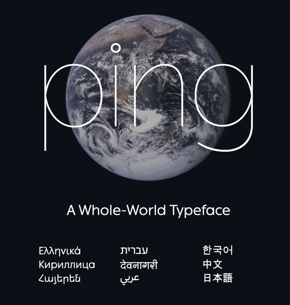
Independent Dutch type foundry, Typotheque, has published a new typeface, which has a rather large ambition to support most of the world’s languages.
All images courtesy of Typotheque, via submission
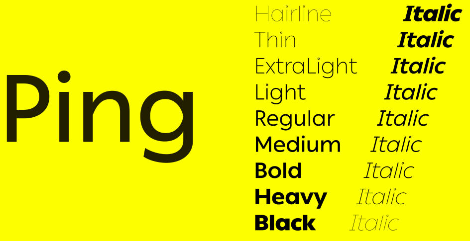
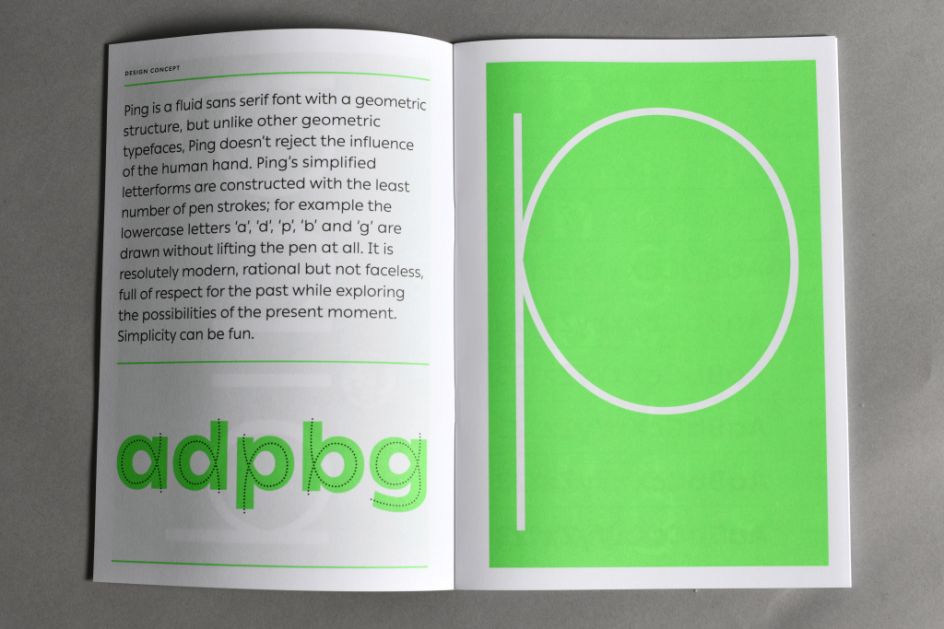
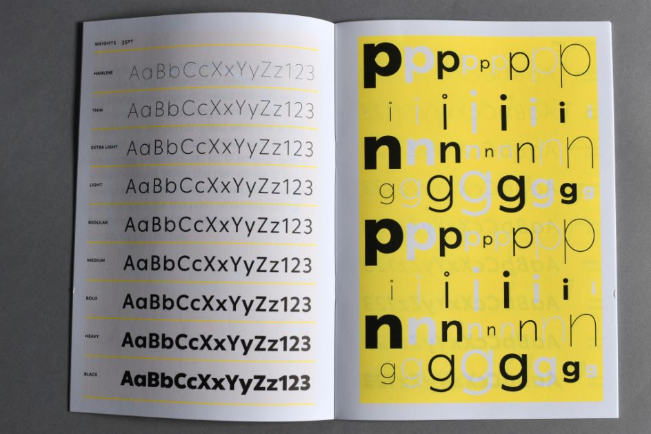
'Ping' is a fluid sans serif font with a geometric structure. But unlike other geometric typefaces, Ping doesn't reject the influence of the human hand: its simplified letterforms are constructed with the least number of pen strokes.
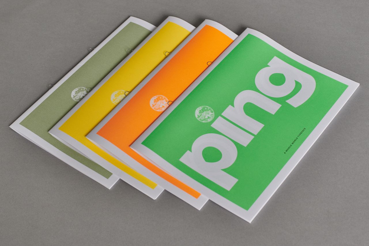
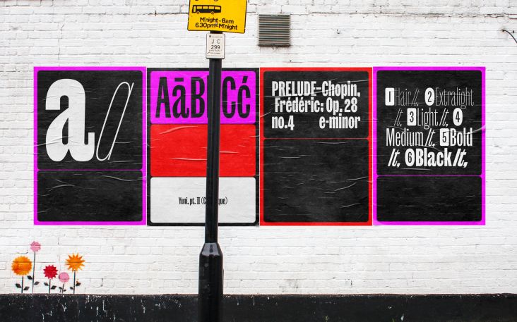
Described as “resolutely modern, rational but not faceless, full of respect for the past while exploring the possibilities of the present moment”, Ping is both a text and display font. Typotheque even commissioned Pentagram to design the printed specimens. We chatted to Peter Bilak of Typotheque to find out more.
What’s the story behind Ping?
The first sketches of Ping come from 2008 when it was originally designed as a proposal for a luxury car manufacturer. In the end, it was never used, but I liked the drawings and continued its development.
Since then Typotheque developed a strong interest in multilingual typography, so naturally, we adjusted Ping to fit this new focus and worked on many different writing scripts at the same time.
Traditionally, non-Latin versions of fonts are made after the Latin font becomes a success, so working concurrently on many different language versions is rather unusual.
Ping reconciles two different models of constructing fonts. It appears to be constructed, but unlike typefaces like Futura, it rejects rigid or overly mechanical models, avoiding the sterility of ruler-and-compass constructions. Ping is a fluid sans serif font that embraces the influence of the human hand. Ping’s simplified letterforms are constructed with the least number of pen strokes; for example, the lowercase letters ‘a’, ‘d’, ‘p’, ‘b’ and ‘g’ are drawn without lifting the pen at all.
Your ambitions are quite big for this new typeface in terms of supporting languages. Tell us more
The fact is that there are hundreds of thousands of fonts for English or other Latin-based languages. A designer practising in Western Europe has an incredible choice of typefaces covering all categories.
But it is not the case when it comes to smaller languages such as Armenian, which has its own alphabet, for a country of 3 million. Imagine you have to work on an English/Russian/Armenian publication, not an uncommon scenario for a small country.
There is only a handful of fonts that can cover all three. And if you decide to use the same fonts online as web fonts, there may be even less choice, as these fonts may not be optimised for the use of screens.
As the world is getting more interconnected than anytime before, we find it important to offer a solution to communication across geographic and linguistic borders.
There is a real need for tools that allow this, so at Typotheque, we specialise in developing fonts for all living languages. And that’s why when we work on a new typeface, we don’t only make market-based decisions, but also culturally sensitive decisions, to support also smaller linguistic communities which need new fonts more than the major one.
Pentagram designed the printed specimens. How did that come about?
Pentagram has been using our fonts for many years, and we have made projects together with them, designing custom fonts. I thought it would be fun to reverse the roles and commission them to design something for us.
As an indie type foundry, what challenges do you face?
Just as in any industry, there are a few giants with an unlimited budget that can hire talents, buy companies, start and kill projects. Those companies tend to have a large appetite for market shares and smaller player need to define their unique positions. I suppose thanks to this, small companies profile themselves even more and produce more personal work.
Helvetica Now has just launched, courtesy of Monotype. Thoughts?
Most of Monotype’s revenue comes from licensing the work of dead people, so they obviously go back and try to make that work relevant again. Helvetica is a giant milk cow, and the shareholders are more interested in exploiting successful formulas, rather than trying something new. I am sure Helvetica Now will be super successful, and Monotype will use every opportunity to squeeze its successes for all its worth.
Editor's Picks


Trending


Podcasts


Editor's Picks
Further Reading


 by Tüpokompanii](https://www.creativeboom.com/upload/articles/58/58684538770fb5b428dc1882f7a732f153500153_732.jpg)