Monotype launches the first redesign in 35 years of the world's most ubiquitous font, Helvetica
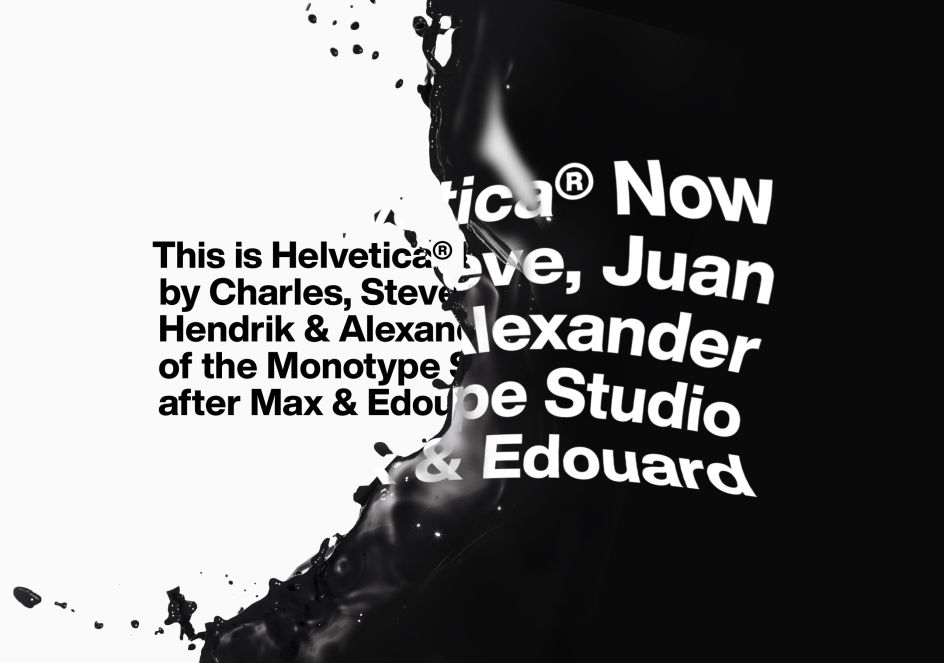
Monotype has today introduced the Helvetica Now typeface, a new family of fonts that have been carefully and respectfully re-drawn for the modern era.
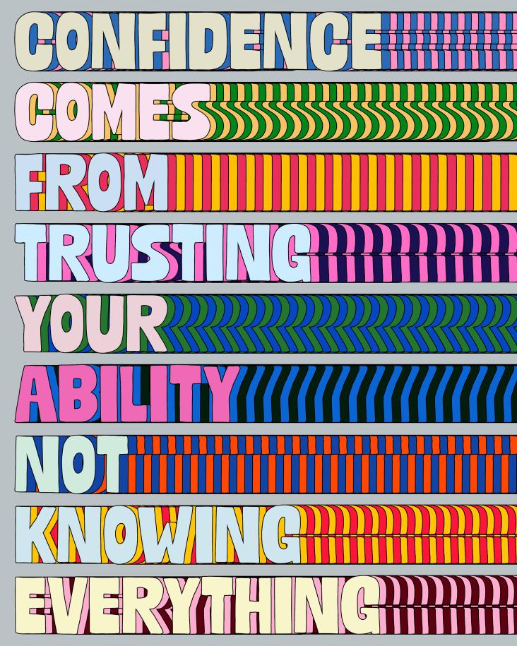
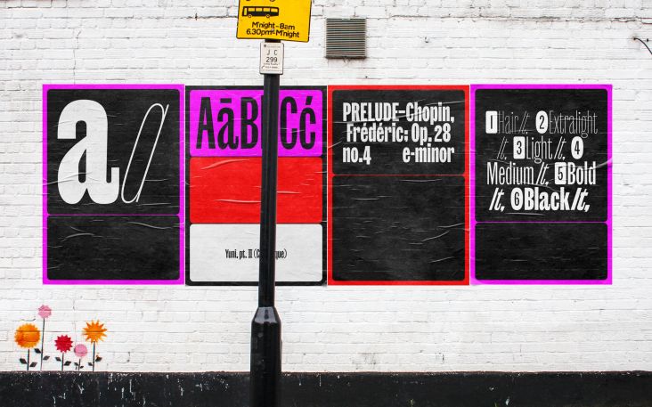
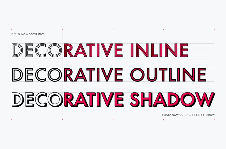
All images courtesy of Monotype
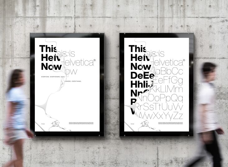
Consisting of 48 fonts and three optical sizes, the typeface has been produced from size-specific drawings and with size-specific spacing and is the first redesign in 35 years of what many argue is the world's most ubiquitous font, Helvetica.
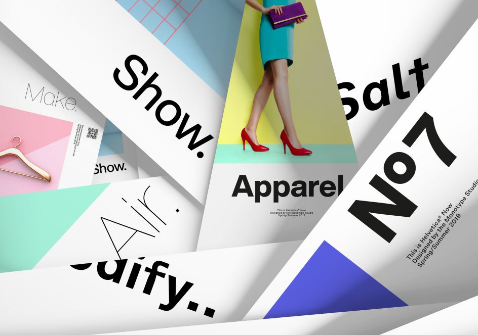
Every character has been redrawn and refit, and a host of useful alternates have been added to help brands meet modern-day branding challenges. Espousing the simplicity, clarity, timelessness and global appeal of the typeface’s storied tradition, Helvetica Now aims to be more sophisticated and graceful than its predecessors.
The Helvetica family has been used by countless brands and creative professionals, in millions of designs since its inception. The typeface embodies clean and versatile design, and the Helvetica Now typeface continues the tradition established by the Helvetica and Neue Helvetica families while introducing a number of improvements. To learn more, watch the video below, narrated by Charles Nix, type director at Monotype.
"Helvetica Now is the tummy-tuck, facelift and lip filler we’ve been wanting, but were too afraid to ask for,” said Abbott Miller, Partner at Pentagram. “It offers beautifully drawn alternates to some of Helvetica’s most awkward moments, giving it a surprisingly thrillingly contemporary character."
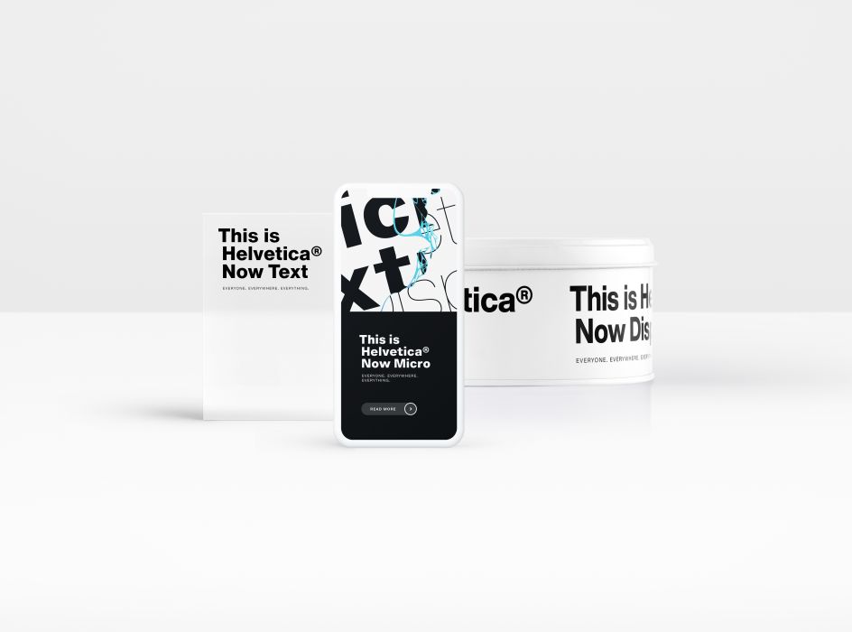
The Helvetica Now typeface is available in three optical sizes – Micro, Text and Display. Helvetica Now Micro solves the decades-old spacing and legibility shortcomings of single-master versions of the family at the smallest sizes (4- to 7-points). It also offers more open apertures, wider forms, a larger x-height, open spacing, larger accents, optical adjustments to the shapes of complex forms, and a number of other changes to produce a highly-legible font at very small sizes.
Helvetica Now Display, meanwhile, provides a range of weights from Hairline to Extra Black, with appropriate spacing, for 14-point settings and up. Big, bold, attention-grabbing Helvetica no longer requires the trimming of characters, manual adjustment of spacing and kerning, or the resizing and repositioning of punctuation necessary with the legacy versions.
Helvetica Now Text is a true workhorse, and comes in a range of weights from Thin to Black with carefully combed spacing and kerning. Helvetica Now Text is easy and pleasing to read, and an ample palette for demanding information-rich design environments.
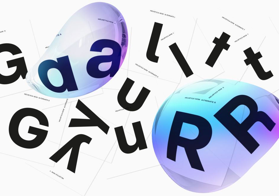
Elsewhere, newly designed alternate glyphs have been added across the entire range of the family, including a single-story ‘a’ and a straight-legged capital ‘R’. Every weight and optical size offers a host of new and useful glyphs, including a suite of Helvetica arrows.
Every letter, number, punctuation mark and symbol in the family – nearly 40,000 in all – have been redrawn, analysed and tested for improved legibility and performance. The result is a better reading experience, as the design’s improved forms and more even spacing mean clearer communication.
"Today, we’re asking Helvetica to do more than it ever has before. Previous versions of the typeface weren’t designed to be used in graphic applications that have developed over the last 30 years. As a result, older versions of the font were lacking in some important areas," said Charles Nix, type director at Monotype.
"Helvetica Now solves the legibility and style challenges that brands using Helvetica have consciously and unconsciously faced for years. The design introduces a new chapter in the Helvetica story—expanding its look and utility while reinvigorating its heritage."
Helvetica Now is already getting some feedback from the design community. Erik Spiekermann, founder and partner, Edenspiekermann, said: "This is the typeface Max Miedinger and Eduard Hoffmann would have designed back in 1957 if they had known about offset printing, small screens, browsers, digital design tools and UI designers."
David Heasty, Partner at Triboro, adds: "I’m having fun with Helvetica Now. Bringing in alternate characters like the round ‘I’ dots and the straight-legged ‘R’ will likely annoy Helvetica purists, but I can totally get behind the flexibility and character this adds. I think the Micro cut goes a long way in making any Helvetica usable for longer texts. I wish I had Helvetica Now sooner!"
Single weights of the Helvetica Now typeface are available for $/€35 or £30 each. The complete typeface family is available for $/€299 or £249. It can be found in Mosaic, Monotype’s cloud-based font discovery, collaboration and management solution.


](https://www.creativeboom.com/upload/articles/7a/7a527d53fefe4f354e8489365e89db422567f281_732.jpg)
](https://www.creativeboom.com/upload/articles/1b/1bafd6401df7c7b55c0632369cb360a7832e3014_732.jpg)