24 fonts that will be popular with designers in 2021
It goes without saying that 2020 has been a pretty weird year all round. And with most of us locked down for months on end, and uncertain of what the future holds, it's not surprising that when it comes to typography, retro styles and nostalgic feels have come to the forefront.
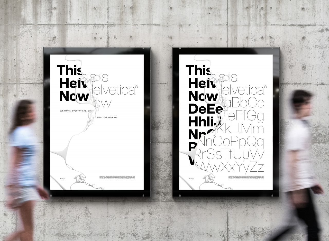
Helvetica Now
So we've seen the resurgence of classic fonts, most notably Futura Now and Helvetica Now, while the graphic design of everything from websites and album covers, book jackets to poster designs, have been harking back to the good old days with classic typestyles and iconic fonts.
We'd venture that it's not just rose-tinted glasses, either. Being quarantined has led many of us to question some of the values we take for granted in modernity, and there really does seem to be a shift back to simpler, more innocent times. Just take a look at Koto's impactful identity for Meatable, a company attempting to return to "harm-free meat" on a sustainable scale, using GT Alpina. This isn't the kind of arch, knowing, post-modern irony we used to see everywhere in advertising. It feels like something a little more… well, genuine.
If you're also feeling the pull of a changing approach to design, it's worth investigating some new fonts outside your usual toolbox. So with the help of some suggestions from the creative community on Twitter, we've brought together 24 stunning fonts that can help you do just that over the next 12 months. Some are old, some are new, and some appeared on last year's list too, but they all have one thing in common. We predict that all these typefaces will be huge in 2021, and for all the right reasons.
Sans Serif fonts
1. Anguita Sans
Designed by Sofia Mohr for Latinotype, Anguita Sans is a brand new condensed sans serif family which debuted this October. Founded terminals, a large x-height and a condensed structure give designers various opportunities to create a good vertical rhythm. This versatile typeface would be especially suitable for titles and short lines of text, in both print and digital media.
2. Jeko
A re-designed form of Aventa crafted by Ellen Luff, Jeko is a new geometric sans-serif that launched in September. Made up of strong elementary shapes and clean circles, interwoven with modern cuts and sharp edges, it's bold, refined and confident. A high X-height and strong capitals provide a high degree of visibility across all weights and have been optically corrected for excellent legibility. Available as a variable font, this versatile workhorse is an ideal choice for interface design.
3. Goldplay
Designed by Enrique Hernández for Latinotype, Goldplay is an evolution of Isidora Sans featuring rounded soft terminals, which give it a friendly and expressive look. At the same time, a large x-height adds a touch of elegance. Launched in October last year, its refreshing combination of modern style and classic proportions make it a good choice for headlines, logos, books, magazines and motion graphics.
4. Versus
Inspired by Latin American wrestling posters, Versus is a type system designed for use with short and block text. Designed by Marcelo Moya Ochoa for Latinotype in January 2019, its orthogonal terminals and short ascenders and descenders make it ideal for branding and posters, including short text, isolated words, logos and titles.
5. Olivetta
Another release from last October, Olivetta is described by its foundry, Los Andes, as an "ironic sans" that's aimed at designers seeking to harness the power of words as images. Designed by Alfonso García, the contrast between thick and thin strokes within the lowercase letters gives visual strength to the font; a dynamic that increases as the weights get heavier. The lightest weights work well in subtle headlines while the intermediate weights are ideal for continuous reading, and the heaviest weights are perfect for posters and short passages.
6. Trust Sans
Trust Sans is a typeface specially designed for corporate identity. Launched last October, this friendly font, designed by Antonio Mejía for Latinotype Mexico, has a gentle flow and humanist features. Trust Sans is made up of two complementary sub-families: a standard, formal font and an alternative, more casual, version. We'd recommend it for editorial design, immersive text, corporate identity, branding and packaging.
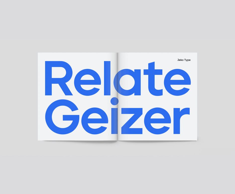
Jeko
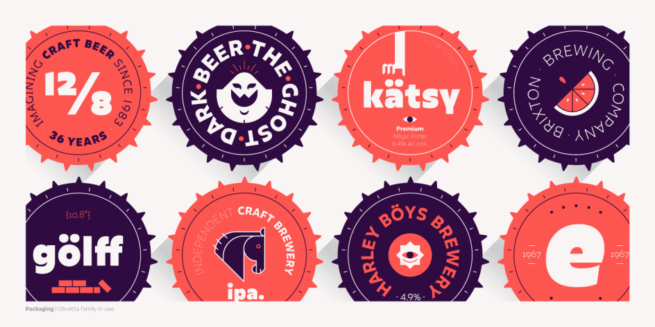
Olivetta
Slab Serif fonts
7. Breton
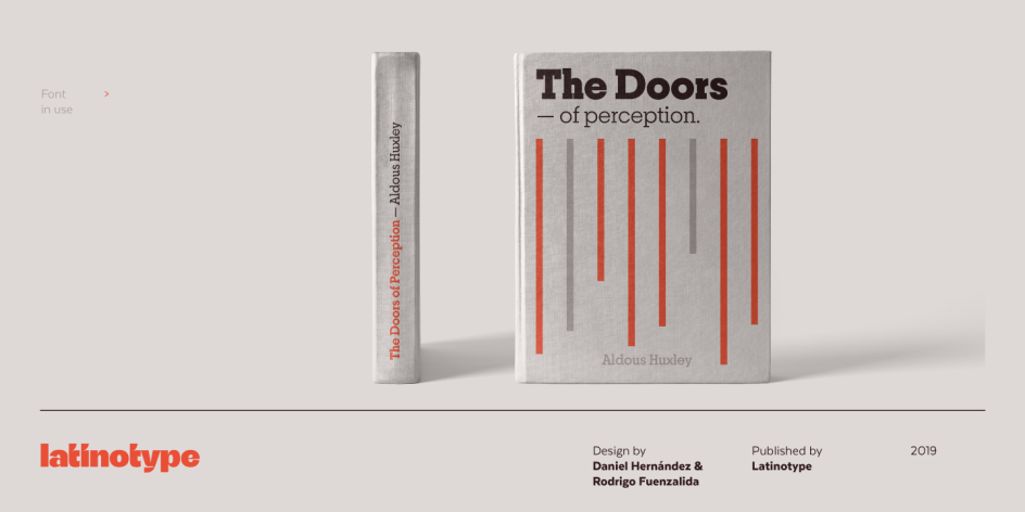
Inspired by Boston, Breton is a geometric slab serif that's great for headings and branding design. A diversity of proportions between rounded and non-rounded letters gives text a lively rhythm and a strong sense of personality. Debuting in March 2019, Breton was designed by Daniel Hernández and Rodrigo Fuenzalida for Latinotype.
8. Klose Slab
A lovely vintage typeface from Studio Sun released this September, Klose is a good choice for logotypes, headlines and display text. It comes with four styles (condensed, normal, semi expanded, and expanded) and is also available as a variable font. Designed by Cahya Sofyan, Klose supports more 75 languages.
9. ITC Lubalin Graph
ITC Lubalin Graph was initially designed by Herb Lubalin in 1974 as an evolution of Avant Garde Gothic and has come to represent the typographic style of American graphic design in the 1970s. With its generous x-height and overall tight fit, this latest version, released in 2000, is most at home when paired with mid-century modern design and more traditional text faces.
10. Sentinel
Created by Jonathan Hoefler and Tobias Frere-Jones for Hoefler & Co in 2009, Sentinel is a well-rounded font family with clear and expressive gestures. It maintains visually consistent intervals between its weights, to ensure that every style has a heavier counterpart that provides the same degree of emphasis.
Breton
Jazmin
Serif fonts
11. Financier
Drawn for the redesign of the Financial Times newspaper in 2014, under a team led by Kevin Wilson and Mark Leeds, Financier is now available through Klim Type Foundary. It's an elegant and authoritative serif that evokes a strong sense of British heritage, via an aesthetic that comes from Eric Gill's classic letterforms. This font's versatility works well across all media, from physical broadsheets to mobile screens.
12. Moranga
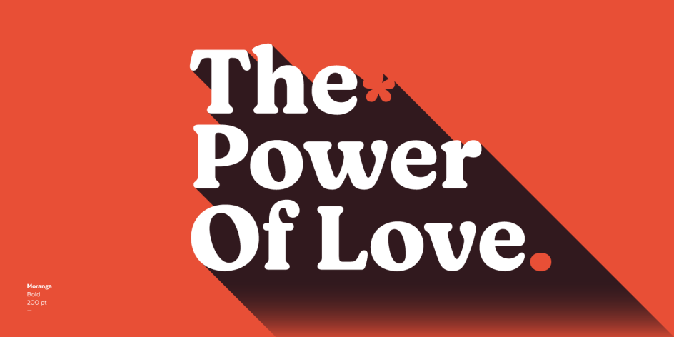
Released this January, Moranga is a retro-style serif that mixes Café Brasil's flowing, organic shapes with elements from popular 1970s fonts such as Cooper and Souvenir. Moranga, in five weights and matching italics. Designed by Sofia Mohr for Latinotype, it's a superb choice for headlines, display use and high-impact designs. Moranga contains features more than 400 characters and supports over 200 Latin-based languages.
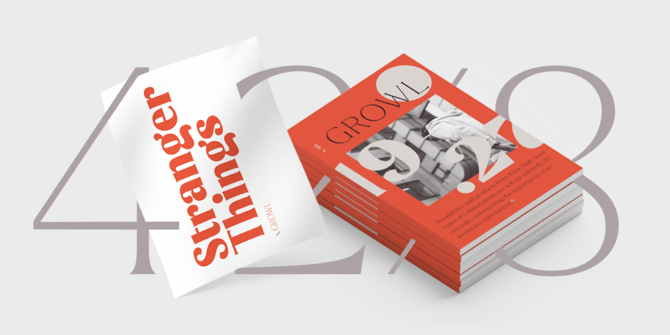
13. Jazmin
Debuting in September last year, Jazmín is a more playful and contemporary take on Morris Fuller Benton's Globe Gothic. Designed by Eli Hernández and published by Latinotype, Jazmín is suitable for use in magazines, short text passages, logos, branding design, packaging design and advertising.
14. TT Ramillas
Another new font launched this September, TT Ramillas by TypeType features high contrast, small flared serifs, variable slope of ovals, open aperture of signs, contrasting thin nodules and no drops. The creation of Pavel Emelyanov, Marina Khodak, Yulia Gonina and Kseniya Karataeva, it's intended for use in magazines, the fashion industry, and the branding of premium goods and services. TT Ramillas is suitable for use both in headings and in body text, whilst some manual hinting in the typeface means it can also be used on the web and in apps.
15. Apparel
Sharing similar functional characteristics with Times New Roman and Caslon, but with added personality, Apparel is a great choice for high-impact design. Its medium-large x-height makes it ideal for headlines and brand identity design, while there's also a version, with a greater contrast between thick and thin strokes, for use in even larger sizes. Debuting this October, it was designed by Daniel Hernández and Alfonso García for Latinotype.
16. Bogart
Released in September, Bogart is designer Francesco Canovaro's typographic tribute to low-contrast, old-style fat faces like Cooper Black and Goudy Heavy Face. Published by Zeta Fonts, its gloopy shapes recall the rub-on transfers and phototypesetting systems of the 1960s and 1970s and are bursting with hippy energy and childlike personality.
17. GT Alpina
GT Alpina started its life in 2011 as a one-off typeface, designed for a book celebrating the 75th anniversary of the Swiss Foundation. Drawing on the steady rhythm and measured proportions of classic book typography, this latest version was designed by Reto Moser and published through Grilli Type earlier this year. It features a distinctive top-heavy lowercase and is described as "a "workhorse serif with a twist", in that it doesn't swap personality with functionality, but is brimming with both.
18. Recoleta
Another fantastic font that's back on our list for another year, Recoleta combines various elements of 1970s typefaces, including such as the soft, gentle shapes of Cooper and the fluid, angled strokes of Windsor, in one sleek retro design. Designed by Jorge Cisterna for Latinotype in 2018, the font's lighter weights are well-suited for body text while heavier ones are perfect for high impact headlines.
Moranga
Meek Display
Display fonts
19. Mirtha Display
“One thing is for sure,” says type designer Jonny Buchanan. "2020 has seen the continued boom of display faces being released, and I'm sure we'll see these rolled out in 2021." We couldn't agree more, and here's one that's top of our mind right now. Debuting last month, Mirtha Display by Nois is a clean and elegant decorative font with the ability to create chains: you make a shape in Adobe Illustrator and type @@ to form a link on it. Inspired by art deco, it's a good choice for short headlines and can be used in posters, branding, logos, packaging, magazines and more. Designed by Spanish typographer Guillermo, Mirtha Display supports Basic Latin, Western European, Euro, Catalan, Baltic, Turkish, Central European, Basic Greek and other languages.
20. Beatrice Display
We featured Beatrice Display on our list of 2020 fonts, but we're just as convinced it'll be an essential choice for designers in 2021 too. That's because it truly is an eye-grabbing font, that still hasn't been surpassed for its originality since it was released by Sharp Type two years ago. Built on the foundation of a traditional American Gothic but with super-tight spacing, the font doesn't follow any predictable or historical model of type design. It is all the more refreshing for it.
21. Aesthet Nova
Aesthet Nova is a display type family featuring rounded serifs, ball terminals and soft corners. Based on the 2015 typeface Aesthet, it was designed by Mariya V. Pigoulevskaya and released through The Northern Block this January. It's a good choice for anyone looking for a subtle hint of 1970s styles within a formal and functional typeface. "Aesthet Nova is kind of a Cooper Black style but more refined," says graphic designer and illustrator Sarah Fisher. “I think quirky fonts with rounded serifs like this will be increasingly popular in 2021.”
22. Meek Display
Meek Display is a type family with a sense of the unexpected: a persistently oblique stress, an eclectic mixture of calligraphic and typographic features, and contrast in place of serifs. Designed by Ryan Bugden and published by Future Fonts in 2018, this unusual font is best suited for large, text-like headlines.
23. Degular
Some fonts want to grab your attention: Degular, in contrast, aims to fade into the background like a white noise machine. Designed by James Edmondson and published through OH No Type Co in April, Degular comes in three optical sizes, each in seven weights in Roman and italic styles. "I hope for OH No Type Co that Degular is huge in 2021," says typographer and designer Elliot Jay-Stocks, adding with tongue-in-cheek: "I also selfishly hope that it's not and that my website's use of it remains unique."
24. Futura Now
Monotype Studio describes Futura Now, which it launched this October, as nothing less than "the definitive geometric sans". The latest version of one of the families that defined modern typography, its contemporary alignment of names and weights offers an improved user experience, and it's available as a variable font too. Read more about this landmark 2020 release in this article.

Editor's Picks


Trending


Podcasts


Editor's Picks
Further Reading
](https://www.creativeboom.com/upload/articles/fa/fa43d485824157cd9751c5ab202d8ef4119cdf26_732.jpg)