Top 20 fonts that will be popular with designers in 2020
It's been an incredible year for type lovers everywhere. With more independent foundries launching than ever before and the industry's established names pumping out fresh specimens each month, there's never been a better time to find the right fonts for your projects.
](https://www.creativeboom.com/upload/articles/7a/7a527d53fefe4f354e8489365e89db422567f281_1280.jpg)
Untitled Sans by Klim. Design by Holt
As we start to review another year at Creative Boom, we've done a little research to uncover the top 20 typefaces that are proving popular with graphic designers and those we think will be a big hit in 2020.
From sans serif and slab to serif and display, we've thrown in some existing well-known fonts as well as brand new contenders – all designed to give your work that edge you've been looking for while maintaining essential clarity and readability.
1. Helvetica Now
One of the biggest stories of 2019 was when Monotype introduced its Helvetica Now typeface. Produced from size-specific drawings and with size-specific spacing, it was the first redesign in 35 years of what many argue is the world's most ubiquitous font, Helvetica. Every character has been redrawn and a host of useful alternates have been added to help you meet those modern-day branding challenges. It's proved very popular over the last six months; we think that will only continue.
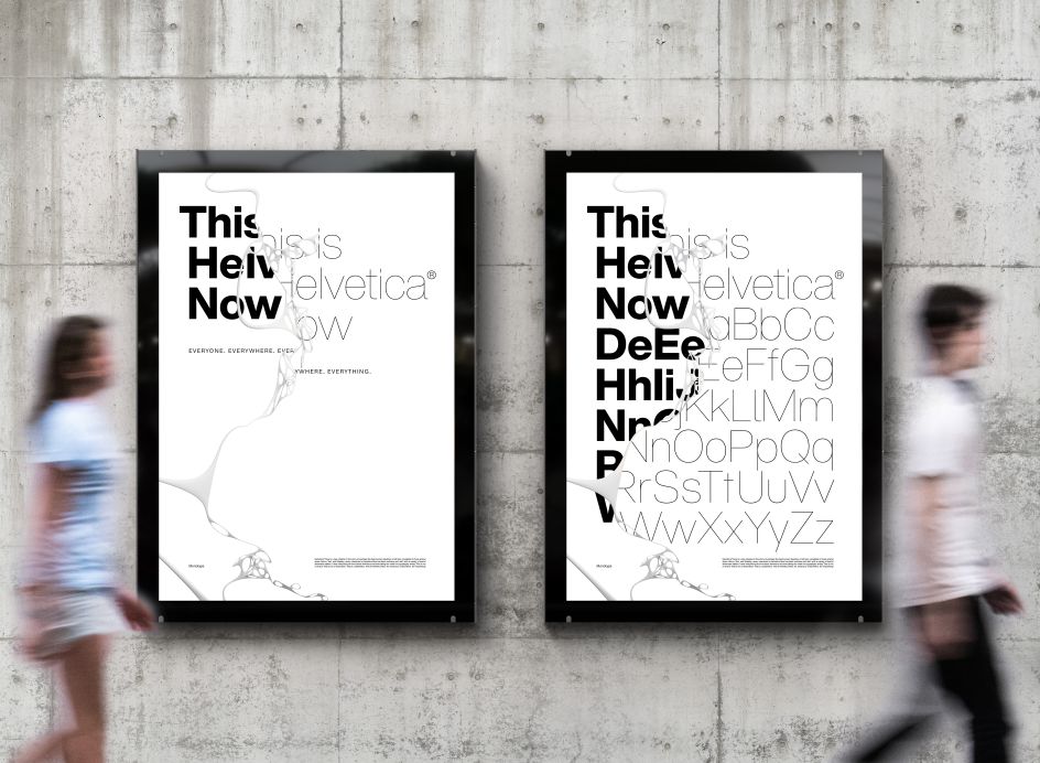
Helvetica Now by Monotype
2. Aeonik
Mark Bloom of Mash Creative has just launched his own foundry, CoType, after years of creating his own font families. We love Aeonik. Described as a "structural workhorse, crafted with mechanical detail", it's conceived as a "neo-grotesque with a geometric skeleton" and comes in seven weights and italics, so you can get full use out of the family.
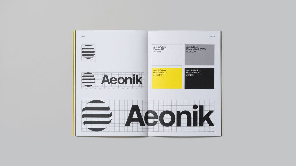
Aeonik by CoType
3. NewsSans
Content continues to be king. And it's going nowhere in 2020. Which is why we love Character Type's latest typeface system, NewsSans. Incorporating no fewer than 90 styles, it allows you to create a varied typographic look, effortlessly ranging from loud and expressive, to subtle and reserved. The large x-height combined with low ascenders and descenders allows for tight and efficient designs. All sharp corners were trimmed off to add character and nuance of extra space.
We especially like how NewsSans’ strokes link humanist curves with 'American Grotesque' details and solid square stems. The system contains nine weights from hairline to black, and five widths from compressed to extended, each accompanied by a proper italic. Free trial fonts are available exclusively via charactertype.com.
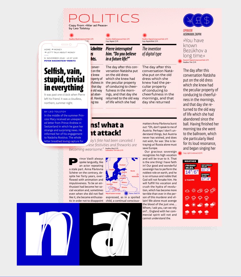
NewsSans by Character Type
4. Beatrice Display
Beatrice is a new kind of typeface by New York foundry, Sharp Type. The family is an exploration of contrast methodologies, combining various aspects from the canon expansionist systems, inverted contrast, and the contrast behaviour of standard sans-serif grotesks.
"These methodologies were dissected and used as cornerstones in building our own system, with the final result landing largely in unexplored territory," explains Sharp Type. "Built on the foundation of a traditional American Gothic but with tight-as-can-be spacing, the superfamily spans a robust set of weights and includes two optical sizes: a super high-contrast, tightly packed Display cut, as well as a standard low-contrast cut, designed to function beautifully in a wide range of optical sizes."
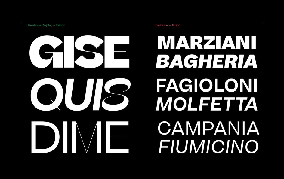
Beatrice Display by Sharp Type
5. Untitled Sans
Brought to you by New Zealand foundry Klim, Untitled Sans is a plain, Neo Grotesk sans validated by the ideas of Jasper Morrison and Naoto Fukasawa’s Super Normal project.
It has the same principles applied to it as its complementary typeface, Untitled Serif, which is drawn from the old-style genre of types: the post-Caslon, pre-Times workhorses offered by almost every metal type foundry of the time. This is a typeface we're seeing again and again.
](https://www.creativeboom.com/upload/articles/eb/ebc945e81c78dae53fac629d9de5bf61c1dd0352_944.jpg)
Untitled Sans by Klim. Design by Holt
6. Gilroy
Gilroy is a modern sans serif with a touch of geometry. Designed by Radomir Tinkov, it's a younger brother of the original Qanelas font family and comes in 20 weights and 10 uprights with matching italics. Rather wonderfully, the Light & ExtraBold weights are free of charge, so you can use them to your heart’s content.
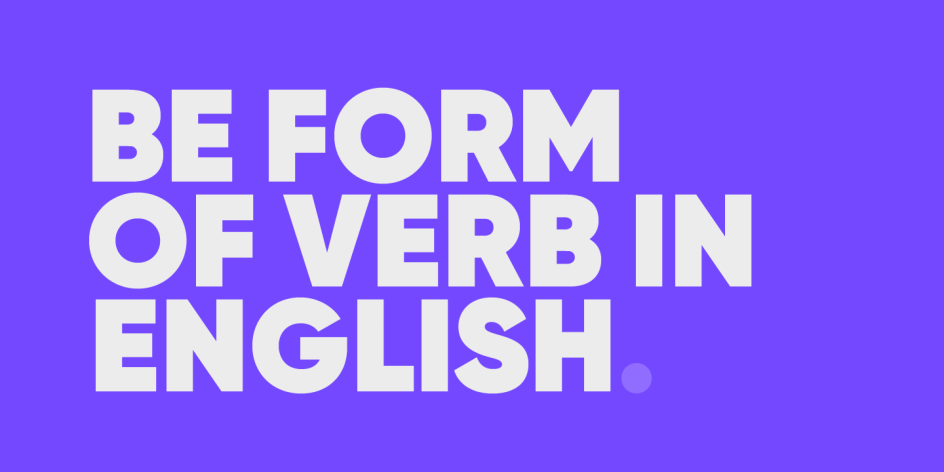
Gilroy by Radomir Tinkov
7. DIN Next
DIN is that classic typeface you always root for – the one you want to use but just can't bring yourself to because it's limited in its range of weights and widths. The century-old design has proven to be timeless, but it needed a modern update. That's where DIN Next steps nicely in – a versatile sans serif family that will never go out of style.
This classic design turned modern must-have, created by Akira Kobayashi, includes seven weights that range from light to black, each of which has a complementary italic and condensed counterpart. There are also four rounded designs, stretching the original concept’s range and core usability. And there's a suite of small capitals, old-style figures, subscript, superscript and several alternate characters.

DIN Next by Monotype
8. Recoleta
Just like Grandma’s best recipe, Recoleta combines a variety of ingredients – from various popular 1970s typefaces, such as the soft and gentle shapes found in Cooper or the fluid, angled strokes in Windsor, mixed into one single design that features familiar, yet fresh, modern flavours.
Published by Latinotype, its variety of weights provide a range of choices that will help you find the best typographic colour for your project. Lighter weights are well-suited for body text while heavier ones are ideal for high impact headlines. The available stylistic alternates offer a number of different characters that give your logo or business card a unique look.
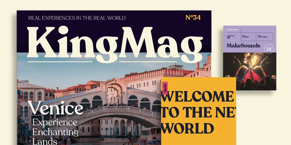
Recoleta by Latinotype
9. Fann Grotesque
Fann Grotesque by Colophon has upright styles that seem to capture the broader spirit of 19th century British Grotesque, exploring its idiosyncrasies and imperfections. The designs draw inspiration from a number of British type foundries including Stephenson Blake, Day & Collins and Miller & Richard. I'll give you an example – the floral italics adopt an unusually cursive style for a sans serif, a gesture sparked by a page from a Fann Street Letter Foundry type specimen.
Available in nine weights: Thin, ExtraLight, Light, Book, Regular, Medium, SemiBold, Bold and Black – all with corresponding true italics.
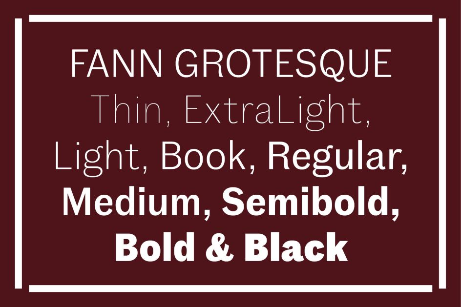
Fann Grotesque by Colophon
10. Doyle
Another one to come out of Sharp Type is Doyle, a period piece and "loving synthesis of two iconic styles that became the visual backdrop of a generation". Taking cues from Lucas Sharp’s ode to Cooper Black drawn from memory and a style reminiscent of ITC American Typewriter to create something entirely new, the coherent family is both structured and loose, with "inky wetness positively brimming with life".
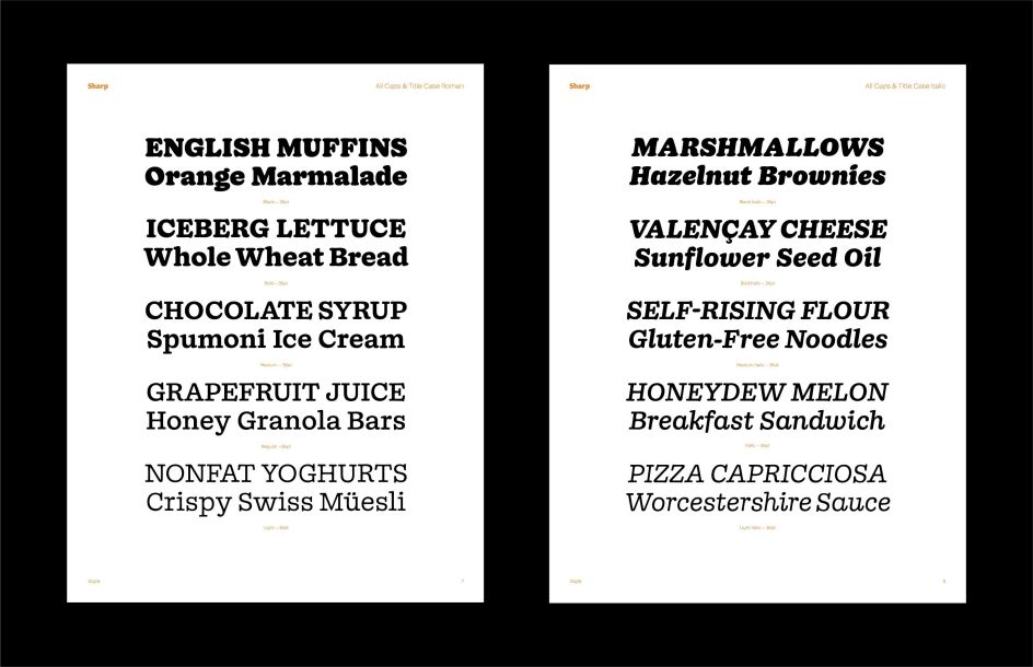
Doyle by Sharp Type
11. Albertus Nova
Courtesy of Monotype, Albertus Nova is a digital revival of Berthold Wolpe’s earlier design of Albertus. This new design enlarges the typeface set from its previous two weights into a robust set of five ranging from thin to black, all with extended language support including Cyrillic and Greek.
Berthold Wolpe began working on Albertus in 1932, at the encouragement of Stanley Morison. Morison saw an example of Wolpe’s engraved lettering and liked it so much that he commissioned a typeface based on the design. Since then, the original Albertus typeface has been used on book covers, in branding, on signs and in video games. We expect to see a lot more of this font in 2020.
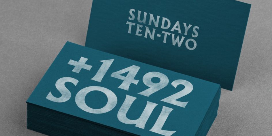
Albertus Nova by Monotype
12. FF Mark
Created in 2013 by German type designers Hannes von Döhren, Christoph Koeberlin and the FontFont Type Department, FF Mark contains 10 weights from Hairline to Black and is ideally suited for film and TV, advertising and packaging, editorial and publishing, logo, branding, music and nightlife, software and gaming, sports as well as web and screen design. It also comes with a complete range of figure set options – old-style and lining figures, each in tabular and proportional widths.
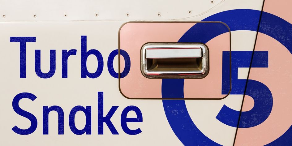
FF Mark by Monotype
13. TT Norms Pro
Considered to be one of bestselling geometric sans ever released, TT Norms Pro is a reliable workhorse. With classic type character proportions, the designers (Ivan Gladkikh, TypeType Team and Pavel Emelyanov) have given us eleven weights and eleven corresponding italics, two variable fonts, small capitals, stylistic alternates, ligatures, and broad support of OpenType features. This is a family that can be easily adapted for different purposes. TT Norms Pro works equally well in large text arrays and in small headings, and it is "the one" universal geometric grotesk.
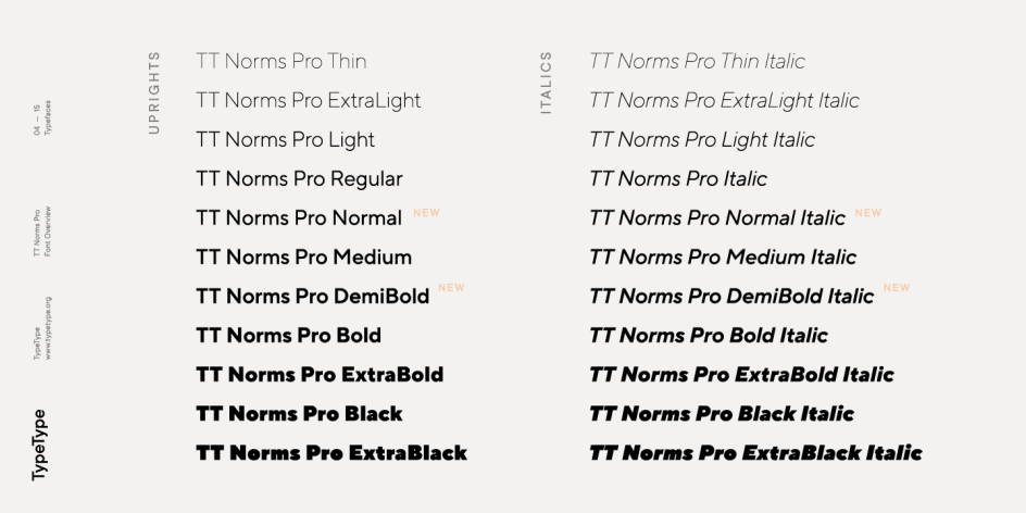
TT Norms Pro by TypeType
14. Coign
Coign by Colophon is an extensive study of condensed forms based on the DeLittle type foundry’s Elongated Sans. "DeLittle’s type challenges conventional letterforms, pushing the notion of what is 'condensed' to the absolute limit," says the foundry. "A quoin, Coyne, coigne or, in this case, Coign, is a wedge-like device used in letterpress printing to lock type and spacing material into place within a chase or directly onto a press.
"Combining the systematic approach of Adrian Frutiger’s Univers and the eccentricities of 19th and 20th-century wood type, Coign offers a vast range of condensed styles that explore how the relationship between counter form and letterspacing can alter the expression and texture of type."
Super condensed designs are typically limited to a small range of styles as part of a much larger family, but Coign offers 28 styles with seven weights in four different widths – all of them super condensed. It's no wonder this font is proving a hit.
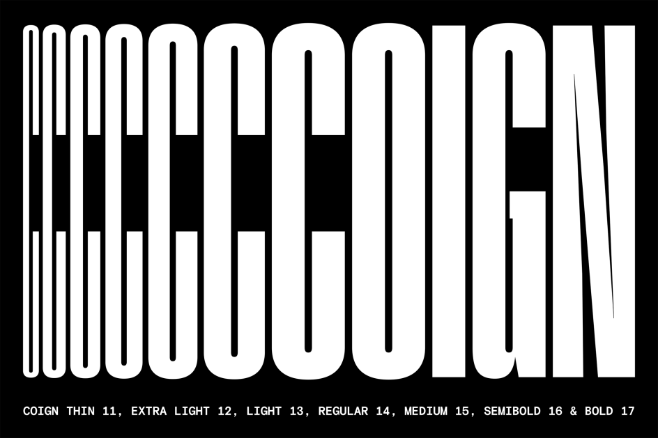
Coign by Colophon
15. Neue Haas Grotesk
The first weights of Neue Haas Grotesk were designed in the late 1950s by Max Miedinger with input from Eduard Hoffmann. Neue Haas Grotesk was to be the answer to the British and German grotesques that had become hugely popular thanks to the success of functionalist Swiss typography. The typeface was soon revised and released as Helvetica by Linotype AG.
As Neue Haas Grotesk had to be adapted to work on Linotype’s hot metal line casters, Linotype Helvetica was in some ways a radically transformed version of the original. During the transition from metal to phototypesetting, Helvetica underwent additional modifications. And in the 1980s Neue Helvetica was produced as a rationalised, standardised version.
Designer Christian Schwartz later released a digital revival of Neue Haas Grotesk, marking an opportunity to set history straight. "Much of the warm personality of Miedinger’s shapes was lost along the way. So rather than trying to rethink Helvetica or improve on current digital versions, this was more of a restoration project: bringing Miedinger’s original Neue Haas Grotesk back to life with as much fidelity to his original shapes and spacing as possible (albeit with the addition of kerning, an expensive luxury in handset type)."
Schwartz’s revival was originally commissioned in 2004 by Mark Porter for the redesign of The Guardian, but not used. Schwartz completed the family in 2010 for Richard Turley at Bloomberg Businessweek. Its thinnest weight was designed by Berton Hasebe.

Neue Haas Grotesk by Monotype
16. Harriet
Harriet is a serif typeface brought to you by Okay Type. It’s sort of a contemporary reimagining of Baskerville with a dash of Scotch Roman. A versatile family, it has two optical sizes and a range of weights. The display styles are exuberant enough to sparkle at large sizes, while the text styles are more restrained, with a sturdiness more appropriate for everyday use.
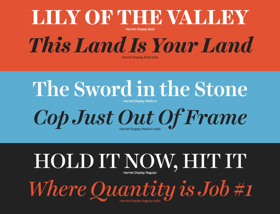
Harriet by Okay Type
17. Avenir Next
Akira Kobayashi worked alongside Avenir’s esteemed creator Adrian Frutiger to bring Avenir Next Pro to life. A new take on a classic, it's an expansion of the original concept that takes the font to the next level.
As well as the standard styles ranging from ultra-light to heavy, this 32-font collection offers condensed faces that rival any other sans on the market in on and off-screen readability at any size alongside heavyweights that would make excellent display faces in their own right and have the ability to pair well with so many contemporary serif body types. Overall, the family’s design is clean, straightforward and works brilliantly for blocks of copy and headlines alike.

Avenir Next by Linotype
18. Nib
Although Nib was originally triggered by a stone carving Dries Wiewauters spotted in Denmark, the final family is a blend of multiple influences. Initially developed for the Museum of Fine Arts in Ghent, Belgium – in close collaboration with Ruud Ruttens, the head of their design department – Nib is now available for licensing.
Both the serifs and idiosyncratic overhanging forms such as the «f», «j» and «y» give it an elegant, yet eccentric quality. There are multiple different gestures occurring, some based on calligraphy, others from stone-carving. But together they create a symbiosis that balances many opposite qualities. "Nib strives to be both friendly and aggressive in the same moment, thus allowing it to be moulded and applied to a wide range of contexts," explains Colophon, the foundry behind the type family, which is available in five weights (Light, Regular, Semibold, Bold, and Black) with corresponding italics.
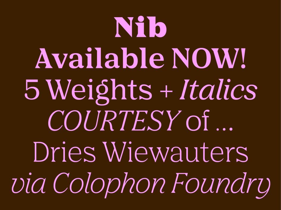
Nib by Colophon
19. Silk Serif
Rakel Tómasdóttir is the person behind Silk Serif, a high-contrast typeface with thin, pointy, heavily bracketed serifs, and ball terminals in the appropriate places, as well as bracketed junctions in various letterforms. The main feature of this delicate and legible typeface is the disconnection between the bowls and the stems. However, the bowl is very close to the stem, creating the illusion of connection. A sophisticated choice for your projects.
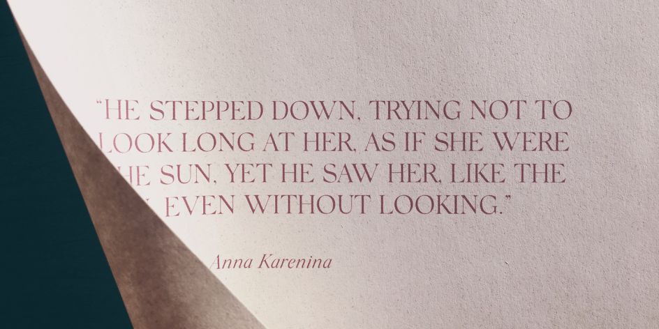
Silk Serif by SilkType
20. Visuelt
Originally created as a bespoke typeface for the 2013 and 2014 identity of design conference and competition Visuelt (Oslo, Norway) – also known as the National Norwegian Design Awards – this typeface spawned from a more considered and constrained version of Aperçu. "From its initial roots and underlying aesthetic, new details were brought in to remove some of the more distinguishable features of Aperçu to make way for a new tone of voice and trajectory," explains Colophon Foundry.
"We revised and revisited the typeface and produced additional weights to accompany the pre-existing Regular. The Lightest of these weights took on thin precise curves, whereas the heaviest weight counters were opened and sharp terminal ends chiselled to provide small technical details to an otherwise brut-ish and heavy face."
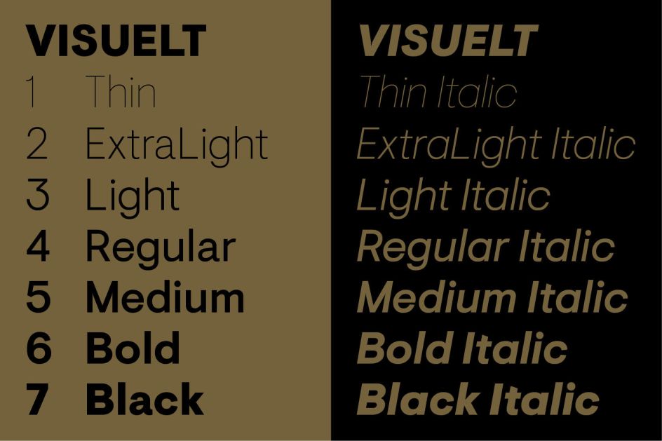
Visuelt by Colophon


](https://www.creativeboom.com/upload/articles/d6/d6a4e3470465b2a0e4e1269d570cd2f3467485a8_732.jpeg)
