Koto's identity for Meatable hopes to get the world talking about 'harm-free meat'
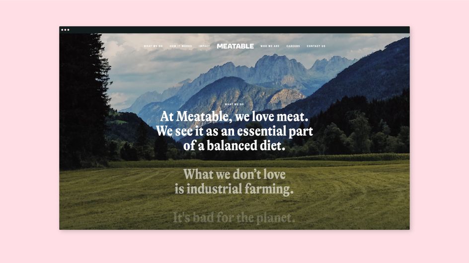
With meat consumption on the rise and industrial livestock farming damaging the planet, Meatable is aiming to be the first company in the world to produce "cultivated meat" efficiently and sustainably at scale.
To kick things off, it recently called on London studio Koto to create a "credible and inspirational" brand identity that could "open up a dialogue" and "get the world excited about the possibilities of harm-free meat".
"If you Google cultivated meat today, you’ll find photos of scientists in lab coats staring into Petri dishes; images which only fuel confusion and uncertainty," says Arthur Foliard, design director at Koto. "The story that Meatable's founders want to tell is much more inspirational. So we created a brand strategy that focuses on a future where the world's appetite for meat can be satisfied without harming people, animals, or the planet."
This visionary idea is communicated through a brand story that's clear, frank, and which can resonate with every single one of Meatable's audiences, from investors to food producers, regulatory bodies to everyday consumers.
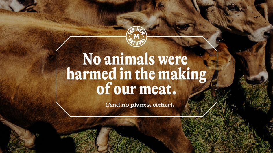
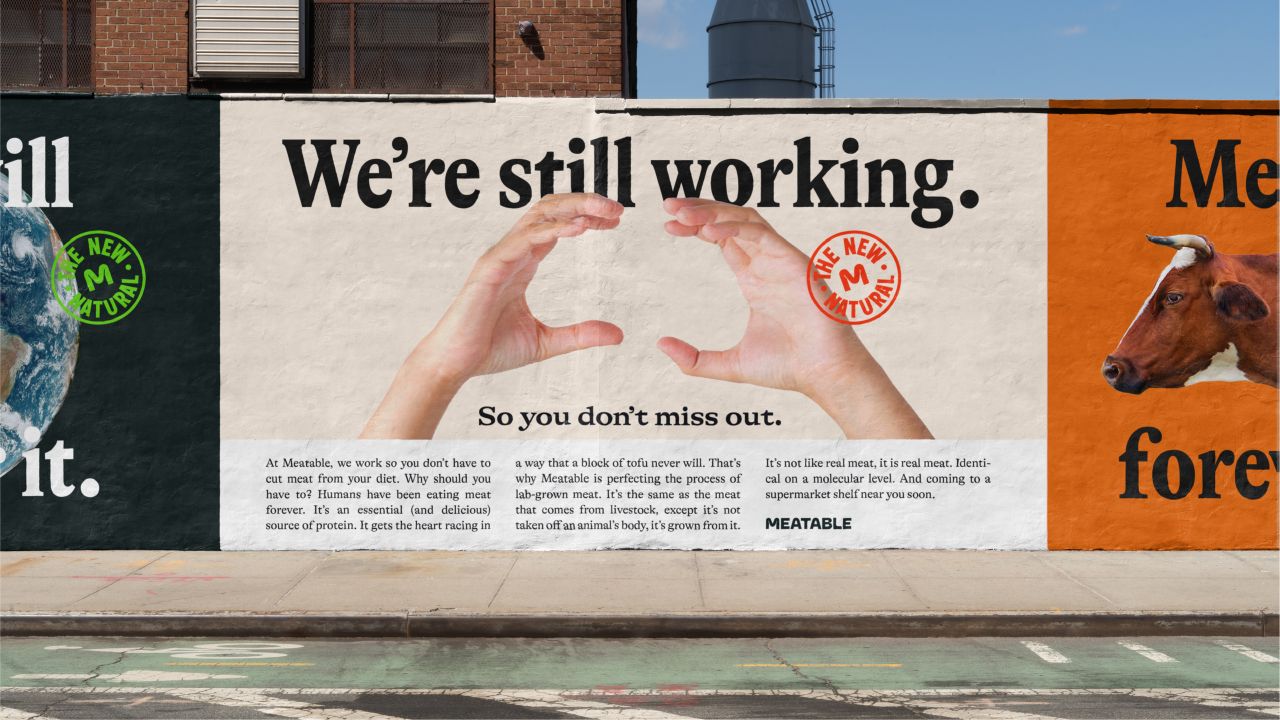
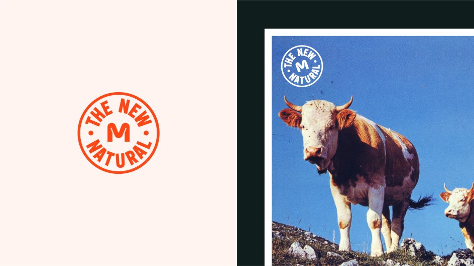
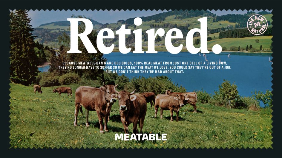
Central to the strategy is a brand idea: "the new natural". This positions cultivated meat not as science fiction, but as an evolution of a completely natural process.
"The new natural is cows grazing happily in fields, not trapped in feedlots," Arthur continues. "It's a return to the 'old natural' of a cleaner, unspoilt planet." Based on this idea, it acts as the foundation for a brand that feels simultaneously nostalgic and modern, and which takes its cues from nature. "It allows Meatable to celebrate its innovative work in a landscape beyond the lab," adds Arthur.
"Our brand imagines a world where cows are freed from factory farming. And with that strong idea in mind, we started thinking that 'without the need to kill animals anymore, they could go back into the fields and retire in peace'. We started referencing vintage holiday postcards, with cows grazing happily in fields and on mountains. It gave us a strong starting point to express what Meatable does distinctively and unexpectedly."
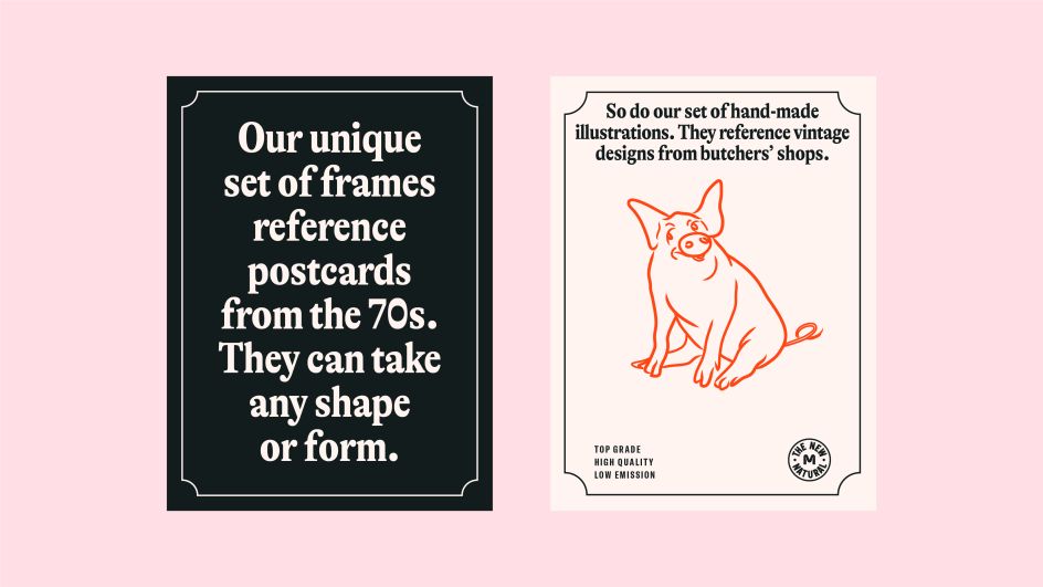
These vintage postcards greatly inspired the graphic language. Koto supposedly bought hundreds of them, from across Europe and the US. The idea in that process was to take the recurrent elements of that vernacular and add a modern twist. The frame, the illustrations, the typography, the layout, art direction, colours, messaging, all became the pillars of Meatable's brand.
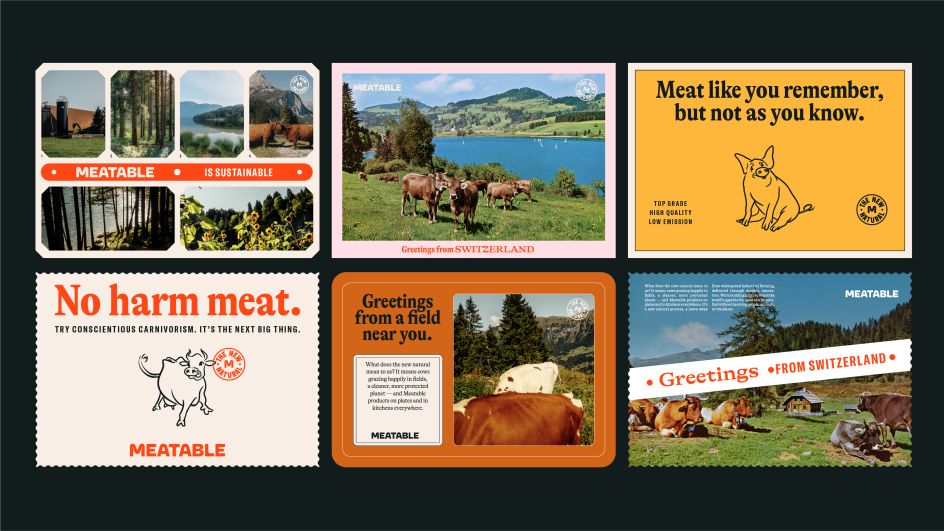
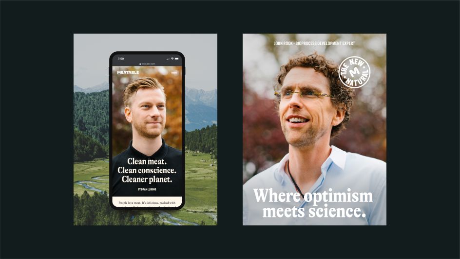
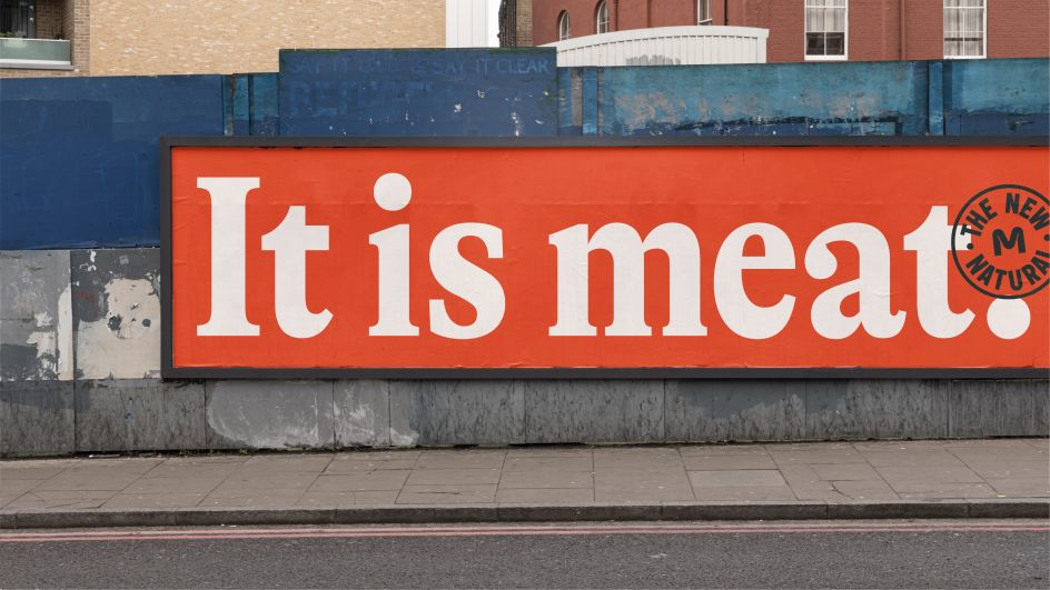
Koto paired this language with a characterful typeface inspired by the long-form advertising of the 1960s. "This style of communication felt in line with our strategy, as it's clear and frank, and could give us a great medium to talk about the considerable benefits of Meatable," says Arthur. "The graphic language has the inherent honesty we wanted to portray through our visuals and copy."
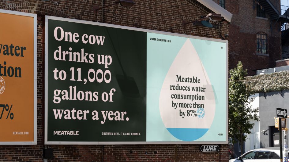
Colour-wise, the bold red is supported by a natural-feeling palette selected from breeds of farm animals. Koto paired the new wordmark with a stamp that acts as a sign of authenticity and quality. It also developed a distinctive infographic style that enables Meatable's team to communicate the benefits of cultivated meat in visually arresting ways.
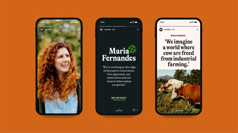
Koto was also in charge of a photoshoot with Meatable's team. "It gave us a place to celebrate the people behind the passion," says Arthur. "We used the art direction principles to portray in a natural and honest way the impact of Meatable on both the planet and animals."
Editor's Picks


Trending


Podcasts


Editor's Picks
Further Reading