Top 10 Times New Roman alternatives for designers
Bored of using Times New Roman and seeking a new typeface for your editorial design projects? Check out these options.
 for [Collin Coffee](https://pangrampangram.com/blogs/font-in-use/collin-coffee)](https://www.creativeboom.com/upload/articles/d7/d70c13e4a0489c3b0ba22e9bab63d4f1ecc385c0_1280.jpg)
Editorial New by Mathieu Desjardins, Francesca Bolognini, as used by Reesaw for Collin Coffee
Times New Roman is one of the most popular and established fonts for editorial typesetting, especially in print newspapers. But by that very token, this serif workhorse can feel a little overused and predictable. Designers hoping to turn heads may be looking for a Times New Roman alternative that provides the same level of authority and legibility while providing a fresher look and feel.
After all, while it has 'new' in the title, Times New Roman is not really that new. It was commissioned in 1931 after typographer Stanley Morison wrote an article criticising the London newspaper for being badly printed and typographically "behind the times".
The new design was supervised by Morison but was actually drawn by Victor Lardent, an artist from the paper's advertising department. Morison used an older typeface, Plantin, as the basis for his design but made revisions for legibility and economy of space and also took inspiration from Perpetua and Baskerville.
Across the nine decades since, Times has been hugely popular worldwide, from newspapers to desktop publishing software. That ubiquity is partly due to its supreme versatility and readability but also because it is a standard font on most computers and digital printers. Most notably, it was the default font in Microsoft Word for many years.
Looking to put a new visual twist on an old favourite? Then check out our pick of the ten best Times Roman alternatives available today.
1. Teodor by Martin Vácha
Teodor is a serif typeface with a classicist feel. Characterised by high contrast and vertical weight stress, it takes a calligraphic approach to terminals and works well with its sibling families Tobias and Reckless. This font family has several similarities with Romana, Caslon 224, Grouch and Perpetua. It comes in eight weights, 16 styles and supports 34 languages.
2. Photina by José Mendoza y Almeida
Designed by Jose Mendoza y Almeida in 1971 and published by Monotype, Photina was created specifically for phototypesetting, the technology that preceded digital and laser typesetting. Its high typographic quality, robustness and refined detail make it a good choice for body text in magazines and books. Photina comes in eight styles and supports up to 81 different languages.
3. Editorial New by Mathieu Desjardins, Francesca Bolognini
Designed by Mathieu Desjardins and Francesca Bolognini, Editorial New is a precise and elegant narrow serif designed for long-form copy. Legible yet far from bland, this family will give your design a mid-90s retro feel while being rich and contemporary. In that light, it would suit the fashion industry in brands or magazines. It comes in 16 styles with 463 glyphs each, including italics, and supports 38 languages.
 for [Collin Coffee](https://pangrampangram.com/blogs/font-in-use/collin-coffee)](https://www.creativeboom.com/upload/articles/8f/8f784448171aa5e5c9b80e2a93bbee4bd31ee69e_944.jpg)
Editorial New by Mathieu Desjardins, Francesca Bolognini, as used by Reesaw for Collin Coffee
4. Arno by Robert Slimbach
Designed by Adobe's Robert Slimbach, Arno is inspired by early Venetian and Aldine book typefaces. It includes such typographic niceties as five optical size ranges, extensive swash italic sets, and small capitals for all covered languages. A multi-featured OpenType family, Arno also offers wide-ranging pan-European language support, including Cyrillic and polytonic Greek.
5. Monticello by Matthew Carter
Published by Linotype, Monticello is a transitional serif font with an astounding heritage: its origins traced back to America's first successful type foundry, established in 1796. It was developed in its modern form by Chauncey H. Griffith in 1946. Its recent iteration by Matthew Carter in 2002 saw it fully updated for the internet age. Evoking a pioneer style of American typography, Monticello supports up to 78 different languages.
6. Tiempos by Kris Sowersby
Tiempos began life as an optimisation of Galaxie Copernicus (based on Plantin) for a Spanish newspaper redesign. It's since evolved to become its own standalone family: a modern serif for editorial use. Tiempos Text is robust, legible and clear, making it perfect for economic typesetting. Tiempos Headline is designed for larger headline sizes, striking a balance between practicality and elegance. Tiempos Fine, meanwhile, keeps the proportions and letter fit of Tiempos Headline and intensifies the interplay between warm curves and sharp details.
 for [Fimeb](https://klim.co.nz/in-use/fimeb/)](https://www.creativeboom.com/upload/articles/27/27a14be717c4d359371b9bd393fadb12444f979d_944.jpg)
Tiempos by Kris Sowersby, as used by Bureau Nuits for Fimeb
7. Stanley by Ludovic Balland
Inspired by Times New Roman, Stanley was designed by Ludovic Balland in 2013. It's characterised by sharp and angular shapes, giving it a contemporary look while preserving the essential qualities of its reference. With wide and honed counter-forms, along with short ascenders and descenders, it provides excellent legibility and incredible sharpness at very small sizes, while the graphic shape of the serifs gives it a distinctive look.
8. Lusitana by Ana Paula Megda
A free and open-source Google Font, Lusitana is inspired by the type found in the 1572 first edition of The Lusiads, a Portuguese epic poem by Luís Vaz de Camões. This typeface was designed by Ana Paula Megda and is ideal for long text passages in small sizes.
9. Victor Serif by Christian Jansky
Released in 2019, Victor Serif is a workhorse serif from Kometa that pays homage to Times New Roman. This no-frills take on the transitional genre walks a thin line between display and text settings while benefitting from a clear lack of pretension. Victor Serif comes in 16 styles and with support for 45 languages.
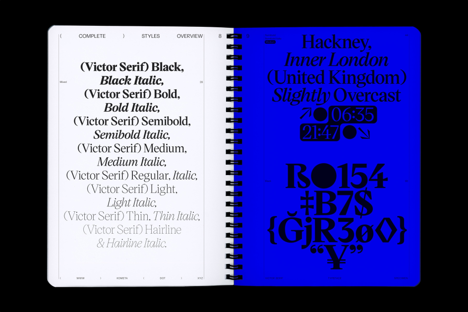
Victor Serif by Christian Jansky
10. Times by Stanley Morrison
Finally, if you're looking for a Times New Roman alternative, have you considered Times? As you might assume, this isn't the typeface Times New Roman replaced, but a more recent, digitised offshoot published by Linotype. Times and Times New Roman look very similar at first glance, but at large sizes, the subtle differences reveal themselves, including thinner serifs, blunted terminals, longer dashes and tighter spaces. There are also small differences in individual letters, such as a rounded ear on the g. Times supports up to 81 different languages.


 using <a href="https://www.ohnotype.co/fonts/obviously" target="_blank">Obviously</a> by Oh No Type Co., Art Director, Brand & Creative—Spotify](https://www.creativeboom.com/upload/articles/6e/6ed31eddc26fa563f213fc76d6993dab9231ffe4_732.jpg)
. In use by [Garbett](https://garbett.com.au/) for Career Trackers](https://www.creativeboom.com/upload/articles/0f/0f4e193ba9164073646e67421eb37b4b26986c67_732.png)