All images courtesy of Google Fonts
Free fonts are great, and there are thousands on the web to choose from. The problem is, though, most of them can be a bit overused or underwhelming. So how can you save money on type while still getting the high quality you'd expect from a paid-for asset? Two words: Google Fonts.
First launched in 2010, Google Fonts is a repository for open-source typography projects, and they're typically very high quality. They're also totally free, with no strings attached. For instance, there are no donation buttons, so you won't get spammed with requests to buy a fuller version.
Furthermore, you can use Google Fonts in both personal and commercial projects. You can modify them without seeking permission and use them in logo designs for clients and in any product you're selling.
Technically, Google Fonts is also very easy to use online. Rather than messing around with multiple font files, you can use the Google Fonts CSS API to embed the fonts directly on your website. And they're lightweight and compressed, so they'll load nice and quickly.
How to choose
So how do you choose the best Google Font for your project? First, you'll need to check if it's suitable for the design elements you're using. Some fonts, for example, suit normal-sized body text but not large headlines, and vice-versa. You'll also want to know that the font family contains all the features you need. For example, is the font available in a sufficient range of weights and styles? Do you require multiple language support, numbers, fractions, etc.?
You'll also need to consider legibility: it's worth, for example, comparing the O and 0, l and 1, to see how distinguishable they are. And if you need lots of design flexibility, are there multiple widths and optical sizes (different versions of a typeface intended to be used at different sizes), or is the typeface available as a variable font?
With all that in mind, here are our pick of 20 great Google fonts to get started with. They're free and fast to download, with absolutely no commitment, so why not give them all try?
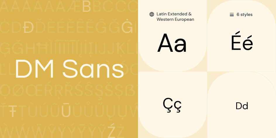
1. DM Sans by Colophon
DM Sans is a low-contrast geometric sans serif design intended for use in smaller text sizes. It was designed by Colophon as an evolution of the Latin portion of ITF Poppins by Jonny Pinhorn. It supports a Latin Extended glyph set, enabling typesetting for English and other Western European languages.
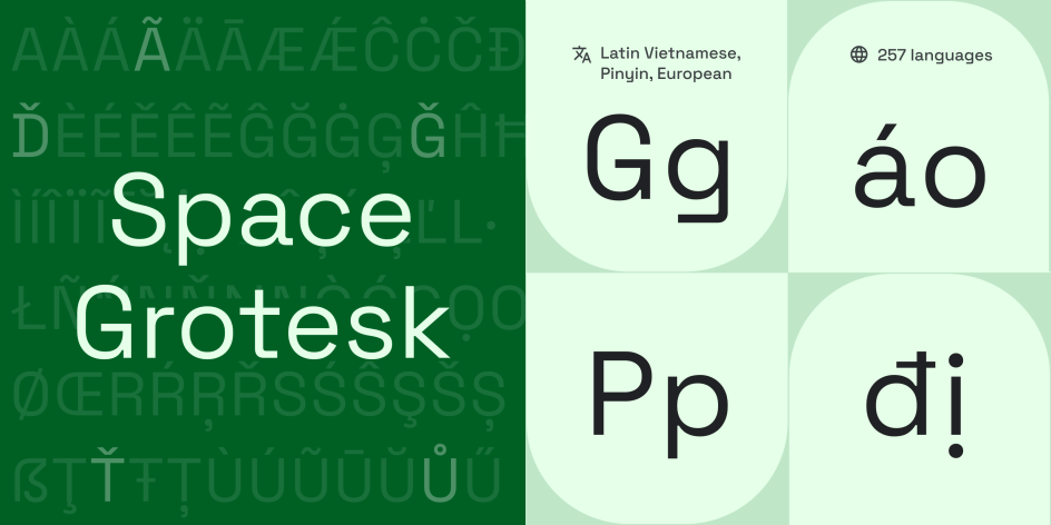
2. Space Grotesk by Florian Karsten
Space Grotesk is a proportional sans-serif based on Colophon's fixed-width Space Mono family (2016). Originally designed by Florian Karsten in 2018, it retains the monospace's idiosyncratic details while optimising for improved readability at non-display sizes.
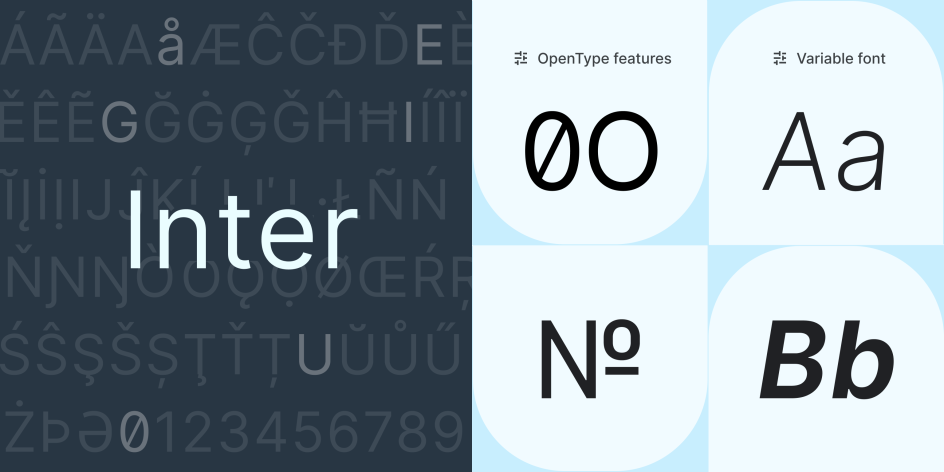
3. Inter by Rasmus Andersson
Led by Swedish software designer Rasmus Andersson, Inter is a variable font designed for computer screens, featuring a tall x-height to aid in the readability of mixed-case and lower-case text. It also includes several OpenType features, including tabular numbers, contextual alternates that adjust punctuation depending on the shape of surrounding glyphs, and a slashed zero for when you need to disambiguate zero from the letter O.
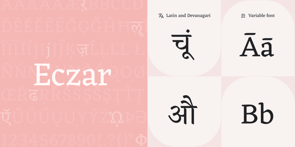
4. Eczar by Vaibhav Singh
Eczar is designed to bring liveliness and vigour to multi-script typesetting in Latin and Devanagari. Providing a strong mix of personality and performance, both at text sizes and in display settings, this font family offers a wide expressive range. The display qualities of the design intensify with a corresponding increase in weight, making the heaviest weights best suited for headlines and display purposes.
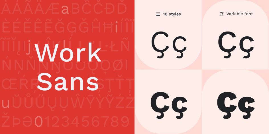
5. Work Sans by Wei Huang
Based loosely on early Grotesques, such as those by Stephenson Blake, Miller and Richard, and Bauerschen Giesserei, Work Sans is simplified and optimised for screen resolutions. For example, diacritic marks are larger than how they'd be in print. The regular weights are optimised for on-screen text usage at medium sizes (14-48px), while those closer to the extreme weights are more suitable for display use.
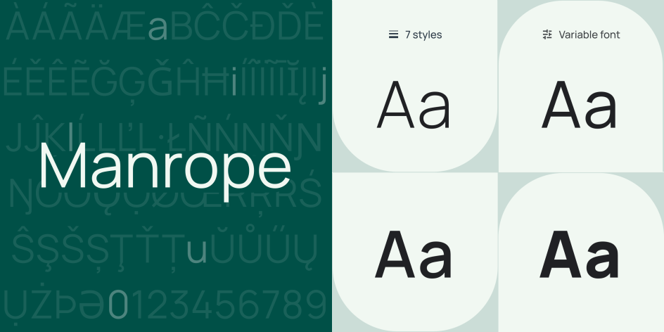
6. Manrope by Mikhail Sharanda and Mirko Velimirovic
In 2018, Mikhail Sharanda designed Manrope, an open-source modern sans-serif font family. A crossover of different font types, it's semi-condensed, semi-rounded, semi-geometric, semi-din and semi-grotesque. It employs minimal stoke thickness variations and a semi-closed aperture. In 2019, Mikhail collaborated with Mirko Velimirovic to convert it into a variable font.
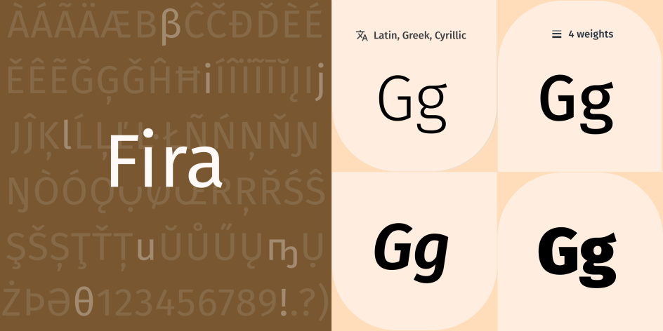
7. Fira by Carrois
Led by Berlin type foundry Carrois, Fira is designed to integrate with the character of Mozilla's FirefoxOS. More broadly, this typeface family aims to cover the legibility needs of a large range of handsets varying in screen quality and rendering. It comes in three widths, all accompanied by italic styles, and includes a Mono Spaced variant.
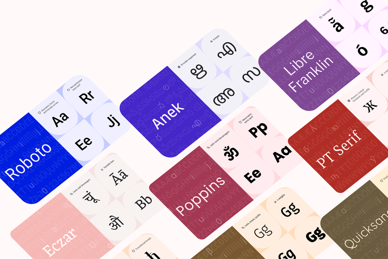
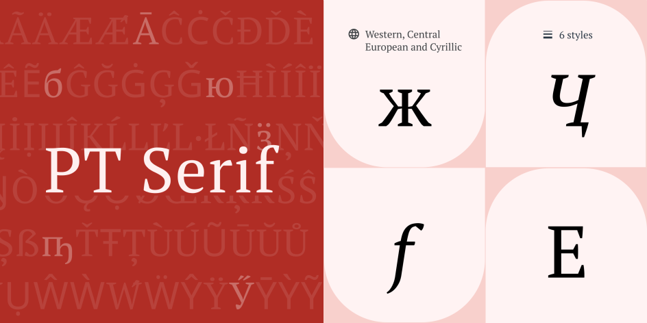
8. PT Serif by Alexandra Korolkova, Olga Umpeleva and Vladimir Yefimov
Released by ParaType in 2010, PT Serif is a pan-Cyrillic font family. A transitional serif typeface with humanistic terminals, it's designed for use together with PT Sans and is harmonised across metrics, proportions, weights and design. Regular and bold weights with corresponding italics form a standard font family for body text. Meanwhile, two caption styles in regular and italic are for use in small point sizes.
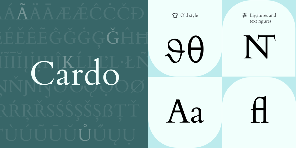
9. Cardo by David Perry
Cardo is a large Unicode font specifically designed for the needs of classicists, Biblical scholars, medievalists, and linguists. It also works well for general typesetting in projects seeking an 'old-world' look. Its large character set supports many modern languages, as well as those required by scholars. The font set includes ligatures, old-style numerals, true small capitals and a variety of punctuation and space characters.
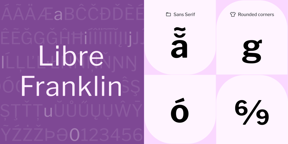
10. Libre Franklin by Pablo Impallari
Led by Argentinian type foundry Impallari Type, Libre Franklin is an interpretation and expansion of the classic Franklin Gothic typeface by Morris Fuller Benton. This versatile sans-serif is good for use in body text and headlines, and its characters feature distinctive rounded corners that become apparent in large sizes.
11. Lora by Cyreal
A contemporary font with roots in calligraphy, Lora is well suited for use in body text. Characterised by moderate contrast, brushed curves and driving serifs, it effortlessly conveys the mood of a modern-day story or art essay. Optimised for screens, it also works well in print, and it has been updated to a variable font since 2019.

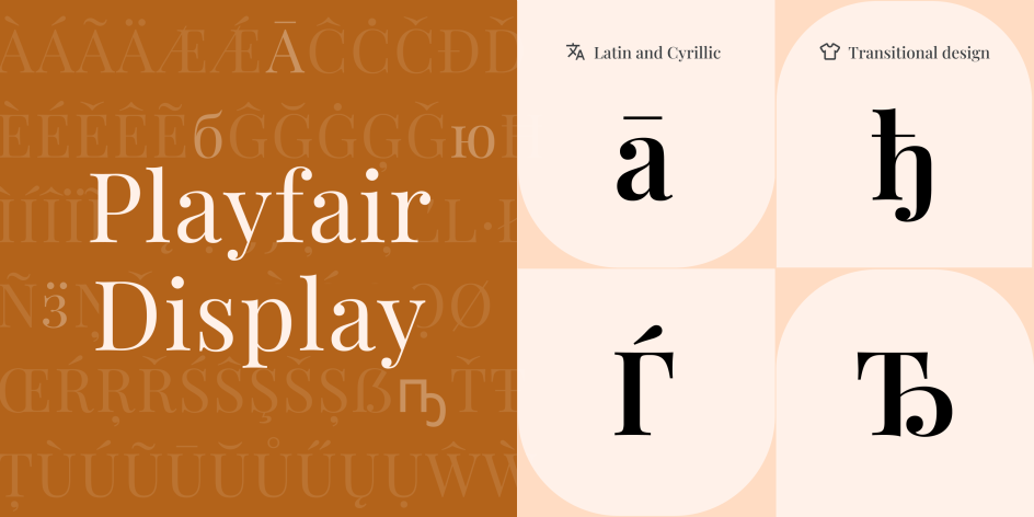
12. Playfair Display by Claus Eggers Sørensen
Inspired by the lettering of John Baskerville and 'Scotch Roman' designs of the late 18th century, Playfair is a transitional display font with high contrast and delicate hairlines. Suitable for use in large sizes, it works well accompanied by Georgia for body text.
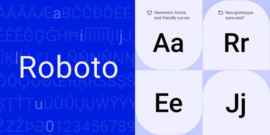
13. Roboto by Christian Robertson
Roboto is a neo-grotesque sans-serif typeface family originally developed by Google as the system font for its Android operating system. It has a mechanical skeleton, and the forms are largely geometric, featuring friendly and open curves. Providing a natural reading rhythm more commonly found in humanist and serif types, the regular family can be used alongside the Roboto Condensed family and the Roboto Slab family.
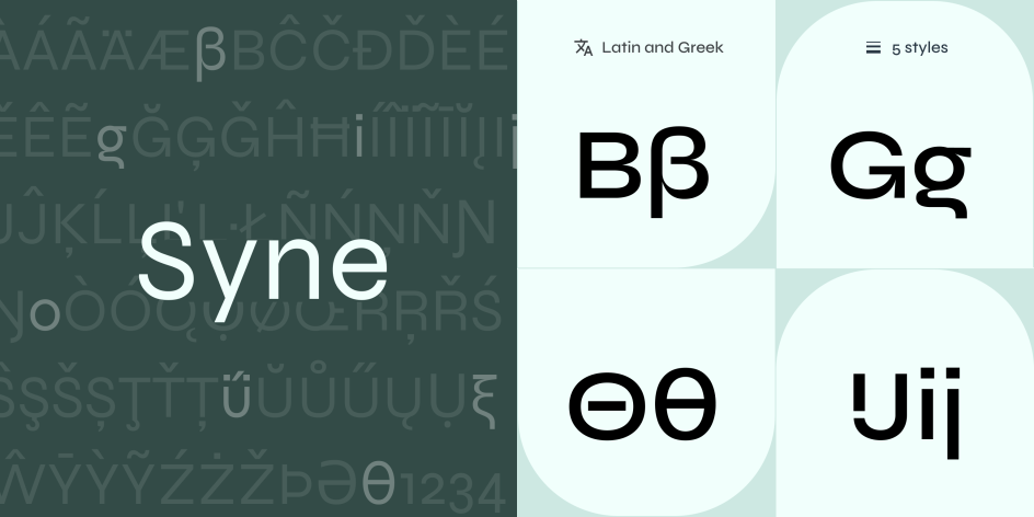
14. Syne by Bonjour Monde
Conceptualised by Bonjour Monde and designed by Lucas Descroix with the help of Arman Mohtadji, Syne was originally designed in 2017 for the Parisian art centre Synesthésies. It represents an exploration of atypical associations of weights and styles and is a good choice for anyone open to making radical graphic design choices. A Greek script designed by George Triantafyllakos was added in 2022.
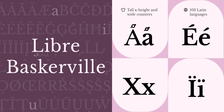
15. Libre Baskerville by Impallari Type
Libre Baskerville is a web font optimised for body text, typically 16px. It's based on American Type Founders' 1941 classic Baskerville but has a taller x-height, wider counters and a little less contrast, allowing it to work well for on-screen reading.
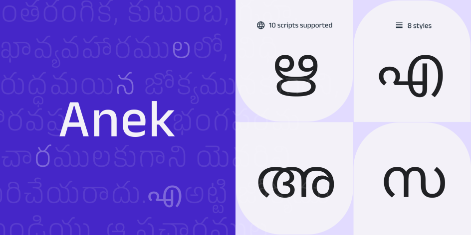
16. Anek by Ek Type
Anek is a new interpretation of India's letter traditions. At its most condensed, capsular forms keep structures compact, providing a graphic texture. At the wide end of the spectrum, the extra legroom lets each letter yawn and stretch into its message. And at the boldest weights, it's ideal for headlines and word marks. Anek comes in 10 scripts: Bangla, Devanagari, Kannada, Latin, Gujarati, Gurmukhi, Malayalam, Odia, Tamil and Telugu.
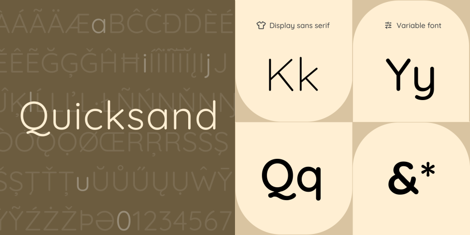
17. Quicksand by Andrew Paglinawan
Created by Andrew Paglinawan in 2008 using geometric shapes as a core foundation, Quicksand is a display sans serif with rounded terminals. It's best used for display purposes but remains legible enough to use in small sizes as well. In 2016, it was thoroughly revised by Thomas Jockin, and in 2019, Mirko Velimirovic converted it into a variable font.
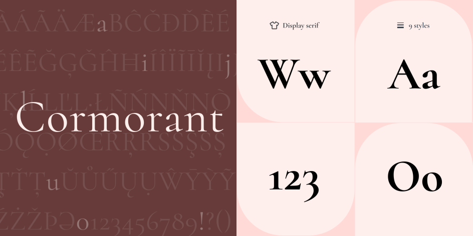
18. Cormorant by Christian Thalmann
Cormorant is a serif, display type family inspired by the 16th-century designs of Claude Garamont. It comprises a total of 45 font files spanning nine different visual styles and five weights. Cormorant is the standard version, Cormorant Garamond features larger counters, Cormorant Infant features a single-story a and g, Cormorant Unicase mixes lowercase and uppercase forms, and Cormorant Upright is an italic design.
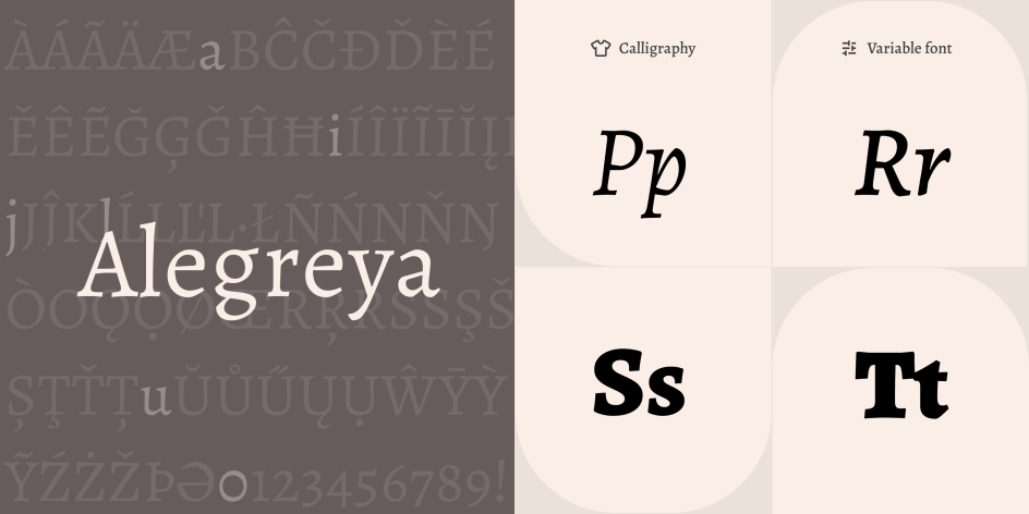
19. Alegreya by Juan Pablo del Peral, Huerta Tipográfica
Alegreya is a typeface designed for literature. It conveys a dynamic and varied rhythm which facilitates the reading of long texts and translates the spirit of calligraphic lettering into contemporary typographic language. This 'super family', which includes both serif and sans-serif families, provides for strong and harmonious text.
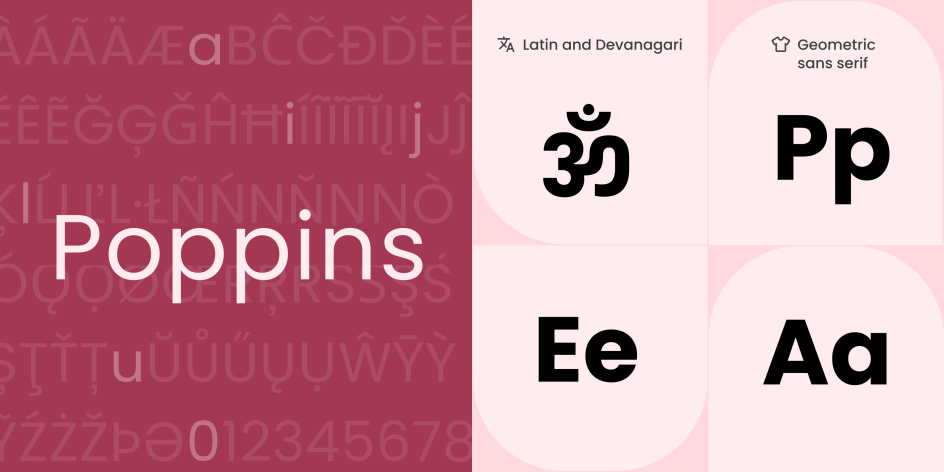
20. Poppins by Indian Type Foundry
Poppins is a geometric sans serif with support for the Devanagari and Latin writing systems. Many of the Latin glyphs, such as the ampersand, are more constructed and rationalist than is typical, while the Devanagari design is the first-ever typeface with a range of weights in this genre. Both are based on pure geometry, particularly circles. Each letterform is nearly monolinear, with optical corrections applied to stroke joints where necessary to maintain an even typographic colour.


](https://www.creativeboom.com/upload/articles/1c/1cab991e8d88486e914a9b9ea06c52d766621302_732.jpeg)
 using <a href="https://www.ohnotype.co/fonts/obviously" target="_blank">Obviously</a> by Oh No Type Co., Art Director, Brand & Creative—Spotify](https://www.creativeboom.com/upload/articles/6e/6ed31eddc26fa563f213fc76d6993dab9231ffe4_732.jpg)
](https://www.creativeboom.com/upload/articles/7a/7a527d53fefe4f354e8489365e89db422567f281_732.jpg)
 using GT Pressura](https://www.creativeboom.com/upload/articles/15/15bb446bc7e18a26703746b660313a843ed655e5_732.jpg)
](https://www.creativeboom.com/upload/articles/1b/1bafd6401df7c7b55c0632369cb360a7832e3014_732.jpg)