Danish icon Tuborg is made relevant again thanks to a community-driven rebrand
Leeds-based design agency Robot Food has breathed new life into iconic Danish beer brand Tuborg with an identity that emphasises community and its consumers.

The new identity reaches out into the world beyond the product itself
How do you create an updated identity for an already iconic brand with a long history and perfectly serviceable existing graphics? That was the challenge facing Robot Food, a Leeds-based design agency that won the pitch to rebrand the Danish beer brand Tuborg.
After winning the contract in 2020, Robot Food was briefed on making Tuborg more relevant to Danes today. For Robot Food Managing Director David Timothy, this tied into the pitch they gave to the brewery. "I think we were in there because they wanted a new perspective on the brand," he explains. "Tuborg is a Danish cultural icon - it's more than just a beer brand."

The new brand appears on packaging and all other customer touchpoints
A refined wordmark is a shorthand for the whole approach to the rebrand
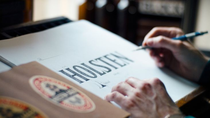
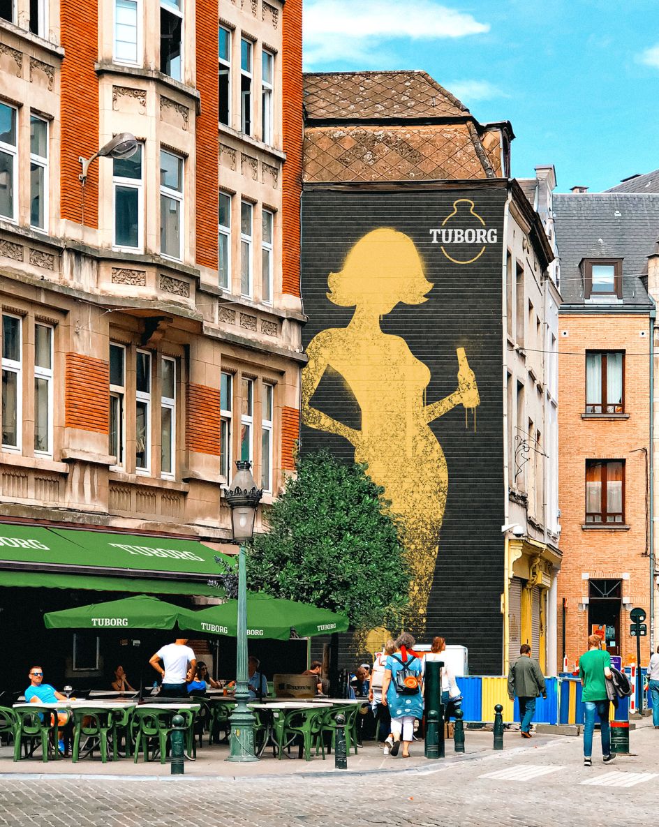
As part of the rebrand, Robot Food repositioned Tuborg as a "proud parent brand". This allowed Tuborg to place its 'clockman' device – a bauble-like circle motif – at the centre of the brand. This icon is well known throughout Denmark, so it makes sense to retain it and polish it up with a redrawn Tuborg wordmark courtesy of typographer Rob Clarke.
"By consistently applying these two assets, we created headroom to express the individuality and often the longstanding personality of each beer, whilst never losing the link to the parent brand," adds David.
A parent brand needs children, though, and that's just what Robot Food created. Tuborg's core range comprises four core beers (Grøn, Classic, Guld, and Nul) and two seasonals (Julebryg and Paskebryg), which were decked out in a fresh look. Robot Food also worked on designs for three new drinks: Nul Fruit, Grøn Organic, and Guld Passionfruit.
Making a brand look more relevant is all well and good, but in the world of business, it's inevitable that Tuborg wanted this new identity to lead to increased sales. Like many beer brands, Tuborg does not want to get left behind by the changing drinking habits of the younger generation. Whereas older generations used to enjoy a 'little and often' approach to drinking, drinkers aged 18-25 have an 'all or nothing' mentality.
Community is at the heart of the new Tuborg brand identity
The 'clockman' motif still has a place in the Tuborg brand
Robot Food hopes the carefully-balanced identity will help Tuborg to stand out while not alienating its existing customers. "Many new or potential new drinkers are coming to the category and either choosing not to drink at all or looking at alternatives. Tuborg, like other brands, was losing favour with that demographic," says David. "Drinking the beer your dad drinks can feel like the antithesis of cool."
Legacy brands like Tuborg also have to wrestle with existing assets. Often these are created with the best intentions over many years. However, the result can be a mish-mash of styles which need a refresh to make them more consistent, rather than an overhaul.
"There's a sense of classicism in Denmark: if you look at the fundamentals of things like furniture design, the style and aesthetic doesn't really change much over time," says Ben Brears, Robot Food Creative Director. "You do it once, do it well, then just polish it a little bit."
It was a similar story with Tuborg. Products and touchpoints needed some refinement, but the fundamentals of an effective brand were already in place. Robot Food, therefore, had to assess and deconstruct various design elements which already had varying degrees of resonance with consumers, boil them down into a kit of parts, and then promote what worked best.
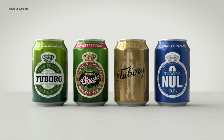
Tuborg has an existing customer base which it had to carefully balance in the new rebrand
Will younger generations with different drinking habits buy into the rebrand?
"A good redesign is often about understanding the assets you've already got and amplifying them in new ways," David adds. "Our job is to listen, learn, and understand just as much as it is to come up with interesting creative. That's when the relationship really works because the client trusts you to know where you can push it and where you have to rein it in."
"We were brought in to offer a fresh perspective and not be led by what they had before, but you've always got to be respectful," adds Ben. "A great client is open and listens to what you're saying and loves to be challenged, but who knows the consumer really well and helps you find that sweet spot.
"These changes might seem minimal for some, but it was never about throwing the baby out with the bath water. The assets and system we've been able to establish help set Tuborg up for a progressive future."
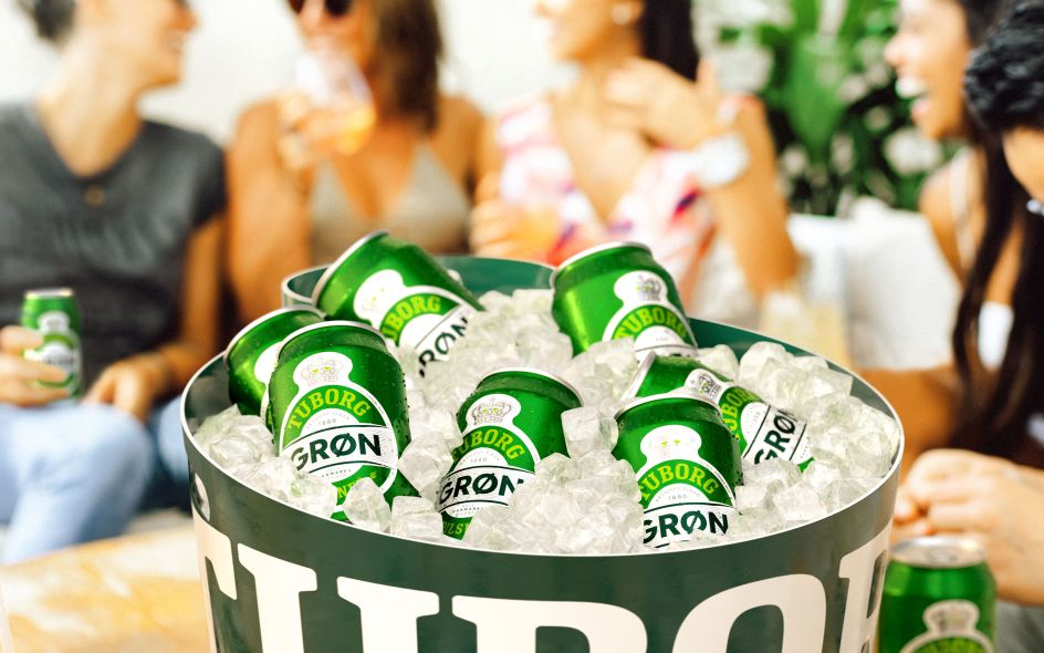
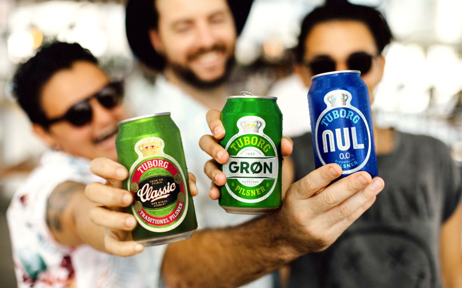
Spontaneous lifestyle shots are an important part of the identity

The clockman design can be simplified as a symbol for the entire Tuborg family
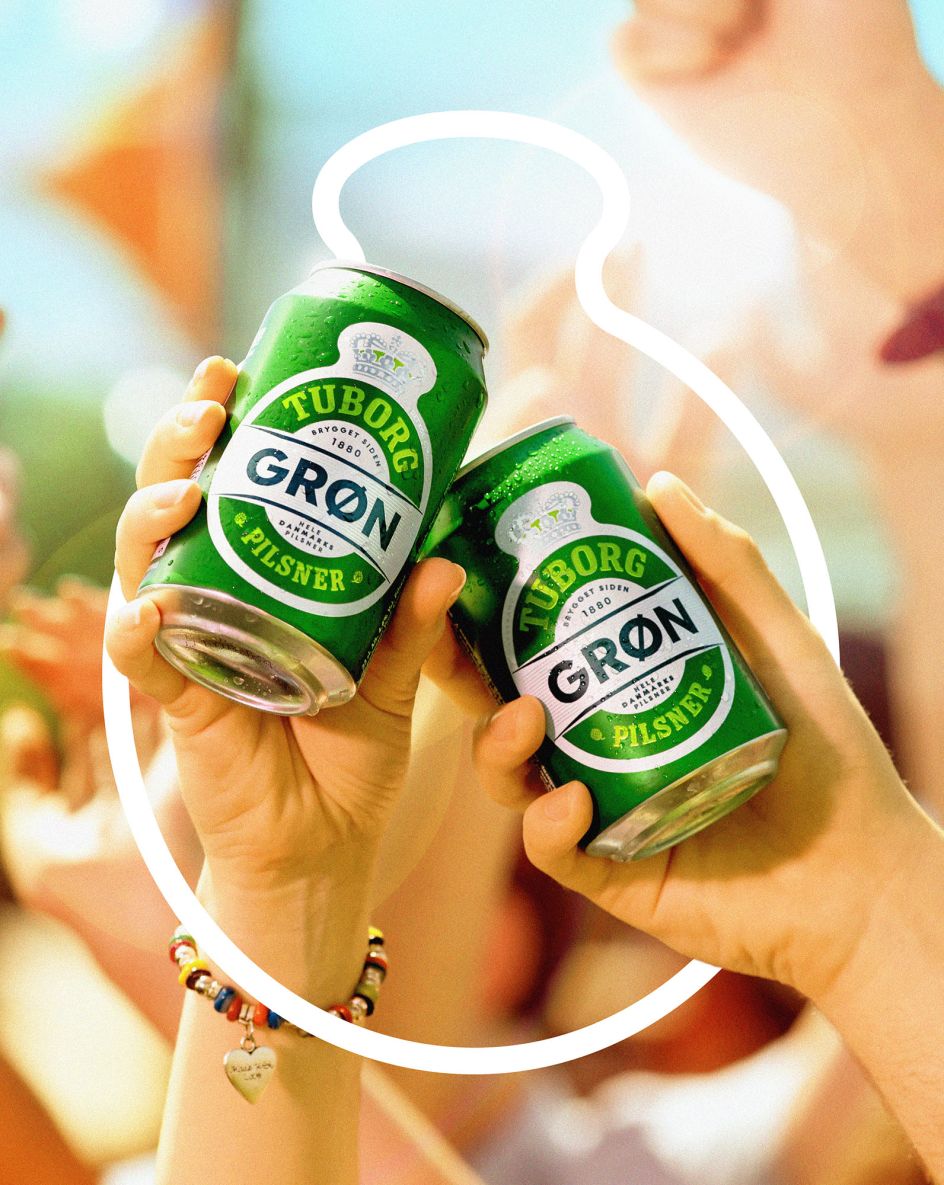
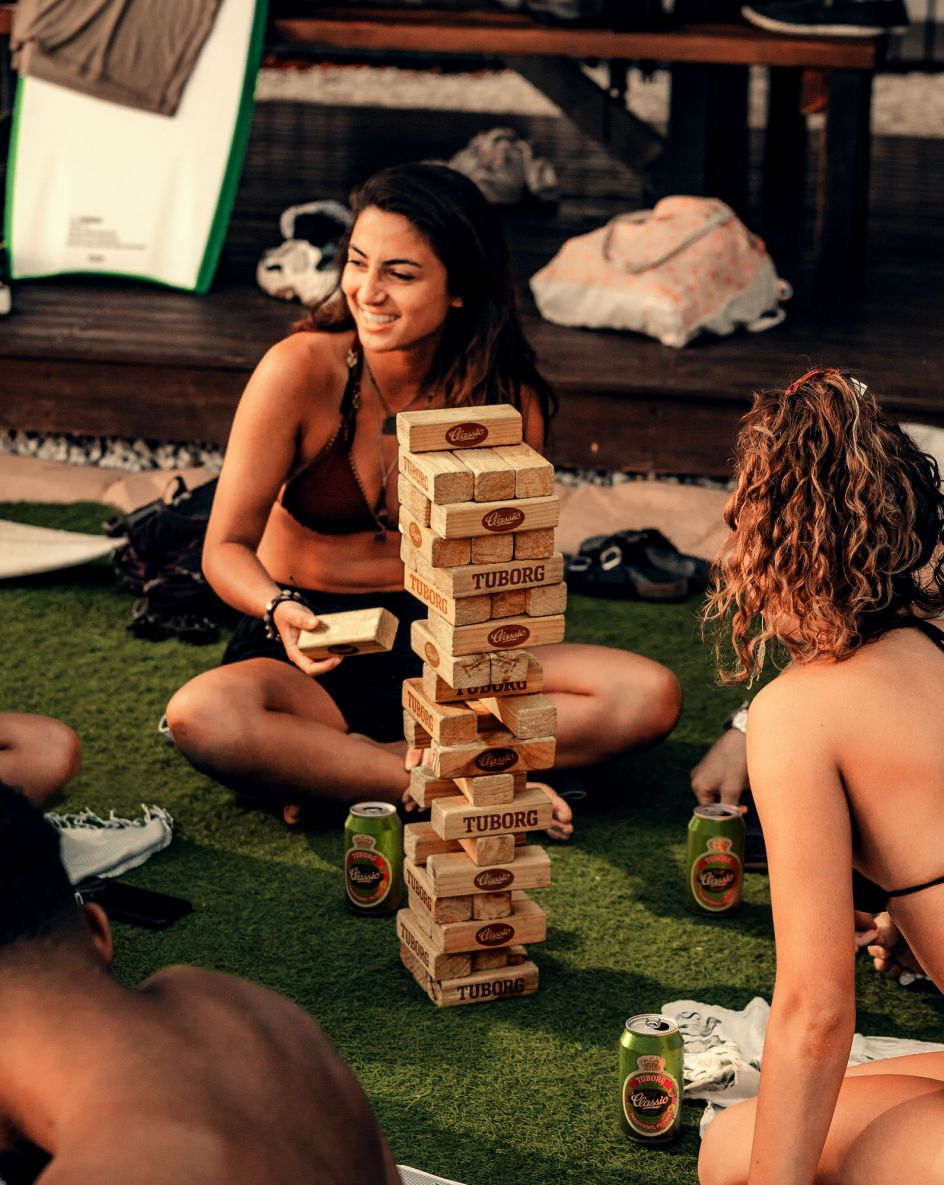
The brand's repositioning saw it adopt the idea of "fællesskab", or community, as its foundation. This concept manifests through imagery that places the consumer at the brand's heart. Photos of festival-goers enjoying a can of Tuborg beer are the perfect example of "fællesskab", and it's a spontaneous aesthetic that celebrates togetherness in a way that's unique to Tuborg.
The new designs are rolling out, but it already sounds like they've gone down well. Louise Dandanell, Marketing Manager at Tuborg Denmark, said: "The past two-ish years have been some of my best at Carlsberg.
"From the first pitch to where we are today, Robot Food's understanding of our local needs and vulnerabilities, dedication, craft, and (most importantly) sense of humour have made the process a joy. It's easy for us to be happy clients – every meeting is like spending time with family."

The sense of community the rebrand taps into is unique to Tuborg
Robot Food were careful not to throw the baby out with the bathwater in terms of existing design
The new Tuborg identity has already started rolling out into the real world
Editor's Picks


Trending


](https://www.creativeboom.com/upload/articles/90/908fdb6378db1e95d12595416f54e6336d5e80b8_732.jpg)
Podcasts


Editor's Picks
Further Reading