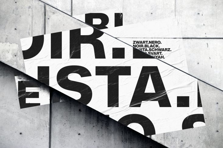
Monotype launches the redesign of the iconic Futura, the only font on the moon
Since its original design in 1927, Futura has given expression to the Bauhaus movement, has been to the moon and helped some of the world's most iconic brands "just do it" and "give you wings". It is the definitive Modern typeface and has defined geometric-sans for 90 years. The typeface was even famously used on a plaque left on the moon by NASA astronauts in 1969.
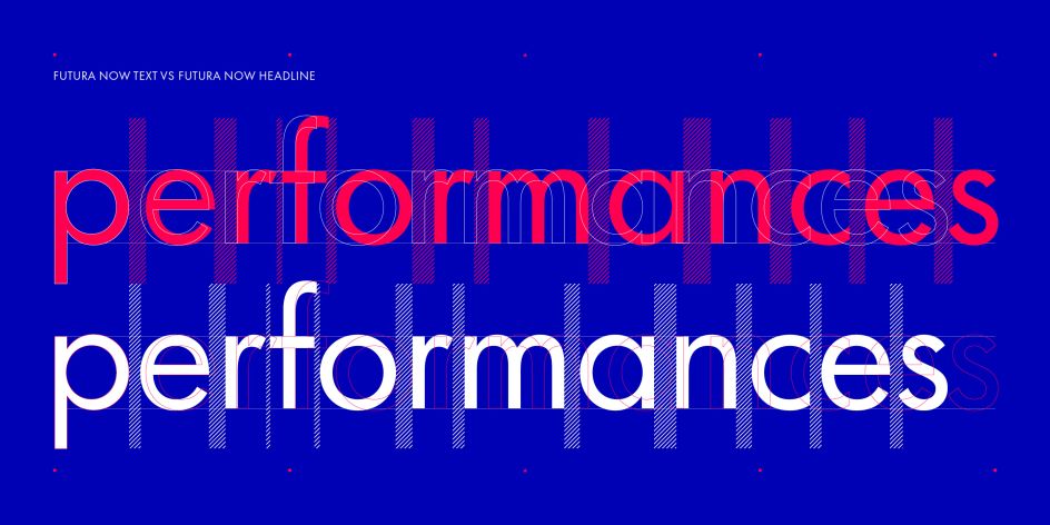
Today, it has been refreshed for the digital era with the launch of Futura Now – deemed as the definitive version of this iconic family, expanded by Monotype to "meet the demands of 'digital-first' campaigns, made for forward-thinking brands and publishers".
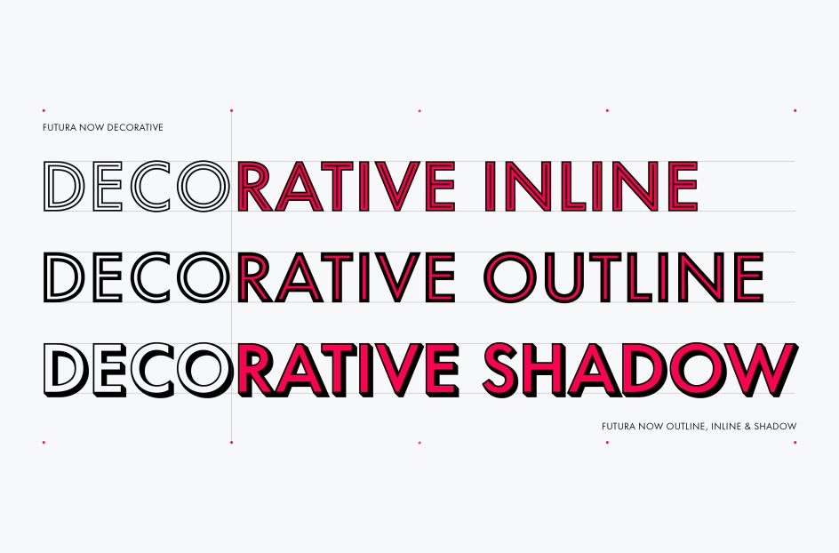
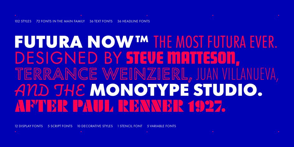
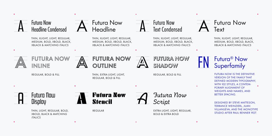
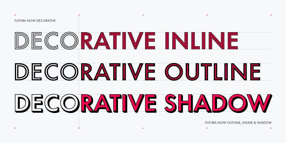
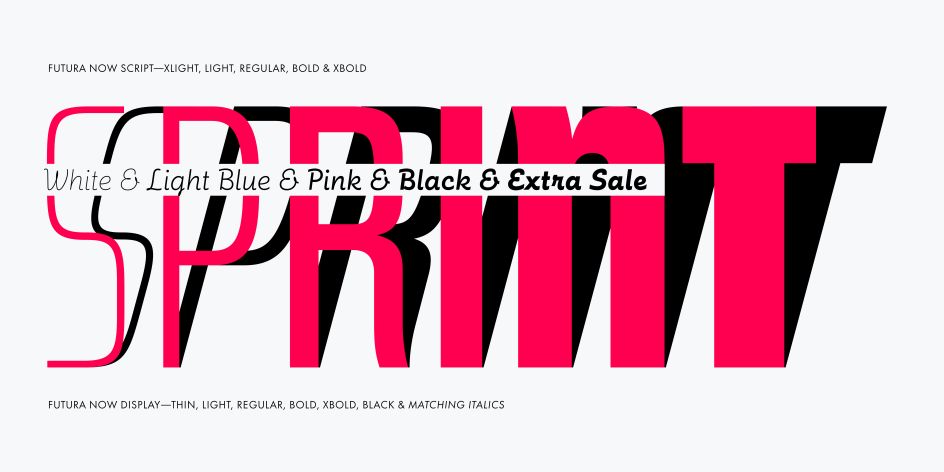
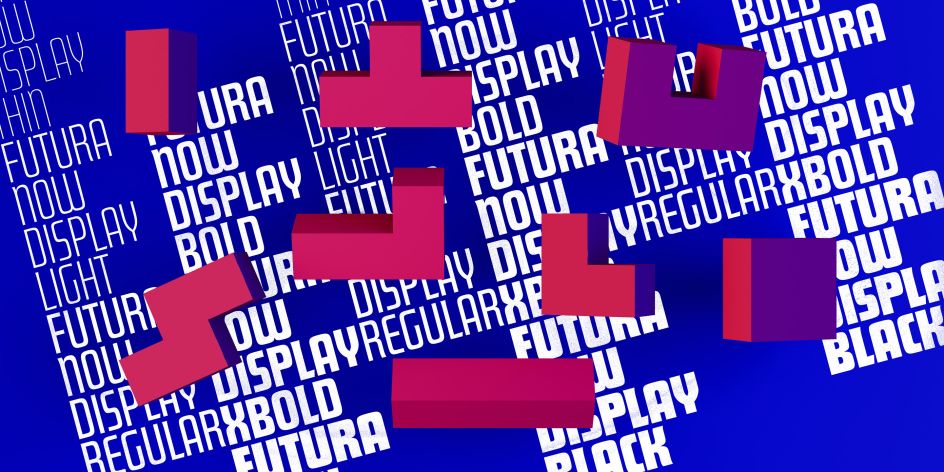
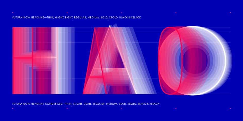
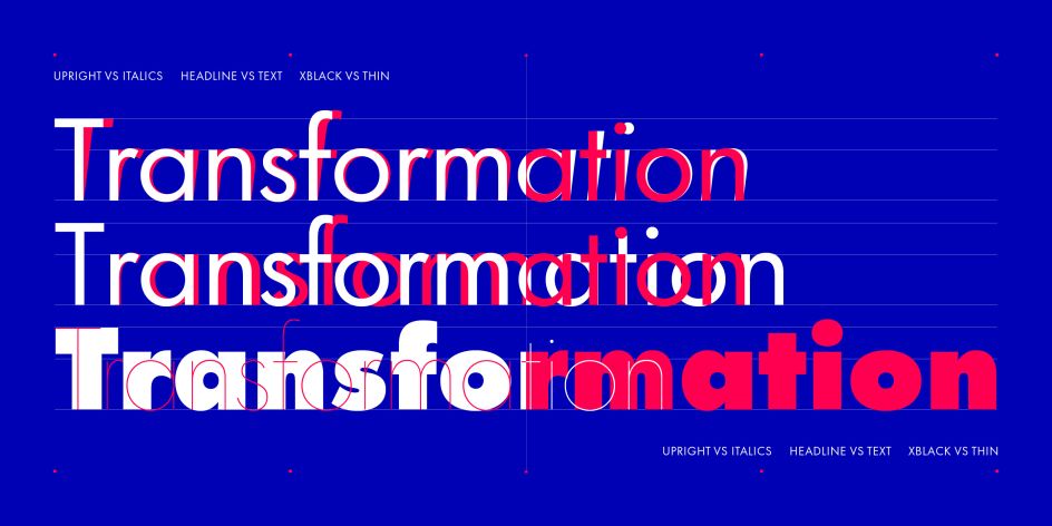
The fresh family of fonts retains the idea of Paul Renner's 1927 original but now has 102 styles, including generously-spaced text and closer-fitting headline subfamilies. "Its contemporary alignment of names and weights offers an improved user experience," says the foundry. And it's also available as a variable font, "delivering limitless styles in a tidy digital footprint".
The development of Futura Now was led by Steve Matteson, Juan Villaneuva, and Terrance Weinzierl. What makes Futura so iconic? "It's a great tool for teaching typography, type design, and type history," says Juan. "It's a masterclass for understanding how we perceive geometry in typographic forms. Although it's historically tied to Bauhaus aesthetics and modernist principles, its later adoption into the mainstream and all the various interpretations of it has made it less of 'the typeface of our time' – as Bauer Type Foundry called it – and more of a typeface of any time. It's an incredibly rich design to dive deep into as a student, professional, or anyone using type."
The trio delved deep into Futura's history to help with their research and development. "The process of digitising really starts by having a solid understanding of what I'm trying to digitise in the first place," explains Juan. "Before I started drawing, I collected and studied all previous versions of the typeface that I could find to get a better sense of how the design had evolved. In my research, I found that each version was different in both form and content. While I really enjoy the spirit from the 1978 version for Modern Publicity with all its alternate forms – especially the new ampersand – the actual eureka moment was finding an early specimen from the Letterform Archive.
"That specimen, in addition to showing the demibold we're used to seeing, also showed a book weight which I had never seen before! Having a clear image of what the design was when it was originally released was key to redrawing the glyphs, refining the spacing, expanding the weight range, and developing it as a variable font. Without that research, I don't think I could've done it justice."
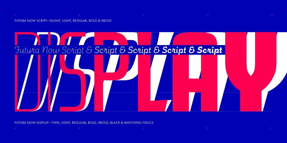
Were there any challenges to overcome? For the Futura Now Display sub-family – which is sort of a rectangular-based design in contrast to the main Futura family – there are many aspects which make the design feel a bit dated. Terrance Weinzierl added several alternative letter shapes to the family to address that. "The challenge for the script was that the quirks I had grown fond of as a graphic designer were actually artefacts from previous digitisations," adds Juan. "As a type designer, it was a challenge to excavate the forms and restore them while keeping the quirkiness and warmth that we're familiar with. It feels like I'm using Futura Script for the first time since it hasn't been properly digitised since its release in 1954."
Futura has certainly stood the test of time. But 90 years is a tough act to follow. Monotype hopes that by offering these fonts in Variable Font Format as well as the individual font weights they'll add many years to the longevity of Futura's legacy. "We hope that new graphic designers will see Futura Now as an opportunity to make their own mark with innovative typography – like the early Modernists all the way to people like Wes Anderson have," says the foundry.
"I'd love to see it in use by students of design or upcoming designers, mainly because a new generation can bring fresh eyes and a different perspective on typography," says Juan. "That said, more seasoned designers used to seeing Futura might be delighted at how it has improved and perhaps use it in a different way. I look forward to seeing all the ways that people use it."
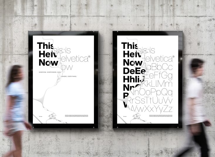
Futura Now consists of 102 styles, as well as a variable font, with over 600 characters, including 72 entirely new family members, and support for 89 languages. It's one of the biggest font refreshes since Monotype launched Helvetica Now. To find out more about Futura Now, visit monotype.com.
Editor's Picks


Trending


Podcasts


Editor's Picks
Further Reading

. In use by [Garbett](https://garbett.com.au/) for Career Trackers](https://www.creativeboom.com/upload/articles/0f/0f4e193ba9164073646e67421eb37b4b26986c67_732.png)