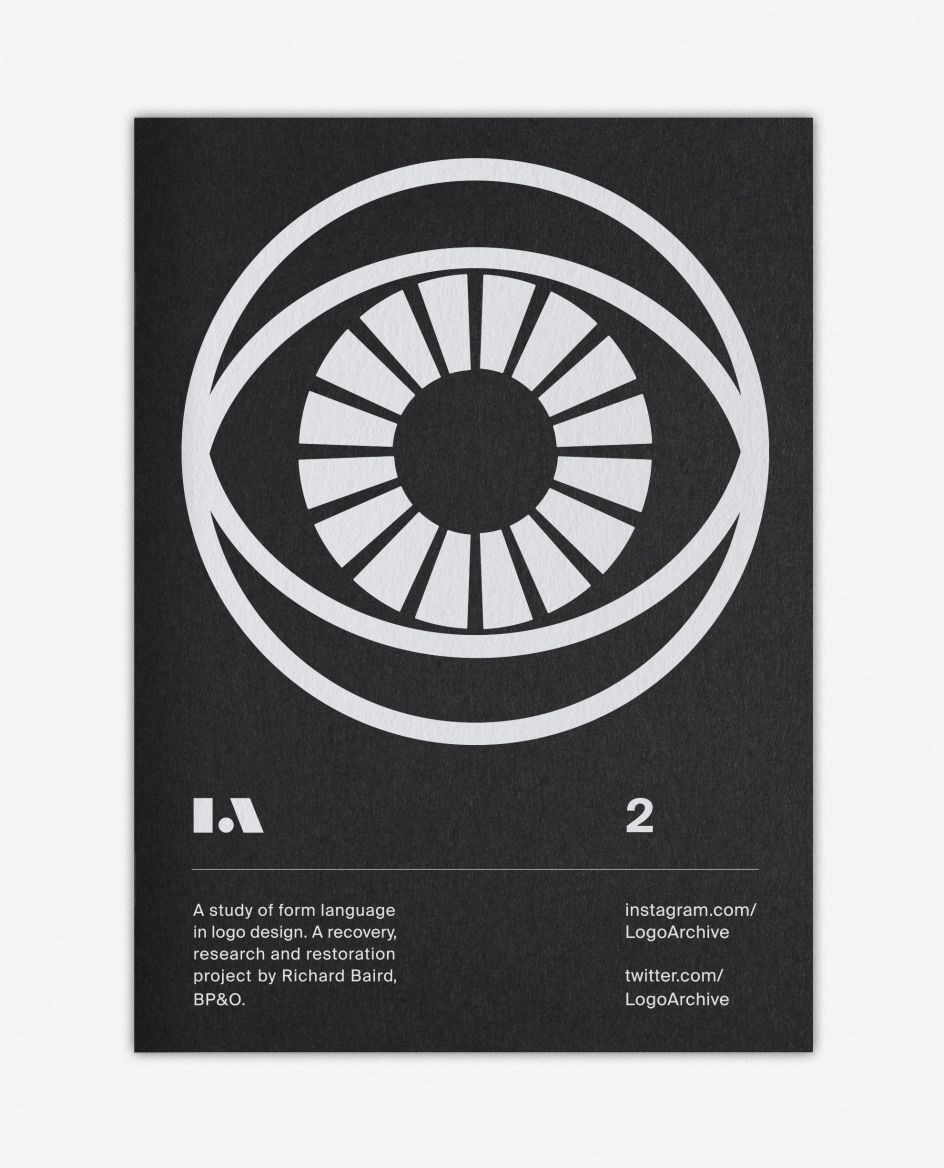
LogoArchive#2: Richard Baird again explores the form language of mid-century symbols
London-based freelance designer, writer and publisher Richard Baird has launched the second issue of LogoArchive, a zine that explores the form language of mid-century symbols and the potential it has to tell an ongoing story, share ideas and be reconfigured over time.
Building on his popular Instagram account LogoArchive – an extensive collection of mid-century symbols with a following of 126k – and inspired by a panel discussion on independent publishing the day before, Richard conceived, designed and sent LogoArchive Issue 1 to the printers in a day.
In the momentum of its design LogoArchive seeks a closer connection between the passion of its author and material object. Following a successful launch and sold-out first release, LogoArchive returns with Issue 2, which begins to reconfigure itself.
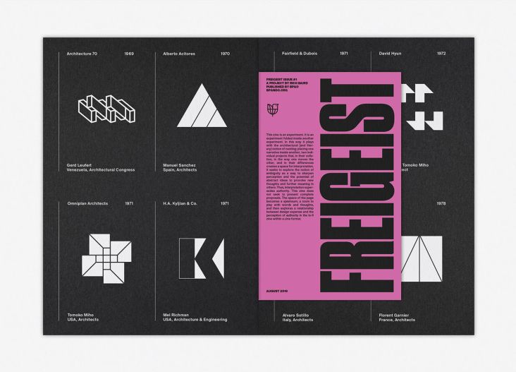
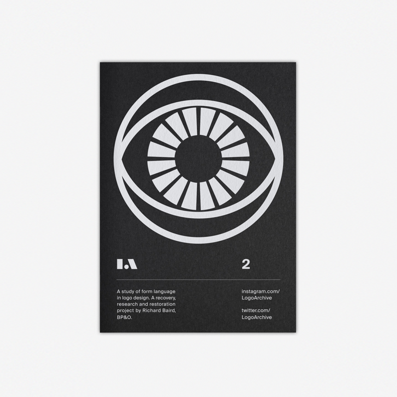
"LogoArchive is founded on an enthusiasm for a well-crafted symbol; a convivial metaphor, a communicative immediacy and smart use of form language," explains Baird. "However, in print, it was never conceived as an object with a singular intention; the simple documentation of symbols, rather a delivery mode in which to build a story and share thoughts.
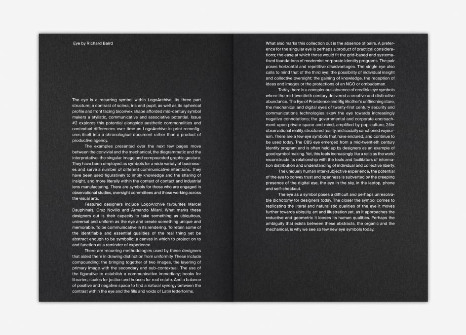
"A conversation on Twitter; digital dialogue lost in the passage of time but forever coded into the electronic aether, is materialised as ink on paper and written into the story and ongoing development of the zine. This sits alongside an anthropological text; a musing on the distinctive qualities of the human eye."
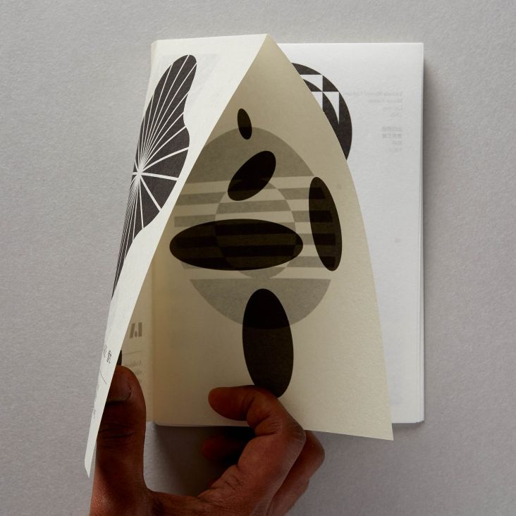
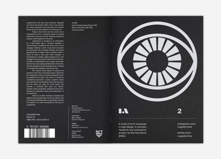
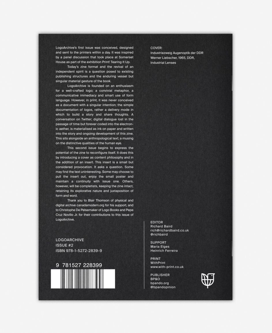
This second issue begins to express the potential of the zine to reconfigure itself. It does this by introducing a "cover as content philosophy" and in the addition of an insert. This insert is a small but considered provocation. It asks a question. Some may find the text uninteresting. Some may choose to pull the insert out–an act of destruction–enjoy the small poster and maintain a continuity with Issue 1. Others, however, will be completists, keeping the zine intact, retaining its explorative nature and juxtaposition of form and word.
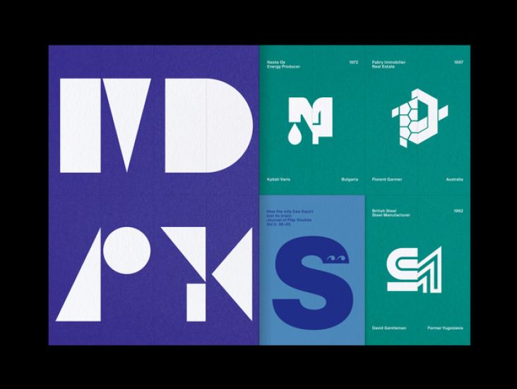
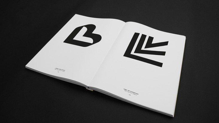
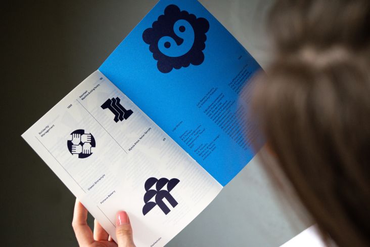
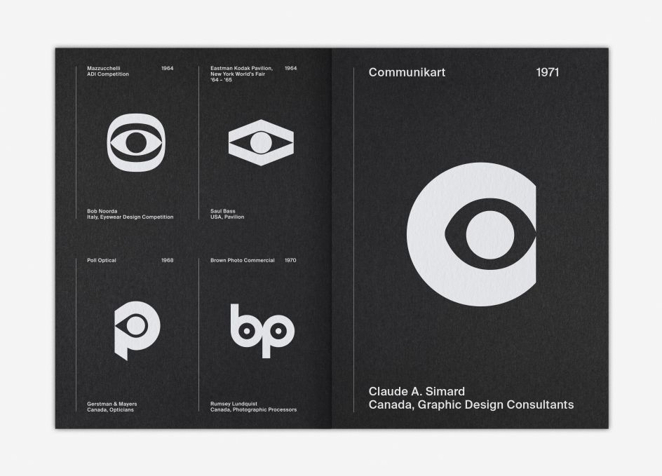
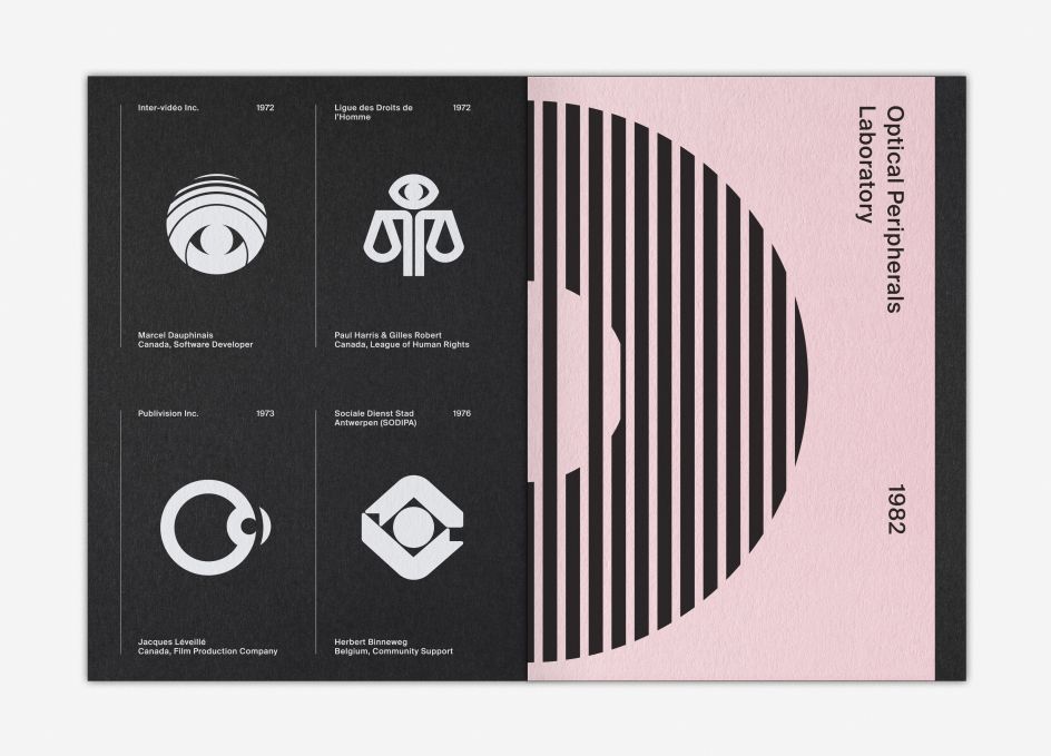
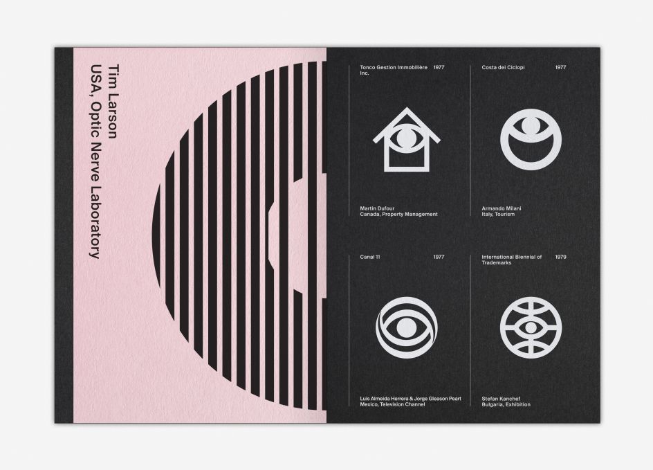
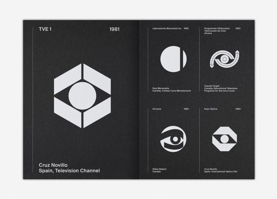
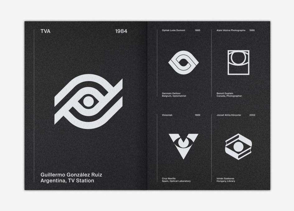
The zine is now arranged chronologically, but in the selection of 25 symbols, intends to use pairings to be playful or call out commonalities and differences in technique and context. This is augmented by an introductory design-focused article and a text on cooperative eye hypothesis.
You can grab a copy from today, over at Counter-Print.

Editor's Picks


Trending


Podcasts


Editor's Picks
Further Reading