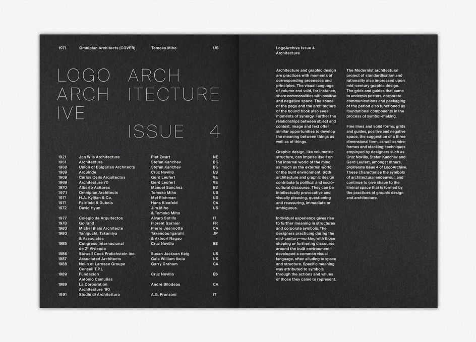
LogoArchive Issue 4 explores the liminal space between architecture and graphic design
LogoArchive is back with its fourth print release, this time dedicated to the symbols of architecture. What began on Instagram soon found its way to print.
"It was founded on an enthusiasm for a beautifully crafted symbol and smart use of form language," explains Richard Baird, the designer behind the project. "However, in print, it was never conceived as a booklet with just a singular intention; the simple documentation of symbols, rather, a way to tell a story and migrate thoughts and ideas outside of traditional publishing and distribution channels and expectations.
"LogoArchive explores the potential of the zine to reshape itself frequently over time. Alongside the presentation of mid-century symbols, each new issue features a different insert. These are surfaces for enquiry and self-criticism, typographical, spatial and material play and partial thoughts and proposals."
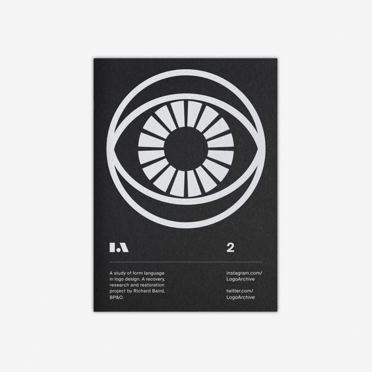
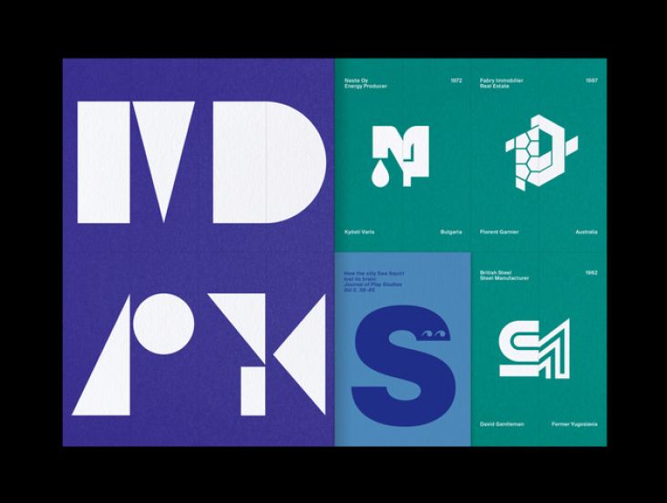
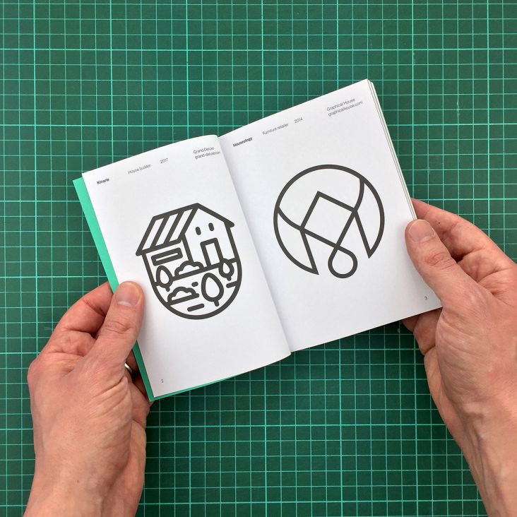
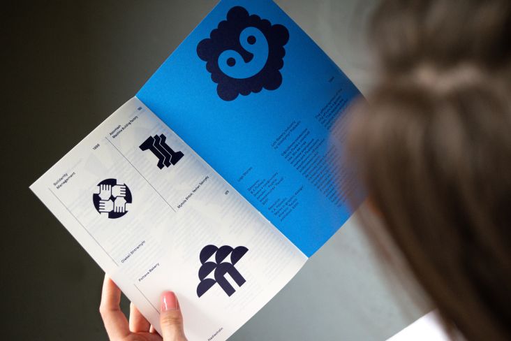
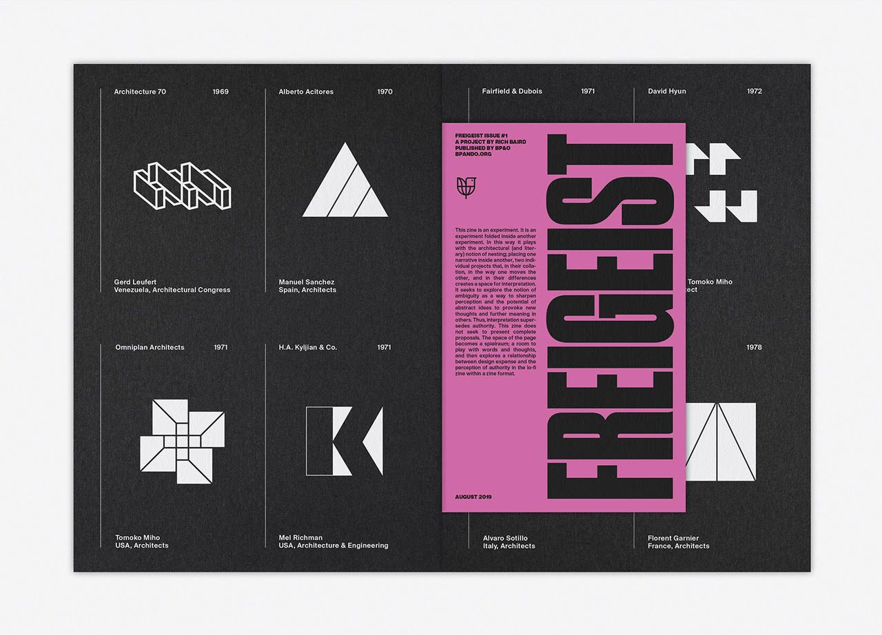
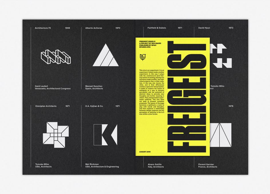
LogoArchive Issue 4 explores the symbols created for architects, architect magazines, events and unions. It also includes an additional zine within its pages, named Freigeist.
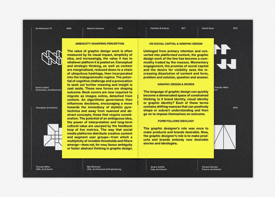
Baird explains: "Freigiest was a popular concept within 18th Century German literature and journalism. It was used to describe those who believed that thinking should not be constrained by traditional ideas, certain fundamental and non-contestable values as well as firmly established channels of distribution. The concept of the 'free spirit' and of free-thinking is also a reoccurring theme within Nietzsche’s philosophy.
"Although at first glance the Freigeist concept may appear lacking in complexity, however, Nietzsche found a philosophical significance within it. To him, it was more than an invocation towards individuality and the subversion of expectation but the search for and liberation of a spirit. Freigeist zine was produced in search of that spirit."
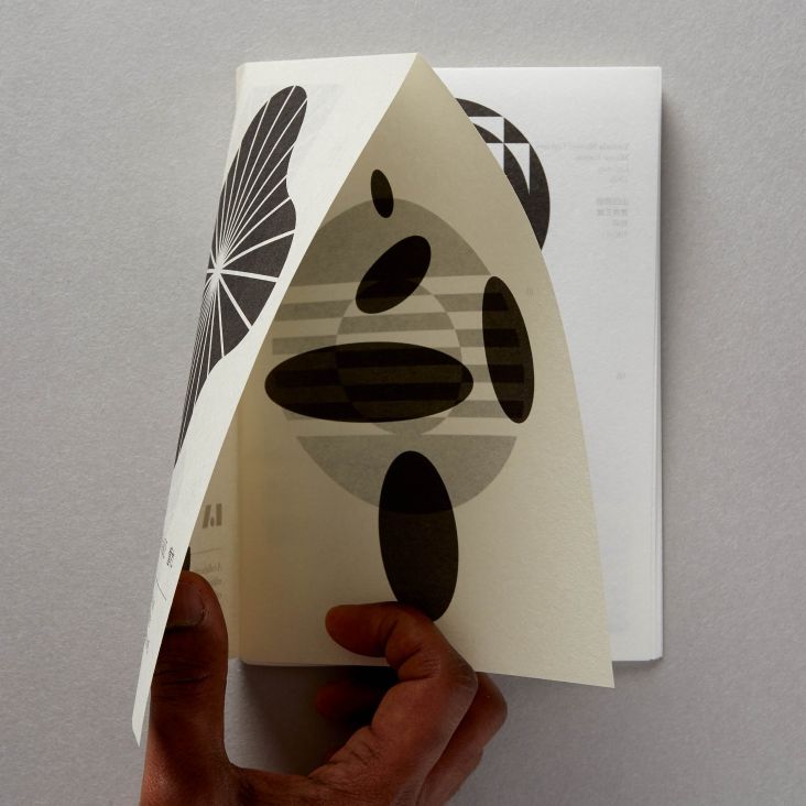
The design of Freigeist – its material colour, type and layout – is intentionally lo-fi, channelling the agency of self-published pamphlets of the past.
The special insert is available in three Colorplan coloured papers, randomly distributed. Each has its own concept and relevance within the broader LogoArchive project.
These include Factory Yellow; this channels the political pamphleteering of the past, maximum impact with minimum means. Pale Grey; a clear reference to the architectural theme of the main booklet. And Fuchsia Pink; a flight of visual fancy and an exploration of the potential for limited editions. Grab a copy over at Counter-Print.


](https://www.creativeboom.com/upload/articles/90/908fdb6378db1e95d12595416f54e6336d5e80b8_732.jpg)