Playful new issue of LogoArchive wants you to tear up its pages
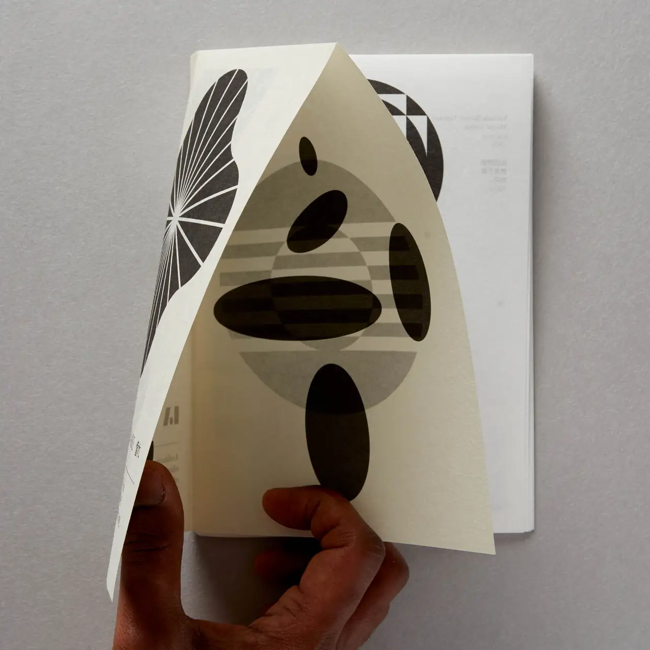
Designed by Studio Sutherl&'s Jim Sutherland, the latest issue of LogoArchive is an enquiry into how work and play influence graphic design. Featuring perforated pages that are designed to be ripped up, the zine promises to offer a new way of looking at old things.
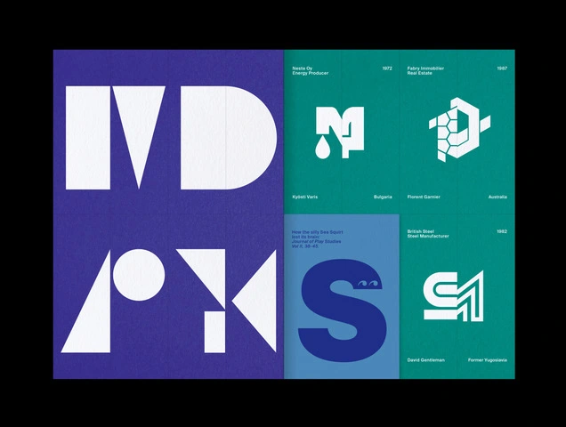
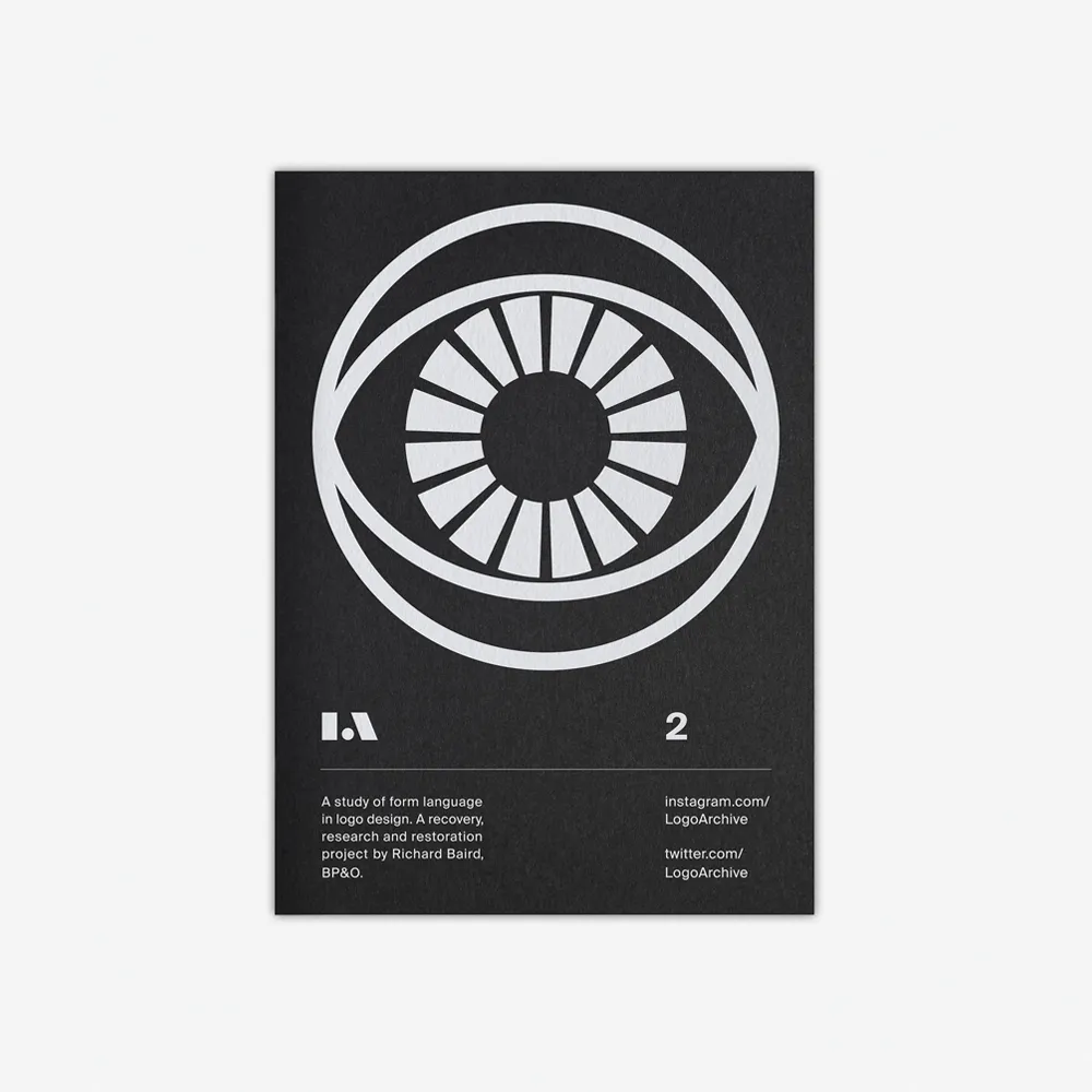
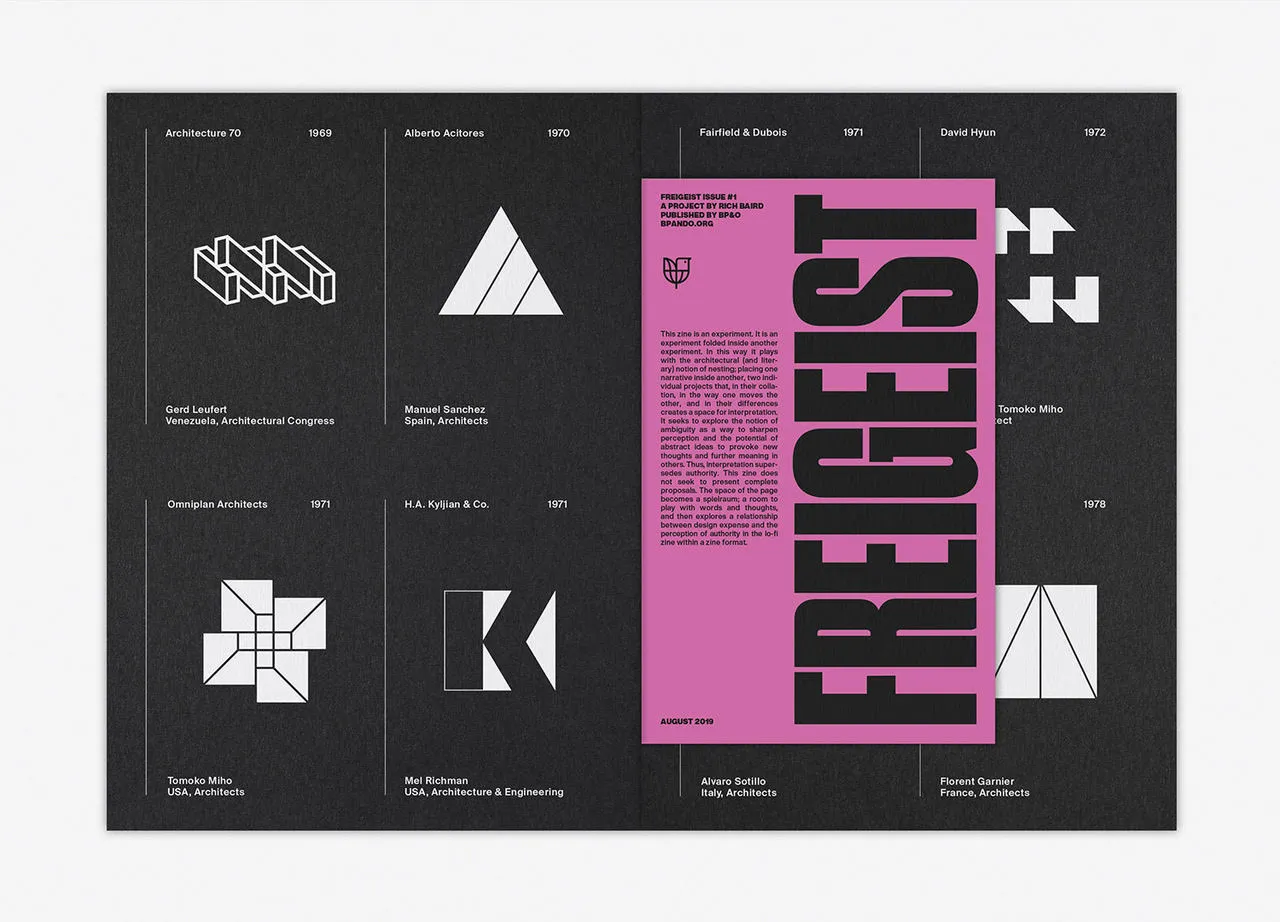
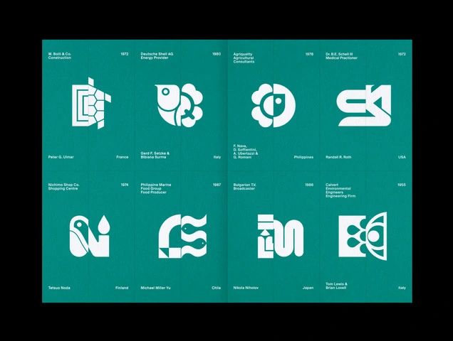
Popular among designers for its explorations of contemporary concerns and forgotten interests in design practice, LogoArchive is a series of light booklets that balance thoughtful texts with the appealing forms of modernist symbols. But for this extra issue, pLAy, editor Richard Baird decided it was time to add some levity to the series by working with Jim Sutherland.
"For me, Jim's work displays both play and purpose; he is also highly collaborative and experimental, and this felt like a perfect fit with LogoArchive," Richard tells Creative Boom.
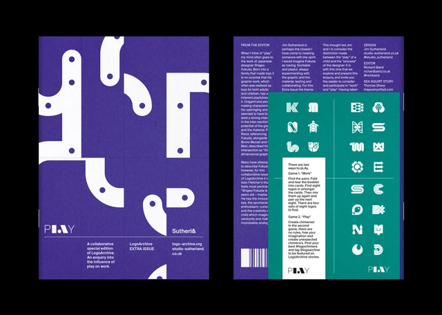
Richard adds: "As with any of the other LogoArchive zines, the intention is to either share an idea, tell a story or present a proposal. Here, the proposal, put simply, is that work and play (in graphic design) are not oppositional forces, but between them, they can create a liminal space in which to inhabit and generate better work."
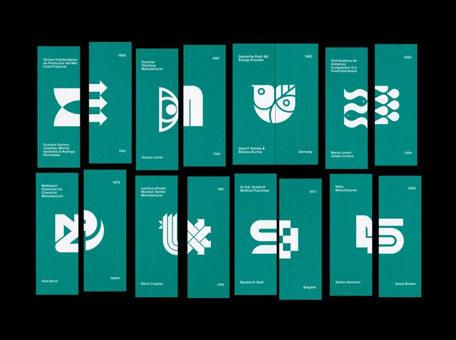
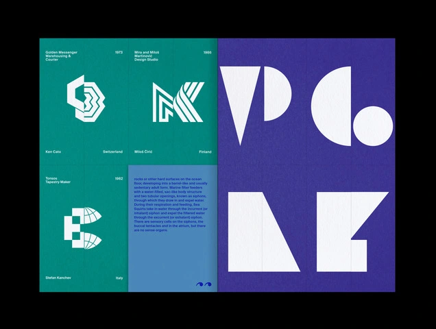
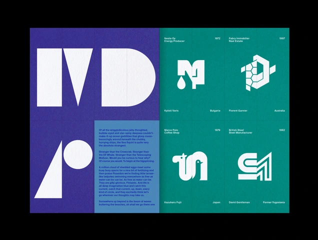
To communicate this idea effectively, they decided to evoke that feeling of potentiality within the reader as they interacted with the magazine. With the help of folds and a custom perforated grid, the zine can be ripped up and rearranged to create a series of games and puzzles. "Some of these puzzles will feel like work (as they are regulated and goal-orientated) and others a sense of play (those that are intuitive and self-directed)," says Richard.
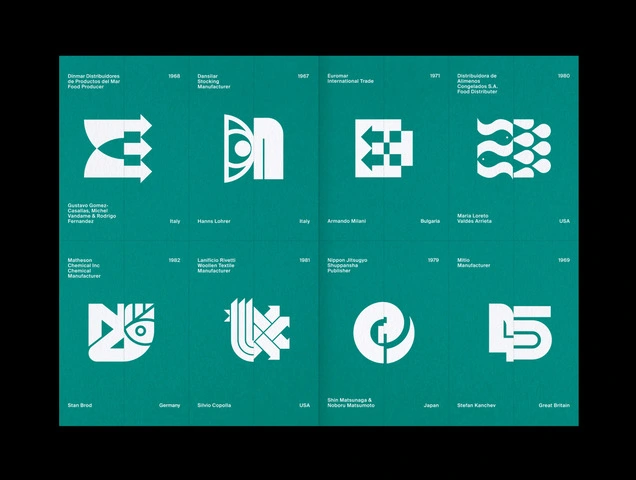
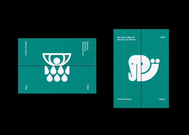
Take Game 1, for example, which is a matching puzzle. Logos have been cut in half and mixed up throughout the booklet, and it's up to the reader to fold and tear the pages in order to fix them. This requires a form of assessment and strategy, making it feel more like work. However, Game 2 is a self-directed exercise with no definite solution, as readers are given free rein to create their own mismatched logo chimaeras.
"Alongside these two games, there's a cover puzzle that reveals a logo by Shigeo Fukuda, and a typographical puzzle in which the words "Work" and "Play" can be spelt out," Richard explains. "This typographical puzzle also has a play element, as the geometric forms can be used to create images."
Editor's Picks





Trending






Latest Jobs
Marketing Copywriter at ustwo
Full-time·London·£40k-£50k
Graphic Designer at Crux Product Design
Full-time·Bristol·Up to £36k
Digital and Marketing Manager at Manchester Art Gallery
Contract·Manchester·£38,126 pro rata
Designer at New Genre
Full-time·London·£36k–£48k
Creative Project Manager at Analogue
Full-time·Leeds·£28k–£35k
Design Director at Koto
Full-time·London·£72k-£90k