The latest LogoArchive zine is devoted to Canada’s modernist symbols
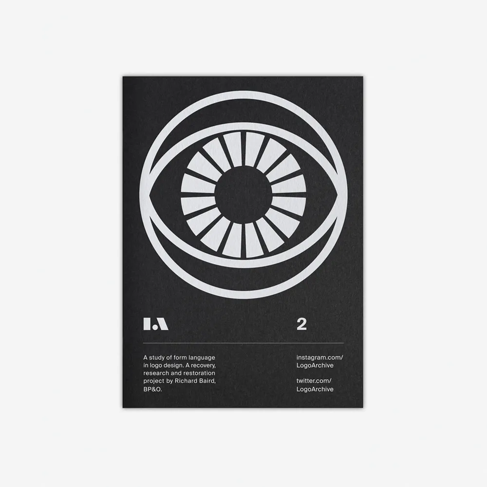
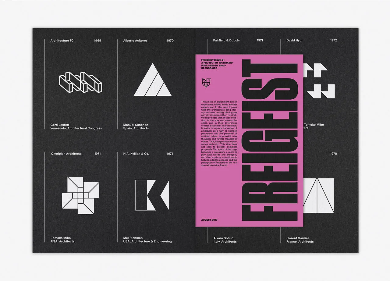
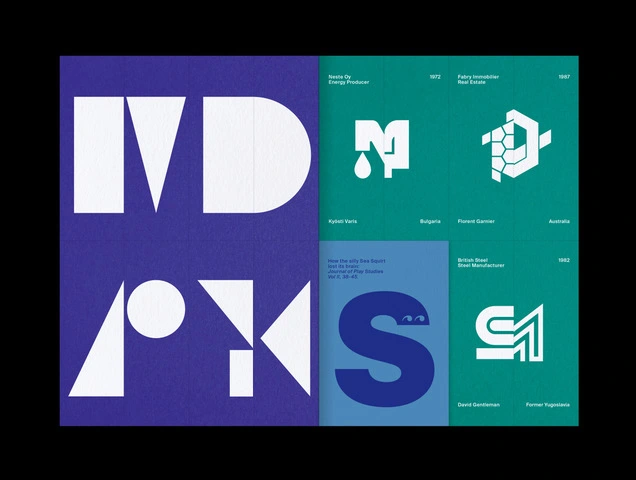
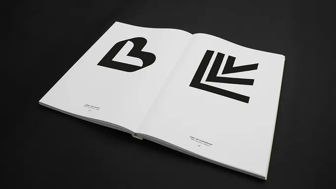
LogoArchive is a zine devoted to mid-century symbols.
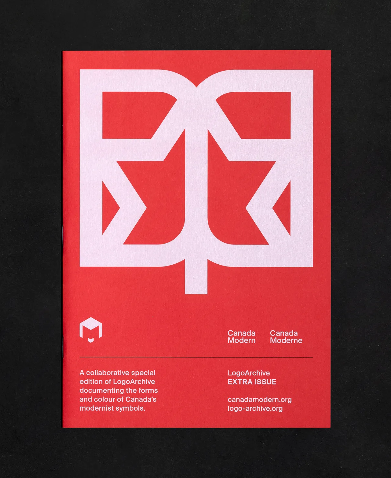
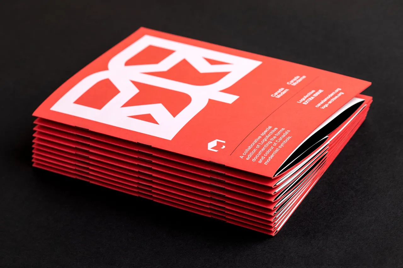
For its latest issue, LogoArchive Extra Issue is a collaboration with physical and digital archive Canada Modern, designed by Blair Thomson and dedicated to Canada’s modernist symbols.
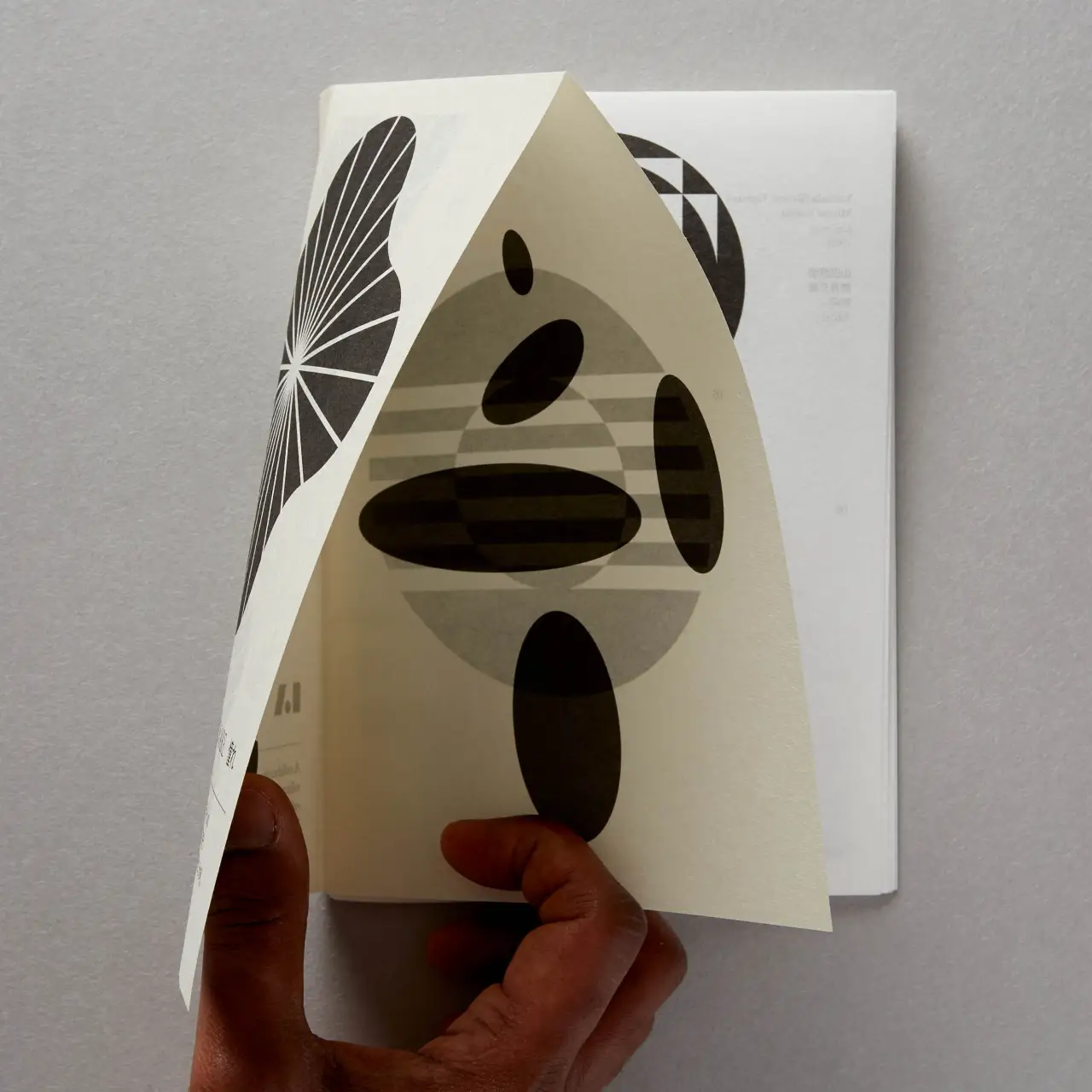
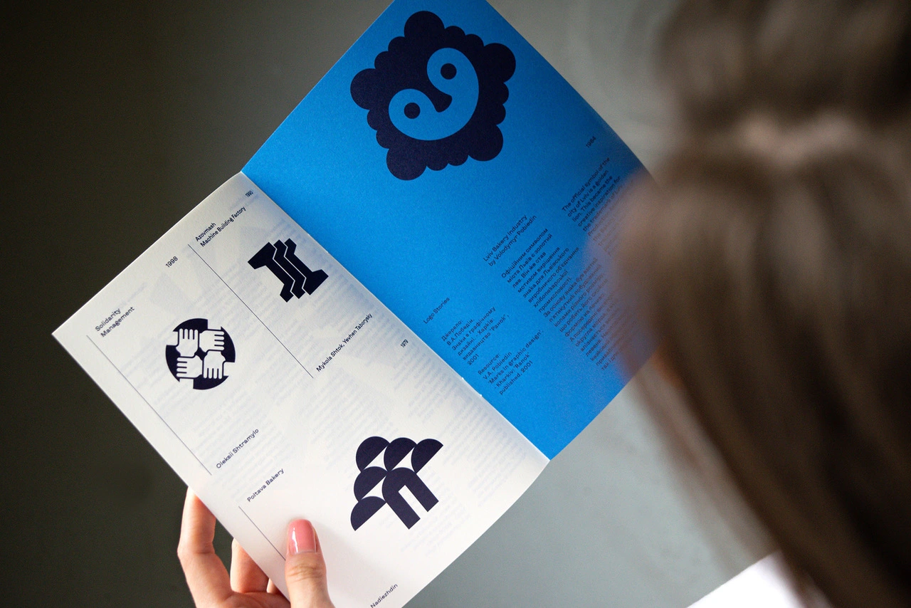
Published by BP&O, this latest offering breaks from previous issues, which were printed on black stock and featured text inserts, instead Colorplan Bright Red and full-colour insert.
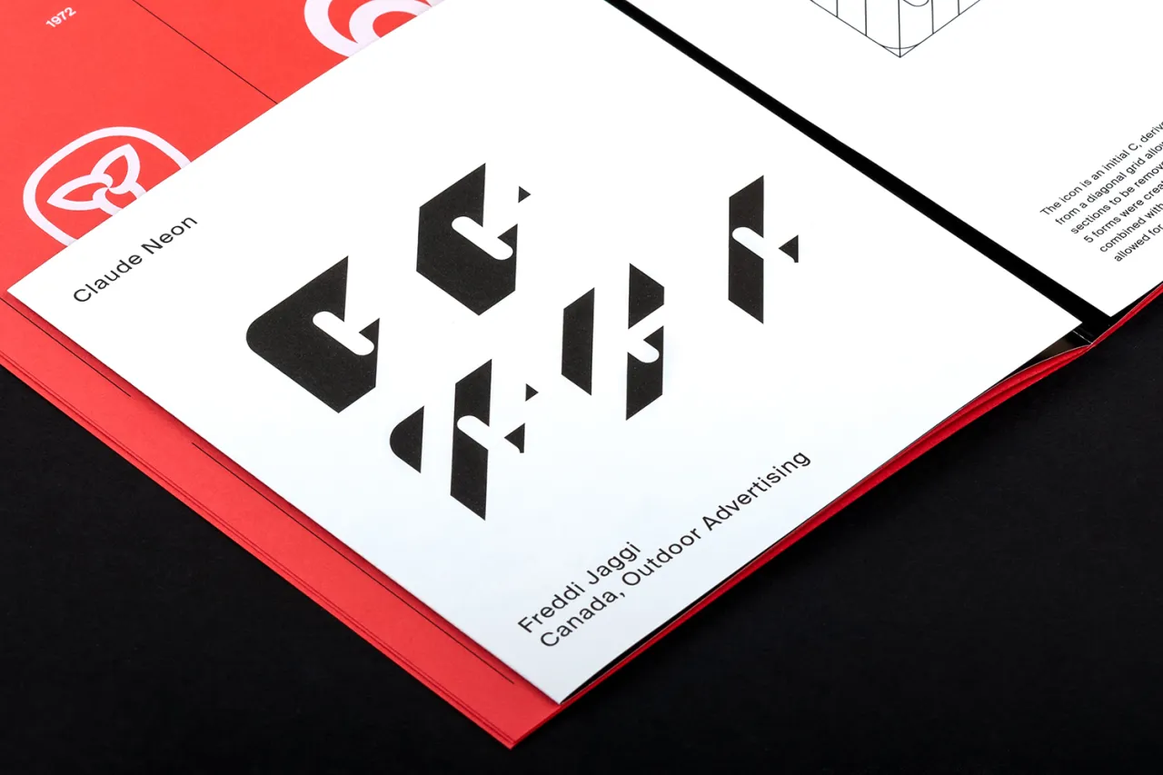
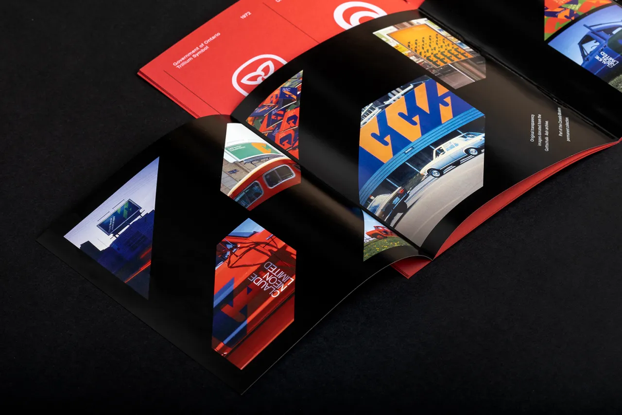
The volume tells the story of Gottschalk+Ash’s work for Claude Neon, an early example of adaptable identity systems. The colour images were taken from the original transparencies donated by Stuart Ash and Entro Communications.
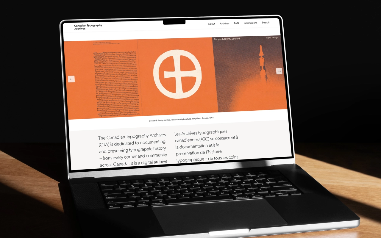
Canada Modern, which launched last year, is a digital and physical archive of Canadian graphic design that aims to highlight pieces that until their appearance on the site, have only been held by institutions or private collectors, or in the private archives of the designers themselves.
"The names of some of the designers who led this creative revolution are celebrated, as are some of their more famous projects, but the picture is incomplete," says the LogoArchive team. "For every Montréal Olympics, Expo67 or Canadian National Railways, there are hundreds of projects that are either impossible to find or misrepresented through poor quality images online or in old publications (often black and white).
"The work of Burton Kramer, Allan Fleming, Rolf Harder and Julian Hébert has been preserved in academic institutions, but these collections are not generally accessible to the public."
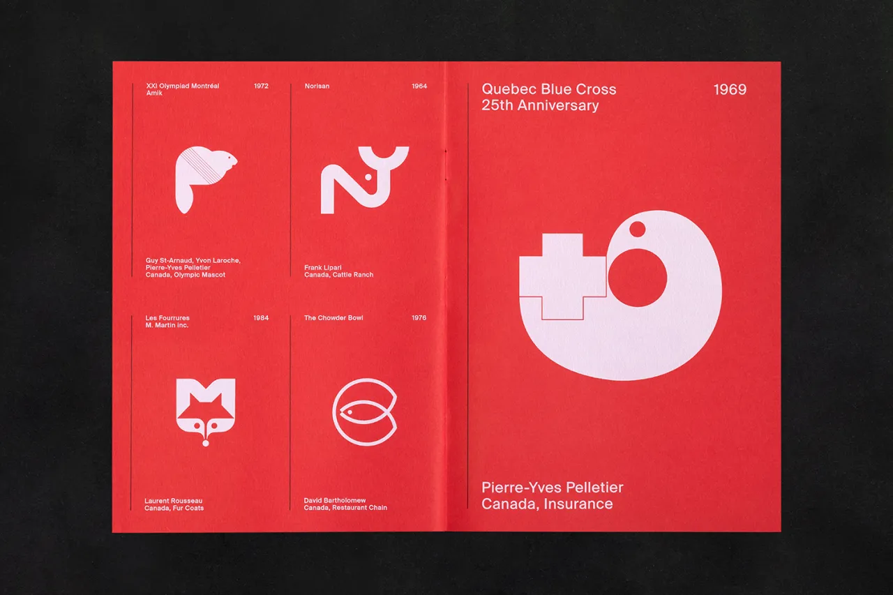
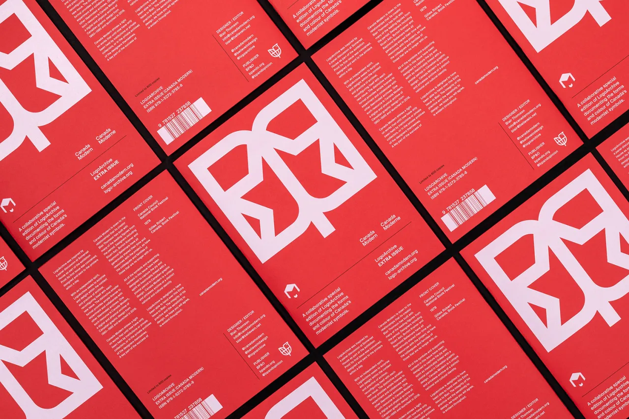
The LogoArchive zine series was inspired by a panel discussion at Somerset House as part of the exhibition Print!, where its first issue was conceived, designed and sent to the printers within a day. It is part of an ongoing project by Richard Baird documenting the symbols of the mid-century.
"Channelling the spirit of fanzines, pamphleteering of the past and with an independent spirit, LogoArchive seeks to surprise and delight within the context and practice of mid-century logo archival, reconfiguring itself with each new issue," he says.
The book is available from Counter Print.
Editor's Picks





Trending




Latest Jobs
Head of Production at Art&Graft
Full-time·London·£80,000 – £95,000
Art Director at The New York Times
Full-time·New York·$120,000 – $130,000
Associate Creative Director, Earned Marketing at The New York Times
Full-time·New York·$85 – $97 per hour
Senior Producer, Marcom at Code and Theory
Full-time·New York·$100,000 – $130,000
Multidisciplinary Designer at Formation Games
Full-time·London·£40,000 – £50,000
Visual Development Artist - Feature at Sony Pictures Animation
Full-time·Los Angeles·$53.37 – $83.75 per hour