Virgin Wines celebrates the 'joy of wine' in its first major rebrand in 20 years
Virgin Wines has introduced its first major rebrand in two decades, including a fresh logo, colour palette, and typography. Crafted by Norwich agency Borne, it's designed to breathe new life into the range and emphasise the "joy of wine from grape to glass".
Almost two decades since entering the market with a vision to shake up the traditional wine connoisseur space, Virgin Wines recently decided it needed to adapt and refine its brand to better reflect its unique value proposition. Nathan Wadlow, brand and digital marketing director at Virgin Wines, said it was the company's intention to not only be recognised but to be hugely known for excellence. "With an elevated brand, we aimed to deliver long-term commercial value and a tangible, positive impact on Virgin Wines' people," he explained.
The rebranding, a decision not taken lightly, was informed by extensive market research, which revealed that Virgin Wines was perceived as lacking in buying expertise and premium quality – a perception the company was, quite understandably, eager to change. The new identity, therefore, pivots on the theme of 'joy', which encapsulates the entire customer experience, from selecting a wine to the moment of tasting.
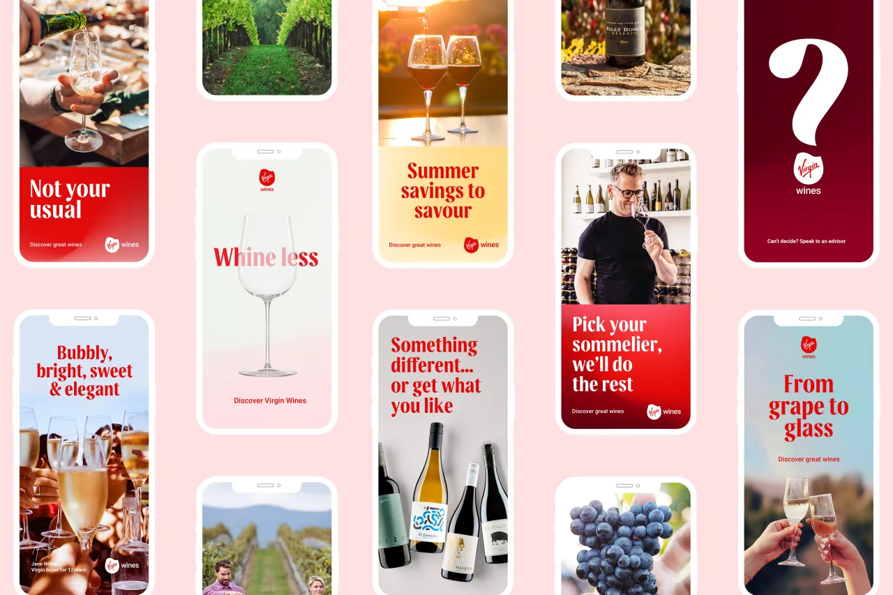
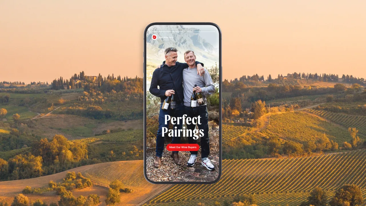
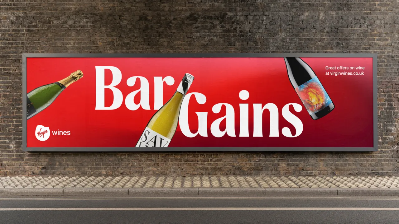
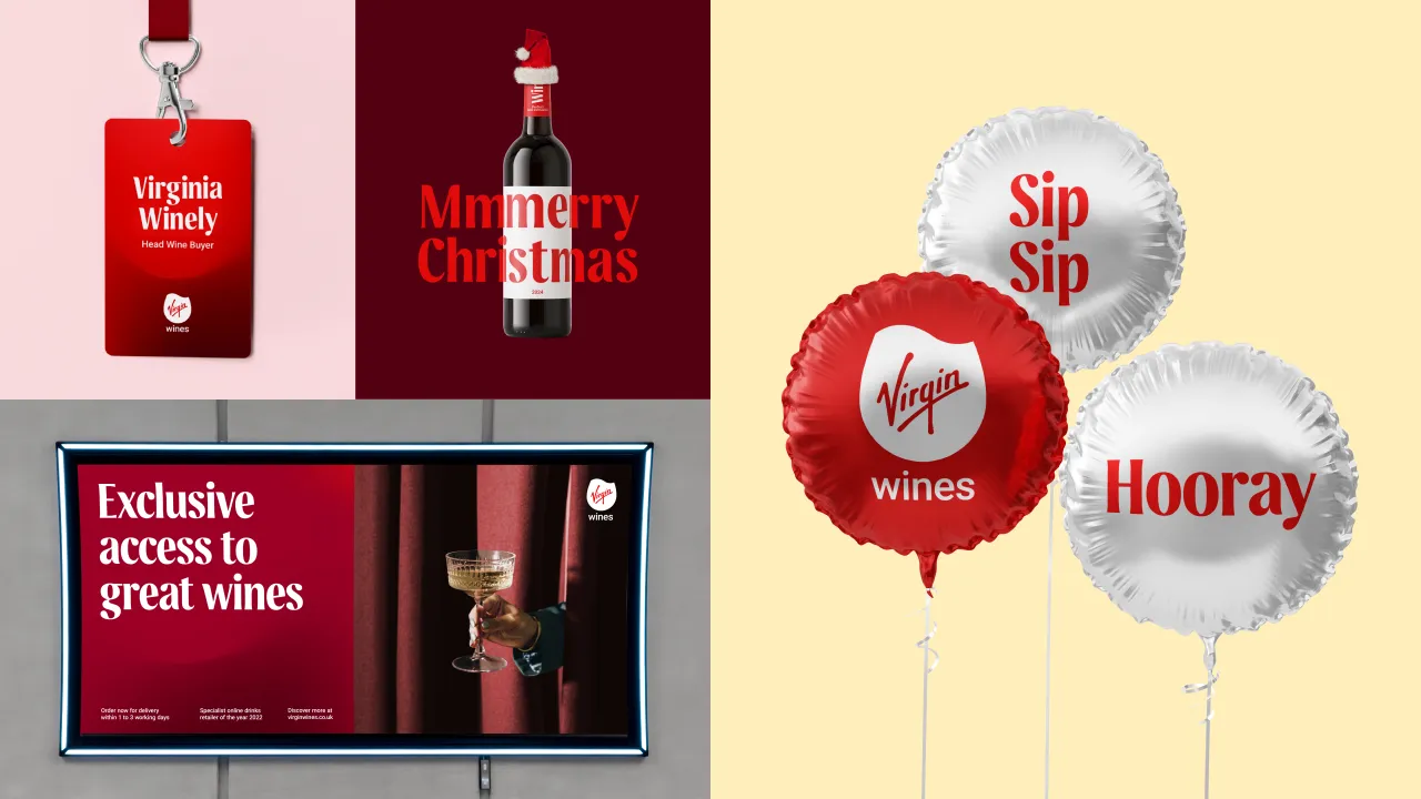
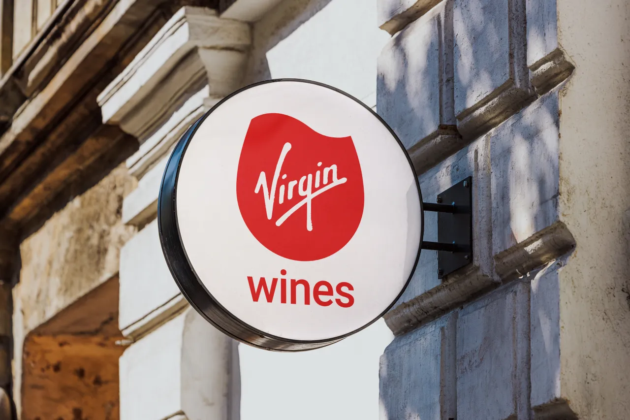
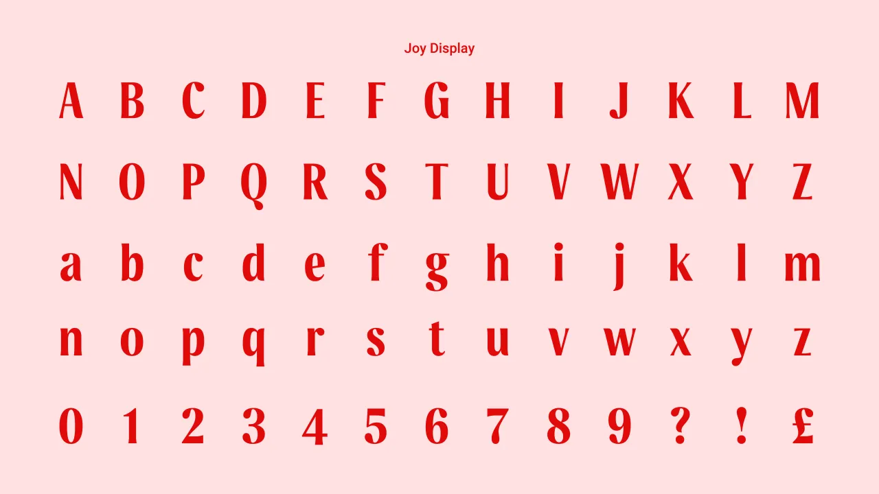
Borne introduced several interesting elements in the rebrand, including a swirling new logo that mimics the motion of wine in a glass, designed to mimic the sensory experience of wine tasting. This new logo replaces the previous static wine glass mark. And it's complemented by a bespoke font developed by Dalton Maag, which includes unique 'flowing' lines and subtle references to joy and wine droplets.
The colour palette has also been revamped, retaining the iconic Virgin red but introducing gradients inspired by various wine types like Malbec and Riesling. These are intended to evoke the light refracting through swirling wine. This choice not only ties back to the product itself but also helps maintain a connection to the broader Virgin brand's identity.
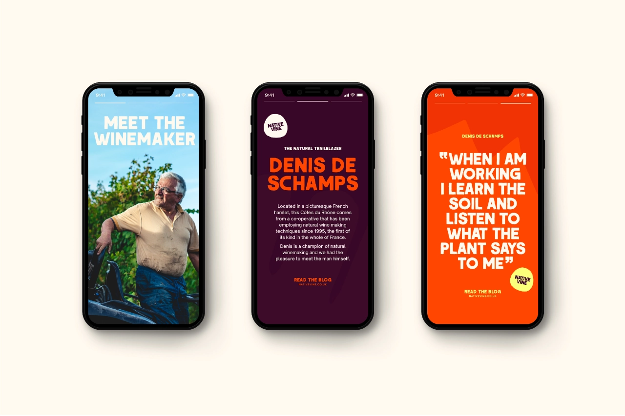
Photography plays a crucial role, too, with a focus on authenticity and capturing real moments of enjoyment. Julia Patrick, design lead at Borne, outlined the approach: "We developed photography pillars that focus on putting the product on a pedestal, celebrating the detailed process from grape to glass, showing the people behind Virgin Wines, and capturing joyous moments of our customers."
Previous logo
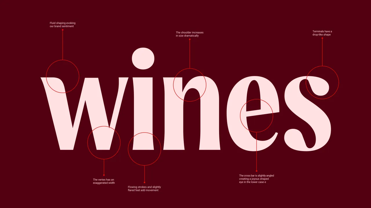
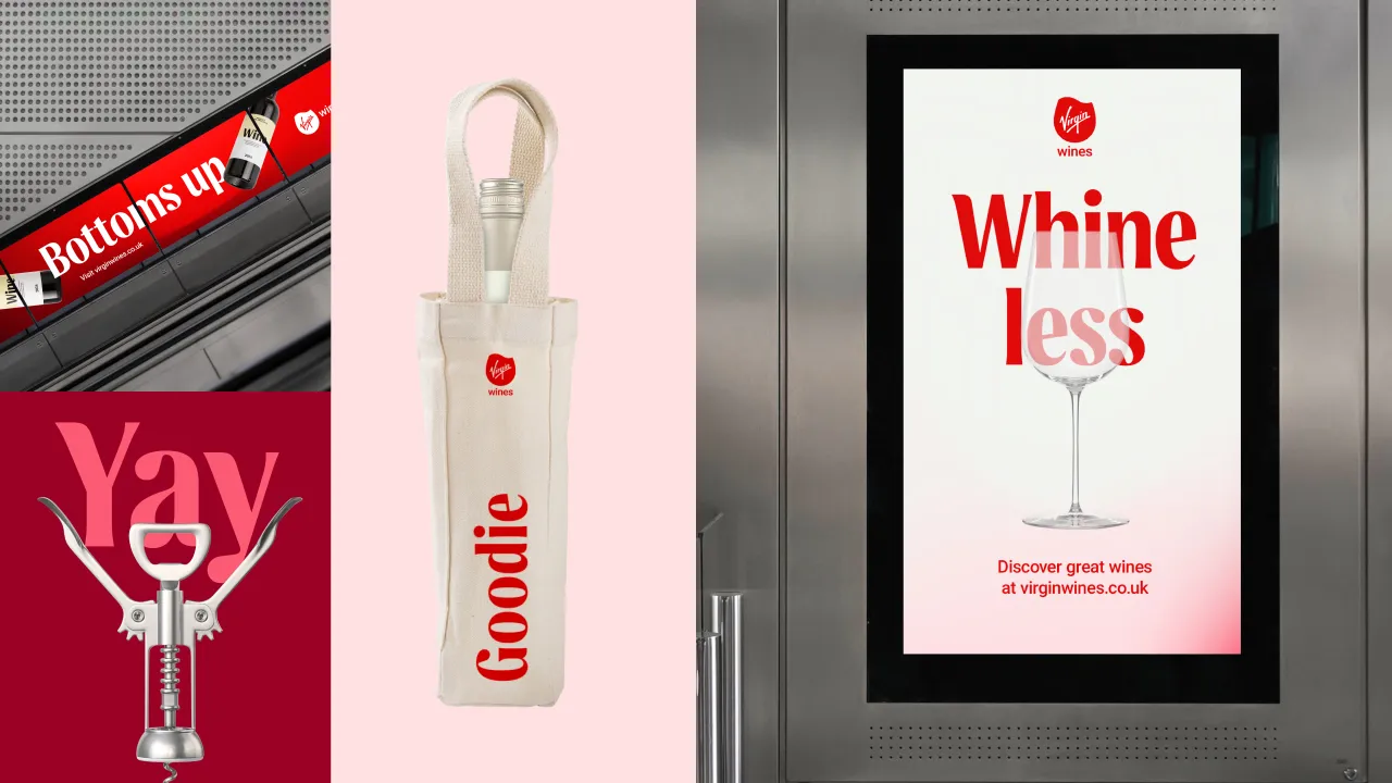
The result is a sophisticated identity that fully embraces the brand's new motto, 'A joy that flows naturally,' influencing every design decision and reinforcing the brand's commitment to creating exceptional experiences. Wadlow praised Borne's deep engagement with the project, noting, "They fully immersed themselves in our culture, market positioning, and product strategy, which enabled them to grasp a deep understanding of the nuances of what we were trying to achieve."
As Virgin Wines moves forward with its refreshed brand, it hopes to make a significant impact on the wine industry, offering both premium products and "joyous experiences" to its customers. Wadlow adds: "Borne has delivered an identity that perfectly represents our brand vision, and we couldn't be happier with the creative vibrancy and clarity we now have."
Editor's Picks





Trending




Latest Jobs
Senior Designer at David&Goliath
Full-time·Los Angeles·$100,000 – $140,000
Designer, Marketing at The New York Times
Full-time·New York·$85,000 – $100,000
Director, Brand at KQED
Full-time·San Francisco·$125,547 – $165,000
Director of Product Design at Monzo
Full-time·London·£140,000 – £165,000
Creative Director (Social) at Known
Full-time·Los Angeles·$125 per hour
Junior Account Manager at Gardiner Richardson
Full-time·Newcastle·£30,000 – £32,000