Robot Food launches its second Project Disrupt, tackling three 'tired' subjects: funeral care, pensions and over 50s holidays
When Robot Food wants to flex its design skills, it dives headfirst into Project Disrupt – an internal side venture that challenges its entire team to come up with three fictional brands.
For its second go, the Leeds agency looked at three "tired" service categories: funeral care, pensions and over 50s holidays. Partnering with market research firm Relish, Robot Food pulled together some detailed consumer insight that helped to "inform and inspire" each of the final solutions.
"Project Disrupt shows what we do best: challenging inwardly looking categories by designing relevant brands that people actually want," says Simon Forster, founder and executive creative director at Robot Food. "It's our take on what it means to be disruptive but also a chance to push ourselves and prove that our thinking and approach are transferrable across categories.
"Clients often choose an agency based on previous work and its success. It stands to reason, but safe choices can often result in safe outcomes. We want to show how questioning with fresh eyes can build something better."
Why the word disrupt? "It's a buzzword that's been misconstrued and watered down by overuse, often in relation to brash or (worse) 'edgy' design," Simon continues. "Shouting louder than everyone else isn't disruptive – it's just noise. Brands that really disrupt come from questioning the status quo to answer a genuine need and, ultimately, create strong commercial opportunities. Just look at what the likes of Tesla, Monzo and Airbnb have done."
It's the second time Robot Food has embraced this internal challenge. Some of their previous ideas have come to life in other brands, so it's a project that's working. "It's not to say that the companies weren't already underway with similar ideas," adds Simon. "We see it as a positive that validates our ability to create relevant brand opportunities. A lot of our clients loved what we did, so it helped set out our stall and won us work with the right people, willing to embrace change."
For Project Disrupt 2.0, the Leeds agency wanted to push itself out of its comfort zone. "Death, old age and money are taboos nobody likes talking about, which made funeral care, holidays for over 50s and pensions perfect for tackling," says Simon.
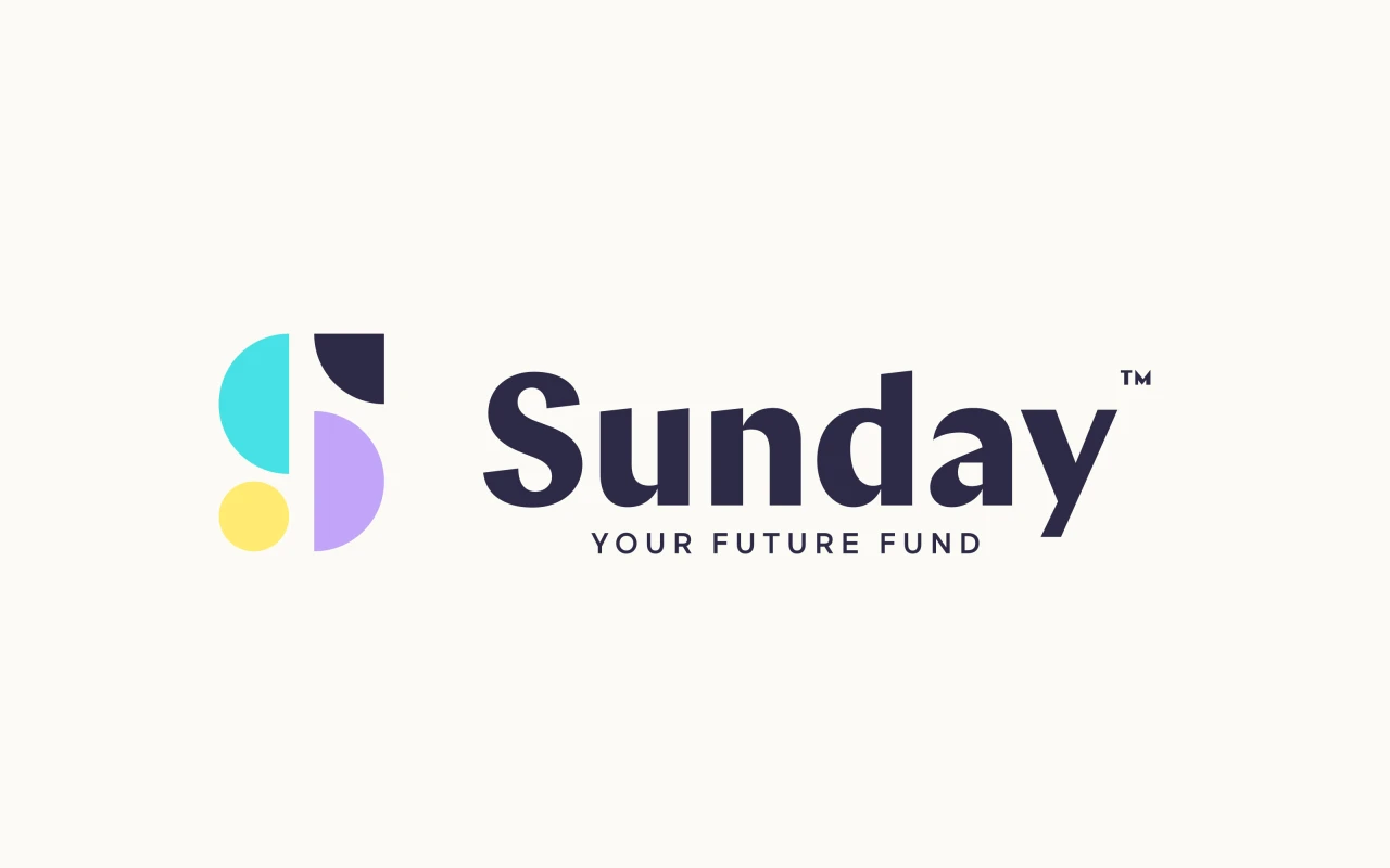
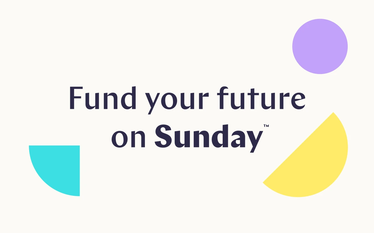
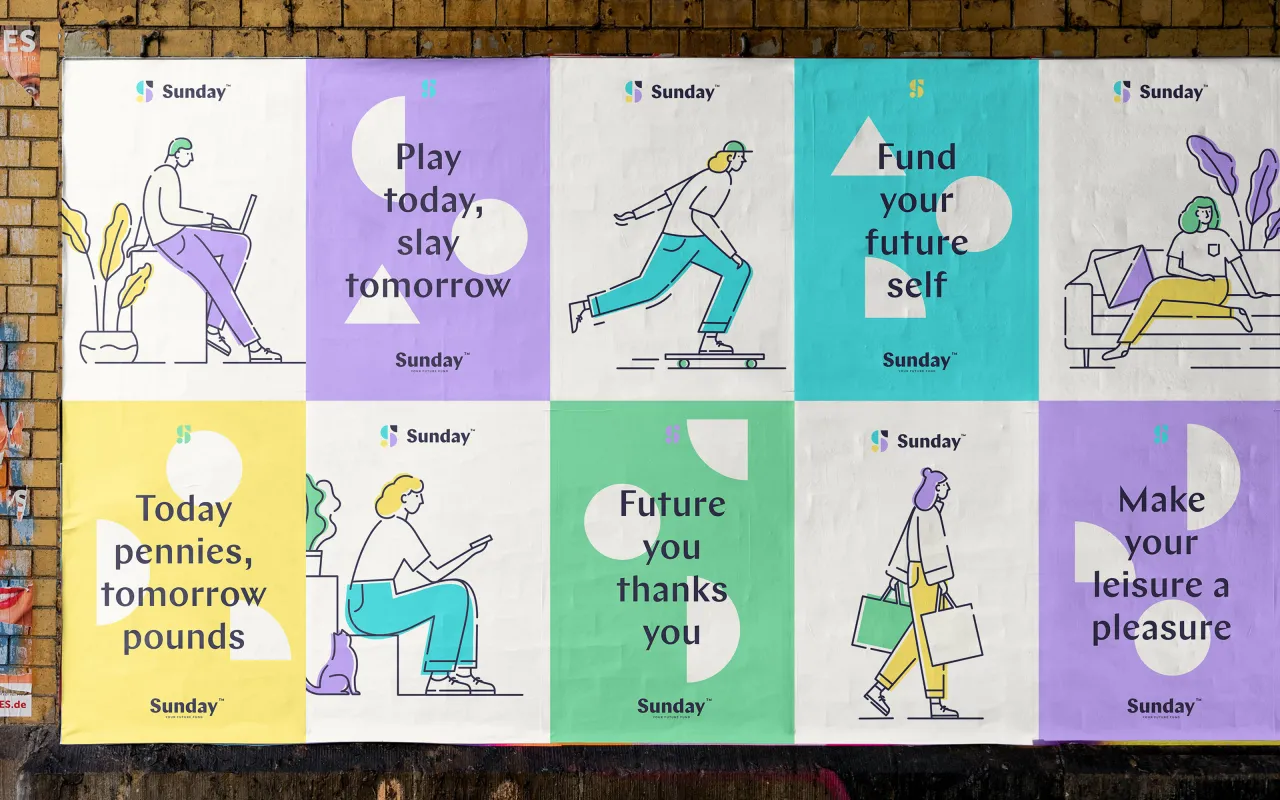
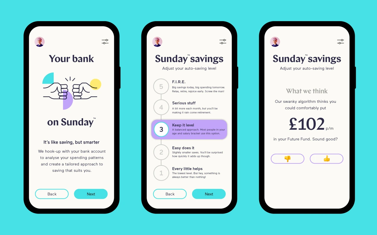
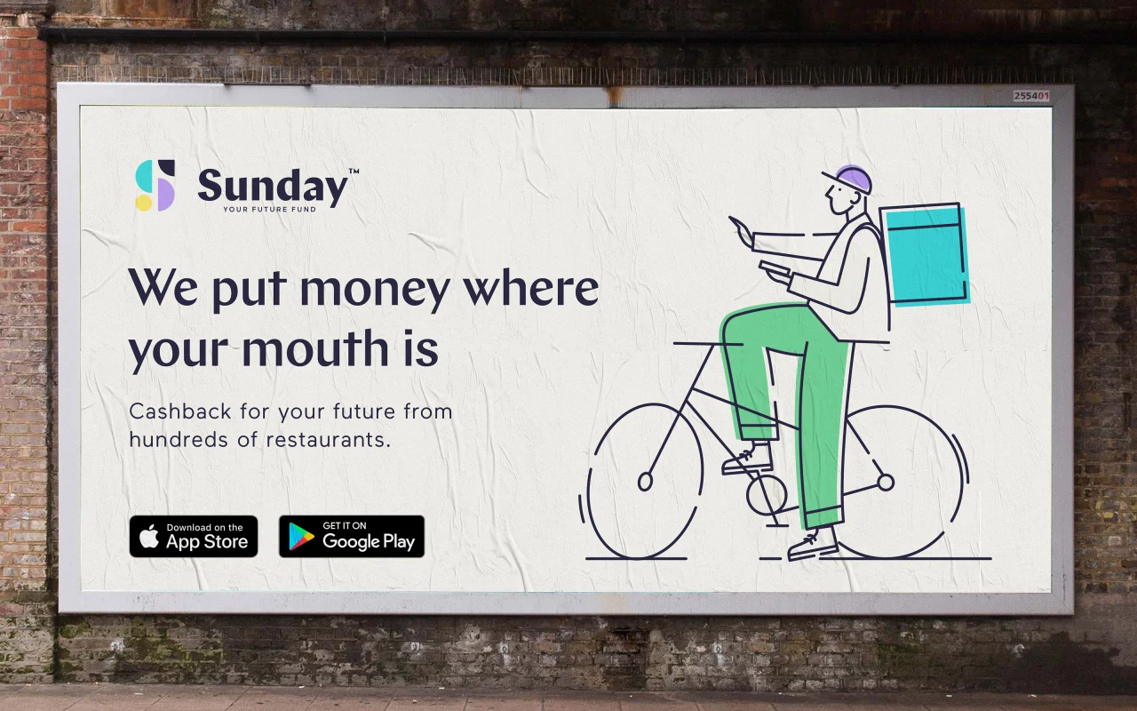
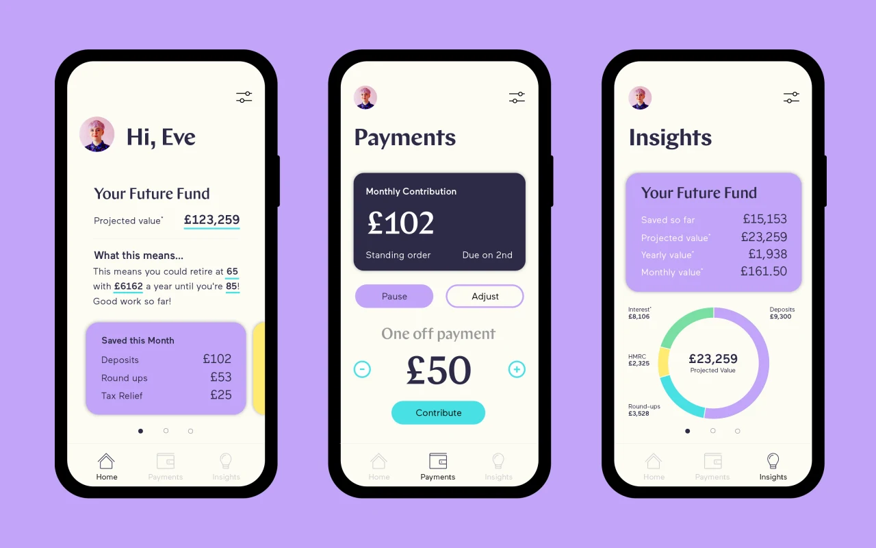
For pensions, Robot Food came up with 'Sunday', which takes inspiration from new-gen fintech to target those who need a pension most – young adults. "Consumers felt unable or felt a lack of impetus, to start a pension while they're young and felt overwhelmed and anxious at the thought of their financial future," Simon says. "Through a youthfully upbeat tone and visual style, Sunday encourages a proactive, positive approach to pensions. Oh, and it's not called a pension."
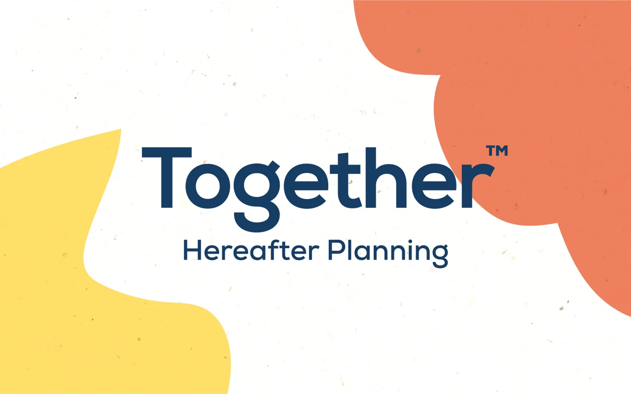
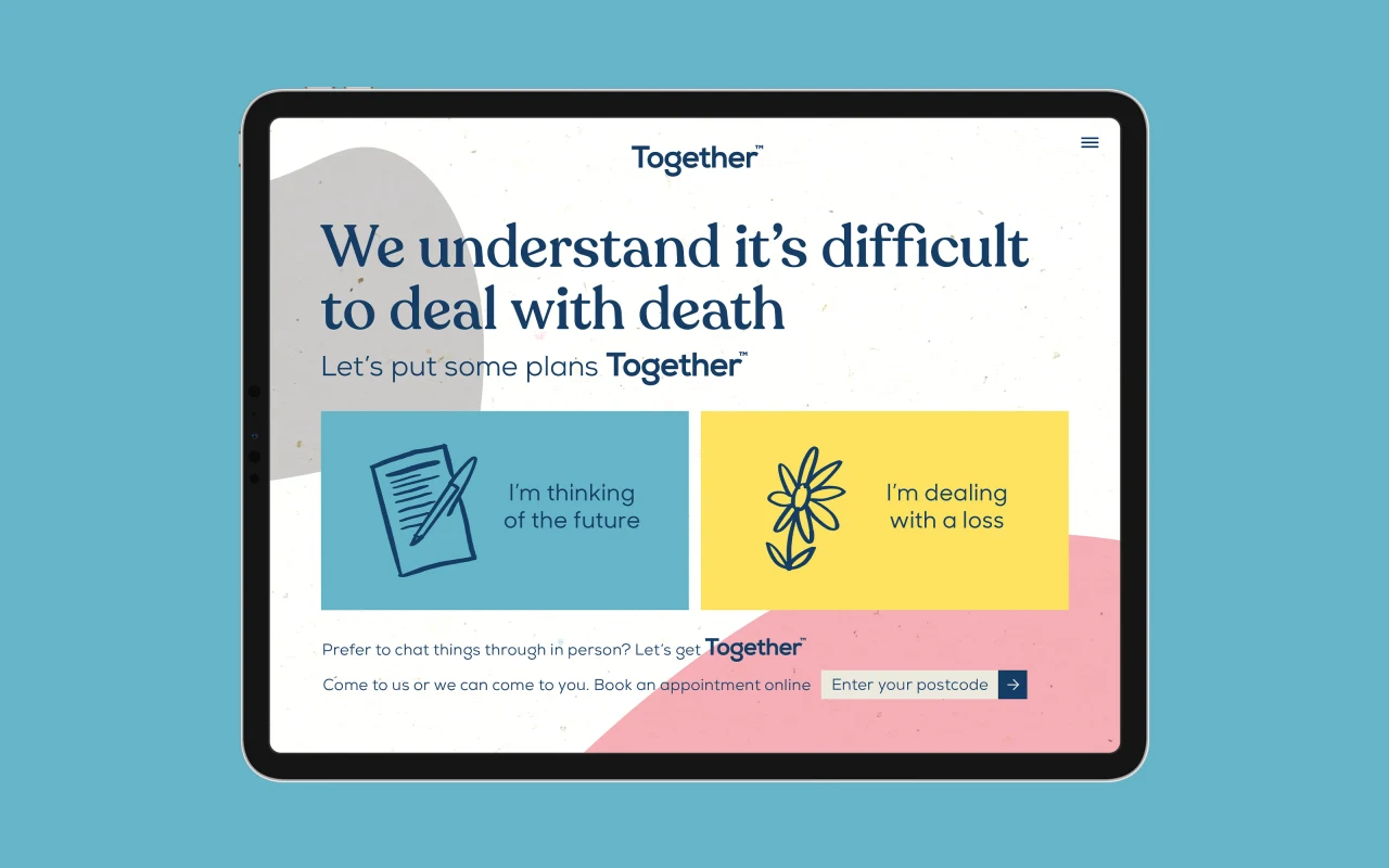
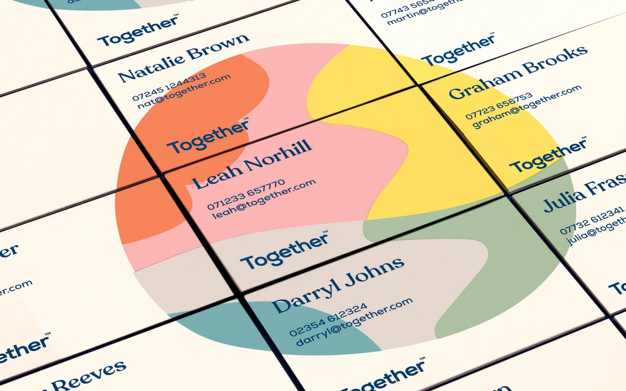
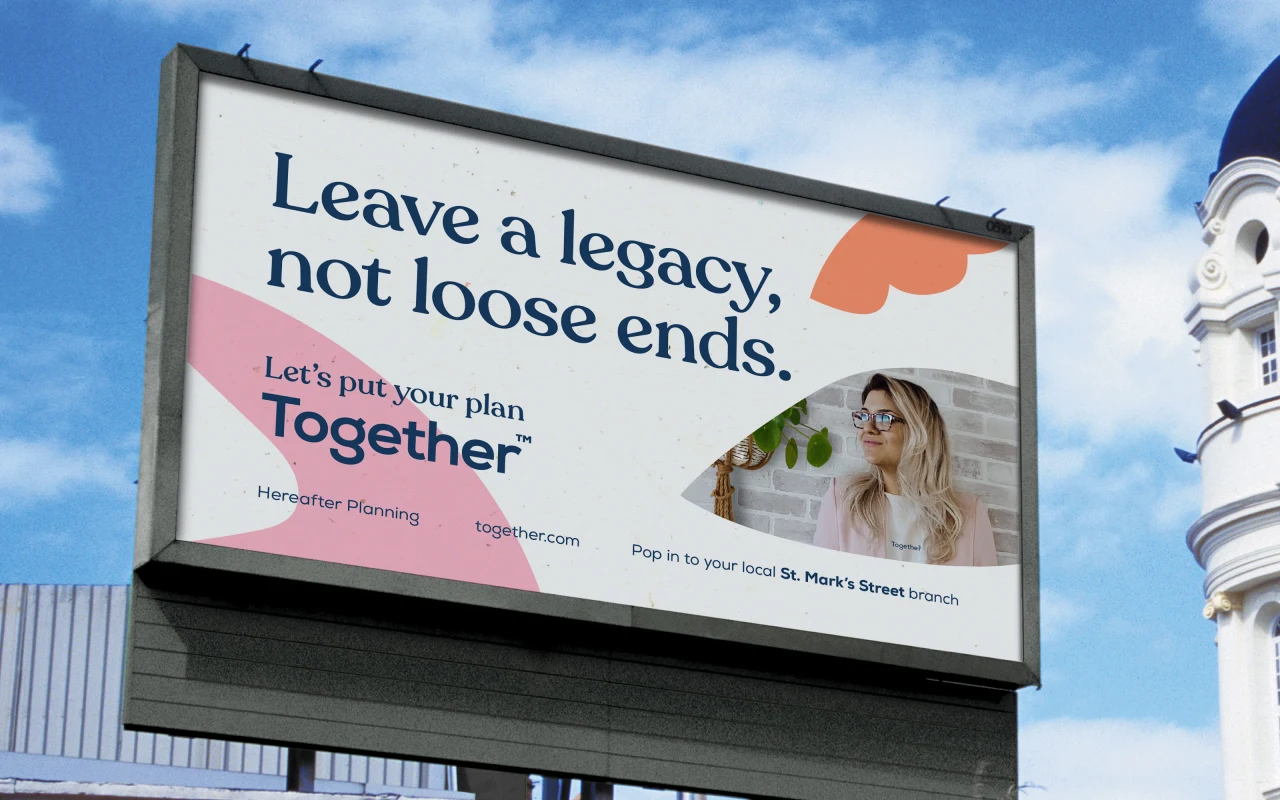
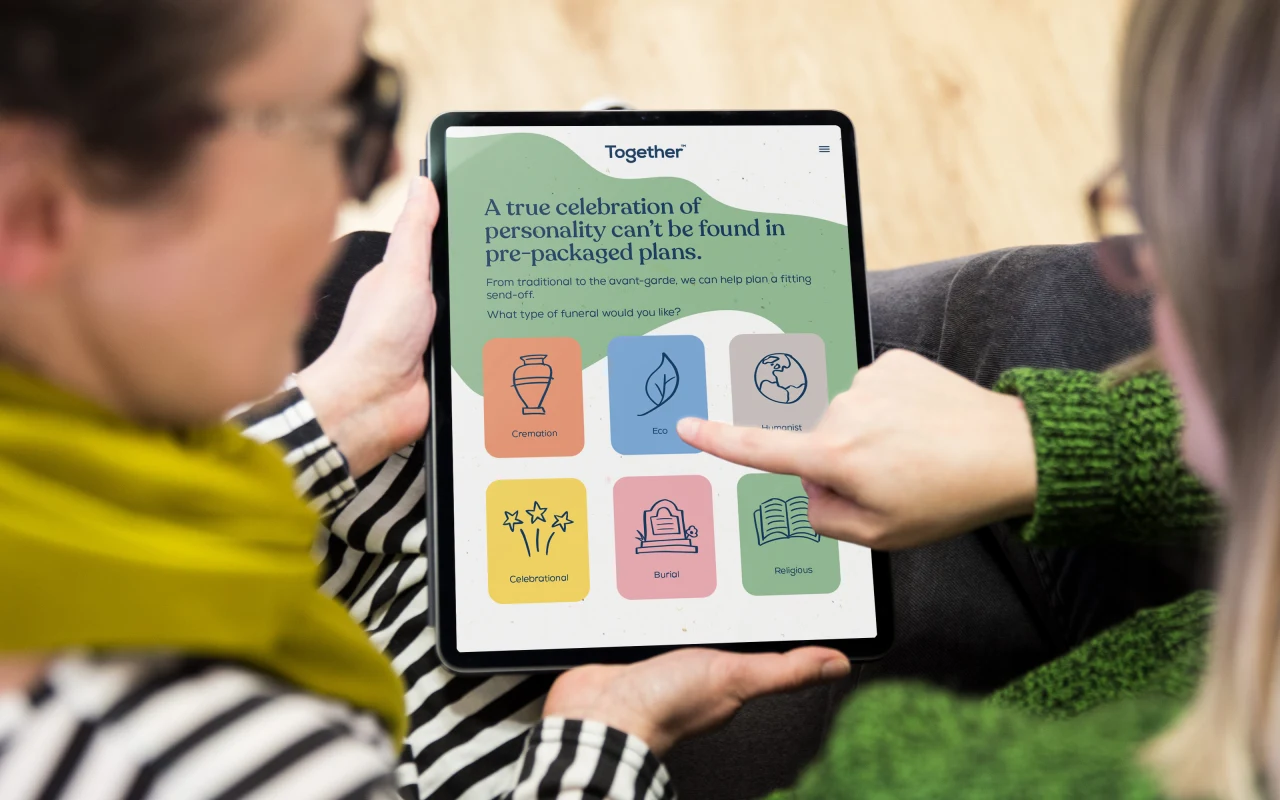
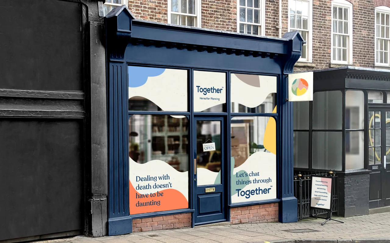
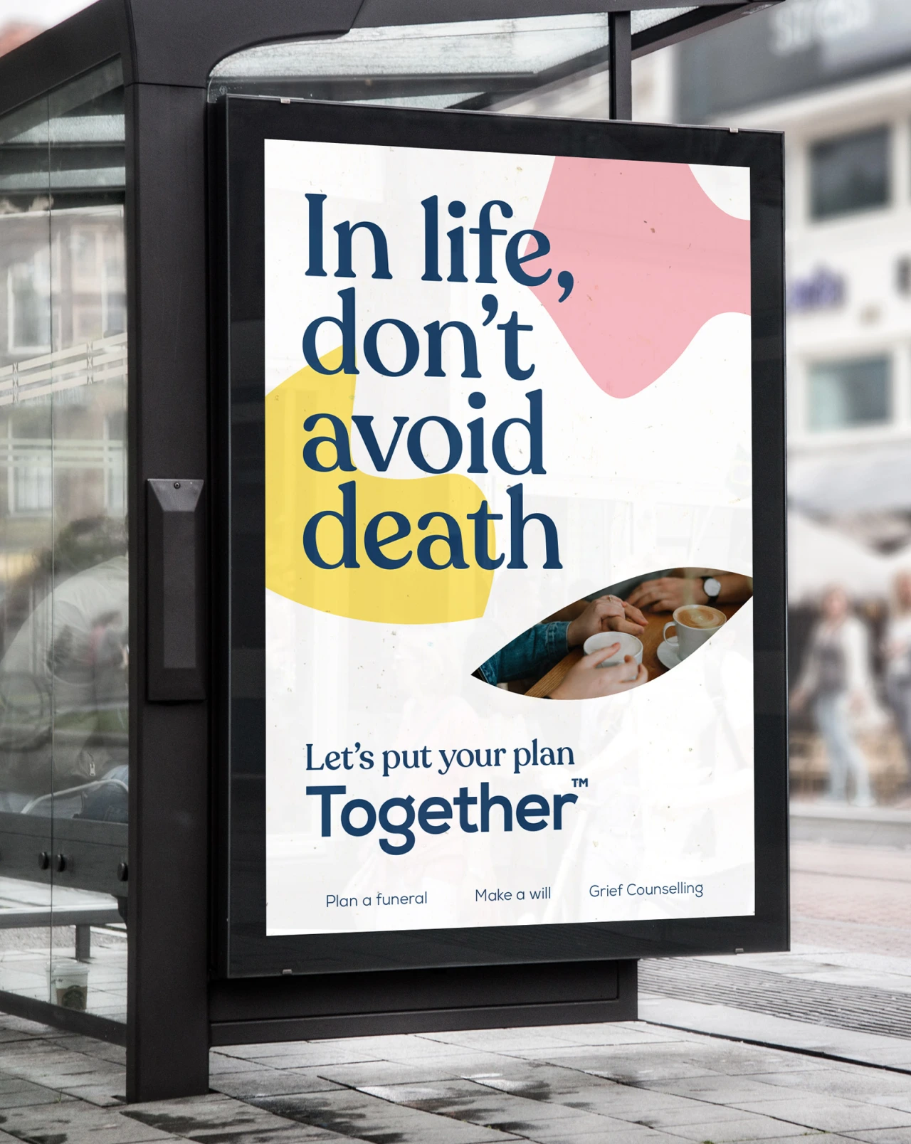
On the subject of death, Robot Food created the fictional brand 'Together'. Simon adds: "Death is the one thing we all have in common. However, our insight told us that the practical and emotional support people needed just wasn't there. When faced with (or planning for) life after death, consumers were overwhelmed and underprepared. So, we created Together – a fully transparent, approachable planning service for the hereafter. A service that looks at death holistically, providing support and practical advice for funerals and everything else you might not know you need."
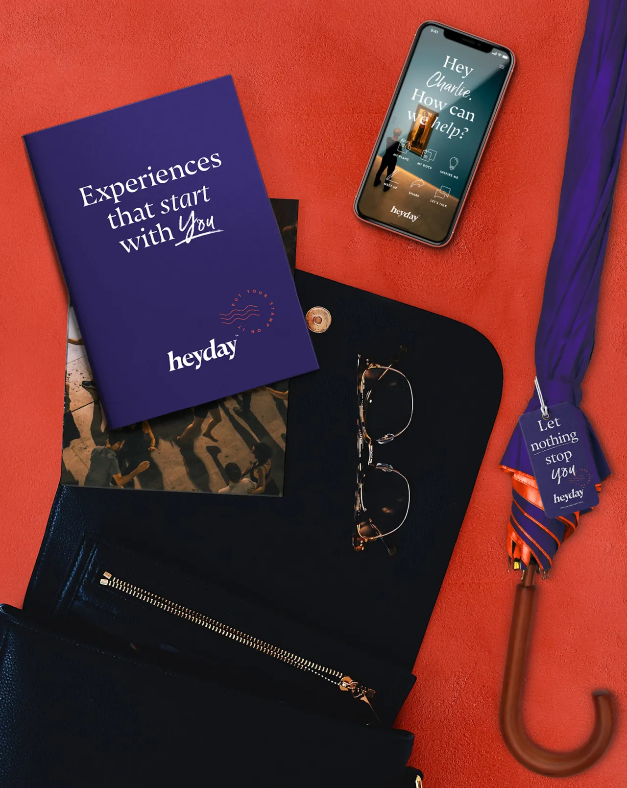
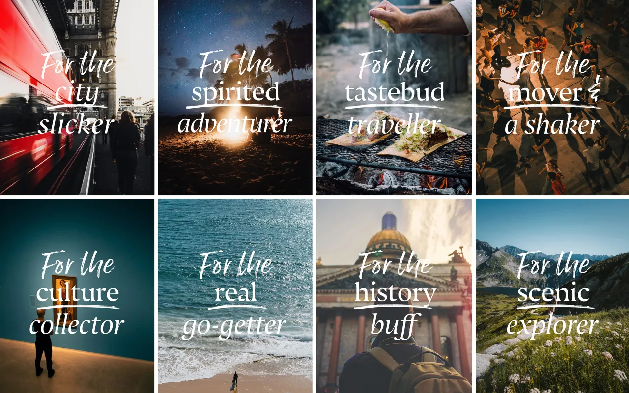
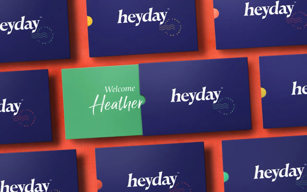
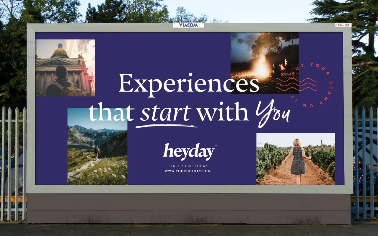
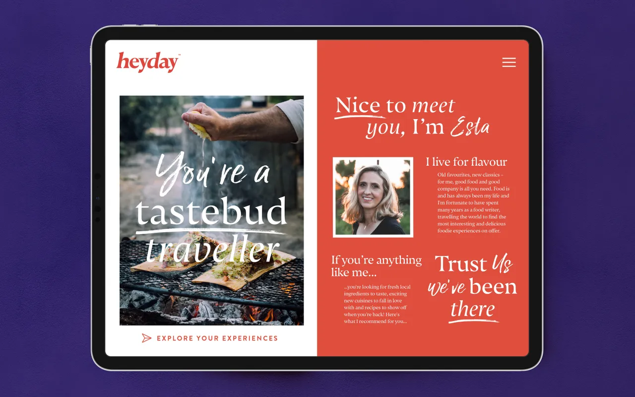
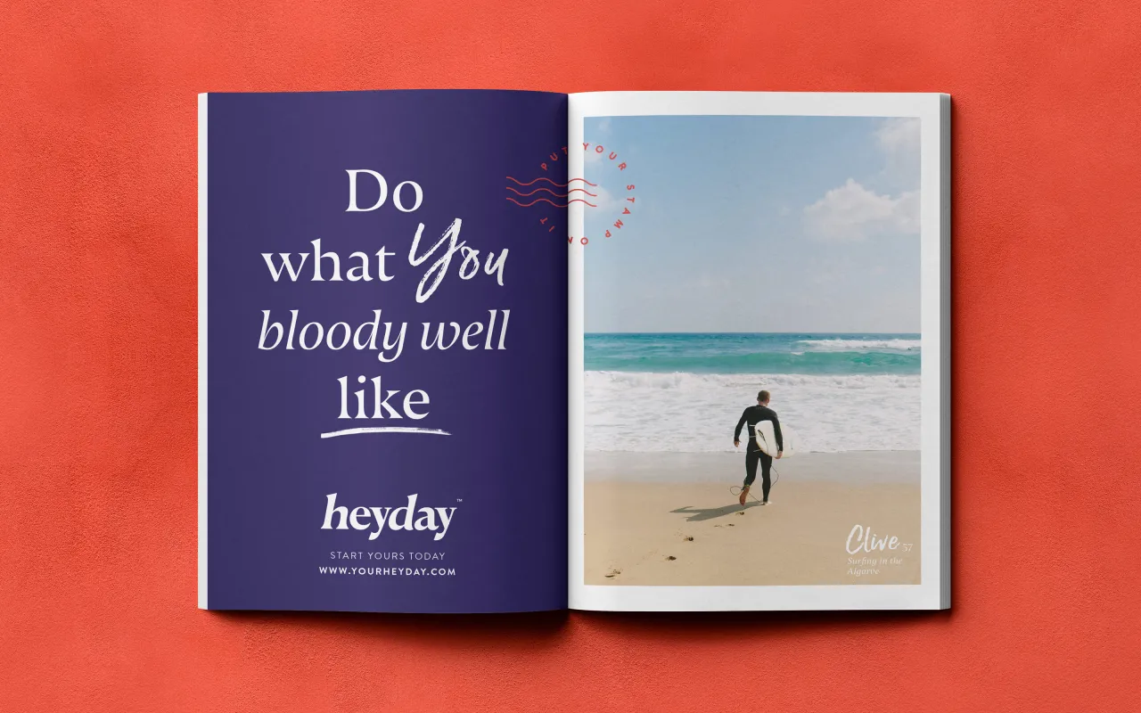
And for holidays for the over 50s, the Leeds agency saw a bigger opportunity beyond holidays and created 'Heyday'. Simon explains: "From our research, the real issue was the misrepresentation of over 50s by brands in general. Consumers we spoke to felt positive about their age and showed no signs of slowing down. Brands for over 50s were for 'oldies' and not how they saw themselves. Heyday chooses to actually acknowledge age and celebrate it through a tone of voice inspired directly by the audience and timeless creative direction."

How did Robot Food find the whole experience? Simon believes consumer insight is critical, something that can be used to validate gut feel. "Design isn't styling; it's how a product or service is shaped to suit our needs.
"We always say 'simplify to amplify', and what we've got to are three solutions that put consumers first by simplifying the category to amplify the benefit and what it means to them. Like most people, the brands I'm drawn to are sincere, unapologetic, targeted and, above all, relevant. That's why they cut through most other brands."
Editor's Picks





Trending






Latest Jobs
Account Director at How&How
Full-time·London·£73k-£79k
Brand Strategist at DNCO
Full-time·London·£45k-£60k
Agent & Producer at The Jacky Winter Group
Full-time·London·£35k–£40k
Growth and Client Development Director at 3800
Part-time·Sheffield·£60k-80k
Brand Copywriter at Origin
Full-time·Porthleven, Cornwall·£35k–£40k
Brand Designer at Adfin
Full-time·London·£30k–£50k