Regular Practice redesigns low-alcohol spirit brand Quarter Proof
After three years on the market, the studio saw an opportunity for the brand to ride the wave of the moderation movement and enhance its brand experience, putting Quarter Proof on the same shelf as its high ABV predecessors.
Social attitudes to alcohol have no doubt changed in recent years, with more people being more aware of their health in a post-pandemic world and many young adults being sober-curious. Data proves that the moderation movement, especially in the US, is on the up, with the non-alcoholic beverages market projected to grow from $161.31 billion in 2023 to $225.62 billion by 2030.
For those who don't favour the 'all or nothing' approach, low-alcohol options offer a safe middle ground and a subtle lifestyle change. The problem is that most low-and-no-alcohol spirits just don't measure up to their high-ABV predecessors when it comes to brand experience and communications.
Luckily, low alcohol spirit brand Quarter Proof has set out to change this with the help of design studio Regular Practice. After three years in the market, the business decided that it needed a rebrand to future-proof it for at least the next ten years.
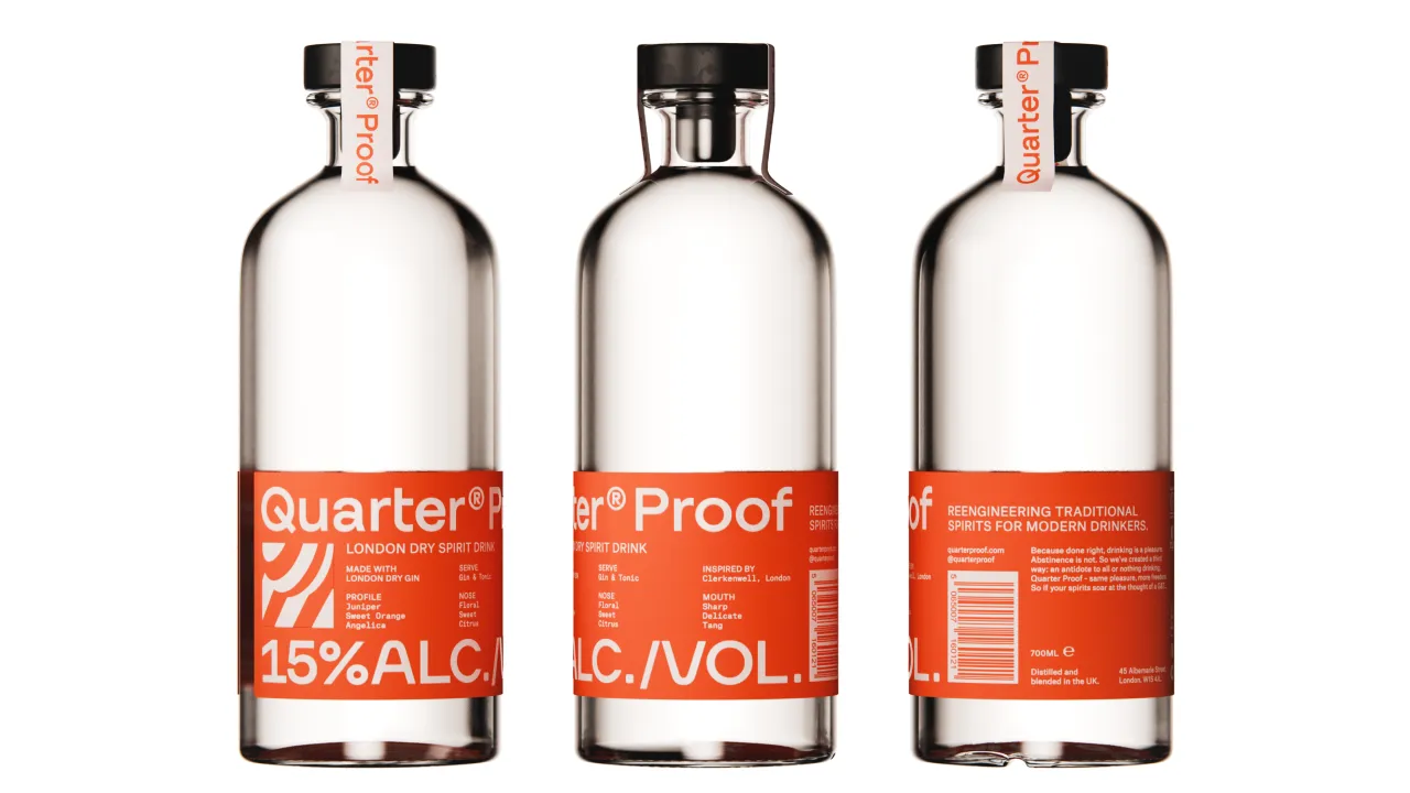
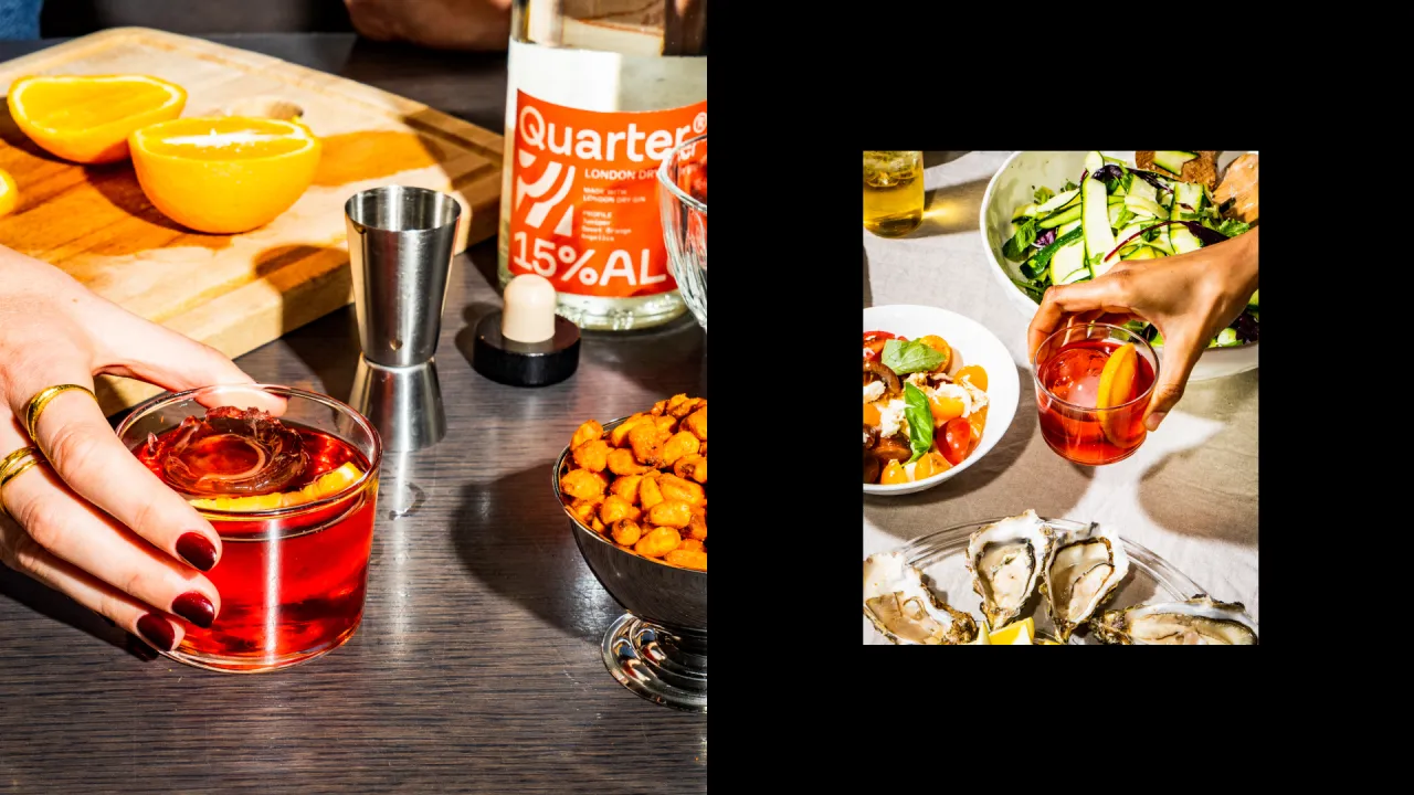
Regular Practice was connected with Quarter Proof through Ask Us For Ideas, and the original brief was to reposition the brand with a new tagline (previously 'All Buzz No Blur'). However, the studio saw a bigger opportunity and pitched a more holistic brand redesign using that initial chat.
Speaking on competitors in the space, Regular Practice strategy director Ed Little mentions brands like Decem in the UK, as well as Small Beer.
He explains how changing the brand name from Quarter to Quarter Proof added "another layer of legitimacy and edge" to the brand. "It's also a term that mixologists really understand, especially in the states, speaking directly to that on-trade audience", says Little.
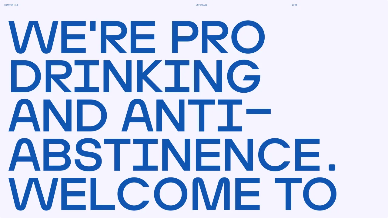
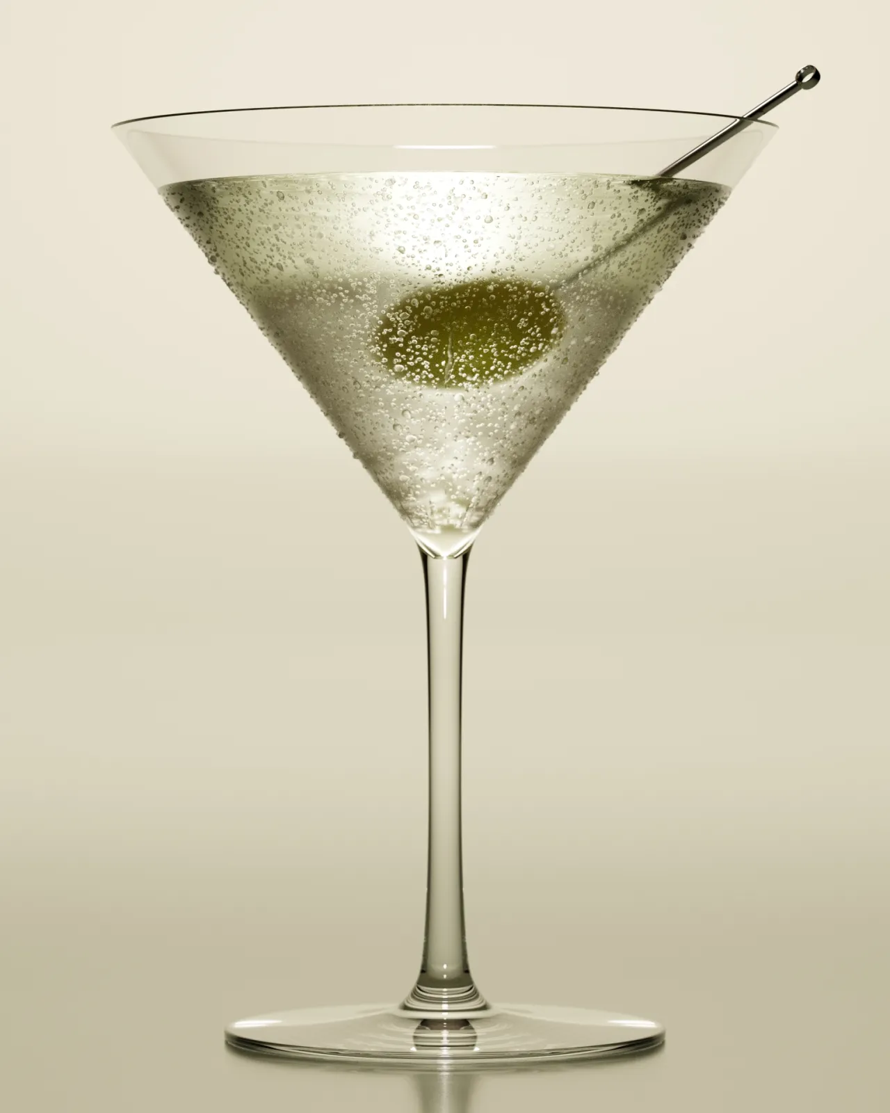
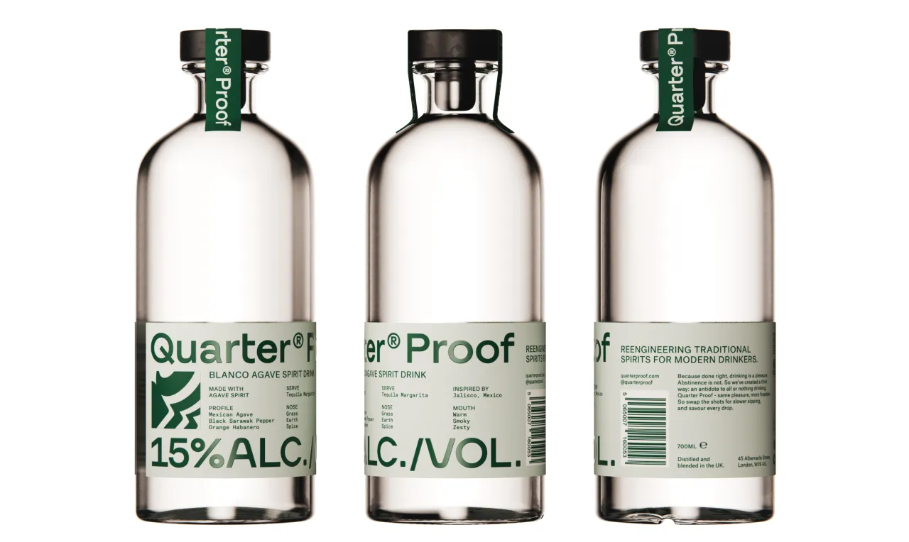
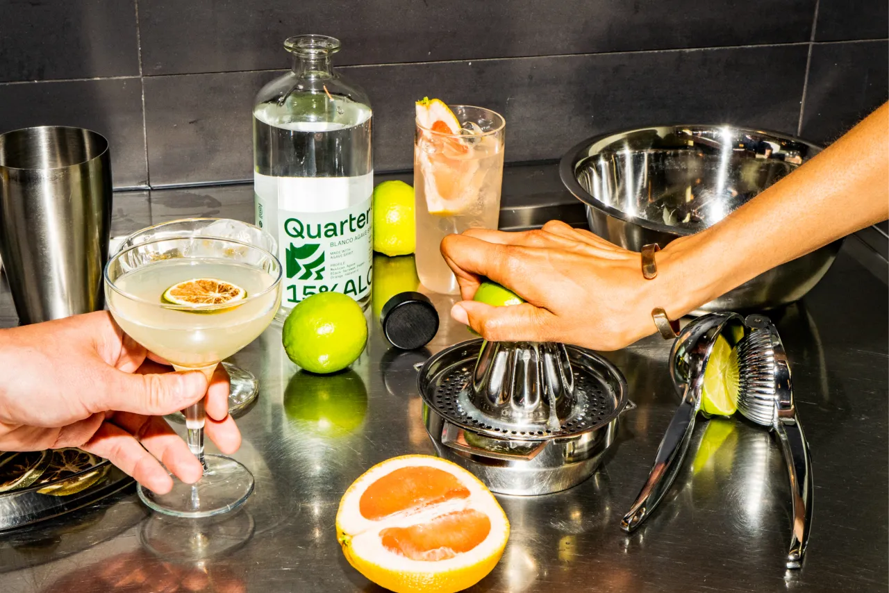
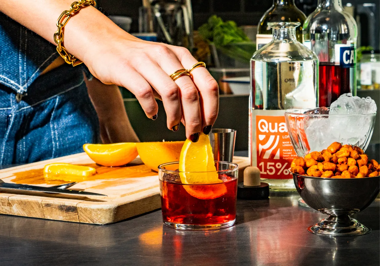
The studio also changed the names of Quarter Proof's 15% ABV spirits to get into the American market and avoid various legal entanglements, according to Little. The brand's gin and tequila were previously called 'Light G/N' and 'Light T/Quila', whereas now they go by London Dry (Gin), Blanco Agave (Tequila), with the third in the party being Three Grain Spirit (Vodka).
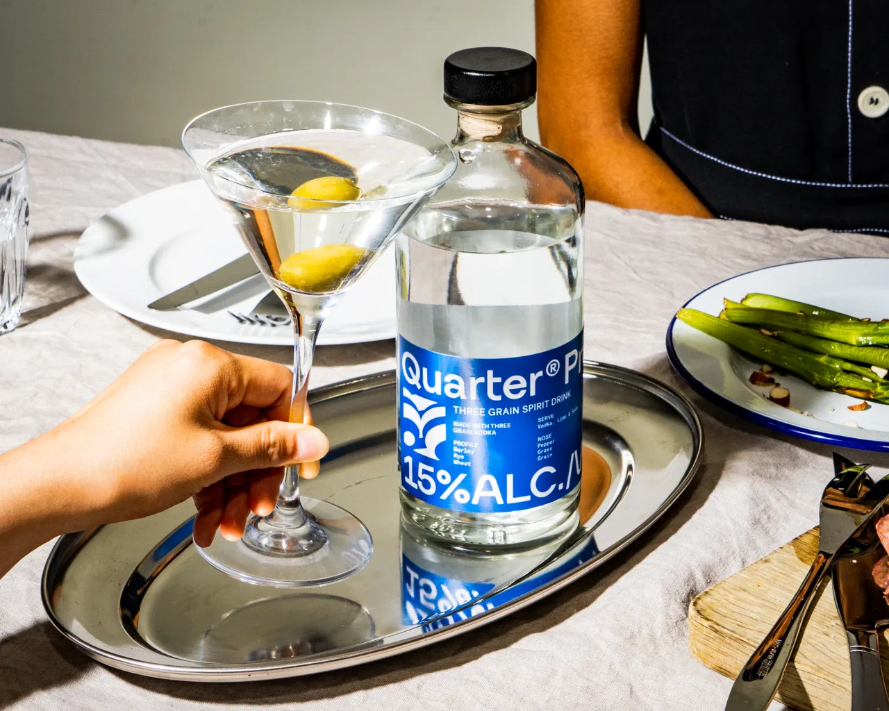
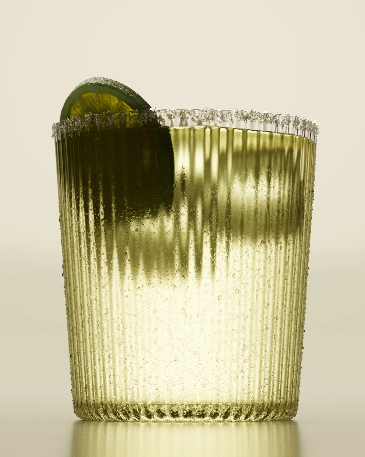
When choosing the colour palette for each spirit, Regular Practice borrowed semiotics from the existing spirit world and considered ingredients and legacy colours. Since Quarter Gin was always orange, that stayed the same, while the tequila took on a green shade in line with the added mention of Agave in its name.
The Quarter Proof vodka, or 'Three Grain Spirit', is blue, "partly because of brands like Belvedere, Absolut, and Ciroq", adds Regular Practice founder and MD Tom Finn.
The goal of the brand emblem was to create something resembling a maker's mark. Finn notes that they wanted it to be "a distinctive and ownable stamp that can carry across the brand, flex across different SKUs, and grow for the future".
He describes it as "a window into the distillation process", which uses something called fractionation, which involves harnessing centrifugal force to strip out three-quarters of the alcohol "while retaining the fundamental keys of flavour and taste".
"It's not a literal visualisation, but it's a living breathing representation of the spirit of innovation that's built into Quarter Proof's process, a combination of traditional distilling techniques with modern science," Finn explains.
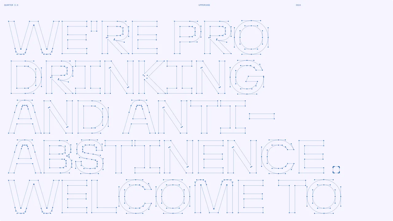
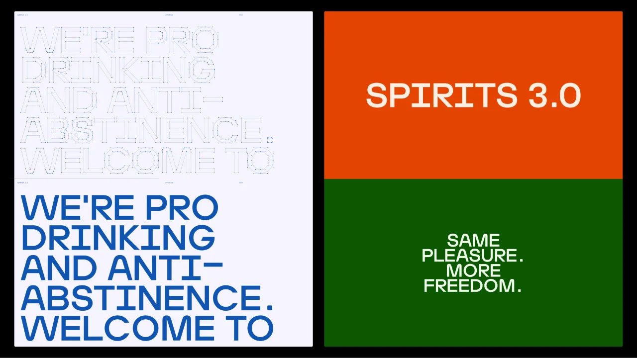
For the wordmark and larger font applications, Regular Practice drew a custom headline typeface in the studio, with some help from independent type designer and regular collaborator Kasper Pyndt. Finn says: "The type itself has a kind of technical feel to it, with rounded corners, accentuated elements in the ink traps, and lighter weight.
"However, there is still a roundness and character that comes through in the lowercase 'a' and geometric circular characters."
The type-led design system is complemented by Atlas Grotesk, which Fin says has "a rudimentary charm to it, brought to life through 3D renders and bespoke motion graphics".
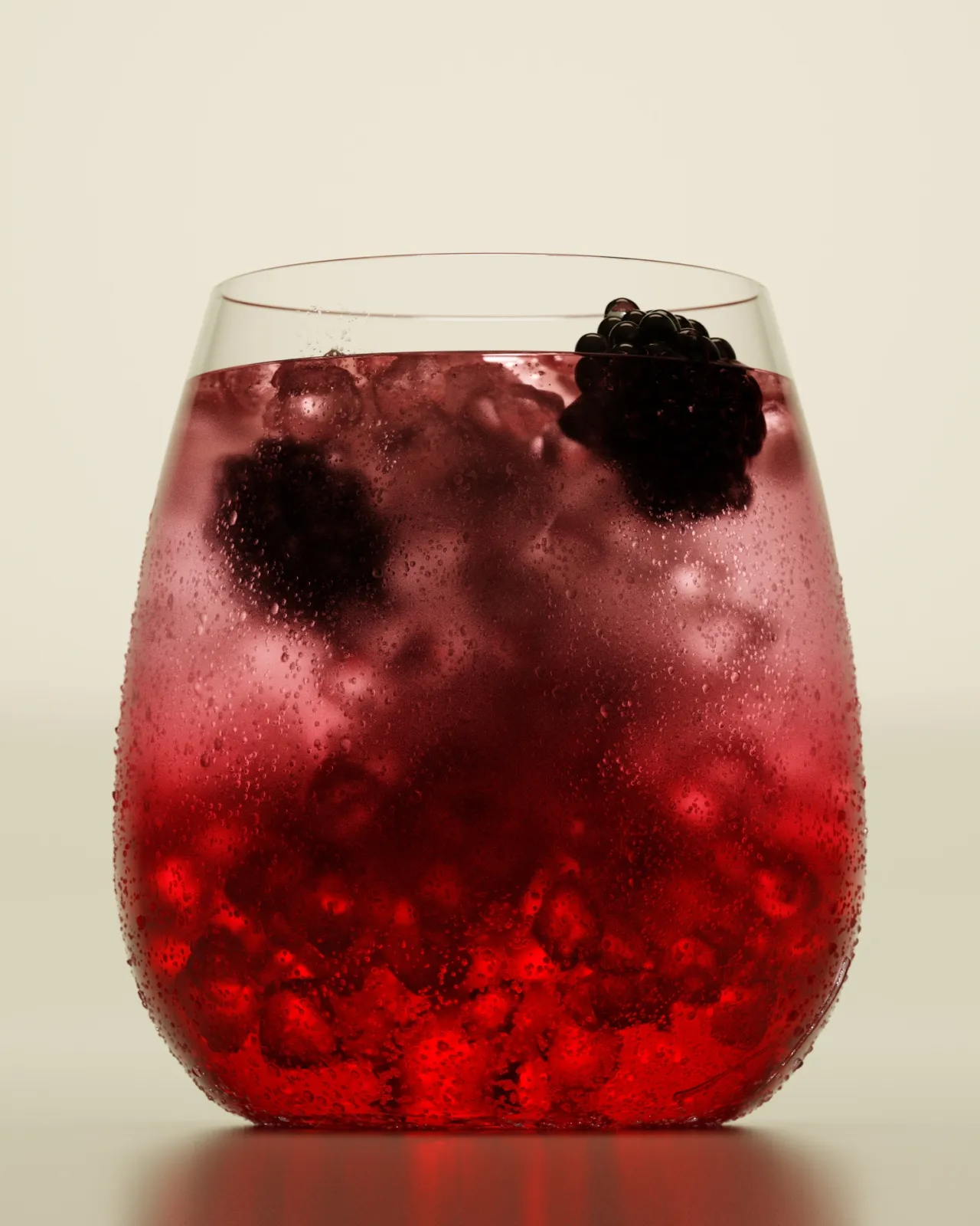
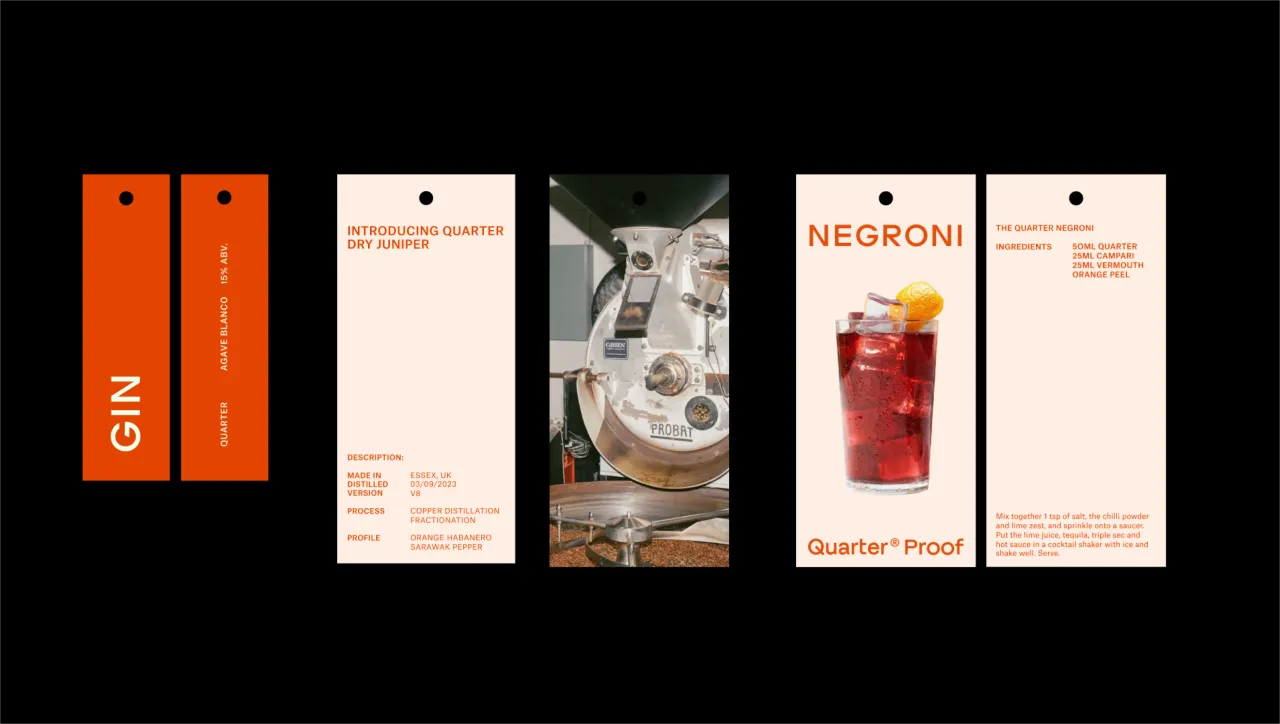
Regular Practice took a uniform approach to the design of the labels and packaging, allowing the different spirits to look like a tight unity while still showcasing their individual colour palettes. The studio opted to use two tones of the same colour for each SKU, with some based on the original colours and others, like tequila, using green to add a sense of familiarity and align with consumer expectations.
Finn adds that the labels use "a soft-touch material with a gloss varnish over the larger letters".
Editor's Picks





Trending




Latest Jobs
Senior Graphic Designer at MoMA Retail
Full-time·New York·$72k-$80k
Senior Copywriter at Human After All
Full-time·London·£48k–£66k
Midweight Designer at Catalyst Creative
Full-time·London·£32k-£36k
Senior 2D Motion Designer at Art&Graft
Full-time·London·£50k-£65k
Designer at New Genre
Full-time·London·£36k–£48k
Design Director at Human After All
Full-time·London·£66k–£88k