Red Stone rebrands Explorer Scouts for a generation worn out by expectation
London agency Red Stone has rebranded Explorers, the Scouts programme for 14–18-year-olds, around a blunt new line – "Grow up" – with a compass-led marque, bold supergraphics, and 40 fresh badges.
When Explorer Scouts launched in 2002, most families shared a single home computer (if they had one at all), and social media didn't exist yet. Two decades later, the world has moved on, and a brand built for teenagers was starting to show its age.
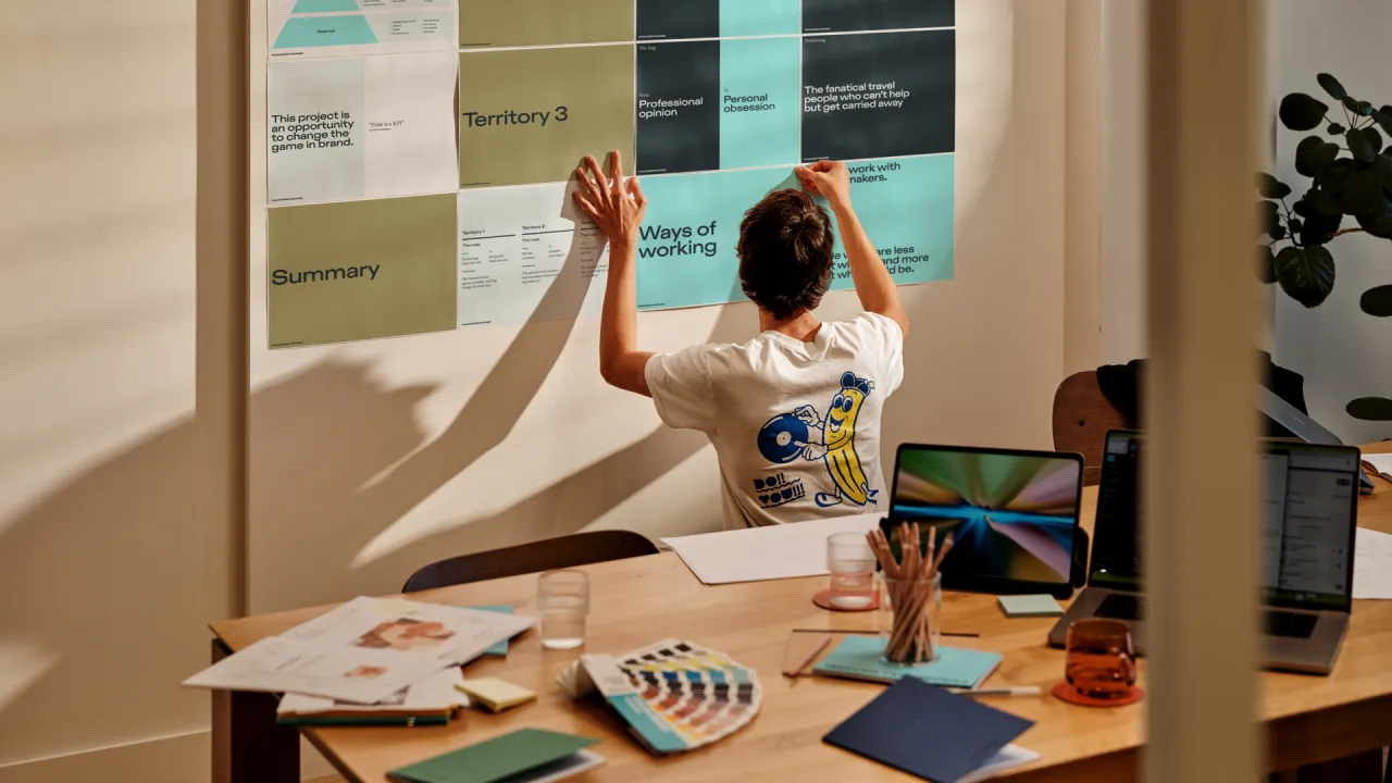
It's why Scouts brought in London agency Red Stone to give Explorers a new identity. It wanted something more relevant and inclusive. And it had to feel authentic to brand-savvy "digital natives" who can spot an advert a mile off.
It comes as research suggests many teenagers feel less prepared for adult life, with teachers flagging concerns about confidence, communication, and readiness for work. So alongside the rebrand, Scouts has refreshed the Explorers programme itself. Co-designed with young people, it offers a mix of practical skills with creativity, leadership, and adventure.

At its core is a deliberately un-slick line: "Grow up". Teenagers, it argues, are worn out by the constant pressure to perform at school and everywhere else. And it sadly leaves little room for curiosity or growth.
Instead of overpromising, the brand positioning frames Explorers as a place anyone can belong, but nobody has to fit any mould. A straight-talking personality, "Real curious", carries it through.
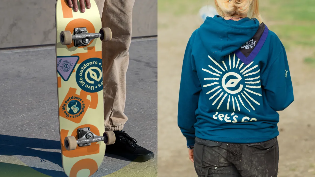
The identity puts young people front and centre. The new marque takes its cue from the compass, giving Explorers a strong visual language for the journey, and a set of bold supergraphics spins out from it, with a subtle nod to the Explorer necker. The photography keeps things real rather than staged: the friendship, the energy, and the general randomness of being part of a club.

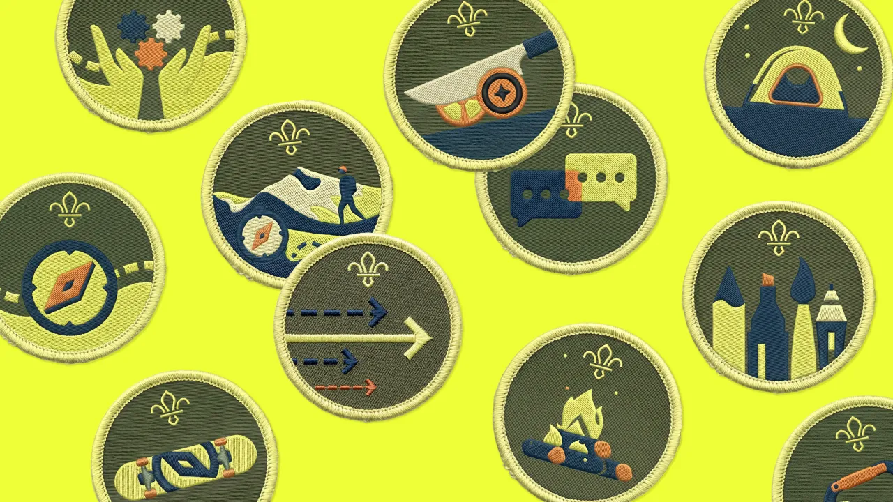
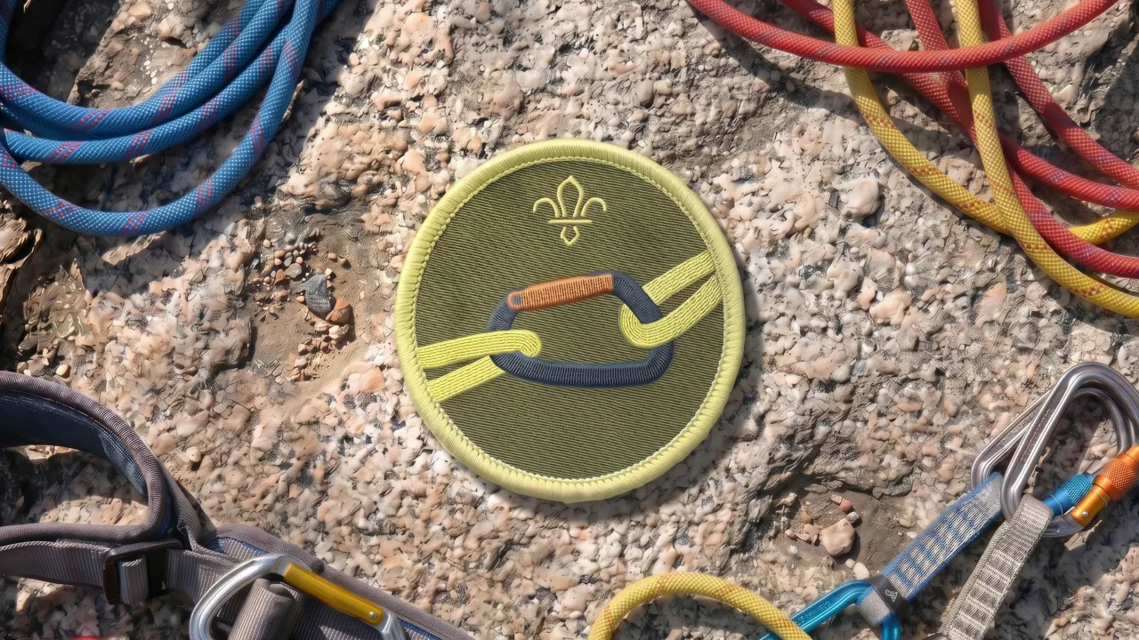
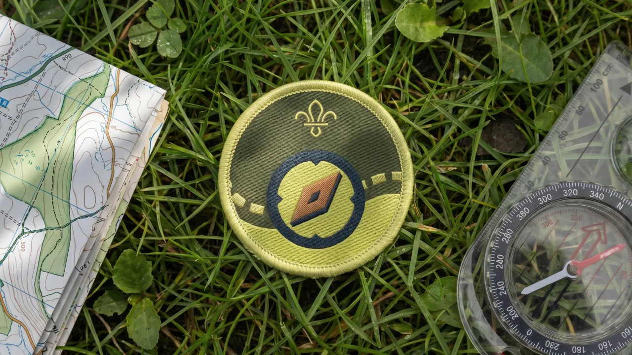
Consistency mattered, but Red Stone also built the brand so every unit and Explorer can make it their own. A logo system and templated comms let each club create its own materials that still feel on-brand. And a set of "logo expressions" loosens things up for merch. The team also illustrated 40 badges to match the revamped programme: bold, accessible, and designed to add a pop of colour to every uniform.
"Red Stone has helped set a new direction for Explorers Scouts to meet the needs of Generation Alpha, balancing real-world skills and adventure with a powerful sense of belonging," says Chris James, brand and content lead at Scouts. "The brand feels fresh, equally at home on screen and in print. It's inspired by the outdoors, shaped by young people and truly captures the fun, friendship and freedom, pointing to brighter futures."
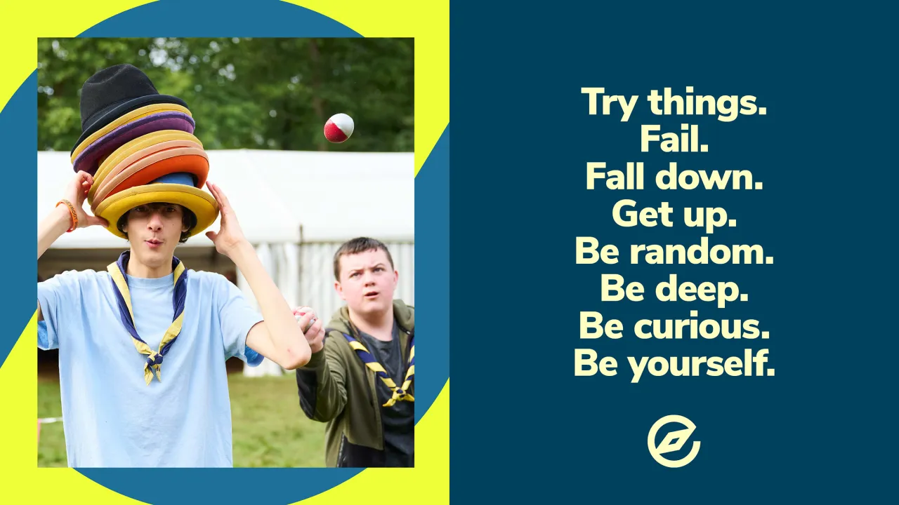
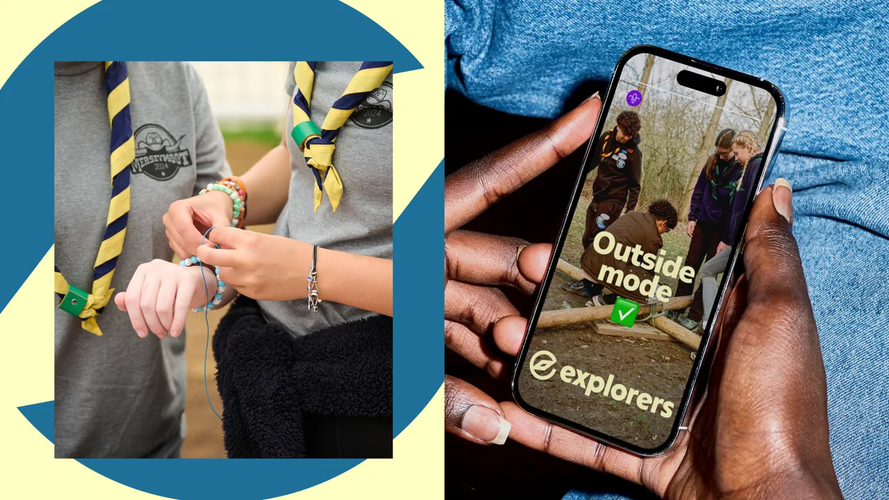
For Red Stone, the brief came down to challenging assumptions. "Positioning Explorers as an antidote to the intense, always-on nature of life for teenagers today, we wanted to build a brand that embraced individuality, curiosity and most importantly, fun," says Rich Corr, associate creative strategy director at the agency. "From the strategy through to the graphic assets, the brand is welcoming, eclectic, and just a little bit irreverent."
It all rolls out as Explorers gears up to relaunch and reach more young people across the UK.
Editor's Picks





Trending




Latest Jobs
Senior Designer at BKC
Full-time·£50k-£60k
Senior Copywriter at Human After All
Full-time·London·£48k–£66k
Content Editor at ITV
Full-time·Birmingham·£41,284 - £57,412
Creative Project Manager at Analogue
Full-time·Leeds·£28k–£35k
Brand Designer, Product Launches at Figma
Full-time·New York·$127k–$269k
Head of design at Cog Design
Full-time·London·£55K