Publisher Sitting Wren encourages readers to burn books - but not in the way you think
A book of matches sits at the heart of Sitting Wren's latest campaign, which uses a clever play on words.
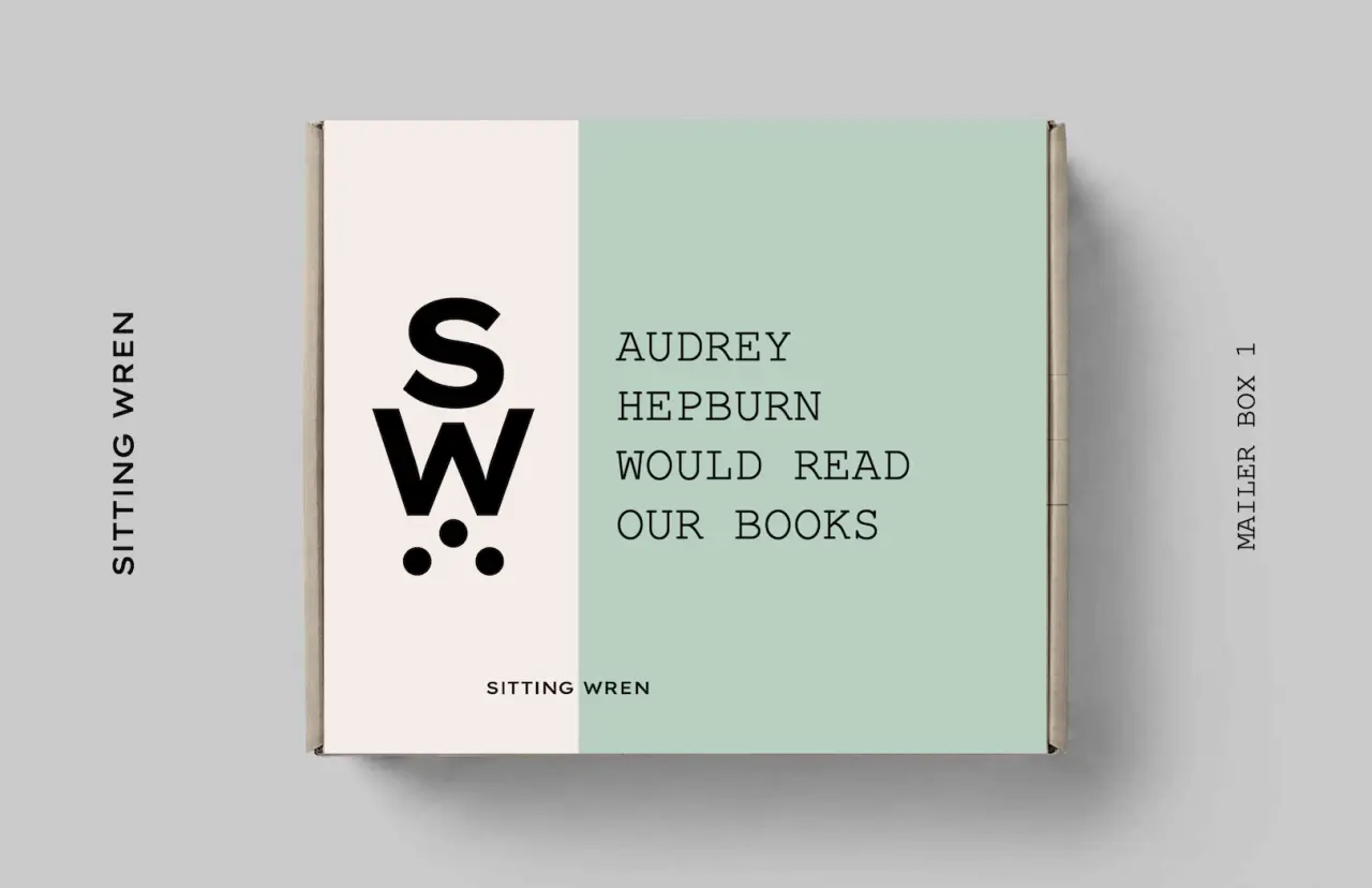
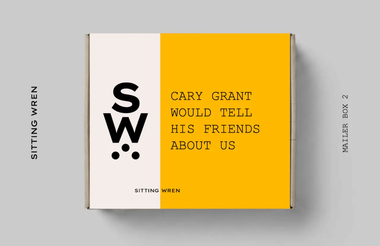
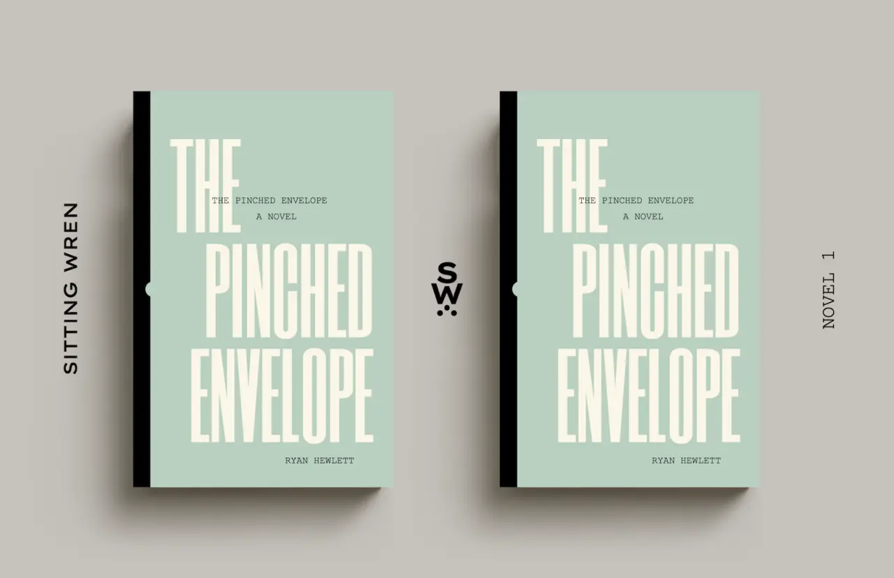
Sitting Wren is a small book publisher with a budget to match, specialising in new novels set in vintage eras. But thanks to the smart work of creative director and author Ryan Hewlett, it knows how to turn the smallest sparks of creative energy into the biggest explosion possible.
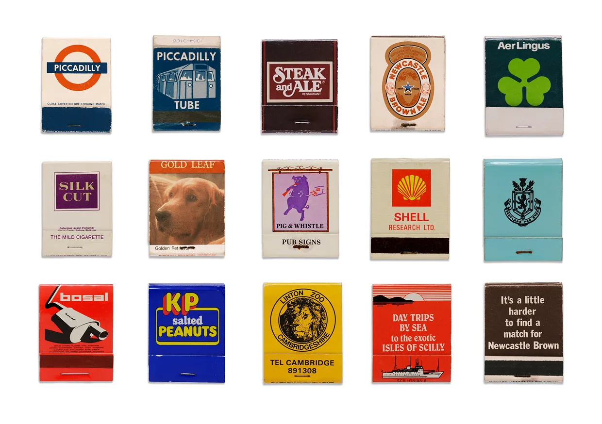
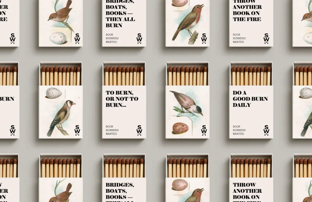
This is plain to see in its latest eye-catching campaign, Book Burners Wanted. Centred around a known and loved icon, in this case a little book of matches, the campaign taps into the viewer's unconscious fascination with all things fiery.
"The goal was to create something physical, tangible, and highly collectable – something that people would want to keep and show off to others," Ryan tells Creative Boom. "Too many promos go straight into the trash. These matchboxes can sit comfortably on a shelf or a coffee table as decorative conversation pieces that get people talking about the brand.
"The little boxes are also functional as miniature symbols of books, as they are proportionally the same."
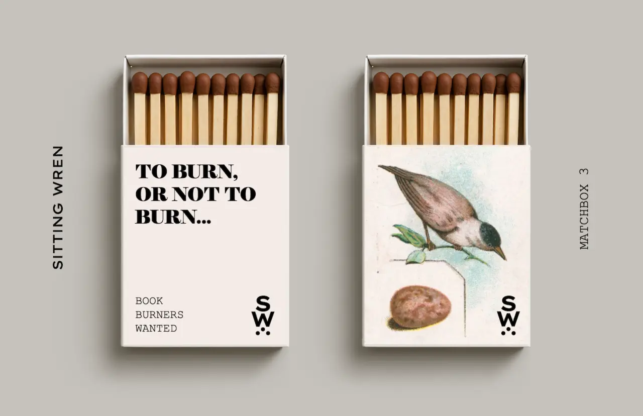
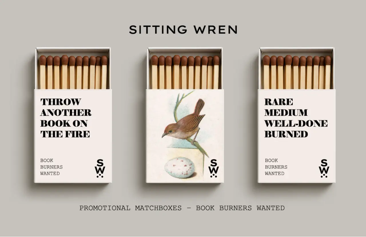
The campaign's tagline is deliberately provocative. Book burning carries strong connotations of oppression, so on the surface it's a peculiar slogan for a publisher. Ryan clarifies that this whiplash is deliberate, claiming that if you want to find out who actually cares about something, you need to threaten to take it away.
"A call to 'burn the books' is really a call to see who cares about them the most. It is also a play on words, referencing another meaning of 'burning' a book – the slow, etching process of burning a good story into your mind, one chapter at a time, whenever you find a book that feels like it was written just for you.
"Beyond this, it is obviously a cultural allusion to the famous concept of book burning, popularised by novels such as Fahrenheit 451, which many readers of classic literature are undoubtedly familiar with."
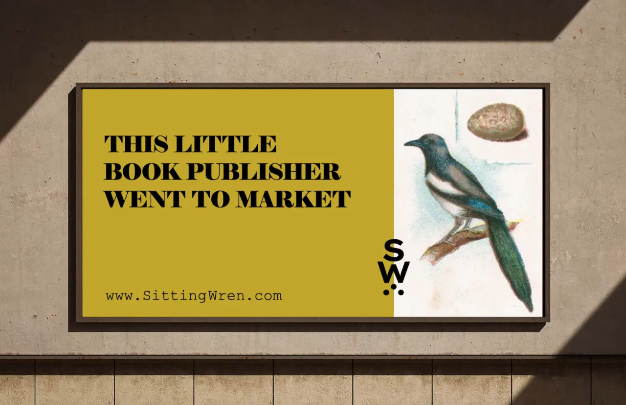
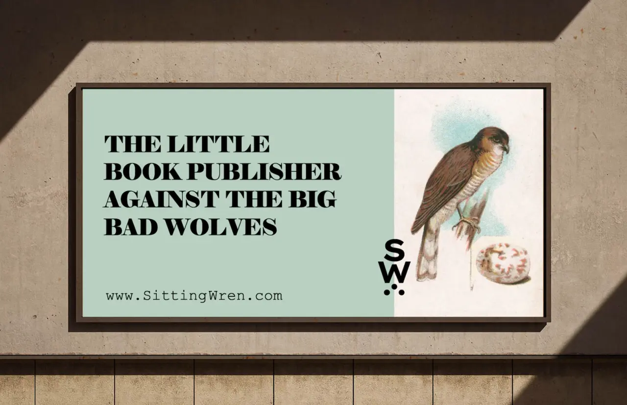
It's a potent image, and one that's thrown into relief even further by Sitting Wren's overall branding, which is centred around birds. Ryan sees these birds as a powerful symbol of nature, and their charming art style also evokes a strong emotional response of nostalgia and connection.
"Naturally, the intention behind the vintage style of the illustrations is to instantly pull the viewer back into an older era that highlighted the elegant and sophisticated," says Ryan.
"The styles of the Edwardian Age up through the Gilded Age and Mid-Century Modern period represent an epitome of a time when things were not only well-designed, but better crafted – with an unmatched attention to detail."


Trending


Latest Jobs
GTA VI (Grand Theft Auto VI) Social Lead at Future
Full-time·Bath·£29,000 – £40,000
Creative Technical Demonstrator at University of Salford
Full-time·Salford·£30,986 – £33,662
Producer at Art&Graft
Full-time·London·£40,000 – £53,000
Creative Designer & Marketing Specialist at The Sweet People
Full-time·Leighton Buzzard·£32,000 – £38,000
Director, Product Design at Datadog
Full-time·New York·$232,000 – $290,000
Lead Product Designer at Monzo
Full-time·London·£90,000 – £120,000