The Click creates bold, geometric new branding for Norwich Castle
The Click has created new branding for Norwich Castle, a medieval historical landmark originally established on the order of William the Conqueror in 1067.
Since it was first created nearly 1,000 years ago, Norwich Castle has been a fortification, a royal palace, a prison and, more recently, a museum and art gallery.
It is currently undergoing a £13m revamp, which will include a new medieval gallery designed in partnership with the British Museum, along with improved visitor facilities such as a cafe, restaurant and retail offering, and new digital and learning spaces.
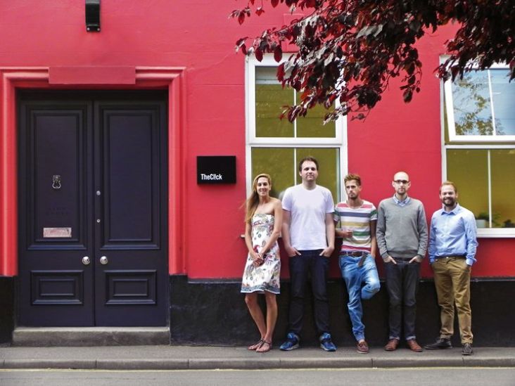
The Click, also based in Norwich, was brought in to create new branding that will be rolled out to coincide with next year's reopening of the refurbished Keep and new visitor spaces. Its new branding for Norwich Castle was inspired by the physical form of the Norman Keep, which "resembles a cube and, as such, is instantly recognisable as well as being memorable," says The Click.
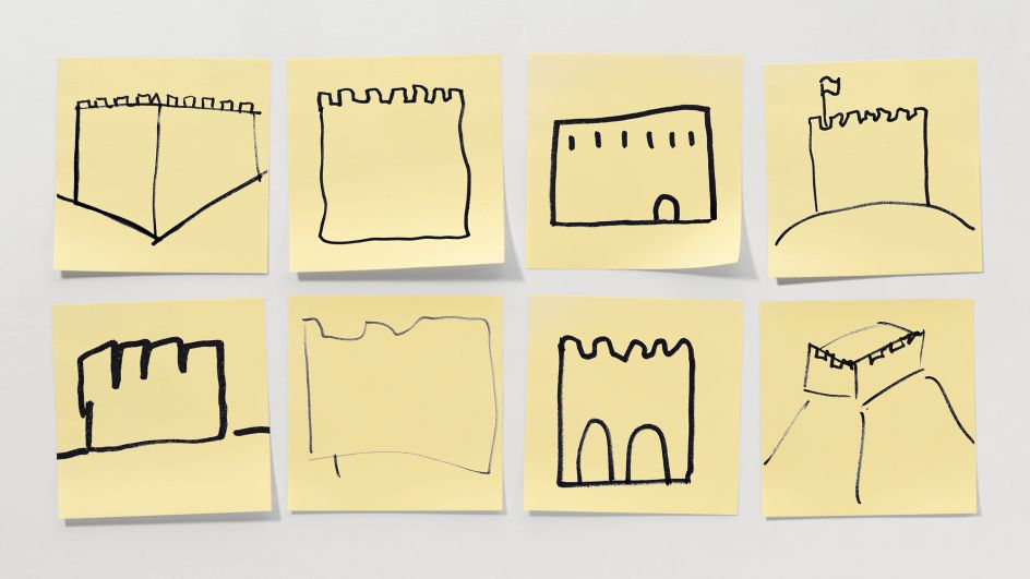
At the start of the project, the design team challenged members of the public to draw a picture of the castle purely from memory on a PostIt note in just ten seconds. "The results were hugely informative and, in turn, very much guided our thinking and creative execution," The Click adds.
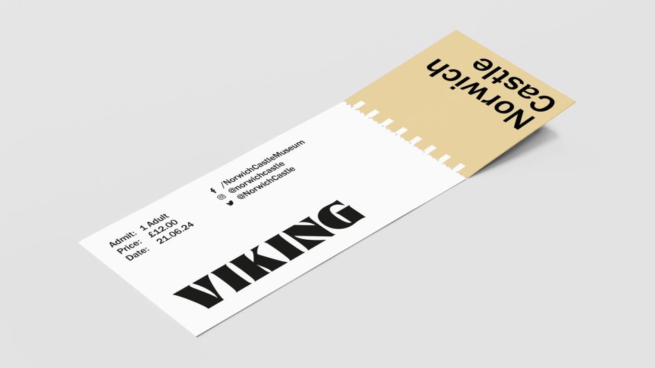
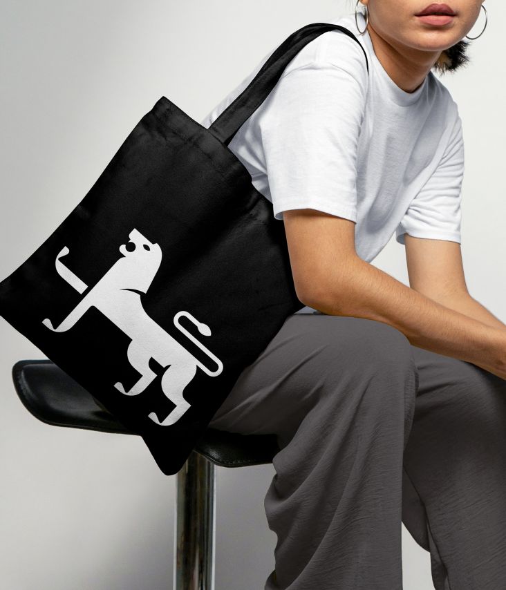
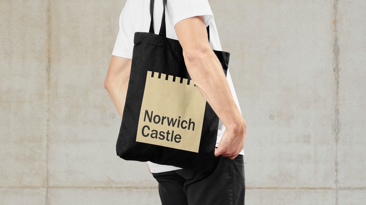
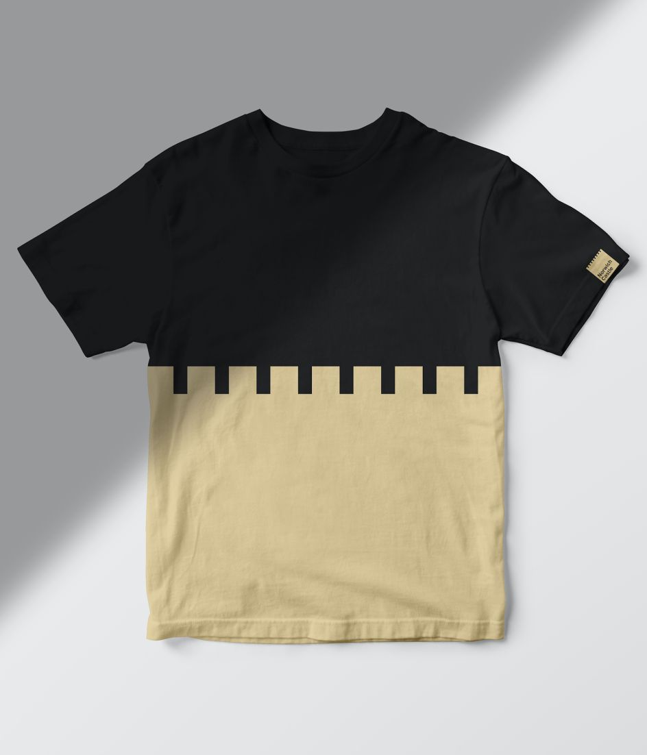
In keeping with the cube-like form of the Keep, the new design system is modular and largely formed by squares. This creates a simple, consistent format that can be used across various branding applications and in templates to roll out the branding in future.
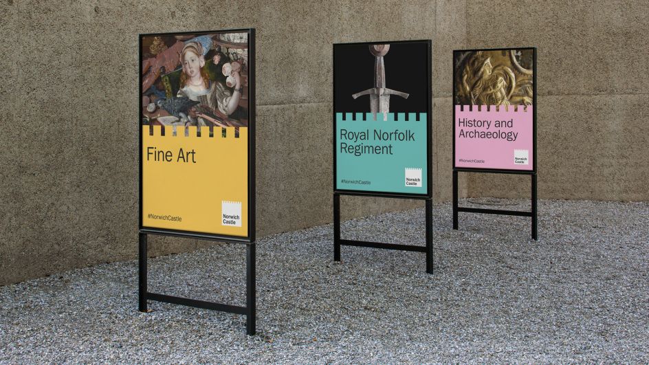
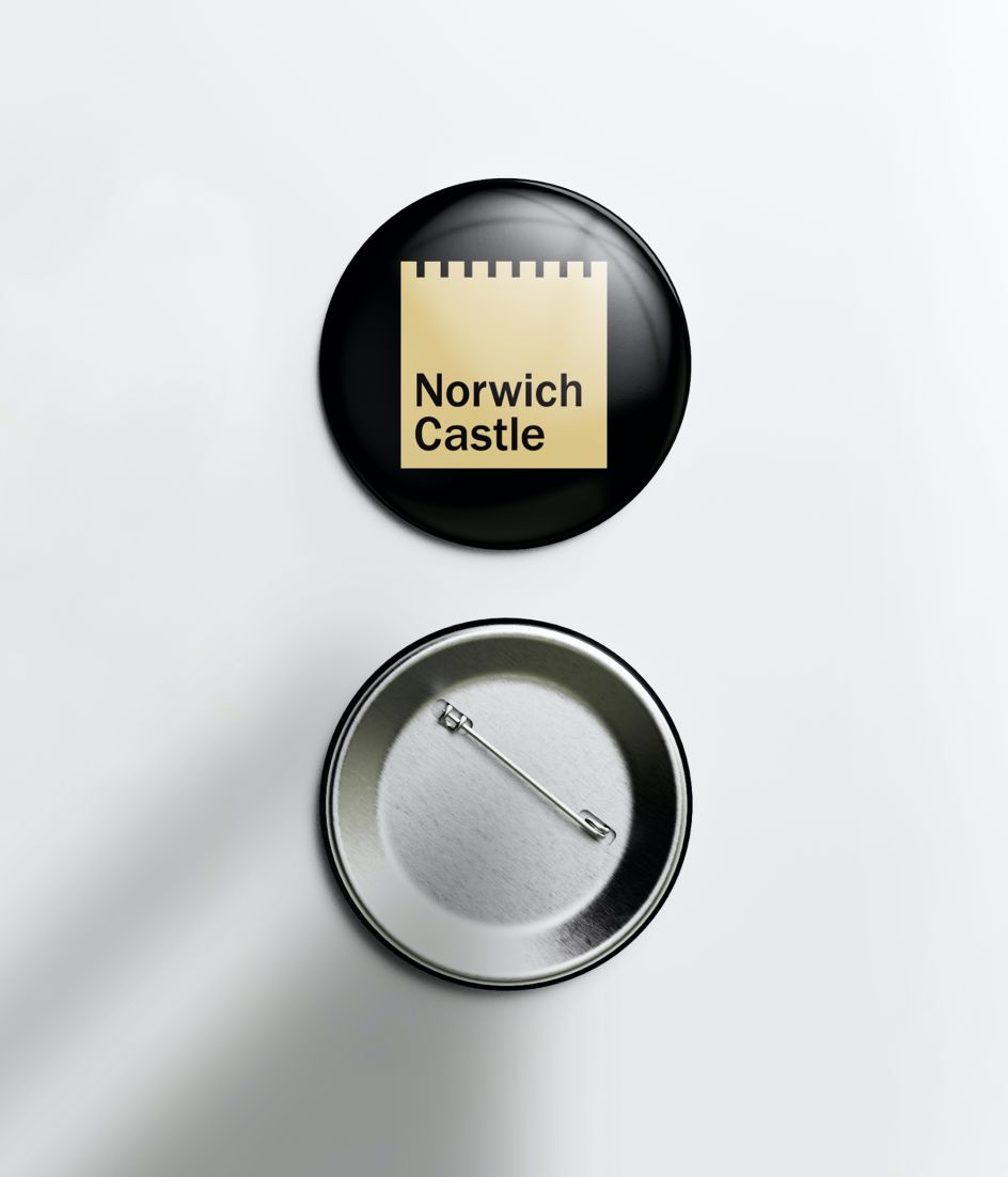
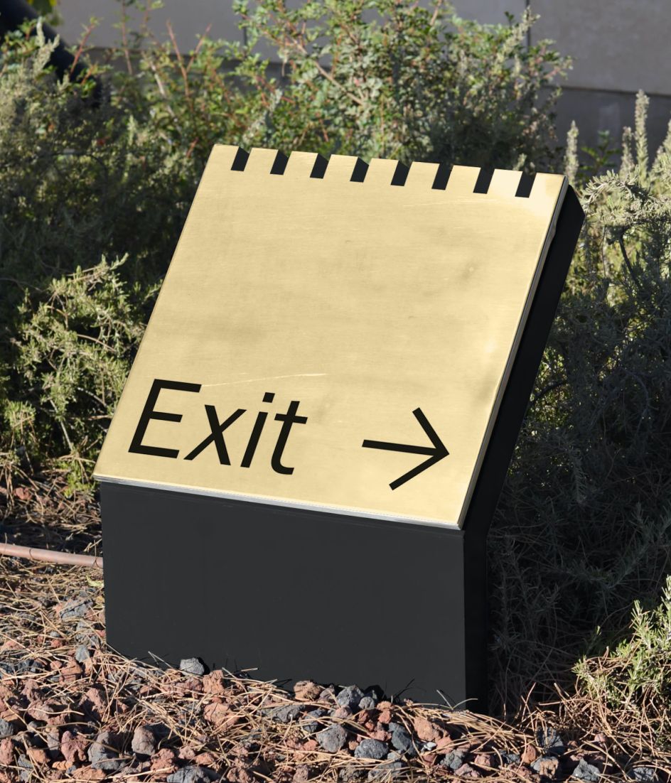
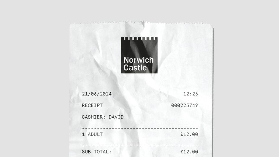
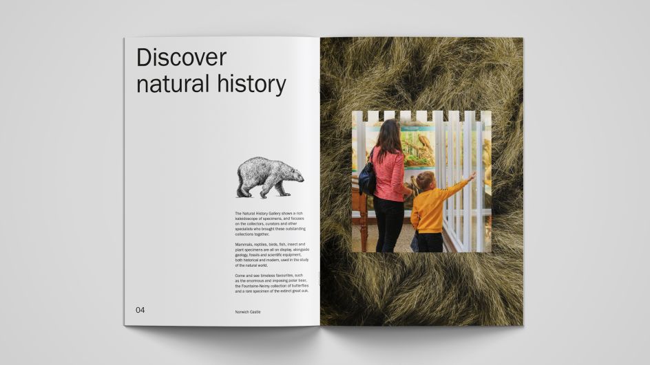
The top of the brand logo bears what The Click terms a 'crenelation device' - in other words, castle battlements - which is used as a graphic divider for a range of communications, including signage, campaigns and digital applications.
The main logo was deliberately kept simple in order to give the castle endless possibilities to use it across merchandise and render it with bold production techniques. It works just as well on tiny pin badges as vast navigation signage, as well.
"We crafted an uncompromisingly simple mark – unmistakably portraying Norwich Castle. In isolation, the core brand logo is understated and intentionally unembellished," says Adam Ewels, The Click design director.
"We removed everything from the previous brand logo that wasn't needed – distilling the visual representation of the castle to its simplest and most iconic form. The geometry of the core brand logo directly informs a unique (nine-column) grid system – referencing the number of merlons on each aspect of the castle."
"This new branding much better supports Norwich Castle's ever-evolving digital offering – from their website, interactive exhibitions, social media and beyond," adds The Click. "It's not every day we get to work with a nearly 1,000-year-old landmark – especially one built on the instruction of William the Conqueror!"

Editor's Picks


Trending


Podcasts
Editor's Picks
Further Reading