Pentagram's Marina Willer leads the identity for a new charity that hopes to tackle lung disease
After two years of a global pandemic, you'd think awareness and understanding of lung disease would be much higher today but it's still hugely misunderstood. Now two leading charities have merged to tackle the problem, appointing Pentagram to create its new identity.
Approximately one in five people in the UK will experience a lung condition in their lifetime and as around 10,000 people in the UK are diagnosed every week, lung disease remains the UK's third-biggest killer. But despite the shocking stats (and the impact of Covid-19), there are still a lot of misconceptions surrounding lung health with many assuming that only people who smoke or have poor lifestyle choices are at risk.
On a mission to change all that are two of the UK's biggest lung charities which have merged to create a single charity under the name of Asthma UK and British Lung Foundation Partnership. Its mission is to be the driving force behind the transformation of lung health by improving understanding amongst the public, politicians and policymakers, as well as to support everyone affected and help drive improvement in prevention, treatment and support.
Pentagram was approached to develop a strong and compelling brand for the new organisation, to enable it to change the perception of lung health and help it stand out in the crowded charity sector. The identity needed to be "powerful and compelling" for new supporters, as well as bring together existing beneficiaries and donors from Asthma UK and British Lung Foundation.
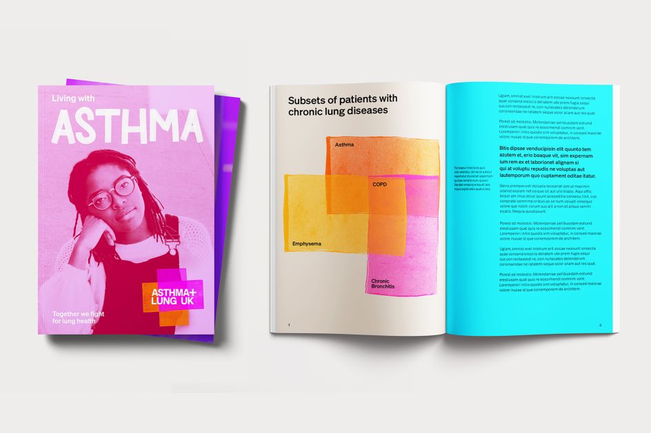
Marina Willer and her team created a new visual identity, including logo, typography, colour palette and graphic language, as well as art direction for photography. These all work together to bring to life the newly chosen name of Asthma + Lung UK.
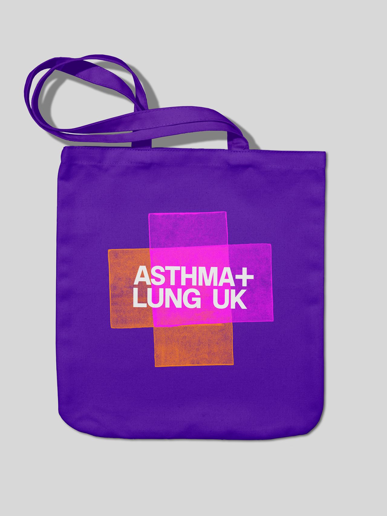
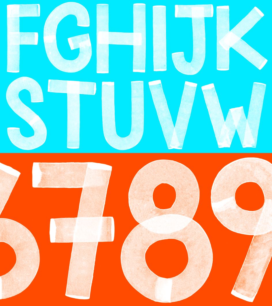
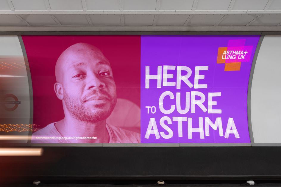
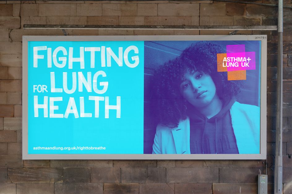
The logo is the primary beacon for the Asthma + Lung UK visual identity. It uses two opaque coloured blocks which are overlaid to create the form of a plus sign, designed to symbolise the coming together of the two organisations and echo the plus symbol in the name. The logotype's robust block of bespoke type sits at the centre of the symbol, which is also a reference to medical care. Offering support is an "informal, individual and deliberately approachable" bespoke display typeface created by Pentagram. As the brief was to create a "fighter brand", which worked as a positive movement, this plays a key part in forming the tonality of the brand. Söhne by Klim Type Foundry is the supporting typeface, offering a clear and more serious approach where necessary.
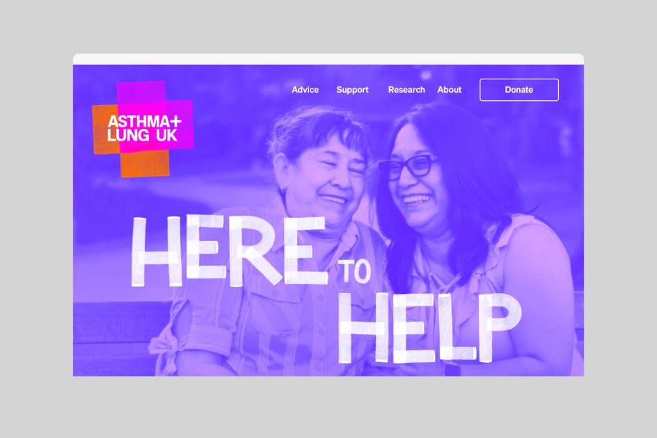
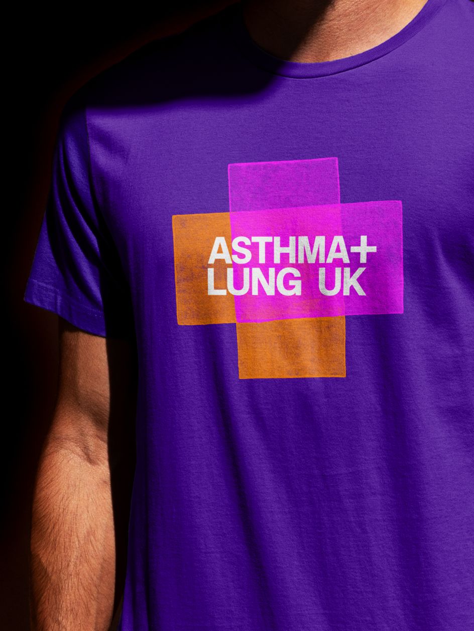
Colour plays a central part in the new identity. The core palette is contemporary, vibrant and warm, with a series of subdued tones added to complement the stronger colours. "This facilitates an adaptable use of colour combinations that are easily recognisable throughout Asthma + Lung UK’s brand communications," explains Pentagram.
Photography is spilt between portrait and narrative with the former being natural and honest, shot using ambient light and featuring people in their own environments. "They remind us that lung disease can happen to anyone at any time in their lives," says the agency. Narrative shots, meanwhile, capture the feeling and mood of a moment or event as well as the interaction between people and the conveyed care, kindness, and humanity. Images are also colour-treated for extra impact in online and offline campaigns.
Sarah Woolnough from Asthma + Lung UK says: "With our eye-catching new look and important strategy, we are better equipped to fight for a world where everyone has healthy lungs and to shine a spotlight on the shameful state of the UK's lung health, which for far too long has been neglected, side-lined and underfunded. Pentagram has done a fantastic job of creating this strong visual identity, which will no doubt help us to campaign for more research into lung conditions, cleaner air and better access to diagnosis and treatment."
Editor's Picks


Trending


Podcasts
Editor's Picks
Further Reading


