Pancreatic Cancer UK indicates urgency with its new editorial identity
GOOD designed the identity to align with the charity's ambitions to double survival rates in the next five years and help it stand out among other cancer charities to gain much-needed funding.
Pancreatic cancer survival rates have barely improved in 50 years, which isn't helped by the fact that it receives just 3% of the total cancer research budget in the UK. Because of this, over half the 10,500 people diagnosed each year in the UK still die within three months of their diagnosis.
Given its experience rebranding similar organisations, creative agency GOOD stepped in to help Pancreatic Cancer UK implement its new five-year strategy for doubling survival rates.
The agency's associate creative director, Isobel Boyce, was very excited by the brief and the challenges it would bring. "Pancreatic cancer is a particularly brutal cancer and has been very left behind in public knowledge and funding, and so the brand we developed needed to combat a sense of fatalism with tenacity and optimism," she explains.
GOOD CEO Chris Norman adds that the brand had to reflect "the relentless energy of their organisation" as well as an unignorable urgency.
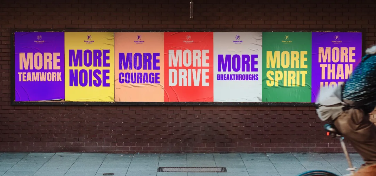
According to associate creative director Pete Snell, being flexible to various audiences was key to making this brand a success. Talking to people with lived experience was crucial to achieving this, and it gave GOOD two clear insights.
Firstly, since the disease has been ignored and overlooked, the brand had to stand out to policymakers, fundraisers, and the general public. Secondly, it had to mean something to those experiencing pancreatic cancer and show empathy and compassion.
"This informed a design system that could scale between what we labelled 'Unignorable' or 'Compassionate' depending on the audience we were talking to, whilst always being able to be in our editorial style," says Snell.
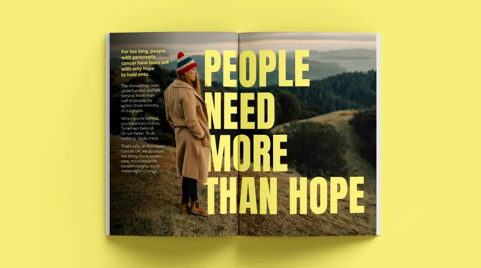
This editorial style informed every choice that GOOD made, whether it was what fonts to use or how to shoot certain images. With those brand tools at the ready, the agency then sought to ensure "a change in mentality within the organisation to consider every brand execution in the same way you might consider a newspaper cover, as opposed to a charity brand," Snell explains.
This involved asking questions like: "What's the punchy headline? How do you use design hierarchy to make this the hero in the layout? What's the perfect image to go with this headline?"
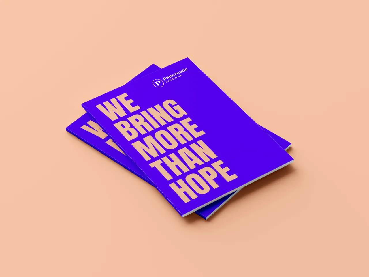
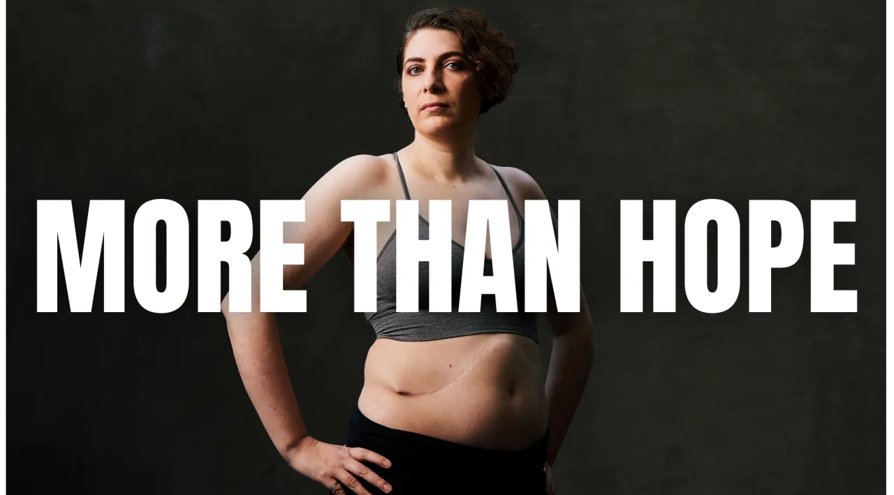
The driving force behind all of the visuals was the brand idea 'More than hope'. Boyce, who has spent her career writing for charities in various capacities, notes that the word 'hope' gets used an awful lot and is important in many ways.
"For example, it's a huge comfort for people to have when it comes to cancer. But there's also a fragility and passivity to it – at the end of the day, no one wants to be told that all they have is hope," she says.
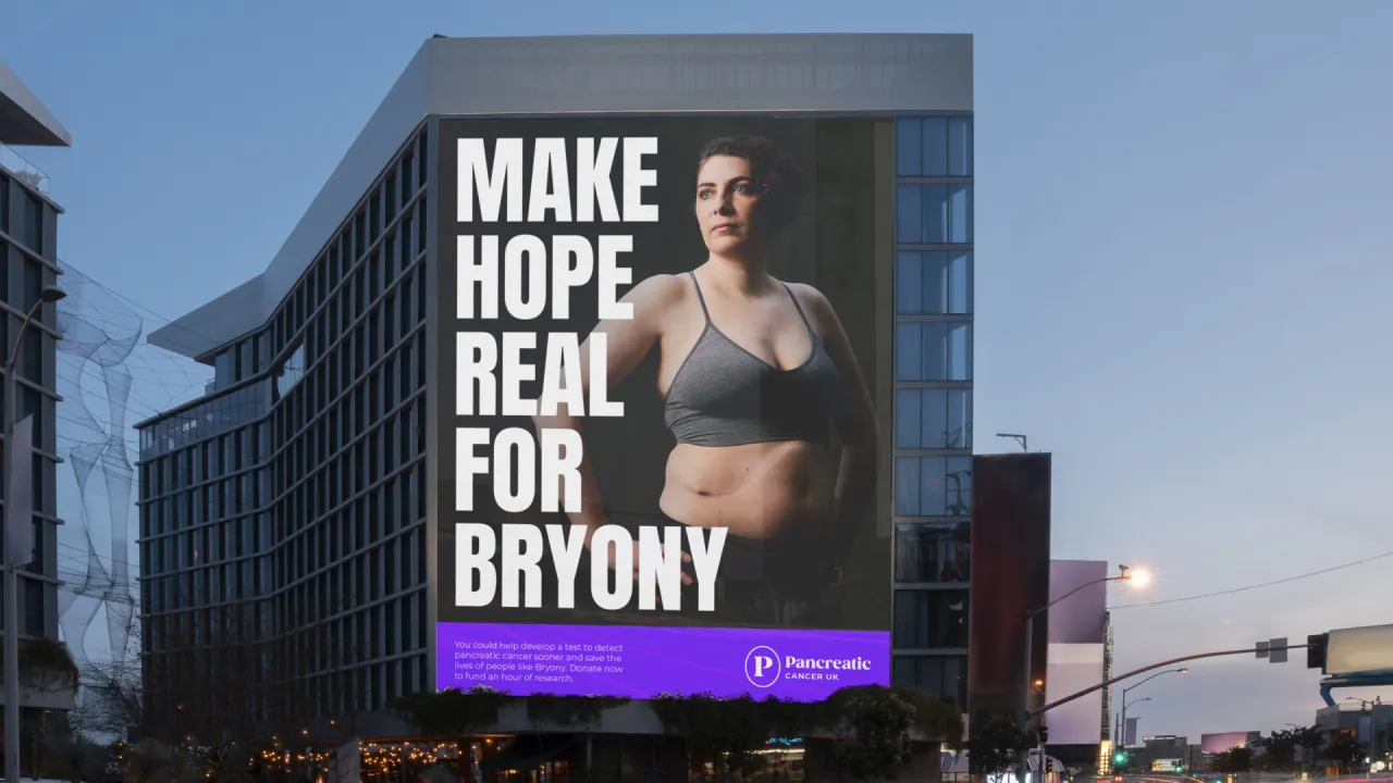
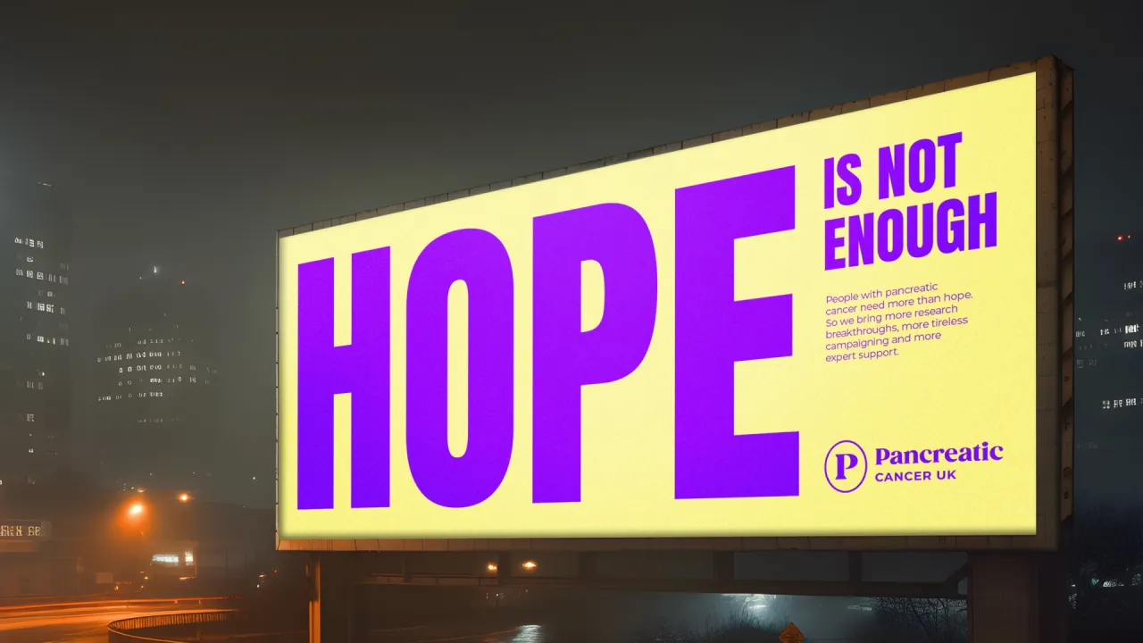
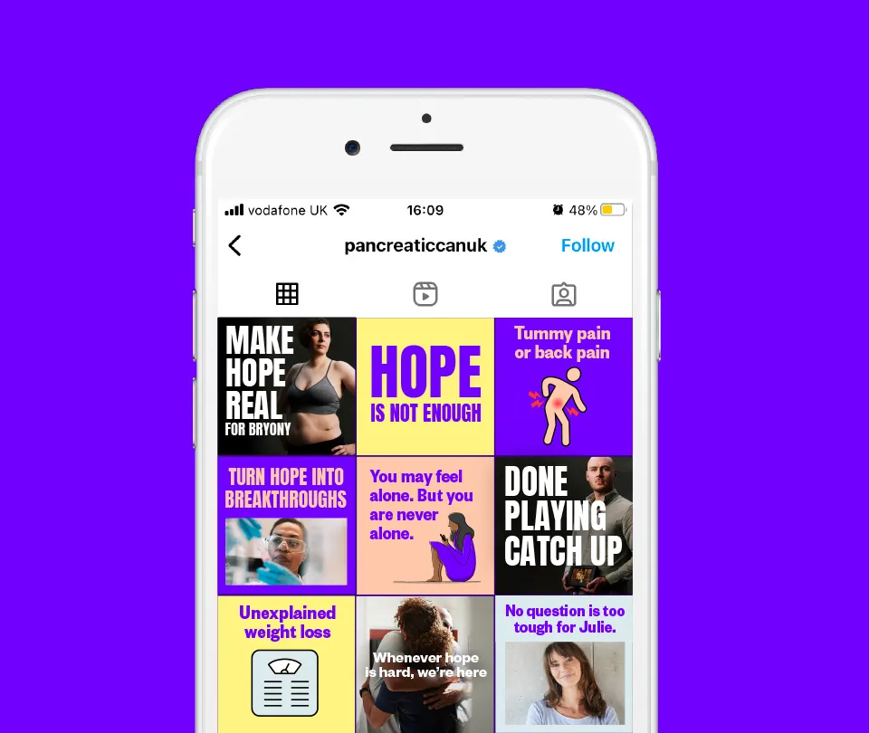
The phrase was chosen to convey that Pancreatic Cancer UK really does bring more to the table, from its campaigning to its research to its support services, championing the charity's energy and passion. "We also wanted an idea that focused on tangible action and could encourage people to take action," Boyce adds.
Previously, the charity's logo relied heavily on the 'PCUK' acronym, resulting in what Snell calls a "digitally unfriendly shape", which was undistinctive next to other UK cancer charities, especially Prostate Cancer UK, which shares the same acronym. "We realised that their difference lay in the 'P' for Pancreatic, so for the wordmark, we switched up the typographic hierarchy, so all the emphasis was on the word 'Pancreatic'," says Snell.
Typography choice was equally important in helping the charity to stand out, as most others in this space use sans-serif wordmarks. These can sometimes feel "cold and corporate", so GOOD opted for a serif font with soft, rounded flourishes that convey "compassion and warmth", according to Snell.
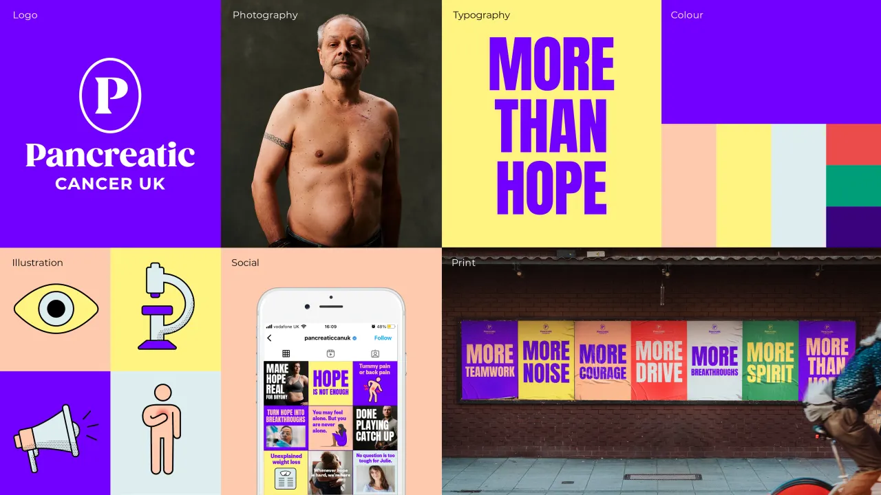
In line with the editorial style, the typeface also resembles publishing brand wordmarks, which GOOD paired with an oval-shaped 'P' symbol for the full lockup.
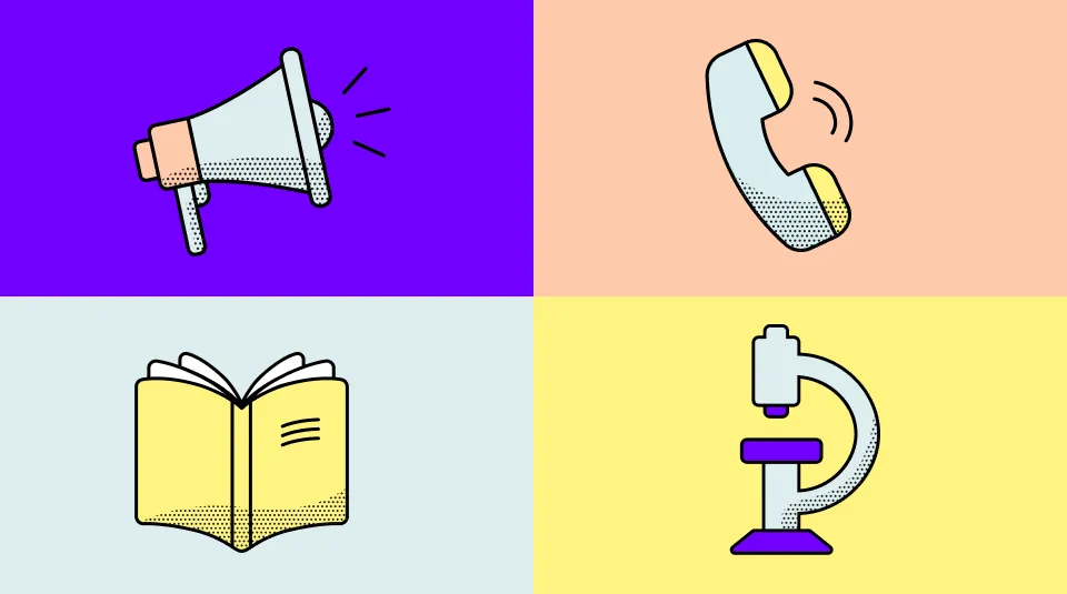
Pancreatic Cancer UK's illustrations are as functional as they are beautiful. As people engaging with the brand might need to know crucial information, such as the symptoms of pancreatic cancer, the illustration style communicates information clearly, helping to visualise some of the shocking statistics associated with this disease.

Editor's Picks





Trending



Latest Jobs
Director, Creative Technology at Code and Theory
Full-time·New York·$160,000 – $225,000
Brand Strategist at DNCO
Full-time·London·£45,000 – £60,000
Senior Visual Designer at Scout Motors
Full-time·Remote·US$130,000 – US$160,000
Senior Lecturer in Fashion Communication at University of the Arts London
Part-time·London·£52,977 – £63,815 pro rata
Multidisciplinary Designer at Formation Games
Full-time·London·£40,000 – £50,000
Broadcast Producer at David&Goliath
Full-time·Los Angeles·$80,000 – $95,000