How Thirst redesigned M&S's beer aisle, from stamp-inspired lagers to bold, flavour-led craft
Marks & Spencer has launched two new own-label beer ranges, with packaging designed by drinks branding specialists Thirst. We take a closer look at what inspired them.
Be honest. How much attention do you normally pay to the design of a supermarket own-label beer? Probably not much. You grab a can with an interesting label, put it in the basket and move on.
When it comes to own-label "continental" lager, the design often doesn't go much further than making the can look vaguely foreign. A bit of sunshine, perhaps some European-looking lettering, and job nicely done.
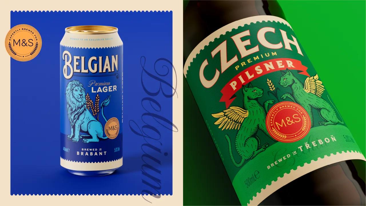
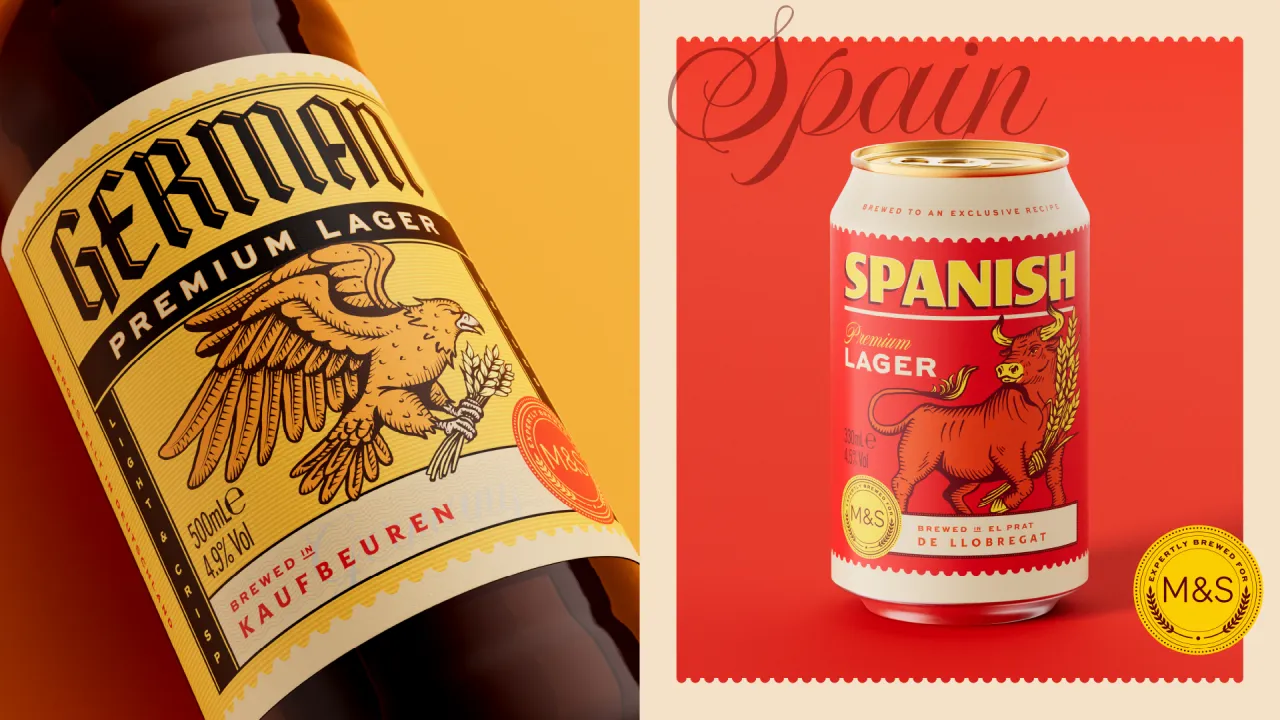
M&S wanted to do something different. The retailer has just launched two new design-led beer ranges, both created with Thirst. Together, they rethink what own-label beer can look and feel like on the shelf. One is a richly detailed Continental range, while the other takes a bolder, more contemporary approach to craft beer. Both have plenty of personality.
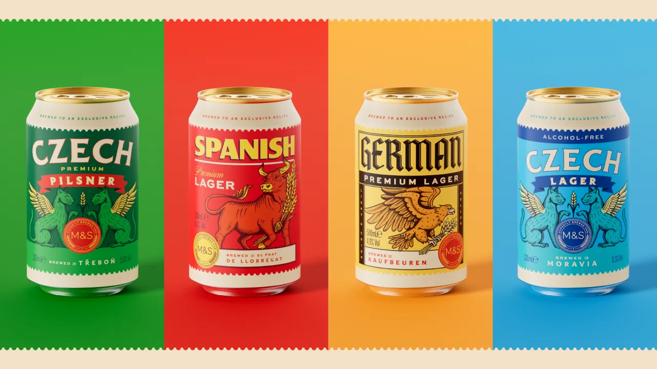
Every lager in the new Continental range is brewed in the country it comes from, so the packaging needed to make that provenance clear. But it also had to stand apart from the familiar look of supermarket own-label beer and big international brands, avoiding the usual clichés.
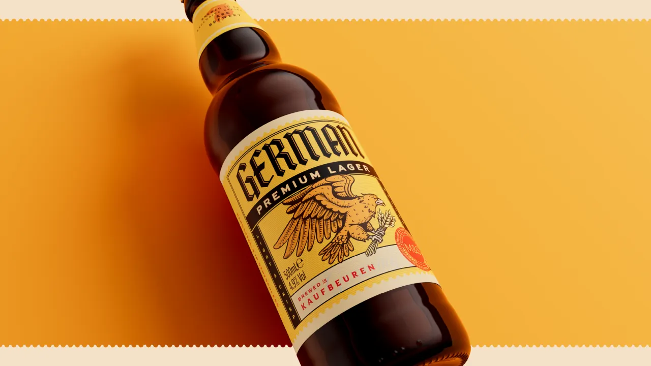
Thirst decided to take inspiration from vintage postage stamps as a starting point. Looking at the designs, you can see why they've chosen the distinctive typography and bold colours, and why there's a stamp-inspired device that celebrates the origin of each beer, with illustrated animal mascots adding another layer of personality.
The result is a range where every beer feels distinctive but still clearly part of a family. I just want to know how Thirst decided on colours and type.
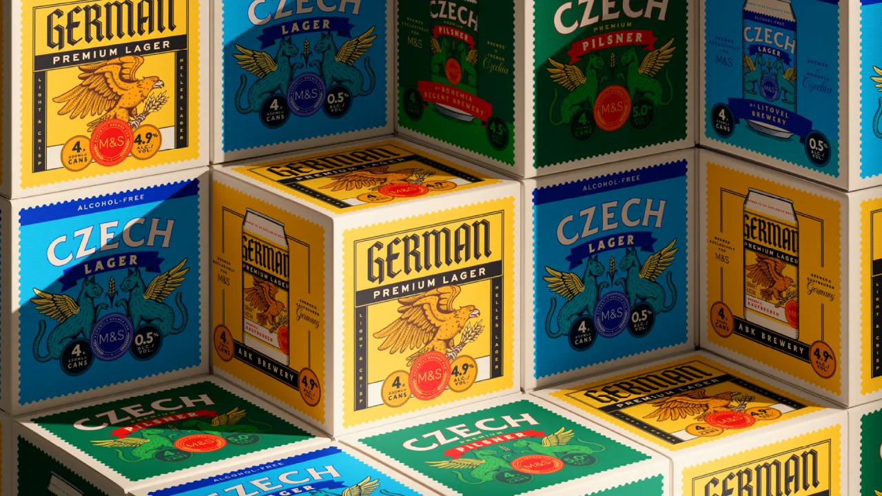
The animals I already mentioned are drawn in a contemporary etched style, inspired by those intricate illustrations traditionally found on old postage stamps. It all works really well.
But there was quite the challenge for Thirst. Printing is split across four countries, with limited finishing options depending on where things are made. So Thirst couldn't use foils or embossing to give the packaging a much-needed premium feel (I mean, come on, it's M&S, after all). So the richness instead comes from the composition of the design, plus the illustration work and all the details.
"For the Continental range, we leaned into storytelling and detail to celebrate where each beer comes from," says Matt Burns, executive creative director at Thirst. "The craft range is more direct and expressive, built around partnerships, flavour and personality. Together, they show how own-label can be just as confident and culturally relevant as anything in the independent space."
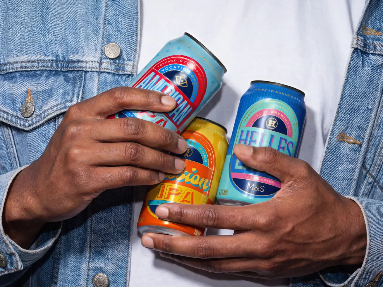
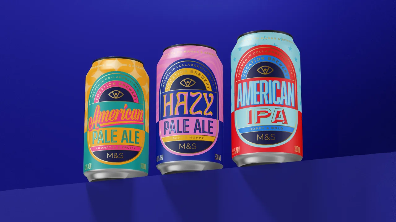
The craft range takes a different approach. It instead feels bolder and more contemporary... more type-led with a nice mix of bright colours. Despite the pared-back approach, they still feel like part of a coherent identity across the core, premium and alcohol-free beers. I especially like the bold badges, which pay tribute to each brewery M&S has partnered with.
Yes, you still get the M&S logo on there, but there's a hierarchy at play that feels fair to the breweries. And it makes the relationship clearer, while giving the range some of the credibility and character associated with independent craft beer.
The rest of the design is all about flavour and personality. Colours reflect the different types, like American IPA and American Pale Ale, while the typography changes with each style of beer. Session beers, for example, get a more relaxed, easy-going feel, while hazy beers use wavy, fluid lettering. The US-inspired brews lean into classic Americana. I really love the use of teal, navy, pink and yellow here, with a dash of gold.
The system also stretches across the different tiers of the range. The premium beers become more tonal and restrained, helping signal greater intensity, while the alcohol-free variants introduce white and blue cues that feel familiar within the healthier category without losing the overall boldness.
M&S, for its part, is thrilled. "Working with Thirst was a pleasure," says Dave Bond, designer at M&S. "They were tasked with redesigning both our craft beer and Continental lager ranges simultaneously and delivered exceptional results across the board. From strategy through to final execution, the level of creativity and attention to detail was outstanding. Their use of colour in particular stands out, using palettes that feel fresh and contemporary while still rooted in the visual language of beer."
His colleague Maddie Love, a product developer at M&S, is equally warm on the process. "Thirst has been a highly reliable and collaborative partner throughout," she says. "The team is clear in their communication, well organised, and efficient at every stage. Their design presentations made it easy for us to review options and make confident decisions."
Thirst, for the record, works globally out of Glasgow and New York for some of the drinks world's biggest names. The new ranges are rolling out across M&S stores now. And as Bond puts it, "the difference from the previous range is night and day".
Editor's Picks





Trending




Latest Jobs
Brand Strategist at DNCO
Full-time·London·£45,000 – £60,000
Senior Designer at BKC
Full-time·£50,000 – £60,000
Director, Strategy at Interbrand
Full-time·New York·$160,000 – $210,000
Marketing Manager at University of Birmingham
Full-time·Birmingham·£36,636 – £46,049
Designer at Art Fund
Full-time·King's Cross, London·£37,456
Associate Web Designer at Planhat
Full-time·London·£30,000 – £35,000