How Cronica is helping EMIF battle disinformation with design
Brighton studio Cronica has partnered with the European Media and Information Fund to craft a dynamic visual identity, blending print and digital aesthetics to combat misinformation and promote media literacy.
In a year where over half the planet is holding elections, it's increasingly clear that truth matters. That's precisely why, in 2021, a bunch of countries got together to found the European Media and Information Fund (EMIF): a collaborative initiative designed to combat disinformation and support media literacy across Europe.
EMIF provides grants to projects that improve the quality of information in the digital age, foster critical thinking, and enhance the public's ability to discern reliable information. In the process, it aims to create a more informed and resilient European society.
To help spread their message more effectively, they recently teamed up with Cronica, a small design studio based in Brighton working with businesses and organisations who want to impact the planet positively.
"We collaborated with their founding partners, the European University Institute and the Calouste Gulbenkian Foundation, in developing the brand identity system, digital platform and communication materials," explains Cronica founder Sérgio Cameira.
Visual direction
The visual direction was inspired by the evolution of how humans consume information. "We looked at the transition from traditional print media to modern digital screens and the diverse visual elements used in these formats," says Sérgio. "By exploring these associations, which are constantly changing and expanding, we created a dynamic visual solution that is both chaotic and organised."
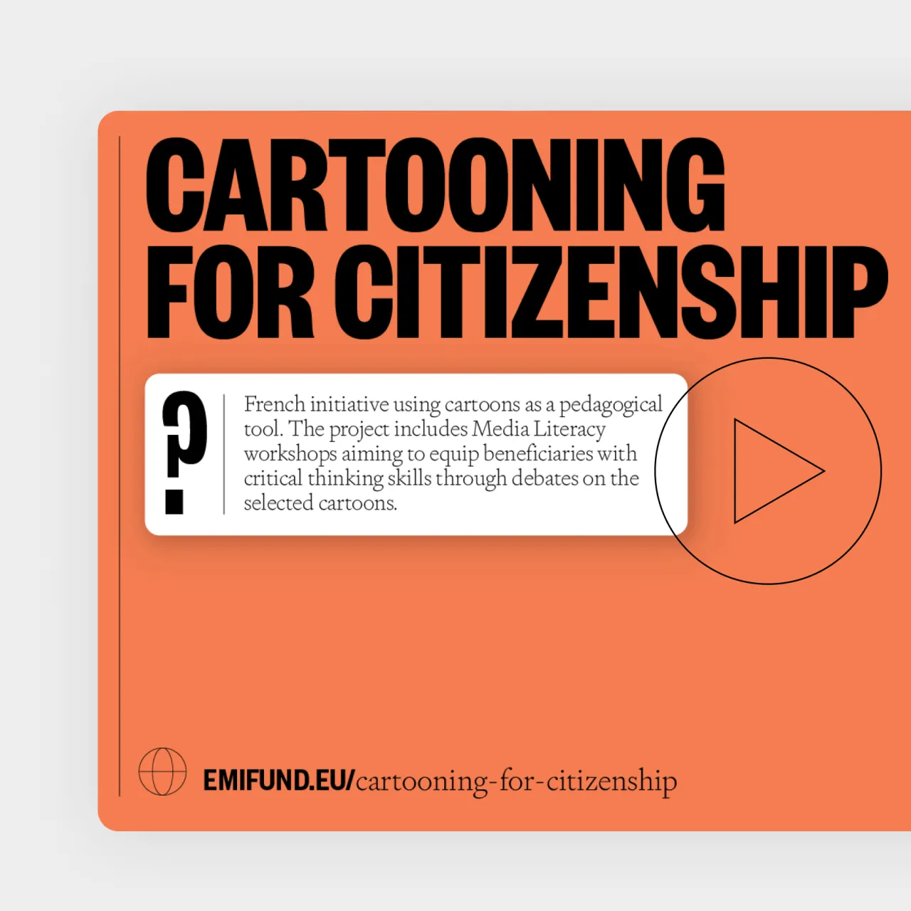
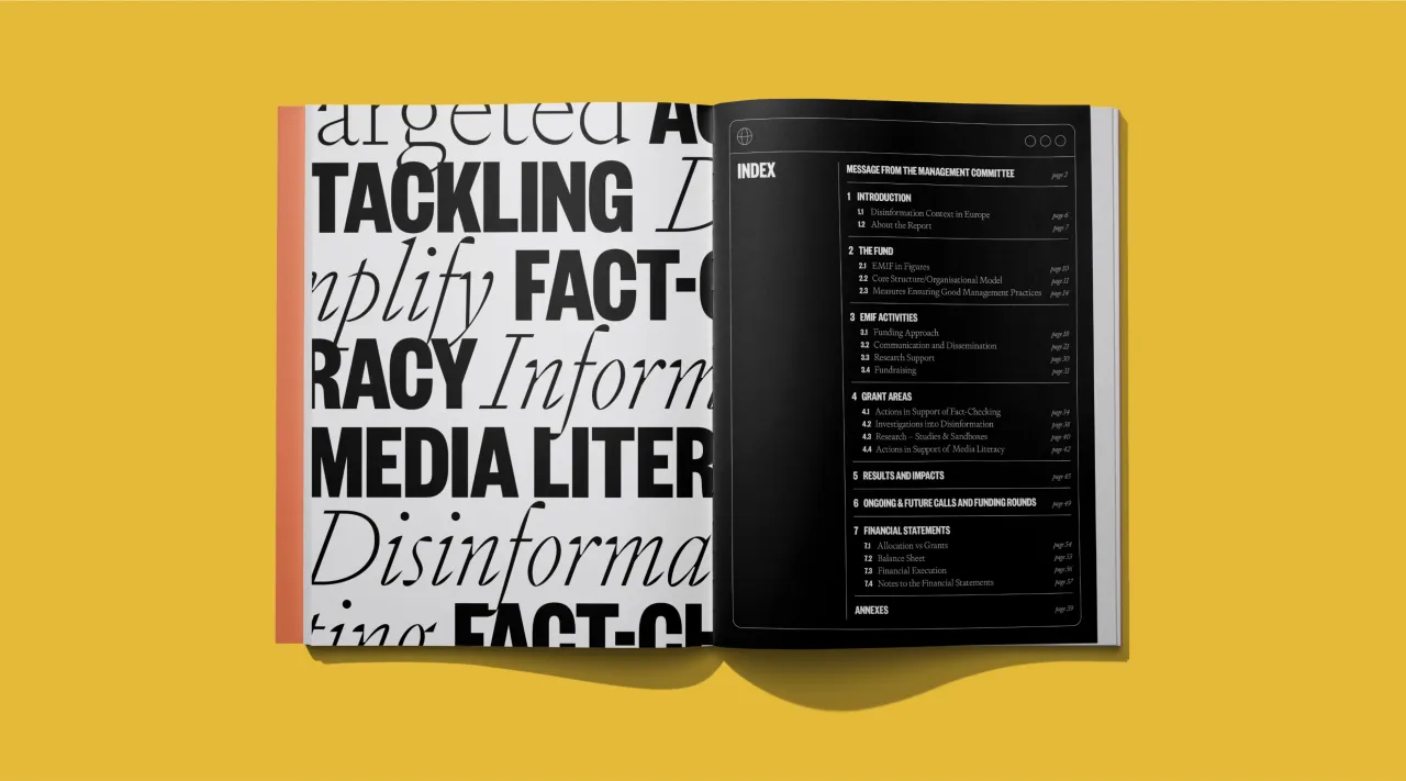
This aesthetic approach pays homage to established media while incorporating the sensationalist style of tabloids. "In today's society, we are inundated with information from all sides, making it increasingly difficult to discern truth from falsehood," explains Sérgio.
"Our goal was to explore this information overload and balance it with the clarity and legibility needed to communicate the fund's purpose effectively."
Influence of digital and print design
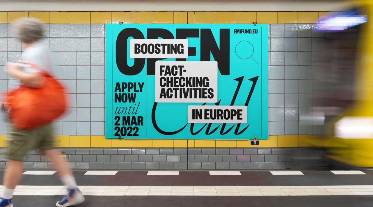
The design nods to both digital and print elements by integrating key features from each medium. "From print design, we incorporated the typography style of traditional publications and a visible grid with thin lines separating columns and spaces. On the digital side, we included white rectangle windows with rounded corners and drop shadows, reminiscent of tabs on a screen and stereotypical UI design, overlapping other elements in the composition."
Additionally, the team designed a series of icons commonly found in digital interfaces, such as arrows, download, and search icons, and used them purposefully and decoratively, adding to the organised yet dynamic visual 'mess'.
This blend creates a cohesive and contemporary brand system that bridges the gap between print and digital aesthetics.
Typography
Regarding typography, Cronica selected Founders Grotesk and Signifier, two fonts from Klim Type Foundry, a studio favourite.
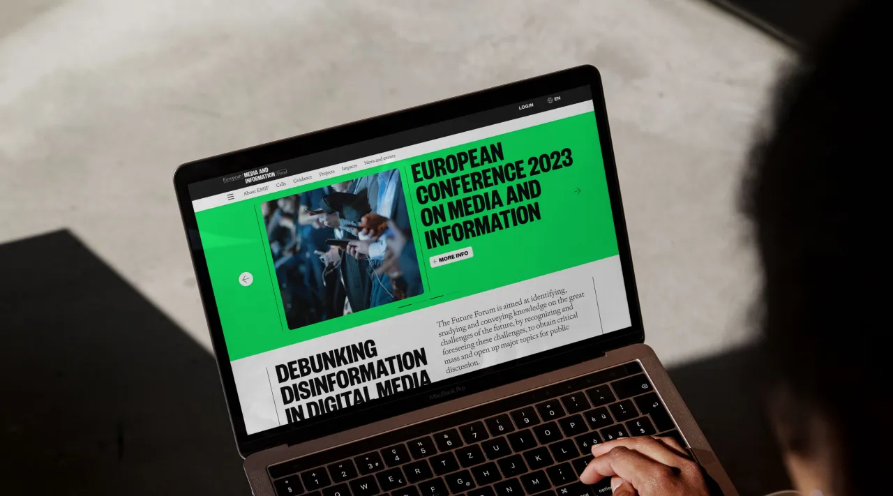
Founders Grotesk was born from commissions for redesigns of several newspapers and magazines and referenced classic newspaper headlines where space is at a premium, but headlines need to stand out.
Signifier, meanwhile, provides the contrast seen in newspaper layout design, combining thin lines and tiny type with bold, large type. Regular and lighter weights of both fonts are used for small copy and digital navigation elements.
The pairing of these two fonts represents the contrast often seen in media formats, with large titles and small, tightly spaced text. This combination establishes a key characteristic of the visual direction, modernising the brand's overall aesthetics.
The careful balance, laid out in a grid with overlapping elements, adds a distinct level of sophistication and uniqueness to every application. This approach ensures the brand's identity remains dynamic and visually engaging across all media.
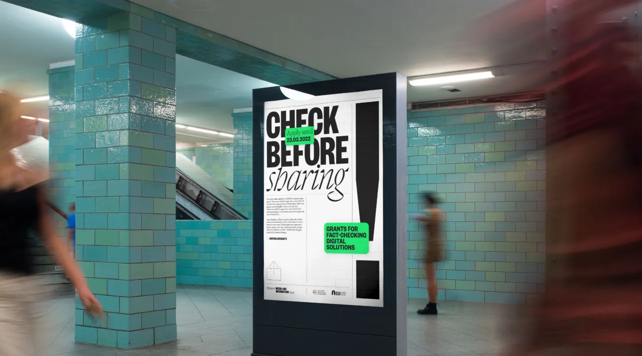
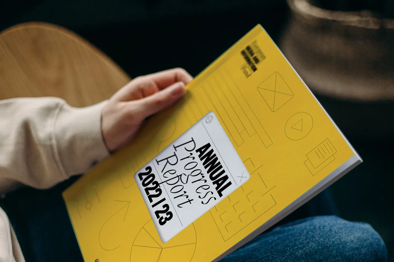
"The most interesting part of the project was the opportunity to creatively blend editorial and digital design elements to craft a cohesive brand identity system," says Sérgio. "While both editorial and digital design require highly structured systems to account for factors like space, word count, accessibility, and legibility, this project allowed us to explore these elements with much greater freedom.
"This playful experimentation enabled us to push boundaries, creating a distinctive and engaging visual identity."
Editor's Picks





Trending






Latest Jobs
Growth and Client Development Director at 3800
Part-time·Sheffield·£60k-80k
Brand Copywriter at Origin
Full-time·Porthleven, Cornwall·£35k–£40k
Midweight Designer at Catalyst Creative
Full-time·London·£32k-£36k
Creative Project Manager at Analogue
Full-time·Leeds·£28k–£35k
Midweight Designer at All Purpose
Full-time·London·£30k–38k
Creative Content Executive at Cognition
Full-time·Birmingham·£28k–£35k