Horizon Organic's brand refresh celebrates three decades of pioneering organic diary
The work by Elmwood New York blends its trailblazing heritage with a bold vision for the future – featuring a cohesive visual system, updated messaging, and a revitalised mascot to strengthen Horizon Organic's leadership in the competitive organic dairy market.
Today, seeing the word 'organic' splashed across everything from butter to tampons would be highly unlikely to raise an eyebrow - it's become a firmly entrenched, totally familiar part of the brand and buyer lexicon.
But that wasn't so much the case back in 1991. Pioneering US-based dairy brand Horizon Organic knows this only too well, having occupied that space for the last 33 years.
It's no mean feat to have been such an early adopter in a space that's since become almost mainstream – and Elmwood New York knew just how important that heritage was to Horizon Organic when it undertook its recent comprehensive brand refresh, which aimed to strengthen its leadership in a competitive $86 billion market.
The design consultancy was tasked with redefining Horizon Organic's visual and verbal identity, revamping and modernising the brand to amplify its voice in the here and now while honouring its trailblazing origins. In 1991, "Horizon Organic led the charge in offering products free from antibiotics and growth hormones," according to Elmwood, adding that the evolved identity "reinforces the brand's continued commitment to driving innovation and sustainability in the organic industry".
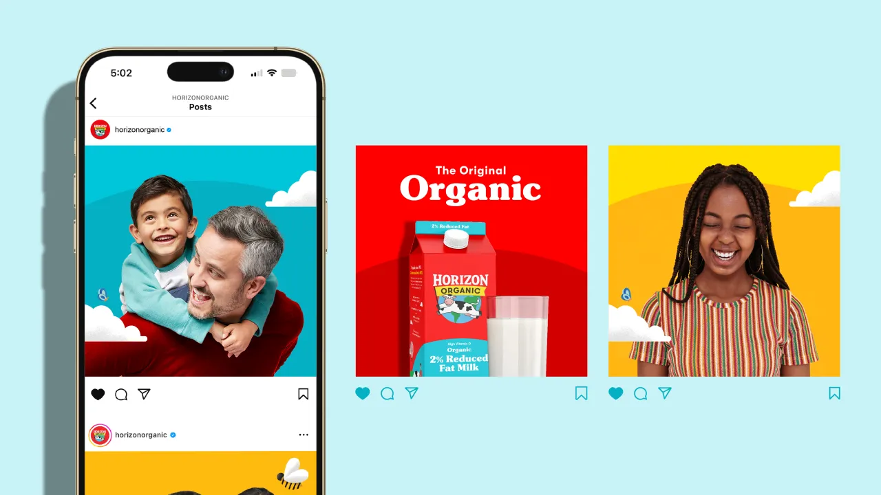
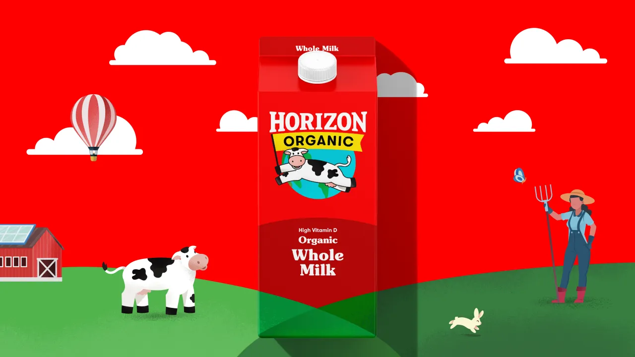
Elmwood New York worked across all brand touchpoints, including packaging designs, shopper marketing, and digital applications. "In a crowded category where organic has become ordinary, Horizon needed to stand for more than delicious milk and happy cows," says Elmwood. In a bid to cut through the noise of the "notoriously confusing" dairy aisle, the new designs aim to ensure Horizon Organic bears a consistent, engaging brand wherever its "health-conscious and sustainability-driven consumers" might encounter it, the consultancy continues.
All elements of the new branding are hooked on the creative concept 'shared horizon', which was inspired by the Horizon Organic name and looks to convey the brand's ambition as "a new horizon for American food" with a "a vision for collaboration, sustainability, and community engagement in the organic movement—promoting a better world for people, animals, and the planet as a whole," says Meg Beckum, Executive Creative Director at Elmwood New York.
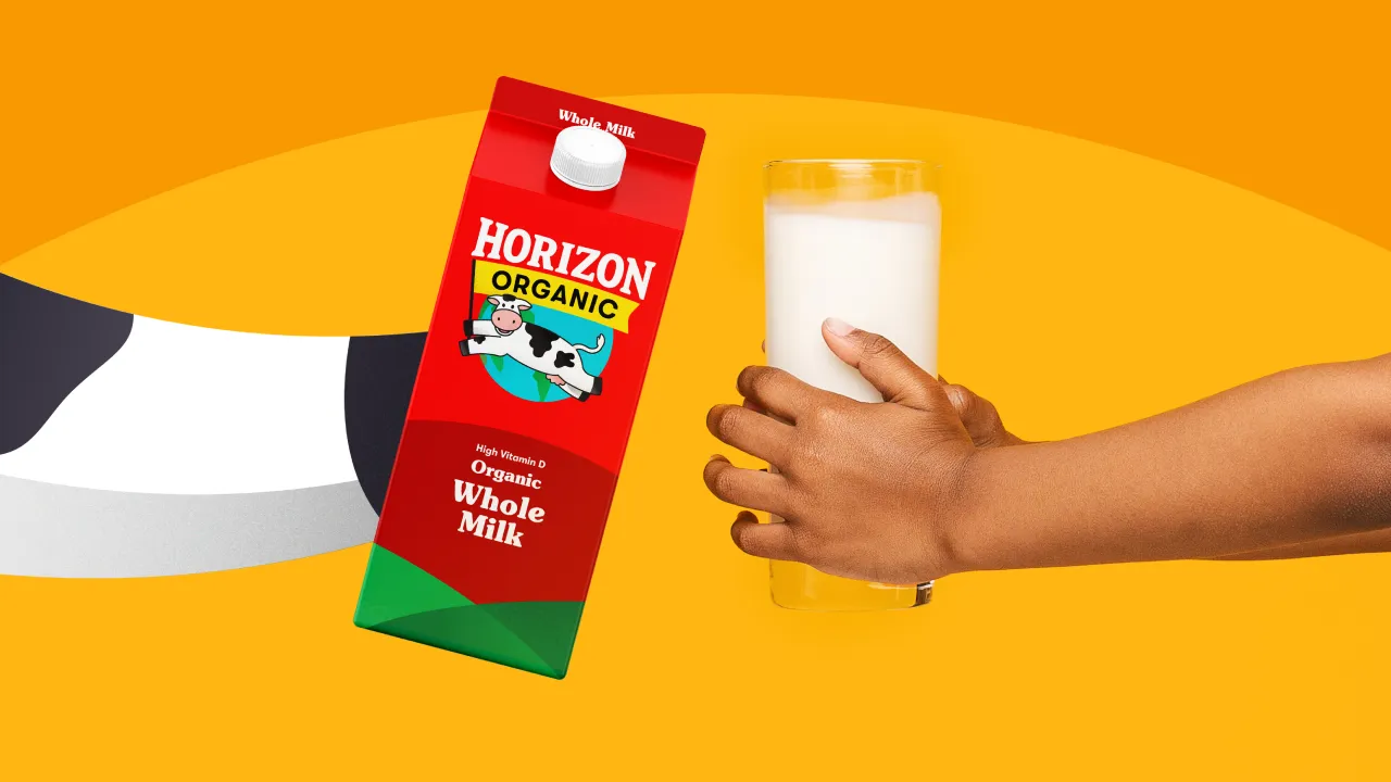
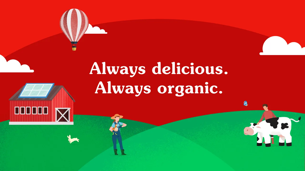
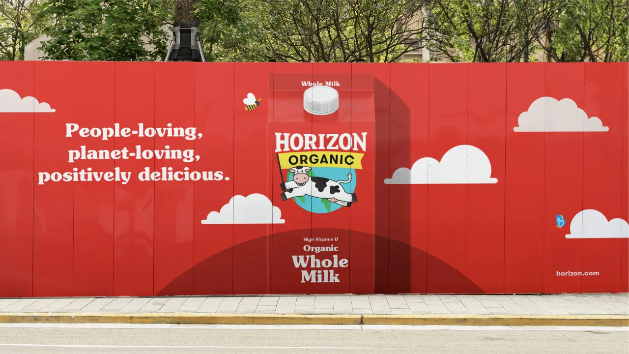
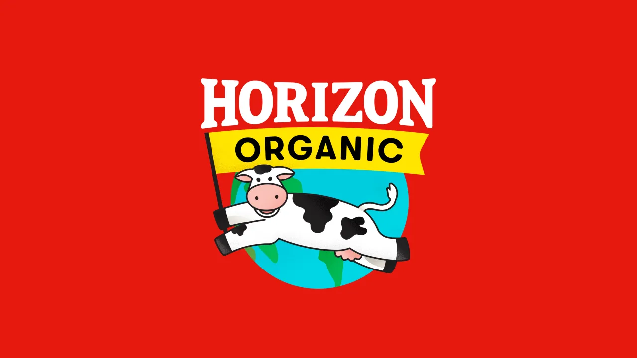
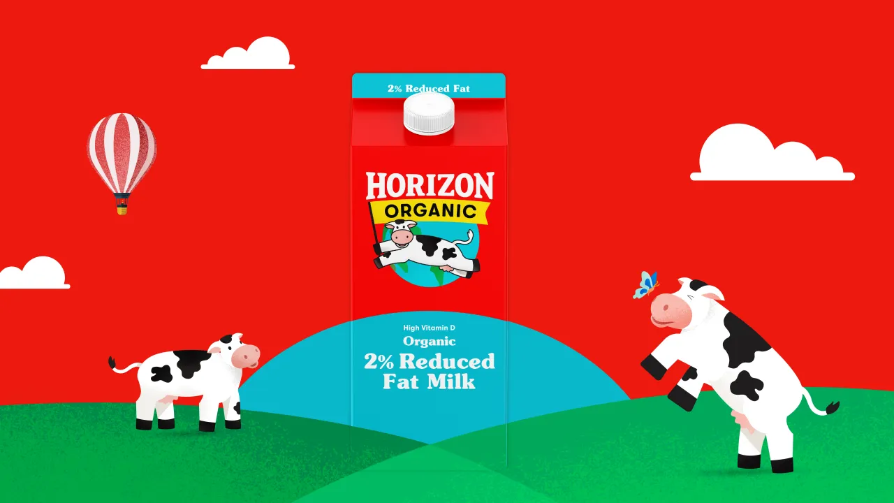
Elmwood opted to retain some of the most well-known and easily recognisable aspects of Horizon Organic's former branding, including its distinctive red packaging and mascot, which is called Happy the Cow. These have been amplified within a rigorously structured new brand architecture designed to further aid shoppers in navigating the dairy aisle.
The new packs use a connecting arc shape to reinforce that cohesive "brand block," as Elmwood puts it. The arc also "signifies unity, growth, and an optimistic outlook, aligning with the brand's mission," Bekum says.
She adds that the revamped verbal identity aims to convey "honesty, passionate conviction, and hopeful realism" through an informative but inspiring tone of voice that confidently communicates "a bold brand story that sets a new standard for American food".
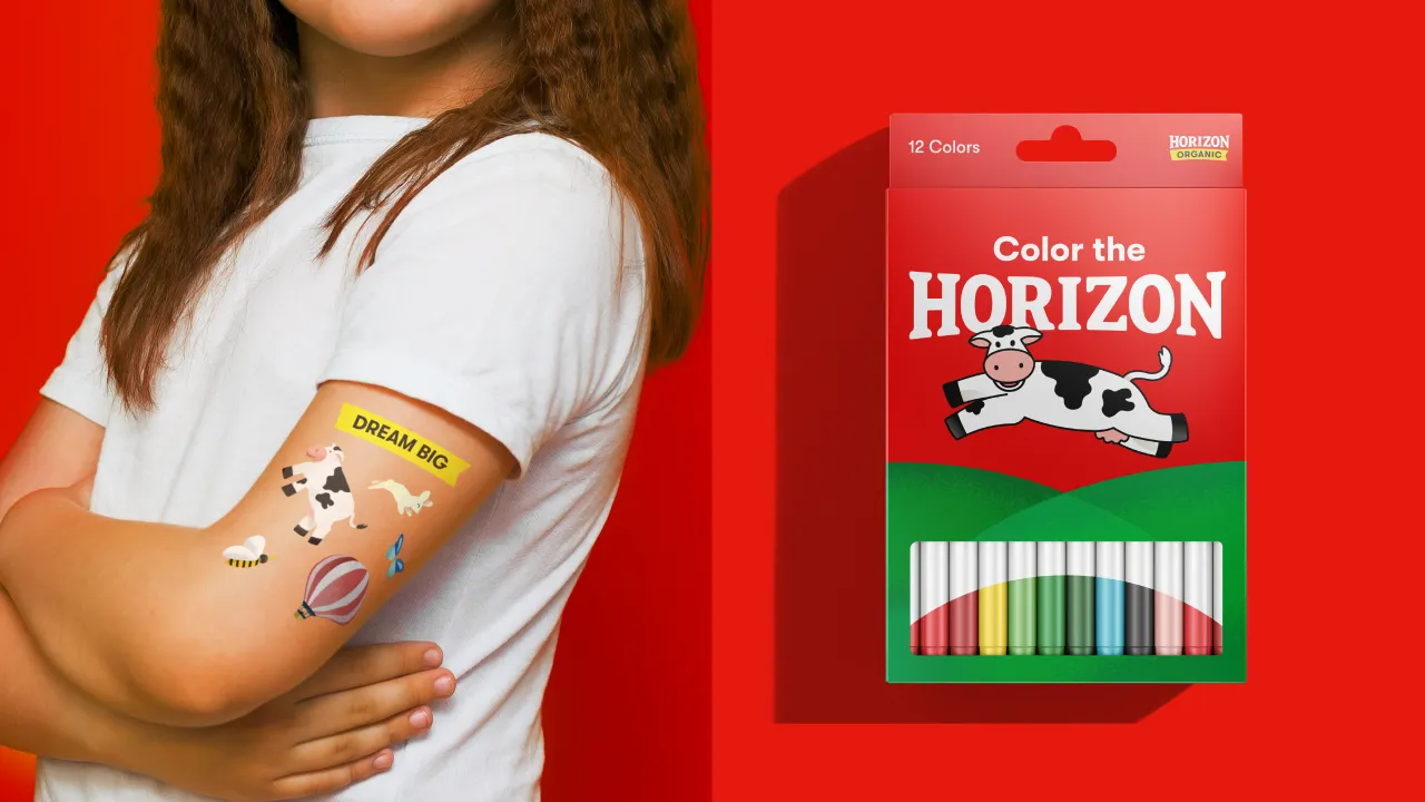
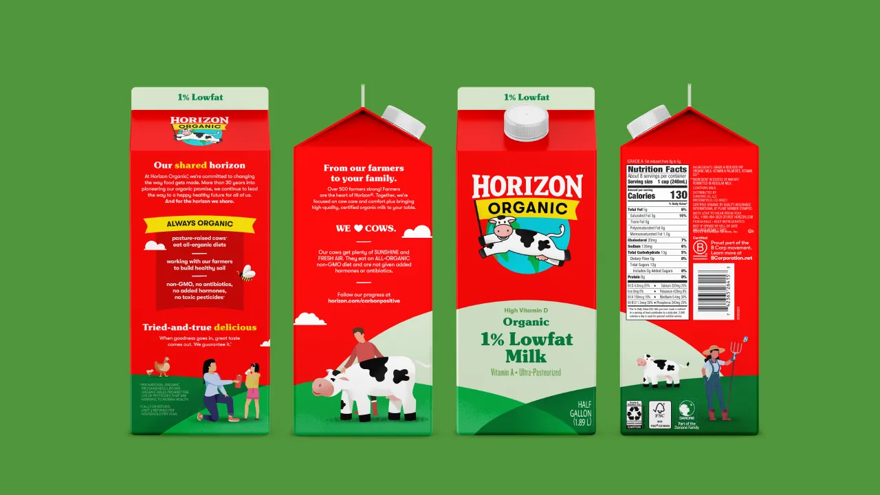
Overall, Elmwood created a newly consistent visual identity in which the brand's central message – its commitment to organic farming, sustainability, nutrition, and support for family-run farms – is threaded throughout all Horizon Organic touchpoints, including advertising, social media, packaging, and customer interactions.
The star of the show, however, has to be Happy the Cow – a character-based encapsulation of the brand's mission and a shorthand for all that's wholesome and positive. "We've placed Happy at the centre of the illustration system—both grazing and grounding us in Horizon's connected hills," Bekum explains. "As a beacon of trust, she personifies the brand story and is a champion for the planet—encouraging us to make sustainable choices to ensure tomorrow's healthy horizon."
Editor's Picks





Trending

Latest Jobs
Web Projects Executive at Manchester Metropolitan University
Full-time·Manchester·£31,236 – £34,610
Visual Development Artist - Feature at Sony Pictures Animation
Full-time·Los Angeles·$53.37 – $83.75 per hour
Design Director at Interbrand
Full-time·New York·$120,000 – $150,000
Staff Producer, Studio Central at DoorDash
Full-time·San Francisco·$176,800 – $260,000
Copywriter at David&Goliath
Full-time·Los Angeles·$75,000 – $95,000
Junior Creative at Northstar
Full-time·London·£24,000 – £28,000