50 fonts that will be popular with designers in 2024
Which typefaces are going to be hot in the year to come? We bring together 50 fabulous fonts that everyone needs to know about – in one easy place.
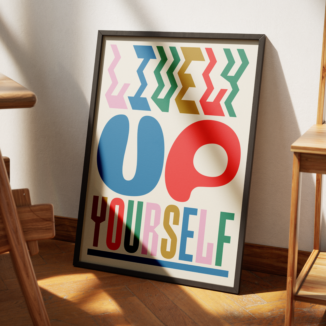
Brinca typeface by In-House International
We've all got our favourite fonts, but it's good to mix things up now and again and stop your design work from becoming stale. And the start of a new year is the perfect time to do so. So, every year, we bring you a selection of the tastiest typefaces that have popped up on our radar, which we think creatives need to know about.
And gosh darn it, if it isn't that time again! It scarcely seems like five minutes ago since we were telling you all about the best fonts of 2023 to look out for. And now we're on the verge of 2024, so get ready for more typography-related goodness.
Below is a comprehensive list of the best fonts that demand your attention in 2024. We've compiled this comprehensive list by asking the creative industry for their favourites, analysing work from the last 12 months, and taking on board the design trends emerging right now.
But while we've tried to be as objective as possible, the following list is ultimately subjective. Quite honestly, we could have added 200 more incredible and inspiring fonts, but we really had to whittle it down to 50, and that was a challenge in itself. In doing so, we've managed to include a decent spread of indie foundries and designers, too.
Of course, the creative industry is so vast, diverse and fragmented; there's always the possibility that we've missed something amazing. So please let us know if there's anything we've missed on socials, and we'll be sure to share your comments and suggestions via the Creative Boom accounts.
Finally, before we get going, let's look at three big font trends that will likely influence typography next year. And if that interests you, check out our wider feature on 2024 type trends.
Three big front trends for 2024
Trend 1. Bespoke or personalised type
We've seen how some of the design industry has been playing it a little too safe lately, a rocky economy is perhaps to blame. But the dangerous outcome of this is that everything is starting to look homogeneous. Cue bespoke and unique type design, a trend we're seeing more often and one that Tom Munckton, head of design at Fold7, believes will continue to emerge in 2024.
Not only that, Tom thinks the future is open-source, but he has this warning: "We've seen a number of greater quality, better-designed open-source SIL fonts, making life very easy. But we've also seen a proliferation of boutique foundries open with vastly different pricing and licensing parameters, making things mind-bogglingly complex. So, it feels like a moment for brands to capitalise on demonstrating a level of altruism whilst showing their identities in a fresh way. And ensuring we don't see the same set of good open-source fonts overused."
](https://www.creativeboom.com/upload/articles/69/697db5ae30d4c3047abc448c926cb459650298dc_944.jpeg)
Naughty Roll. indego design/macau. Image courtesy of Monotype
But Sarah Hyndman of Type Tasting thinks the future will be hyper-personalised. And that's because consumers are becoming co-creators of their brand experiences. Just look at Canva's recent partnering with Monotype to give users access to a huge selection of typefaces previously only available to professional graphic designers. "It means visually savvy consumers can now create their own personal brands while also curating the brands they purchase," she explains. Where is this already happening? Netflix has been adapting to our viewing habits for quite some time, and Coca-Cola lets you personalise the label with a name or message.
Sarah points to other developments: "Imagine going into a supermarket to see augmented reality overlays of packaging designs and dietary suggestions tailored to you. With personalised nutrition programme Zoe, you can scan the barcode on any food item to find out how it scores for your body. Today, you do this by launching an app on your phone, but this will change as AR technology develops." What does this mean for designers? "They will need to reflect the individual requirements of a future consumer who is increasingly both the purchaser and a design-savvy brand in their own right," she explains.
](https://www.creativeboom.com/upload/articles/ce/ce3d3d9bc5bc8cc40dd558f2169dc6032d2e7727_944.png)
Limburgs Museum by Total Design. Image courtesy of Monotype
](https://www.creativeboom.com/upload/articles/fd/fdd6567074ff4a34c5c8fd82bf6d079e5c28bcc8_944.png)
Limburgs Museum by Total Design. Image courtesy of Monotype
Nick Pattison of Primary believes there's a trend toward more decorative typefaces that steal the show. "I'm starting to see a number of projects using funky, bold, custom typefaces as a primary element in the brand identity," he tells us and points to Colour Mill by Universal Favourite as a good example. "The custom typeface is a nod to piping icing textures, appropriate for a food colouring brand with lots of flavours. This typeface plays surprisingly well with the other brand elements that share this puffy icing texture – leaving a lasting, memorable mark. It makes for a tasty brand that looks like no other."
Trend 2. Shaking off perfection and finding personality again
Typography has a wonderful way of reflecting how we're all feeling, and one such trend that Tamara Connolly, associate director at Space Doctors, thinks is big right now responds to what she calls 'perfection fatigue'. "We see a desire for sensory-rich experiences that are less polished and more visceral, and creative drive being more unfettered by genre or stylistic boundaries. As we head into 2024, we may see these sentiments manifesting in various more fleeting trends, but the underlying posture is likely to continue to root and spread," Tamara explains.
How that's showing itself is through slightly crude and quirky sans serifs. "There's something a bit offbeat yet endearing and typographically tasty about them," she says. "Fonts like Bagoss by Displaay, Rebond Grotesque by Extraset, or Grimer by Brandon Nickerson Studio tap into this vibe in different ways." She points to the recent Johnson & Johnson logo redesign as another example. "It guides toward being 'simpler and cleaner' per the press reports, carries some of that sensibility rather than employing a more conventionally slick sans serif."
Marshmellow by Ragged Edge
Mark Nichols, creative director at WMH&I, loves this return to personality. "While bold, attention-grabbing fonts are still a favourite for many, recent feedback on high-profile rebrands like Johnson & Johnson and Nationwide hints at a tilt toward serifs or more classic styles. A standout? Trim Poster from Letters from Sweden. Its cleverly designed cuts infuse both character and allure, making a strong statement without shouting."
Trend 3. Getting experimental
If it's true that perfection is taking a back seat and designers are starting to have more fun again, then 2024 is about to get super experimental. Take OhNo's Drawer or anything by Off Type as a major hint of what's to come. "Gone are the days of rigid font families and type-setting," says Jessica Strelioff of Goodside Studio.
"Thanks to the rise of variable fonts over the last few years, we've seen the creative community really start to let loose regarding rule-following around fonts. This year, we expect designers and foundries to take things a step further with even more dynamic and experimental type. Early signs of this trend have already started taking hold – foundries proudly share out-of-this-world fonts, with some even building in public."
Designer Chris Wilson agrees. He believes the influence of tech has made geometric sans typefaces the norm, and as others cling to classic fonts for nostalgic reasons, there seems to be a growing rebellion against the sea of sameness. It takes the form of experimental typefaces. "Unlike traditional constraints associated with serifs, sans-serifs, or script fonts, experimental typefaces are unconventional letterforms featuring irregular contours, exaggerated proportions, and abstract shapes.
"Thanks to advances in plug-and-play digital mediums, integrating non-standard fonts has become more accessible, and the rise of 3D type has allowed these fonts to create a sense of volume, movement, and interaction, which consumers now expect."
Marbles by Superfried X F37
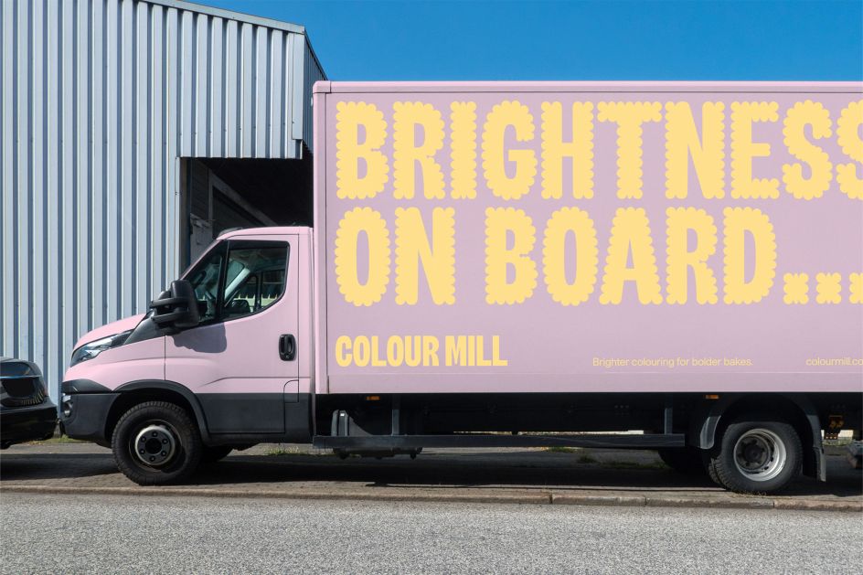
Colour Mill by Universal Favourite
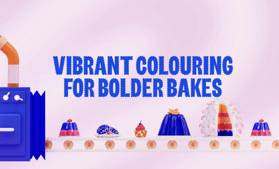
Colour Mill by Universal Favourite
He adds: "I firmly believe that form should follow function in typography. Legibility and effective communication of the message are paramount. However, when applied correctly, I can see how experimental fonts can evoke a visual experience, tell a story, and, in some cases, even replace brand imagery or illustration. The challenge lies in determining when to use them and striking a balance between using type to convey a message and type that is purely a form of art."
And now to our 50 fonts that we think will be popular with designers in 2024. To keep things simple, we’ve broken this year’s list down into sans-serif, serif and display fonts. Enjoy!
Sans-serif fonts
1. Neue Montreal by Pangram Pangram
Designed by Mat Desjardins, Neue Montreal is a versatile grotesque with the spirit of a display font. Inspired by the design scene in Montreal, it's already been used by many local brands, notably the most recent rebranding of the city's football club. The font has 14 weights (seven uprights and seven italics) and a slightly tighter kerning, including Cyrillic support.
2. Aktiv Grotesk by Dalton Maag
Aktiv Grotesk is a grotesque sans typeface described as a 'Helvetica killer' with some justification. It comes with Weight, Width, and Italic variable font axes, support for ten global writing systems, and an extensive icon set. The combined work of 16 experienced type designers, this font is a powerhouse of versatility and functionality.
3. Degular by OhNo Type
Now for something completely different. While most of the fonts on this list hope to grab attention, Degular aims to fade into the background in the spirit of a Japanese white noise machine. Designed by James Edmondson, it comes in seven weights, three optical sizes, in Roman and Italic.
. Work by [Papa Tom Studios](https://papatom.studio/projekte/visuelle-identitat-fur-deutschlands-grosstes-kinder-und-jugendliteraturfestival)](https://www.creativeboom.com/upload/articles/6c/6c75cdedf1417d6963634478b57121a394760583_944.png)
Neue Montreal by Pangram Pangram. Work by Papa Tom Studios
4. Case by Fontwerk
This matter-of-fact Neo-Grotesque is a refreshing alternative to the classics, with some surprising nuances. Erik Spiekermann, Anja Meiners and Ralph du Carrois have revised it from the ground up to make it even more versatile for complex branding projects and doubled the number of fonts and characters.
5. Circular by Lineto
LL Circular offers a fresh take on the genre of the geometric grotesque, marrying purity with warmth and striking a balance between functionality, conceptual rigour, skilled workmanship and measured idiosyncrasy. With real character and near-universal appeal, this friendly font comes in eight weights and is a good choice for editorial, advertising or branding contexts. It's particularly good in headlines or for body copy.
6. Roobert by Displaay
This font was originally designed in collaboration with Anymade Studio as a bespoke typeface for Moogfest 2017, a music and technology festival in North Carolina that honours engineer Robert Moog. The mono-linear, geometrical sans-serif font was inspired by the Moog logotype. We love it so much we plan to use it in a forthcoming Creative Boom update… watch this space!
7. Strawford by Atipo Foundry
Strawford is a low contrast, neo-geometric sans with a balanced width, generous x-height, and short ascenders and descenders, giving it a simple and clean look. It comes in seven weights plus italics, and its recognisable, legible and functional nature makes it a good choice for UI/UX, app design, branding, logo creation, advertising or packaging.
Roobert by Displaay. And a sneak peek at Creative Boom's new branding, launching soon.
8. Agrandir by Pangram Pangram
This contemporary sans-serif was purposely designed as an antipode to neutral modernist fonts. Unaligned, quirky and funky, it consists of 74 fonts (seven weights, five widths, italics and four text styles) or just one 3-axes variable font. There are many OpenType stylistic alternatives, which can be turned on for individual letters or as overall presets – Default, Grotesk and Geometric. This is a great choice for large headlines, websites, logos and posters, while its new text styles are great for body copy.
9. Sonic by F37 Foundry
F37 Sonic is an unusual geometric sans serif that's sharp, striking, impactful and attention-grabbing. Its circular geometry derives from the interior counters of the letterforms rather than the more common exterior. This creates a distinctive texture on the page due to the juxtaposition of narrow, straight letters (like the n, t and f) and the wide diagonal and round letters (like the o, a and v).
10. Noi Grotesk by Studio Feixen Fonts
Designed by Robin Eberwein and Felix Pfäffli, Noi Grotesk is a modern sans-serif that applies a sense of playful friendliness to the traditional Swiss model. It consists of 16 fonts across eight weights or as one of two variable font versions, optimised for either print or web environments.
11. At Haüss by Arillatype Studio
At Haüss is a contemporary re-interpretation of mid-20th-century neo-grotesques. The result is a pure and elegant typeface standing on a solid and balanced structure. It comes in 20 styles, starting with the delicate Air, crossing paths with Retina optimised for high-density screens, and arriving at the robust Super. It's also available as a variable font with two axes: Weight [Air–Super] and Italic [0°–10°].
. Featuring Agrandir by Pangram Pangram](https://www.creativeboom.com/upload/articles/6e/6e0da816b1ed1be3f5cce9211ab70df05885f251_944.png)
12. Gustavo by Lift Type
Designed by Romain Oudin in 2018, Gustavo is a geometric and slightly wide-shaped sans serif, a classic typeface with a splash of personality. The complete family contains five weights, an italic version and a large set of pictograms.
13. Ritma by British Standard Type
Ritma is a contemporary humanist sans serif, designed with an unusual rhythm. It takes a nuanced and modern approach to humanist typeface widths, with a balanced x-height, wide body and dynamic flow. It is practical and expressive and features multiple stylistic sets, including schoolbook characters and OpenType features.
14. Dwight by Lift Type
Dwight is a geometrical sans-serif typeface that's both rigorous and nicely offbeat. With a pronounced, round-shaped punctuation that recalls punched paper, it's a great choice for text and titles. The family is available in seven weights, including italic versions, a ligature set, a number of alternates and a bunch of pictograms.
15. Lay Grotesk by Colophon
Lay Grotesk is a contemporary sans-serif that reinterprets the style of the classics such as Helvetica, Neue Haas Grotesk and Folio, running with their Swiss neutrality but smoothing out their rigidity. The result is a more evident contrast that softens the shapes, making the typeface elegant but at the same time free of frills or other intrinsic meanings.
Lay Grotesk by Colophon
16. Mont by Font Fabric
The Mont Font Family is a geometric sans-serif with a balanced design matched by unique details. For instance, the pointed 't' and the prominent x-height make it perfect for strong headlines and outstanding logos but also suitable for long text. This typeface consists of 10 weights ranging from Hairline to Black with matching italics.
17. Aeonik Pro by Cotype Foundry
In line with the most popular grotesque typefaces, Aeonik Pro features closed apertures with perpendicular stroke endings, clear letter shapes and tight spacing. The most noticeable characters are the 'f', 'j' and 't', which feature 90-degree turns and straight outstrokes, infusing a little geometric twist into this genre. Drawn with clarity and functionality in mind, the 16 stylistic sets containing various alternates allow you to adapt Aeonik's 'voice' to suit any project.
18. Whyte by Dinamo
Fabian Harb drew the first version of ABC Whyte years ago after coming across a type sample from the early heyday of grotesques during a bout of archival digging. More recently, he teamed up with Johannes Breyer, Erkin Karamemet and Fabiola Mejía to explore new possibilities for it. This new version emerges with smooth and sharp transitions. The family consists of 10 weights with corresponding italics, plus a wide range of international punctuation and currency signs.
19. Plain by Optimo
Plain is a geometric take on the classic neo-grotesque model, resulting from years of research by designer François Rappo. Available in 12 weights with matching italics, it's highly fluid thanks to a drawing that is neither constrained by a geometrical approach nor structured according to the idiosyncrasy of the stroke.
. Featuring Gustavo by Lift Type](https://www.creativeboom.com/upload/articles/43/439b7106dae4a009f814b7a495aa0387a895ff27_944.jpg)
Work for ICOF by Image Format. Featuring Gustavo by Lift Type
20. Ginto by Dinamo
ABC Ginto is a geometric-humanist typeface that brings the tension between circular and rectangular forms to life. It was designed by Seb McLauchlan while researching 20th-century sans-serifs, focusing on the shift from strict Modernist purity to the more baroque, animated styles of the 1950s and '60s. The resulting font brings these two impulses together to create a surprisingly dynamic and charismatic typeface.
Serif Fonts
21. Financier by Klim Type Foundry
Drawn for the redesign of the Financial Times (FT) in 2014, Financier is an elegant, authoritative serif. Made up of two complementary families, Financier Display and Financier Text, its aesthetic is drawn from Eric Gill's classic letterforms. Financier Text draws pragmatic detailing from Solus and Joanna; Financier Display takes Perpetua's stately charm. This font works well across all media, from wide-printed broadsheets to narrow mobile screens.
22. Reckless by Displaay
Reckless is a serif typeface with a Renaissance character and a significantly raised x-height. It was designed by Martin Vácha during studies of historical evolution and sources of serif typefaces in various libraries. The main inspiration was from calligraphy tendencies that were brought back from early serifs into contemporary constructions. Reckless Neue is a version with higher contrast, a reorganised character set and new weights, including Thin and Book.
23. GT Sectra by Grilli Type
Designed by Dominik Huber, Marc Kappeler, and Noël Leu, GT Sectra is a contemporary serif combining "the calligraphy of the broad nib pen with the sharpness of the scalpel knife". Originally designed for use in the long-form journalism magazine Reportagen, it's since been expanded to its three subfamilies (GT Sectra, GT Sectra Fine, and GT Sectra Display) and is available in 30 styles.
. Financier by Klim Type Foundry](https://www.creativeboom.com/upload/articles/4b/4b2b738b1dafa55e084cdadfc3a8aee6503ce219_944.png)
24. Flecha by R-Typography
Flecha is a sharp and streamlined old-style typeface made for editorial design. It boasts a sturdy and mechanised appearance, with rigid letterforms, square terminals and geometrically simplified strokes, while still being delicate and reminiscent of the broad nib pen. A good choice for editorial design, the family is divided into three optical sizes: S for body text, M for medium-sized headlines, and L for large headlines and titles.
25. Nice by Fontwerk
In contrast to many historically oriented serif fonts, Nice has a fresh look with a slightly nostalgic flair. Designed by Jan Fromm, it comes in four optical sizes. This enables it to cover a wide range in terms of design and legibility, from texts in very small sizes to large, expressive billboard-grabbing titles. It's also available as a variable font.
26. Ivyora by Ivy Foundry
Ivyora is a Dutch Old Face revival produced from historical specimens found at the Museum Plantin-Moretus in Antwerp, mostly from a folio sheet called Proef van Letteren from the widow of Dirck Voskens issued in 1695. The new font, designed by Jan Maack, comes in Text and Display families, each in five weights with Roman and italic styles.
27. Freight by Joshua Darden
Originally drawn in 2005 by Joshua Darden and expanded several times over, the Freight collection of typefaces remains enduringly popular. As Jan Middledorp put it in Shaping Text: "[The] subtle difference between the various body sizes have been translated into boldly drawn, hugely different variants with pronounced size-related characteristics. Freight turns the traditional 'natural' gradations of contrast and width into a conscious stylistic device."
GT Sectra by Grilli Type
28. FH Total by Typografische
FH Total is a modern serif family for editorial typography inspired by traditional Dutch typefaces and inspired by the fonts produced by Jan van Krimpen in the late 1930s. FH Total Fine is a good choice for headline sizes, while FH Total Display can be used both on screens and in heading and subheading sections.
29. Fenul by Displaay
Inspired by a chapter on bones in an anatomy book, Fenul is characterised by thinner centres and heavier ends. Designed by Jana Papiernikova, it's since been honoured by both the ADC Award and Visuelt. This typeface is available in eight weights and eight styles and also as a variable font.
30. Heldane by Klim Type Foundry
Heldane is a contemporary serif family inspired by the Renaissance works of Hendrik van den Keere, Claude Garamont, Robert Granjon and Simon de Colines. Over a decade in development, Heldane comes in two families: Heldane Display and Heldane Text. The fine detail and tight spacing of the former are best expressed at large sizes, while the latter thrives at smaller sizes, taking stylistic cues from the display cuts but with an additional focus on optical functionality.
31. Salina by Font Fabric
Salina is a high-contrast transitional serif typeface that exudes a captivating blend of contemporary sophistication and timeless elegance. Designed by Ivelina Martinova with the support of Plamen Motev and Vika Usmanova, its defining characteristic is the striking contrast between thick and thin strokes, smooth, graceful ovals, round ball terminals and sharp bracketed serifs. A good choice for anyone looking to add an elegant and sophisticated touch to their designs.
. Featuring Heldane by Klim Type Foundry](https://www.creativeboom.com/upload/articles/28/280ebf6d257f2c66c5770f2fa478971cfa44d428_944.png)
Work for Friends' Central School by Lucy Price. Featuring Heldane by Klim Type Foundry
32. Canela by Commercial Type
Canela is a display typeface that sits in an ambiguous space between sans and serif, both soft and sharp, modern yet with roots in the classical. It began as an interpretation of Caslon, but designer Miguel Reyes took it in a new direction, shedding its serifs and leaving only vestigial flaring at the ends of strokes. It's delicate in its lightest form, but as the weight increases to the blackest weight, it takes on an entirely different feeling of quiet confidence.
33. GT Super by Grilli Type
Designed by Noël Leu of Grilli Type, with help from Mirco Schiavone and Reto Moser, GT Super is the result of an extensive investigation into display serif typefaces from the 1970s and 80s. It takes the expressive and idiosyncratic nature of calligraphic motions and configures them into stable, typographic shapes. This font is available in 20 styles.
34. Argesta by Atipo Foundry
Argesta is a neoclassical serif with high contrast, stylistically inspired by the world of haute couture. It's a good choice for high-end branding design, magazine layouts, or for luxury product packaging. It comes in nine styles, ranging from Hairline to Text, and includes matching true italics.
35. Migra by Pangram Pangram
Migra is inspired by the features of migratory birds and is designed to add sparkle and grace to your designs. Featuring slightly condensed proportions and sharp and spiky serifs, it was designed by Valerio Monopoli. This font comes in 16 styles with 568 glyphs each, including italics.
. Featuring Migra by Pangram Pangram](https://www.creativeboom.com/upload/articles/fc/fcff6d8ba2c56d9a224a8e4a5efc30076dc3778c_944.png)
National Museum in Gdańsk by Tofu Studio. Featuring Migra by Pangram Pangram
. Featuring Migra by Pangram Pangram](https://www.creativeboom.com/upload/articles/0d/0de3041e2d43afe49e10c560f0abdd383aaffa4e_944.png)
National Museum in Gdańsk by Tofu Studio. Featuring Migra by Pangram Pangram
. Featuring Migra by Pangram Pangram](https://www.creativeboom.com/upload/articles/1f/1f65581e91d0d71fa2d6daec3d24ad864489d730_944.png)
National Museum in Gdańsk by Tofu Studio. Featuring Migra by Pangram Pangram
36. Blacker Pro by Zetafonts
Packed with personality, Blacker aims to be a modern classic used for bold statements and self-conscious brands. This font is a revised and extended version of the original wedge serif family designed by Cosimo Lorenzo Pancini and Andrea Tartarelli in 2017. The latter was developed as a take on the "evil serif" genre: typefaces with high contrast, old-style or modern serif proportions and sharp, blade-like triangular serifs. In the Pro version, two additional condensed variant families have been added (condensed display and condensed text) along with three titling uppercase-only variants.
37. Mixta by Rodrigo Fuenzalida via Latinotype
Designed by Rodrigo Fuenzalida, Mixta is based on the idea of mixing different types of terminals in order to create a singular appearance. It's composed of diverse styles, such as Didone and contemporary typefaces, and consists of an extensive set of 1,200 characters that support more than 200 Latin-based languages, as well as Cyrillic letters.
38. Span by Jamie Clarke Type
Span is a modern glyphic type family with sweeping serifs and sculptural forms. Exuberant yet dignified, it's been designed primarily for luxurious headlines and titles. The font's strong vertical stress is softened by elegant organic curves, while its compact height accentuates deep serifs. The family offers five weights, each with three widths and italics.
39. Dashiell Fine by Signal Type Foundry
Designed by Max Phillips, the dramatic contrast and wiry hairlines of Dashiell Fine perform best at large sizes, where its blade-like serifs and Caslon-derived forms give it a hard-edged, Didonesque elegance. Seven weights include an additional Light style for delicate work, while its Black weight provides a sense of swagger.
. Featuring SangBleu by Swiss Typefaces](https://www.creativeboom.com/upload/articles/92/921552ebed8e15d56ea99e678ee7ccb9ed34400a_944.jpeg)
The Future Tense by Hoang Nguyen. Featuring SangBleu by Swiss Typefaces
40. SangBleu by Swiss Typefaces
The new version, SangBleu, supersedes the previous typeface of the same name, which has been discontinued. It's not an update but a completely new design consisting of five full-featured collections (Empire, Kingdom, Republic, Versailles and Sunrise) united by a shared spirit. Each one comes in four or five weights, all of which are accompanied by matching italics.
Display Fonts
41. Miniature by Off Type
Miniature combines a sturdy baroque structure with an unconventionally tall x-height. The result is an earnest display font that's a great choice for postmodern branding projects, editorial explorations and cultural exhibitions. Styles range from light to black across five distinct weights.
42. Roast by Type Everything
Roast is a friendly typeface characterised by a sense of summery fun. That makes it a great choice for display projects, including packaging, posters and branding. Designed by Andrei Robu, it's available in nine weights and as a variable font.
43. Softie by OhNo Type
If you find even the most rounded geometric sans is too harsh, Ohno Softie is here for you, eliminating any trace of a corner or a straight line. Every terminal here is round, and every negative shape is as well, making for a soft and lovely typeface. A great choice for dreamy, child-like design projects.
44. Gnar by Future Fonts
Gnar is a bold and bottom-heavy display typeface with forms influenced by the casual caps of American sign painters but also loud 1990s sports graphics. Intentionally overlapping letters to maximise impact and playing with accents that connect to letters, this is a genuinely unusual and attention-grabbing font.
Kibitz by Colophon Foundry
45. Kibitz by Colophon Foundry
Named after the act of providing unwelcome advice at a card game (no, we didn't know either), Kibitz is a high-contrast display serif. Its combination of exaggerated, angular details and subtle chamfers adds up to a sophisticated design. Moments of asymmetry add a flavour of playfulness, whilst the use of ink traps adds a modern and mechanical feeling. This font is available in five weights.
46. Maelstrom by Klim Type Foundry
Maelstrom is not a normal font, and proud of it. This reversed-stress typeface features razor-thin spacing that forms narrow strips of light through the black mass. Its uneasy mix of heavy horizontals and spindly diagonals makes it feel fragile like it could splinter at any moment. Heady stuff, indeed.
47. Blenny by Dalton Maag
Designed by Spike Spondike, Blenny is a curvaceous, fatface display font with soft, voluptuous curves and a retro feel. It's a good choice for branding, bold headlines, or enticing product labels. It comes in a single weight that supports two writing systems: Latin and Thai.
48. Offbit by Power Type
With early internet nostalgia in full swing, OffBit is a font type derived from Bitmap with various variations from each box. Gloriously low-fi, this font is a great choice for any design project connected with computing, whether that be graphic design, posters or other forms of media.
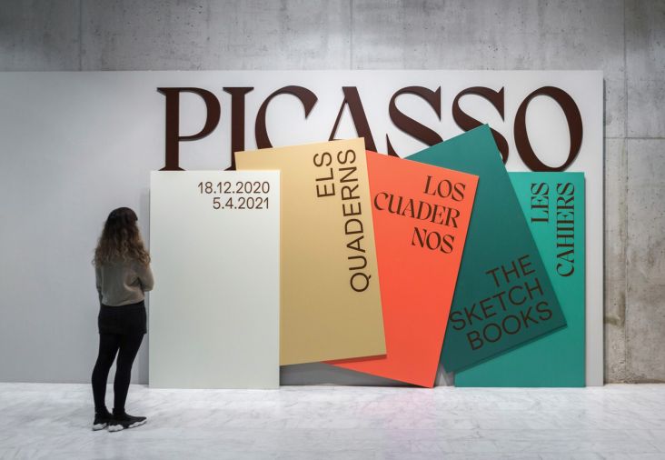
Brinca by In-House International
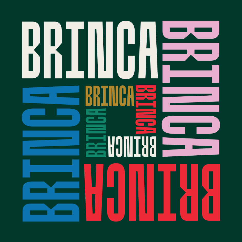
49. Brinca by In-House International
Brinca is a display typeface with an emotional range and a dynamic heart. Named after the jumping extremes of the type's styles (from coiled spring to stuffed and bouncy), it's a good choice for brand identities, packaging, events promotions, merch and product lines, as well as book covers. This font includes uppercase and lowercase alphabets, numbers, punctuation and Latin diacritics.
50. Dala Prisma by Commercial Type
Dala Prisma is a development of the stencil typeface Dala Floda, replacing the latter's solid forms with a series of stripes which vary in width, leading to an eye-catching optical effect. The variation between thick and thin is exaggerated with multiple lines, which increase in number as the typefaces become bolder. The extreme thinning of lines means this family only works at large display sizes.


. In use by [Garbett](https://garbett.com.au/) for Career Trackers](https://www.creativeboom.com/upload/articles/0f/0f4e193ba9164073646e67421eb37b4b26986c67_732.png)

 by Tüpokompanii](https://www.creativeboom.com/upload/articles/58/58684538770fb5b428dc1882f7a732f153500153_732.jpg)

](https://www.creativeboom.com/upload/articles/7a/7a527d53fefe4f354e8489365e89db422567f281_732.jpg)