Dear Monday: A fresh look for the coaching platform helping women lead the change
The Female Leadership Academy is no more. Say hello to Dear Monday, a spirited rebrand by Arndt Benedikt that gives the women's leadership platform a fresh identity full of energy, community and purpose.
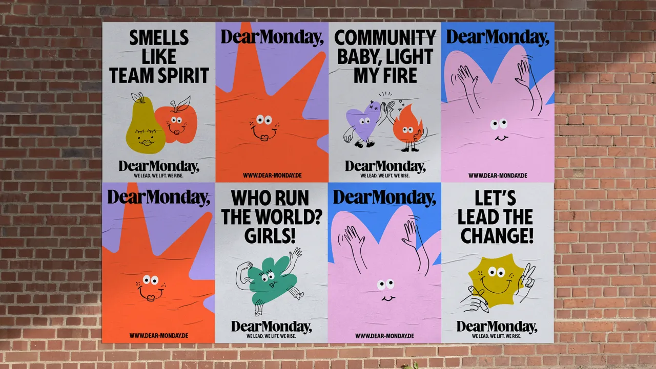
Dear Monday has a bold new identity, marking a fresh chapter for the popular coaching platform, which is on a mission to empower women in leadership. With a new name and vibrant look by Frankfurt-based studio Arndt Benedikt, the rebrand signals more than a makeover—it's a rallying cry for a fairer, more meaningful world of work.
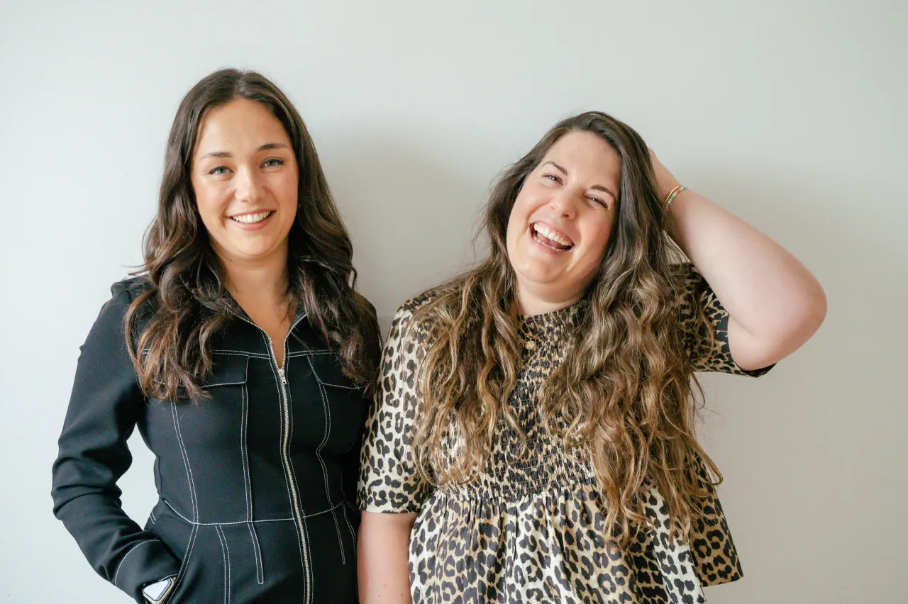
Formerly known as the Female Leadership Academy, the platform was founded in 2018 by entrepreneur and podcast host Vera Strauch. Since then, it's helped thousands of women across Germany navigate leadership with confidence, purpose, and solidarity. But while its mission was loud and clear, its visual identity wasn't exactly pulling any punches.
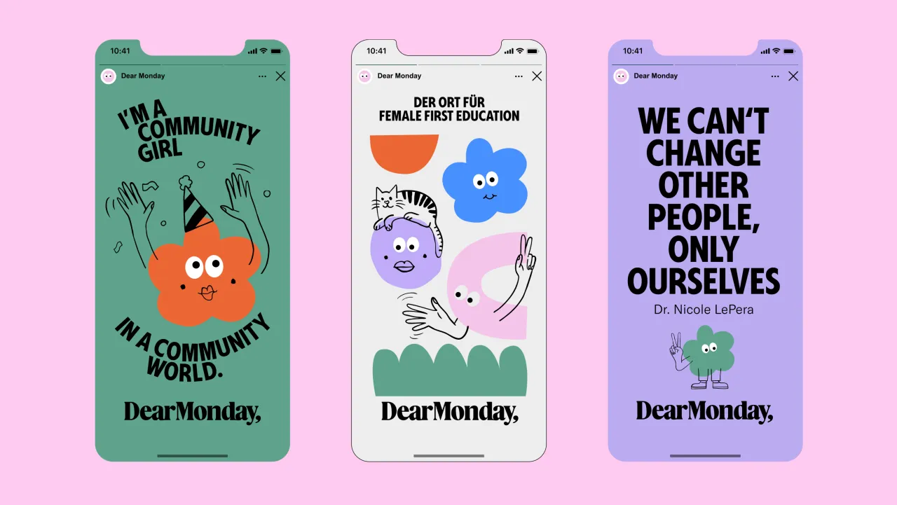
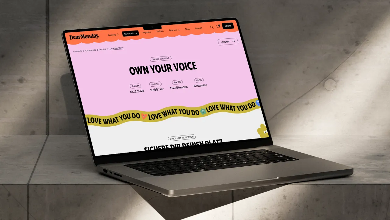

And so Arndt Benedikt stepped in to come up with a new name and brand that could better reflect its ambitions. The resulting colourful and confident identity beams with joy and purpose—something that feels more like a movement than a coaching brand. Which, in truth, it is.
Because Dear Monday isn't just a personal development platform; it's a collective effort to rewrite the rules of leadership. At a time when gender equity is under more pressure than it has been in decades, Dear Monday is helping women push beyond tokenism and glass ceilings. Through coaching, seminars, and a widely celebrated podcast, it equips women with not just skills but also the business language, confidence, and community they need to lead and disrupt on their own terms.
And if you're wondering about the name? It's a cheeky subversion of the Sunday Scaries—a love letter to a new kind of working week, one where women aren't just surviving Mondays but reshaping what they mean altogether.
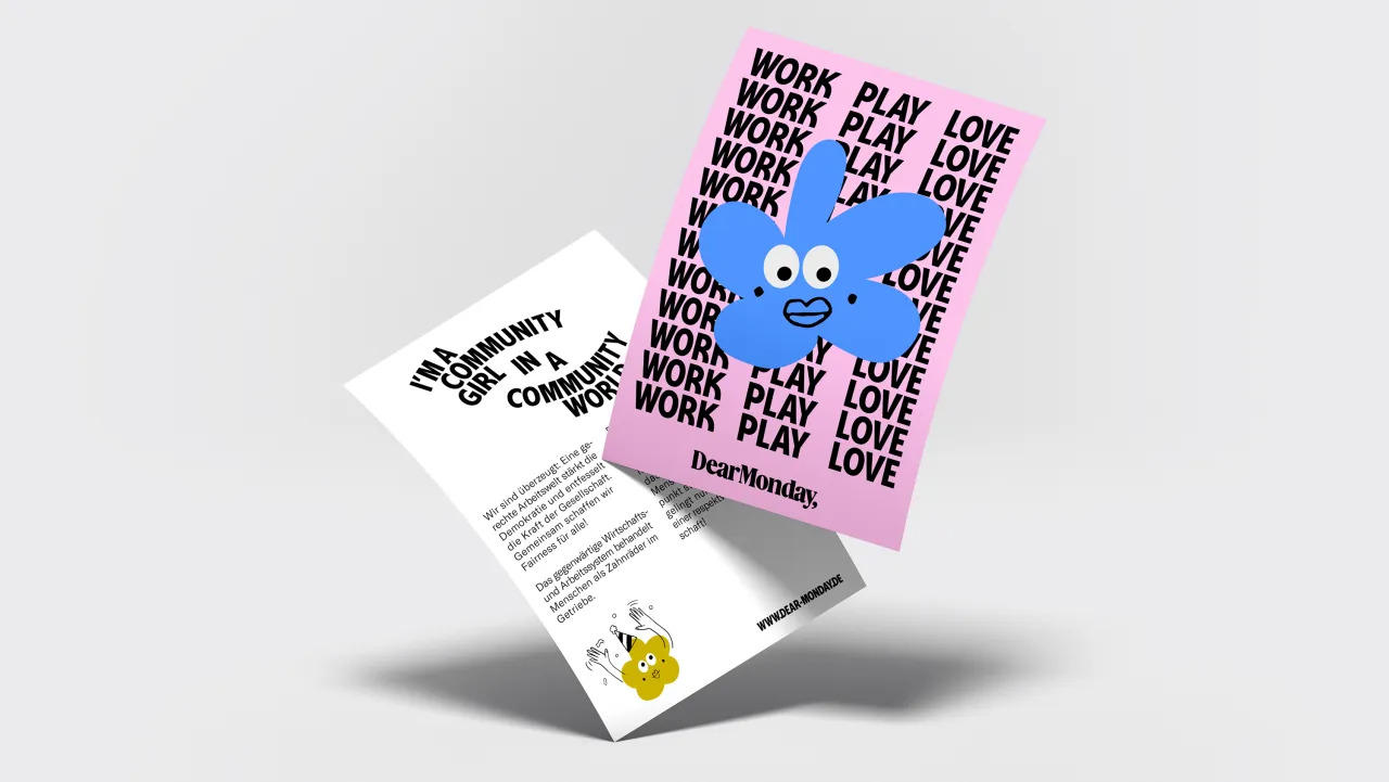
Launched as the Female Leadership Academy, the platform had outgrown its original skin. It was no longer just about training individuals—it was about building a collective space where women could grow, be seen, and shape the future together. The founders needed a brand that matched that energy: emotionally intelligent, confident yet approachable, and flexible enough to work across everything from Instagram to international summits.
The Solution? Monday reimagined. Arndt Benedikt delivered a name that flips the script on the working week, along with a look that radiates energy and intent. The wordmark, set in a custom serif font with organically connected ligatures, nods to community and exchange. A punchy headline font brings movement and momentum, while a calm sans serif keeps things grounded and accessible.
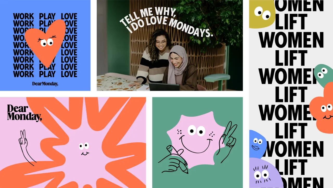
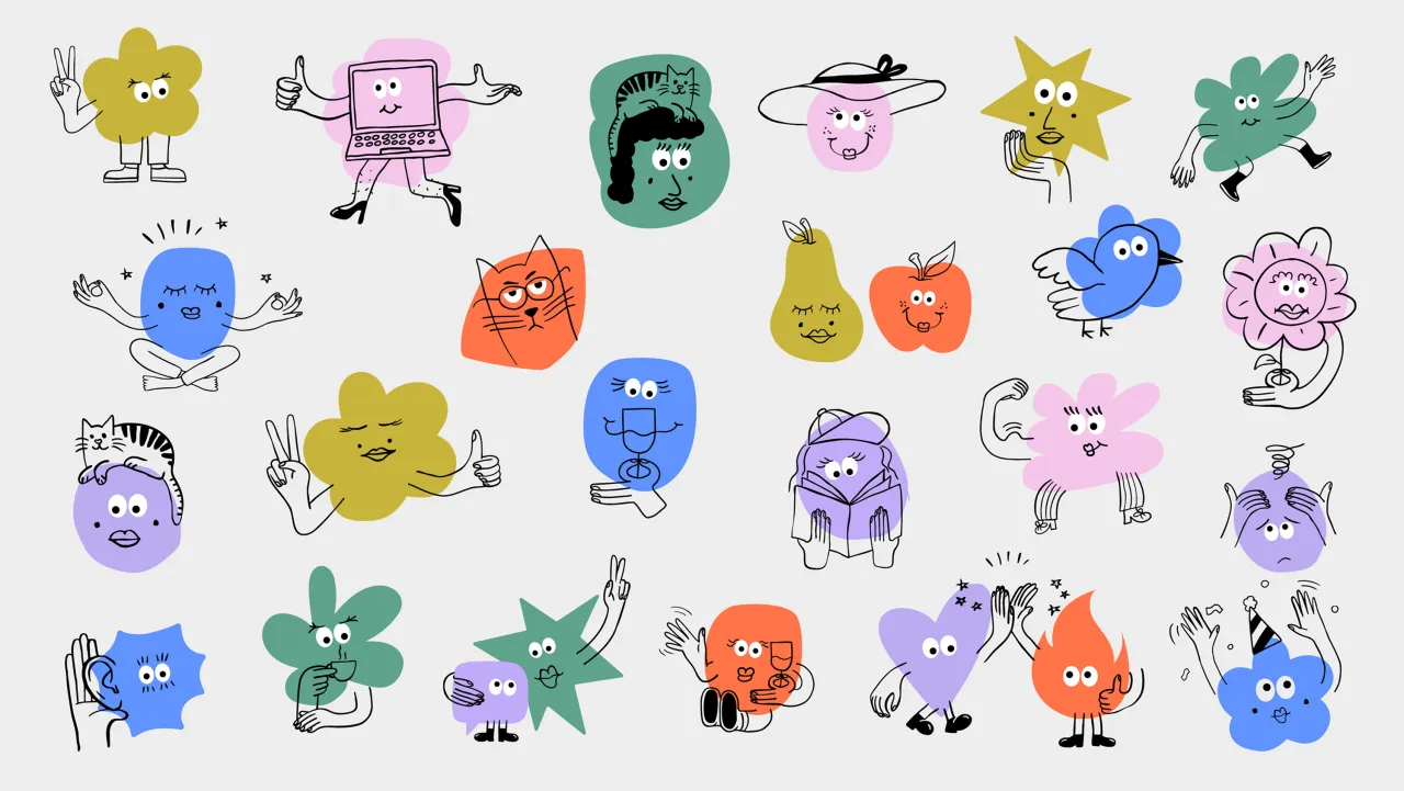
The colour palette shifts between bright, chatty colours and grounded neutrals—a celebration of diversity in every shade. And then there are the Mondies—a suite of playful, inclusive illustrations that embody the platform's values of self-expression, joy, and connection. Real-world photography and the smart use of white space complete a system that's as cohesive as its character.
It's a brand that doesn't just represent women, it champions them. One that reflects who Dear Monday but also who its community is becoming.
Editor's Picks





Trending






Latest Jobs
Agent & Producer at The Jacky Winter Group
Full-time·London·£35k–£40k
Associate Web Designer at Planhat
Full-time·London·£30,000 – £35,000
Senior Designer at Jubba
Full-time·London·£50k-£60k
Lead Digital Designer at Together
Full-time·£55k–£75k
Junior Project Coordinator at Colorido Studios
Full-time·Twickenham·£28k–£32k
Diploma in Professional Studies Coordinator at London College of Communication
Contract·London·£52,977 to £63,815