Sunday's 'Playful Precision': a robotics brand designed to give you your time back
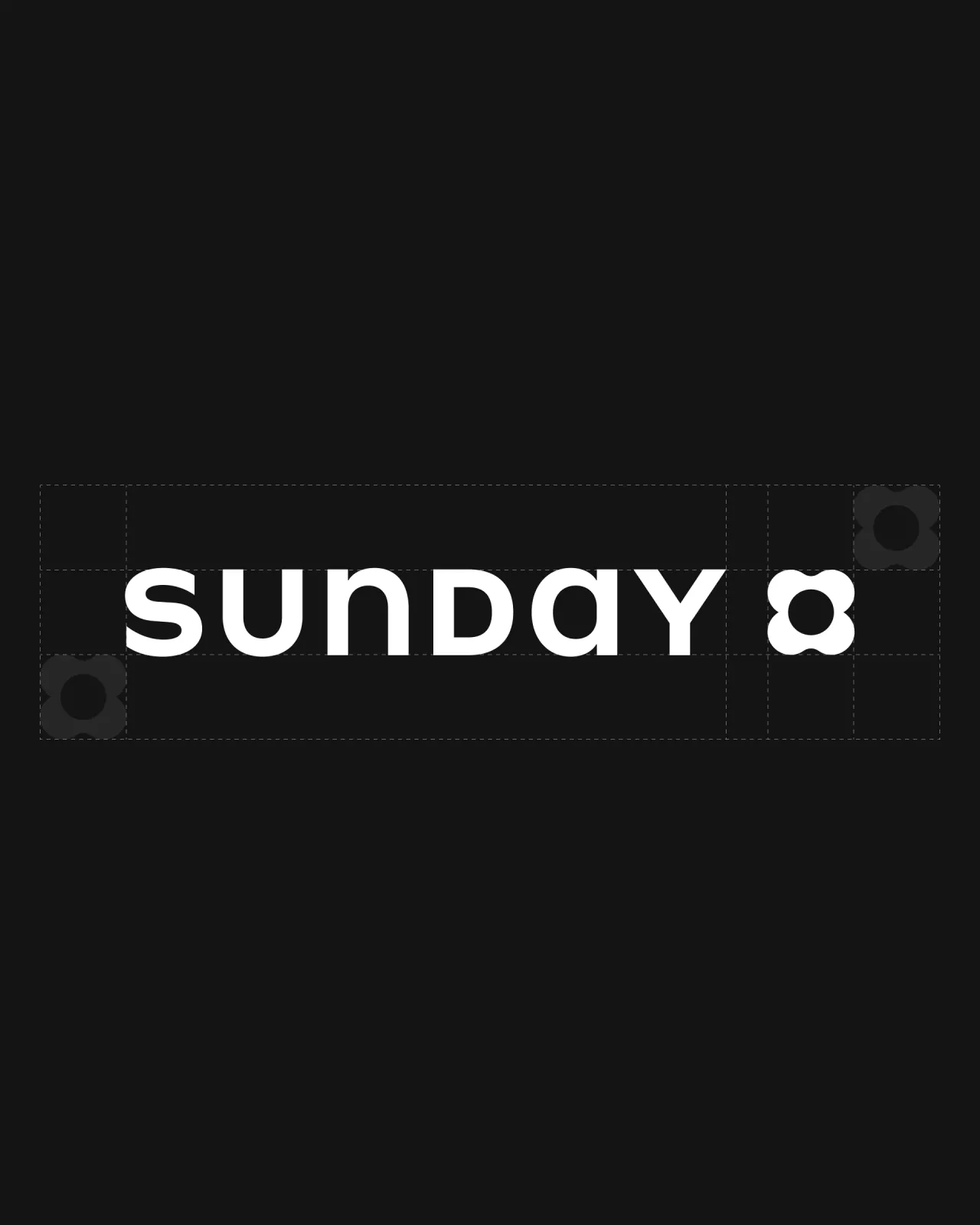
Most technology competes for your attention. Sunday is building the complete opposite, a new kind of robotics company focused on returning time to people's lives. Its identity, created in collaboration with Moniker, strikes a careful balance between warmth and credibility.
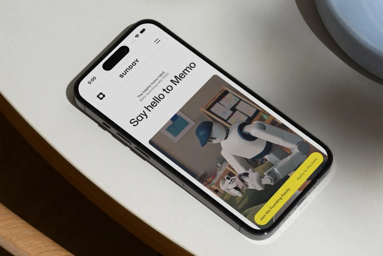
There is no shortage of bold claims in the world of AI and robotics. Every new product promises to change everything, usually while asking for more of your time in return.
Sunday takes a different stance. Its ambition is disarmingly simple: free people from repetitive domestic tasks so they can focus on what actually matters.
Its founders, Tony Zhao and Cheng Chi, have helped reshape how robotics systems learn, and their company has spent more than a year quietly building in the background. Backed by investors, it is now stepping into the spotlight with Memo, a fully autonomous home robot designed for real life.
Sunday's technology centres around its Skill Capture Glove, a proprietary system that allows robots to learn tasks directly from humans. Instead of traditional programming, actions can be demonstrated and absorbed into an expanding skill library, powered by advanced AI models. The result, the company says, is a level of dexterity and adaptability well beyond traditional programming.
Translating that into something people can immediately understand and trust is another challenge entirely. That is where the brand comes in.
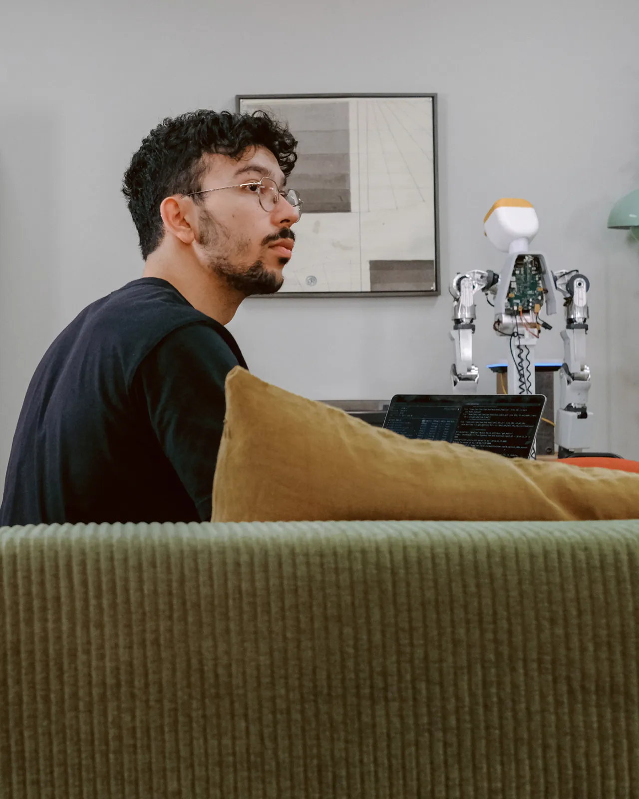
From research lab to real life
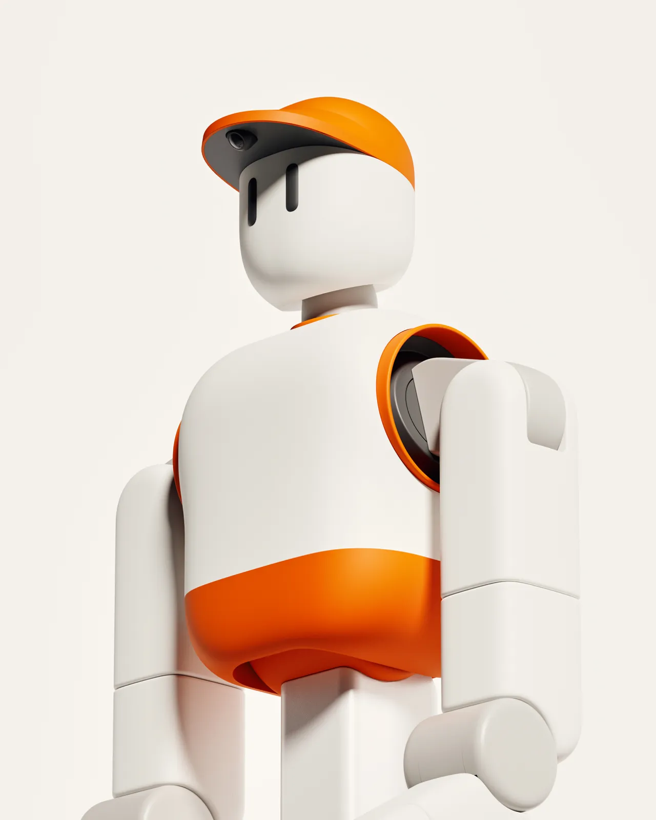
Working alongside San Francisco studio Moniker, Sunday developed an identity that introduces Memo not as intimidating technology, set to take over the world, but as something genuinely helpful. The team recognised early on that the product has an inherent duality: it is highly sophisticated yet outwardly calm and approachable.
They defined this tension as "Playful Precision", a phrase that underpins the entire system. It allows the brand to hold two ideas at once: friendliness and engineering rigour, softness and control.
This thinking carries through to the positioning line, "Life, made lighter". It's simple and free of jargon, with no mention of AI or robotics, just a clear articulation of the outcome – time returned.
Soft on the surface, sharp underneath
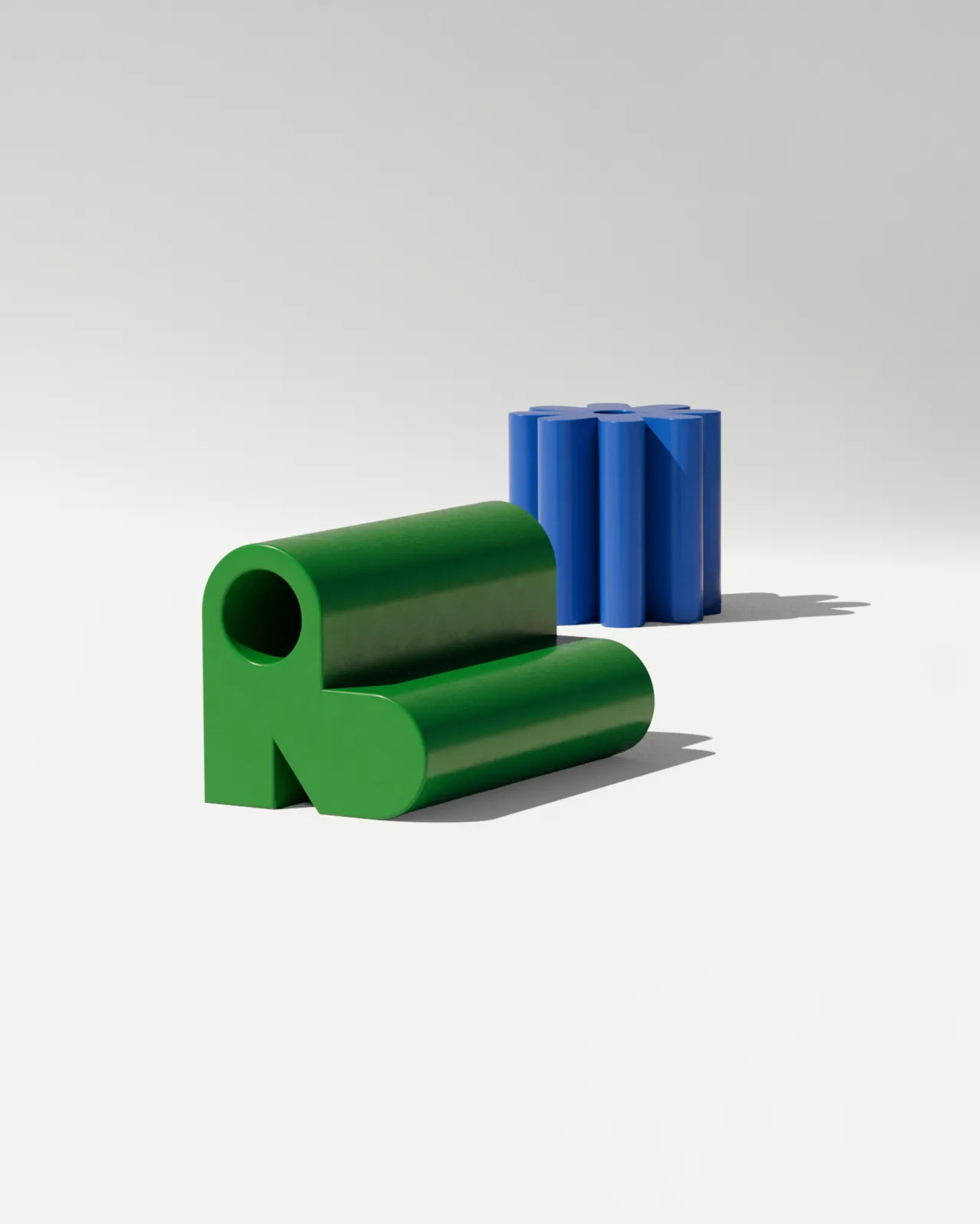
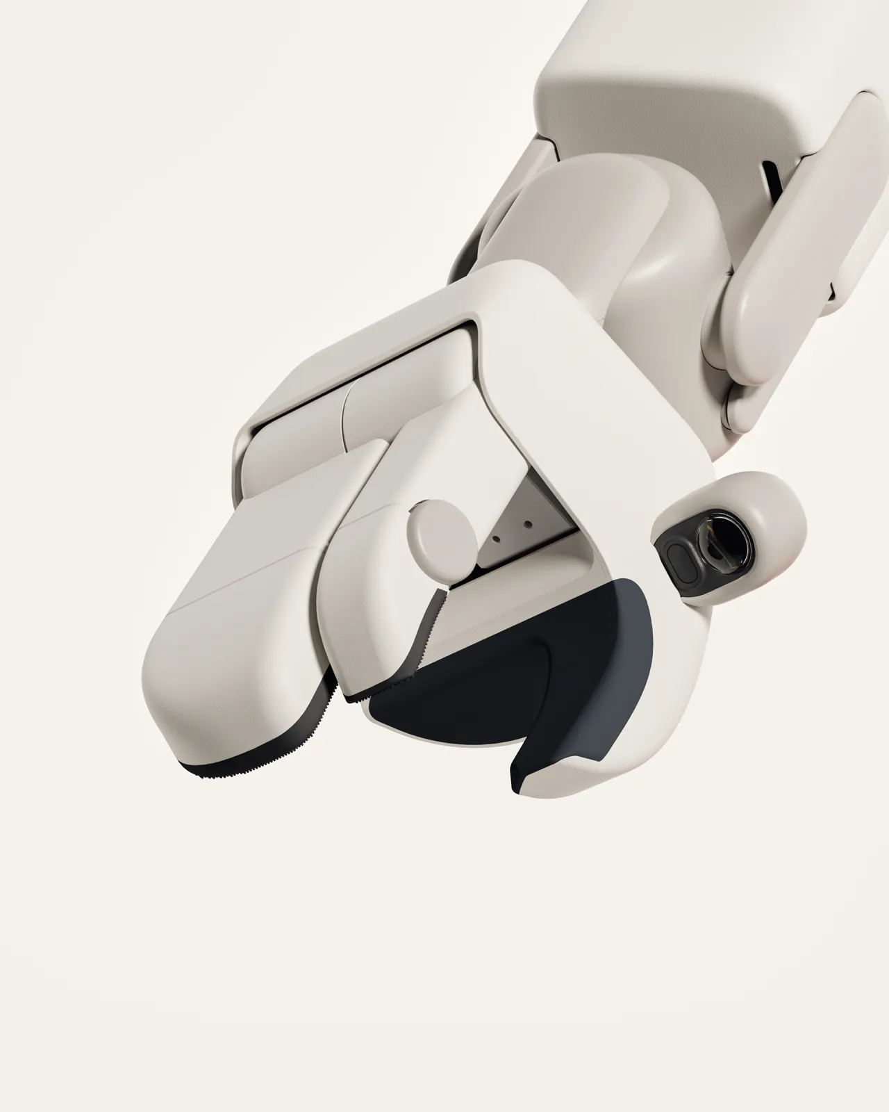
Visually, the identity leans into Memo's physical qualities. Rounded corners and soft forms echo the product's design, while a gentle, restrained use of motion reflects its responsive outer shell. The palette feels considered and calm, reinforcing the sense that this is a product designed to fit quietly into everyday life.
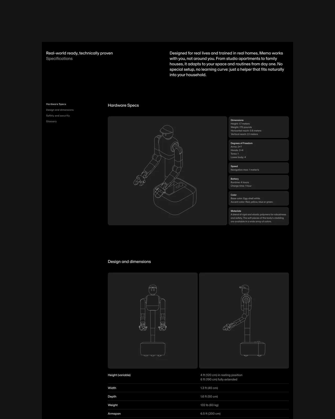
At the same time, the system never shies away from its underlying technology. A secondary layer introduces more technical expression, from dynamic data visualisations to detailed specifications and a darker mode that shifts the tone from aspirational to engineered. It is a careful approach that speaks to future customers while also reassuring investors and the wider robotics community.
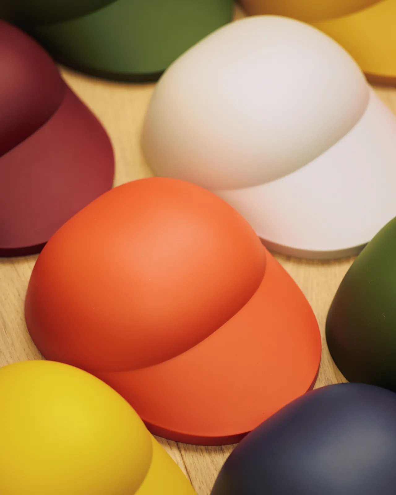
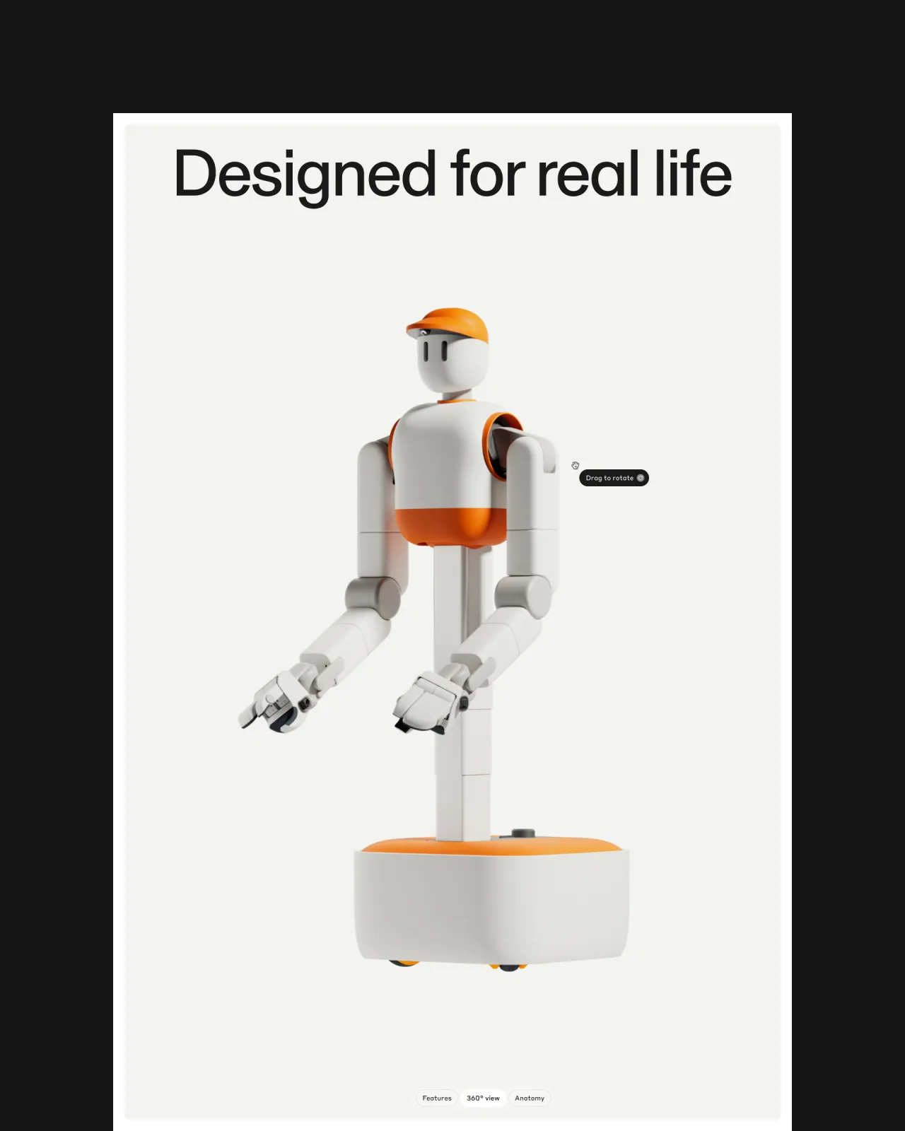
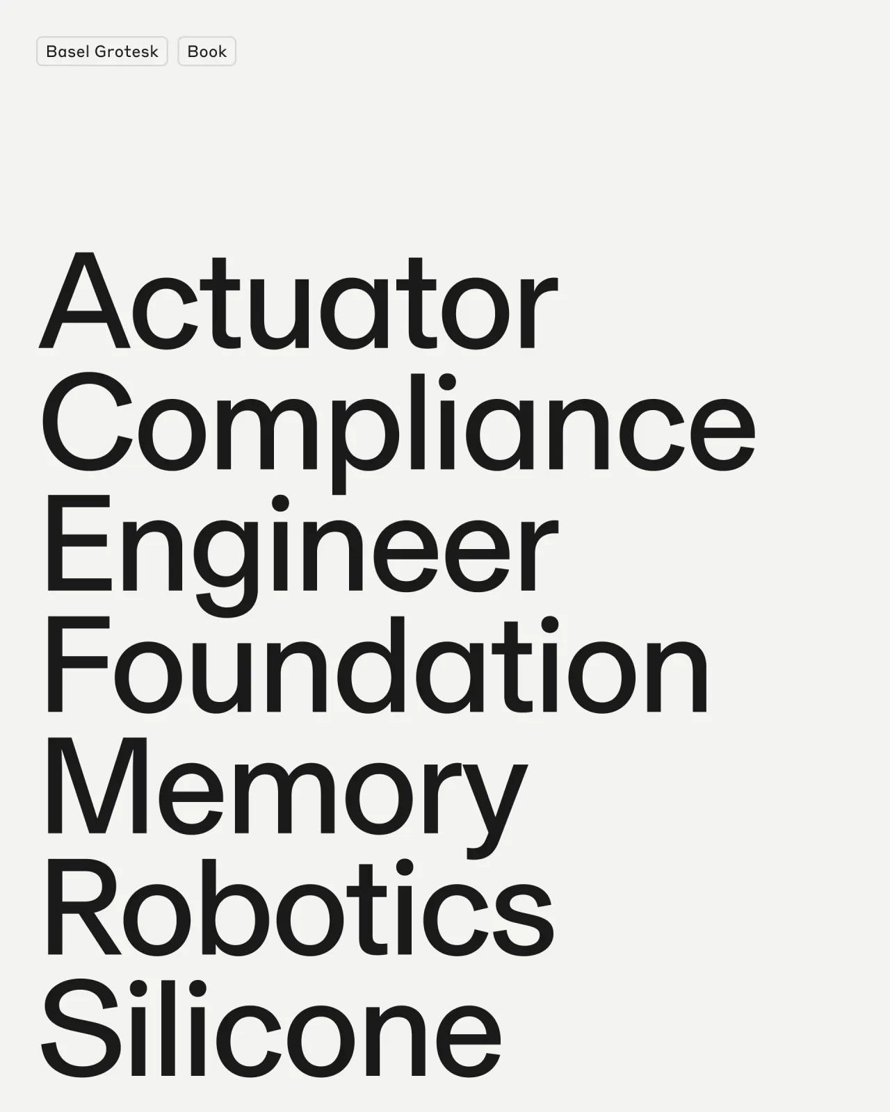
Typography helps meet these different demands. Basel Grotesk provides a clean, contemporary foundation with a neutral, confident voice, while Styrene brings a more industrial edge, particularly in moments where technical detail is important. Together, they create a flexible system that can move easily between warmth and clarity.
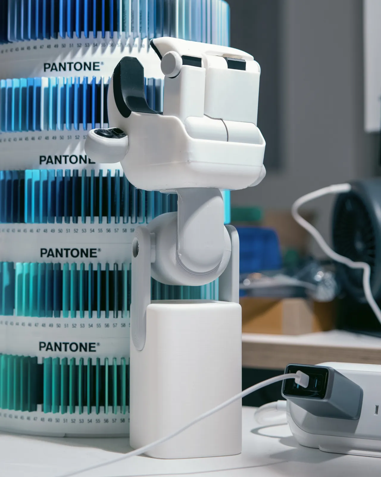
Cinematic footage shows Memo operating autonomously in real homes, making the product a reality. This is paired with behind-the-scenes glimpses of the lab, offering insight into the engineering to build credibility without overwhelming the viewer. Even the smallest details – micro-interactions to motion cues – are deliberately paced.
One of the more thoughtful aspects of the project is how the content was developed. Video, photography and 3D were created alongside the brand rather than added later, meaning everything shares the same strategic foundation. The result is a cohesive world where every touchpoint feels aligned.
A launch that cut through
The launch numbers (supplied by Sunday) are striking: a waitlist filled within hours, coverage from Wired, Bloomberg and TechCrunch, more than 10,000 job applications, and a Series B led by Coatue within three months at a valuation over $1.15 billion.
What makes the work particularly compelling is its restraint. Its category is known for leaning into complexity or spectacle, but Sunday's brand chooses clarity instead. It focuses on what people actually care about and goes from there.
The work by Moniker gives Sunday a disciplined framework, shaping everything from strategy and identity to motion and storytelling. The result is a glimpse of a different kind of future for technology – one that arrived before anyone was quite ready.
Editor's Picks





Trending



Latest Jobs
Growth Strategist (Ecommerce) at Tribe
Full-time·Exeter / London·£50k + Bonuses
Senior Digital Designer at Red Antler
Full-time·New York·$95k-$130k
Midweight Designer at All Purpose
Full-time·London·£30k–38k
Account Director at How&How
Full-time·London·£73k-£79k
Senior Designer at Jubba
Full-time·London·£50k-£60k
Frontend Developer at Northern Artillery
Full-time·Leeds·£35k–£45k