Dạ-Hợp: A dual-concept dining experience that blooms after dark in Ho Chi Minh City
This boundary-blurring F&B brand from M — N Associates proves that two stories are better than one.
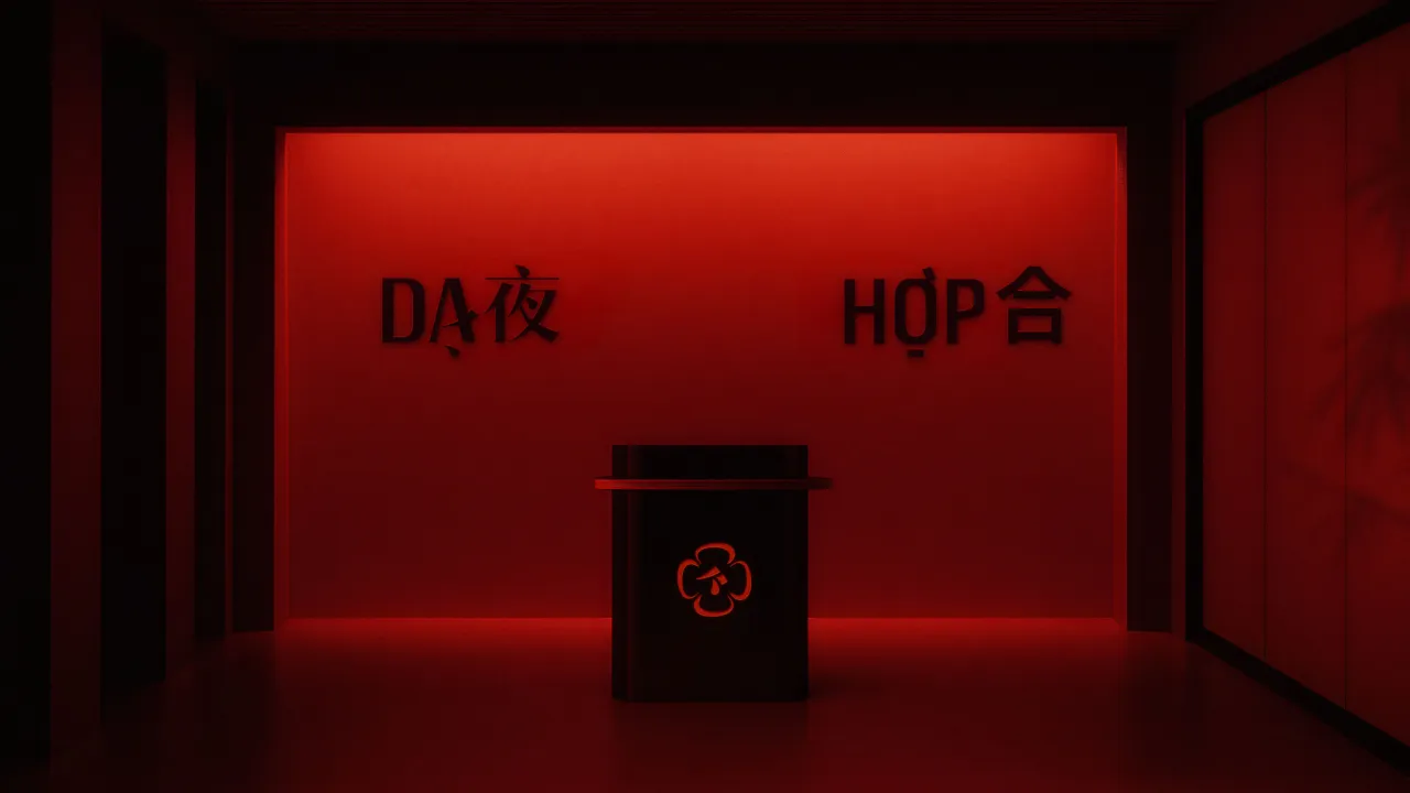
There's no shortage of rooftop bars in Ho Chi Minh City, but few offer quite the experience of Dạ-Hợp. This new two-floor concept pairs cabaret dining with open-air nightlife, woven together by a brand identity that's equal parts refined and rebellious.
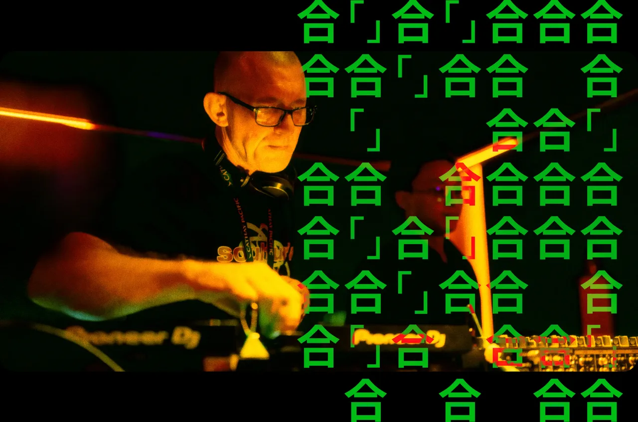
Dreamed up by M — N Associates, the brand behind some of Vietnam's most progressive F&B identities, Dạ-Hợp occupies a unique perch in more ways than one. Sitting atop a corporate office tower, it merges two contrasting experiences under a single, unified concept, with a moody indoor restaurant below and a vibrant rooftop bar above.
Rather than treat the levels as separate venues, the design team proposed a more strategic approach: a dual-concept brand that could function independently yet feel meaningfully connected.
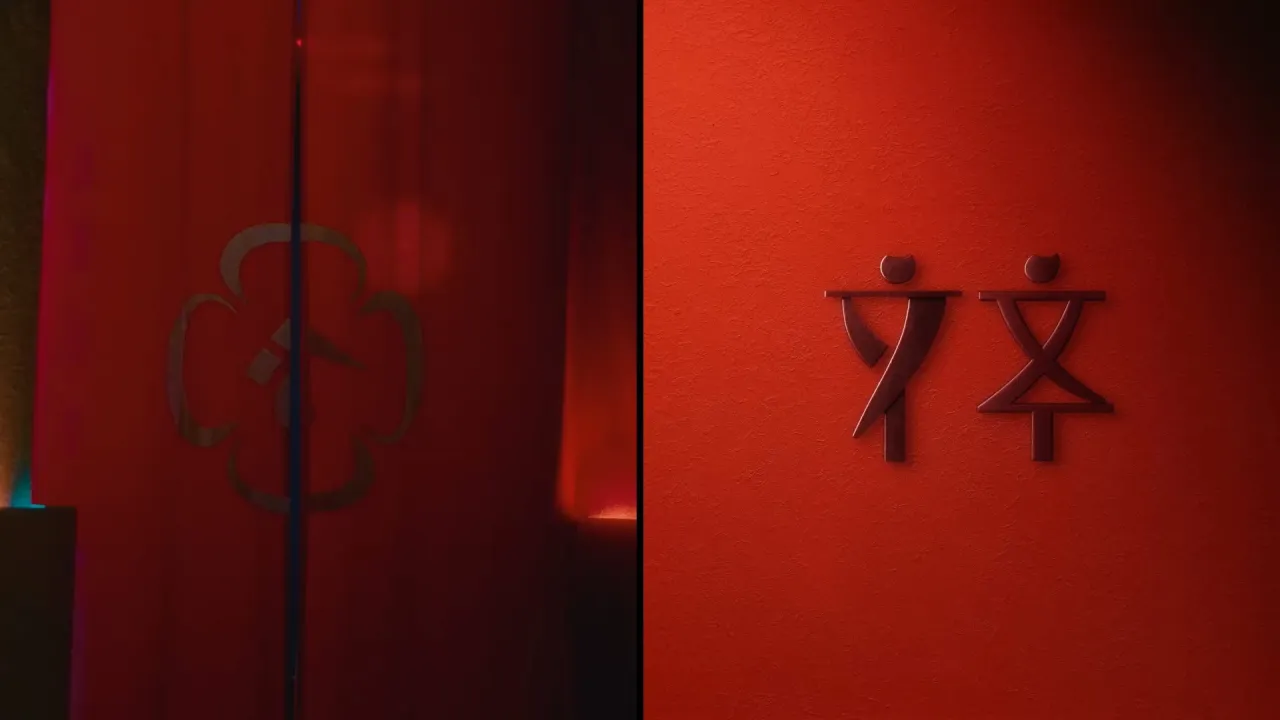
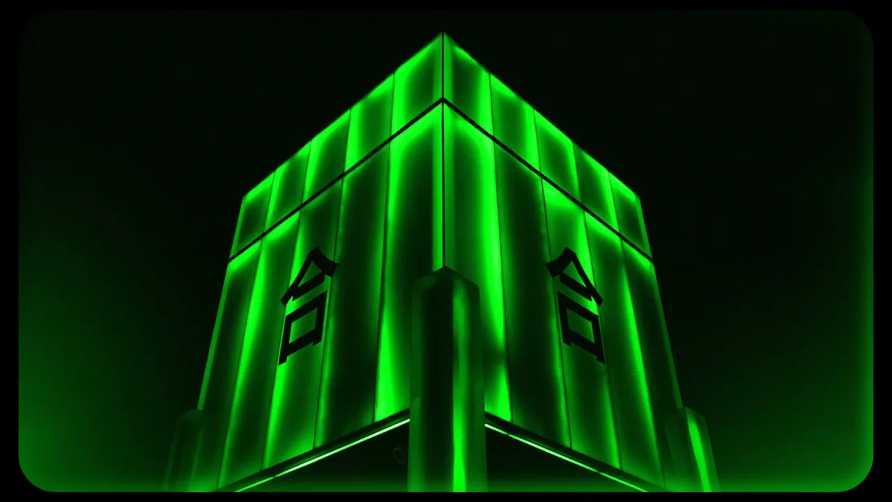
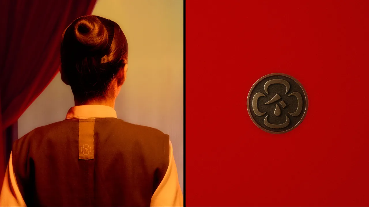
"We were inspired by the magnolia coco flower," says Duy Nguyen, executive creative director at M — N Associates. "It only blooms at night — just like Dạ and Hợp. That metaphor helped us shape everything."
The name Dạ-Hợp (meaning "night" and "together" in Vietnamese-Chinese vocabulary) reflects the layered nature of the brand. It's also as practical as it's poetic, and the floral symbolism underpins everything, from the logo and naming system to the custom typography and spatial transitions.
The result is a brand that feels like a story unfolding across two chapters, each with its own mood, rhythm, and energy.
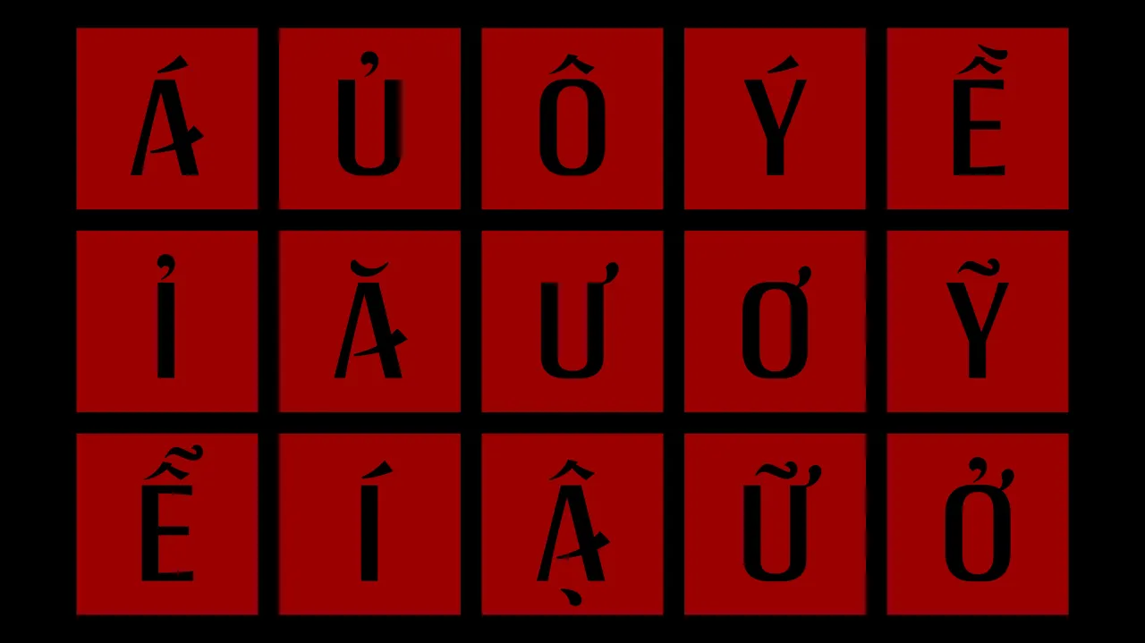
For the custom type system, the team designed what they call "sister letterforms", defined as a typographic pairing that balances tradition and modernity.
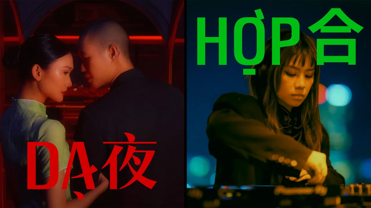
"Dạ's typeface has soft brushstroke curves and calligraphic structure, while Hợp's is a minimal sans-serif — rhythmic, adaptable, and built for nightlife applications," Duy explains. The tall, vertical orientation of the letters nods to the height of the venue while creating a cinematic flow across signage, menus, and digital content.
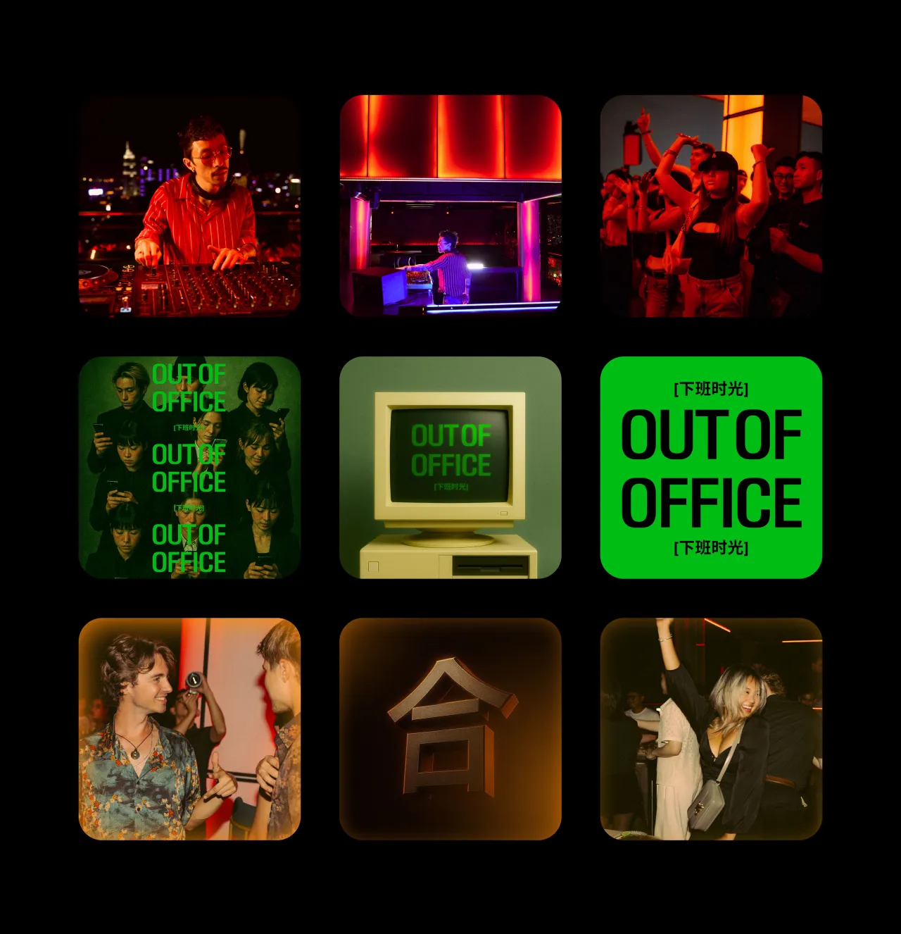
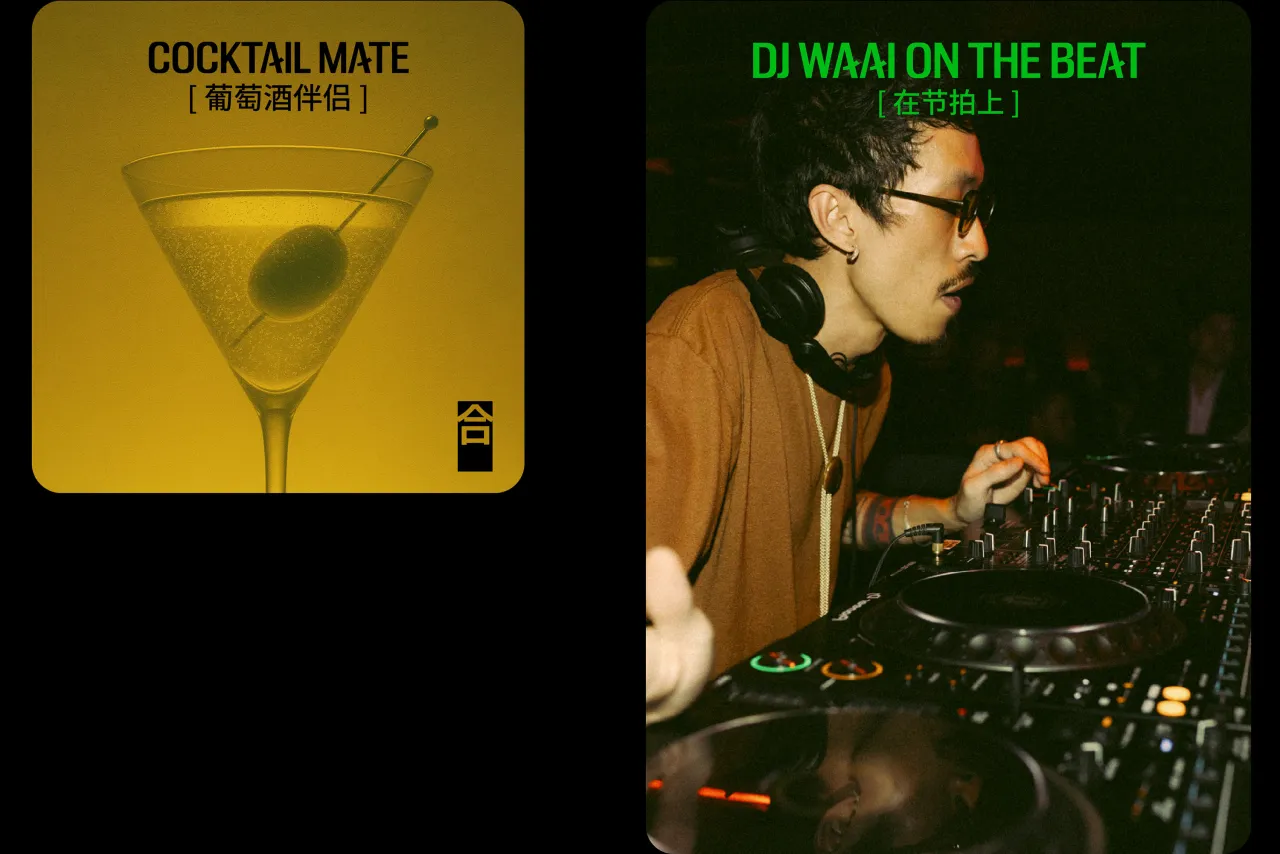
Visual consistency was key across both spaces, especially since Dạ-Hợp hosts a rotating lineup of live DJs, cabaret acts, and themed dining events. However, instead of building a rigid brand system, the studio opted for one rooted in principles rather than prescriptions.
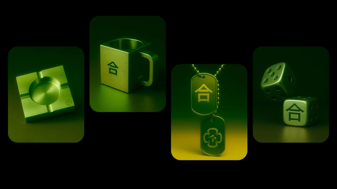
Core elements, such as the magnolia motif, a moody palette of deep reds and muted shadows, and tonal contrast in type, provide an emotional through-line, allowing the brand to flex while staying recognisable.
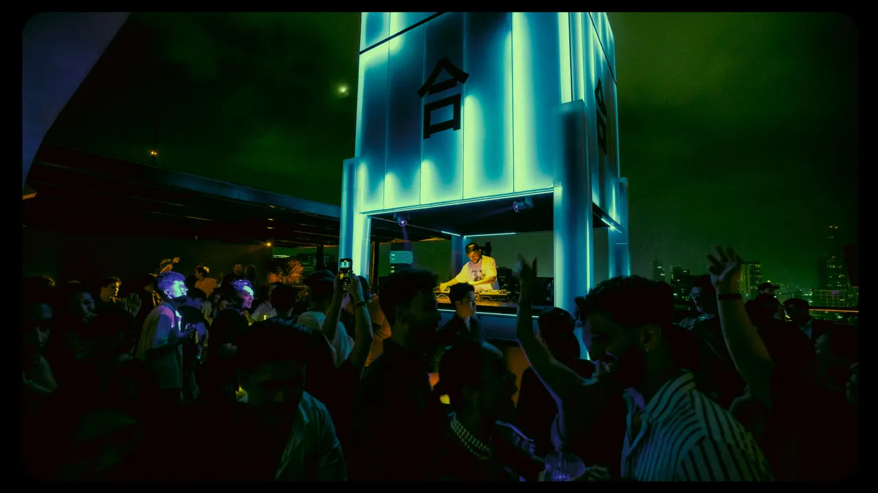
The contrast between Dạ and Hợp isn't just visual but experiential. Downstairs, the atmosphere leans into cinematic cabaret: dark, dreamlike, and intimate. Upstairs, the energy flips, and Hợp is open, contemporary, and buzzing with skyline views and sound.
"We worked closely with the architecture and operations teams to make sure the brand's personality could be felt in every detail – from lighting temperature to how people move through the space," says Duy.
That close collaboration extended to materials and spatial design. From the petal-like forms in signage to the soft glow of menu lighting, each touchpoint reflects the venue's central idea: two experiences that only come alive after dark. Even the uniforms and event visuals follow suit, blending elegance with edginess and ritual with revelry.
The biggest challenge, though, was strategic rather than creative. "Developing two distinct yet cohesive brand voices was complex," Duy admits.
"The in-house team initially struggled with how to balance and implement both identities across operations, especially under a tight timeline. It required close collaboration and lots of refinement." But the effort clearly paid off. Since its launch, Dạ-Hợp has become a talking point in HCMC's F&B scene. The glowing rooftop DJ cube has become a visual landmark, pulling curious passersby up from the street.
"People are sharing it without prompt – the duality gives them something unexpected," says Duy. It's a brand that feels elevated yet not exclusive, modern yet still rooted in cultural familiarity.
At a time when many F&B venues lean hard into one aesthetic or experience, Dạ-Hợp dares to do both. It's a cabaret and a rooftop bar, a restaurant and a music venue, a story told in two voices that come together at nightfall. As far as fusion goes – conceptually, culturally, and visually – Dạ-Hợp is making it work.
Editor's Picks





Trending
Latest Jobs
Midweight Designer at All Purpose
Full-time·London·£30k–38k
Growth and Client Development Director at 3800
Part-time·Sheffield·£60k-80k
Lead Digital Designer at Together
Full-time·£55k–£75k
Senior 2D Motion Designer at Art&Graft
Full-time·London·£50k-£65k
Lead 3D Designer at The British Museum
Full-time·London·£51,623 per annum
Agent & Producer at The Jacky Winter Group
Full-time·London·£35k–£40k