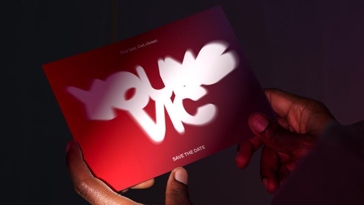
Bold, fiery, empowering: Leyda Luz creates a hot new rebrand for Victoria Records
What do Korn, The Strokes, M.I.A and Jonas Cuaron all have in common? They've all been clients of Victoria Records, which has just been given a scorching hot new look courtesy of multidisciplinary designer Leyda Luz.
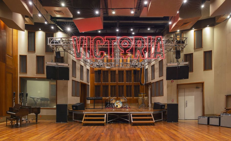
Consisting of a world-class recording studio, publisher, and sister film production company, Victoria Records is the 25-million-dollar project of CEO and producer Victoria Kühne, who launched the label in 2015.
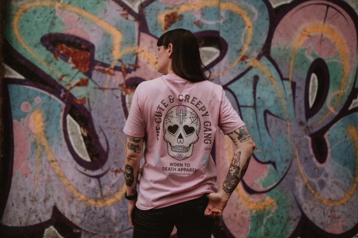
To help bring the various arms of the Victoria Records business together, illustrator, photographer and brand specialist Leyda Luz was tasked with coming up with a consistent look that tapped into the record label's values and reflected the pioneering vision of its founder.
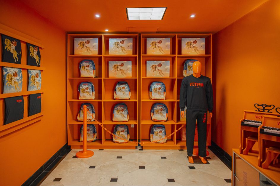
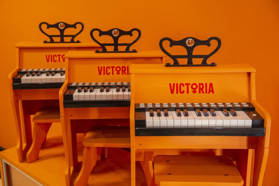
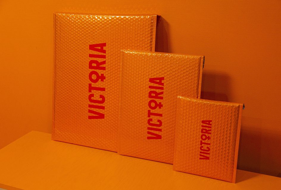
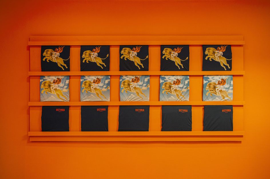
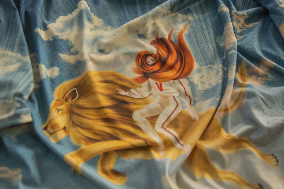
In order to do this, Leyda looked to Victoria herself. Instantly recognisable thanks to her shock of ginger locks, Victoria's hair colour appears to have become a central pillar of Victoria Records' new identity. Everywhere you look, the same colour can be found on the studio's clothing and branding, acting as a striking shorthand for both the label and its owner.
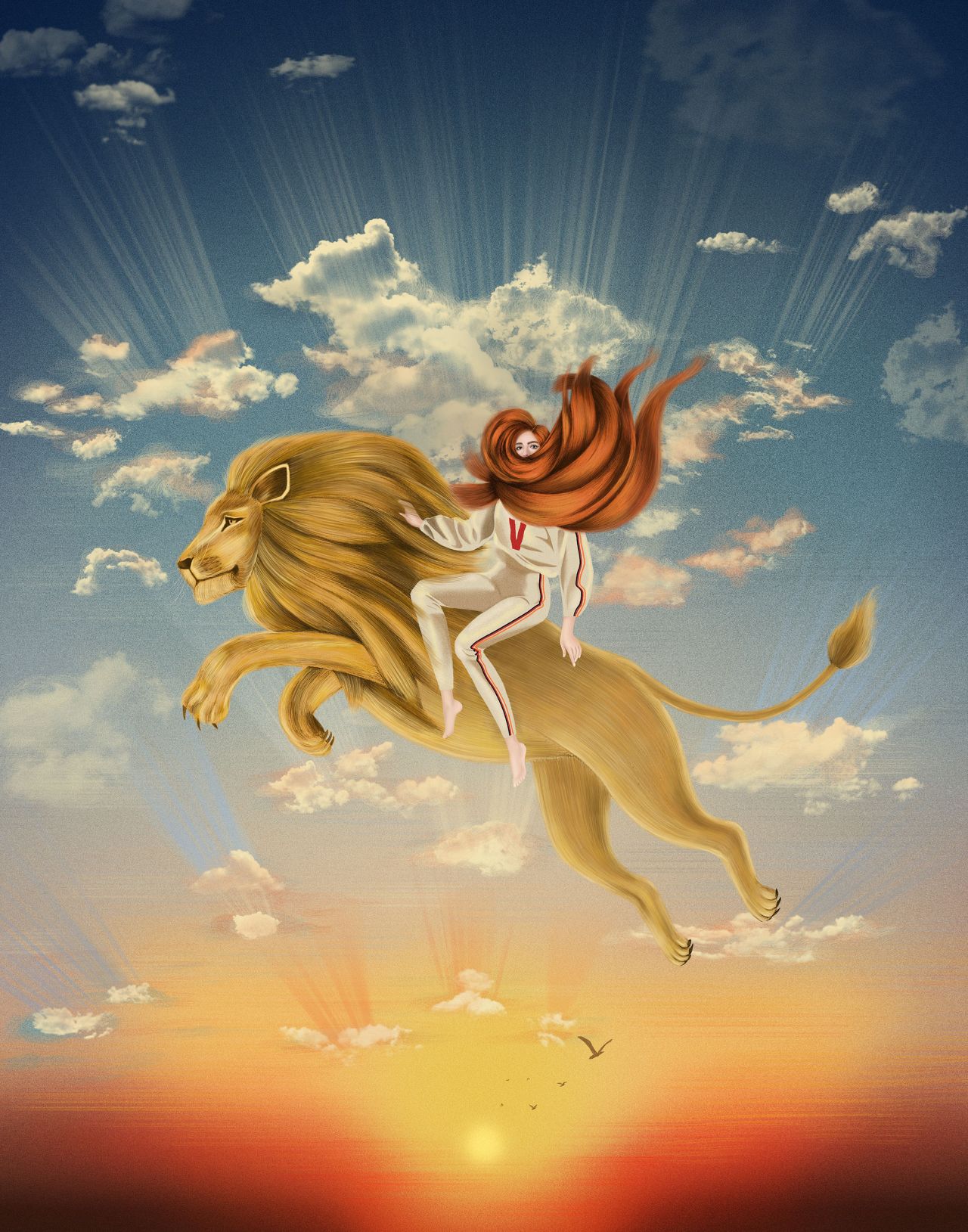
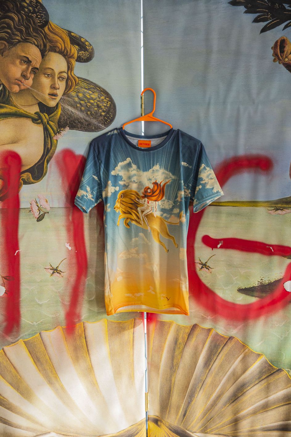
No stranger to creative input herself, Victoria struck upon the idea of capitalising on her unique position as a leading woman in the Latin American music industry. This resulted in the female symbol being incorporated into the Victoria Records logo, as well as the decision to use the central figure from Botticelli's Birth of Venus across all the branding and merchandise.
The reasoning for this is that Venus has been a constant alter ego for Victoria throughout her musical career. It's not hard to see why. Both names start with the same letter, and both have similar hair. But there's more to the bond than superficial similarities. Venus is an iconic woman in art history, so she lends herself perfectly to the theme of empowerment and artistry that the identity was gunning for.
Meanwhile, the iconic illustration of Victoria riding a lion is a tribute to the CEO's Leo star sign. It's one of three images that depict Victoria in a different setting, each relating to a different part of her birth chart and her background as an artist. "We decided to do three images so the three main studios could each have a different concept with only the textual logo tying them together," explains Leyda.
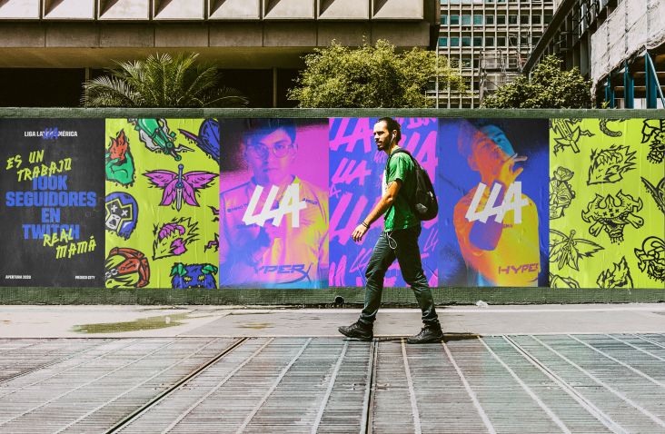
"We worked on the main illustration for her brand and studios with both digital and hand-drawn techniques," she adds. "These are now showcased in every part of the branding, from merchandise and control room screens to the main live room and everything else involving Victoria."
Victoria's decision to work with Facultad de Artes Visuales UANL graduate Leyda appears to be written in the stars. As a Virgo, Leyda complements Victoria's tenacious, creative approach nicely with a detail-oriented outlook. And with a parallel career as a concert photographer, Leyda has better insight into music-related design projects than most.
Editor's Picks


Trending


Podcasts


Editor's Picks
Further Reading