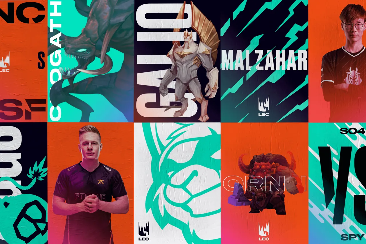
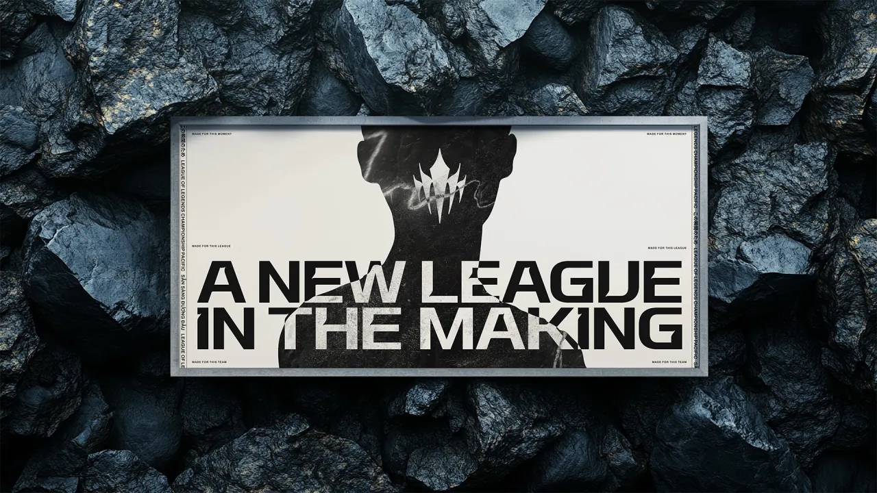
DesignStudio's identity reignites the spirit of Latin America's League of Legends
DesignStudio has today unveiled a new brand identity for the Latin American league of Riot Games' League of Legends.
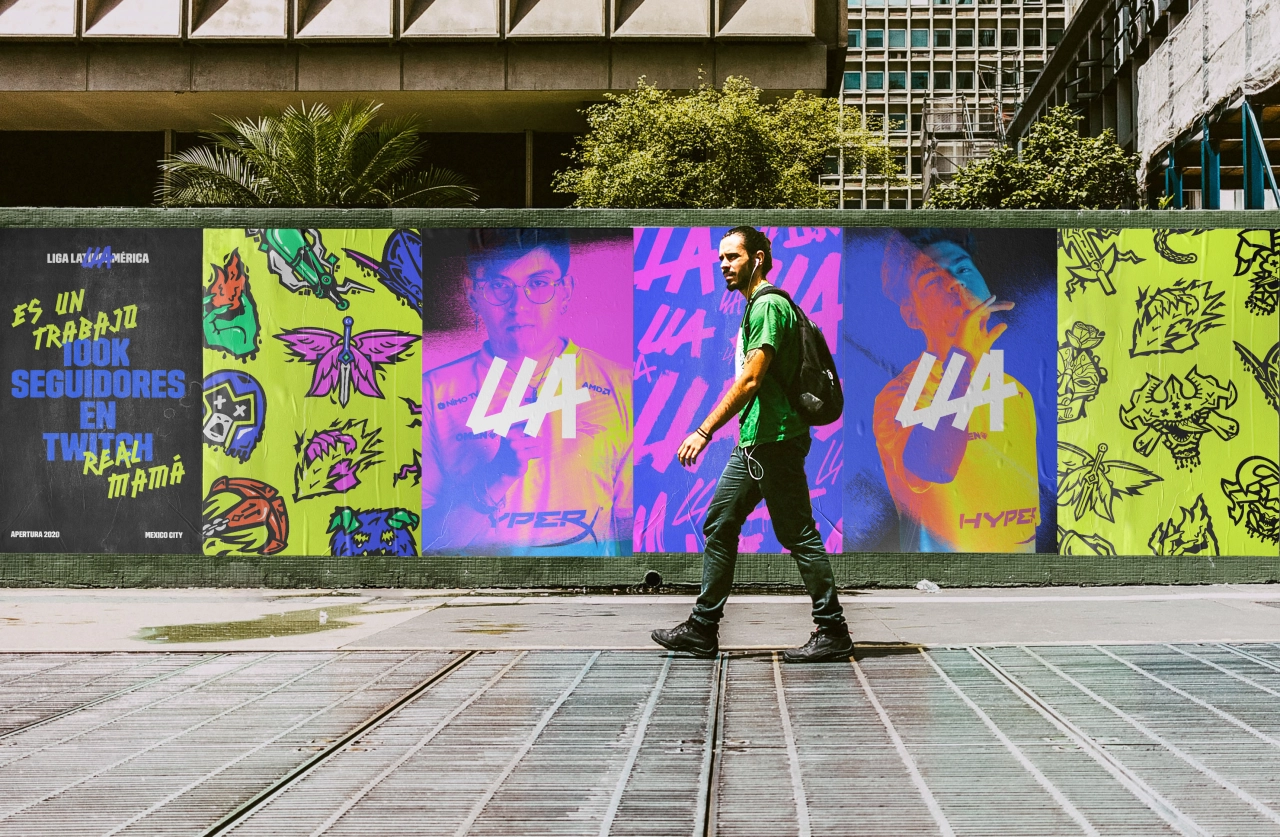
The rebrand for Liga Latinoamérica (LLA) "reinvigorates its connection with audiences" following the recent merging of the Northern and Southern Latin American Leagues – which left fans feeling like some of their spirit, and regional representation had been lost along the way.
DesignStudio's work bridges the divide by building a "passionate, united new community that revitalises the LLA with fresh energy, and recognisable identity for the league as it grows into the global stage".
For the project research, the studio immersed itself in the world of LLA. Its team spent three weeks travelling through five countries in Latin America, where they met with players, fans, and key figures within the league community.
"We took the client along with us on the immersion for this project," says Eric Ng, Creative Director at DesignStudio. "As we knew, this would be a great experience for everyone; we were discovering and uncovering all of the interesting points about this project alongside one another at the same time, in real-time. This early collaborative experience proved vital in shaping the strategic vision, proposition and brand pillars, which led to the refreshed visual identity work."
Through this process of collaboration, the essence of the new LLA began to take shape. Ng adds: "We knew that passion needed to be celebrated and harnessed into an identity that represented underdog spirit and fierce resilience – something everyone could be proud of."
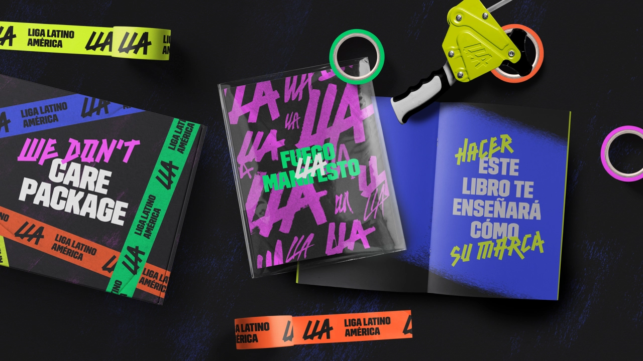
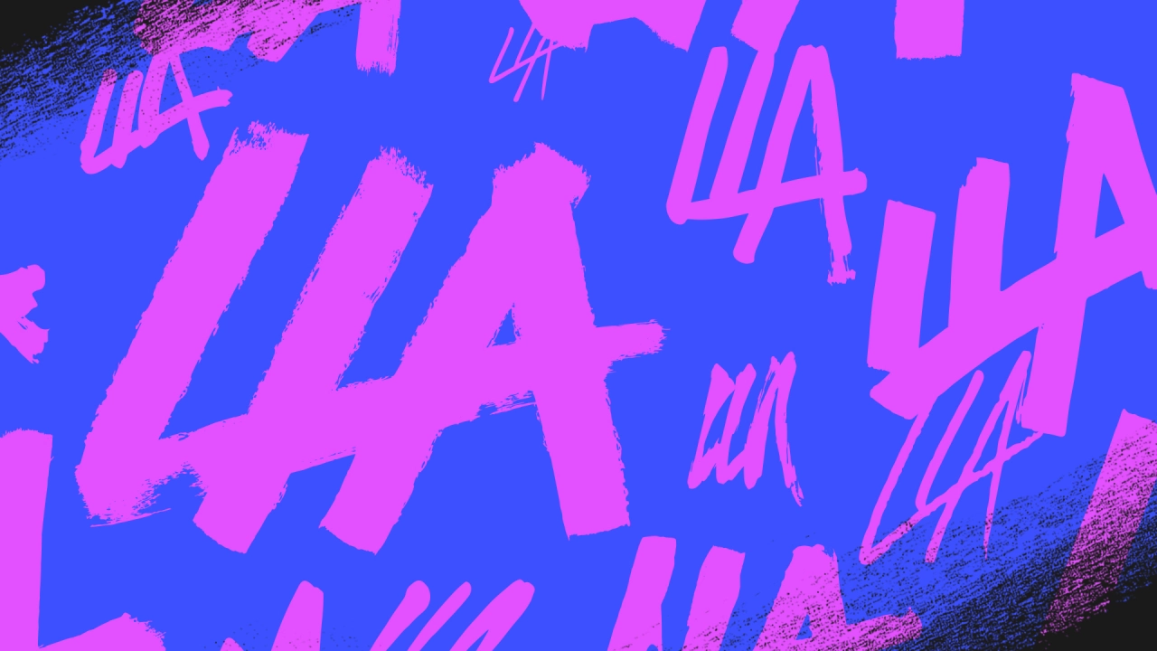
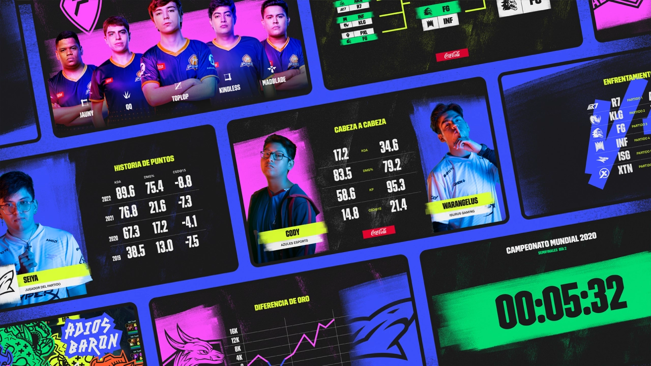
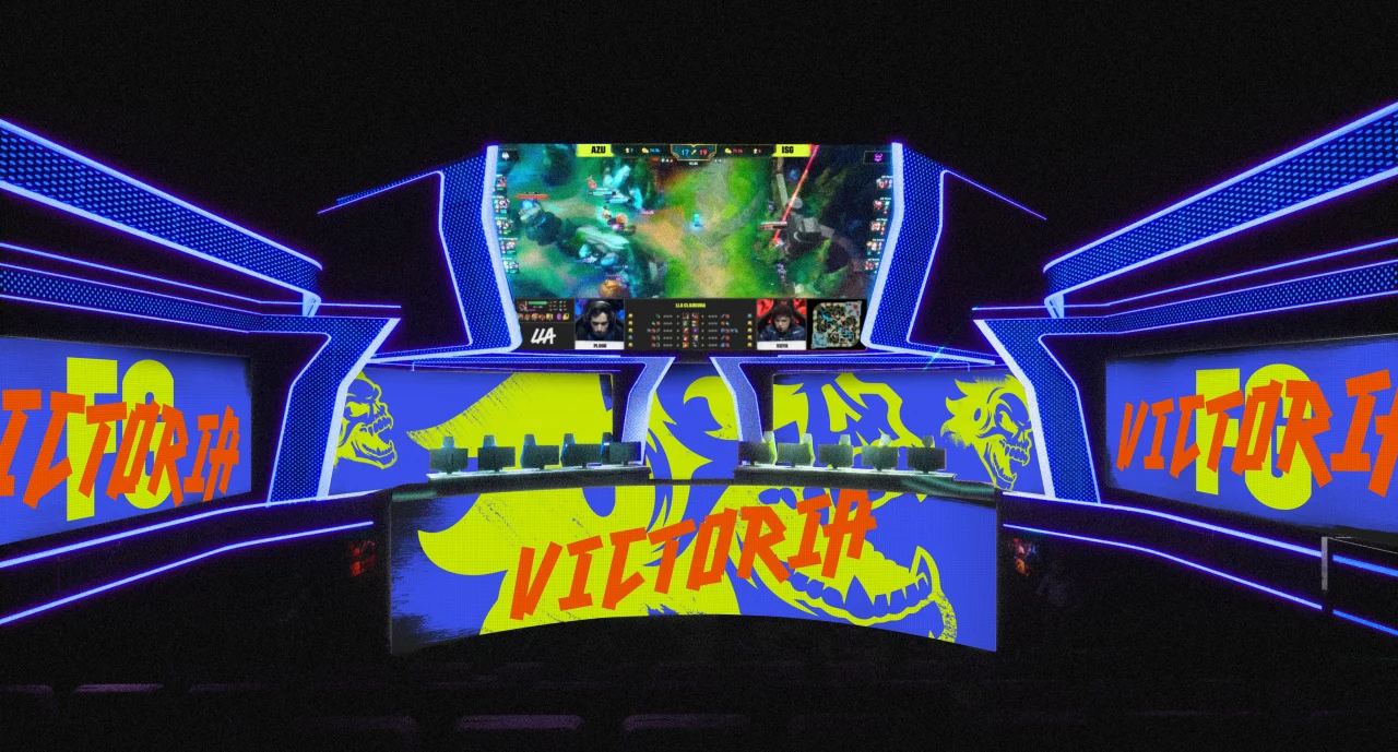
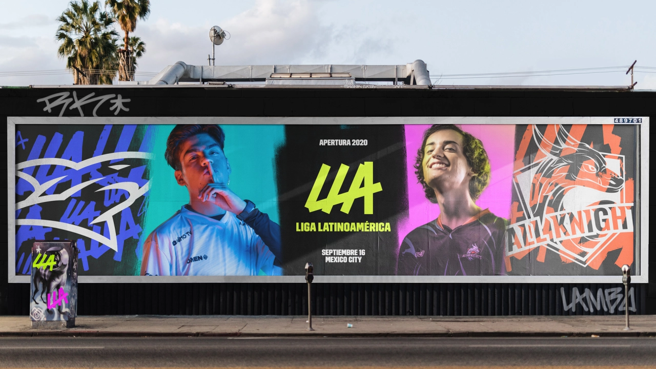
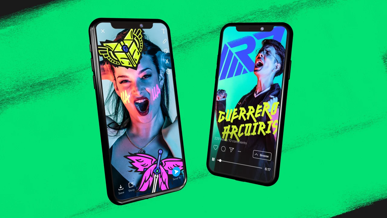
The new LLA identity unites the league with one central rallying cry: 'Show Yourself'. To express this new core positioning, DesignStudio crafted a bold new logo reflecting the DIY attitude and a corresponding custom type called Fuego.
"This new raw look empowers LLA to infuse its fiery personality into communications and puts the brand back into the hands of the fans," says the agency. "When 'Fuego' is paired with a second, more authoritative new type, 'Hielo', the stylistic juxtaposition lets LLA communicate facts while injecting messages with a sense of irreverent humour."
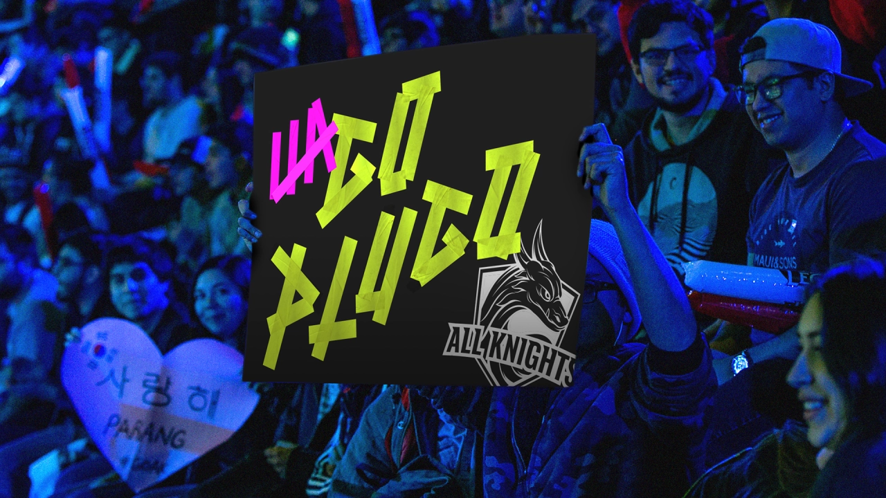
The entire visual system has a guerrilla spirit that invites fans to make the brand their own in a "playful, powerful way", and allows the diverse community behind the LLA to come together.
"Our work gets to the heart of the culture of the Latin American league and its fans," says Ng. "There is a lot of passion and a lot of celebration and fun. We wanted our rebrand to reflect this."
Editor's Picks





Trending




Latest Jobs
Midweight Full Stack Developer at Bureau for Visual Affairs
Full-time·London (Open to remote)·£35k–£50k
Client Partner at Halo
Full-time·Bristol·£30k–£36k
Paid Media Executive at Munro Agency
Full-time·Glasgow·From £27,000
Creative Director at Koto
Full-time·London·£95k-£130k
Growth Strategist (Ecommerce) at Tribe
Full-time·Exeter / London·£50k + Bonuses
Graphic & Motion Designer at The SHARP Agency
Full-time·Leeds·£26k–£33k