Wolff Olins gives Vonage a brand makeover with sleek gradients and illustrations
It was the much-loved brand that broke into the telecom space in the early 2000s, as we stopped having landlines at home. Now Vonage is marking the next era with a new identity by Wolff Olins, full of sleek gradients, designs, illustrations and messaging.
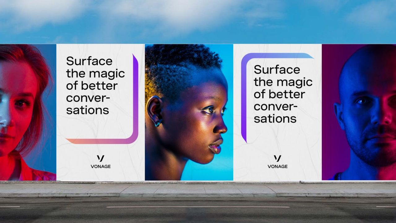
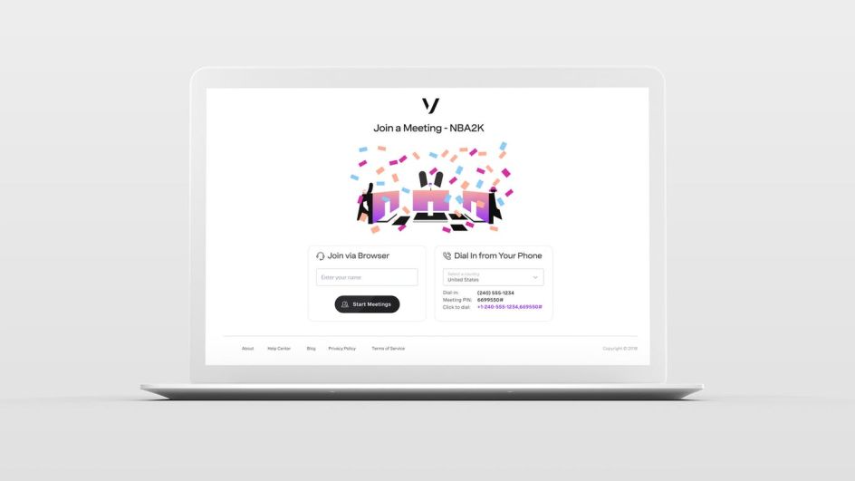
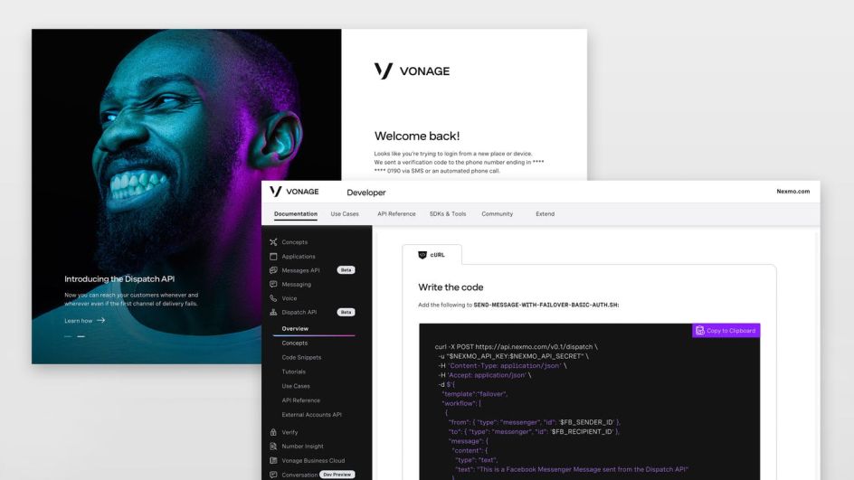
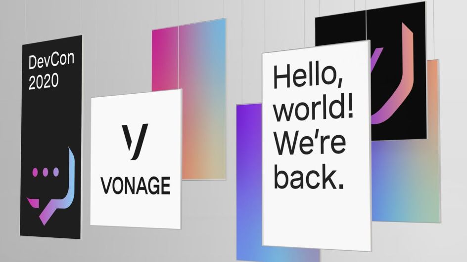
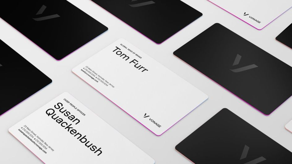
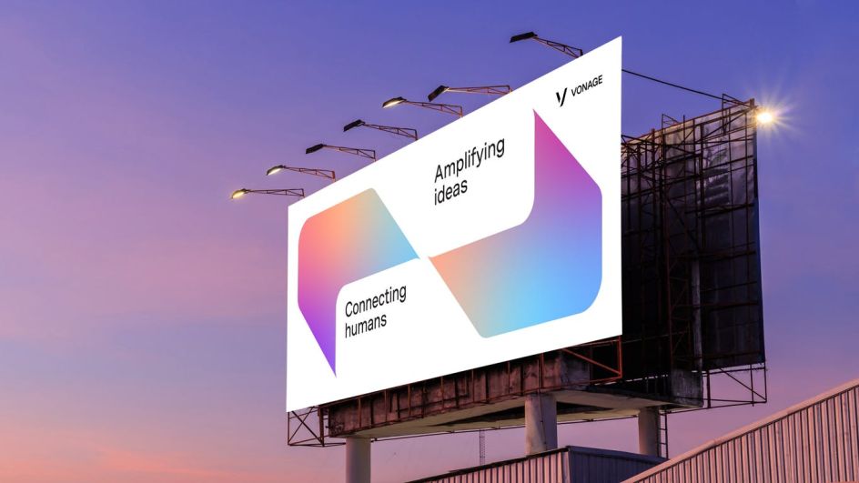
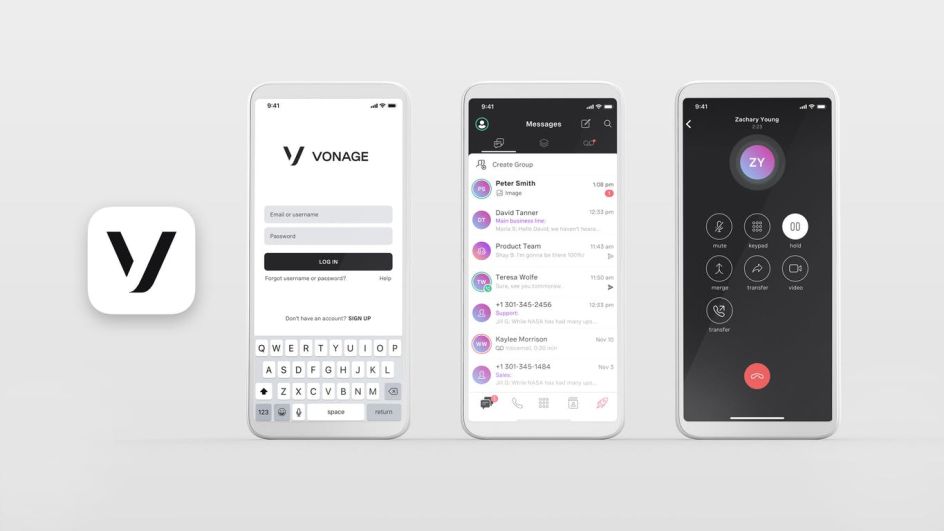
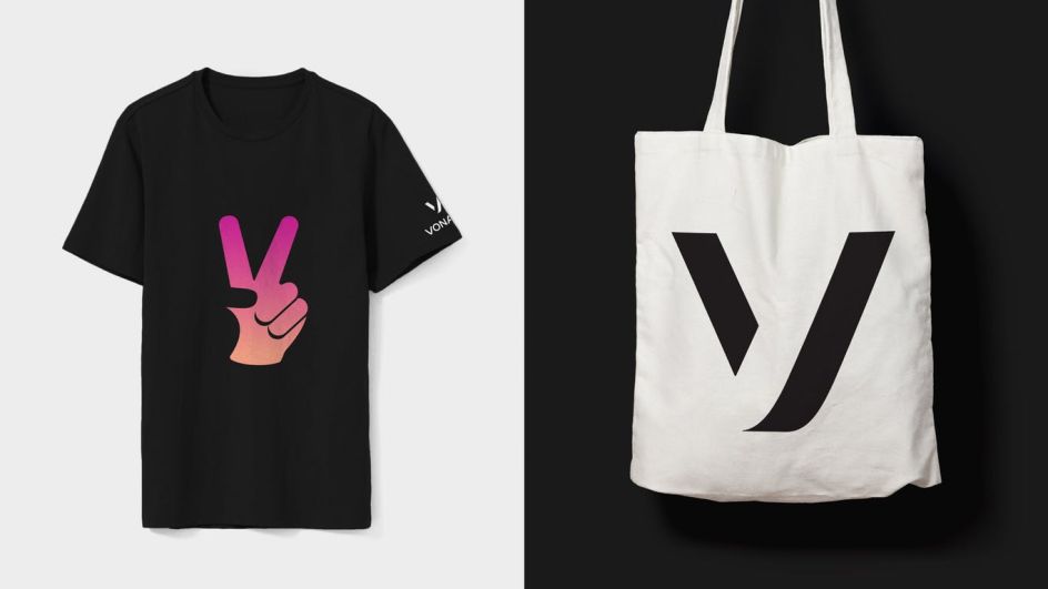
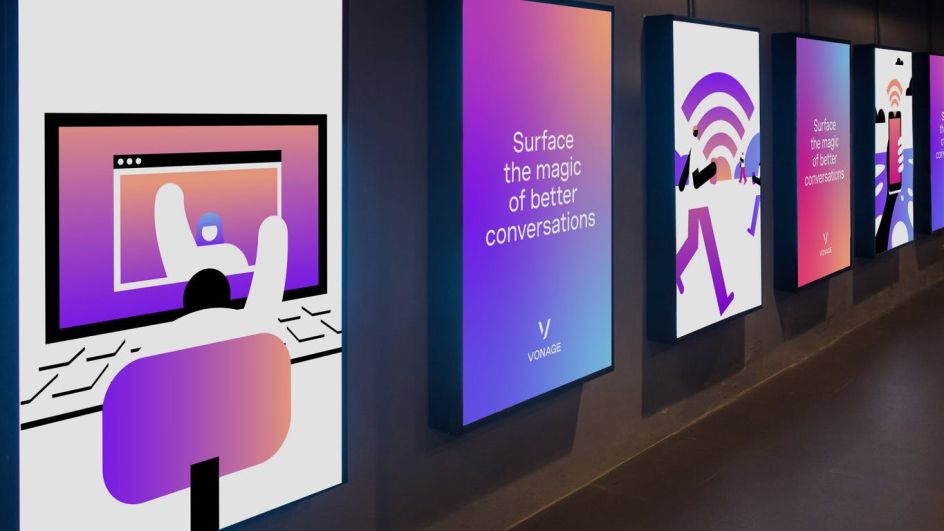
The new brand brings together "the best of its heritage with the innovation it's known for today" and shows how Vonage can be there when you need it, and fade away when you don't. Rich gradients challenge the more static colourspace of the industry, and the illustration style and verbal identity bring to life the quirkiness that made Vonage memorable in the past.
All based around a human approach, Jan Eumann, creative director at Wolff Olins, says: "At Wolff Olins, we strongly believe that we are designing first and foremost for people, even when designing for B2B or B2C. These audiences bring their personal selves to work, with visual patterns and product experiences they’ve learned from brands and apps used daily in their private lives.
"When we started to talk with Vonage, we found a shared understanding that there's no point in creating 'corporate' or sterile looking brands for environments in which businesses operate. This foundation set us up to push the boundaries for the work and set the ambition differently. We wanted to establish a conversational tone of voice, bold use of photography and illustration and drive everything from a system of graphic devices that highlights how Vonage is the secret superpower underneath the surface."
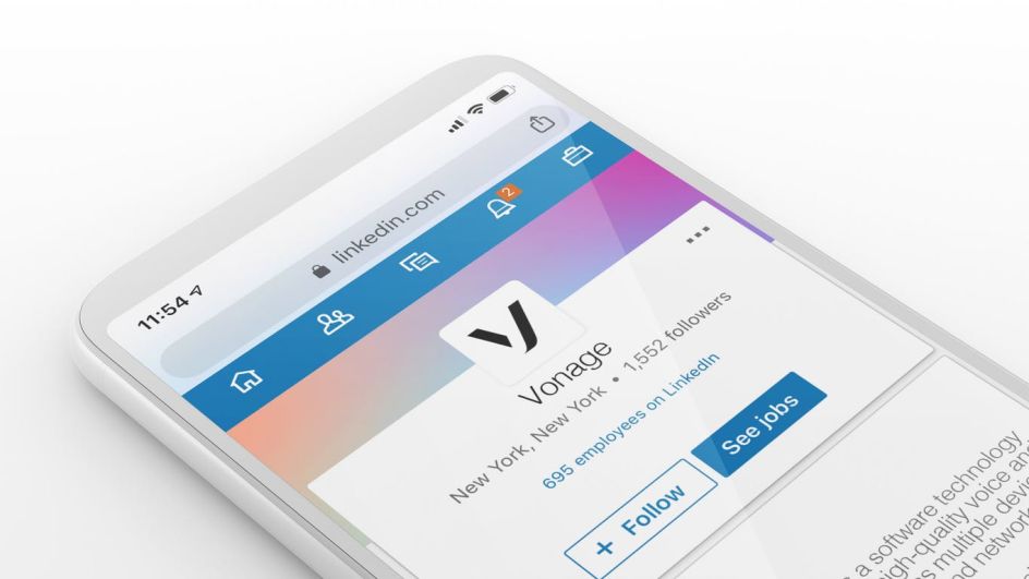
As a result of the collaboration, the new identity system unifies eight separate businesses under one signature vision. Beyond the new branding, Wolff Olins also crafted a new mission statement, brand behaviours and an approach to product and portfolio naming that will be the foundation for future marketing.

Editor's Picks


Trending


Podcasts


Editor's Picks
Further Reading