Make Future's clever identity and packaging for The Cat Asylum microbrewery
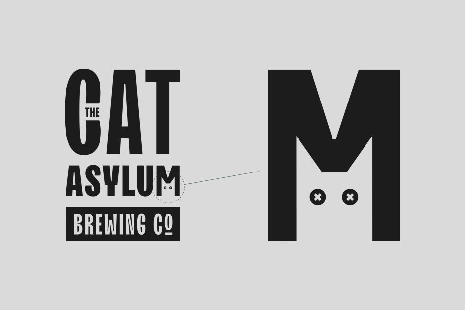
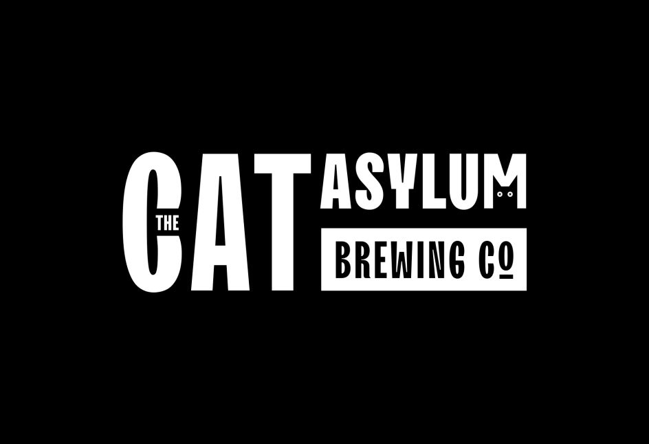
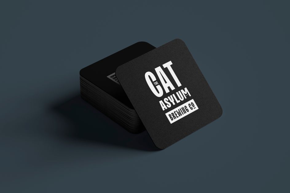
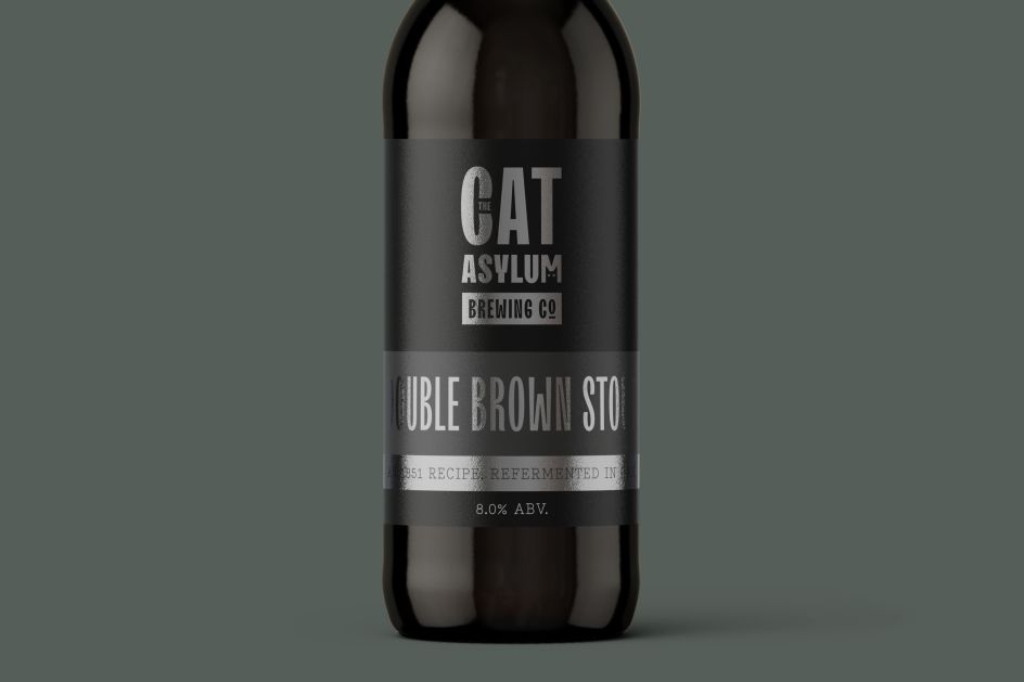
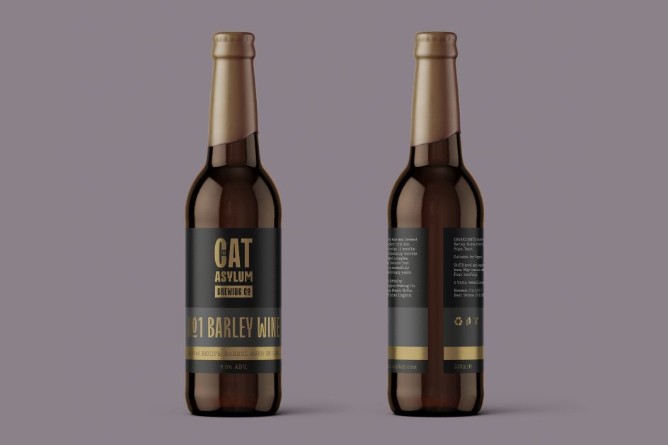
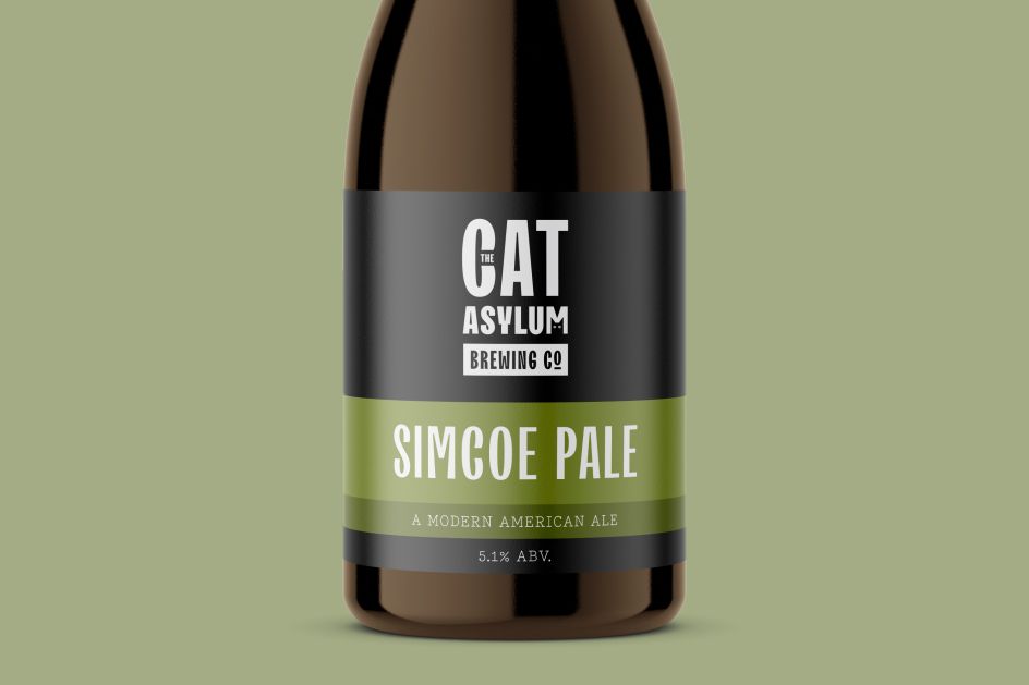
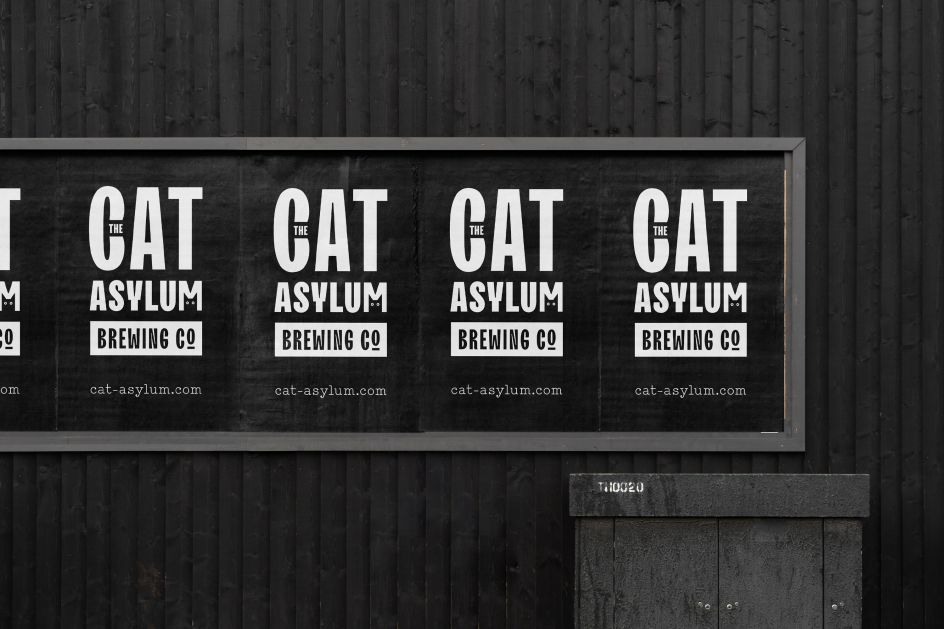
Brighton studio Make Future is behind this interesting identity for The Cat Asylum – a microbrewery specialising in historical recipes from all over the world.
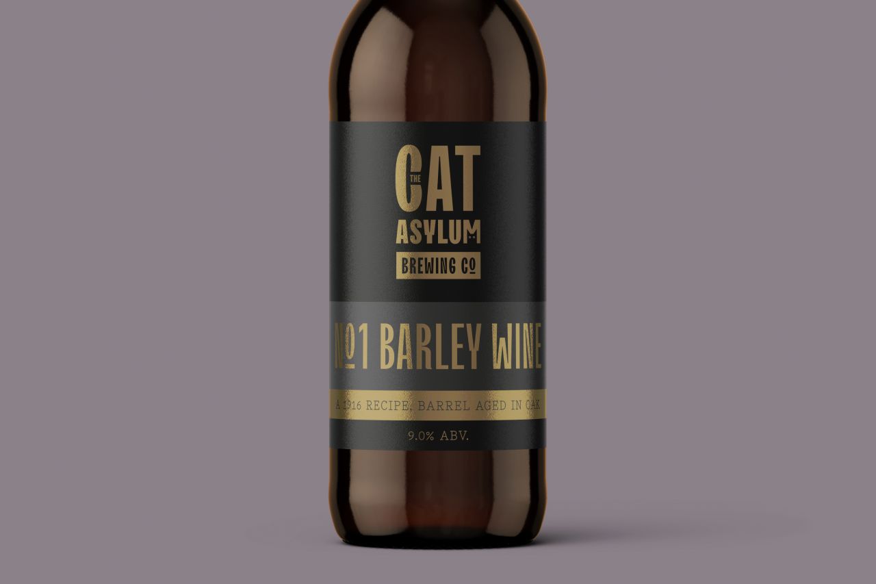
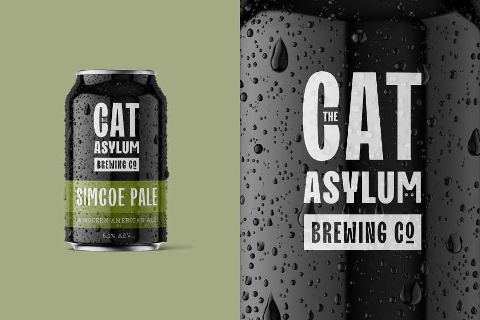
Intentionally quiet, there's a clever cat detail as the main focus of the logo, which sits in the negative space of the 'M', making it a memorable, stand-alone icon. And the accompanying brand system gives a distinctive look to all packaging and pump clips, allowing future product releases to be added with ease.
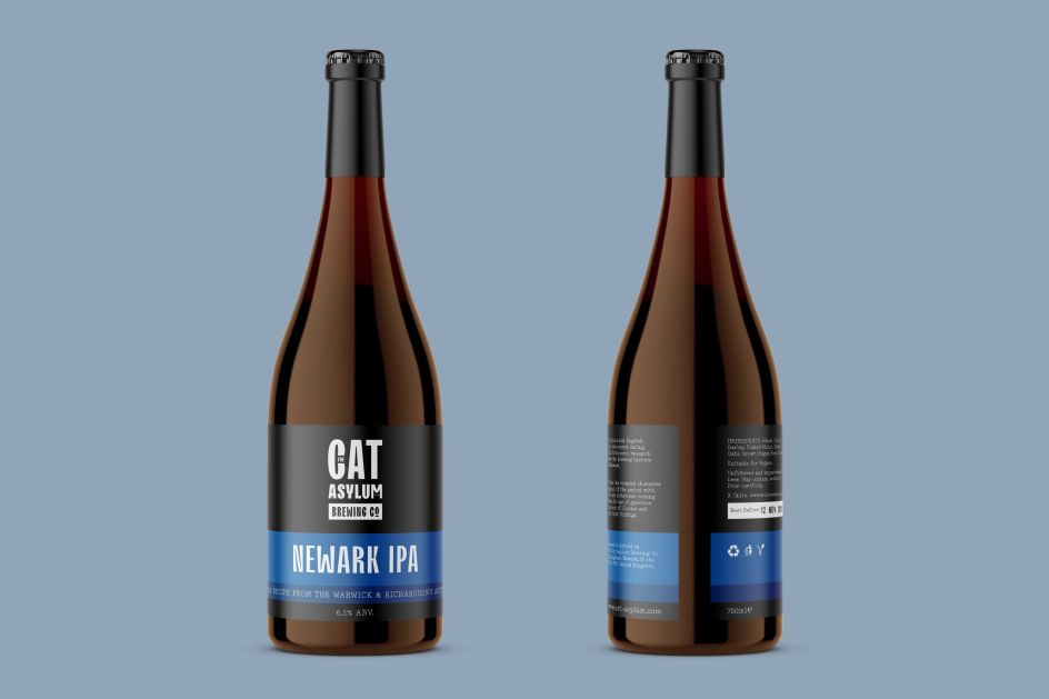
"A simple change of colour, name and information to branded templates differentiates the products from one another," explains Lewie Evans from the studio. "We've made sure that all required information has a specific place, and have eliminated the unnecessary for an approach as succinct and direct as possible."
A variable typeface by TypeType Foundry was chosen to make The Cat Asylum stand out from other breweries and offers a playful feel that aligns with the brand's approach and tone of voice. Special print finishes have been used to heighten limited-edition batch releases while metallic foils give the branded labelling an enhanced, premium aesthetic.
Editor's Picks


Trending


](https://www.creativeboom.com/upload/articles/90/908fdb6378db1e95d12595416f54e6336d5e80b8_732.jpg)
Podcasts


Editor's Picks
Further Reading