Studio Output creates a 'sense of Wonder' for a London-based creative events agency
Studio Output is behind this colourful brand refresh for Wonder – a creative events agency founded in 2012 that has since worked with brands such as Google, Nike and Android.

Although firmly established in the tech industry, Wonder wanted to overhaul its identity as it expanded its portfolio and projects into more "creatively driven" sectors – to reflect where it's now heading.
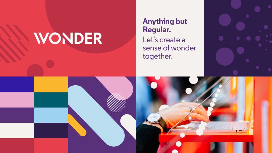
"The challenge here was to build a new design system while keeping aspects of the identity recognisable to a loyal and established customer base," says Johanna Drewe, associate creative director at Output. "Wonder has a well-loved logo that didn’t need changing, but the broader identity lacked the energy and edge to gain cut-through in the creative market. Wonder's purpose is all about helping its clients to create a sense of wonder, and this needed to be made clearer through its communications."
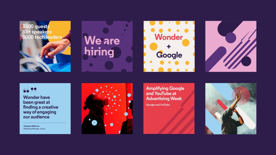
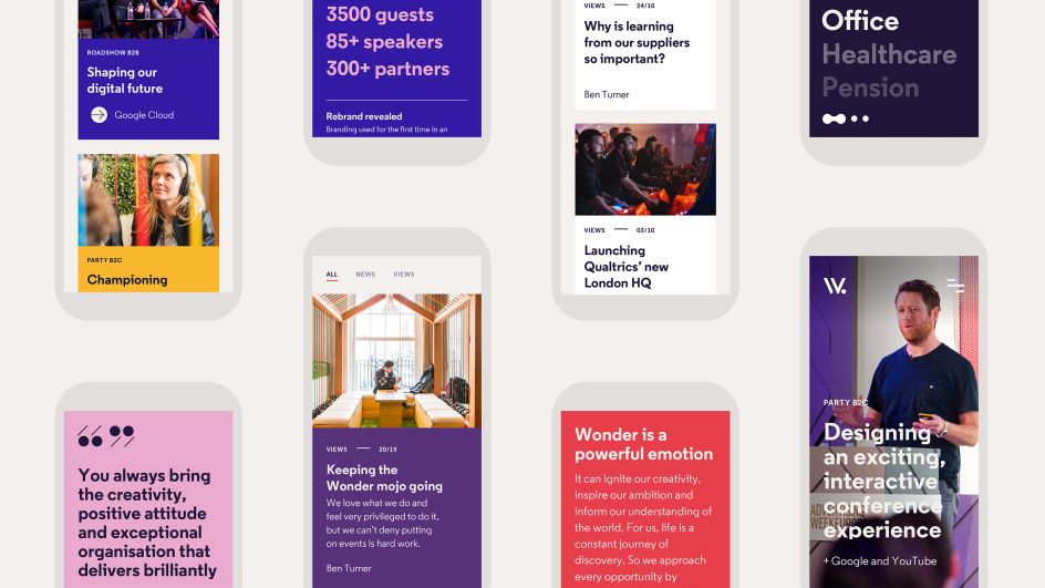
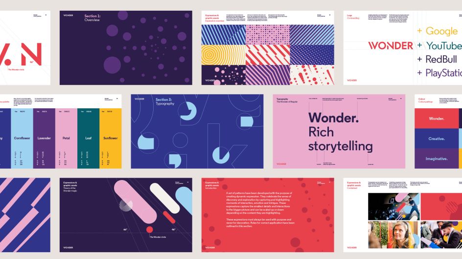
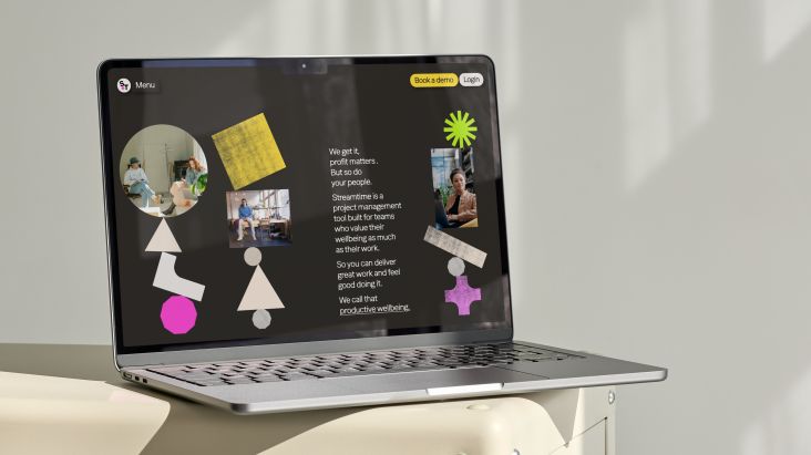
Output refreshed the brand by creating a design system that builds strong, flexible foundations for all sorts of storytelling, from physical marketing assets through to the agency website. The London studio wanted to design an identity that brings to life the look and feel of a Wonder event. "The digital experience had to do justice to the scale and flair of a Wonder production, and the level of detail that goes into them. We needed a digital design system that has personality, movement and a sense of craft," adds Drewe.
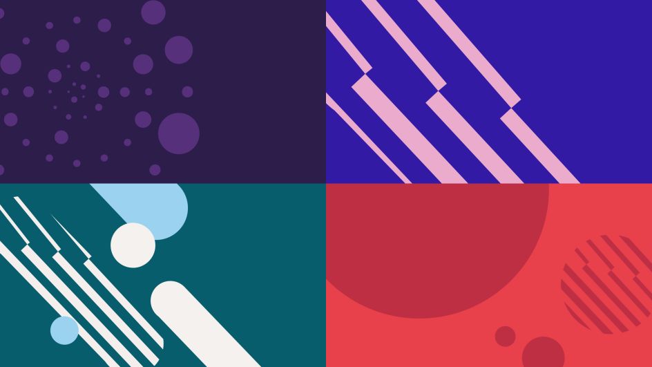
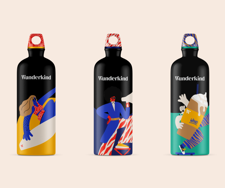
Using the existing logo as a base, and the concept of 'A window into another world', Output's identity for Wonder is full of bold and bright colours, dynamic patterns, and interactive elements with layered graphics to "represent the agency's tailored and scalable approach".
The new identity will be rolled out on Wonder's website and digital channels from today.
