EightySeven captures Italian summer vibes in Verano Spritz brand identity
Summer is well and truly here (at least for readers in the Northern Hemisphere). And what better way to chill out and enjoy the warmer weather than with a can of Verano Spritz designed by studio EightySeven?
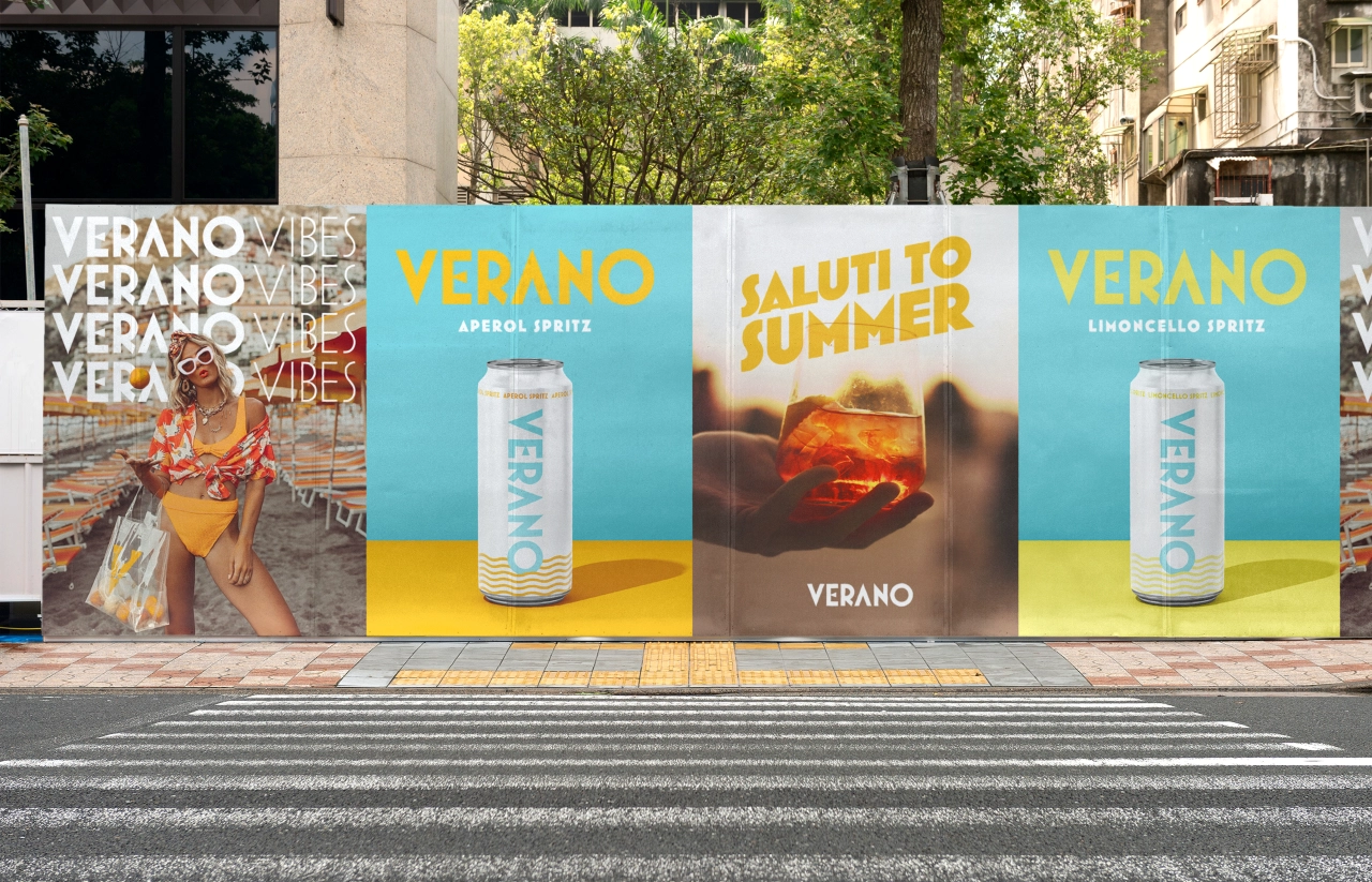
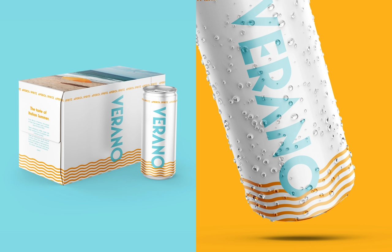
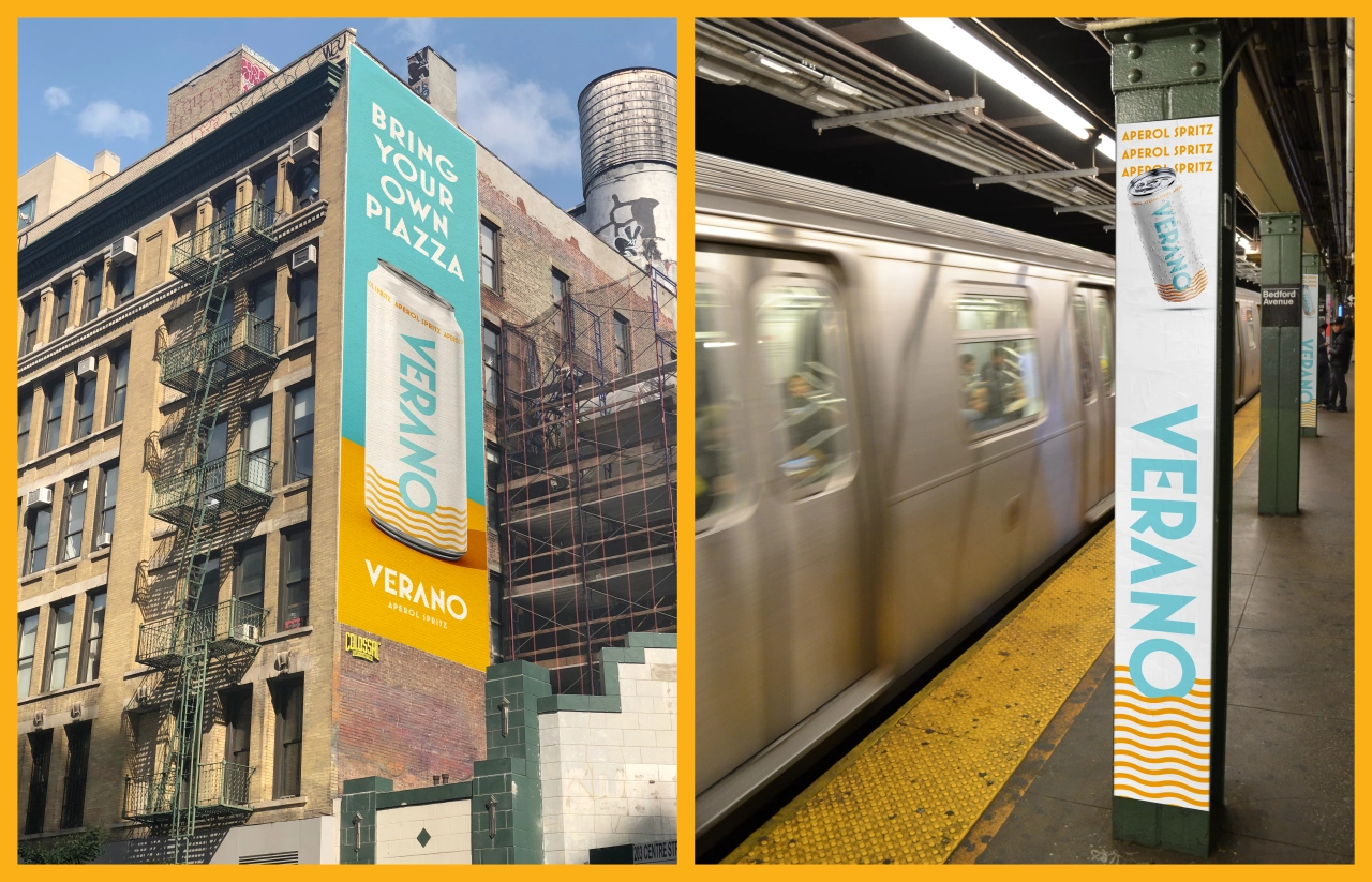
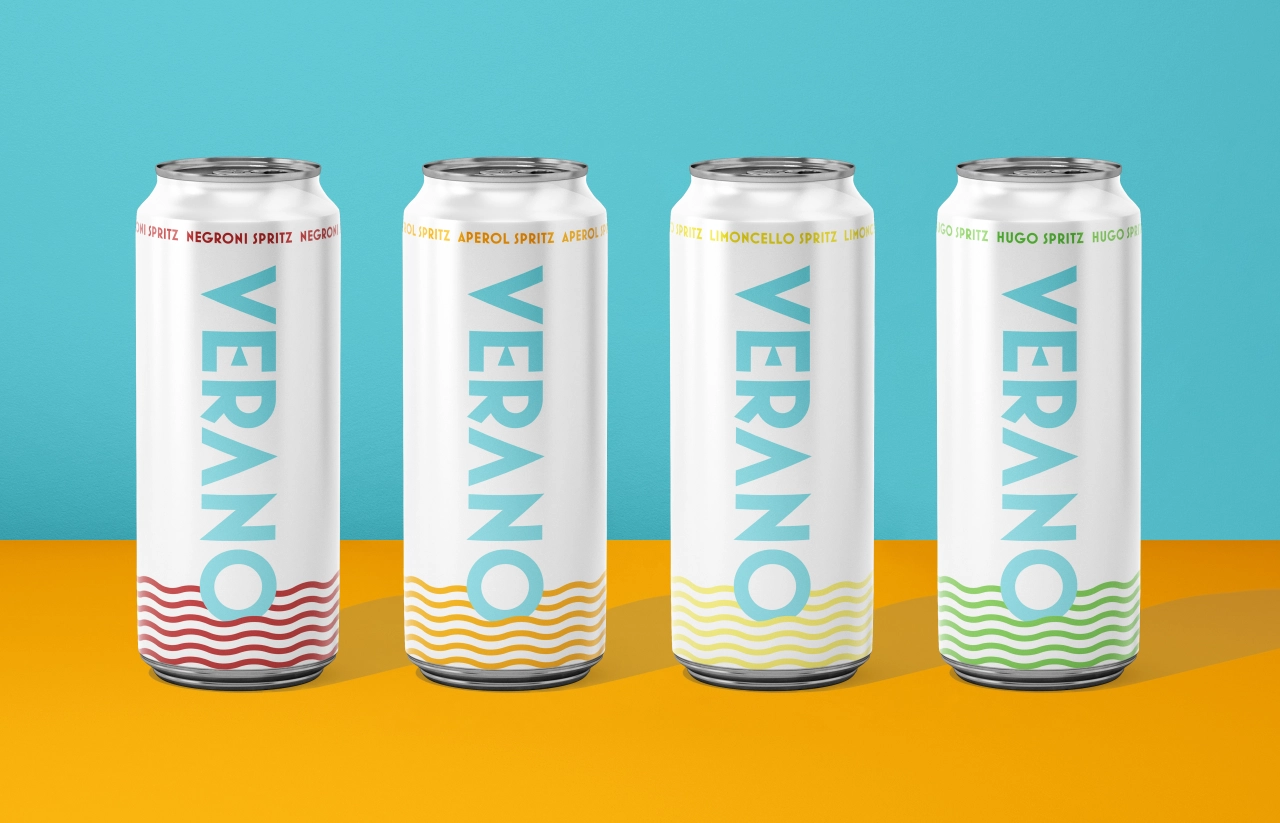
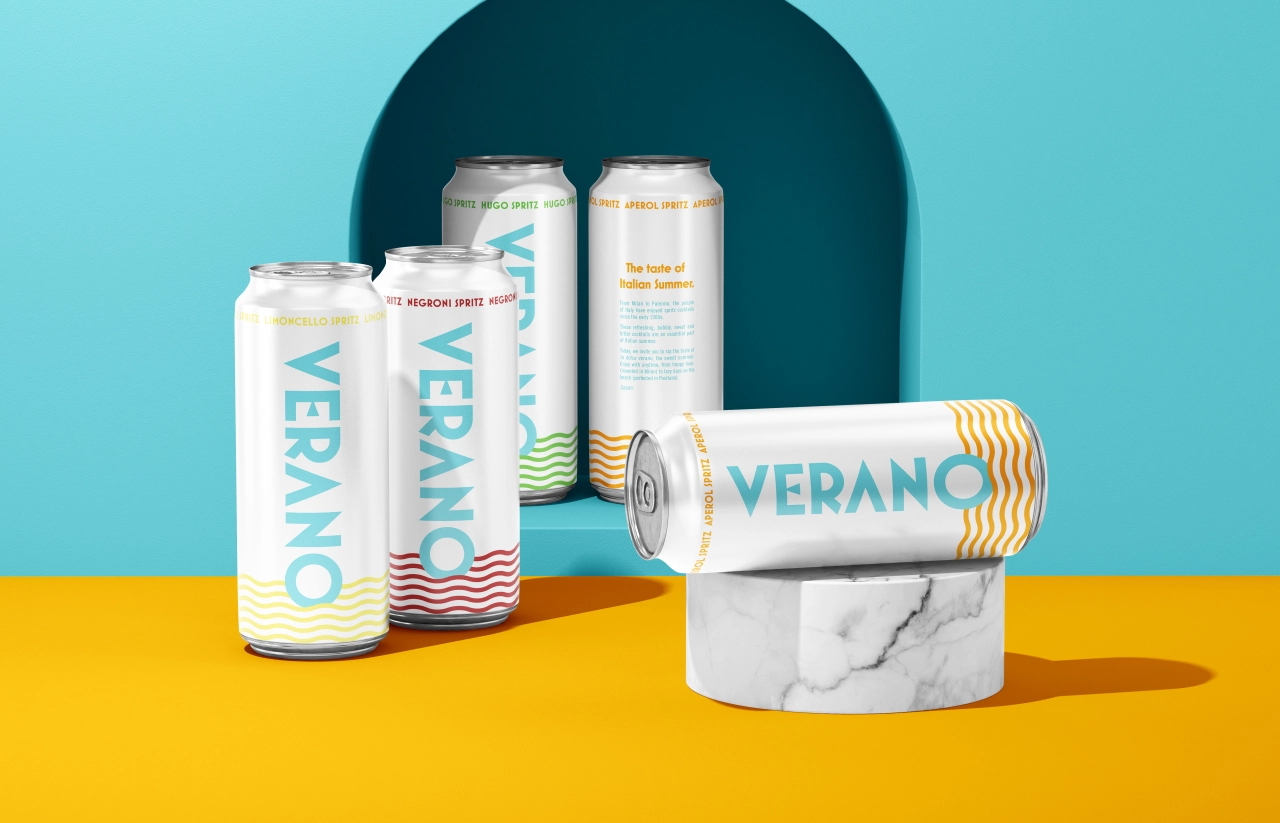
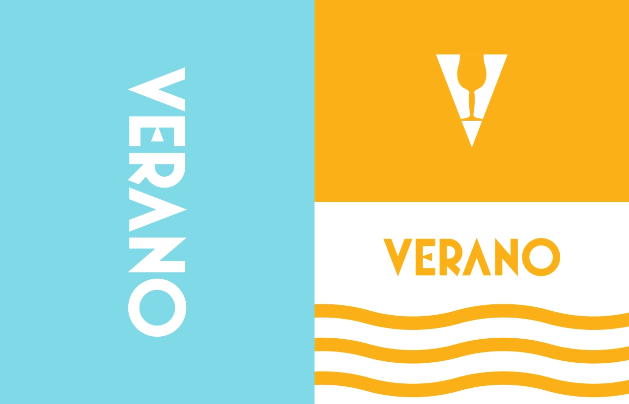
Decked out in rich orange and soothing aqua blue, EightySeven's identity for Verano Spritz is enough to make you feel refreshed before you've even tugged open the ring pull and taken a sip. Topped off with a subtle but effective wave graphic on the can, this design by the award-winning, proudly B.S-cutting agency is the perfect antidote to the soaring summer mercury.
As its name suggests, Verano Spritz is a canned, ready-to-drink cocktail with an Italian twist. (For those who skipped their Italian lessons or have yet to get round to the language on Duolingo, Verano is Italian for summer.) Promising a blend of "old Italian flavour, with new world fun", EightySeven's brand identity trades on this cultural heritage with aplomb.
"From Milan to Palermo, the people of Italy have enjoyed spritz cocktails since the early 1900s," explains Maxwell Billings, Brand Director and Founder at EightySeven. "These refreshing, bubbly, sweet, and bitter cocktails are essential to an Italian summer."
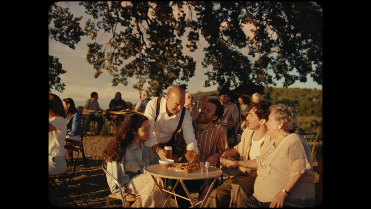
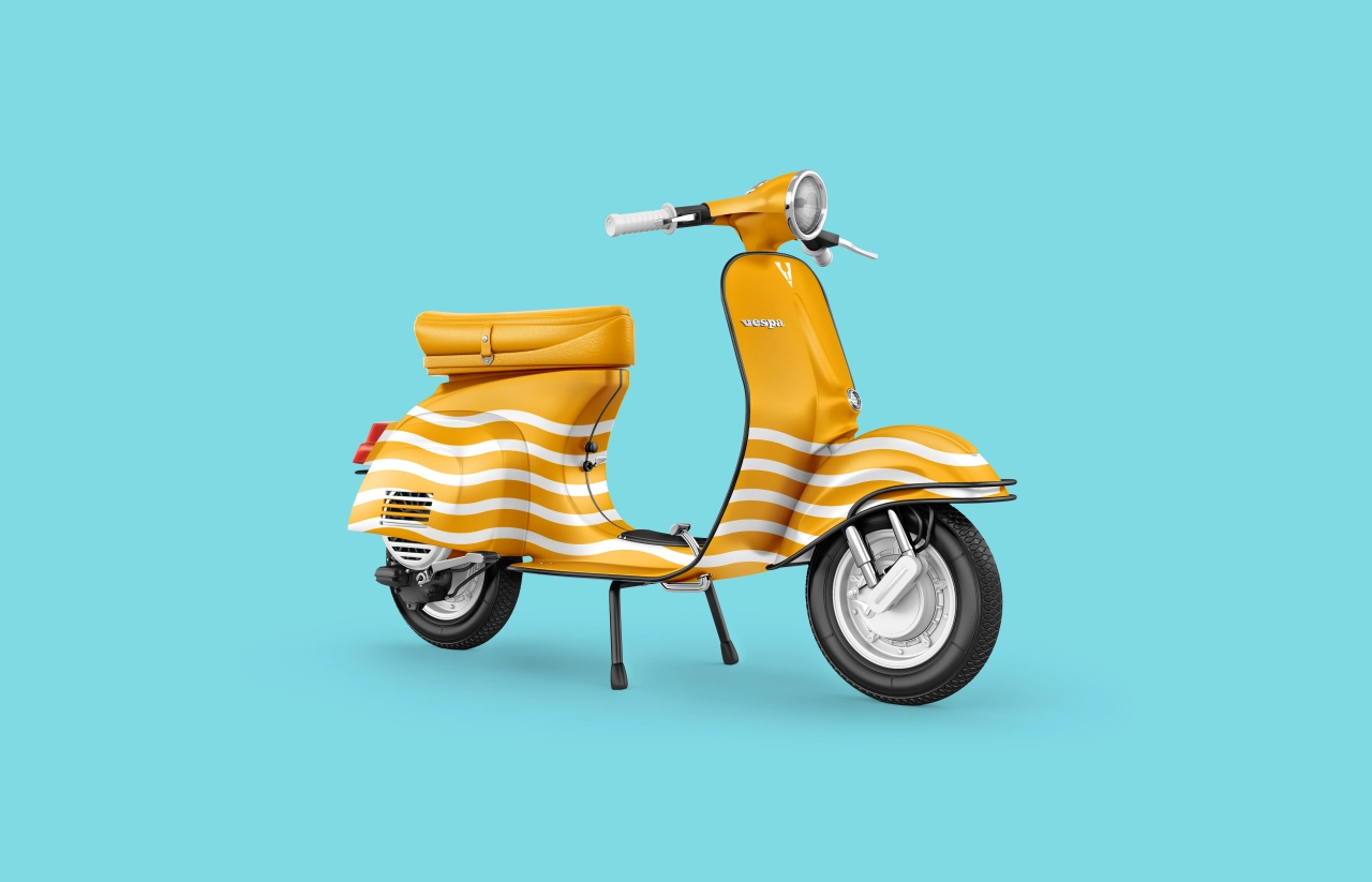
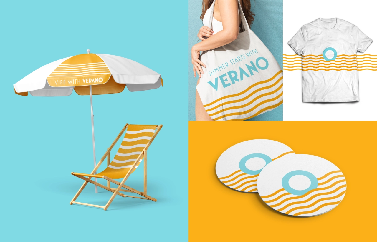
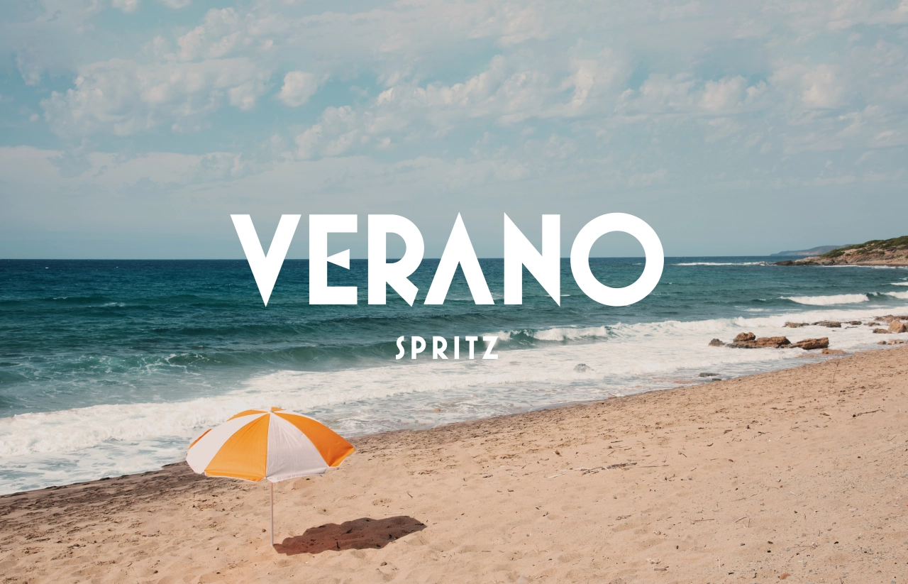
Speaking of essential components of an Italian summer, the vibe wouldn't be complete without sunny sands, a striped parasol, and a retro scooter ready and raring to whisk you off on a holiday adventure. Of course, all of these elements make an on-brand appearance in the advertising and help to evoke the story a the heart of the message.
"The brand name, strategy, packaging, and storytelling all centre around the idea of "la dolce Verano," the sweet summer," Maxwell reveals. "From happy hour, invented in Milan, to lazy days laying on a beach, perfected in Positano, the team embraced and designed an elegant and fun summer canned cocktail brand."
He adds: "From the geometry of the waves to the vibrant warm brand colours, each element of the brand identity evokes the feeling of an Italian summer."
Maxwell's not wrong, you feel practically feel the Italian sun beating down on you just looking at this exquisite design work. First-round on you? See you at the beach.
Editor's Picks





Trending


Latest Jobs
Growth Strategist (Ecommerce) at Tribe
Full-time·Exeter / London·£50k + Bonuses
Account Director at How&How
Full-time·London·£73k-£79k
Client Director at Koto
Full-time·Berlin·€70k-€85k
Digital Marketing Executive at Arise
Full-time·Sheffield·From £23,750
Designer at New Genre
Full-time·London·£36k–£48k
Midweight Graphic Designer at We Are Your Friends
Full-time·London·£36k–£44k