A graphic deep-dive into the storytelling, scent and sunshine behind Primavera Estate
Earl of East's new candle collection is a sun-drenched celebration of scent, storytelling and graphic design, inspired by an Italian road trip and brought to life entirely in-house.
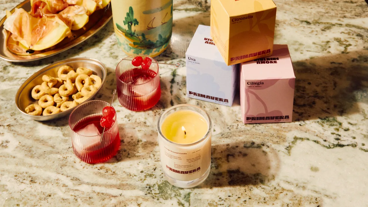
What does summer feel like? For Earl of East, it smells of zingy citronella, ripe cherries and sweet grapes — wrapped in golden-hour nostalgia, washed in sun-baked colours, and sealed with a 'Vivi Ridi Amore' attitude.
The cult London-based fragrance brand has just launched Primavera Estate, a bold new candle collection inspired by a month-long road trip through Italy. But this isn't just about scent. From art direction to packaging to campaign photography, every element of the collection was imagined, designed and produced in-house by the Earl of East creative team: a masterclass in graphic storytelling and modern brand building.
"We were drawn to the boldness and optimism of 1970s and '80s Italian design," says Paul Firmin, co-founder of Earl of East. "Expressive type, sun-faded colours, and the kind of graphic energy you'd find on vintage matchbooks or tourist postcards. There's a romanticism to that era that felt right for a collection which is all about memory and mood."
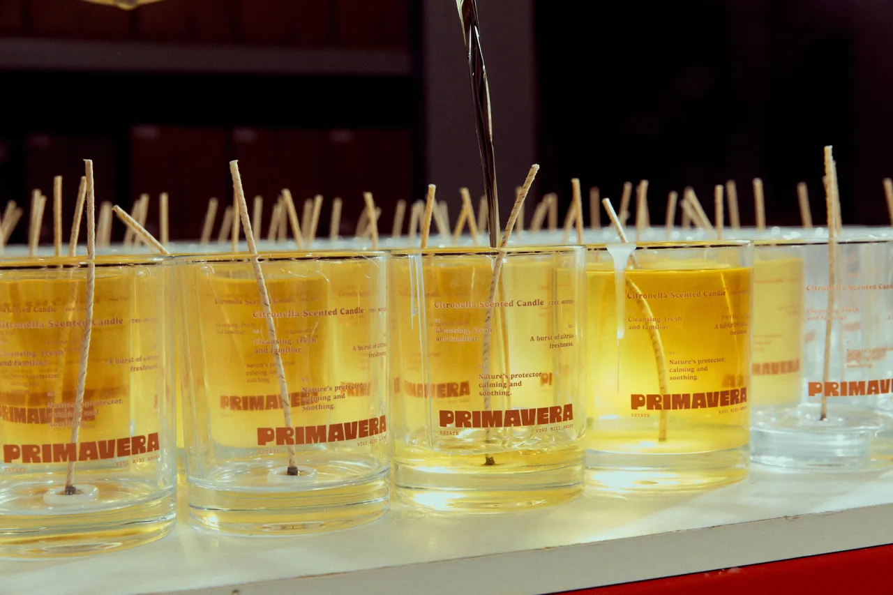
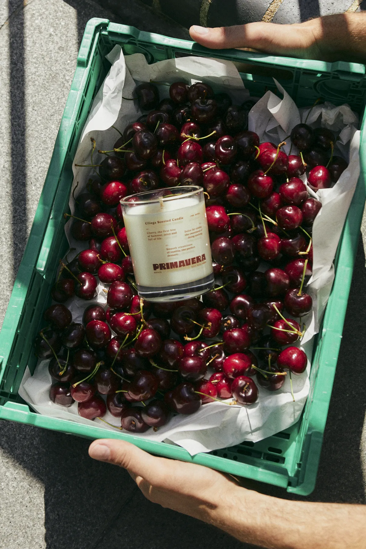
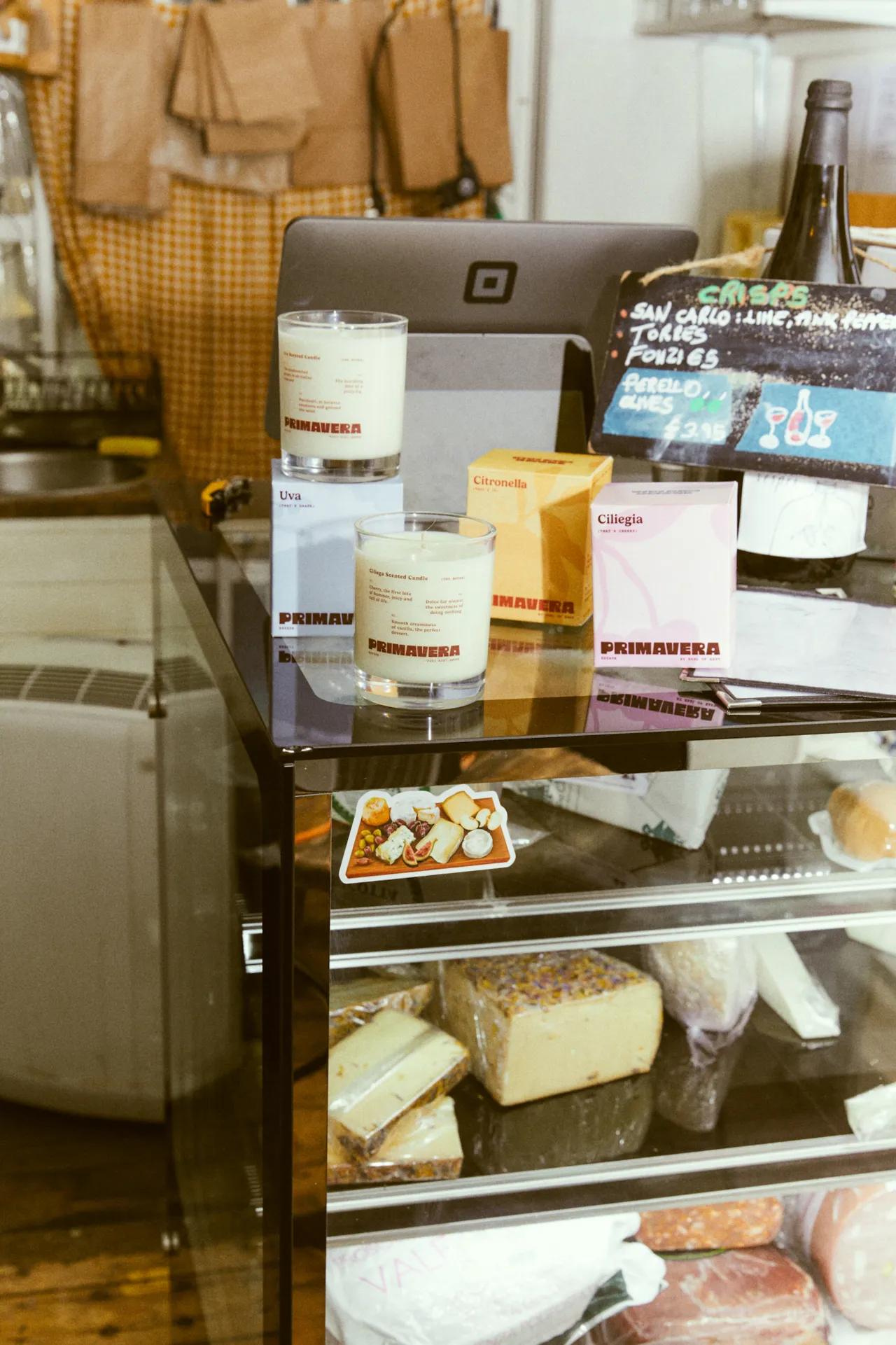
The three candles in the debut summer drop – Citronella, Ciliegia (Cherry), and Uva (Grape) – evoke the delicious chaos of Italian summer: long lunches that blur into dinner, late-night garden parties, and roadside fruit stalls bursting with colour. "Citronella is practical but also familiar. It's the scent of evenings outside gathered around a table," Firmin explains. "Cherry felt right for now, one that's playful, a bit nostalgic, and definitely the scent of the season. Grape is deeper and more refined, bringing a bit of balance to the trio."
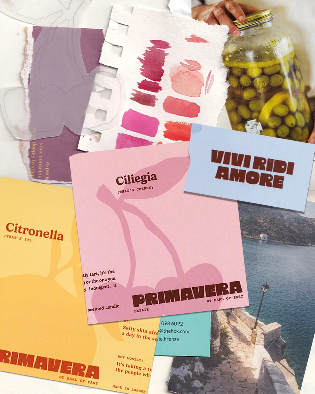
Visually, the collection marks a shift for the brand. Drenched in a palette of citrus yellow, sunburnt red, and deep wine purple, the packaging and merch borrow cues from nostalgic travel ephemera – bold, graphic and brimming with character. "We knew from the start that Primavera Estate had to feel totally different to Café, which was all about earthy tones and comfort," says Firmin. "This collection is brighter, more expressive – it needed to reflect the heat, colour, and vibrancy of an Italian summer. The packaging is designed to evoke a feeling before you even light the candle."
One bold move? Stripping back the branding. "We removed the Earl of East name from the front of the candle," Firmin says. "It felt like a big step, but it allowed the identity and world of Primavera Estate to stand completely on its own."
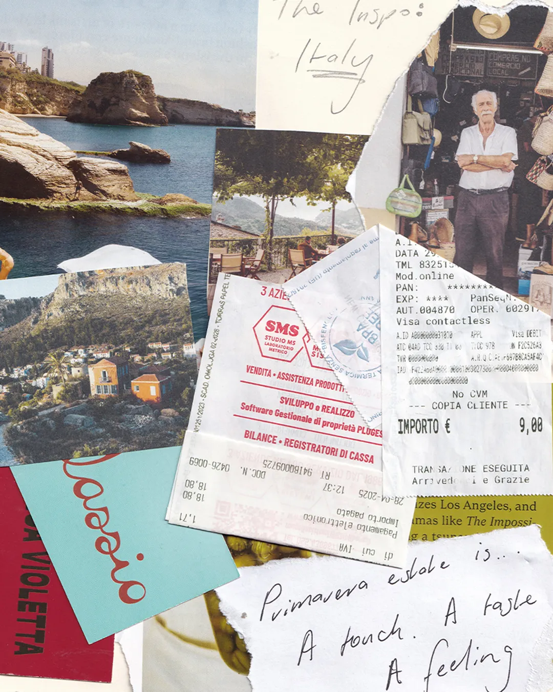
That confidence stems from a very real and personal creative journey. The collection was inspired by an actual month-long road trip across Italy, from the Alps through Lake Garda and Tuscany to Florence, taken by Firmin, his partner and co-founder Niko Dafkos, and their dog Piper. "Driving those winding roads lined with cypress trees had been on our list for years, and it didn't disappoint," Firmin recalls. "The food, the markets, the culture... Florence in particular shaped so much of this collection."
Those real-life experiences shaped every part of the creative brief. "We captured all of the road trip content ourselves – travel guides, recipes, audio, short videos," he says. "Our team then used that raw content to build a layered visual world: from ingredient-led studio shots to campaign imagery, and even recreating Italian markets and delis in London to tie it all together."
Photography, shot by longtime collaborator Sarah Bates, reflects the mood and energy of the scents. "We wanted the images to feel warm, lush, and a little nostalgic – like a memory you've lived before, even if you haven't," says Firmin. "There's a softness and glow to the whole series that mirrors the mood of the candles themselves. The energy of Primavera Estate is playful and expressive. It's all about vivi, ridi, amore; living well, laughing often, and enjoying the moment."
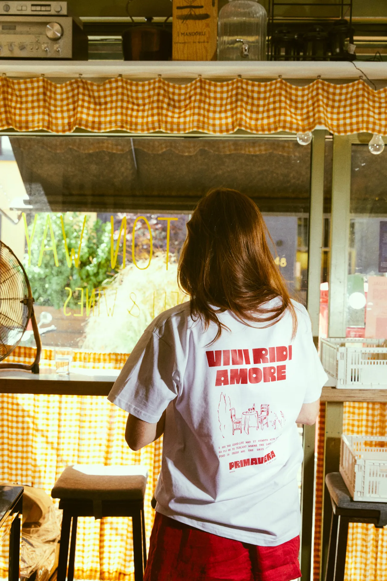
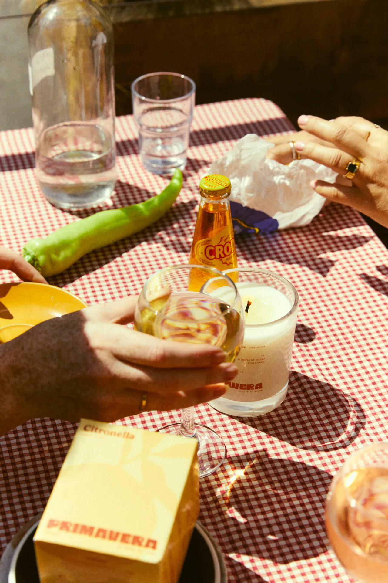
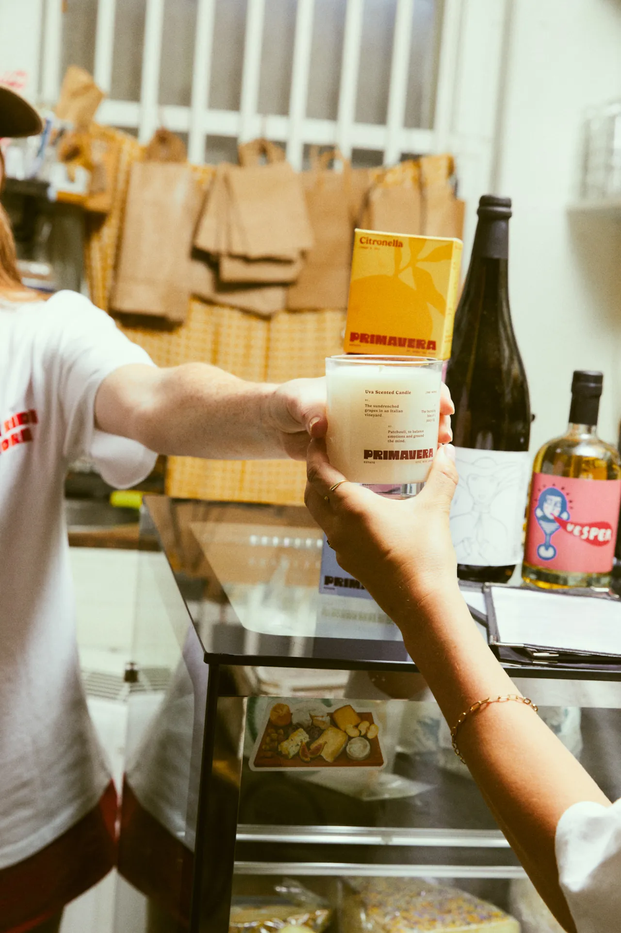
For Earl of East, this collection is a love letter to Italy as well as a testament to the power of creative direction done with intention. Everything from scent notes to typefaces to the glow of a photo is there to transport you. "We wanted Primavera Estate to feel like a scent souvenir," Firmin adds. "Something that brings a moment back to life as soon as you smell it."
The first drop is available now, with a second chapter arriving later this summer, leaning into richer, more savoury scents inspired by the Italian harvest. And with limited-edition merch to match (yes, there's a tee), Primavera Estate is proof that scent can be a whole mood, not just something you burn quietly in the background.
Editor's Picks





Trending

Latest Jobs
Creative Director at Koto
Full-time·London·£95k-£130k
Deputy Head of Stage at Factory International
Full-time·Manchester·£35,015
Graphic & Motion Designer at The SHARP Agency
Full-time·Leeds·£26k–£33k
Lead 3D Designer at The British Museum
Full-time·London·£51,623 per annum
Associate Web Designer at Planhat
Full-time·London·£30,000 – £35,000
Digital Marketing Manager at HDK
Full-time·London·£34,000 – £38,000