Universal Favourite crafts emotive branding for fertility testing startup
New MedTech company When aims to empower individuals with accessible egg count information and expert advice. Creative agency Universal Favourite explains the thinking behind the brand.
It's incredible what new health services are coming online these days. But first, people have to know about them. And second, they have to trust them. Here's a great example of how thoughtful branding can achieve both these things and help bring the providers of cutting-edge medical tech together with those who need their help.
In a first for Australia, MedTech startup When has launched an at-home egg count testing service, coupled with access to leading fertility experts. By providing individuals with direct access to this information, the company is on a mission to break down the barriers to care that have long existed in traditional medical settings.
The startup's approach is twofold: offering a user-friendly, at-home testing kit and creating a platform for open dialogue about fertility. This combination addresses a critical gap in the market, where fertility discussions have often been limited to clinical environments or shrouded in outdated narratives about biological clocks.
To help create the brand, they approached Sydney-based design studio Universal Favourite. "It needed to be a brand that balanced credibility and compassion in equal measure," Universal Favourite studio manager Kate Brookes explains. "One that felt just as comfortable in a trusted doctor's office as the shiny shelves of a global beauty store."
Brand concept
Of course, brands in the fertility space are all designed to build trust in their medical expertise: that in itself is nothing new. "But this narrow focus has resulted in a category that feels overly clinical and sometimes cold," says Kate, "losing sight of the real people at the heart of it all."
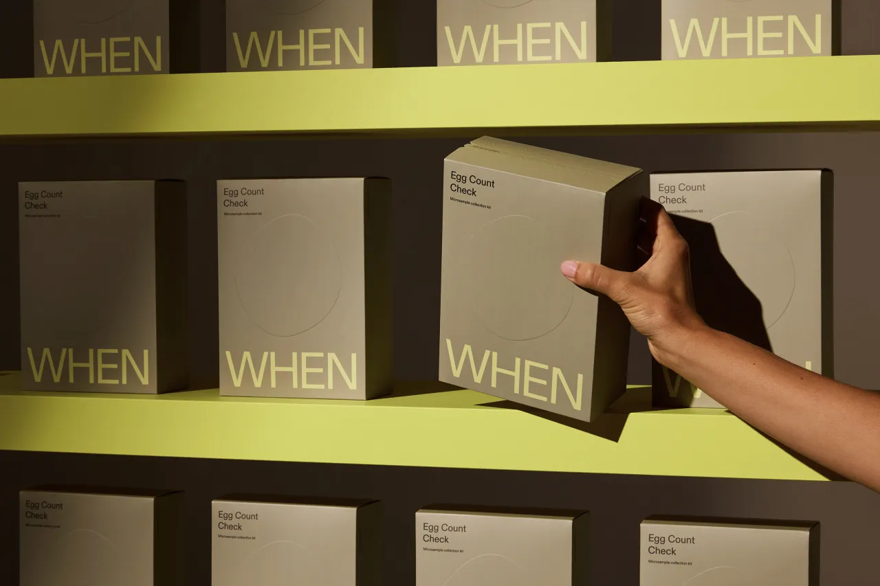
In that light, the team saw an opportunity to create something that balanced trust and credibility with warmth and humanity. "A direct-to-consumer lifestyle brand built on deep medical experience that felt equally at home in a retail environment."
To get to the heart of the issue, Universal Favourite partnered with VML to conduct a series of focus groups, one-on-one interviews and stakeholder research.
"Because in failing to talk about it, we're failing to give people the information they need at the right time," explains Kate. "People are proactive about pap smears, mammograms, skin checks, and sexual health tests; all considered lead indicators that look ahead to impact the future. However, fertility is measured as a lag indicator, and only once is it more difficult to affect the outcome.
"Without jumping through costly medical hoops, there is no accessible way for people to know what's happening inside their very own bodies without a referral. The medical industry is not set up to provide this kind of information proactively, which can make people feel blocked. And when it comes to fertility, information is power."
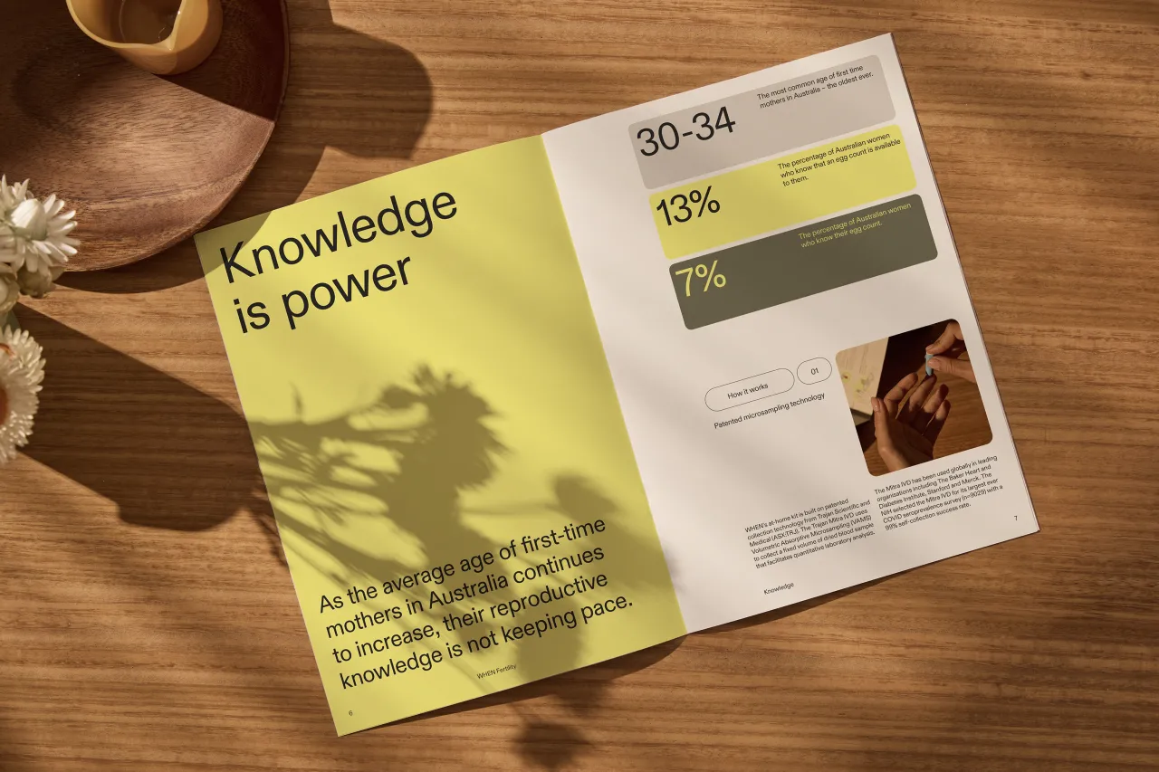
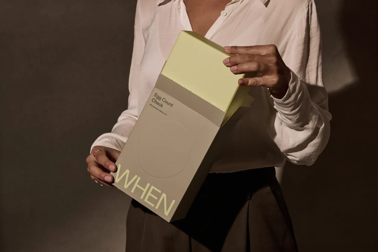
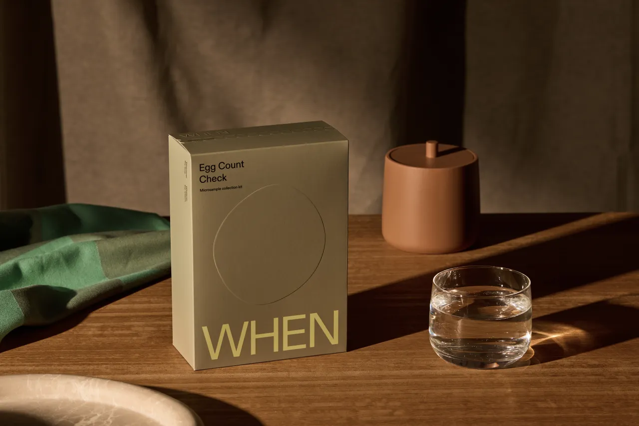
Given When is the first of its kind in Australia, care needed to be taken to communicate the importance and impact of its service. "Credible medical expertise was a leading reason to believe. But we also knew people needed to hear the real stories behind the brand to build trust in something so new. Striking the balance was critical."
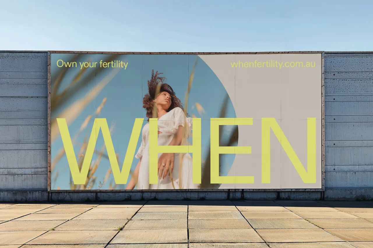
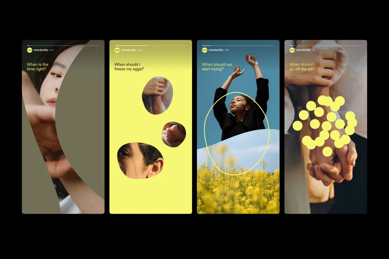
The result is a visual and verbal system that blends emotion with science and expression with information. It's been designed to showcase fertility stories, expert advice, and the endless questions people ask themselves everywhere, from packaging to print, retail stores to social media.
Visual elements
The When wordmark sits at the heart of the visual identity, anchoring the brand as a dependable figure in the health and medical space. It's paired with an organic cell shape that reacts to the world around it, the wordmark and logo form interacting and reinforcing the other. "Together," says Kate, "they represent standing strong amid the ever-changing nature of life."
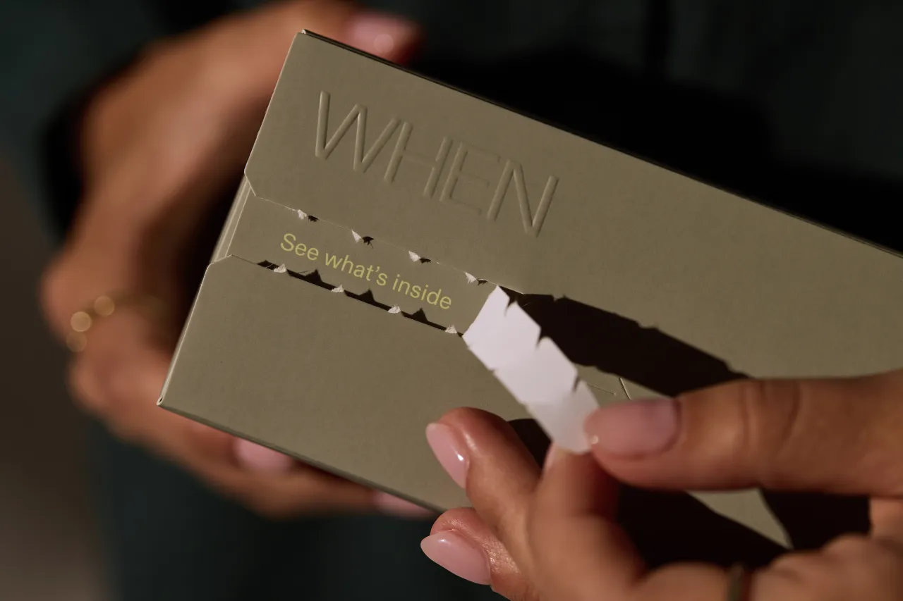
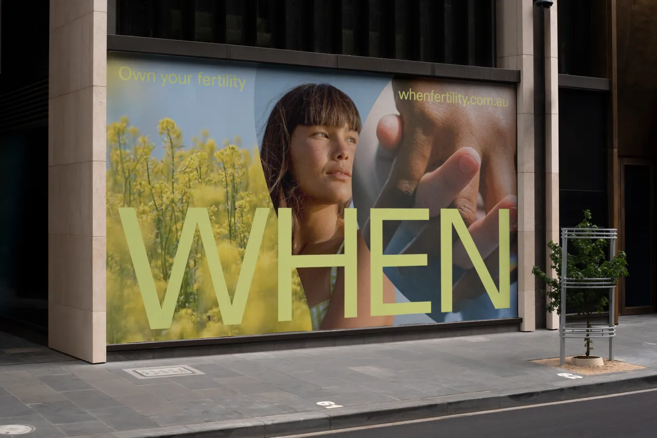
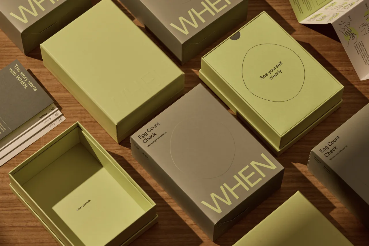
Universal Favourite chose ABC Diatype as the main typeface for its modernity and scientific edge and to bring calm and clarity to communications. Paired with a colour palette of lemon and neutrals, the identity feels light and warm—an inspired choice in a sector that's often been criticised as cold and clinical.
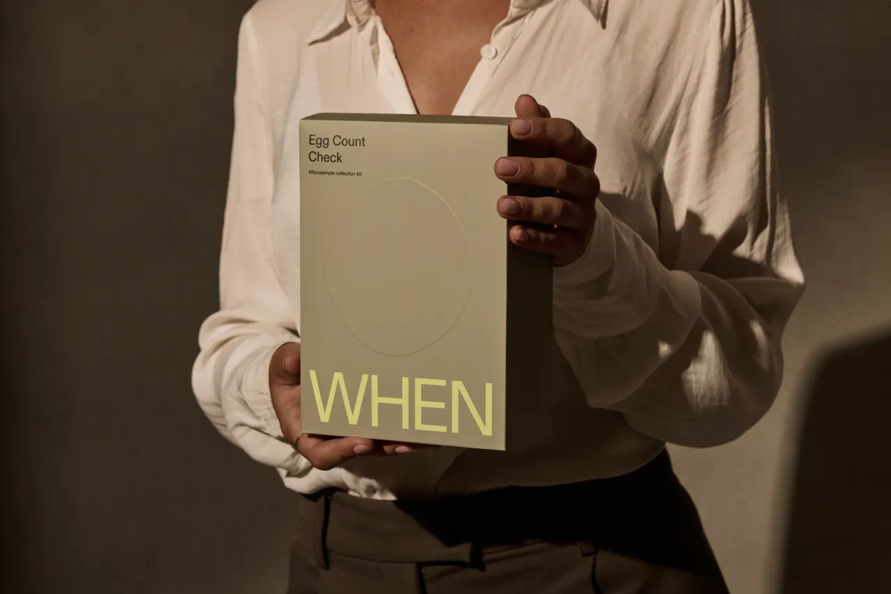
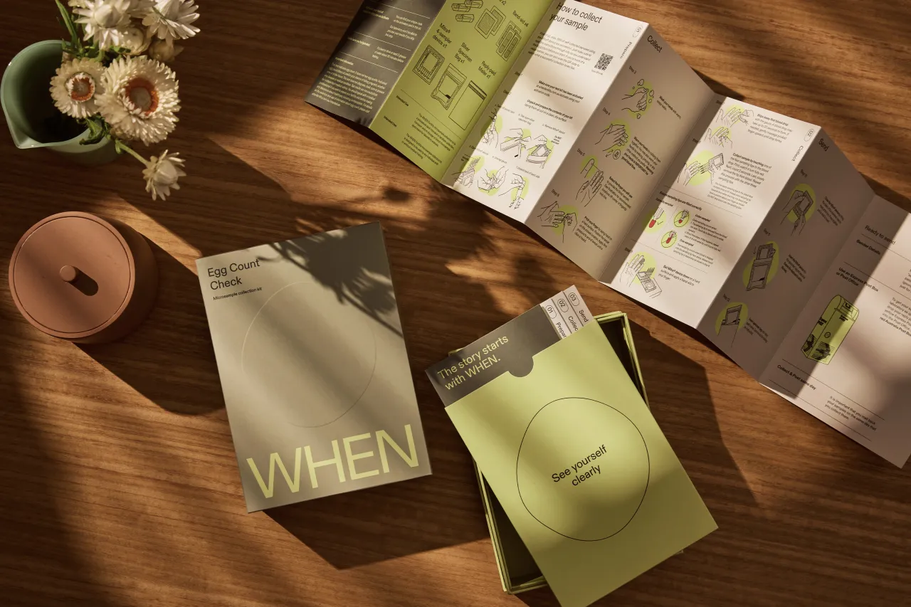
As for the consumer, an important first touchpoint was the at-home testing kit: the Egg Count Check. The kit is split into three sections: Prepare, Collect and Send. "We designed the packaging experience to follow the same logical structure," notes Kate, "ensuring the steps were simple and easy to follow.
"Inspired by the sleek aesthetic of our favourite tech brands, the kit's box takes a rigid form with special attention paid to premium print finishes. We also created a custom instruction booklet to guide the user through the process, designed and illustrated in-house."
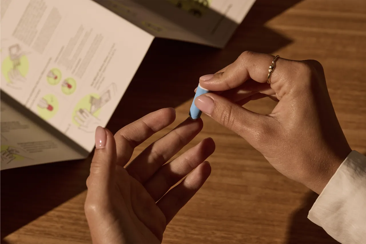
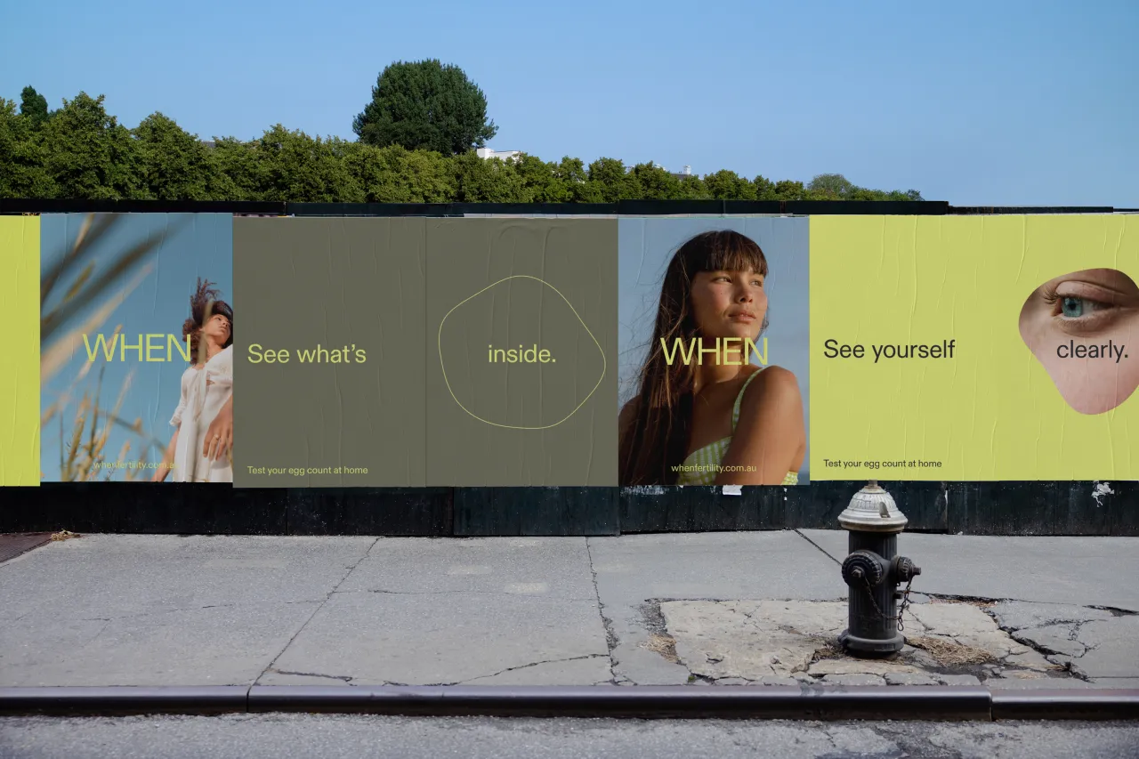
The primary photography style, meanwhile, uses intimate portraits and close crops to focus on the subject's internal thoughts and feelings. "We aim to capture moments that feel like a natural extension of everyday life, empowering and relatable in their familiarity," says Kate. "As a secondary style, we splice natural textures and fluid forms with our portraits, like fragments of memory telling the story of a person's inner world."
To further enhance this sense of intimacy, a series of icons were developed to capture people's different states of mind around this sensitive and personal topic. Following the same visual language as the logo, these icons add flexibility and expression to the brand, especially when used with intimate portraiture.
Naming strategy
Universal Favourite also helped the company settle on a name for the service. "The brand name itself is a question: when?" explains Katy. "But it's also a statement of intent. We worked with copywriter Amy Scott to develop a verbal concept exploring the idea of an inner monologue, giving voice to the questions we ask ourselves but perhaps never verbalise.
"The brand speaks as an empathetic expert, both insightful and inclusive. By creating space for open conversation and asking the questions people ask themselves, we show no matter where they're at in their fertility journey, they're not alone."
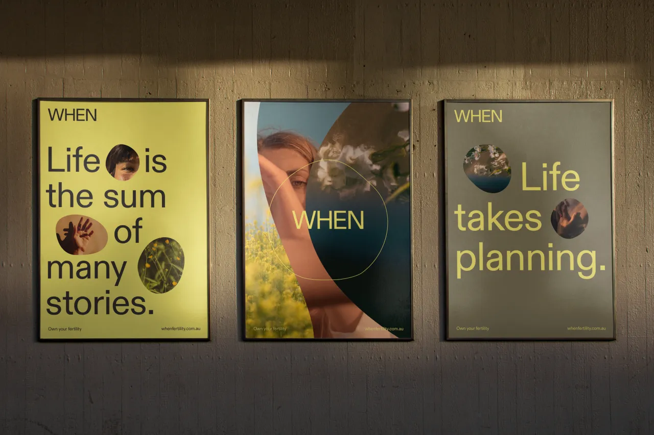
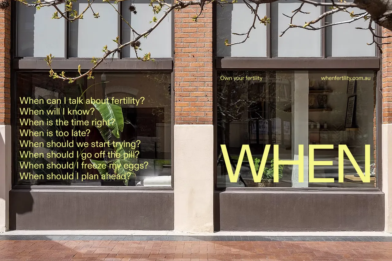
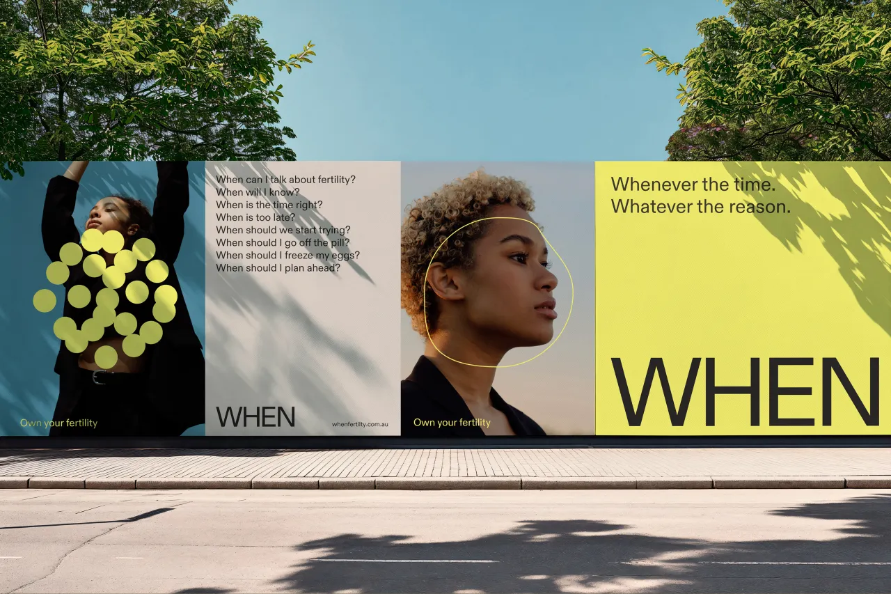
Ultimately, When is set to change fertility testing and facilitate an aspirational platform that aims to drive community and empower conversation around fertility. With this in mind, the brand has been crafted to grow into a multidimensional platform for fertility information access and support.
"We helped design the first step of this journey through When Matters, a curated blog for sharing real fertility stories and credible medical expertise to ensure no one with ovaries was left feeling alone on their journey," adds Kate.
Editor's Picks





Trending




Latest Jobs
Copywriter & Content Strategist at Chapel
Full-time·London·£30,000 – £40,000
Senior Designer at BKC
Full-time·£50,000 – £60,000
Graphic Designer & Illustrator at Discord
Full-time·San Francisco·$116,000 – $130,500
Senior Social Media Manager at Whitney Museum of American Art
Full-time·New York·$95,000 – $100,000
Designer, Marketing at The New York Times
Full-time·New York·$85,000 – $100,000
Creative Director at Art&Graft
Full-time·London·£70,000 – £90,000