Turner Duckworth redesigns Taylors of Harrogate coffee brand mark and packaging
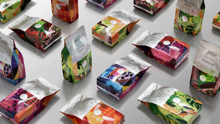
Turner Duckworth has worked with Yorkshire-based coffee roaster, Taylors of Harrogate to create a refreshed brand mark and modernise its packaging.
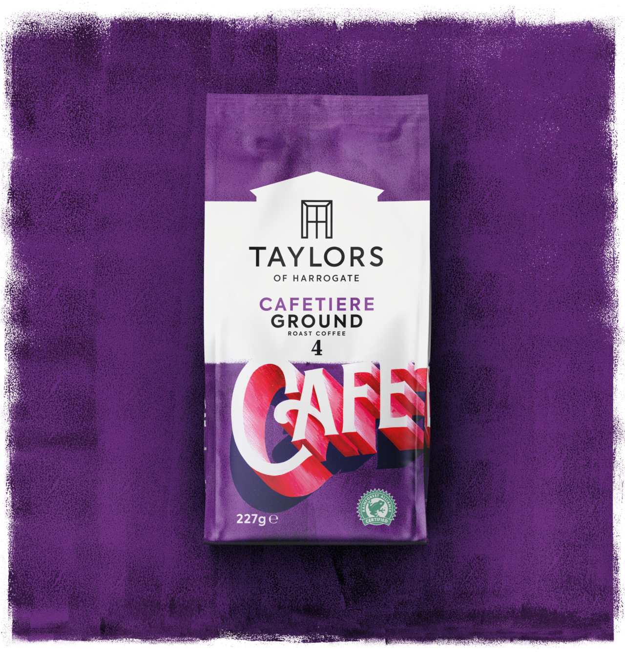
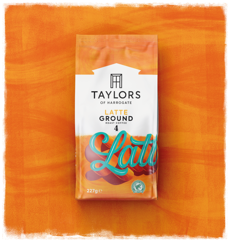
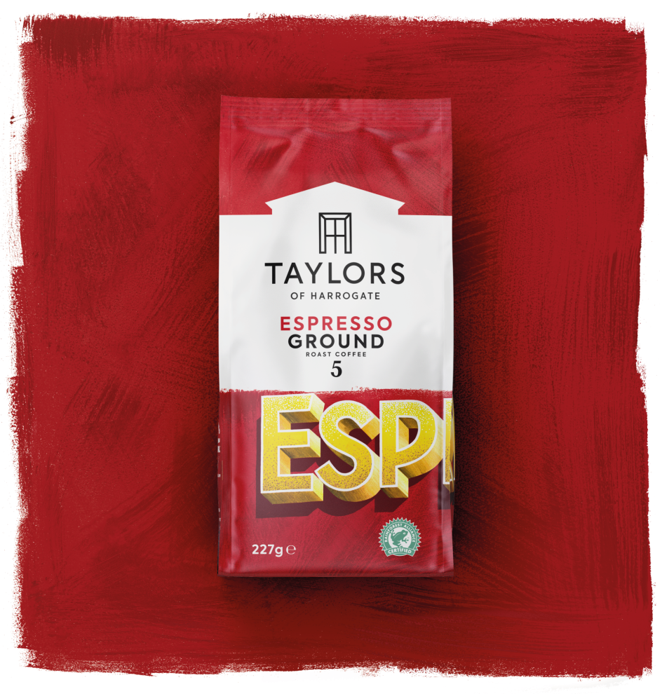
The evolution of the brand mark has seen Turner Duckworth introduce a "roof profile" graphic above the wordmark, which it says references Taylors of Harrogate's beginnings. All Taylors coffee packs will be updated with the new logo by February 2021.
The new packaging aims to "bring to life the brand’s character and creativity," says the US and London-based agency.
The brand's ‘Especially For’ range aims to simplify the often-complex range of coffee products on the market. So the new designs strive to create clarity and authenticity while also demonstrating quality and character.
Turner Duckworth says it used a "direct" approach to the new designs, since "the supermarket coffee aisle can be a confusing place," says Taylors senior brand manager Kelly Wright puts it."Tasting notes, strength levels, roast colours and fancy coffee names can be a lot to take in."
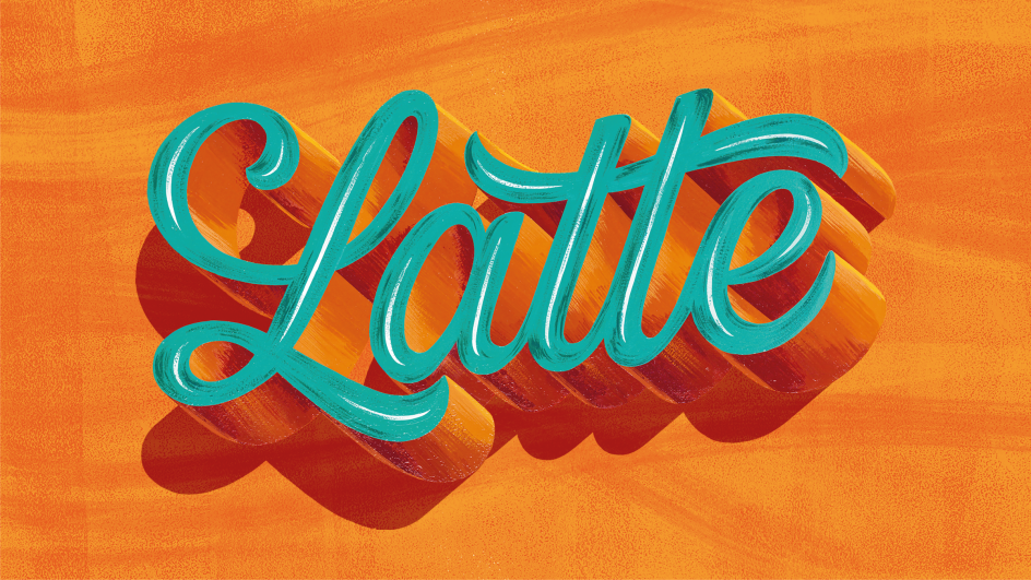
Hand-painted typography appears across the packaging as a nod to the "unique qualities of the brewing process such as the soft pressing of a cafetière and the velvety swirls of a latte," says the agency. A colourful palette was added to stand out on shelves.
The designs also pay homage to Taylors of Harrogate's roots by "incorporating design elements reminiscent of Yorkshire," says Turner Duckworth creative director Miles Marshall. “Inspired by the craft of hand-painted sign-writing, which can still be seen throughout the region, we created intricate art on the packs to amplify the artistic essence of the brand.”
Editor's Picks


Trending


](https://www.creativeboom.com/upload/articles/90/908fdb6378db1e95d12595416f54e6336d5e80b8_732.jpg)
Podcasts


Editor's Picks
Further Reading