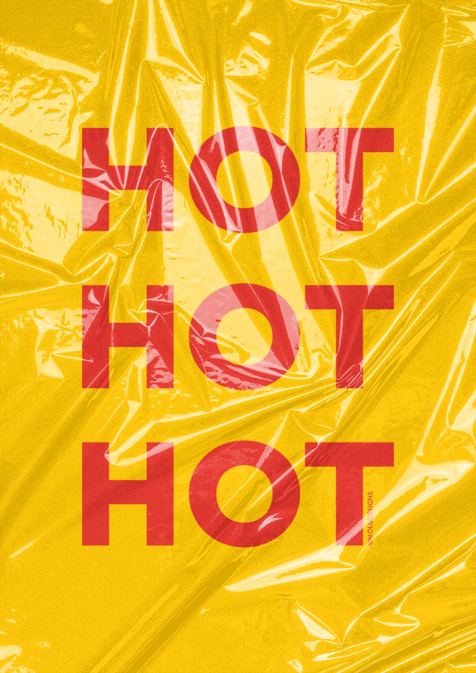
Lockdown Type: Molu Designs brings us typographic messages of positivity and hope
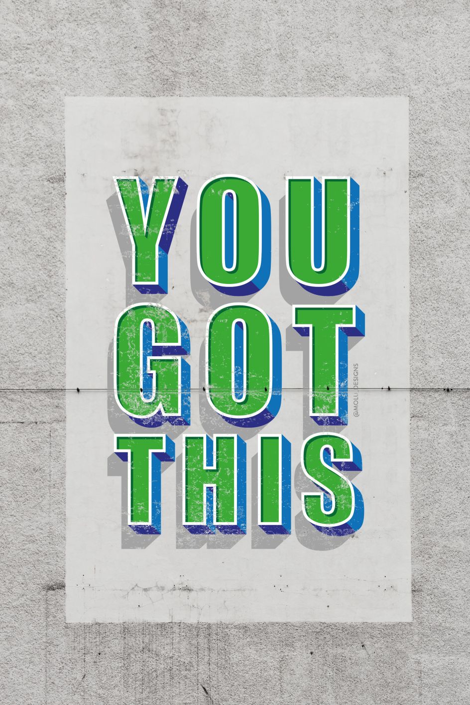
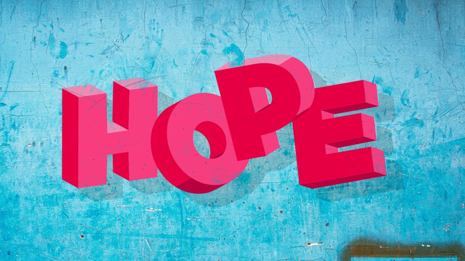
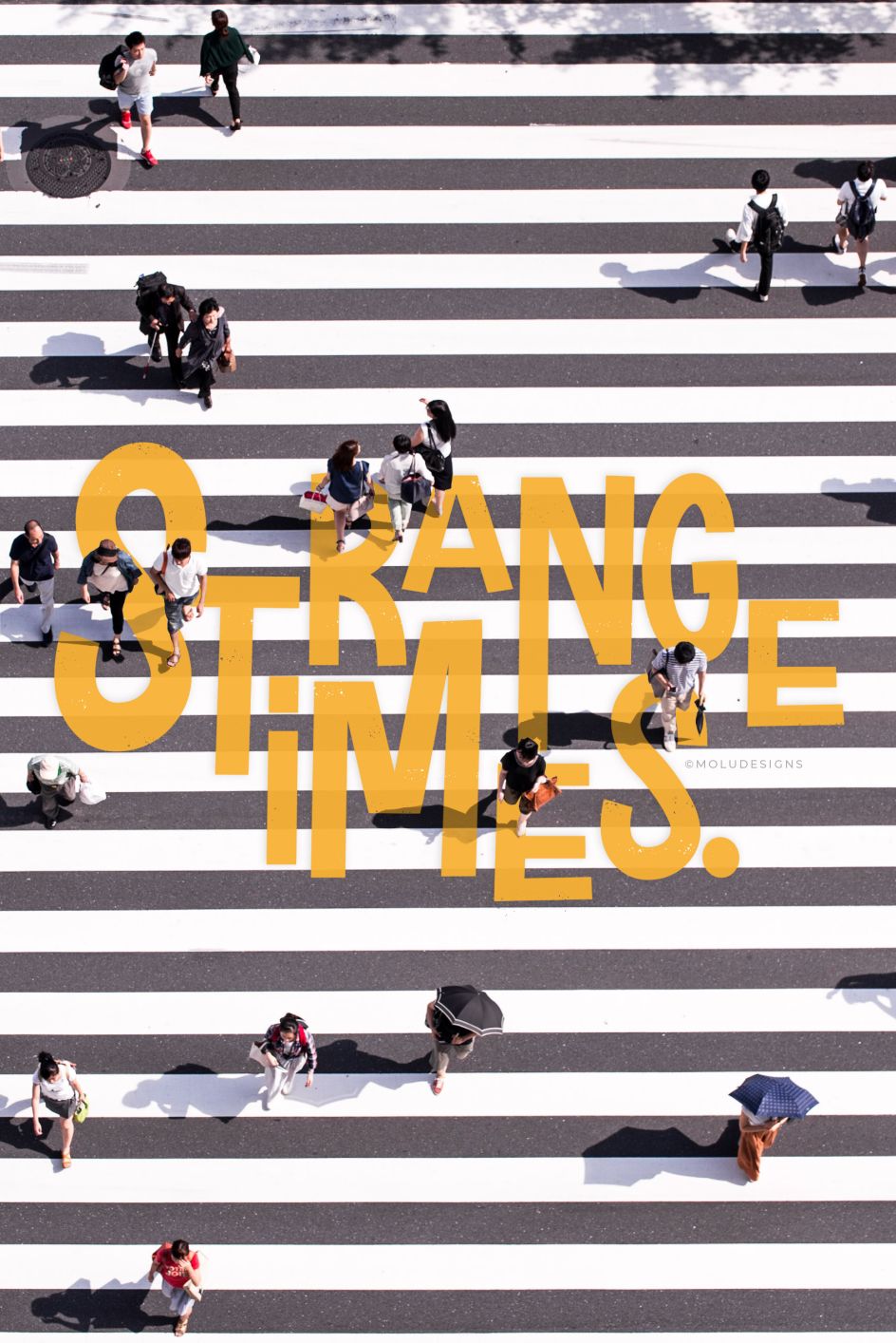
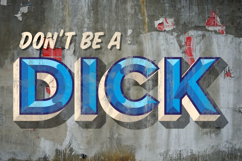
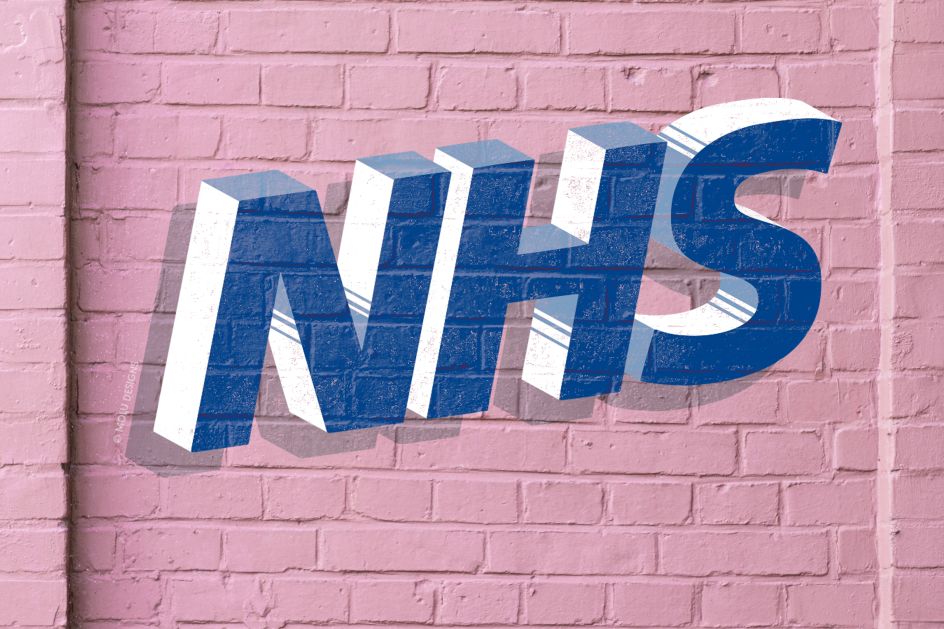
Designer and lettering artist Soumya of Molu Designs has throughout lockdown been super creative, using her craft to spread messages of positivity and hope.
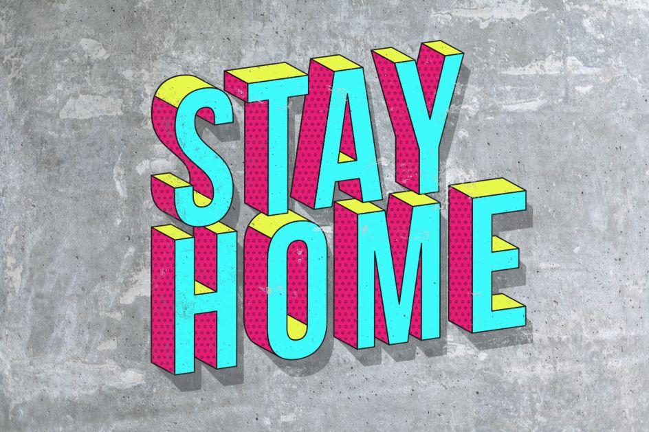
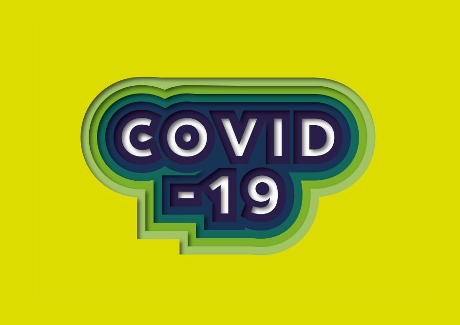
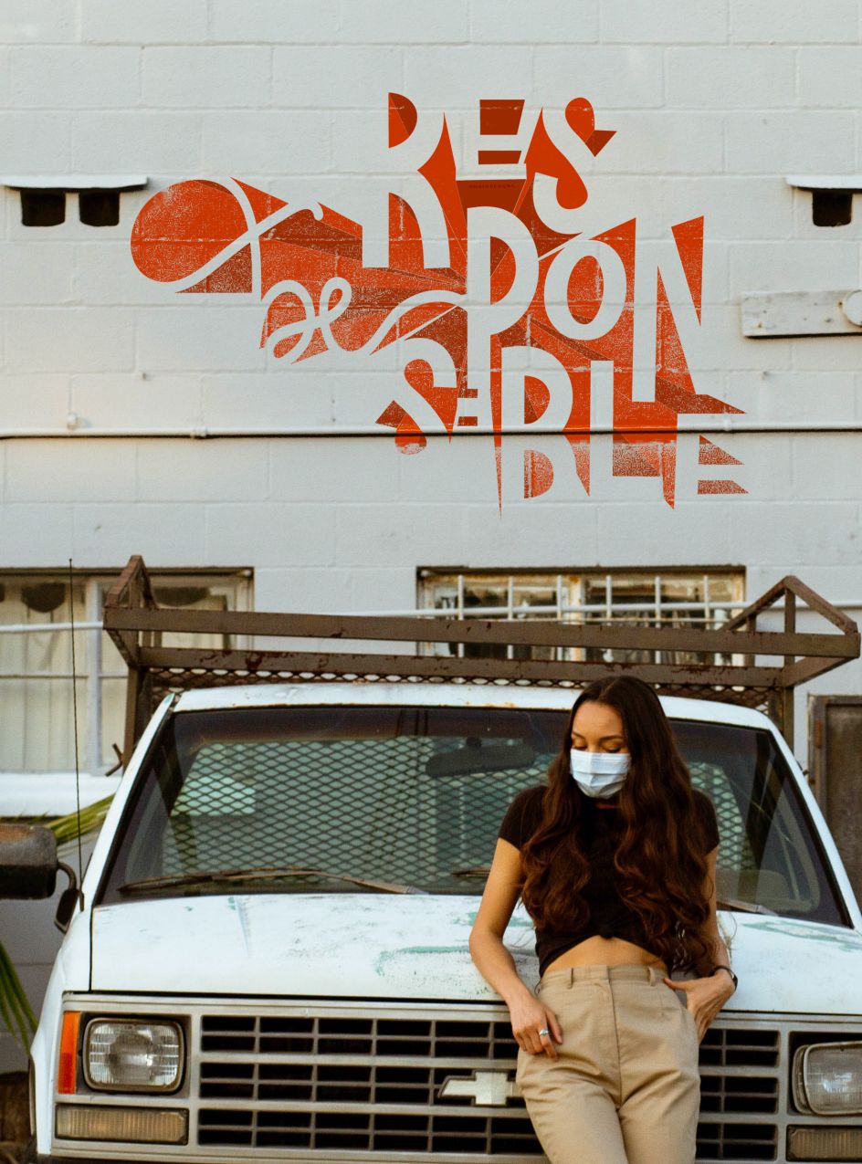
'Stronger together' and 'stay home' feature in her bright and bold typographic works but there are also tributes to the National Health Service alongside some more relaxed pieces with a dash of humour to get us through these challenging times.
"This year has taken us all by surprise with the pandemic, forcing many of us to work from home," Soumya tells Creative Boom. "While it brings its own series of challenges with work being cancelled and postponed, it did also bring an opportunity to dabble in some self-initiated projects. The ones we usually don't have time for in normal instances because we're far too busy juggling a million jobs and trying to meet pressing deadlines.
"I used this time to play around with some digital lettering, seeing as I didn't have much access to my paints and sundries in my studio or any wall space. I opted to create some fun type locks using the current climate as the theme."
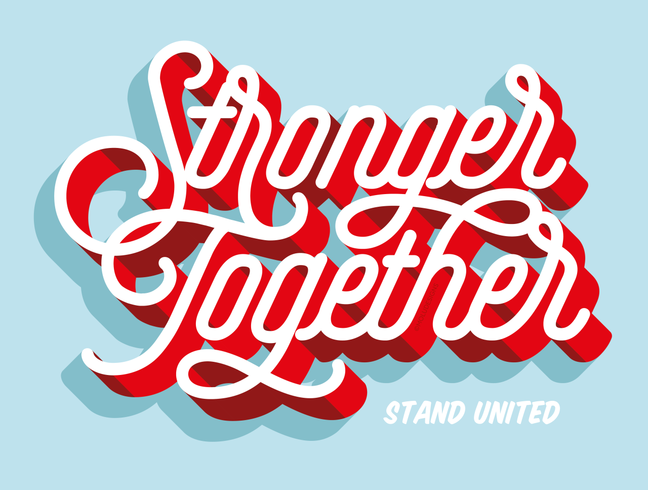
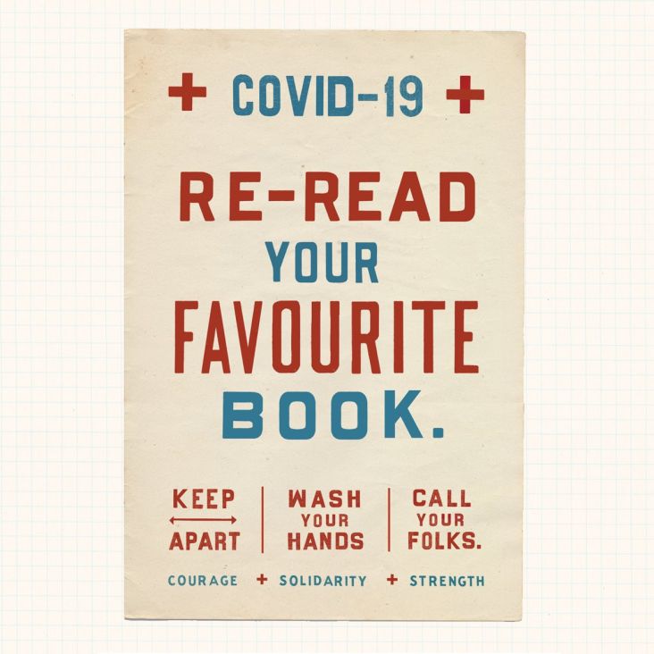
Earlier this year, Soumya also took park in In Good Company's Posters for the People campaign, opting for 'Community – We are all stronger together' as her artwork slogan. Speaking of the design, she says: "The type lock playfully highlights the word 'unity' in the word 'community'. It's right there for all to see! I intentionally kept the design simple yet bold, so that the message was both legible and crystal clear to all who saw it."
Based in London, Molu Designs is a studio that specialises in lettering, sign painting and typographic installations. To find out more, visit moludesigns.com.


. All photography by [@CWPhotographics](https://www.instagram.com/CWPhotographics).](https://www.creativeboom.com/upload/articles/67/676df72d2da7c0b6b34db562bbe9d7b70efd85fd_732.jpg)