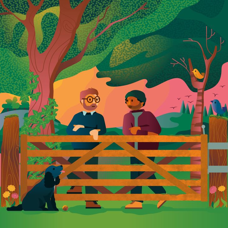
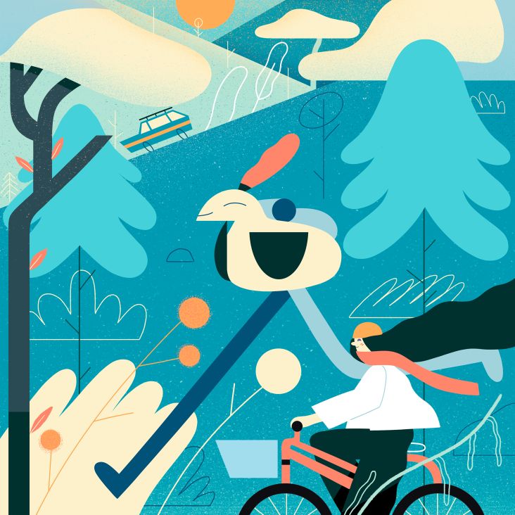
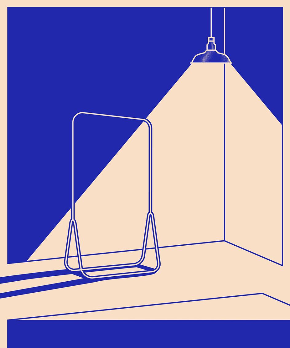
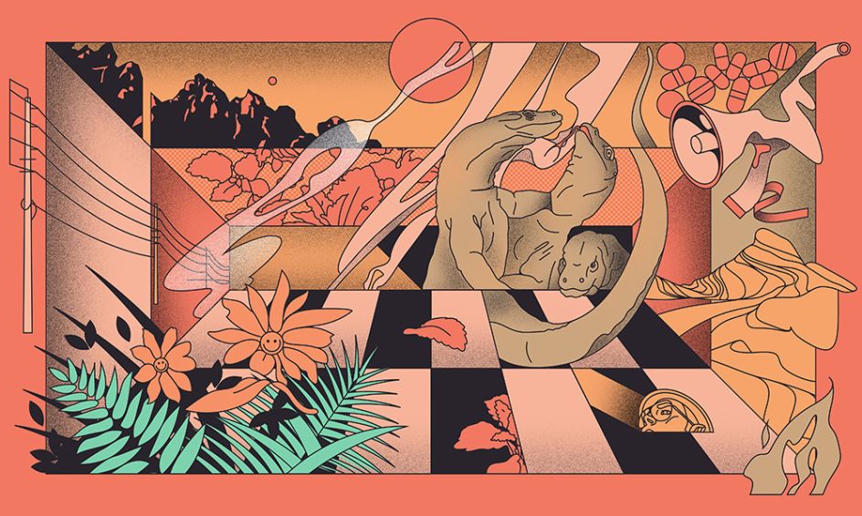
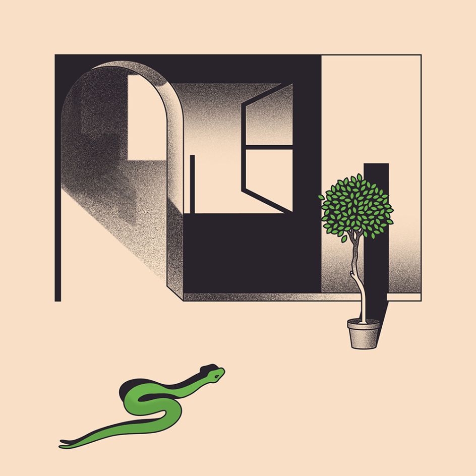
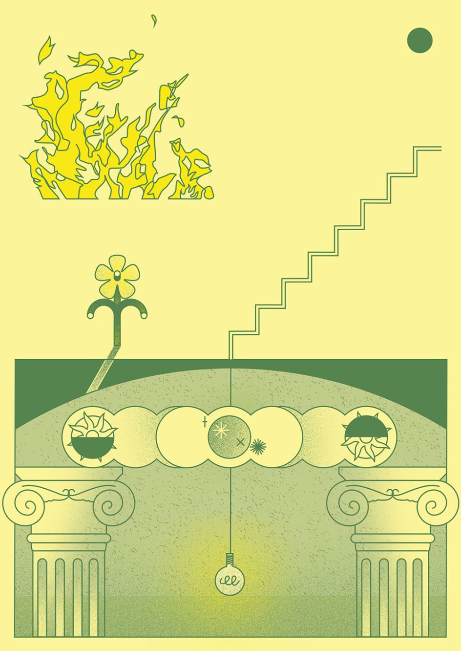
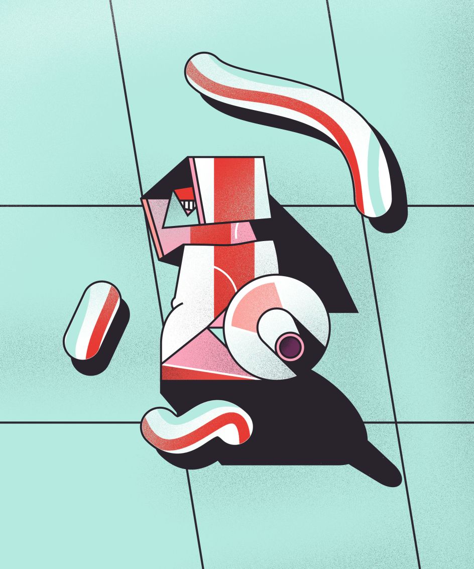
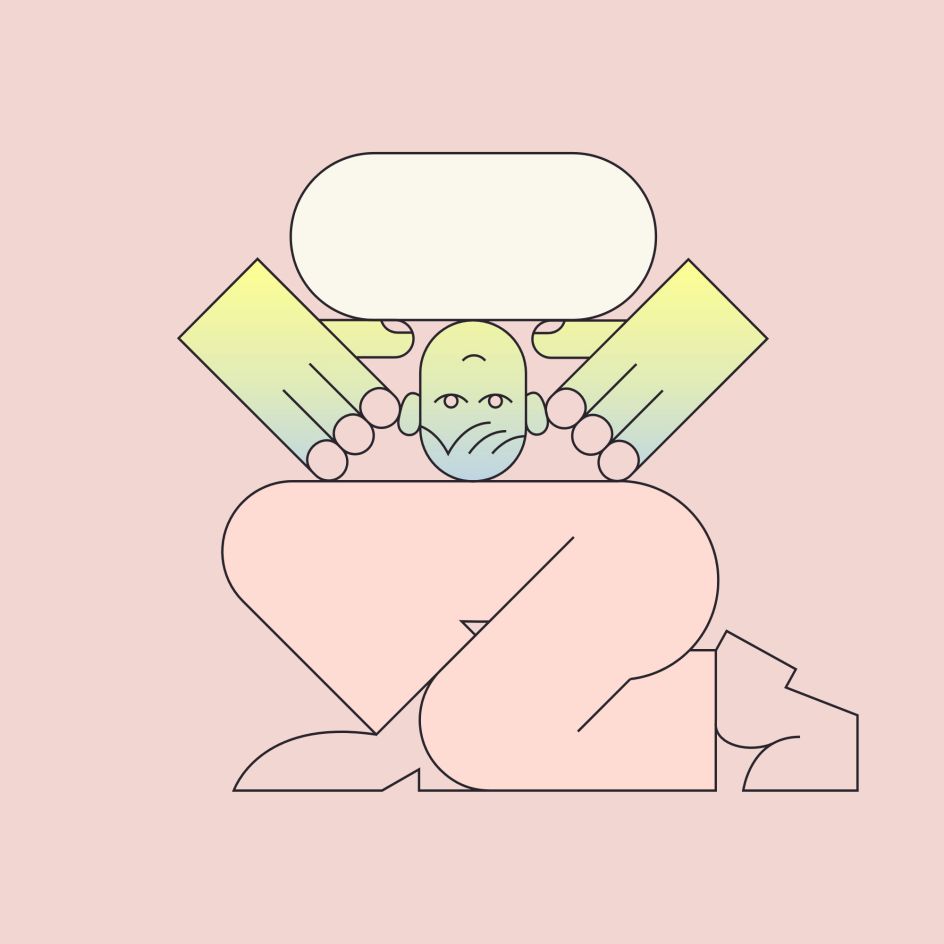
Thomas Hedger experiments with hazy tones and a looser colour palette
Ahead of his upcoming graduation from London's prestigious Central Saint Martins, illustrator Thomas Hedger has produced a new series of work.
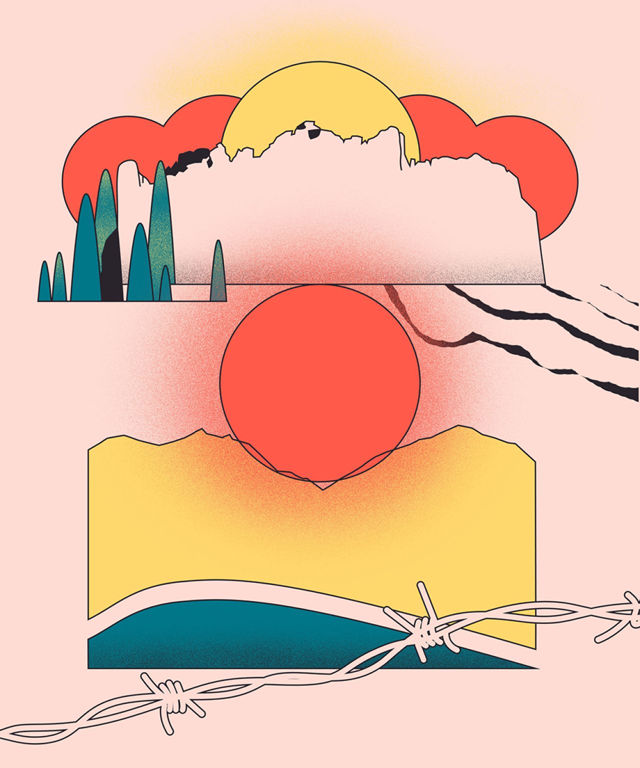
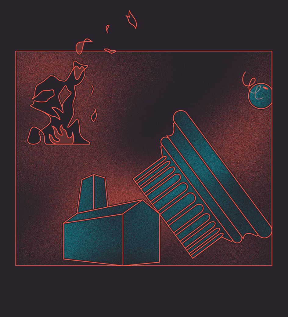
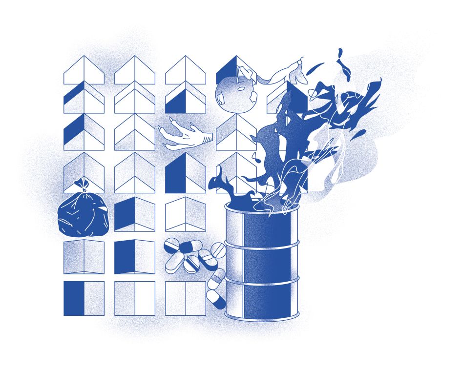
In contrast to the bold nature of his previous pieces, Hedger's new body of illustrations features hazy tones and a looser colour palette – a very conscious progression by the artist.
He explains: "I’ve been thinking about how I can make digitally created drawings softer and a bit more forgiving – the medium can be quite harsh and brutal so playing and experimenting with gradients has helped by creating subtle tones that blend and flow.
"Progressing my style by taking the same outlines and colours forward but using them in a different way I think perhaps gives a different feel to my work - being softer can give it a more emotive quality through better-capturing mood, which means I’ve been able to expand the topics I work with."
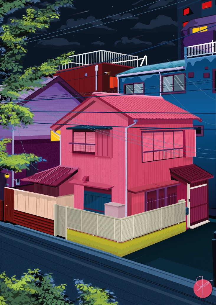
London-based, Thomas has become renowned for his brightly coloured designs, which he's created for a range of clients from the New York Times to The Guardian and Urban Outfitters.
You may recognise his work from our post on the Petrol Station series. Discover more at www.thomashedger.co.uk.

Editor's Picks


Trending


](https://www.creativeboom.com/upload/articles/90/908fdb6378db1e95d12595416f54e6336d5e80b8_732.jpg)
Podcasts


Editor's Picks
Further Reading