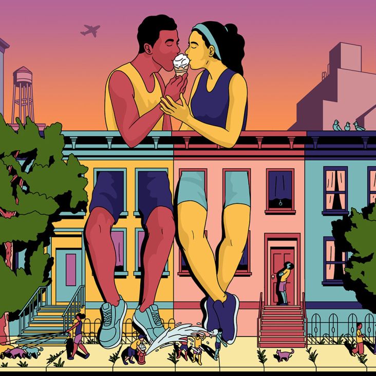
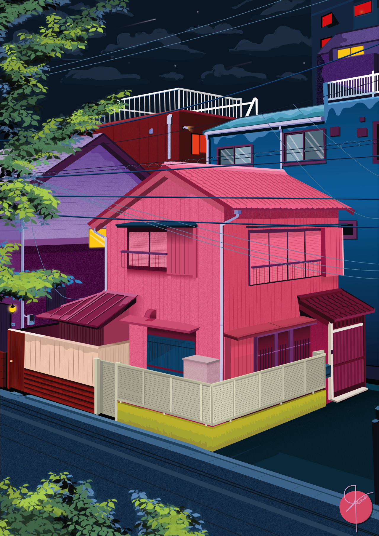
Colourful architecture drawings by Christian Iannello Tovar play to his perfectionist side
Having temporarily veered away from his passion for art, London-based illustrator and graphic designer Christian Iannello Tovar found his way back into it by creating drawings of buildings that leap off the screen with their bold, unmissable colours.
© Christian Iannello Tovar
The sixth form is a tricky time. As well as going to lessons and cramming for exams, you've got to start making some pretty concrete plans for your future. For Christian Iannello Tovar, pressures from friends and family weighed heavy on him, too, making him decide to study a "safe" choice of higher education instead of the art he craved.
"Similar to most people's experience, this time in my life was very confusing!" he tells Creative Boom. "I chose to study 'international business management', seeing the business world as more secure. Looking back on it, I would advise anyone in the same situation to follow their heart. Whatever springs to mind first are usually what you desire the most."
As predicted, his university course wasn't fulfilling. And after being inspired by a friend who was starting a clothing brand, he decided to pick up graphic design again. "I remember spending countless hours teaching myself all the techniques I had forgotten or didn't learn at school. It was a balance between lectures and mastering my craft!"
© Christian Iannello Tovar
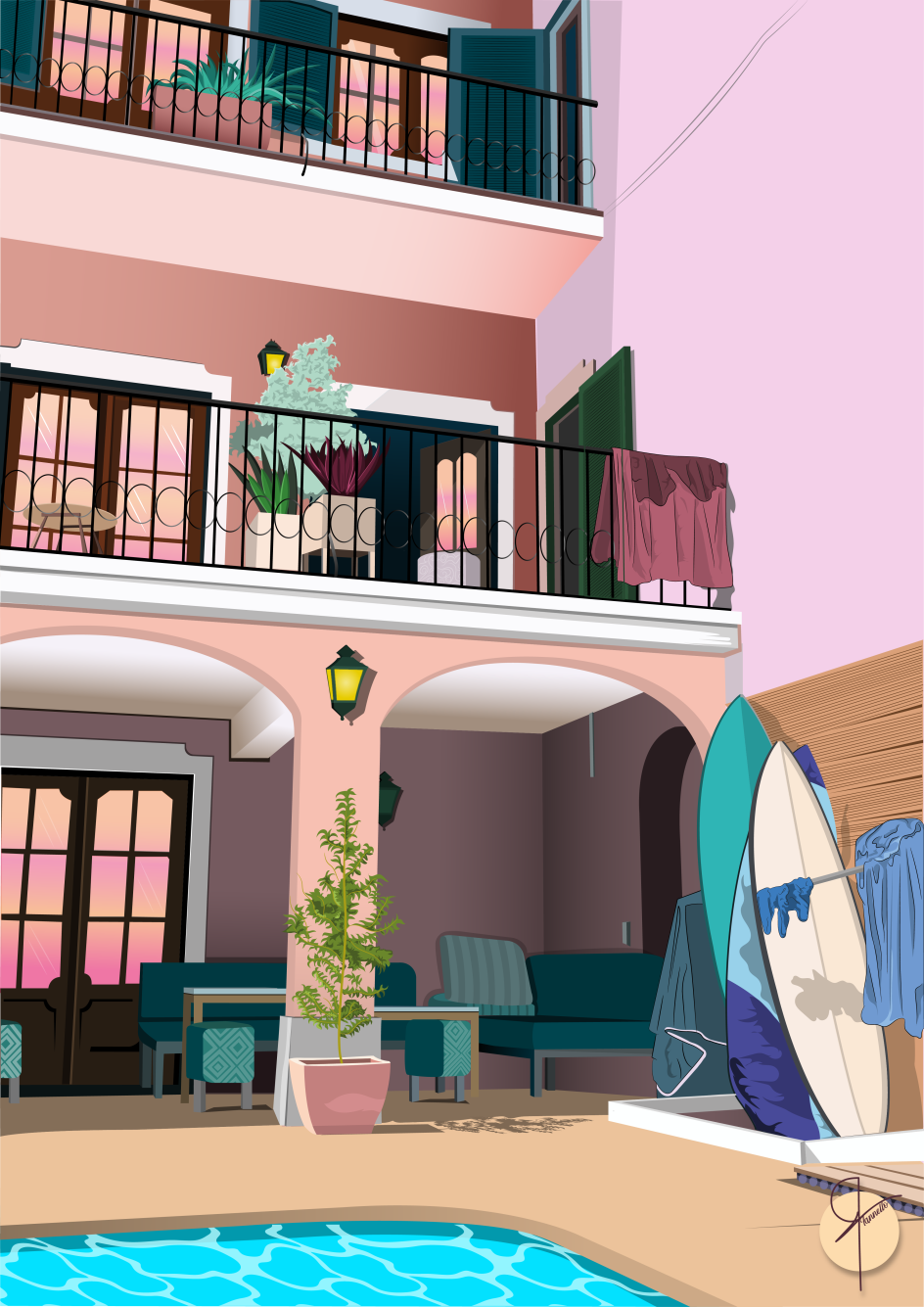
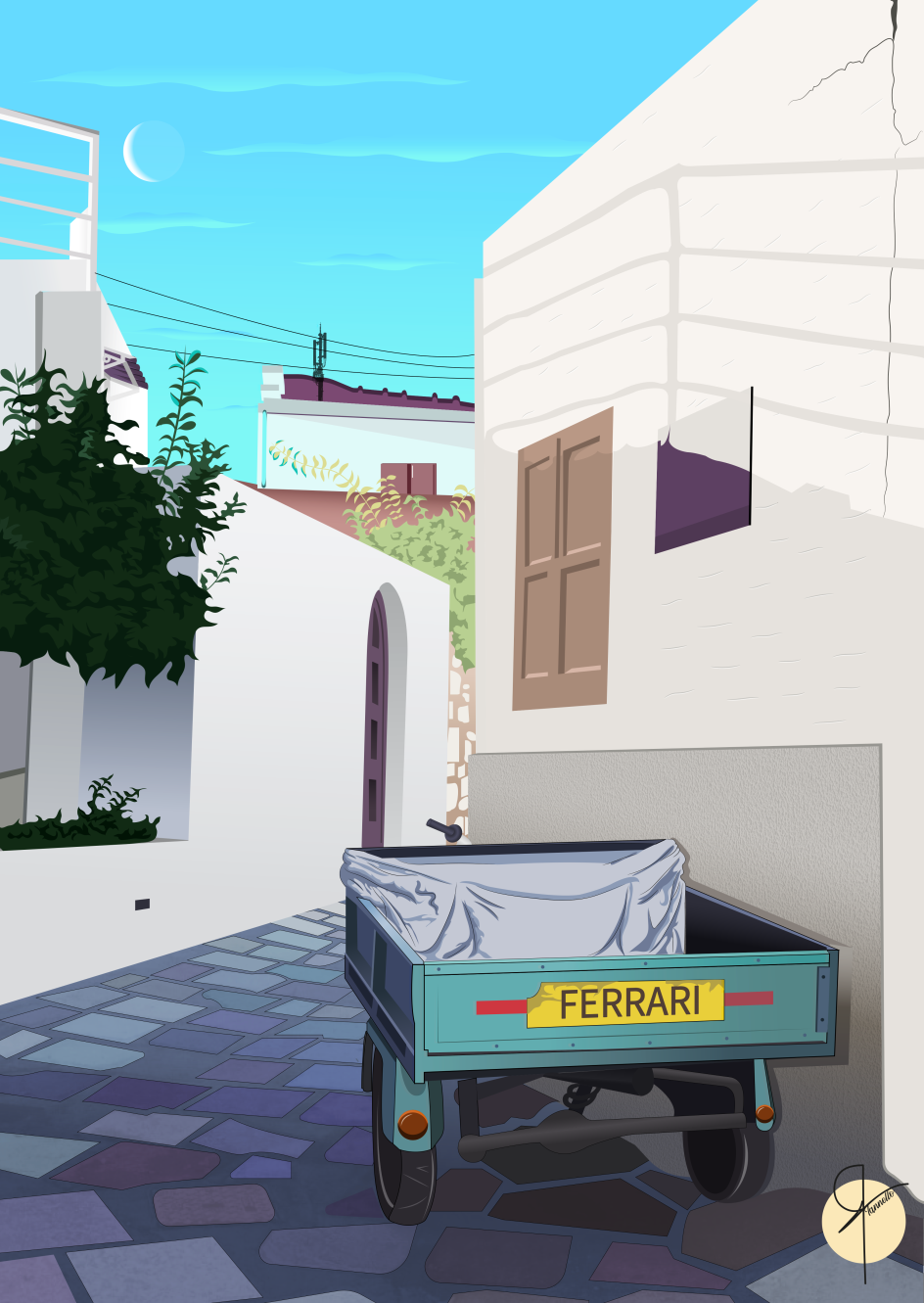
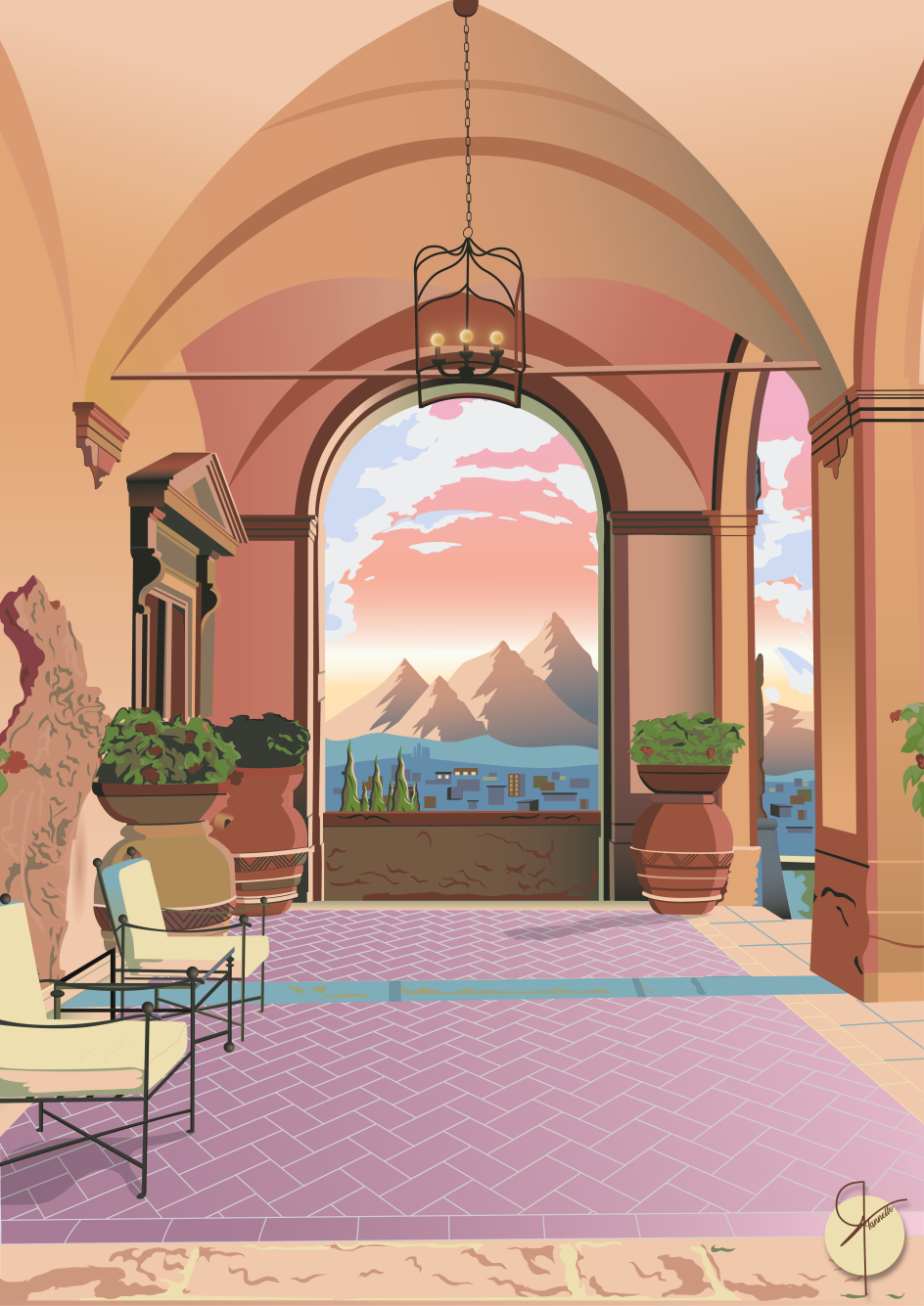
Christian's portfolio is defined by his vibrant, precise drawings of buildings from around the world. And while plenty of big names in this field influence him, his biggest inspiration is someone much closer to home. "My biggest inspiration has to be my Dad," he reveals. "We would often go on holidays when we were younger, and he always had a camera in his hand. He loved taking images of the scenery and the architecture in the places we visited. He definitely had an eye for it.
"We always used to make fun of him, but it wasn't until I was older and looking through our photo albums that I saw the talent in his imagery. It inspired me to move towards a more building, landscape and architecture type of design.
"In the past, I was a bit all over the place regarding the work I was creating. I would go from typography to logos to character designs. I have definitely found my style, and many of my designs have come from images found in the same photo albums that inspired me."
© Christian Iannello Tovar
© Christian Iannello Tovar
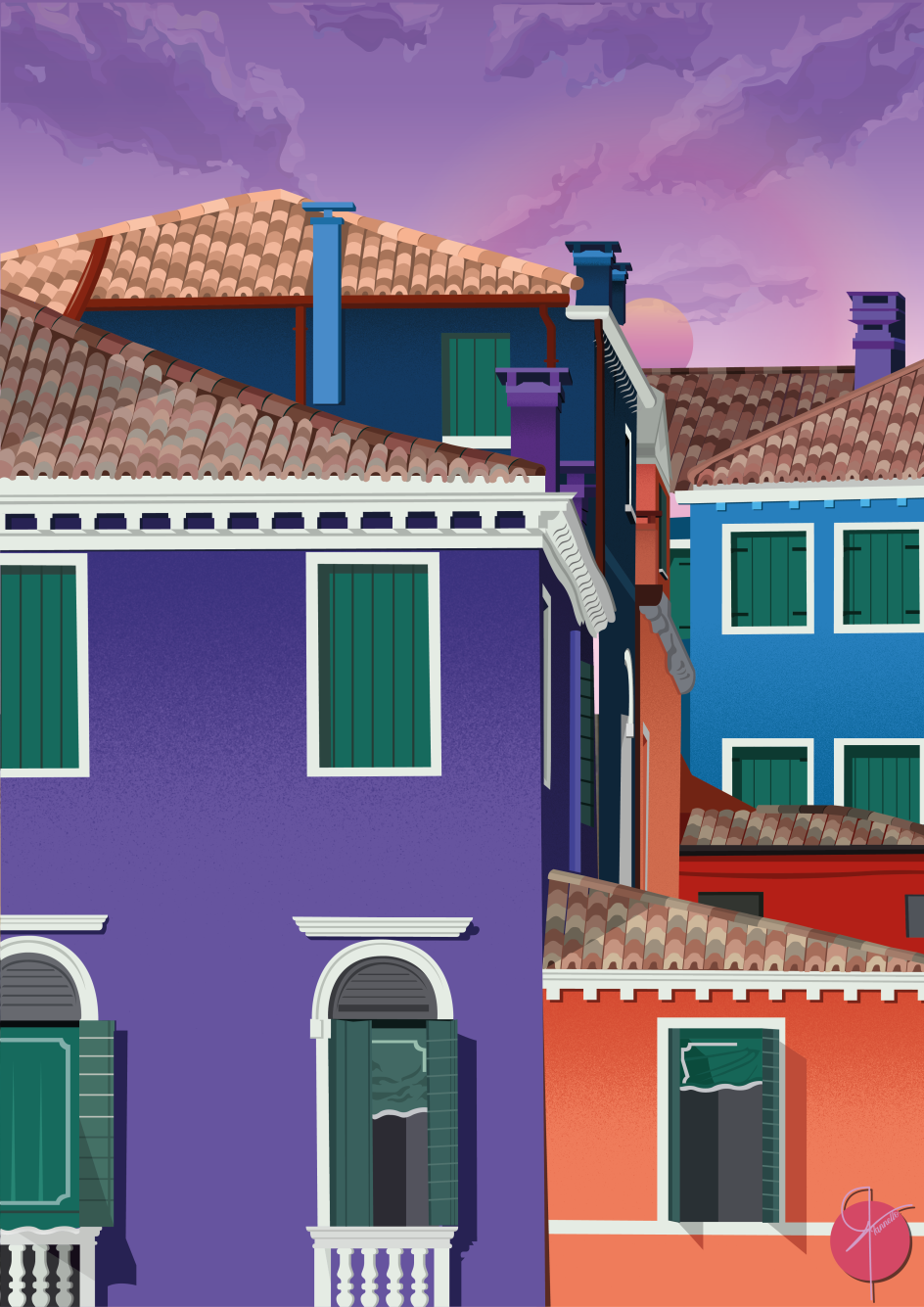
As well as his father's influence, another thing that appeals to Christian about drawing buildings is the sense of perfection they demand from an artist. "My designs are a mixture of structure and my own creative spin," he explains. "Most buildings that stay upright need a degree in maths, physics and engineering, all of which require rules and theory (the perfection aspect).
"There's something about the straight lines that all perfectly meet that's satisfying to design/illustrate. Around the architecture, I get to use colour and texture and throw in any other random objects that come into my imagination at the time. This allows me to create a scene that is interesting to the eye and makes you want to imagine what on earth is going on there."
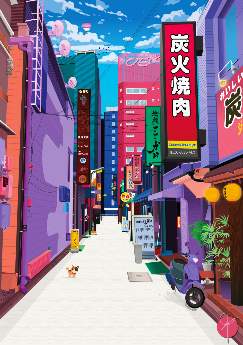
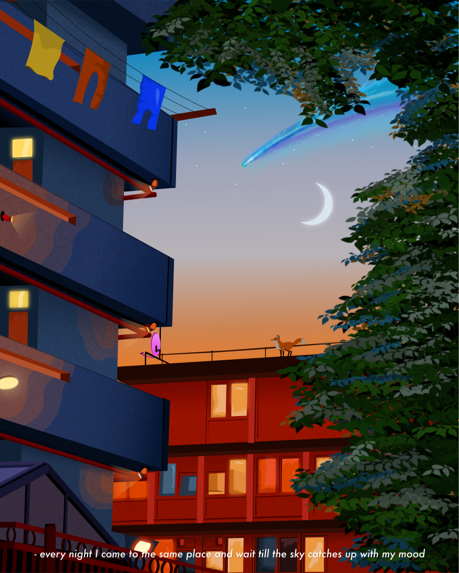
Speaking of engaging the viewer's imagination, the absence of people in Christian's images is a curious, creative decision. Was this a conscious choice, and if so, what does he hope it achieves? "I like my images to be as simple as possible even though the colours are sometimes bold and bright," he reveals. "I want the viewer to focus on the architecture and the scene. However, I do occasionally feature an animal in the scene!"
© Christian Iannello Tovar
© Christian Iannello Tovar
© Christian Iannello Tovar
Christian's innovative and imaginative use of colour elevate his buildings from drawings to designs and art pieces. However, this approach took a while to settle on, and he says that in the beginning, he often illustrated each scene to look exactly how it looked in the reference image. "It would take me hours to draw every single detail, and I would focus heavily on the angles and shadows," he says.
"Once my design would be completed after months of working on it, I would often zoom out and realise that it would look exactly the same as the original. Some would say that is a good thing, but my thought process was, 'If you can't tell the difference between a picture and an illustration of the picture, then what is the point of doing it'! All that hard work for the artwork to look identical to the original image..."
© Christian Iannello Tovar
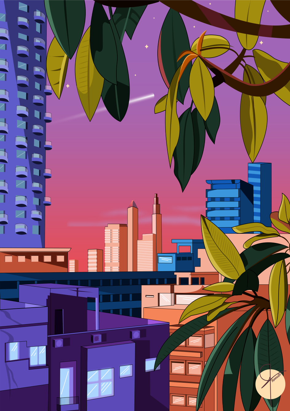
Shortly after this revelation, Christian decided to make his illustrations more explicitly larger than life. "I played around with colours, especially purples, blues and pinks. I started to add things that were not in the original images and played with the time of day by changing the tone of colours and skyline. I added textures and different techniques to create shadows. My goal was to make it seem like even though the buildings looked normal, everything else didn't."
Christian tends to stick to a few main colours when creating his illustrations, namely purple, pink, blue and orange. Then, once he's decided on the time of day he wants the illustrations to take place in, he chooses the mood he wants to provoke.
"Playing around with the saturation and the different hues of each colour is one of the most fun parts of creating the design," he concludes. "I imagine it's like an artist using a brush and mixing paint. I will mix tons of varieties of colours and scatter them around my artboard to use them when I like."
Editor's Picks


Trending


](https://www.creativeboom.com/upload/articles/90/908fdb6378db1e95d12595416f54e6336d5e80b8_732.jpg)
Podcasts


Editor's Picks
Further Reading