The Plant creates adorable 'Bean Army' illustration-led branding for new plant-based protein brand
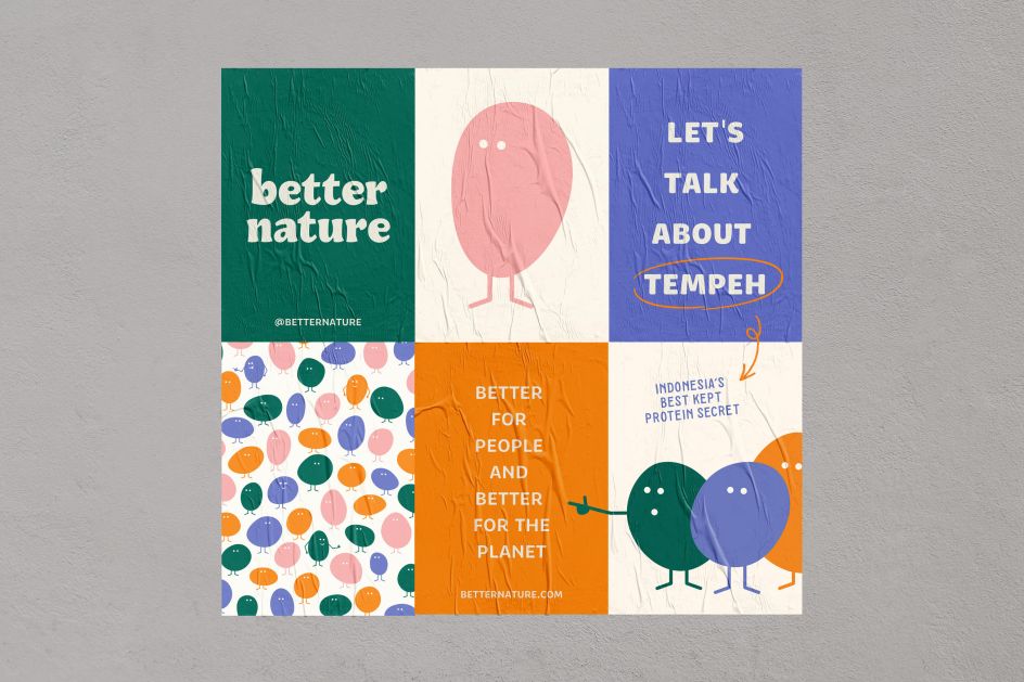
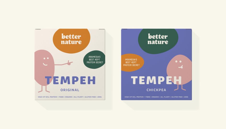
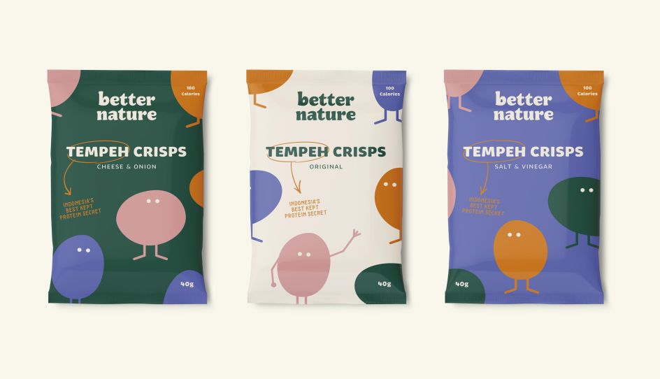
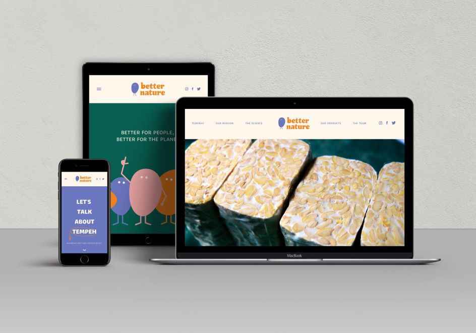
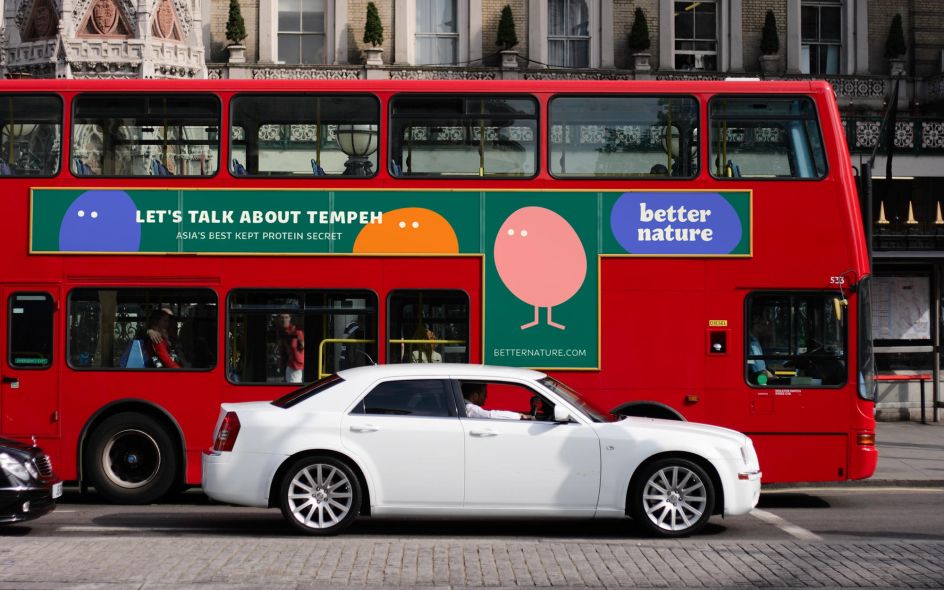
The Plant has created a charming character-based designs scheme for Better Nature, a new food brand centred around Tempeh plant-based protein.
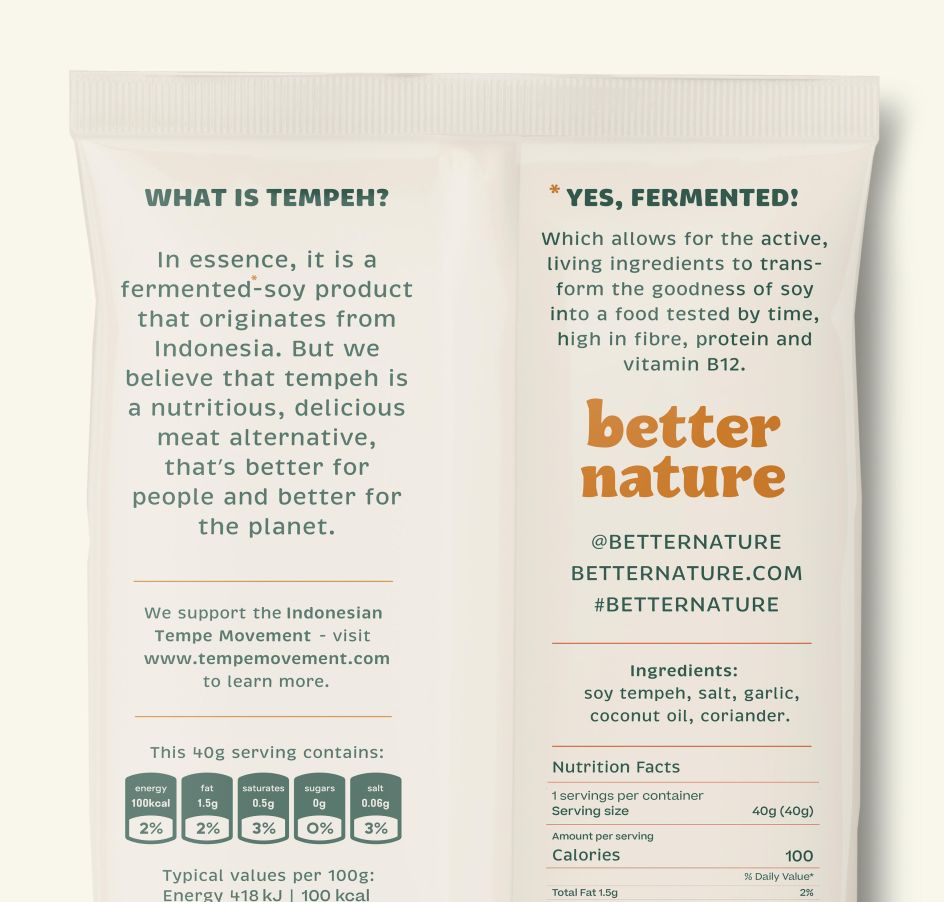
It worked on the entire strategic side – from naming to logo design, packaging, positioning, concept creation and a suite of illustrations created in-house. The Plant's designs looked to reflect Better Nature's goals to "better understand the impact of the food production system on our planet, with more people looking for a nutritious, affordable, and tasty plant-based source of protein."
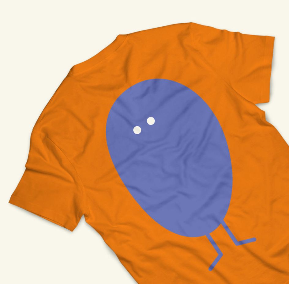
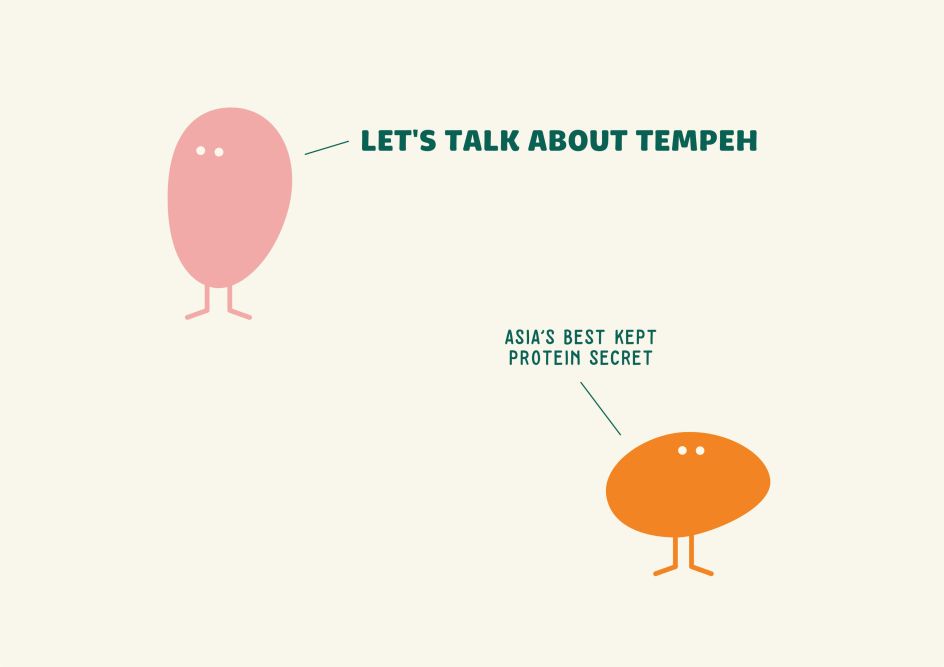
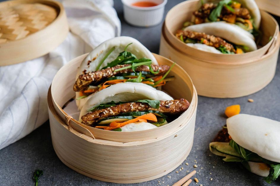
The characters are based on the soybeans from which Tempeh is created, and the playful illustrations are used across the entire brand from packaging to online platforms, billboard ads and more. This 'Bean Army' was inspired by the way Tempeh is traditionally created as a fermented soy cake, often cooked wrapped and sold in banana leaves, which when sliced reveals a distinctive mottled pattern.
These illustrations are used alongside equally friendly typography, which uses a rounded serif style across both upper and lower case lettering in various applications.
According to The Plant, Better Nature was "born from a desire to better understand the impact of the food production system on our planet, with more people looking for a nutritious, affordable, and tasty plant-based source of protein", which was found to be 300-year-old Indonesian staple, Tempeh. The design system's goals were to "put Better Nature at the forefront of the Tempeh movement" in a fun, engaging way.


Editor's Picks


Trending


Podcasts


Editor's Picks
Further Reading