Childish kicks off its 'design for better purposes' with new identity for plant-based baby food
After 10 years of working for large corporate clients who "don't care about the environment, animals or people", Andy Lester decided to set up his own studio, focusing on helping "purpose-driven startups" and non-profits, all with the aim to "design for better purposes".
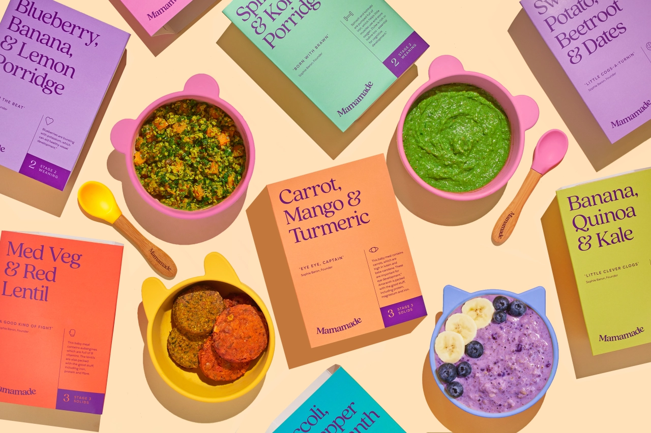
Childish Design also gives graduate designers their first experience of live client work through paid freelance opportunities in a bid to end "free" internships. Launched during a pandemic, Andy's firm has already rebranded fiils.co and has worked with the Special Olympics GB. One other project that caught our attention was its brand identity for Mamamade, a plant-based baby food delivery service that was looking to reposition its brand and packaging to fit with the "feeling of community that its brand had come to be known for".
"Not only is the food nutritionally informed, good for the planet and convenient but it also brings together a community of parents giving it their best shot, and not being ashamed to struggle along the way," says Andy. "We worked together to create a new brand identity and packaging design which highlights the health benefits and unites a family of new parents."
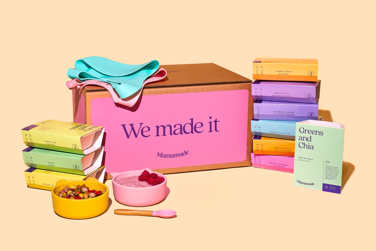
The concept behind the identity was based on the old saying, "it takes a village to raise a child". "But in a world where people don't know their next-door neighbour's name, we wanted to build a new village," adds Andy. That is, a community of like-minded parents open to the struggle and sharing their experiences for the greater good. The brand's strapline, 'We made it', is all about "togetherness as a community on a journey to healthier, happier families," as Andy puts it.
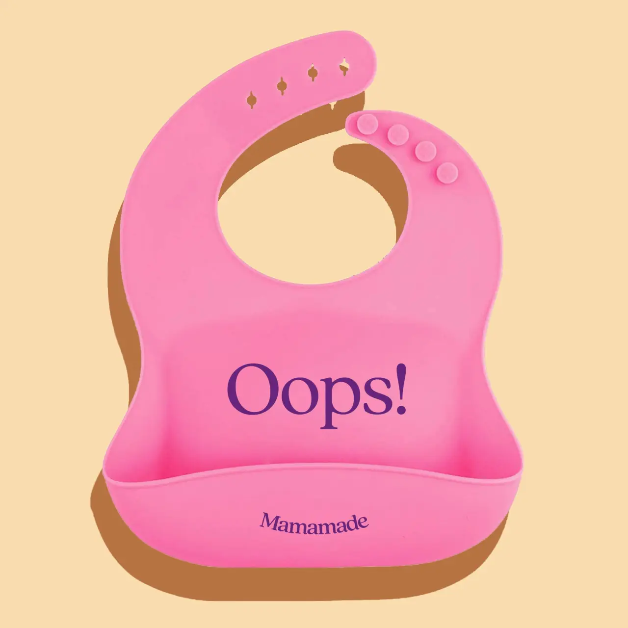
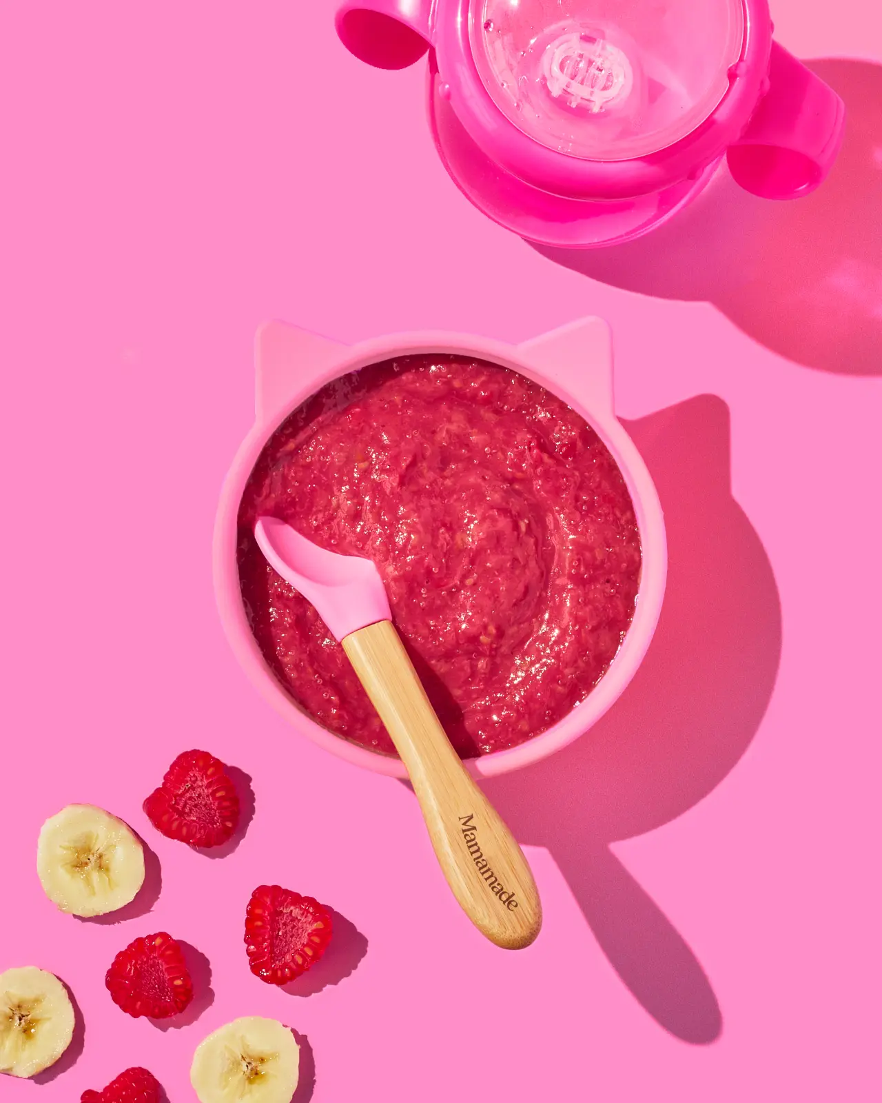
The wordmark design, meanwhile, was based around the idea of support to give a sense of togetherness and warmth within the parent community. "The packaging designs were kept super simple to give the feeling of a methodical, simple journey for parents to follow through the stages of weaning," says Andy. While the colour palette was made "bright and optimistic" but still held a "sense of maturity with the deeper aubergine master brand colour".
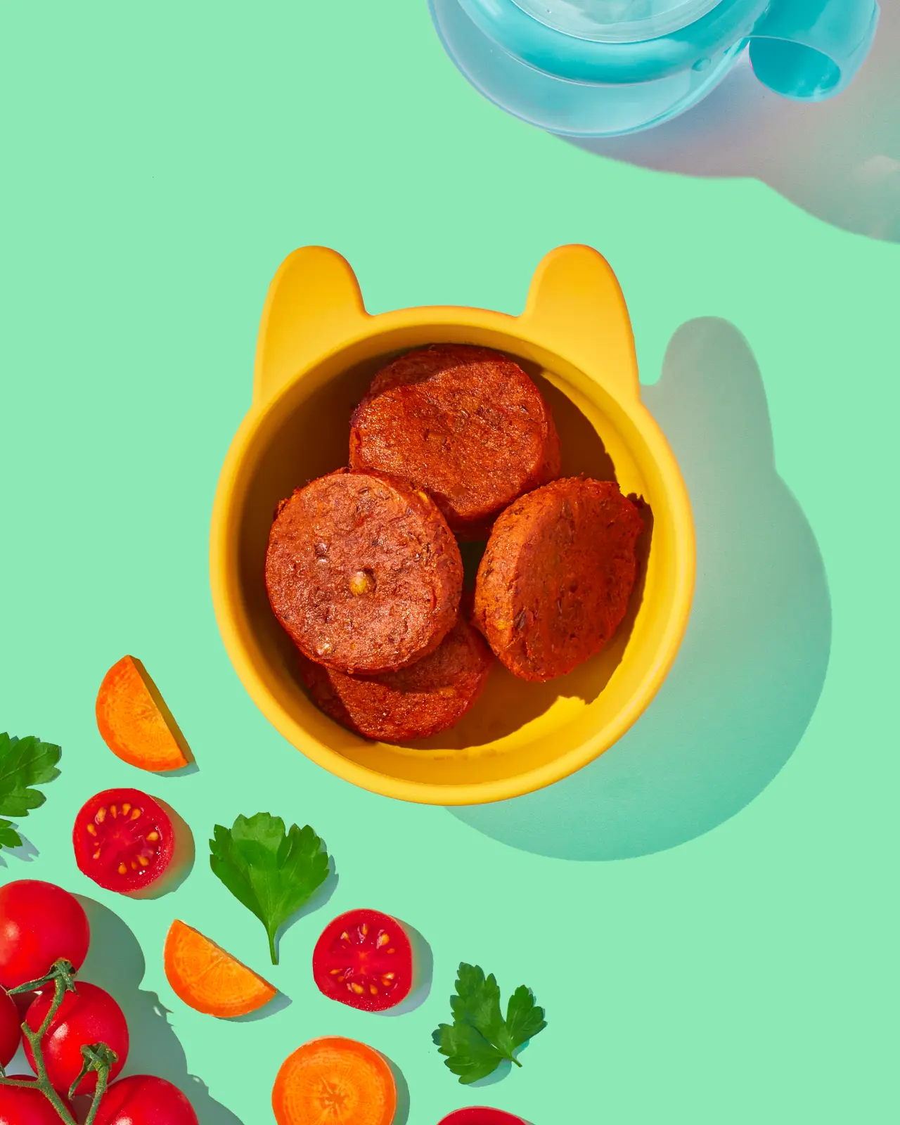
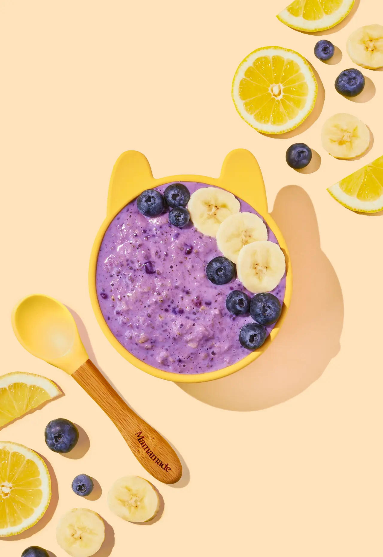
Photographer Cara Cormack then used this colour palette to photograph each of the meals to capture the sense of vibrancy and texture of the food.

Editor's Picks





Trending



Latest Jobs
Designer, Marketing at The New York Times
Full-time·New York·$85,000 – $100,000
Staff Producer, Studio Central at DoorDash
Full-time·San Francisco·$176,800 – $260,000
Director, Brand at KQED
Full-time·San Francisco·$125,547 – $165,000
Associate Web Designer at Planhat
Full-time·London·£30,000 – £35,000
Senior Creative Artworker at Forward Associates
Full-time·London·£30,000 – £40,000
Senior Social Media Manager at Whitney Museum of American Art
Full-time·New York·$95,000 – $100,000