Thisaway treads a fine line in its designs for radical skincare brand Sönd
Thisaway's branding for skincare company Sönd champions the beauty and diversity of skin and balances a bold point-of-view with an underlying softness and approachability.
Right now, there's a revolution happening within the beauty industry. It's no longer about conformity, stereotypically beautiful models, and the exclusion of otherness. Nowadays, beauty branding is inclusive, diverse and positive. And skincare company Sönd has been right at the front of this changing approach.
Sönd is not a follower of fads or fables. Instead, it uses simple science and a deep understanding of skin to create a radically different product.
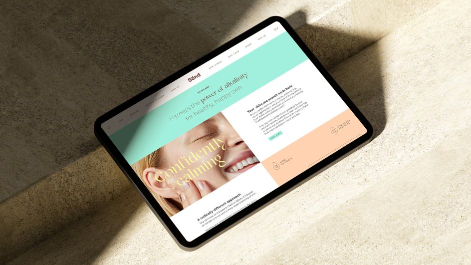
Whilst many skincare products on the market are acidic, Sönd harnesses the power of alkalinity to create a solution that works more harmoniously with the natural pH level of your skin's regenerative layers.
Sönd's founders know from experience the burdens of troublesome skin. And they know that these issues are anything but skin-deep. Anxiety, self-consciousness and low self-esteem can all come as a direct result of skin problems and can leave people feeling trapped and helpless.
But how to convey this philosophy in a simple way that consumers can quickly grasp? Sönd approach Bath-based branding agency Thisaway to help them out.
Sönd tasked Thisaway with creating a new brand that liberates and empowers. A brand that positions Sönd as the sigh of relief at the end of a frustrating search for skincare that actually works. Freeing people from the prison of non-conformist skin.
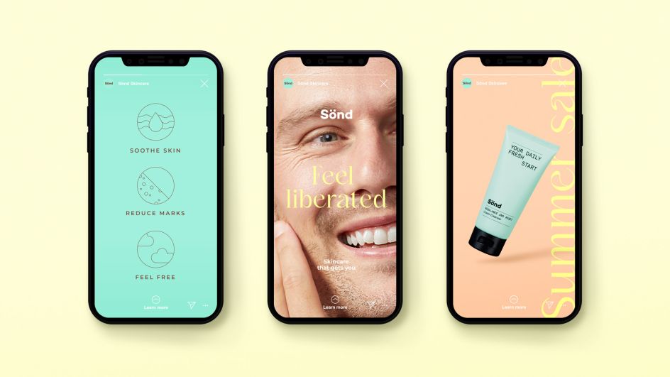
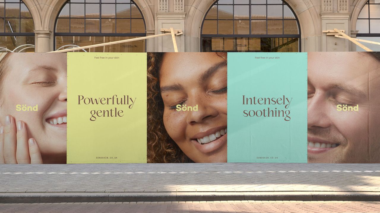
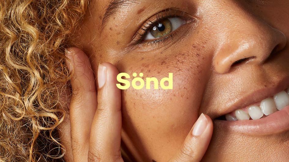
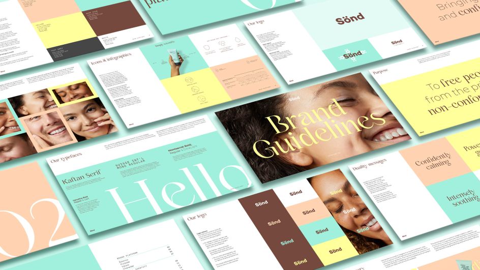
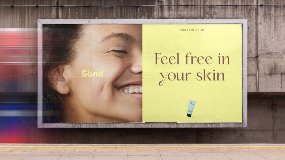
Based on the idea of skincare that makes you feel better both inside and out, Thisaway created an identity that is all about embracing calm and exuding confidence. They partnered with photographer Matt Davis to bring this to life with a series of super close-up portraits that capture a feeling of relief and empowerment whilst championing the beauty and diversity of skin.
These portraits are complemented by a colour palette that blends soothing skin tones with more vibrant colours, which bring a sense of life and freshness without feeling garish or clinical.
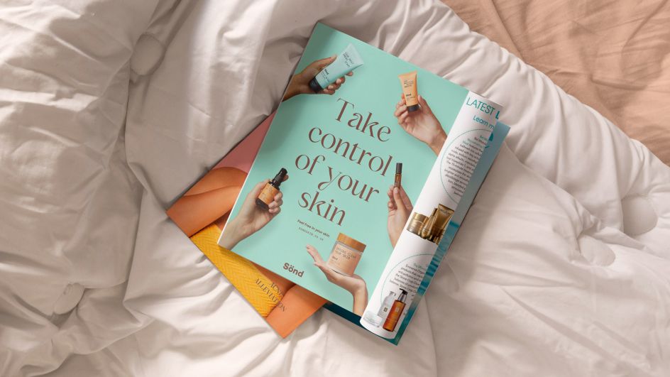
A delicate yet distinctive typeface leads communications using soft curves that allude to the contours of the human body. Supporting fonts play a more functional role and are often accompanied by elegantly simple icons and infographics that look to ground the brand in facts and proof points without becoming stuffy or giving users a science lesson.
The new brand will be rolled out across the Sönd website and social channels, as well as a clinic recently opened in Milan. Thisaway will continue to work with Sönd as a brand guardian moving forward and hope to evolve the brand's packaging in future.
"In many ways, creating Sönd's new identity was an exercise in balance," says Adam Cale, design director for Thisaway. "Not only did we have to tread the line between being bold and confident yet soft and soothing – but we also had to make sure that whatever we created worked with the existing logo and packaging.
"To do this, we ensured that all of the new identity elements were far more tactile and human in contrast to the very minimal packaging aesthetic. This contrasting yet complementary approach resulted in a nuanced brand that feels calming yet empowering, bold yet understated and simple yet scientific."
Sönd's founder Markus Goess-Saurau adds: "Working with the Thisaway team was a very enjoyable experience. Everything from project management to the creative process was second to none. The brief we provided was understood in depth, and we couldn't be happier with the results that Thisaway produced."
Editor's Picks


Trending


Podcasts


Editor's Picks
Further Reading


