She Was Only gives century-old film magazine a facelift
Print magazines about TV and movies are sadly closing left, right and centre at the moment, SciFi Now was the latest casualty in August. But that only makes it more impressive that Boxoffice Pro, a magazine dedicated to the movie theatre business, is still going strong, 100 years after its launch.
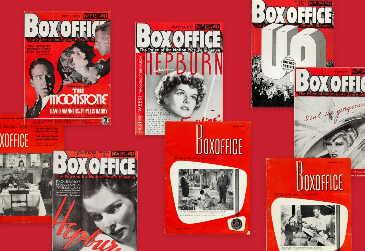
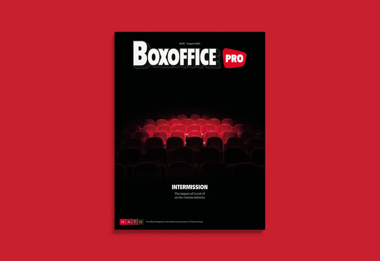
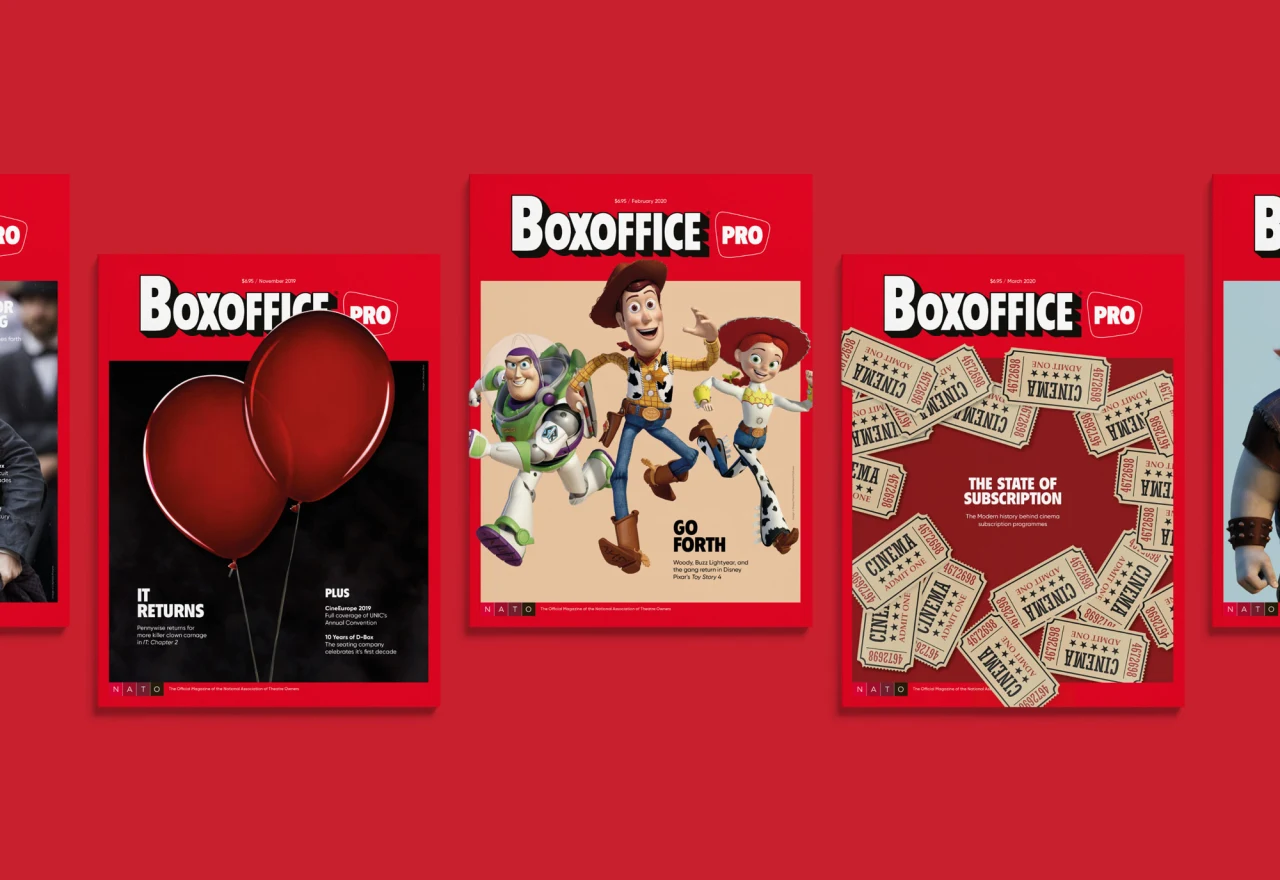
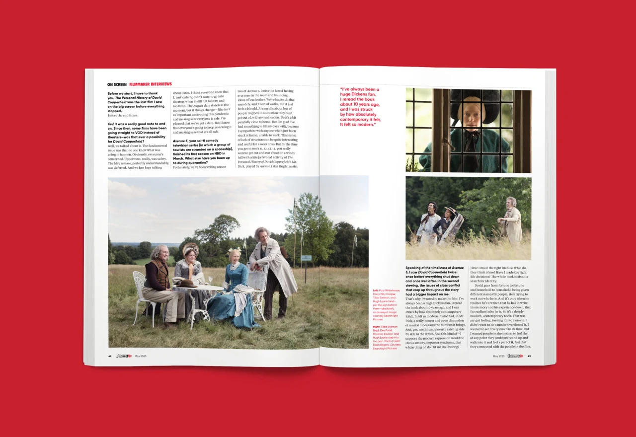
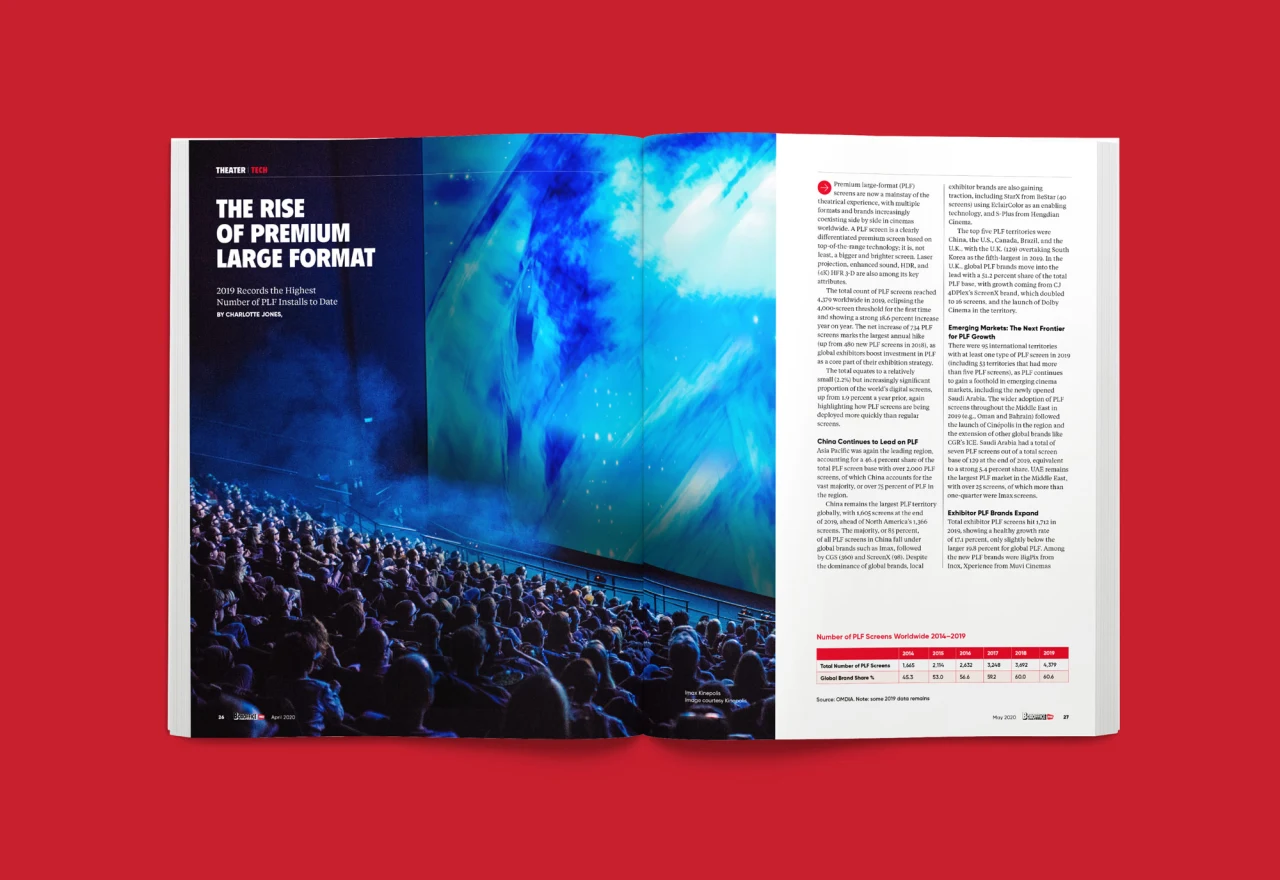
To celebrate this fact, London consultancy She Was Only has given the title a redesign, to make it more modern, and visually impactful.
In publication since 1920, Boxoffice Pro is the official publication of the National Association of Theatre Owners. Called NATO for short (yes, they got there first!), the magazine is distributed to over 90 per cent of North American movie theatres.
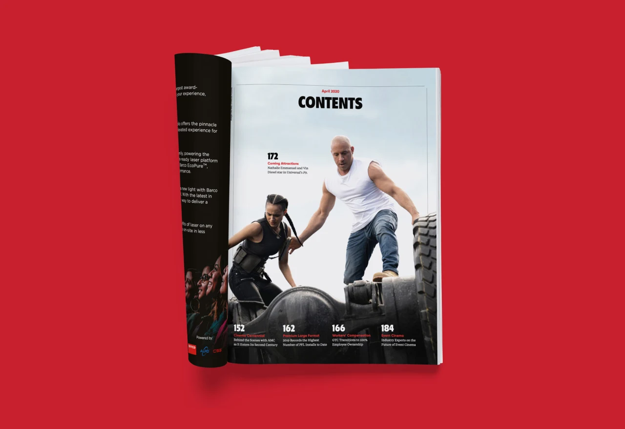
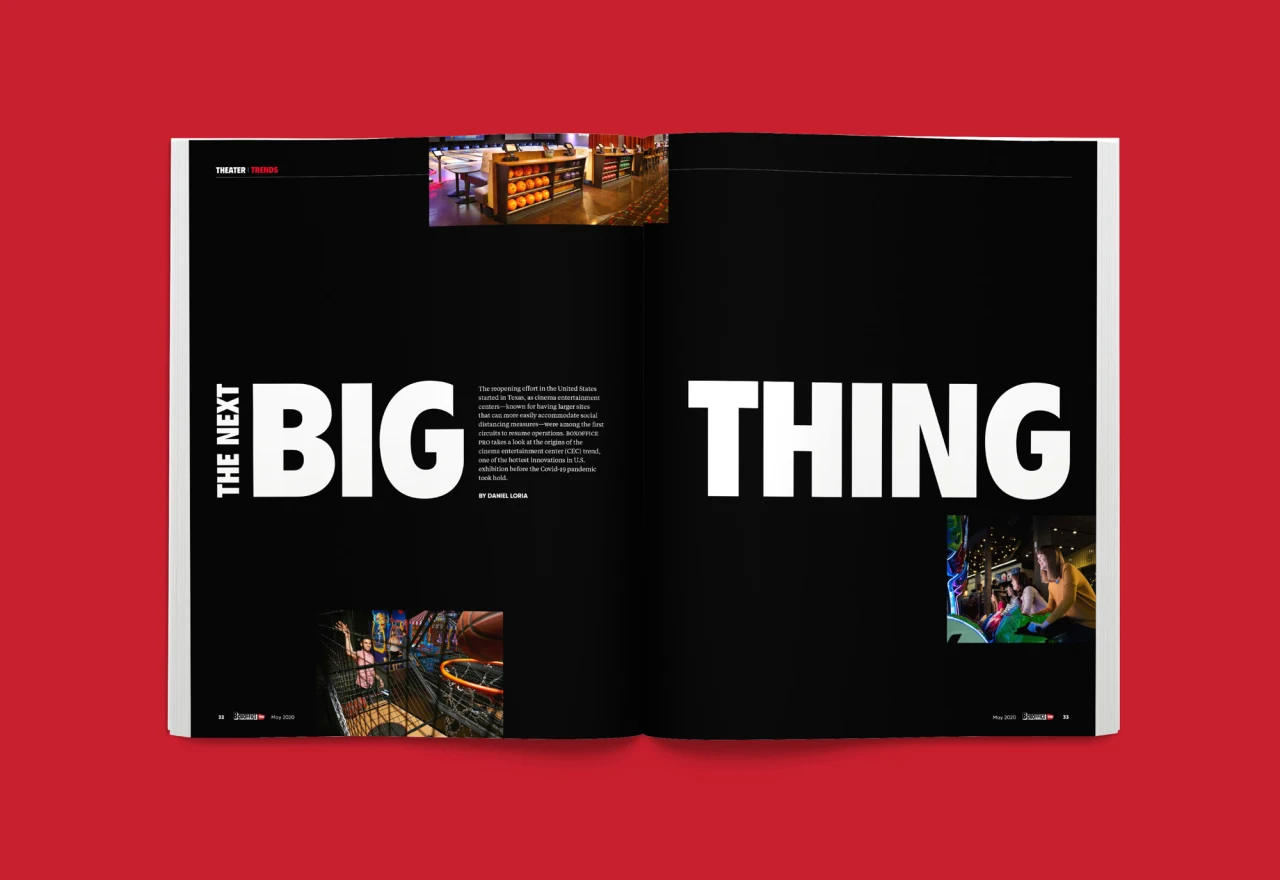
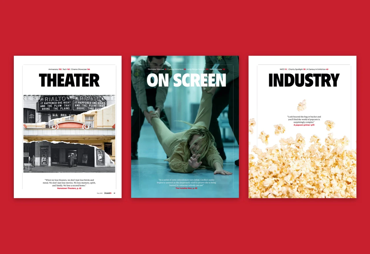
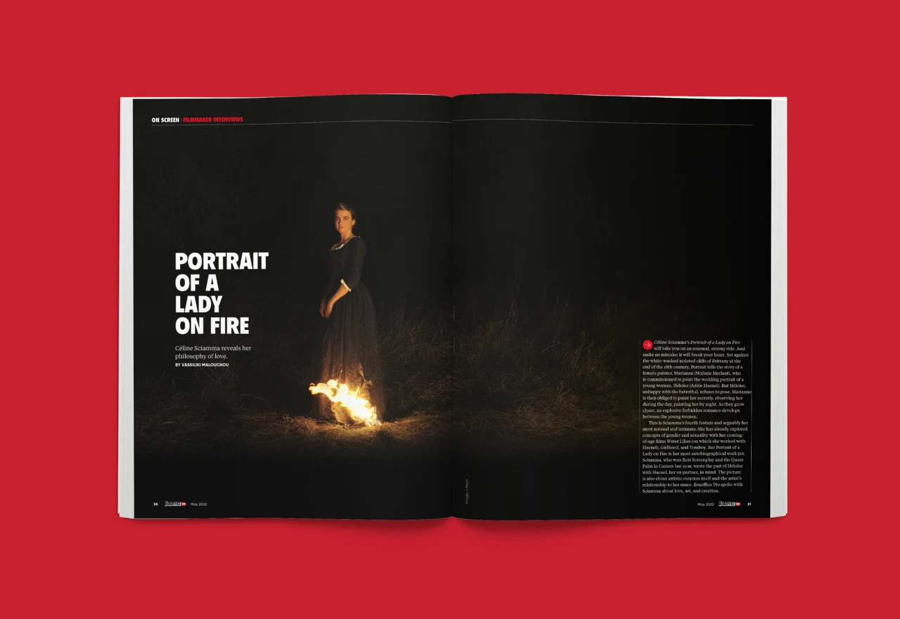
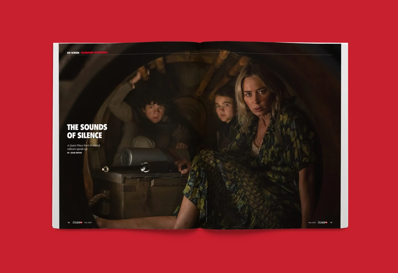
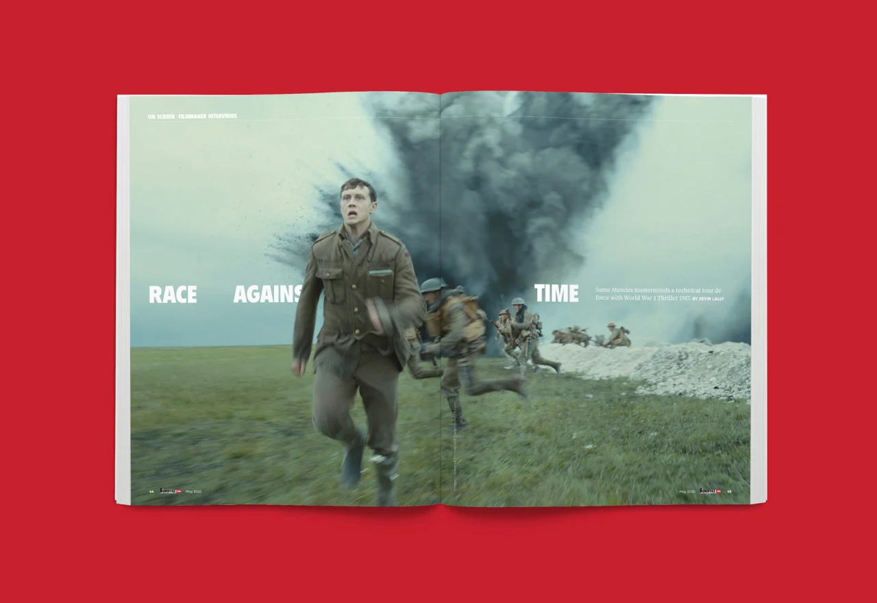
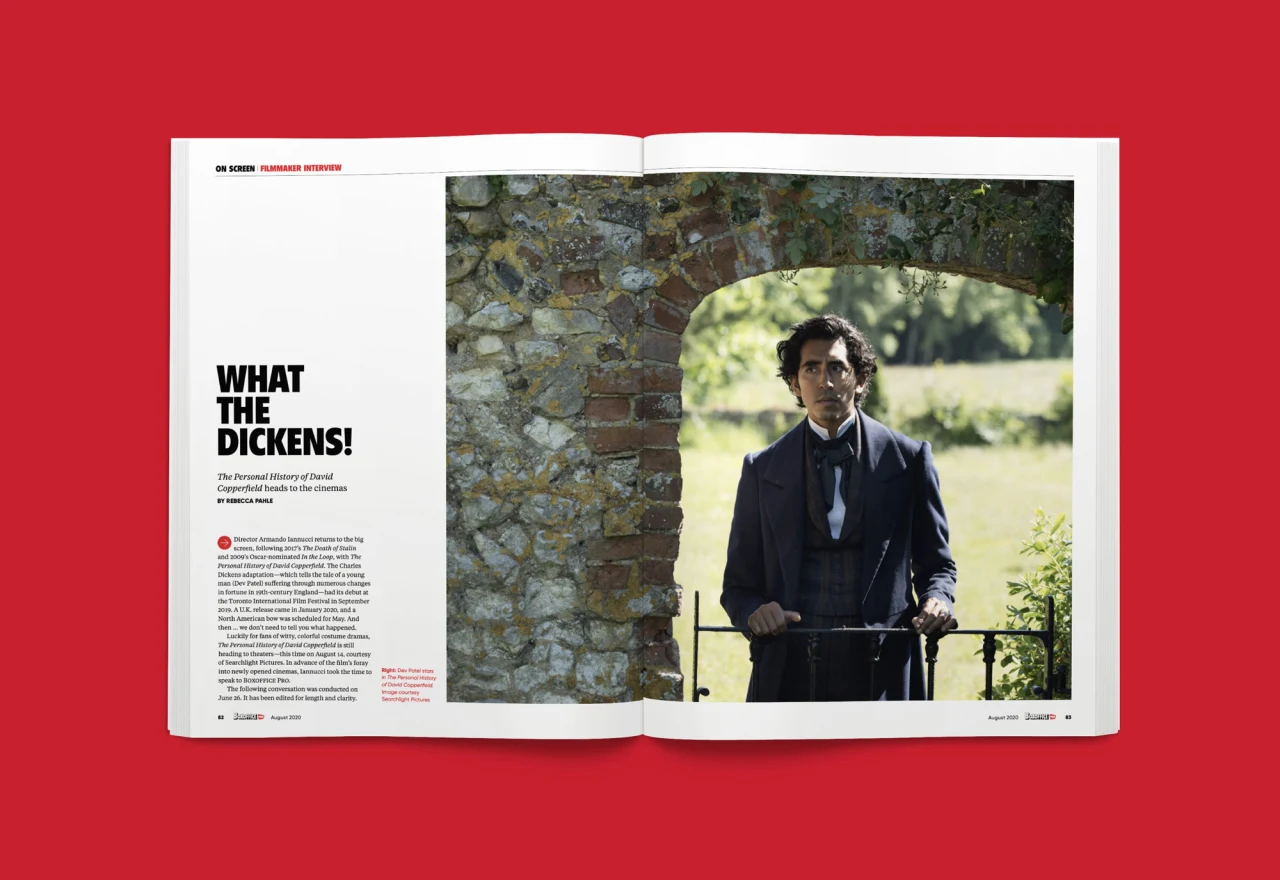
She Was Only's redesign is inspired by the graphic history of the magazine, mainly the classic covers from the 100-year archive while transforming it into something new. A more visual approach to storytelling has been introduced, along with bolder use of photography and film stills.
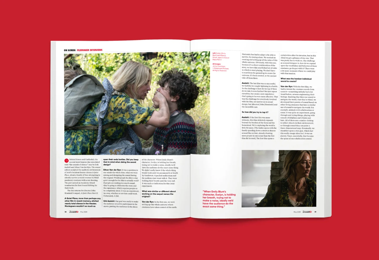
More specifically, a flexible 12-column grid allows for more diverse layouts and a greater mix of sidebars, infographics and pull quotes. Typography has also been updated, based around Tiempos Text by Klim for body text, Gilroy by Radomir Tinkov for captioning, and Flyer LT for Titling.
The aim with the cover, meanwhile, was to create a flexible format that was impactful, increased brand awareness, but also didn't compete with the magazine's paid cover take-overs.

Editor's Picks





Trending






Latest Jobs
Talent Agent & Producer at The Jacky Winter Group
Full-time·Los Angeles·$70k-$85k
Midweight Designer at All Purpose
Full-time·London·£30k–38k
Design Lead at Madeo
Full-time·New York City·$85k–$120k
Account Manager at BUILDHOLLYWOOD
Full-time·London·£34k–£38k
Design Director, Opinion at The New York Times
Full-time·New York·$160k–$180k
Designer at New Genre
Full-time·London·£36k–£48k






 in Manchester. Photography by Ash Young](https://media.creativeboom.com/4435e5d0-6562-4f51-9526-ff408915014a/conversions/e21a44b56cbd3e37046173113e4461f78b4c6675-medium.webp)